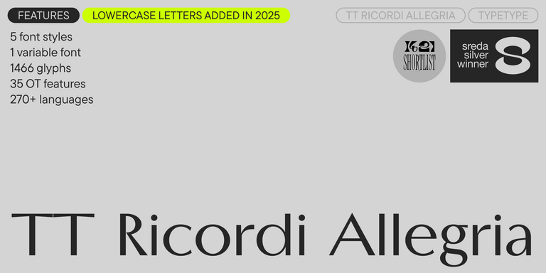
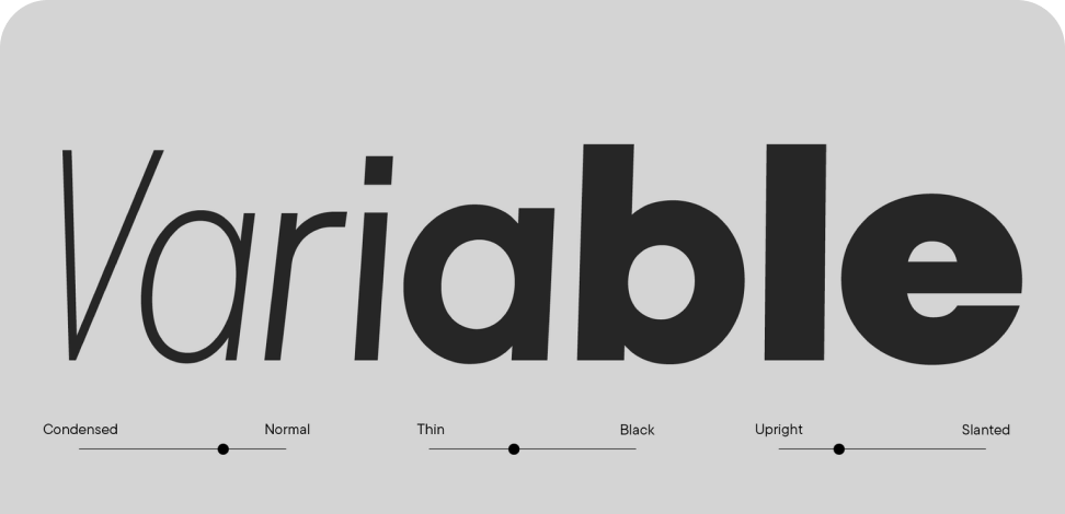


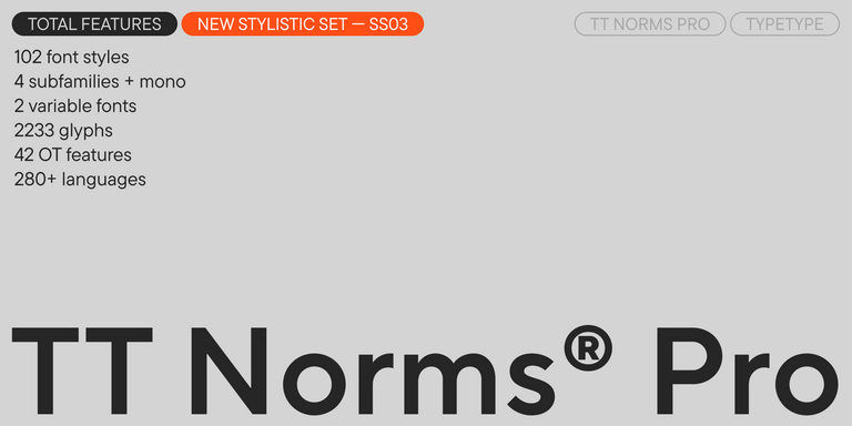
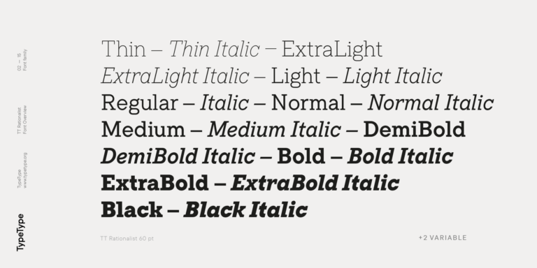
- A full lowercase set has been added (the lowercase characters from the previous version can now be found in a small caps set).
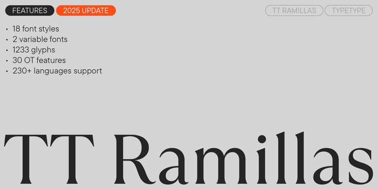
- The number of glyphs per style has nearly doubled, increasing from 750 to 1,466.
- Specifically, we have: expanded the extended Cyrillic and Latin sets; expanded the basic currency set (Bitcoin, Lira, Rupee, Som, Sum, Tenge, Tugrik, Won for all cases); drawn fractions and double ligatures, as well as alternate and small cap forms for ligatures; drawn all figures for numerators and denominators; drawn service characters for the lowercase set; drawn numerals and currency symbols for minuscule and minuscule tabular figures.
- The number of OpenType features has increased from 19 to 35.
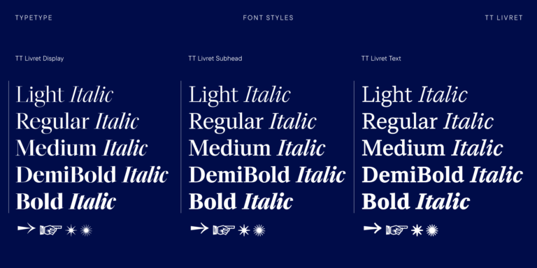
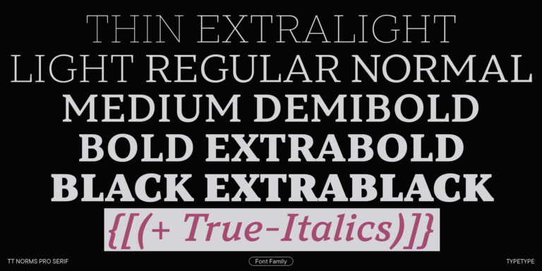
- The number of font styles has increased from 3 to 6: the bolder Medium and Demibold have been added, which significantly expand the typeface’s range of use.
- New stylistic sets have been added: SS09—Circled Figures, SS10—Negative Circled Figures, SS11—Bashkir localization, SS12—Chuvash localization, SS13—Bulgarian localization, SS14—Serbian localization.
- The number of supported languages has increased from over 200 to over 230.
Antiqua is a common name for different groups of serif fonts. The first Antiquas appeared a very long time ago, in the Renaissance era, reflected in the name, translated from Latin, “antiquus,” which means “ancient.”
With serifs, typographers of the past produced better prints by minimizing the wear and tear of the letters themselves. Today, serif fonts are actively used in print and are especially popular as book or magazine fonts.
In addition to serifs, high contrast is typical for Antiquas. They are a broad group of fonts that fall into different categories. Based on the application range, there is a distinction between text and heading Antiquas.
The most common is the classification of Antiquas by the historical period.
There are Old Style, Transitional, New Style, and Slab serifs.
Old style serif is the name given to the first fonts that became widespread in the 15th-17th centuries and possessed features of handwritten letters. The main features of the old-style serifs are slanted ovals of the letters and asymmetrical serifs.
An interesting example of a typeface from the TypeType collection is TT Bells, which has the features of Old Style fonts but was designed using modern geometric solutions.
Transitional serif differs from the previous one in high contrast letters and symmetrical serifs. This font type looks strict and neat, so it is often used for official documents and books.
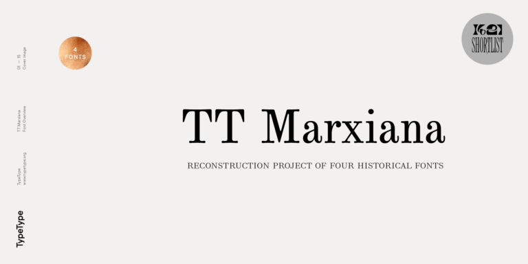
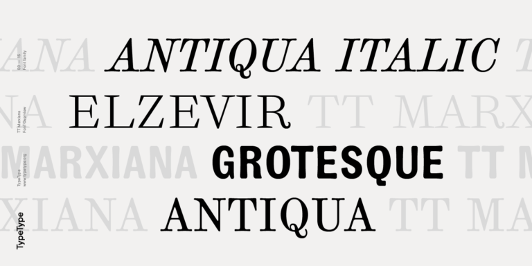
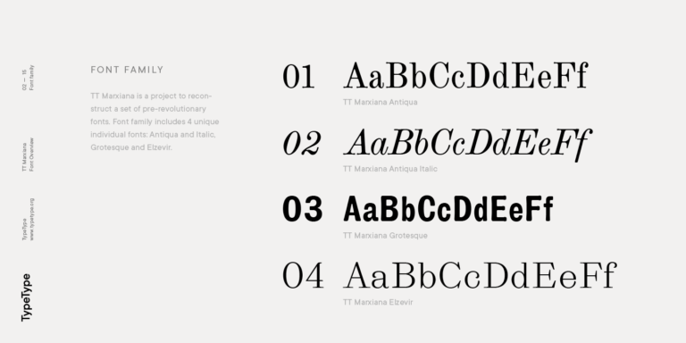
In our collection, you will find the unique TT Marxiana font inspired by the pre-revolutionary fonts of the St. Petersburg magazine Niva. The TT Marxiana family contains 3 fonts, one of which, TT Marxiana Antiqua, is an example of a Scottish serif that is halfway between Transitional and New Style.
New style serifs appeared at the end of the 18th century. This category includes fonts that have monospaced proportions and strong contrast. Among the main use cases are printing books, brochures, and magazines.
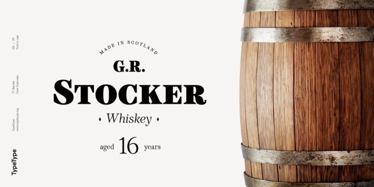
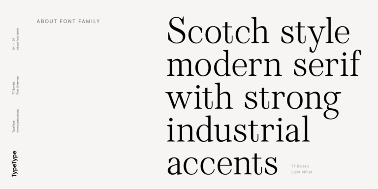
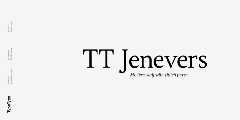
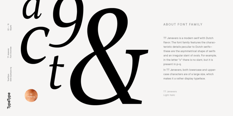
TT Jenevers and TT Barrels are our main examples of New Style serifs.
The last subcategory of serifs is Slab. The period of their popularity in typography falls at the beginning of the 19th century. Such fonts are characterized by robust rectangular serifs and low contrast. Slabs are ideal as headline fonts for advertising and posters.
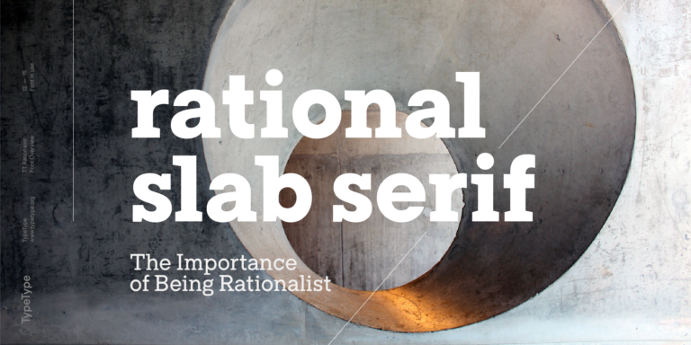
The TypeType collection features TT Rationalist as a great example of a Slab serif, perfect for title pages in books, magazines, and other printed materials.
Today, serifs have a wide application range but are most often used as heading or textbook fonts. Such typefaces attract attention and have good readability. In the TypeType collection, you will find serifs of various characteristics, from strict to expressive.
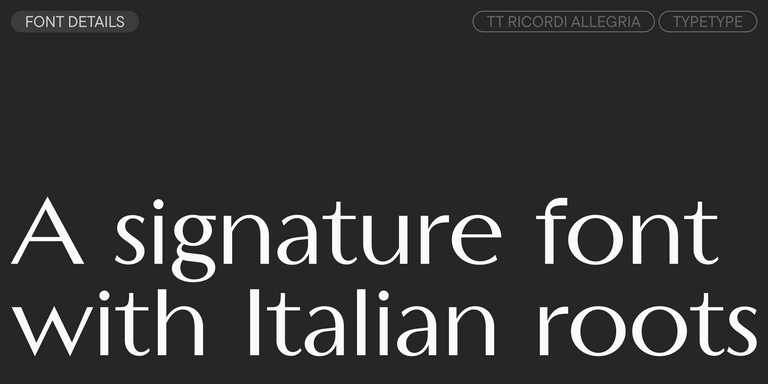
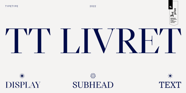
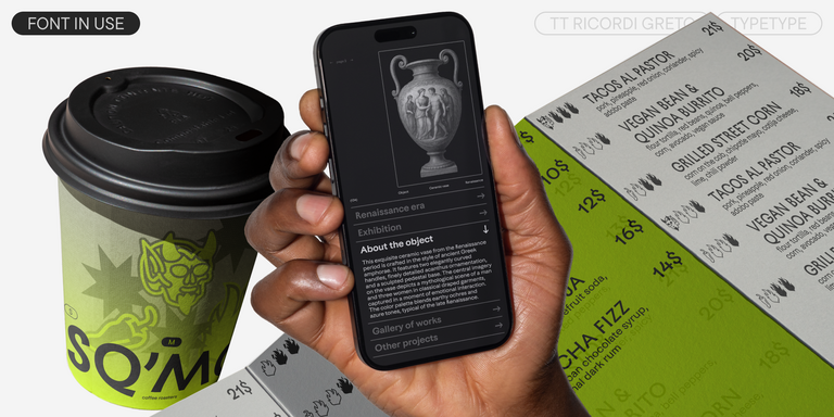
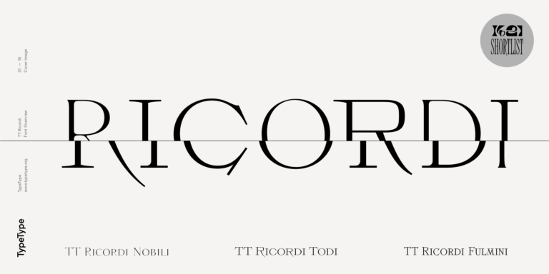
Among serifs with a pronounced character, our collection offers the particularly popular TT Ricordi collection of six display headline serifs: TT Ricordi Nobili, TT Ricordi Allegria, TT Ricordi Greto, TT Ricordi Marmo, TT Ricordi Fulmini, TT Ricordi Todi, and TT Livret Display.
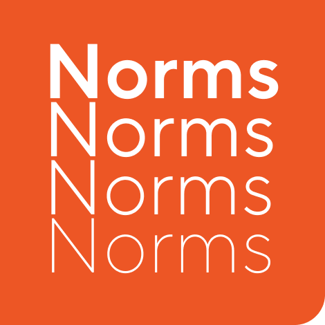
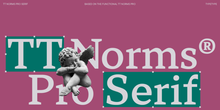
The bestsellers among TypeType text serifs are TT Norms® Pro Serif and TT Livret Text.
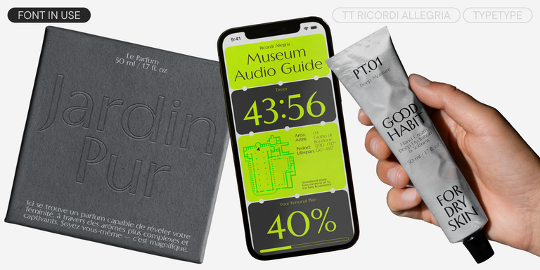
TT Ricordi Allegria is a sleek and intelligent contemporary Florentine grotesque.
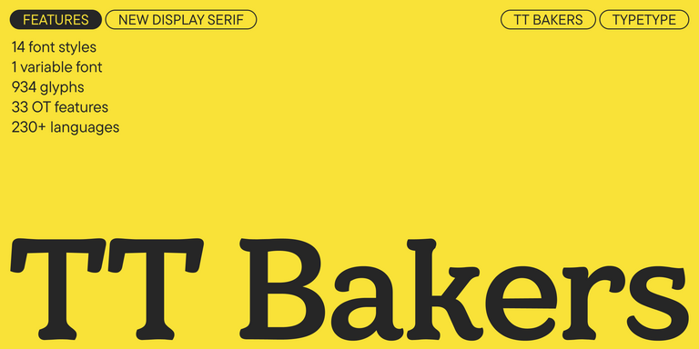
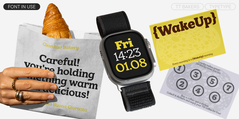
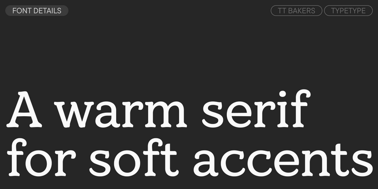
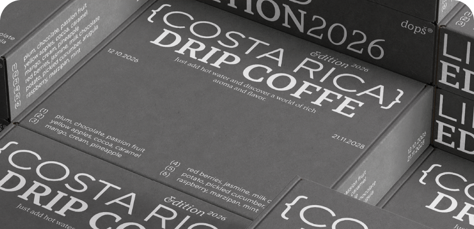
TT Bakers is a fluid serif with a gentle and lively character. This font is like freshly baked goods: it’s warm and soft, especially in its bolder weights.
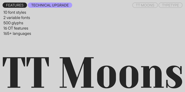
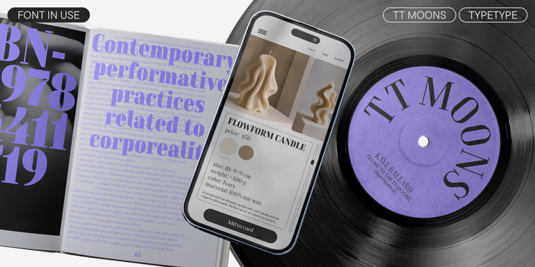
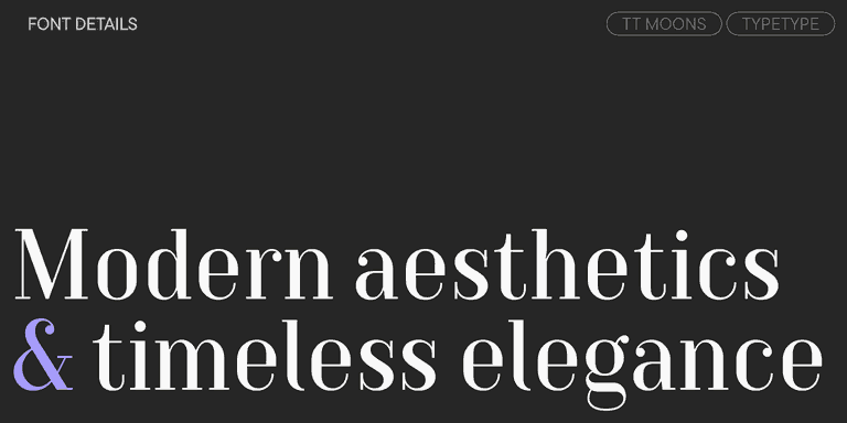
TT Moons is a slim and contrast serif. This font family works especially smart in classic design themes. TT Moons is a typeface of the glyptal modern typeface.
Our bestsellers
TT Norms® Pro
TT Norms® Pro is a typographic legend embraced by world-renowned brands. Evolved through multiple iterations, it has conquered MyFonts and redefined typographic versatility. A design workhorse that transforms from a humble tool to an essential creative companion.
- from $42 . 99
Our bestsellers
TT Commons™ Pro
TT Commons™ Pro is the studio’s typographic powerhouse. A font so versatile it defies categorization, seamlessly bridging style and function. For designers seeking a universal foundation that elevates every project, this is the definitive choice.
- from $42 . 99
Our bestsellers
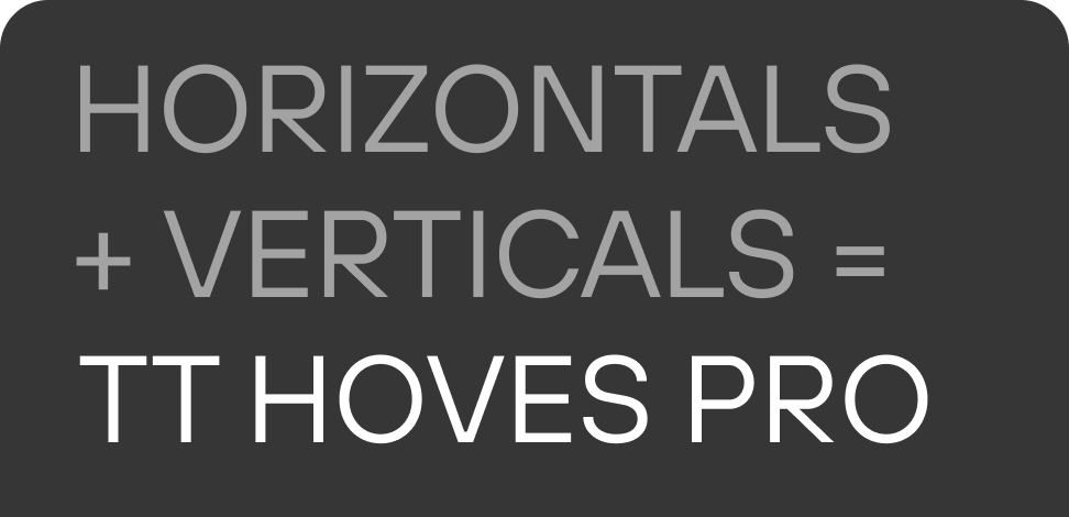
TT Hoves Pro
TT Hoves Pro is a Scandinavian sans serif that whispers minimalist elegance. Simultaneously understated and distinctive, it’s a designer’s secret weapon that transforms complex challenges into visual poetry with effortless precision.
- from $42 . 99
Our bestsellers
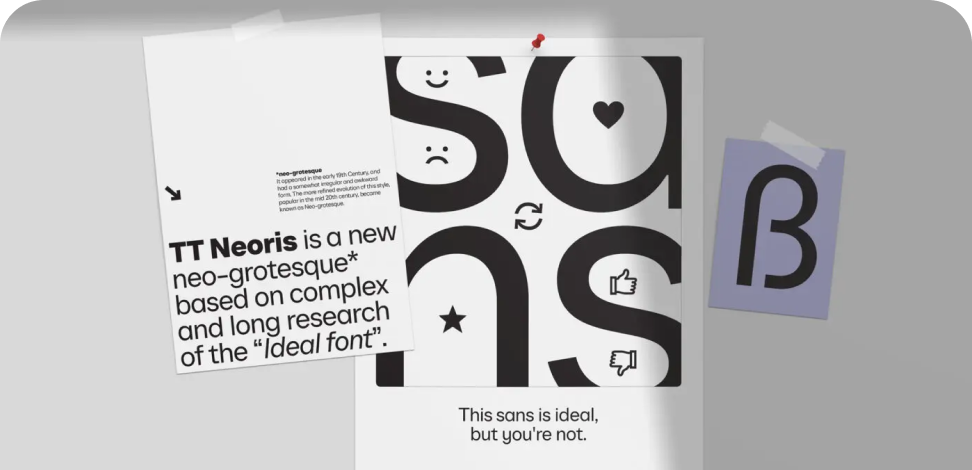
TT Neoris
TT Neoris is a true shape-shifting font that seamlessly adapts to your tasks and preferences. We developed it for two and a half years to make it perfect in everything: from design to functionality. A Muse and Indigo award-winner that redefines typographic potential.
- from $59 . 99
Our bestsellers
TT Supermolot Neue
TT Supermolot Neue is a game-changer in visual communication! An advanced, modular sans serif that captures the pulse of technological innovation, bringing electrifying vision to everything from immersive game interfaces to bold visual narratives.
- from $42 . 99
Our bestsellers
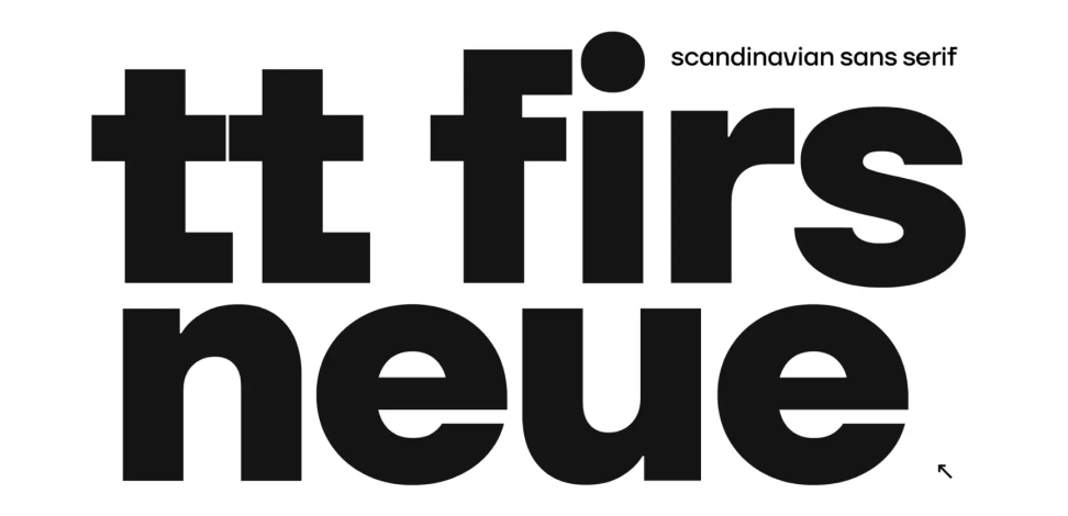
TT Firs Neue
TT Firs Neue is a balanced sans serif infused with Scandinavian design philosophy. Elegant and versatile, polished through two deliberate revisions to achieve typographic perfection.
- from $42 . 99
Our bestsellers
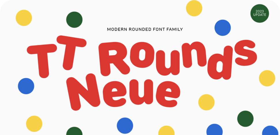
TT Rounds Neue
TT Rounds Neue is a soft and friendly font that knows how to be different. In lighter font styles it looks minimalist and neutral. The bold font styles make it puff up and achieve maximum roundness, exuding childlike charm.
- from $42 . 99
Our bestsellers
TT Fors
TT Fors is a design Swiss Army knife of typography. This geometric sans serif delivers pure versatility through clean, refined proportions. It can be used for defining interfaces or crafting visual accents.
- from $42 . 99
Our bestsellers
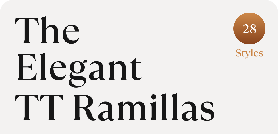
TT Ramillas
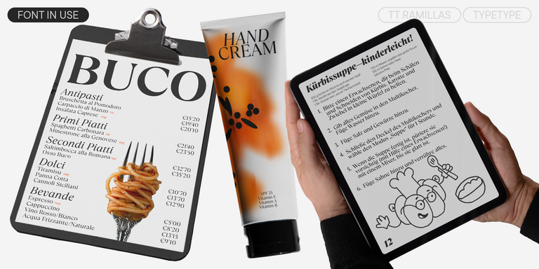
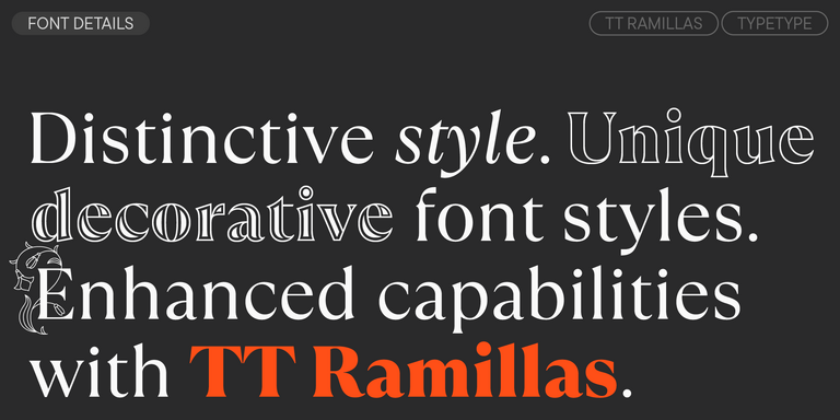
TT Ramillas is a stylish and contemporary serif that elevates design to an art form. Characterized by its unique decorative styles and initials with a floral ornament, it crafts visual experiences that are truly one-of-a-kind. Already adorning over 3000 websites globally, it’s a Modern Cyrillic award-winner that redefines typographic sophistication.
- from $42 . 99
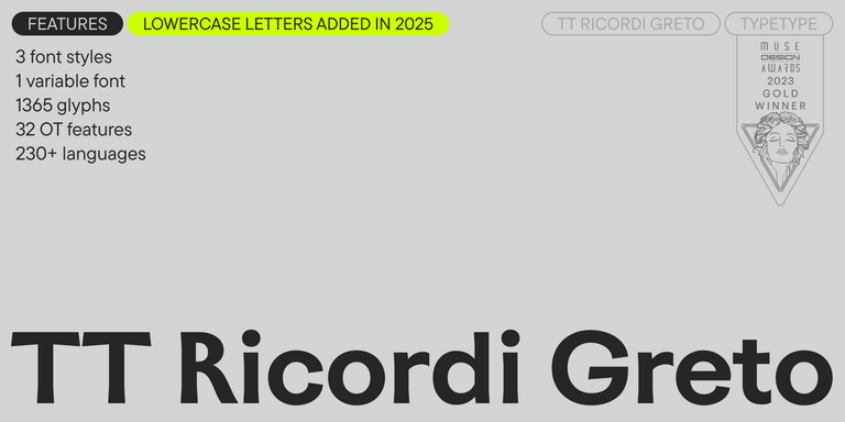
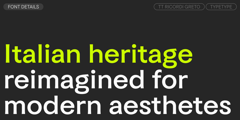
TT Ricordi Greto is an experimental project, inspired by a floor plaque dating from 1423 found in the Basilica di Santa Croce, Florence.
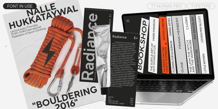
The bestseller TT Norms® Pro—a geometric sans serif, trouble-free workhorse
TT Ramillas is a fully reconsidered high contrast transitional serif, which is perfectly adapted to modern realities and requirements.
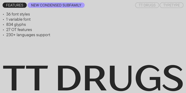
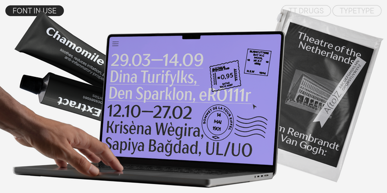
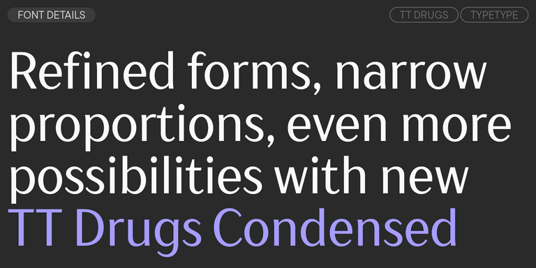
TT Drugs is a typeface that doesn’t feature serifs but stands out for its high contrast.
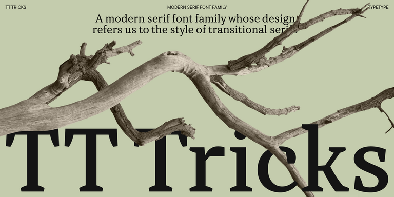
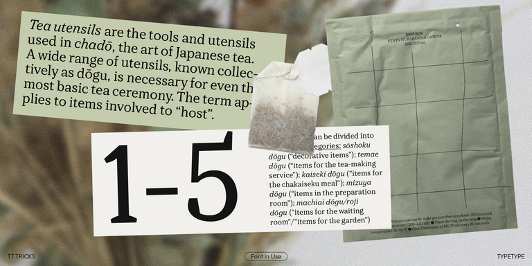
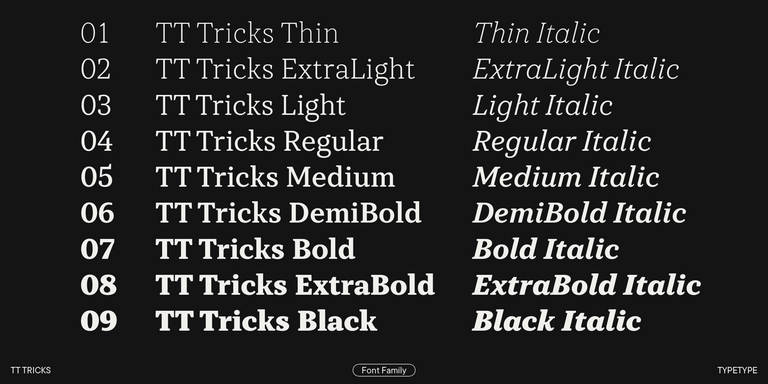
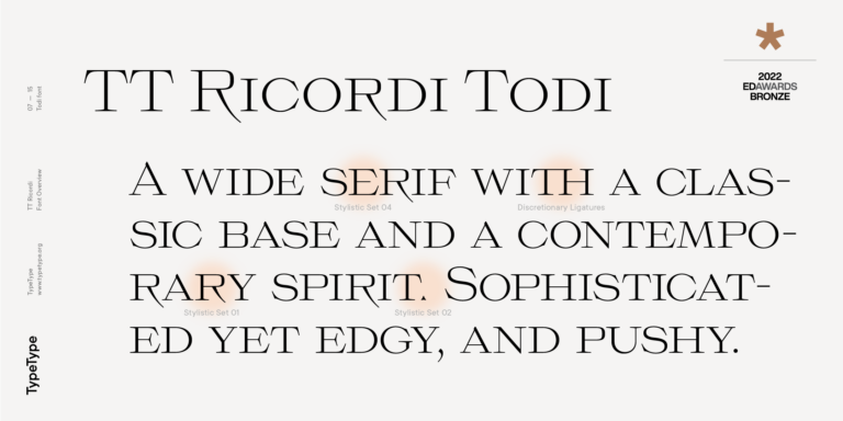
TT Tricks is a modern text serif with a design reflecting the style of Transitional serifs. This font has a calm, elegant, and moderately stern character.
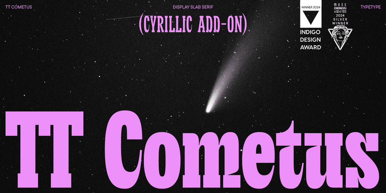
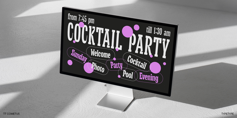
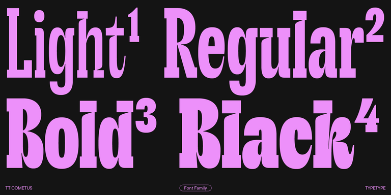
TT Cometus is an expressive typeface that captivates from the first time.
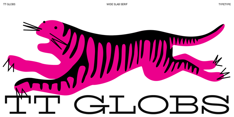
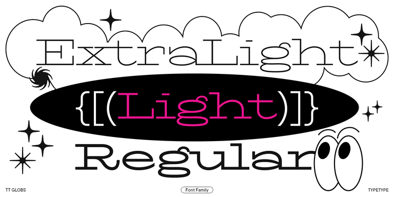
TT Globs is the first font from the TypeType Starter Kit line.
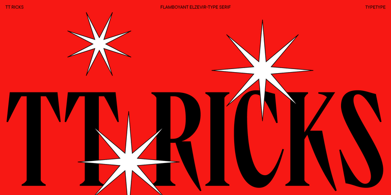
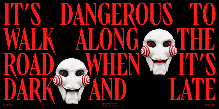
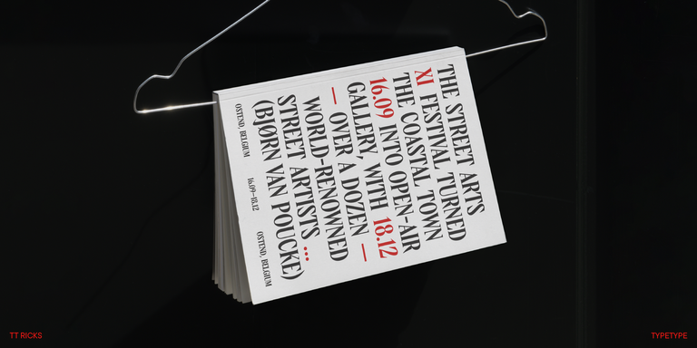
TT Ricks is a flamboyant elzevir-type serif, for which the words “cute” or “calm” are not a fitting definition.
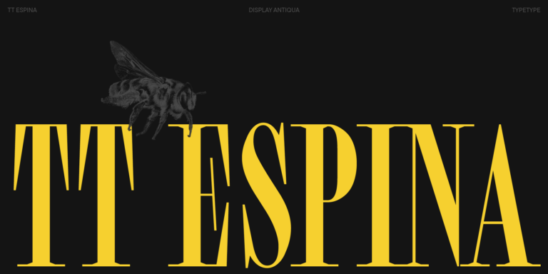
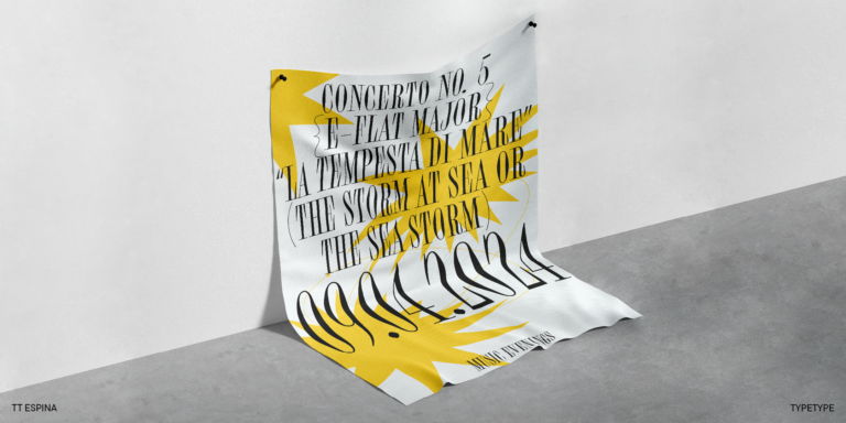
TT Espina is a display antiqua with expressive serifs
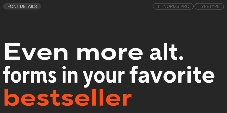
We continue to expand the line of the studio's main bestseller TT Norms® Pro!
TT Rationalist is functional and neutral slab serif typeface.

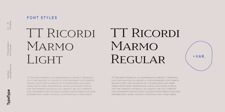
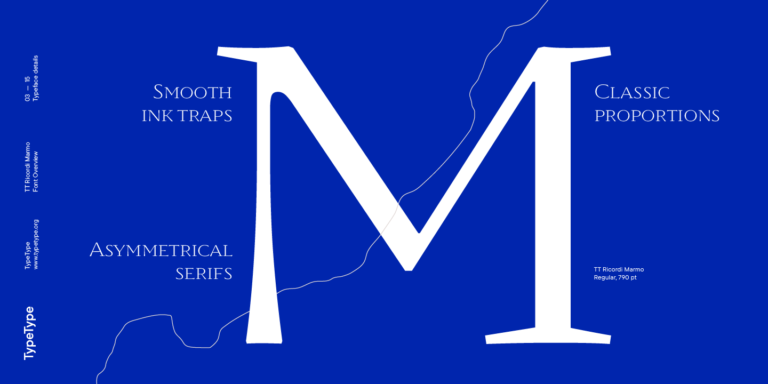
TT Ricordi Marmo is an original experimental project inspired by inscriptions at Basilica di Santa Croce in Florence.
The TT Ricordi font family is a collection of three display heading serifs.
from $49
Buy font
TT Marxiana Elzevir is a title or header font and is a compilation of monastic Elzevir that were actively used in the Niva magazine for all its prints.
from $59
Buy font
TT Geekette is an experimental variable serif with friendly and flexible character of shapes.
from $29 . 99
Buy font

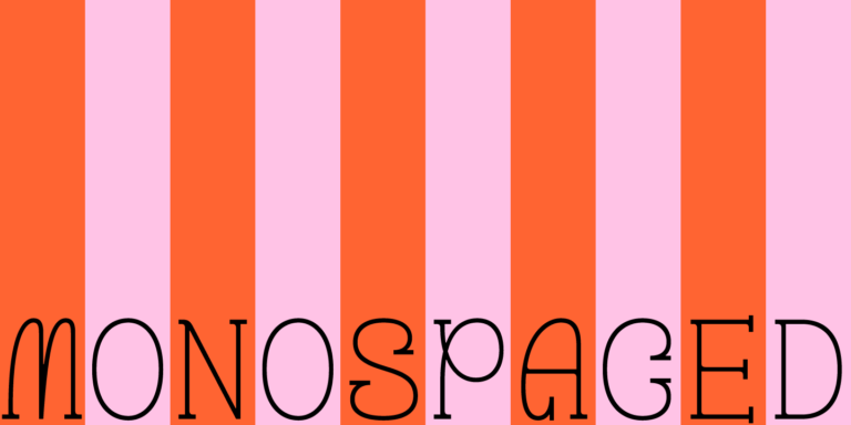
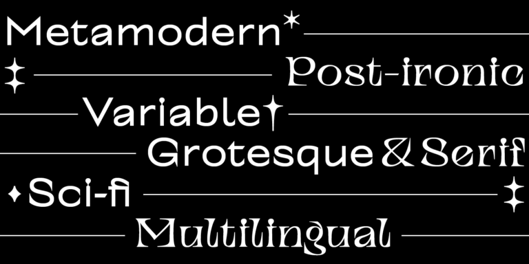
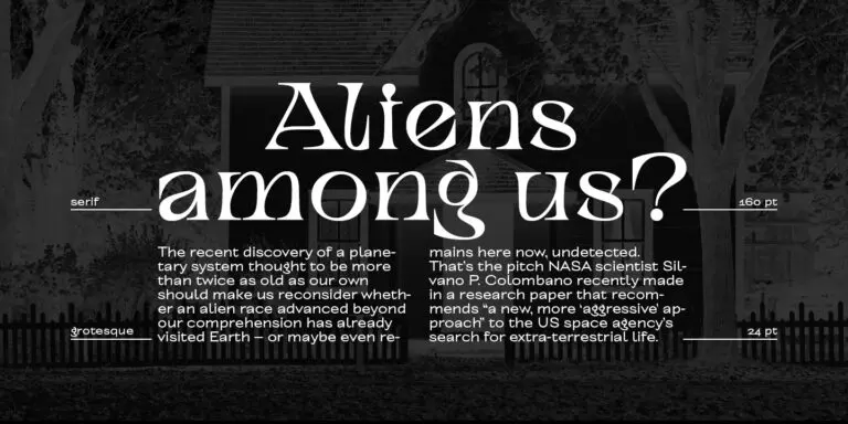
TT Alientz is a variable typeface that allows the user to make a visual journey from an extraterrestrial grotesque to a very prickly display serif.
from $29 . 99
Buy font

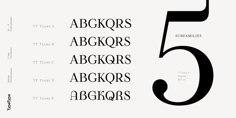
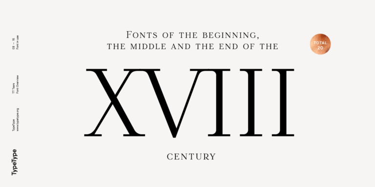
The TT Tsars font family is a collection of serif display fonts that are stylized to resemble the fonts of the beginning, the middle, and the end of the XVIII century.
from $39
Buy font

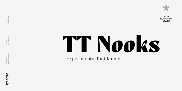
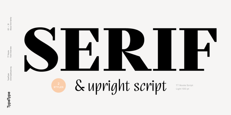
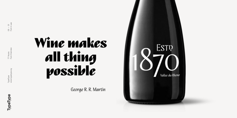
TT Nooks is an experimental project comprised of a high-contrast egocentric serif and an upright humanist italic.
from $39
Buy font