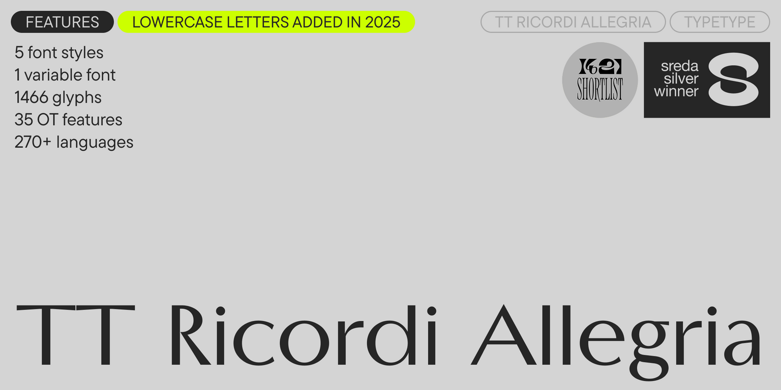


Introducing TT Ricordi Allegria version 2.000—now with a lowercase set! This typeface has undergone a major update: we’ve significantly expanded the character set, added new font styles, and introduced a host of new features.
TT Ricordi Allegria is a modern high-contrast sans with an intelligent character. It is an original project by Antonina Zhulkova, developed as part of the Ricordi font line. The main idea behind this unique series is the search for “typographic treasures” in old inscriptions on plaques and stones and bringing the most interesting ones back to life as modern fonts.
The inspiration for TT Ricordi Allegria came from the semi-erased inscriptions found in the Basilica di Santa Croce in Florence. The font’s design reflects a transitional stage between classic Antiqua and Florentine Grotesque. Its distinctive features are hyperbolized dynamic proportions, contrast between strokes, wedge-shaped stroke ends, and the absence of traditional serifs.
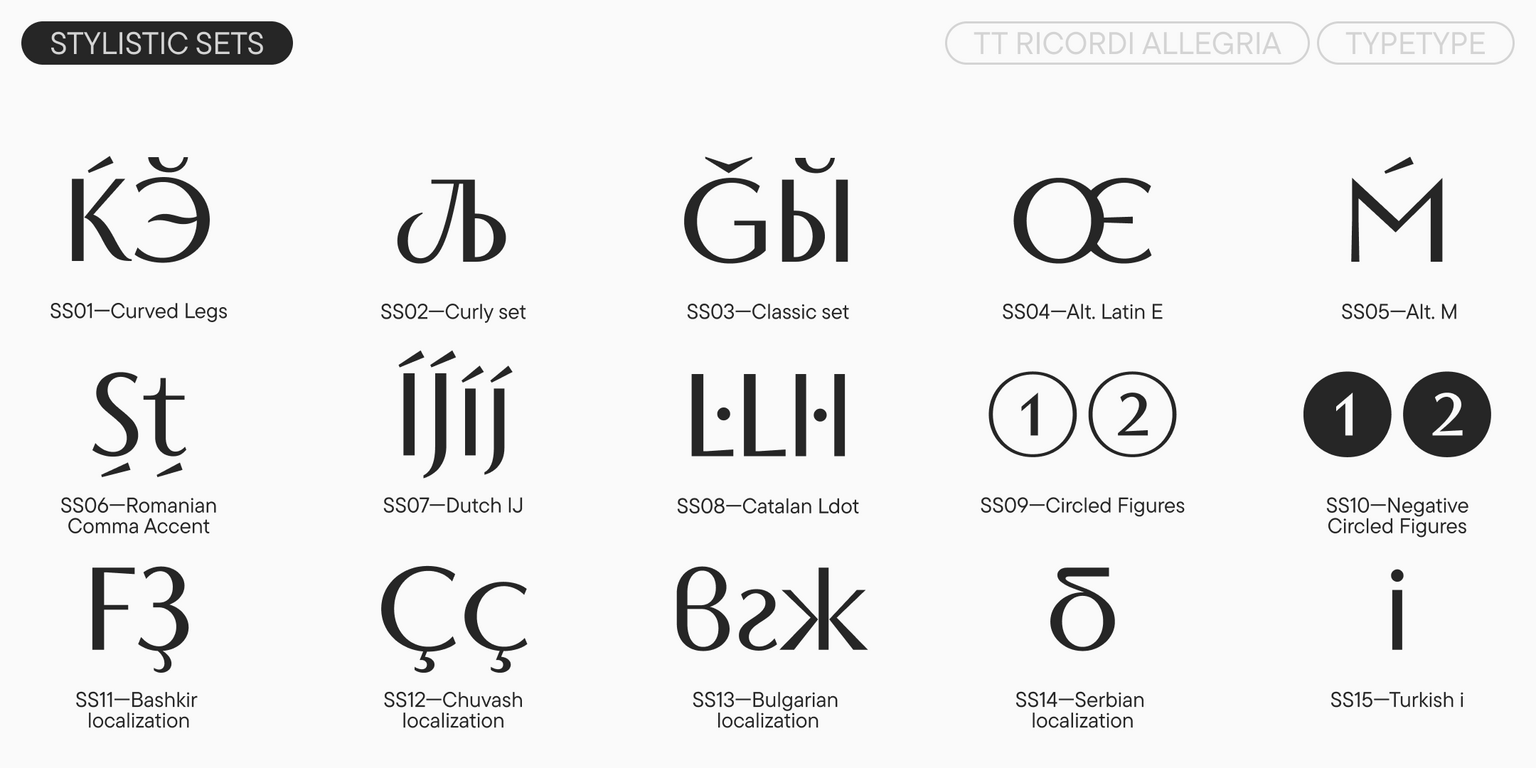
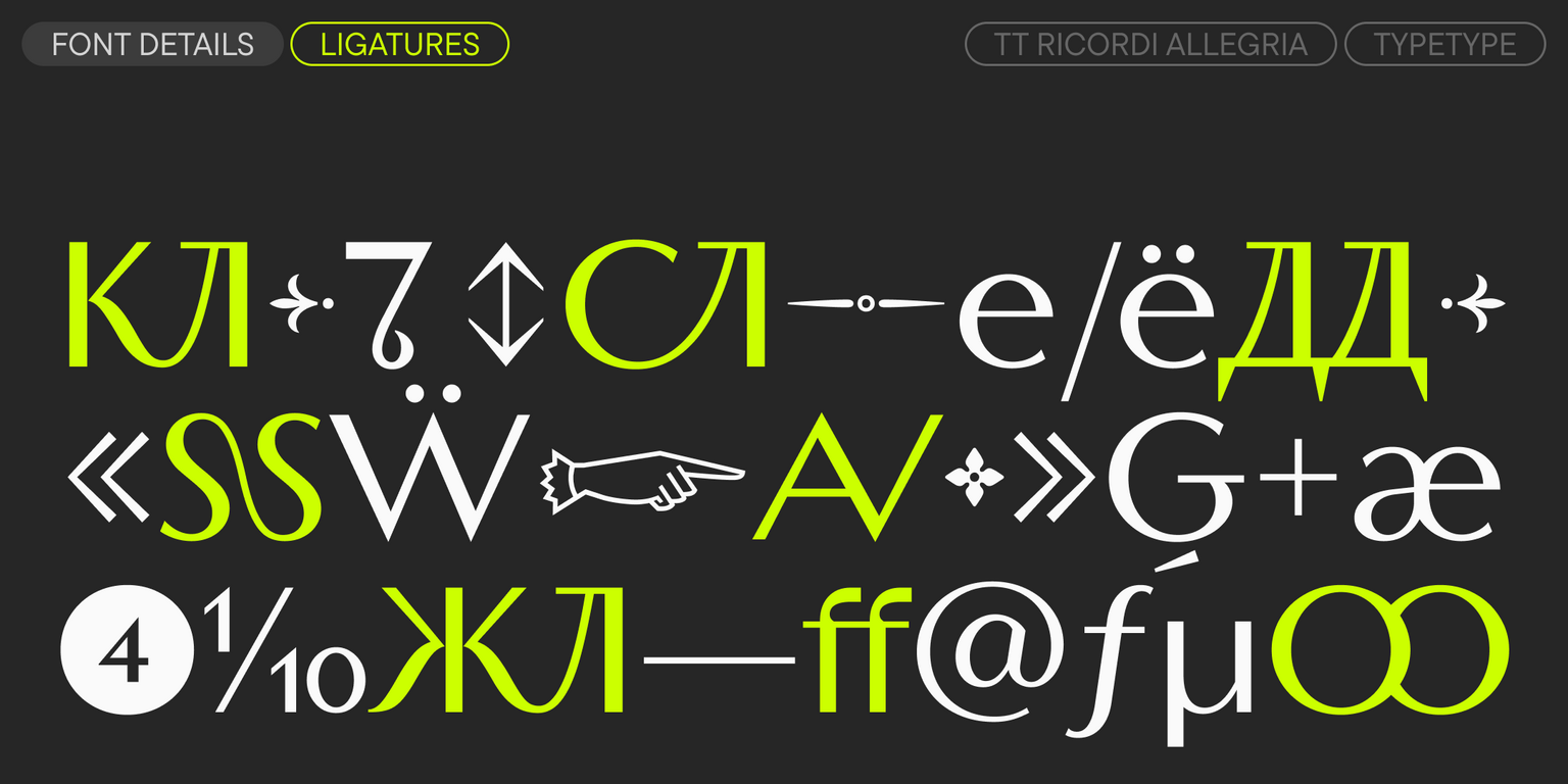
The font’s main visual hook is its multi-faceted nature: using stylistic sets, you can completely change the character and perception of TT Ricordi Allegria. The characters in the main set have a concise design, which gives the font a stern mood. It creates the feeling that an inscription set in it was truly carved from stone. The alternate set, on the other hand, makes the characters more rounded: some letters here feature noticeable “swirls” or fluid “legs.” Additionally, the typeface includes a set of beautiful ligatures for use in display lettering, such as in large headlines.
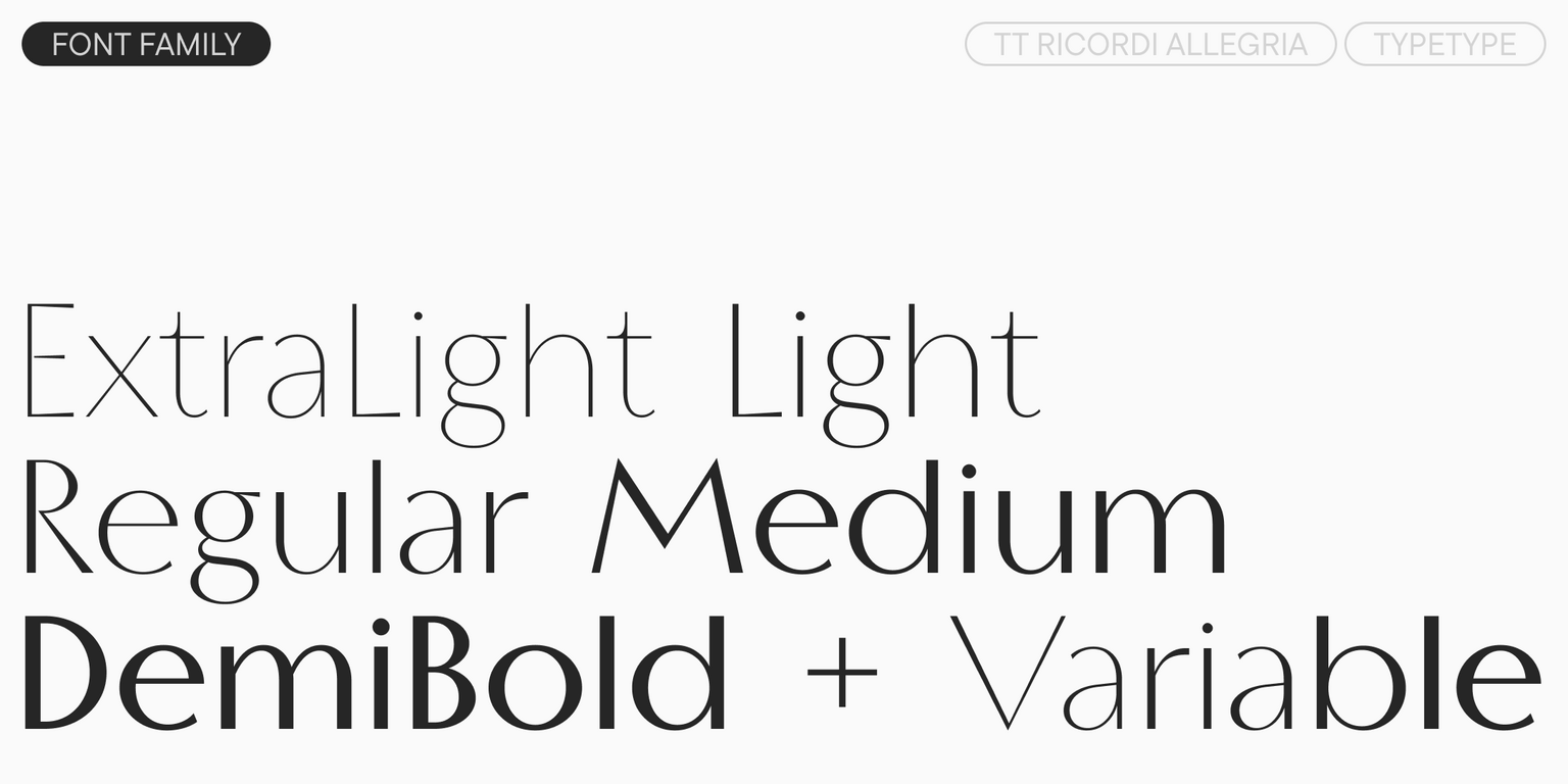
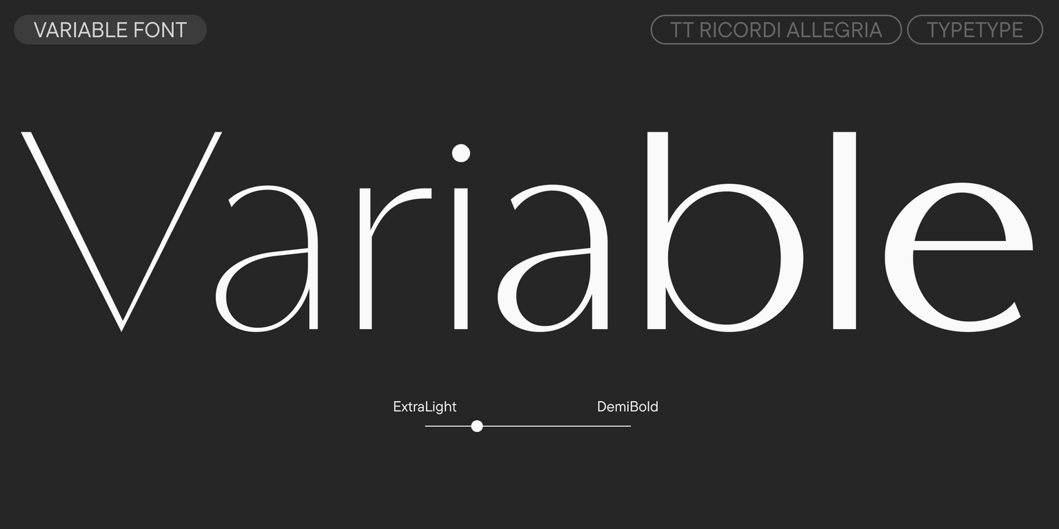
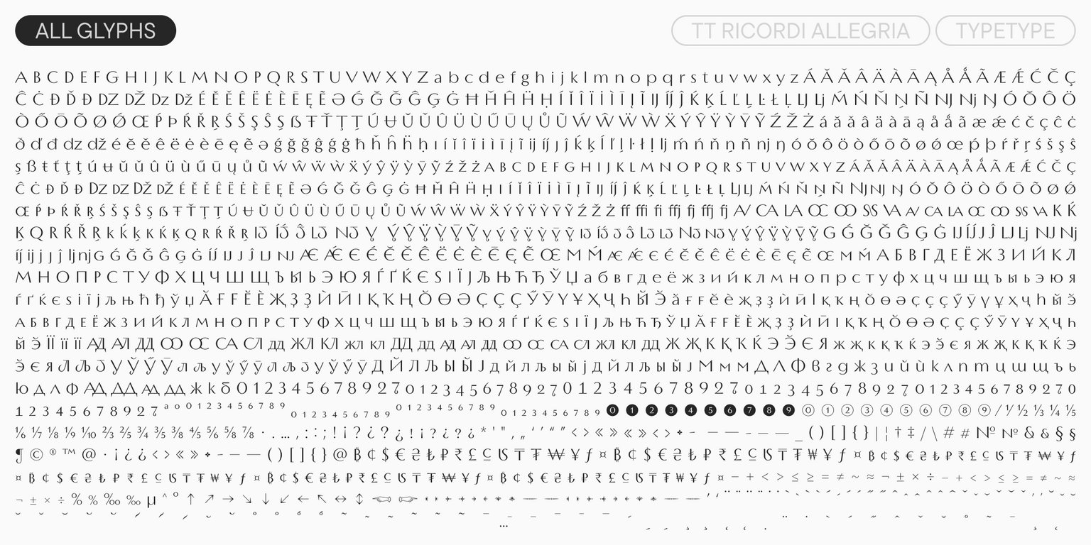
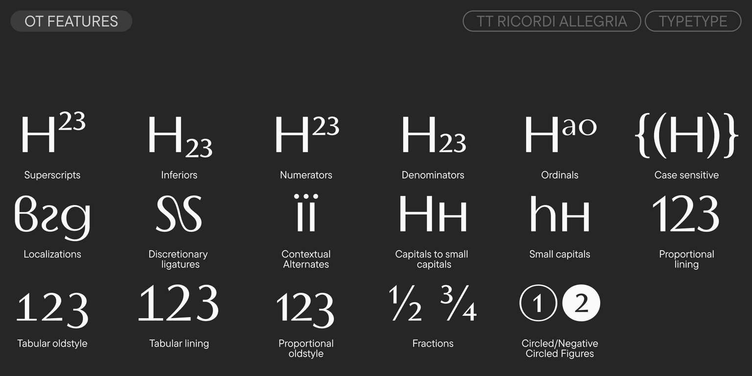
With this update, the possibilities for working with the typeface have expanded significantly. We have nearly doubled the character set. The most important update is that the font now has a full lowercase set (the lowercase characters from the previous version can now be found in a small caps set). We also added three new styles, including Medium and Demibold, which significantly expand the typeface’s range of use, and a variable style that allows the font to be changed along the weight axis. And on top of that—new stylistic sets, languages, and a large number of OpenType features.
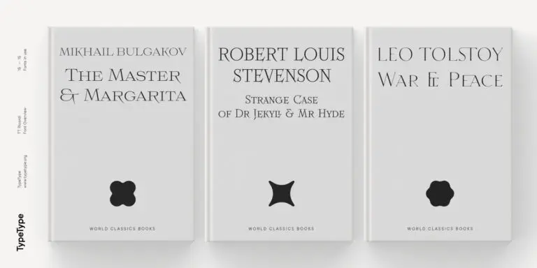
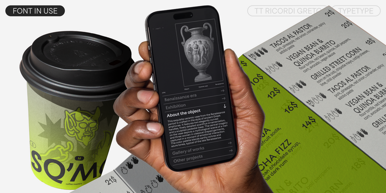
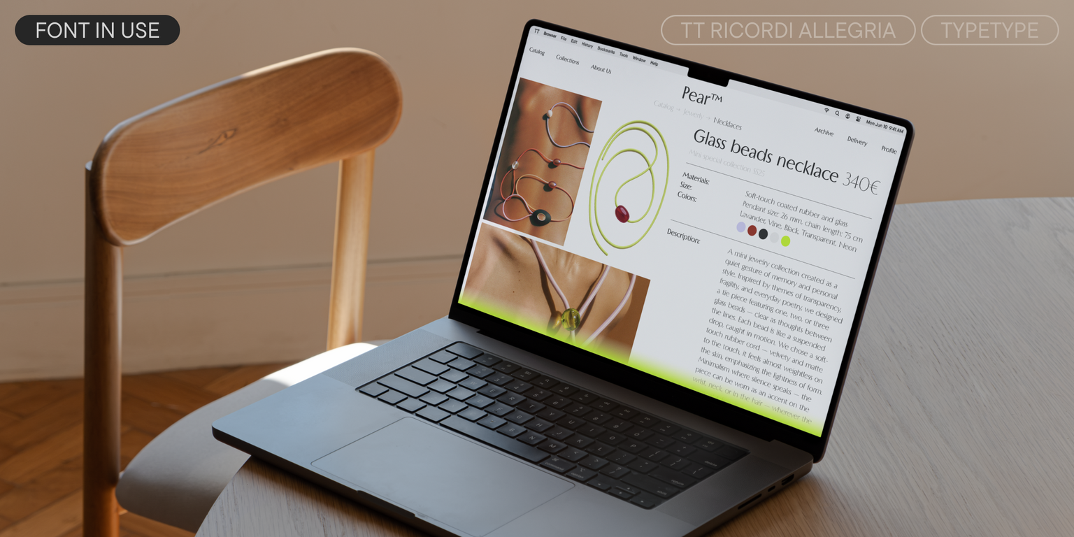
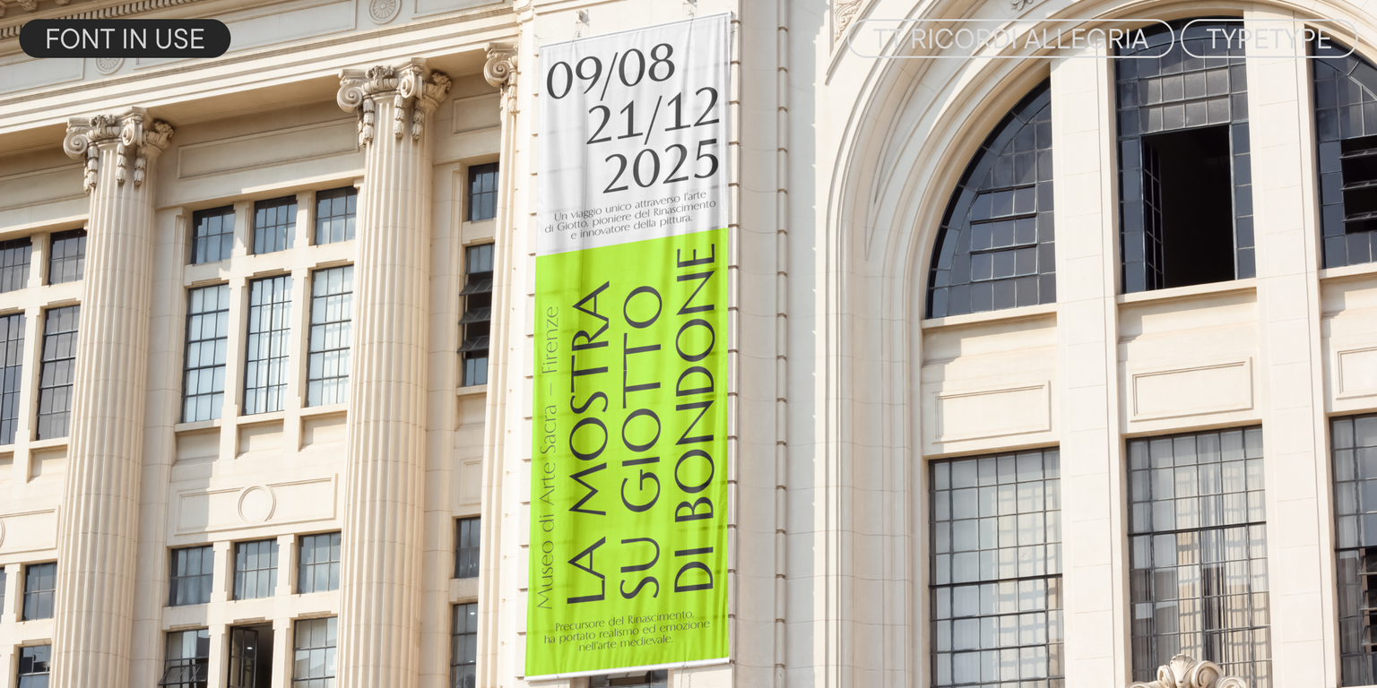
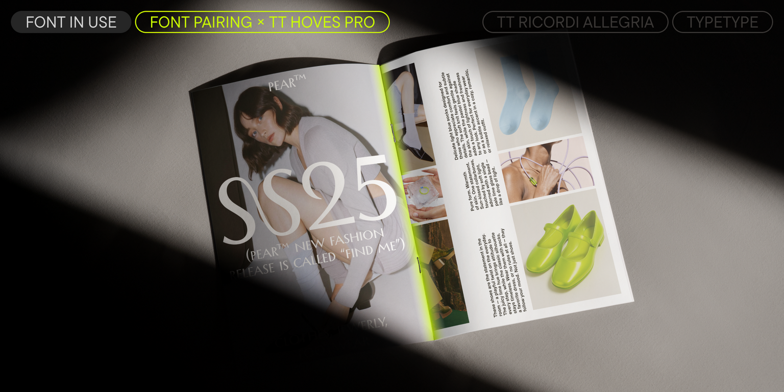
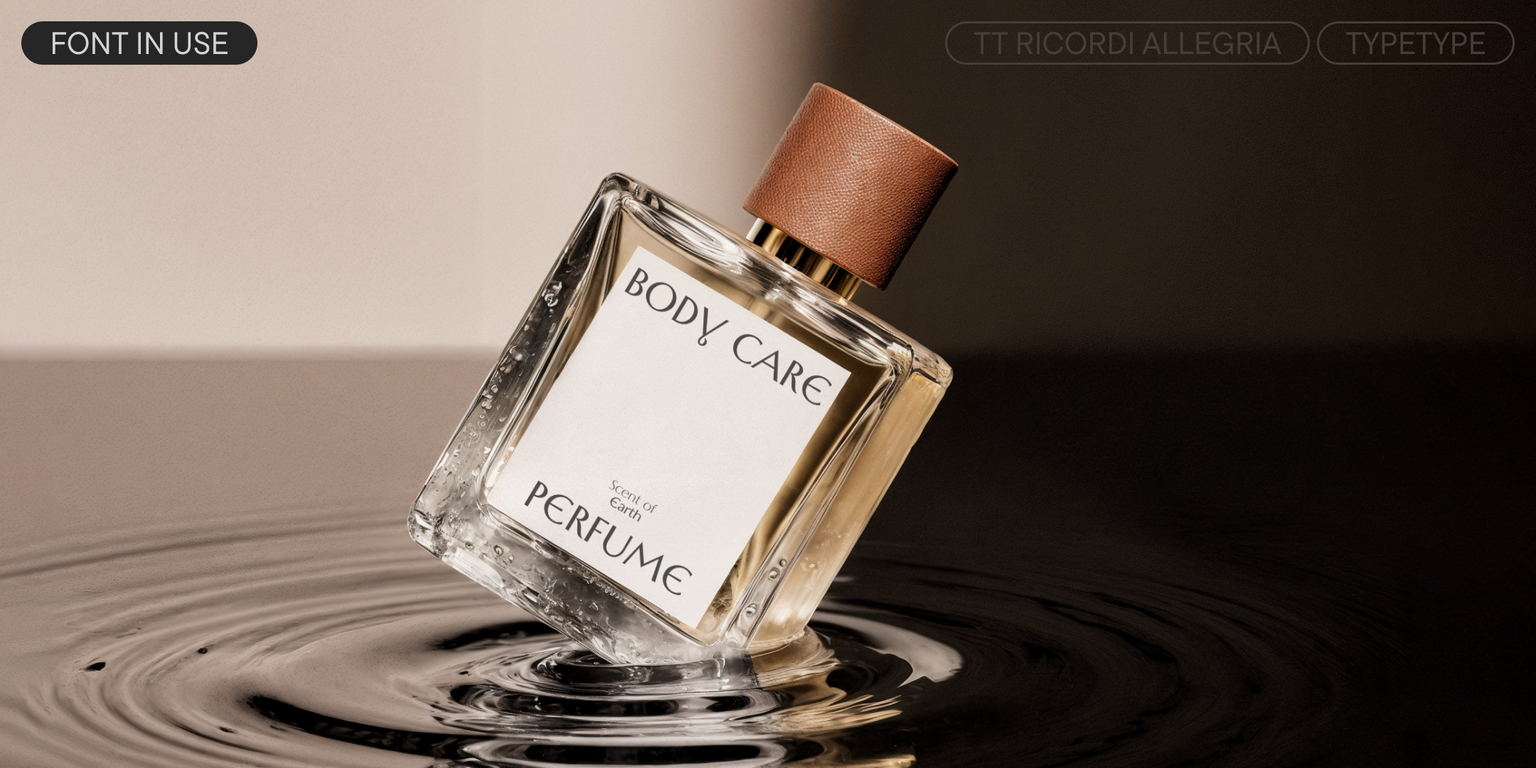
This graceful font is well-suited for elegant accents. It works best at large and medium sizes: for example, it can be used for posters and announcements, book and magazine covers, in branding, and in web design.
TT Ricordi Allegria 2.000 includes:
- 6 font styles: 5 uprights and 1 variable
- 1,466 glyphs per style
- 35 OpenType features
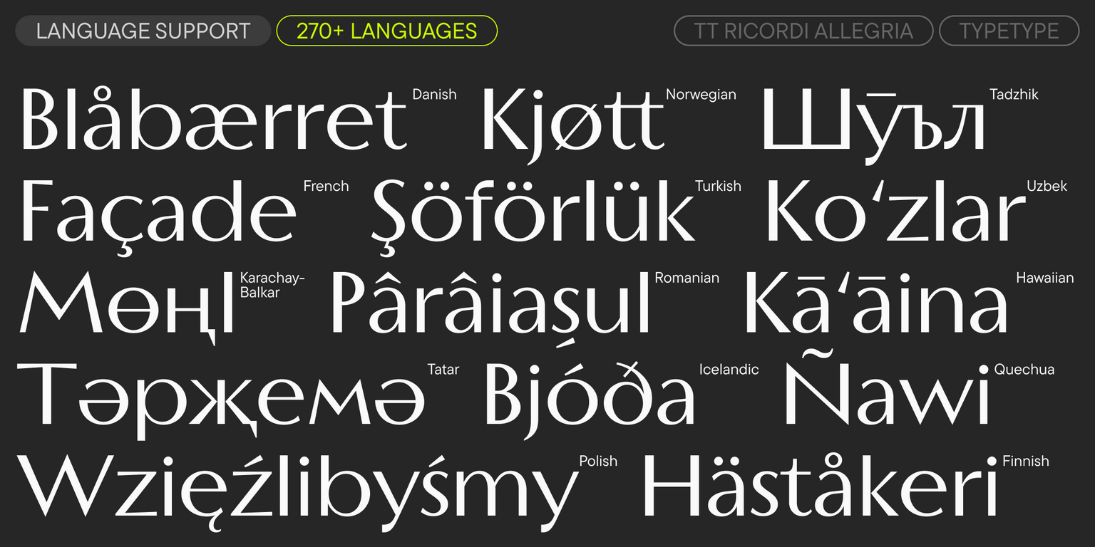
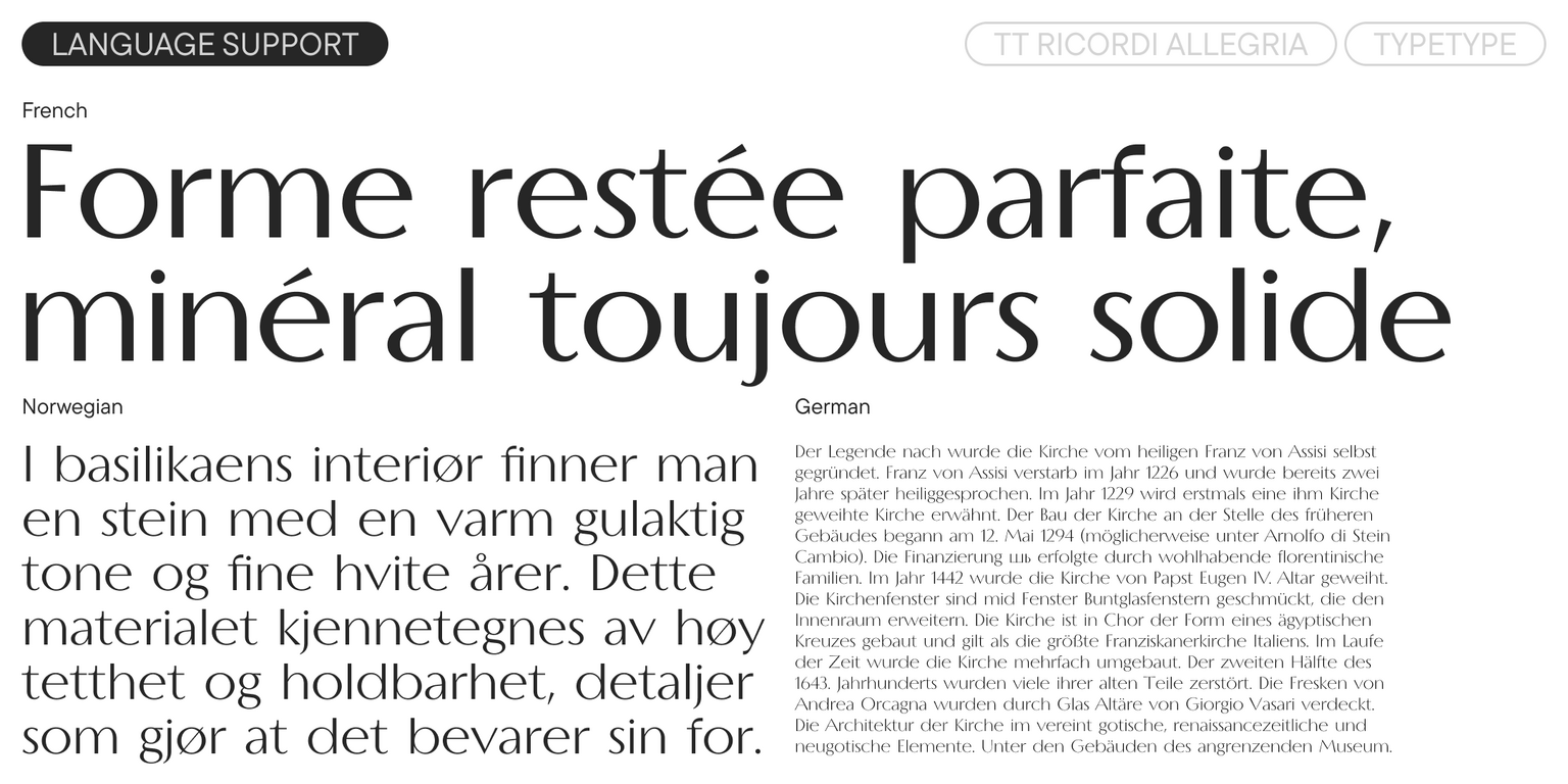
- Support for over 230 languages