top_banner_ttnormspro0426
TT Jenevers
14 styles
Type foundryFonts & StylesSerifTT Jenevers

TT Jenevers

TT Jenevers is a Dutch-influenced display serif with distinctive details like asymmetrical shape of serifs and an irregular slant of ovals.
Single style: from $47.99
Full family: from $249 14 styles

Buying Options

Choose the fonts and licenses you want. Then, press the "Add to Cart" button

Any questions about the font or licences? Write us.

Choose the fonts you want

Package offer:
per style $17.79
from  $249
14 styles
from  $249
from $47.99
from $47.99
from $47.99
from $47.99
from $47.99
from $47.99
from $47.99
from $47.99
from $47.99
from $47.99
from $47.99
from $47.99
from $129
from $129
Package offer:
per style $19.08
from  $229
12 styles
from  $229
from $47.99
from $47.99
from $47.99
from $47.99
from $47.99
from $47.99
from $47.99
from $47.99
from $47.99
from $47.99
from $47.99
from $47.99
Package offer:
per style $114.50
from  $229
2 styles
from  $229
from $129
from $129

Any questions about the font or licences? Write us.

Select font licenses

You must specify a font package or style before selecting a licence

Choose the licenses you want

On request
On request
On request
On request
On request
On request
On request
On request
On request
On request
No selected items
Total
$0

Testers

TT Jenevers
Size
Features
Turn on all

A modern serif with Dutch flavor

TT Jenevers
Size
Features
Turn on all

In the letter "o" there is no slant, but it is present in p-q. In TT Jenevers, both lowercase and uppercase characters are of a large size, which makes it a rather display typeface. At the same time, the big half-ellipse of the lowercase characters does not allow the letters to stick, which allows the implementation of TT Jenevers in text arrays.

TT Jenevers
Size
Features
Turn on all

The font family features the characteristic details peculiar to Dutch serifs

TT Jenevers
Size
Features
Turn on all

The italics of the TT Jenevers are slightly narrower as compared to upright faces

TT Jenevers
Size
Features
Turn on all
Variable axes
Weight

fifth (5) space

Ideal font pairs with TT Jenevers

What is a font pair, and what does it serve for?

A font pair is a combination of two fonts within one text block. Most often, one of the fonts in a pair is a more expressive headline font, and the other one serves to communicate information. Such fonts complement each other and help designers solve various tasks, like highlighting key elements, adding emotional expressiveness to the project, or separating semantic blocks.

How to choose fonts for a project: Several general recommendations

To begin with, establish the project's tone. Choose the fonts that stylistically match the main idea. After that, you need to determine the functions of each font in the project and their hierarchy: which font will complement the design and which one will serve to attract attention as the main element. You need to assess the difference between the fonts and decide what kind of information each of them should convey. First, we recommend choosing the base font you will use most, and then you can find a suitable pair for it.

Core principles of font pairing and recommendations from designers

The main rule you should follow when matching two fonts is that both similarities and differences must be visible between them. You can highlight the coherence of fonts by the following characteristics: contrast, proportions, width, openness of characters, individual letter shapes, and overall tone. Feel free to experiment with different combinations. We also recommend analyzing the projects you like: this way, you can enhance your visual skills, elevate your knowledge base, and gain confidence in dealing with typography.

Description

About font family TT Jenevers
190+ Language support

Introducing TT Jenevers version 1.200!

We’ve updated the typeface: we’ve added new glyphs, features, languages, and variable styles, and also enhanced the typeface’s technical components.

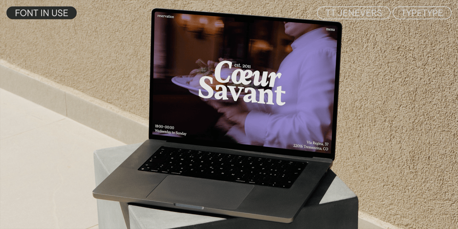
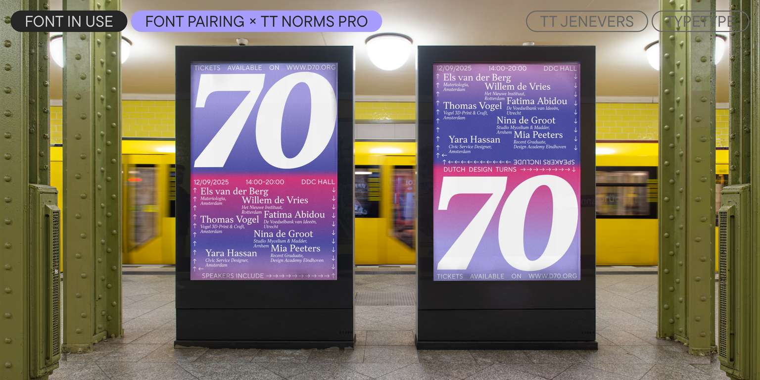
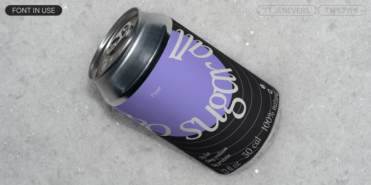
TT Jenevers is a Dutch modern serif typeface. It has characteristic details typical of this font style: for example, asymmetrical serifs and an irregular slant of the ovals. For instance, the letter ‘o’ has no slant, while ‘p’ and ‘q’ do. The italic styles included in the typeface are slightly narrower than the uprights—this was done to create a denser texture in text setting.

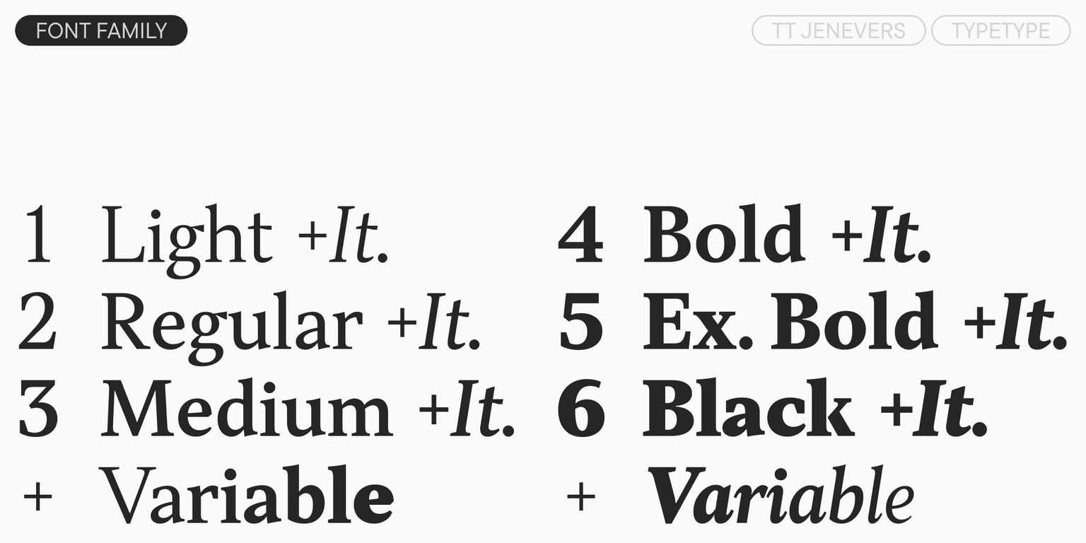
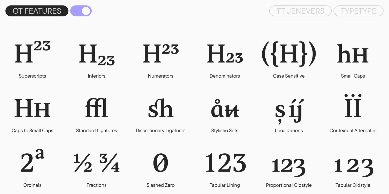
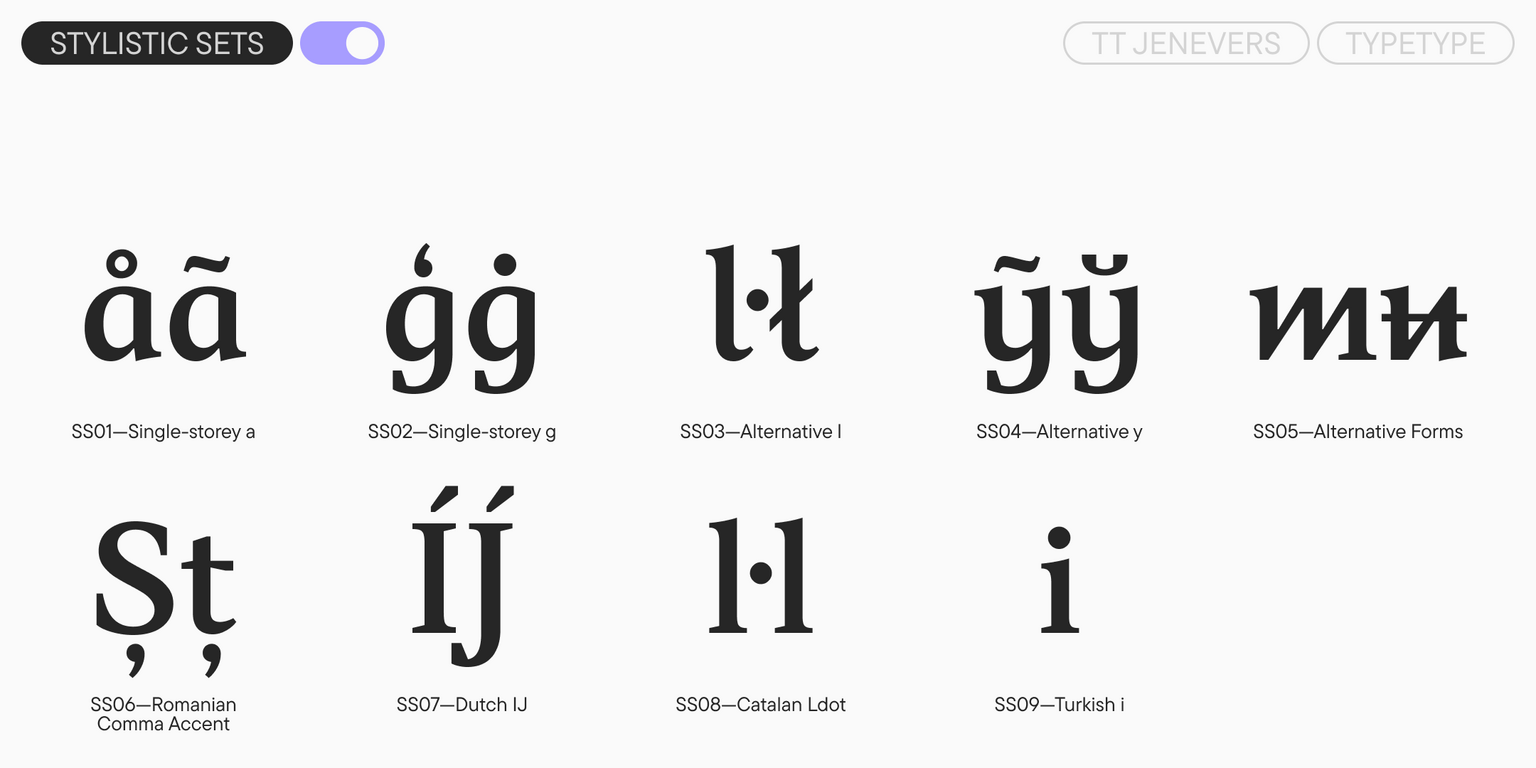
TT Jenevers includes five stylistic sets that allow you to change the font’s character—making it more calligraphic or adding sharpness and a futuristic feel. The typeface also includes small caps for Cyrillic and Latin, ligatures, standard and oldstyle figures, and other useful features.

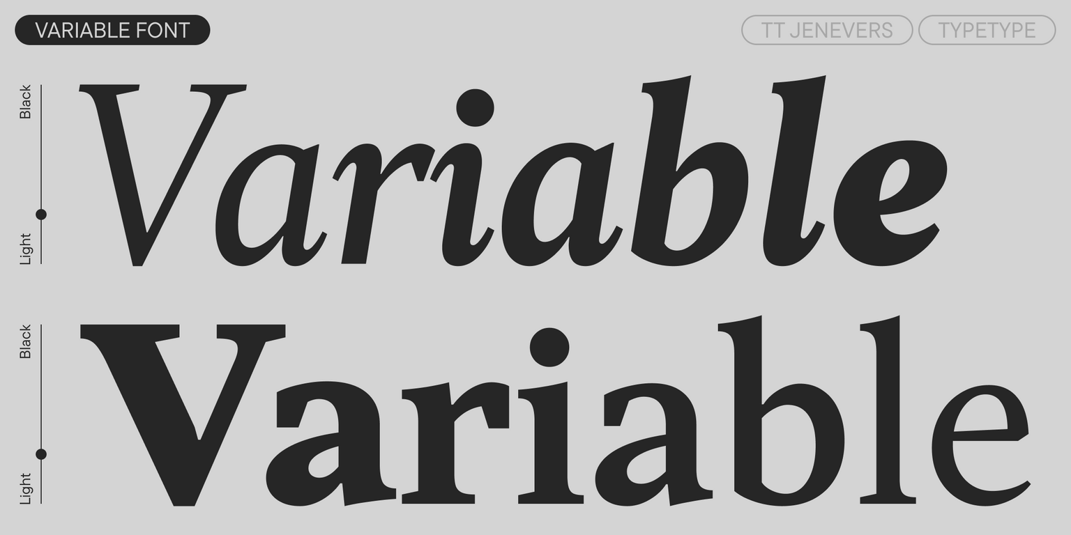
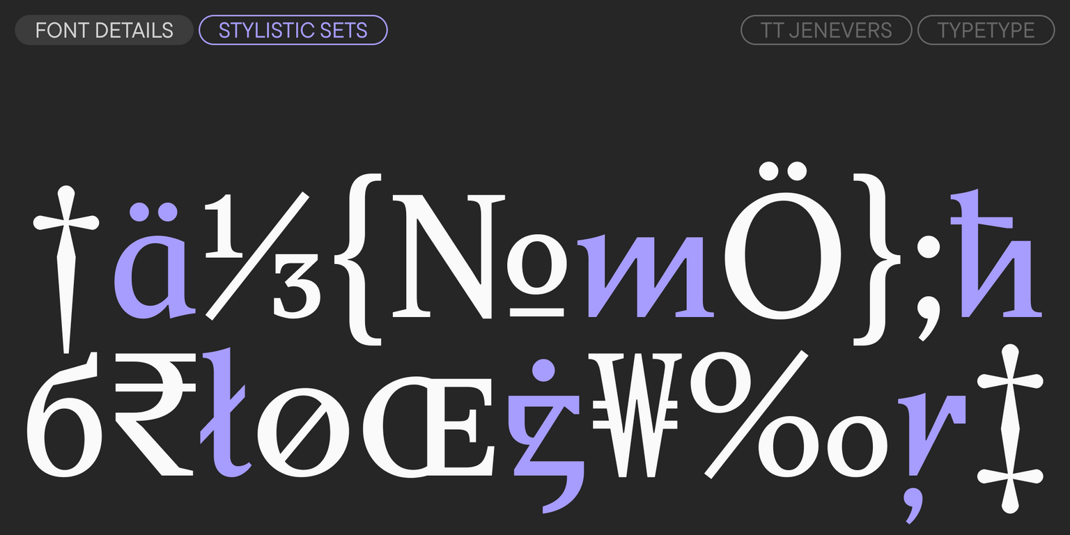
In the updated version, the character set has been expanded—most notably, fractions have been added. The typeface’s functionality has been significantly expanded thanks to two new variable fonts—one for the upright weight and one for the italic weight. Additionally, we performed a thorough manual kerning review and added manual hinting to all styles.

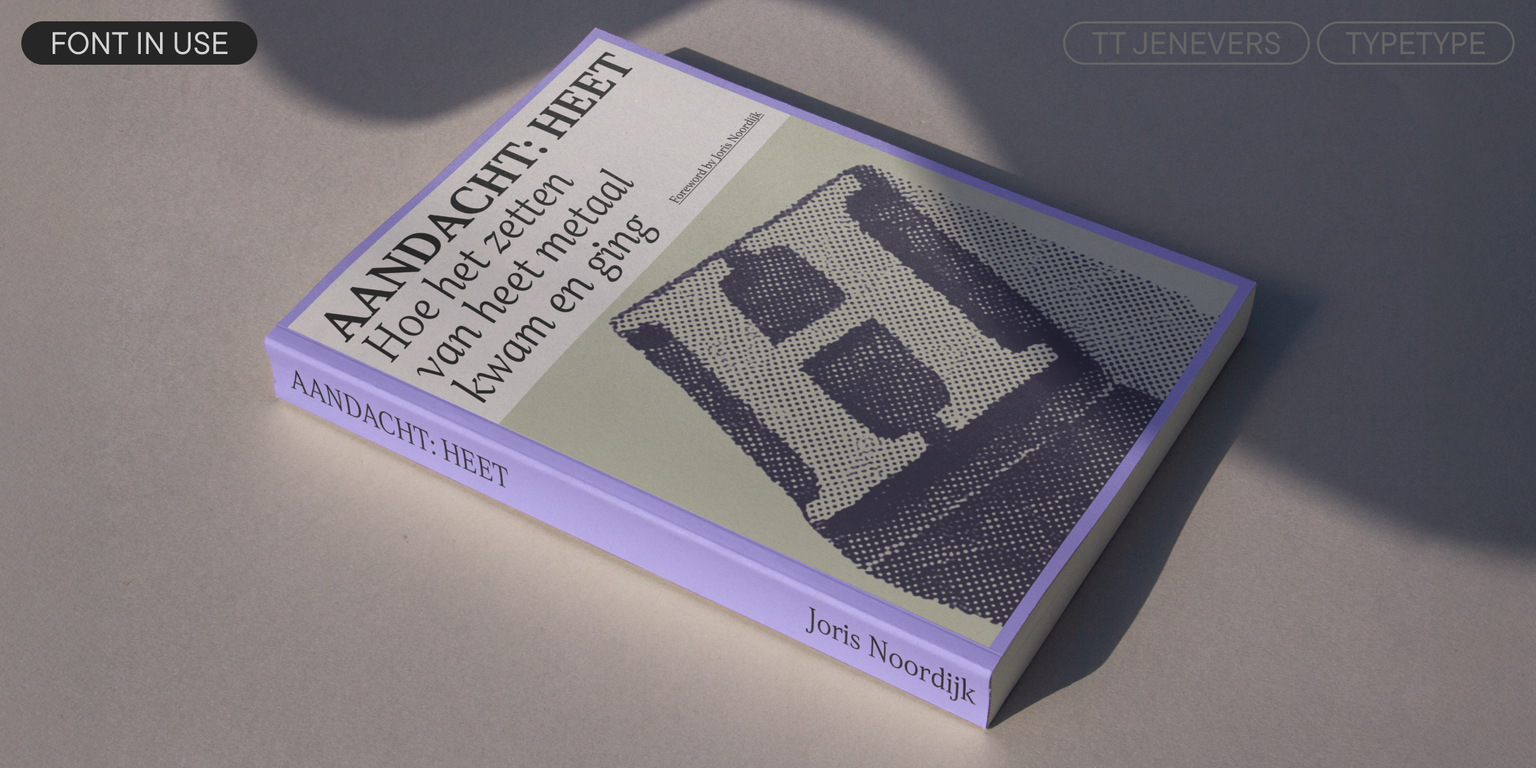
The typeface is quite versatile in its application. The generous proportions of its lowercase and uppercase characters give TT Jenevers a strong display quality. At the same time, the large, open semi-ovals of the lowercase characters maintain high legibility and prevent blurring, which allows the font to be used comfortably in text blocks.

TT Jenevers version 1.200 includes:

  • 14 styles: 6 uprights, 6 true italics, and 2 variable fonts
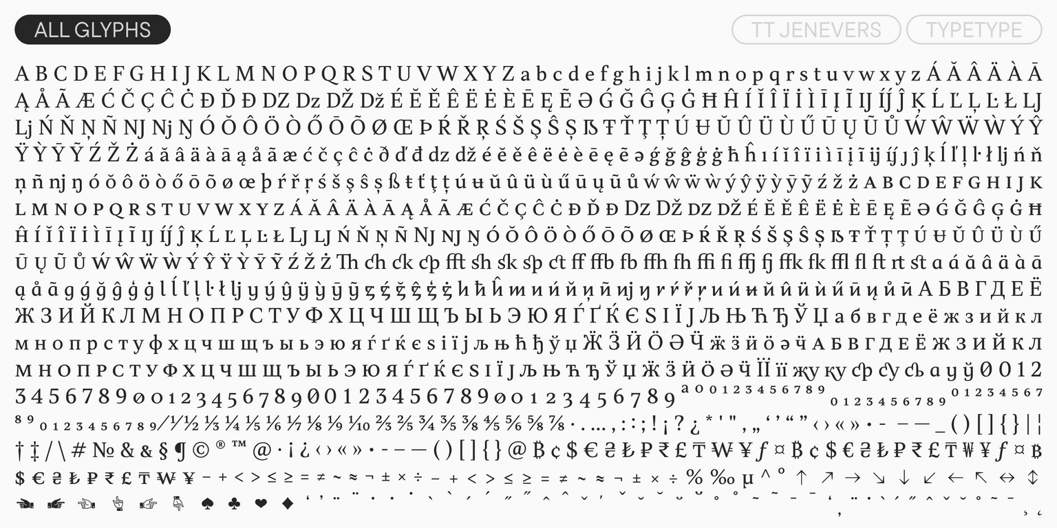
  • 997 glyphs per style
  • 30 OpenType features
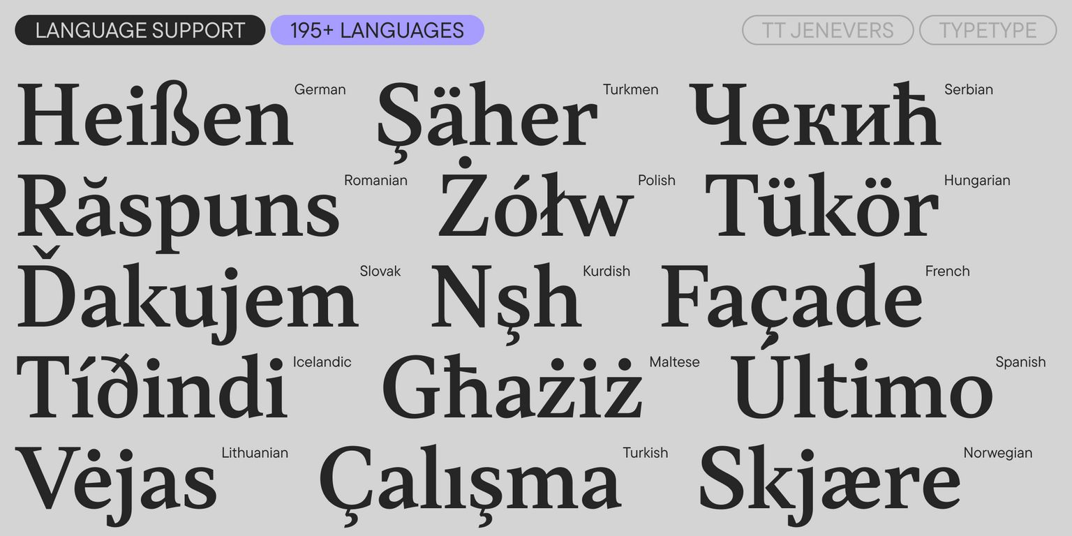
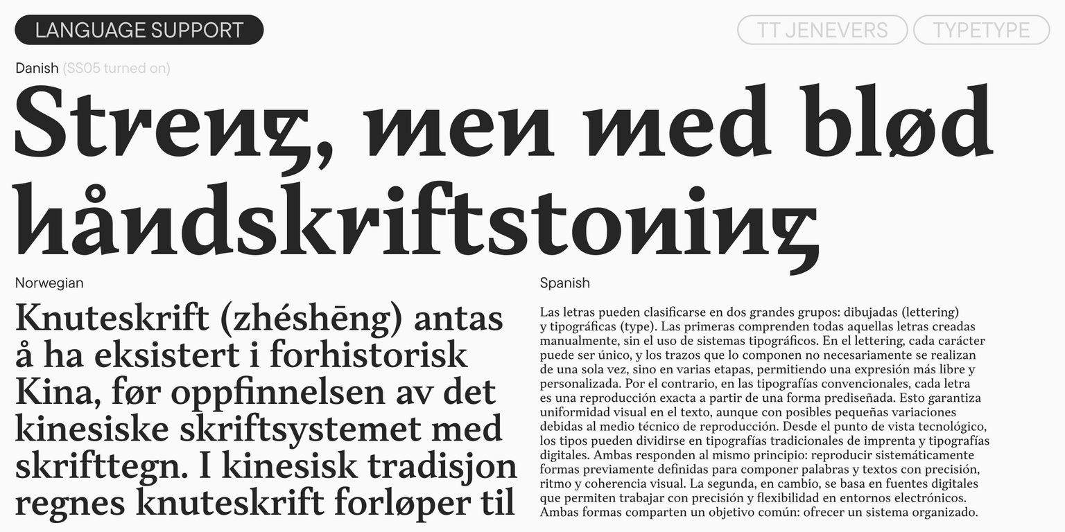
  • Support for 195 languages

TT Jenevers—a serif that knows how to surprise!

Release and update date

Release: 7 February, 2018

Last update: 5 November, 2025

What's changed in the font:
  • The total number of styles has increased from 12 to 14.
  • Two new variable styles have been added for the upright and italic weights—TT Jenevers VF Upright and TT Jenevers VF Italic.
  • The total glyph count per style has increased from 877 to 997.
  • Notably, fractions have been added.
  • The number of supported languages has increased from 180 to 195.
  • The number of OpenType features has increased from 24 to 30.
  • We performed a thorough manual kerning review for all styles.
  • Manual hinting has been added to all styles.

Additionally

Specimen

Download font specimen (pdf)

Poster Images

Graphic presentation at Behance

Custom version

Looking for a custom version of this font?

+ extended writing system Show all

Character Set

Basic Latin Basic Cyrillic Extended Latin Extended Cyrillic Fractions Proportional Lining Figures and Currencies Other Figures Punctuation and Symbols Math Symbols Arrows
A B C D E F G H I J K L M N O P Q R S T U V W X Y Z a b c d e f g h i j k l m n o p q r s t u v w x y z
А Б В Г Д Е Ё Ж З И Й К Л М Н О П Р С Т У Ф Х Ц Ч Ш Щ Ъ Ы Ь Э Ю Я Ѓ Ґ Ќ Є Ї Љ Њ Ћ Ђ Ў Џ а б в г д е ё ж з и й к л м н о п р с т у ф х ц ч ш щ ъ ы ь э ю я ѓ ґ ќ є ї љ њ ћ ђ ў џ
Á Ă Â Ä À Ā Ą Å Ã Æ Ć Č Ç Ĉ Ċ Ð Ď Đ DZ Dz É Ĕ Ě Ê Ë Ė È Ē Ę Ə Ǵ Ğ Ĝ Ģ Ġ Ħ Ĥ Í Ĭ Î Ï İ Ì Ī Į Ĩ IJ Ĵ Ķ Ĺ Ľ Ļ Ŀ Ł LJ Lj Ń Ň Ņ Ñ NJ Nj Ŋ Ó Ŏ Ô Ö Ò Ő Ō Õ Ø Œ Þ Ŕ Ř Ŗ Ś Š Ş Ŝ Ș Ŧ Ť Ţ Ț Ú Ʉ Ŭ Û Ü Ù Ű Ū Ų Ũ Ů Ŵ Ý Ŷ Ÿ Ȳ Ź Ž Ż á ă â ä à ā ą å ã æ ć č ç ĉ ċ ð ď đ dz é ĕ ě ê ë ė è ē ę ə ǵ ğ ĝ ģ ġ ħ ĥ ı í ĭ î ï i ì ī į ĩ ij ȷ ĵ ķ ĺ ľ ļ ŀ ł lj ń ň ņ ñ nj ŋ ó ŏ ô ö ò ő ō õ ø œ þ ŕ ř ŗ ś š ş ŝ ș ß ŧ ť ţ ț ú ʉ ŭ û ü ù ű ū ų ũ ů ŵ ý ŷ ÿ ȳ ź ž ż
Ӝ Ӟ Ӥ Ӧ Ә Ӵ ӝ ӟ ӥ ӧ ә ӵ
½ ¼ ¾
0 1 2 3 4 5 6 7 8 9 ¢ $ £ ¥ ƒ ¤
¹ ² ³
· . ... , : ; ! ¡ ? ¿ * ' " « » - _ ( ) [ ] { } | ¦ / \ # & § © ® @ ª º ^ °
+ < > = ~ ¬ ± × ÷ % μ

OpenType features

ss05 | Alternative Forms

ğ ħ ñ ü

ğ ħ ñ ü

smcp | Small Caps

a b c d

a b c d

liga | Standard Ligatures

fi ffh

fi ffh

onum | Oldstyle Figures

1638

1638

dlig | Discretionary Ligatures

ck st fb

ck st fb

case | Case Sensitive Forms

({[H]})

({[H]})

Show all

Similar fonts

24 font styles
28 font styles
38 font styles
Buy font