top_banner_ttnormspro0426
Type foundryFonts & StylesAntiqua

Antiqua fonts

Serif details, letter proportions, and the relationship between thick and thin strokes give antiqua typography its varied character. Antiqua fonts belong to a broad typographic tradition rather than a single uniform design. This TypeType collection brings together multiple families to consider for editorial work, packaging, and identities, with individual specimens providing the basis for a considered choice.

Tags: Antiqua

What Makes Antiqua fonts Distinct

Antiqua fonts are generally associated with serif traditions, but the category does not describe one fixed set of proportions or details. This page groups separate families rather than variations of a single typeface called Antiqua. When comparing specimens, look at letter construction, stroke contrast, spacing, and the shapes of serifs. These offer useful ways to distinguish candidates without assuming that every entry shares the same historical classification. Consider the overall rhythm of a line as well as individual letters: a striking character in isolation may create a different impression when repeated across a paragraph.

Where Antiqua Typefaces Are Used

Brands aimed at readers, cultural audiences, or customers navigating detailed product information can consider Antiqua fonts for their visual systems. Potential applications include publishing, identities, packaging, and exhibition materials; suitability depends on the particular family and layout. An editorial project calls for checking sustained reading and the relationship between headings and body copy. Packaging requires attention to short names, supporting information, and reproduction size. For an identity, assess how lettering behaves across recurring touchpoints. These are starting points for evaluation, not claims that every family on this page serves each application equally well.

How to Choose Antiqua fonts for Your Project

Start evaluating Antiqua fonts with the words your project actually needs. Set a representative headline, a paragraph, a brand name, and any essential numbers or punctuation. Compare candidates at their intended sizes rather than judging enlarged specimens alone. Keep the layout consistent so differences in spacing, proportions, and visual emphasis remain easy to assess. Next, check the relevant product information for available family options and required characters. If another typeface is already part of the design, test both together in a clear hierarchy: headings, supporting text, captions, and navigation where relevant. Review the result in the intended medium, including a printed sample when appropriate. Trial versions can support this assessment within their stated terms. Before committing, confirm that the applicable license covers your planned use, and ask TypeType for clarification if the product or licensing information leaves a question unresolved.

Browse TypeType's Antiqua fonts Collection

The collection includes TT Nooks Serif, TT Rationalist, TT Ramillas, TT Norms® Pro Serif, and TT Livret, alongside other listed families such as TT Odellia, TT Bells, and TT Jenevers. Treat these names as entry points for comparison, not as a ranking or a promise of particular features. Open individual family pages to examine specimens and confirm the details relevant to your brief. A useful shortlist records what you have checked, what remains uncertain, and which candidates deserve a closer trial. TypeType offers trial versions and the option to request a suitable license, allowing evaluation and licensing to remain separate decisions. For questions about design choices or the next step, contact the design or client-care team through the website form. Keep current product information and license terms alongside your visual notes so the eventual choice reflects both the design requirements and the intended deployment.

  • The quick brown fox jumps over a lazy dog.
  • Pack my box with five dozen liquor jugs.
  • Sphinx of black quartz, judge my vow
  • 0123456789 !?.,:;—–()[]{}<> “quotes” ‘apostrophe’ @#%&*_+=/\| № $ € £ ₽ +−×÷=≠≤≥ … % © ® ™
  • Aa Bb Cc Dd Ee Ff Gg Hh Ii Jj Kk Ll Mm Nn Oo Pp Qq Rr Ss Tt Uu Vv Ww Xx Yy Zz
Leading
1.1
Tracking
0px
24 font styles

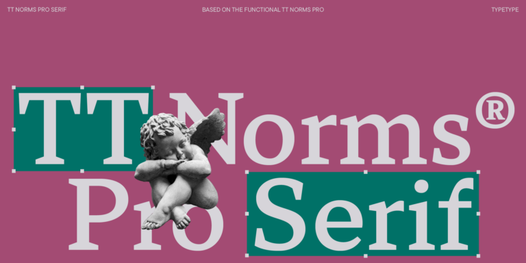
We continue to expand the line of the studio’s main bestseller TT Norms® Pro!

TT Livret Text Regular
32 font styles

TT Livret is an elegant, modern and functional serif

New
TT Odellia Regular
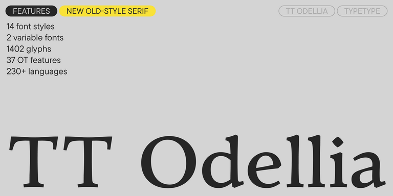
16 font styles

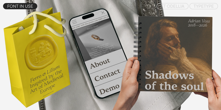
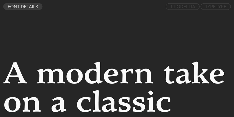
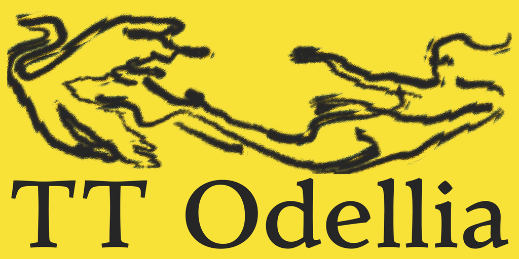
TT Odellia is an old-style serif with a modern design, inspired by Venetian typefaces and classical music.

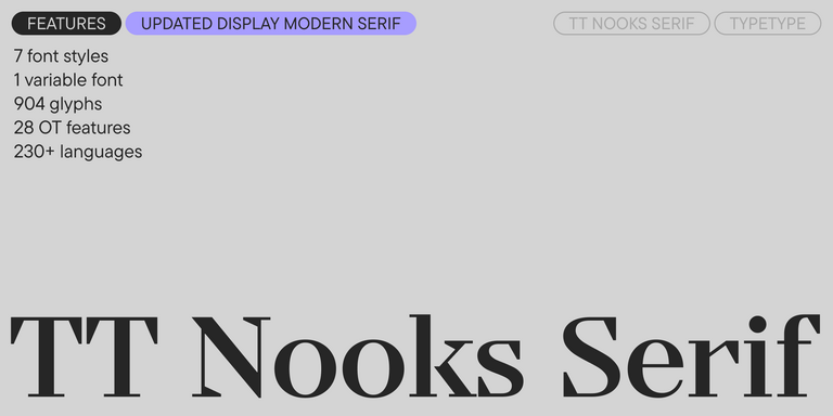
TT Nooks Serif Regular
8 font styles

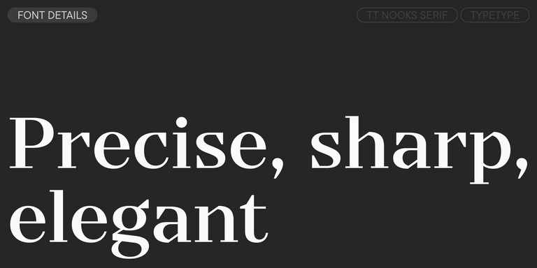
TT Nooks Serif is a display modern serif with a slight touch of egocentricity. It has a sharp and firm, yet elegant and stately character.

TT Rationalist Regular
22 font styles

TT Rationalist is functional and neutral slab serif typeface.

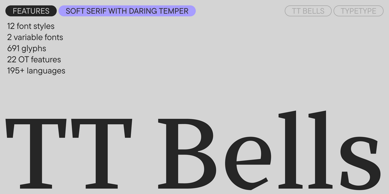
TT Bells Regular
14 font styles

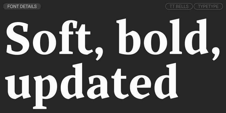
TT Bells combines the elegant softness of Antiqua with a complex and daring temper reflected in straight stroke terminals and arrowheaded serifs. The typeface is based on the broad nib, which creates these hallmark terminals and serifs.

TT Jenevers Regular
14 font styles

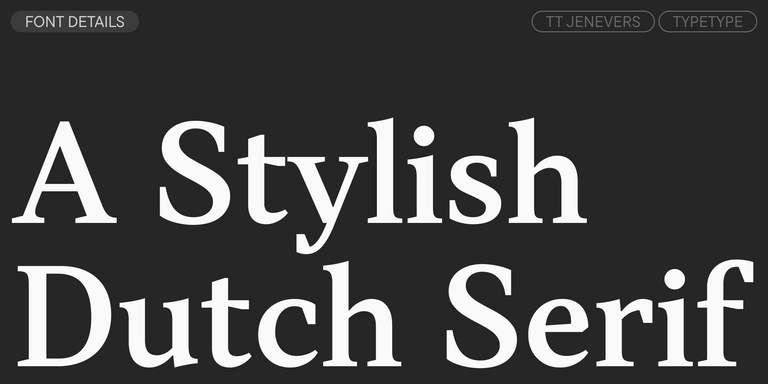
TT Jenevers is a modern serif with a Dutch flavor. The font family features the characteristic details peculiar to Dutch serifs—these are the asymmetrical shape of serifs and an irregular slant of ovals.

New
TT Regins Display Light
38 font styles

TT Regins is a Scottish modern serif. Striking contrast and sharp triangular serifs give this font a stern and commanding character, while refined forms, enlarged lowercase letters, and slightly condensed, static proportions add grace to its design.

New
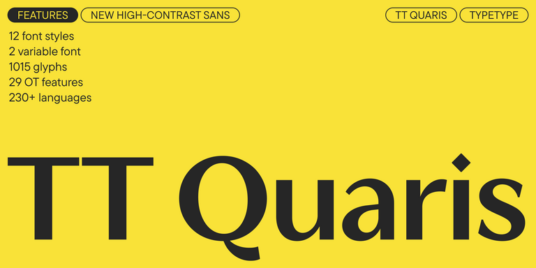
TT Quaris Regular
14 font styles

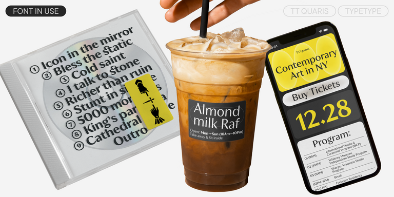
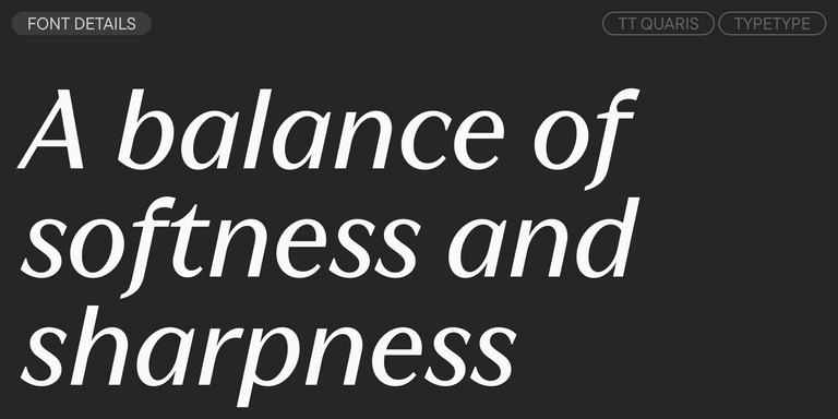
TT Quaris is an exquisite, modern high-contrast sans whose design balances between soft and sharp. The glyph shapes in the font are fluid and tend towards roundness, yet there are also sharp elements.

6 font styles

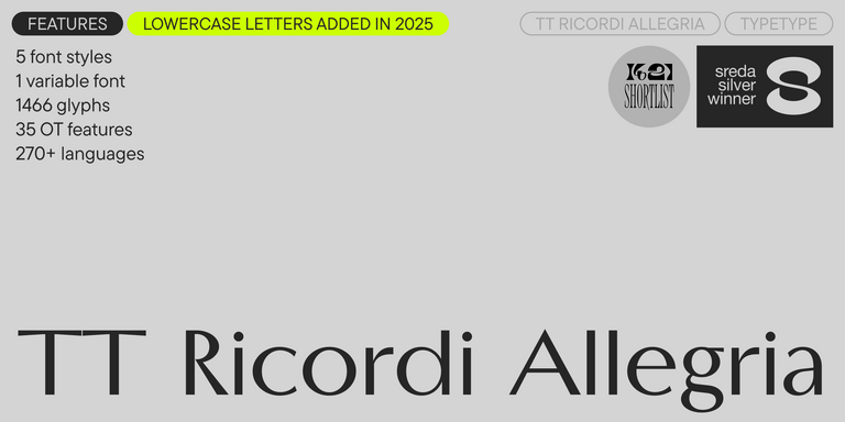
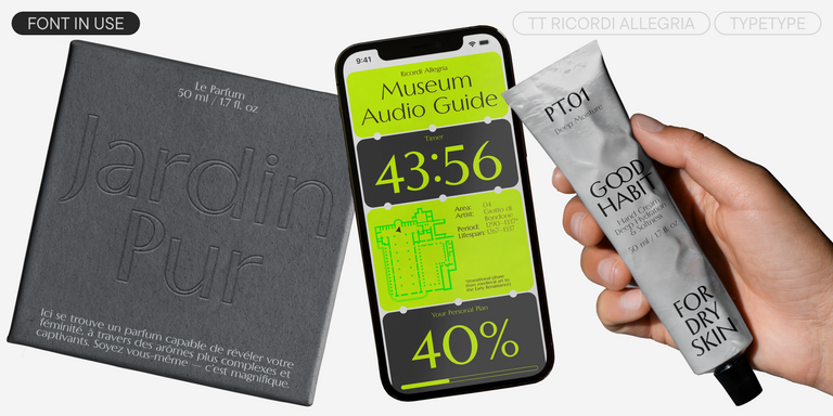
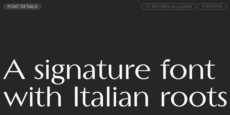
TT Ricordi Allegria is a sleek and intelligent contemporary Florentine grotesque.

New
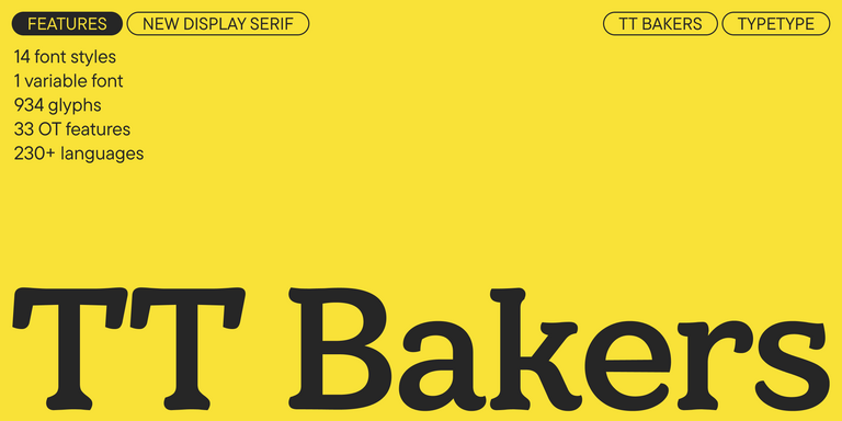
TT Bakers Regular
15 font styles

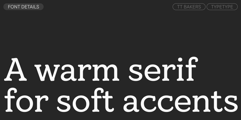
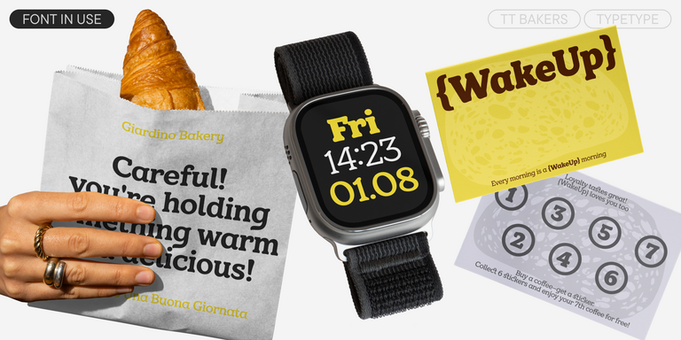
TT Bakers is a fluid serif with a gentle and lively character. This font is like freshly baked goods: it`s warm and soft, especially in its bolder weights.

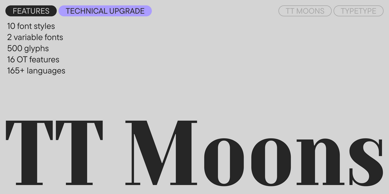
TT Moons Regular
12 font styles

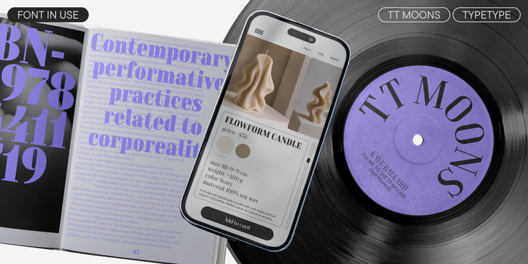
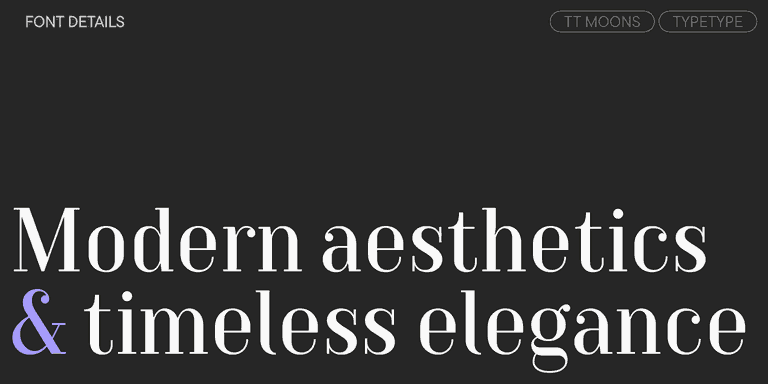
TT Moons is a slim and contrast serif. This font family works especially smart in classic design themes. TT Moons is a typeface of the glyptal modern typeface.

View all discounted fonts
Remaining time:
0 0
days
0 0
hours
0 0
minutes
0 0
seconds
TT Norms® Pro Serif
  • from  Original price was: $47.99.Current price is: $33.59.
  • 30% off Special offer is valid until 16 Oct, 2026
TT Travels Text
  • from  Original price was: $47.99.Current price is: $33.59.
  • 30% off Special offer is valid until 16 Oct, 2026
TT Turns
  • from  Original price was: $47.99.Current price is: $33.59.
  • 30% off Special offer is valid until 23 Oct, 2026
TT Odellia
  • from  Original price was: $47.99.Current price is: $33.59.
  • 30% off Special offer is valid until 23 Oct, 2026
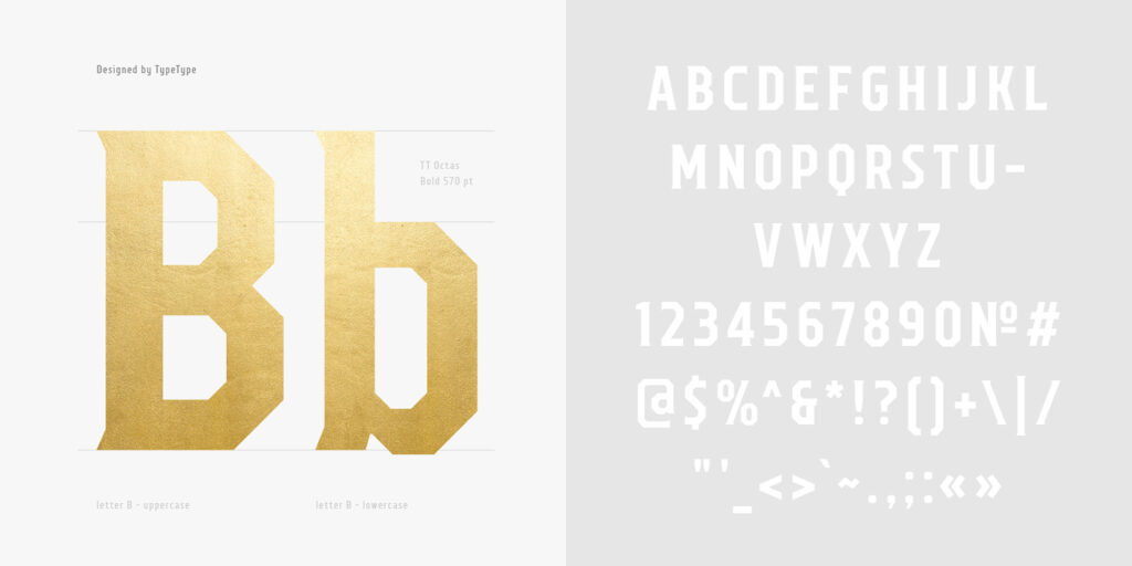
TT Octas
  • from  Original price was: $43.99.Current price is: $30.79.
  • 30% off Special offer is valid until 30 Oct, 2026
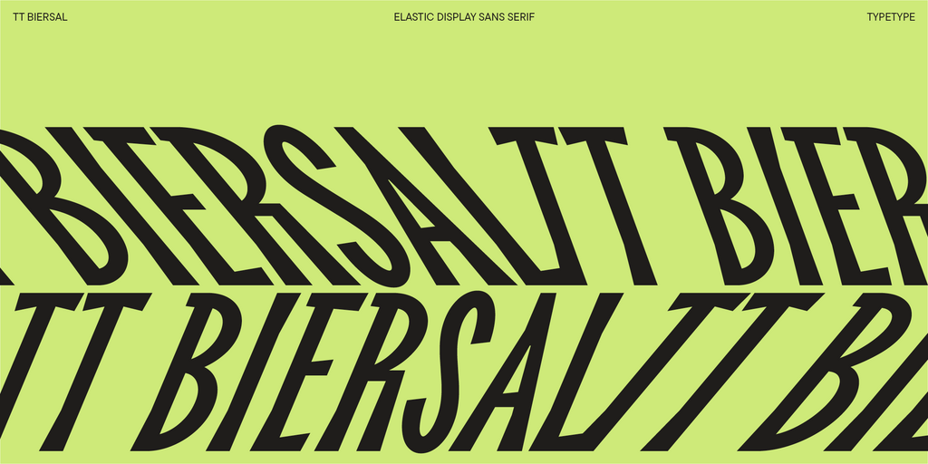
TT Biersal
  • from  Original price was: $43.99.Current price is: $30.79.
  • 30% off Special offer is valid until 30 Oct, 2026
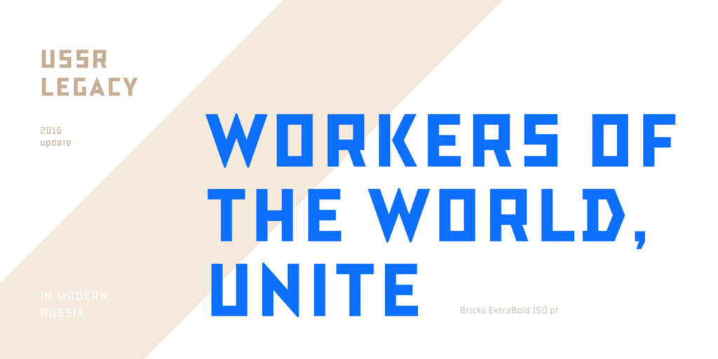
TT Bricks
  • from  Original price was: $43.99.Current price is: $30.79.
  • 30% off Special offer is valid until 6 Nov, 2026
TT Bells
  • from  Original price was: $47.99.Current price is: $19.20.
  • 60% off Special offer is valid until 6 Nov, 2026
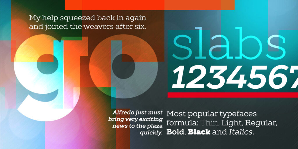
TT Slabs
  • from  Original price was: $43.99.Current price is: $24.19.
  • 45% off Special offer is valid until 13 Nov, 2026
TT Disruptors
  • from  Original price was: $43.99.Current price is: $30.79.
  • 30% off Special offer is valid until 13 Nov, 2026
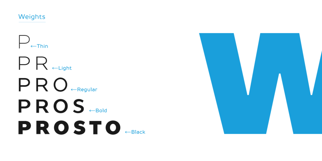
TT Prosto Sans
  • from  Original price was: $43.99.Current price is: $30.79.
  • 30% off Special offer is valid until 20 Nov, 2026
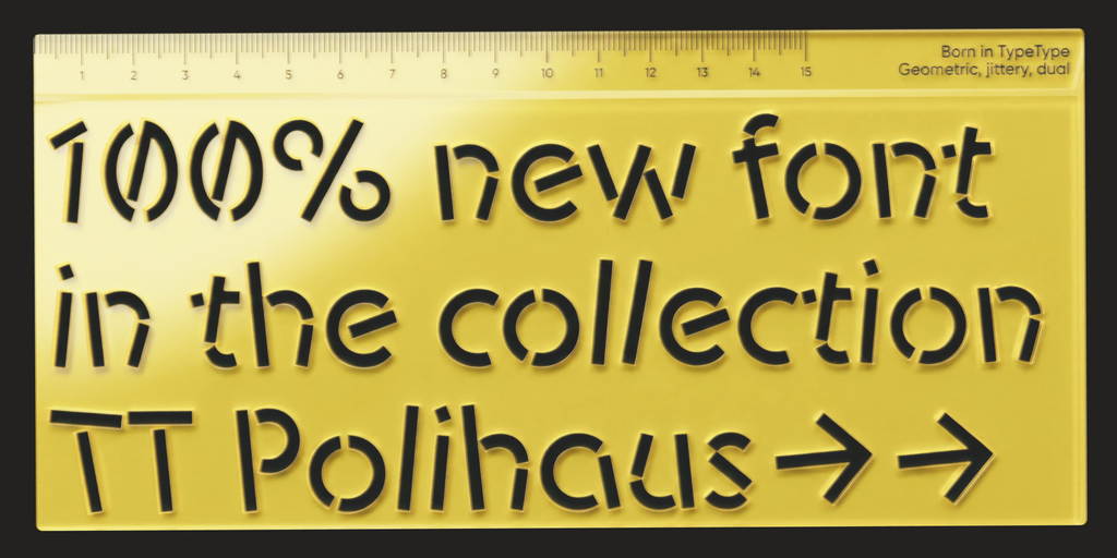
TT Polihaus
  • from  Original price was: $47.99.Current price is: $33.59.
  • 30% off Special offer is valid until 20 Nov, 2026
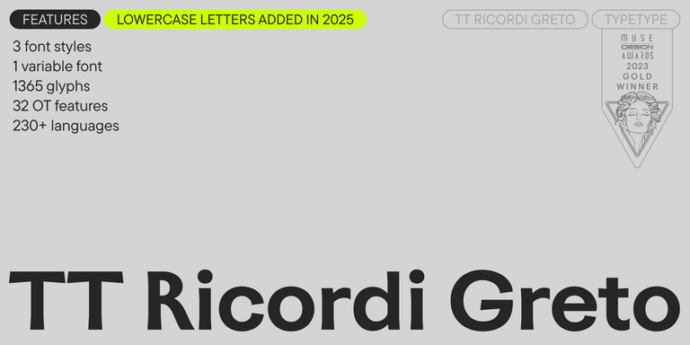
4 font styles

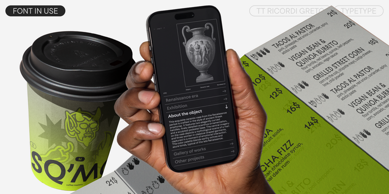
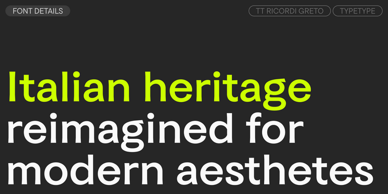
TT Ricordi Greto is an experimental project, inspired by a floor plaque dating from 1423 found in the Basilica di Santa Croce, Florence.

Bestseller
TT Ramillas Regular
28 font styles

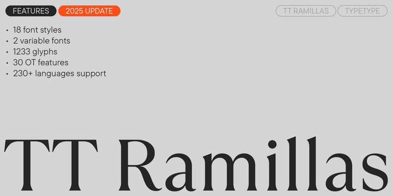
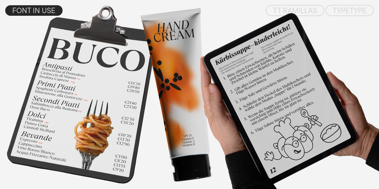
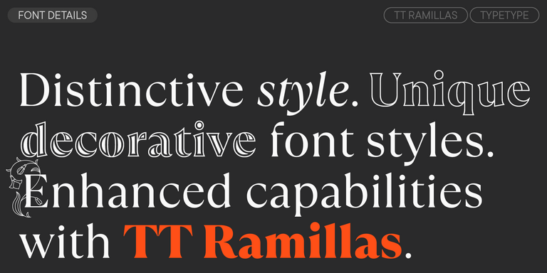
TT Ramillas is a contemporary serif with editorial versatility. It features decorative styles and ornamental initials with floral motifs.

TT Drugs Regular
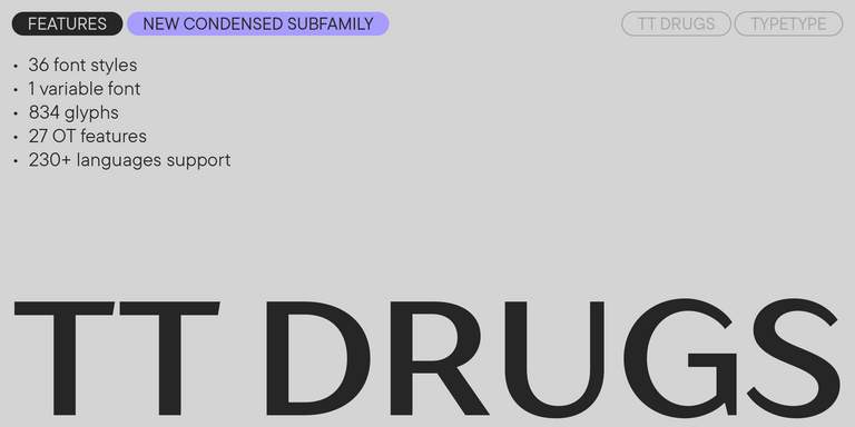
37 font styles

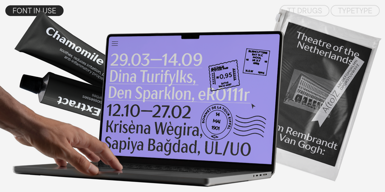
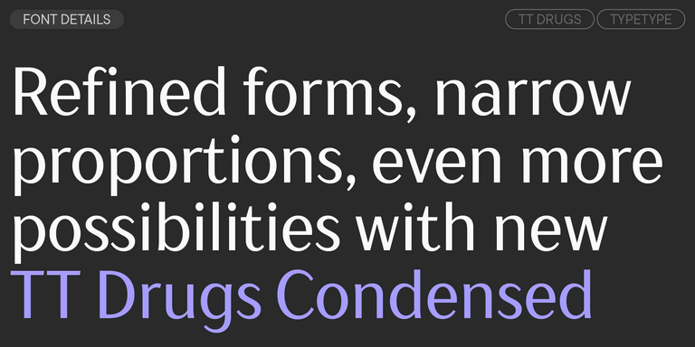
TT Drugs is a typeface that doesn`t feature serifs but stands out for its high contrast.

TT Tricks Regular
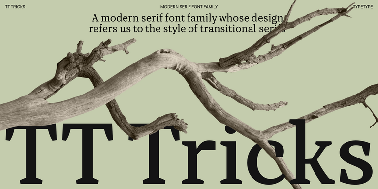
20 font styles

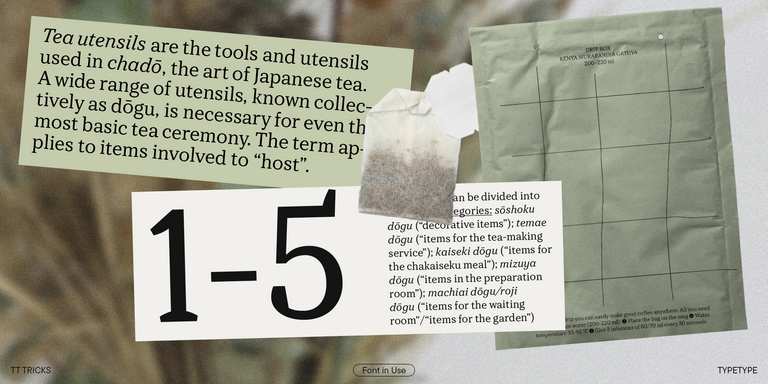
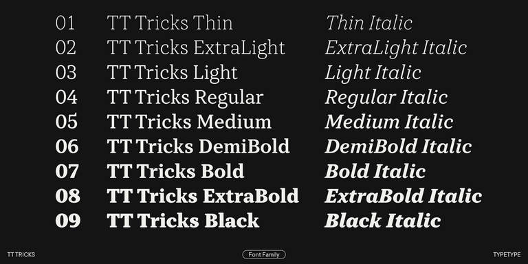
TT Tricks is a modern text serif with a design reflecting the style of Transitional serifs. This font has a calm, elegant, and moderately stern character.

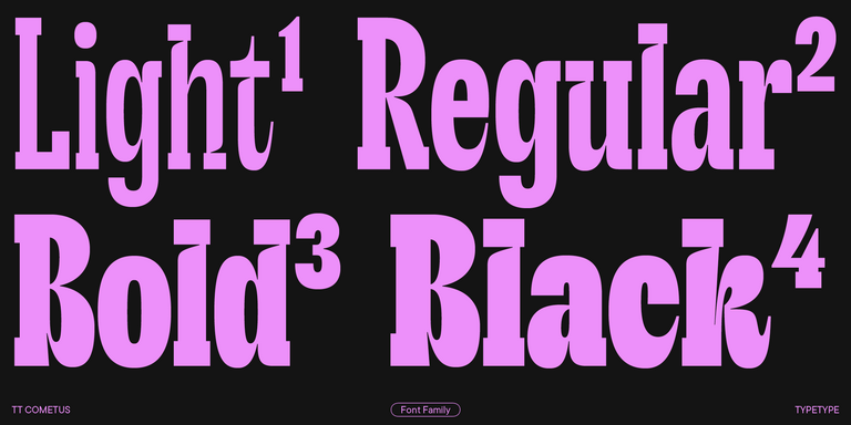
TT Cometus Regular
5 font styles

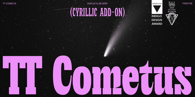
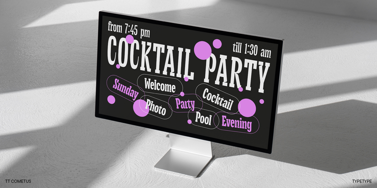
TT Cometus is an expressive typeface that captivates from the first time.

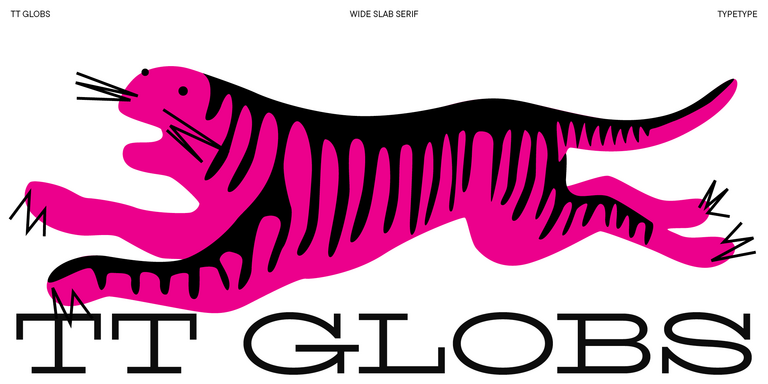
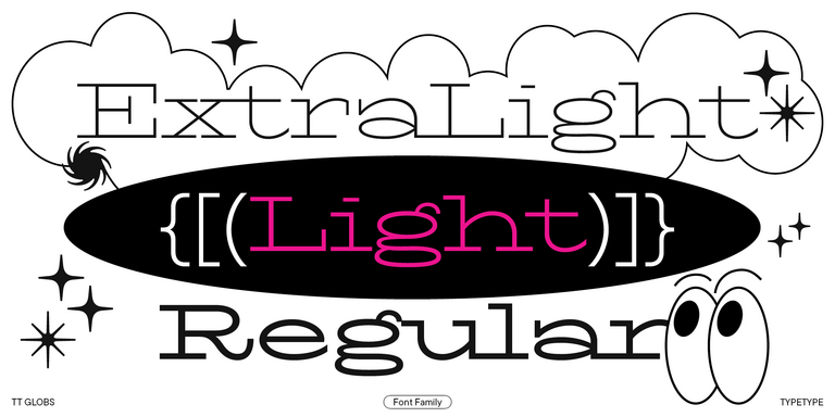
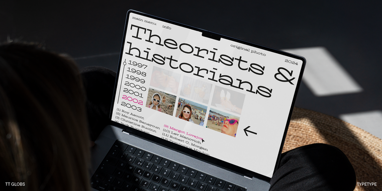
TT Globs Regular
4 font styles

TT Globs is the first font from the TypeType Starter Kit line.

TT Ricks Regular
4 font styles

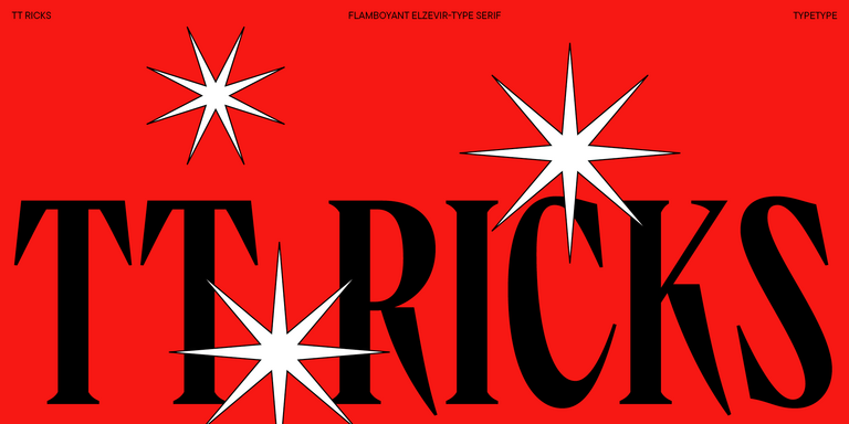
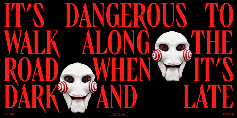
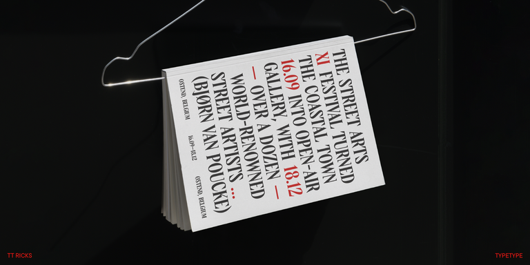
TT Ricks is a flamboyant elzevir-type serif, for which the words “cute” or “calm” are not a fitting definition.

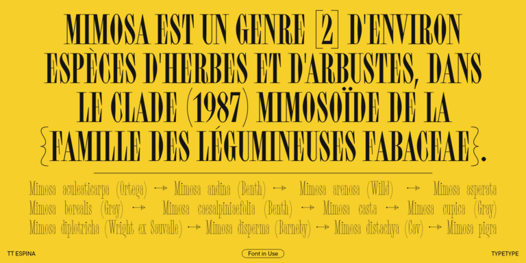
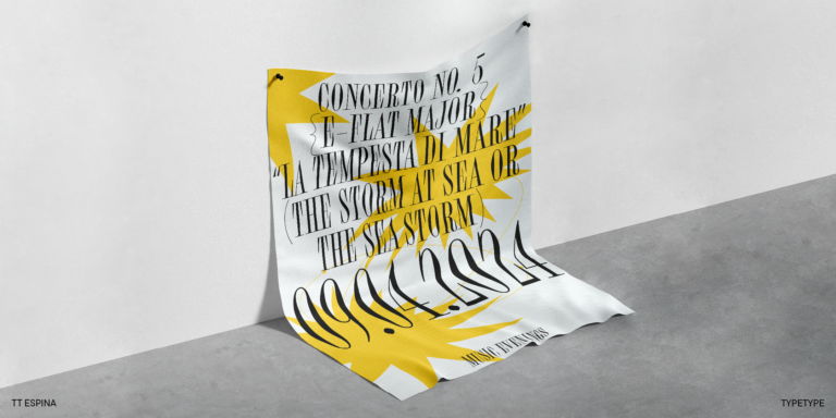
TT Espina Regular
7 font styles

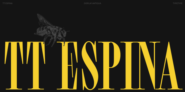
TT Espina is a display antiqua with expressive serifs

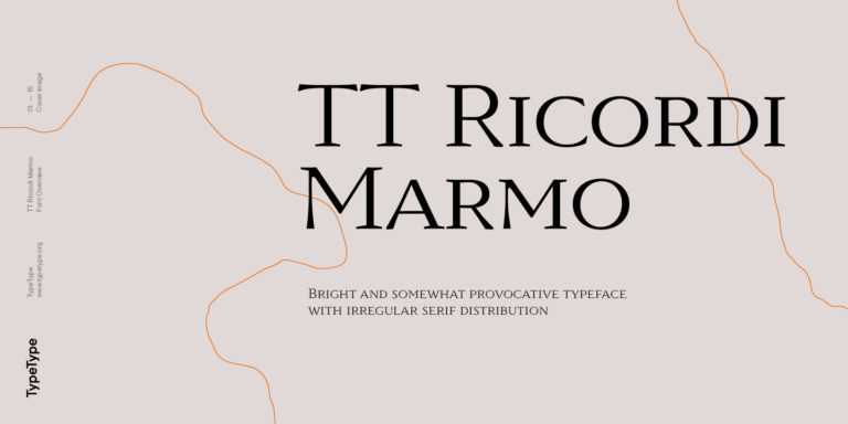
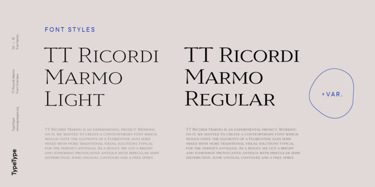
3 font styles

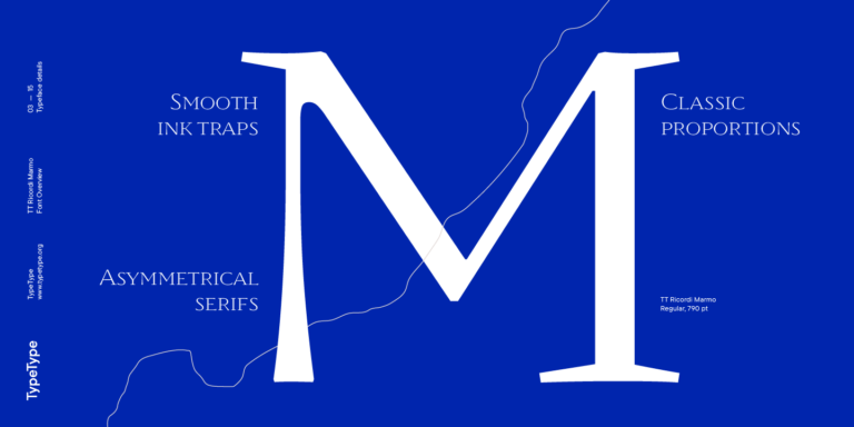
TT Ricordi Marmo is an original experimental project inspired by inscriptions at Basilica di Santa Croce in Florence.

TT Ricordi Todi
3 font styles

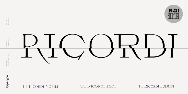
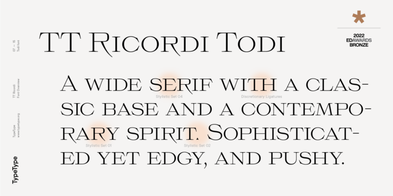
The TT Ricordi font family is a collection of three display heading serifs.

TT Marxiana Elzevir
4 font styles

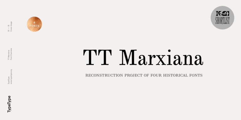
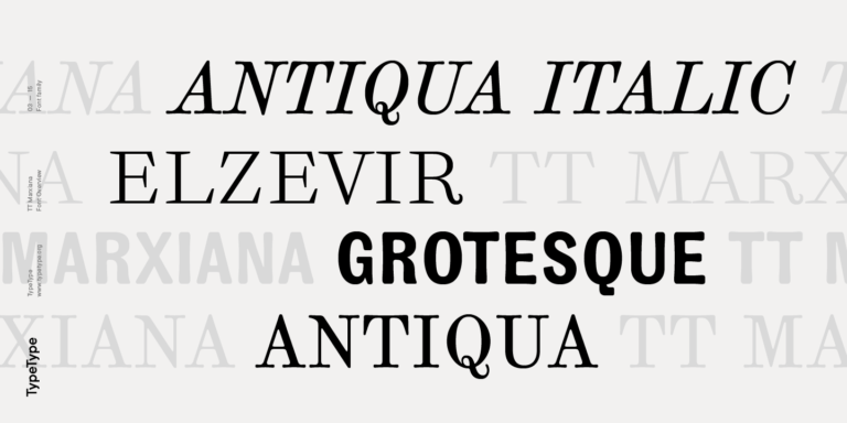
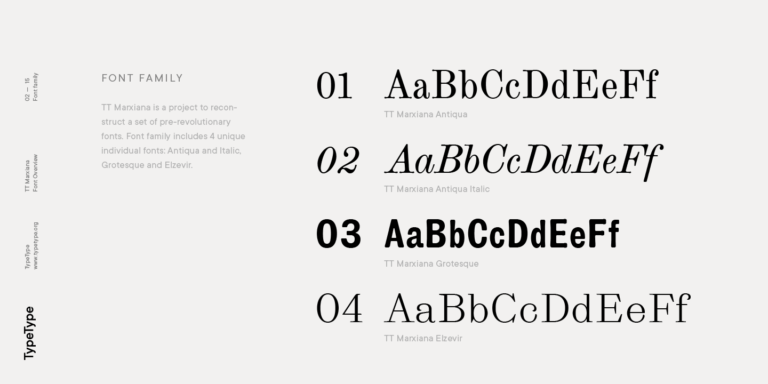
TT Marxiana Elzevir is a title or header font and is a compilation of monastic Elzevir that were actively used in the Niva magazine for all its prints.

TT Geekette Variable
3 font styles

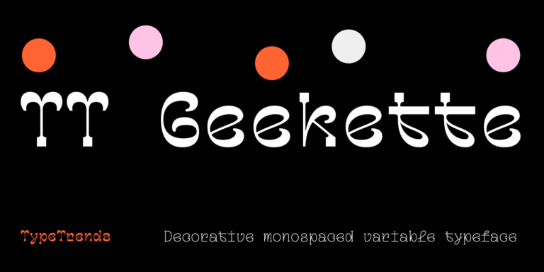
TT Geekette is an experimental variable serif with friendly and flexible character of shapes.

What Are Antiqua fonts?

The term generally refers to a typographic category associated with serif traditions, rather than one named family. Letter proportions, stroke contrast, and serif construction can vary. On this page, it identifies a group of separate TypeType families to compare through their individual specimens.

Which Industries Use Antiqua Typefaces Most Often?

Publishing, cultural projects, packaging, and client-facing services are possible contexts, rather than a verified ranking of adoption. Evaluate each candidate against the work involved: extended text, short labels, presentation materials, or identity elements. The specific design and its reproduction requirements should guide the decision.

Can Antiqua Typefaces Be Used for Branding?

Yes, they can be considered for a brand identity. Test the actual name, recurring messages, and supporting text against the intended tone and visual system. Check both prominent and small applications before deciding, and confirm the relevant license permissions for the planned commercial use.

What Should Be Considered When Pairing These Typefaces?

When pairing Antiqua fonts, establish which typeface leads and which supports. Compare proportions, visual weight, spacing, and contrast using real content. Test headings beside paragraphs and captions at their intended sizes. A pairing should make information levels clear without forcing the two designs to compete.

Can You Browse TypeType Fonts for Commercial Projects?

Yes. TypeType provides trial versions and an option to request an appropriate license. Trial access does not itself establish commercial permission; check current product information and applicable terms before deployment. Design or client-care support is available through the website form for questions about next steps.
Contact us!