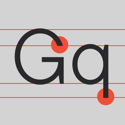
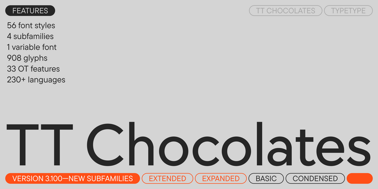
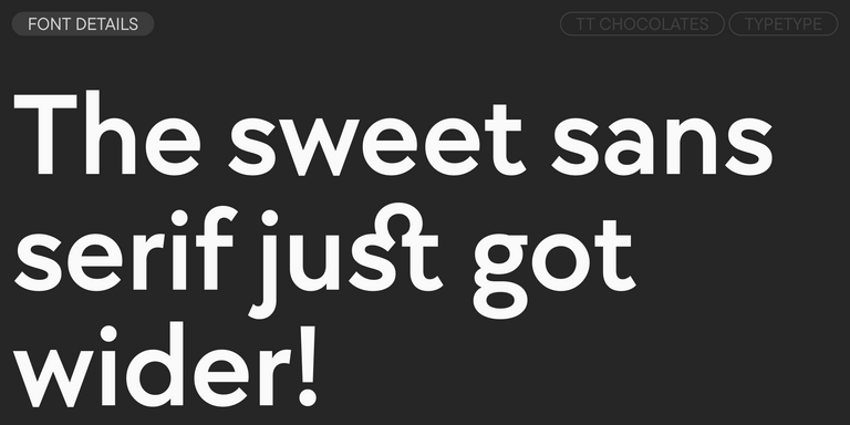
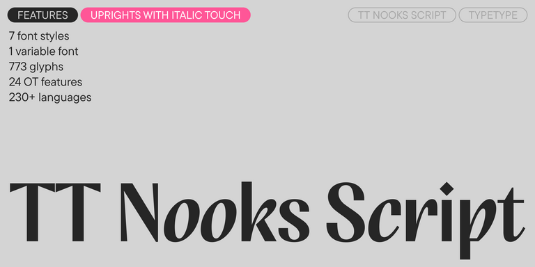
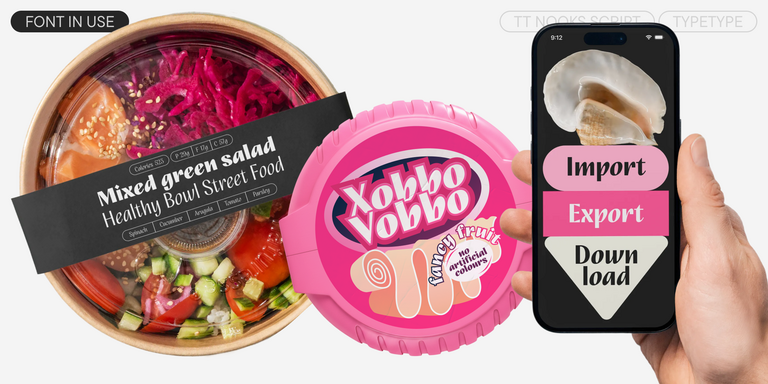
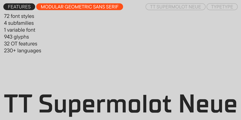
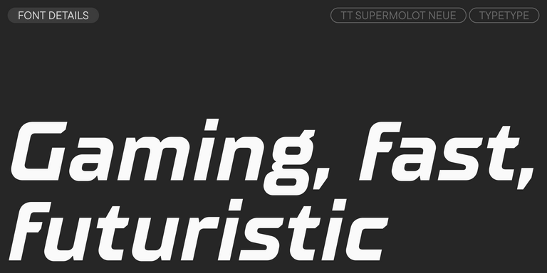
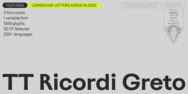
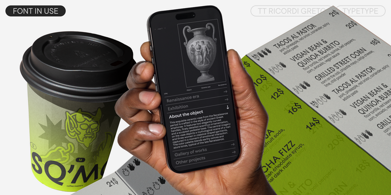
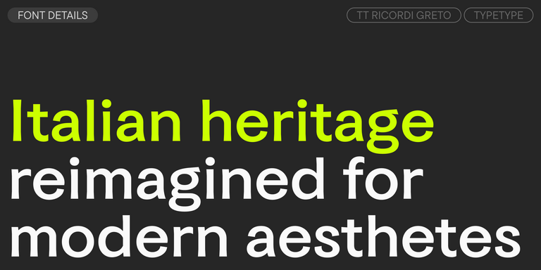
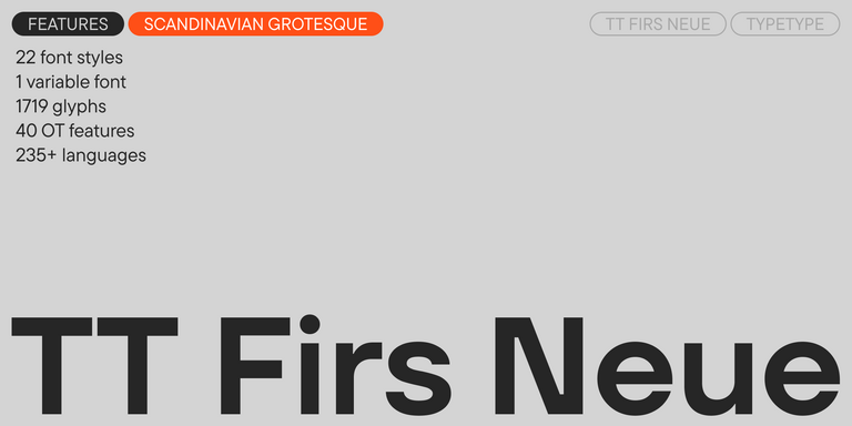
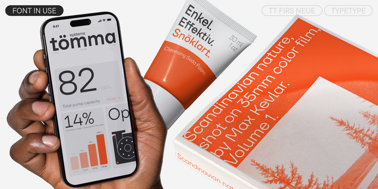
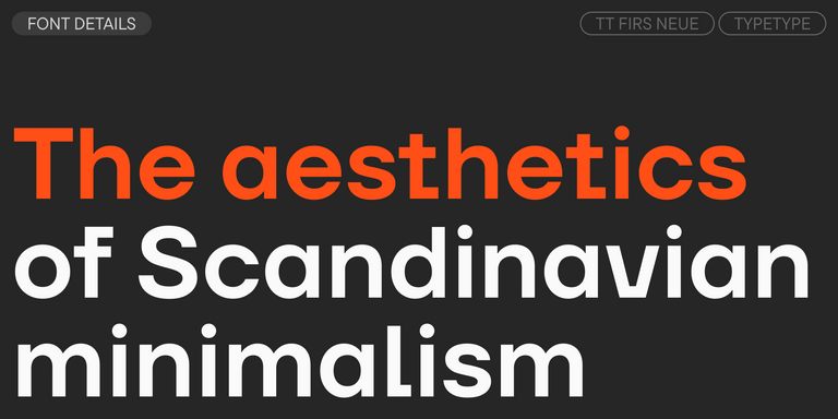
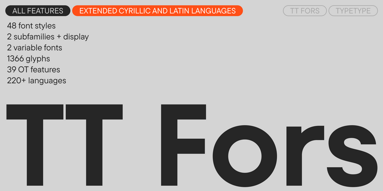
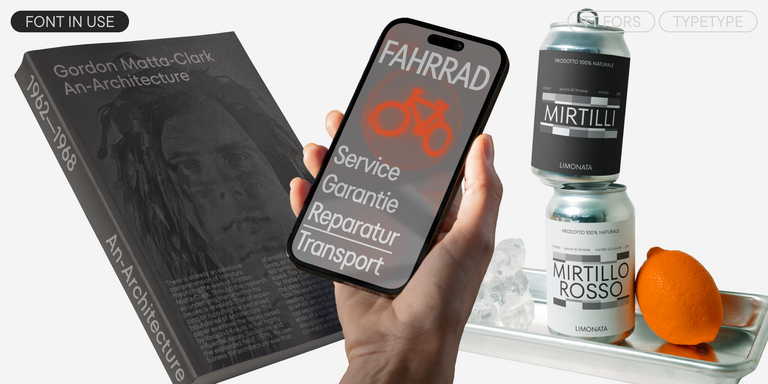
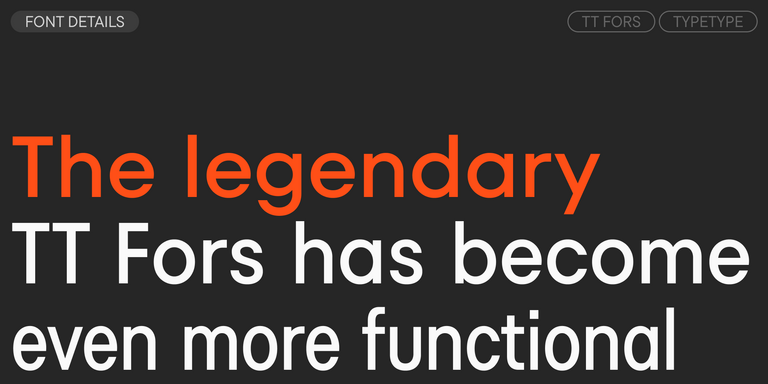
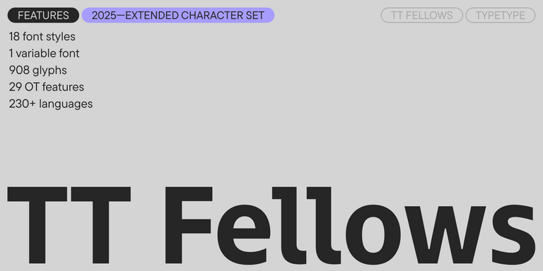
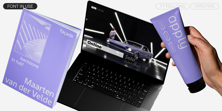
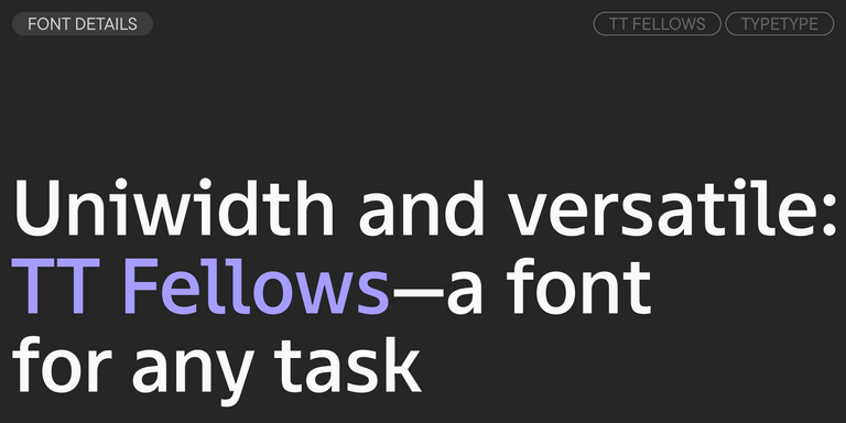
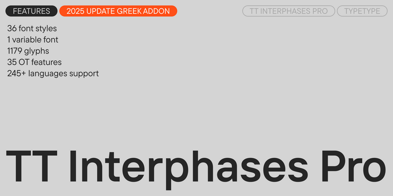
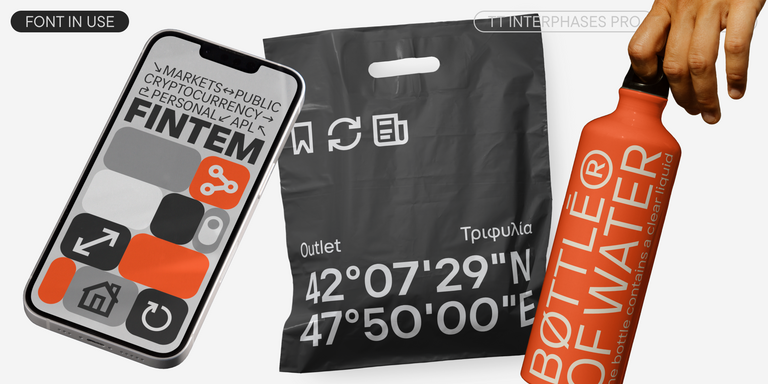
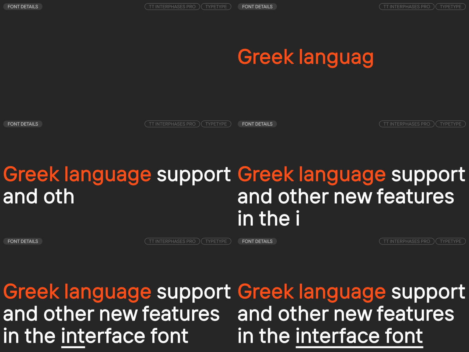
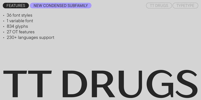
For maximum versatility and readability, Grotesque fonts remain the ultimate choice. These modern sans serifs are celebrated for their clean, structured lines and understated design. Their even contours and neutral aesthetics make them perfect for digital interfaces, corporate branding, and multi-page publications. The TypeType collection features a range of Grotesque typefaces, from ultra-thin neoclassical designs to dense geometric variants, all ensuring clarity at any size.
Designers often look for a grotesque font when they need a typeface that feels clear, confident, and versatile without becoming too decorative. This style works well for branding, interfaces, editorial layouts, and large visual systems because it can support many tones: neutral, modern, strict, corporate, technical, or even expressive depending on the family. Grotesque-inspired type is valued not only for its visual character, but also for practical reasons. It can create readable navigation, stable text blocks, strong headlines, and consistent brand communication across different media. For teams working on websites, apps, presentations, packaging, or identity systems, grotesque alternatives offer a familiar typographic foundation with enough variation to match a specific brand voice.
Key Characteristics of Grotesque Typefaces
A grotesque typeface is usually defined by a sans serif structure, relatively simple letterforms, restrained contrast, and a functional visual tone. Compared with geometric sans serifs, grotesques often feel less constructed and more natural in rhythm. Compared with humanist sans serifs, they can appear more neutral, compact, and direct. Spacing, proportions, terminals, and details such as the shape of "a," "g," or "t" influence whether the result feels classic, modern, technical, or editorial. Grotesque styles tend to perform well both on screen and in print because they combine clarity with a strong typographic presence. Their neutrality makes them useful for body text and interfaces, while heavier weights can create distinctive headlines and brand accents.
How to Choose the Right Grotesque Style
The best grotesque fonts are chosen not by style alone, but by how well they fit the project. Start with the main use case: branding, UI, editorial design, packaging, advertising, or a full design system. For interfaces, check readability at small sizes, spacing, screen rendering, and language support. For brand identity, look at the family’s personality, weight range, and how memorable it feels in headlines, logos, and campaigns. For editorial or marketing layouts, test contrast between text and display styles. The same family may feel neutral in a product interface, bold in a poster, and premium in a presentation. Compare options in real layouts before making a decision, and make sure the license covers every planned use.
Explore TypeType’s Grotesque Collection
TypeType’s collection of grotesque fonts includes families for different design tasks, from neutral brand systems to expressive digital products. The catalog features versatile sans serif solutions with broad weight ranges, carefully built spacing, OpenType features, multilingual support, and licensing options for commercial use. Some families are designed for maximum clarity in interfaces and corporate communication, while others offer a more distinctive tone for campaigns, headlines, editorial projects, or visual identities. Designers can explore type cards, compare styles, download trial versions, and test each family in real mockups before choosing a license. This makes the collection useful for studios, product teams, art directors, and brands that need reliable typography with a modern grotesque voice.
Where Grotesque Fonts Work Best
Grotesque type is especially effective in systems that require readability, consistency, and flexibility. It is often used in brand identities, websites, mobile apps, SaaS products, editorial layouts, posters, presentations, packaging, and marketing materials. In product interfaces, grotesques help organize dense information without distracting from the content. In branding, they can create a confident and recognizable tone while remaining adaptable across many touchpoints. In editorial and campaign design, heavier or more characterful styles can add impact to headlines and visual storytelling. Because grotesque families often include several weights and styles, they allow designers to build hierarchy within one coherent typographic system.
Similar Styles and Comparisons
Grotesque typefaces are often compared with geometric, neo-grotesque, humanist, and modern sans serif families. Geometric options feel more constructed and precise, which can suit technology, architecture, and minimal branding. Humanist sans serifs usually have more calligraphic rhythm and warmer proportions, making them comfortable for long reading and friendly interfaces. Neo-grotesques often look cleaner and more system-oriented, while classic grotesques may bring slightly more irregularity and historical character. If you need neutrality with a strong professional tone, a grotesque style can be a good starting point. If the project needs more warmth, expression, or strict geometry, comparing several nearby categories will help you choose the right direction.
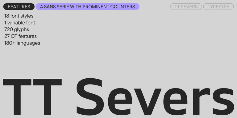
TT Severs is a geometric sans serif with emphasized elements of internal brackets. The main visual feature of TT Severs is the unusual form of internal ovals.
TT Turns is a striking geometric sans serif with expressive elements. This versatile font works exceptionally well for running text, while at large point sizes, it takes on a distinct display character.
TT FRANTZ IS AN EXPERIMENTAL VARIABLE FONT, DISTINGUISHED BY ITS SLIMNESS AND LIGHTNESS. THE VARIATION IN THE FONT AFFECTS THE CHANGE IN THE HEIGHT OF THE MEAN LINE—BY MOVING THE AXIS ADJUSTMENT SLIDER YOU CAN EASILY RAISE OR LOWER THE MEAN LINE OF THE FONT.
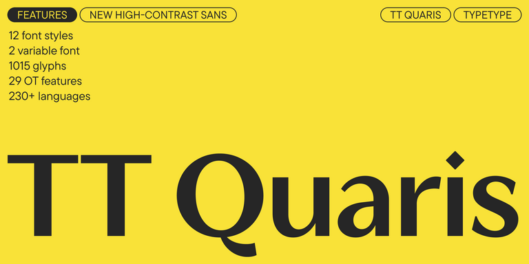
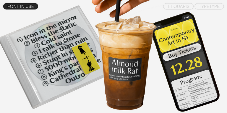
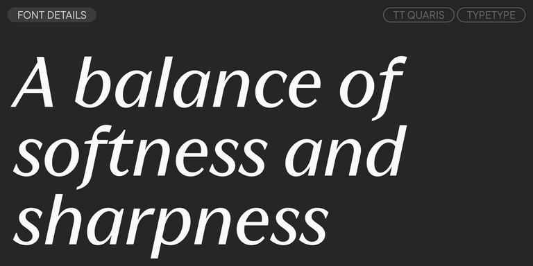
TT Quaris is an exquisite, modern high-contrast sans whose design balances between soft and sharp. The glyph shapes in the font are fluid and tend towards roundness, yet there are also sharp elements.
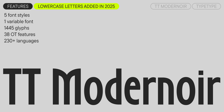
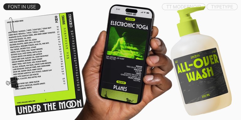
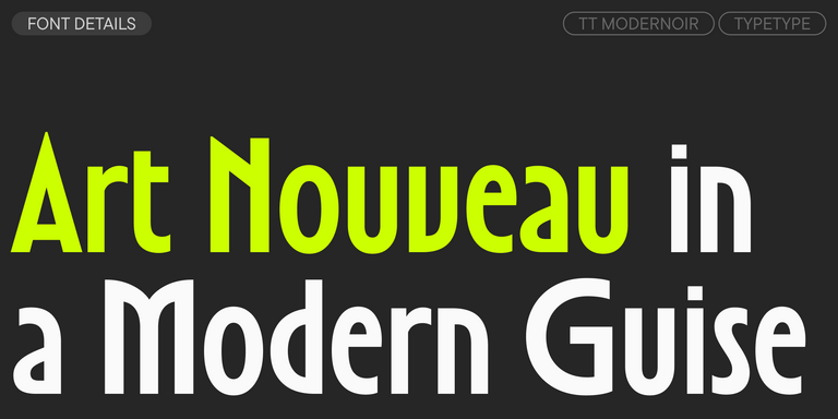
TT Modernoir is a display sans serif with dynamic proportions. Fluid lines and delicate Art Nouveau forms in this typeface blend seamlessly with the rhythmic flow and improvisational freedom of jazz.
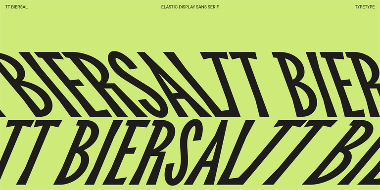
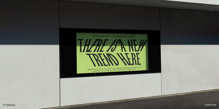
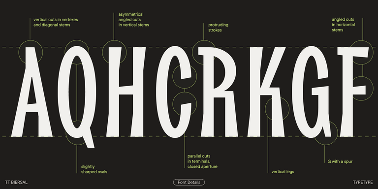
TT Biersal is a display sans serif with a free-spirited, playful, and adventurous nature. The concept of this font was sparked by a German poster from the early 1930s.
Grotesque fonts are widely used in branding, UI design, editorial layouts, and marketing materials. They are often chosen for projects that need clear hierarchy, readable text, and visual consistency across many formats. Their neutral yet confident tone makes them useful for websites, apps, corporate systems, presentations, and identity programs.
How do grotesque typefaces differ from other sans serif styles?
A grotesque typeface usually feels more neutral and direct than a humanist sans serif, but less strictly constructed than a geometric one. It often has restrained contrast, compact proportions, and a practical structure. The right choice depends on the project’s tone, readability needs, and the wider design system.
Which projects are best suited for the grotesque type?
Grotesque type works especially well in identity systems, product interfaces, corporate communication, editorial layouts, and digital platforms. It supports clear information structure while keeping the visual style professional and consistent. The final choice should depend on context, content density, brand character, and readability requirements.
Can grotesque fonts be used in commercial projects?
Yes, grotesque fonts can be used in commercial projects if the selected license covers your intended use. Before buying, check the terms for websites, desktop design work, mobile apps, digital products, and embedding. This helps avoid licensing issues and ensures the typeface can be used safely in production.
What should I check before choosing a grotesque font?
Before choosing a grotesque font, check readability, language support, available weights, implementation options, file formats, and licensing clarity. Test the family in real layouts, because the same typeface can perform differently in interfaces, headlines, long text, packaging, or brand materials.
Enter your email address and spin the sun to win up to 100% off or TypeType services
Giveaway rules:
Each user can only play once;
Each promo code is unique and can only be used once;
The promo code discount applies only to purchases up to $5,000 in the online store;
Please note that the "Font Renaming," "Your Logo in a Font," and "Basic Customization" services do not apply to previously purchased fonts and are only available for new orders;
If you win a service, our manager will contact you within three business days with the details.