top_banner_ttnormspro0426
Type foundryFonts & StylesTurkmen (lat)

The Turkmen (lat) fonts selection

Set Turkmen text in its Latin alphabet without compromising the character of your design. The Turkmen (lat) fonts selection brings together TypeType families for editorial layouts, brand identities, packaging, and digital interfaces. Compare serif and sans serif approaches, choose the weights your project needs, and assess how the language looks across headlines, reading text, and compact supporting information.

Languages: Turkmen (lat)

The Turkmen (lat) fonts selection: Alphabet and Character Coverage

The Turkmen (lat) fonts selection identifies families by language support rather than a single visual style. The modern Turkmen Latin alphabet contains 30 letters, including the additional forms Ää, Çç, Ňň, Öö, Şş, Üü, Ýý, and Žž. These are part of correct spelling, not optional decoration. A useful specimen should therefore include both uppercase and lowercase forms in words, not just isolated characters. Inspect the placement of accents, carons, and cedillas alongside the surrounding letters. Keep these details intact in names, product descriptions, and headings; replacing a marked letter with its unmarked counterpart is not a typographic solution.

Choosing a Style for Editorial and Brand Design

Choose the structure around what readers need to do: follow an article, scan a label, or recognize a name. The Turkmen (lat) fonts selection includes TT Norms® Pro and TT Hoves Pro for geometric sans serif directions, alongside TT Livret for serif typography. TT Livret's Text, Subhead, and Display subfamilies offer distinct treatments for reading sizes and headlines. For a compact corporate system, start with one family and establish hierarchy through weight and scale. For an editorial identity, compare the serif option against a quieter sans serif companion, keeping their roles clearly separated.

The Turkmen (lat) fonts selection for Websites and Interfaces

A Turkmen interface needs consistent typography in navigation, forms, article pages, and transactional messages. The Turkmen (lat) fonts selection offers a starting point for choosing a family across those roles. When developers define Unicode ranges, make sure these include every required Turkmen character; an English-only range is not enough. Allow room for translated labels and validation messages before fixing component widths, especially in mobile layouts with limited horizontal space. Pay particular attention to uppercase navigation and compact form fields, where diacritics need room above or below the letter. Set line height and control heights so marks stay visible, including at increased text sizes. For bilingual pages, assess Turkmen and the second language together rather than assuming one setting fits both. A variable style may help refine emphasis where available, but choose it for a specific layout need, not simply because it offers more settings.

The Turkmen (lat) fonts selection: Trials and Licensing

Browse the collection with a short piece of approved Turkmen copy, then open individual family pages to compare the styles needed for your project. TypeType provides free trial versions for evaluation and client mockups, not commercial publication. Build a representative layout before choosing a package: a cover and reading spread for a publication, or a product label and information panel for packaging. Keep any supporting language, numerals, and punctuation in the same proof. Once the design is approved, select the appropriate licenses for its actual uses. Printed assets, a live website, an application, and a public logo are different licensing scenarios, so a single purchase should not be assumed to cover every channel. For changes to character coverage or letterforms, discuss customization with the studio. Keep the approved styles and license details in the project handover.

  • The quick brown fox jumps over a lazy dog.
  • Pack my box with five dozen liquor jugs.
  • Sphinx of black quartz, judge my vow
  • 0123456789 !?.,:;—–()[]{}<> “quotes” ‘apostrophe’ @#%&*_+=/\| № $ € £ ₽ +−×÷=≠≤≥ … % © ® ™
  • Aa Bb Cc Dd Ee Ff Gg Hh Ii Jj Kk Ll Mm Nn Oo Pp Qq Rr Ss Tt Uu Vv Ww Xx Yy Zz
Leading
1.1
Tracking
0px
Bestseller
TT Norms® Pro Regular
104 font styles

The bestseller TT Norms® Pro—a geometric sans serif, trouble-free workhorse

Bestseller
104 font styles

TT Commons™ Pro is a completely redesigned version of the well-established classic font family TT Commons.

Bestseller
TT Hoves Pro Regular
96 font styles

TT Hoves Pro is a versatile sans-serif with a recognizable geometry

24 font styles

We continue to expand the line of the studio’s main bestseller TT Norms® Pro!

TT Livret Text Regular
32 font styles

TT Livret is an elegant, modern and functional serif

New
TT Polihaus Regular
5 font styles

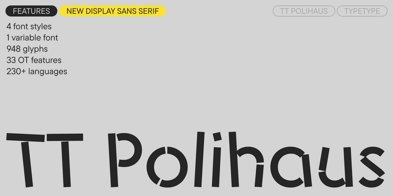
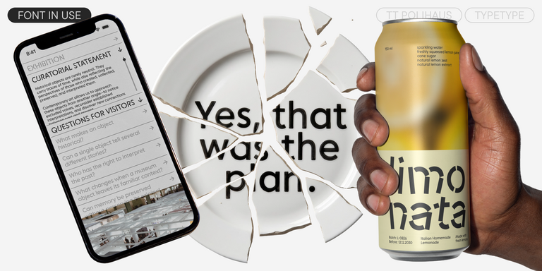
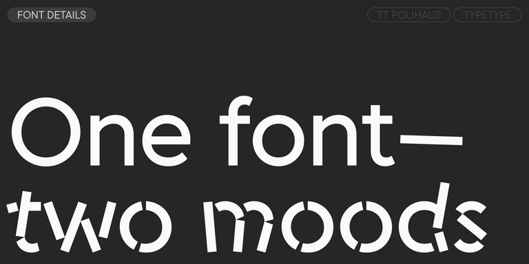
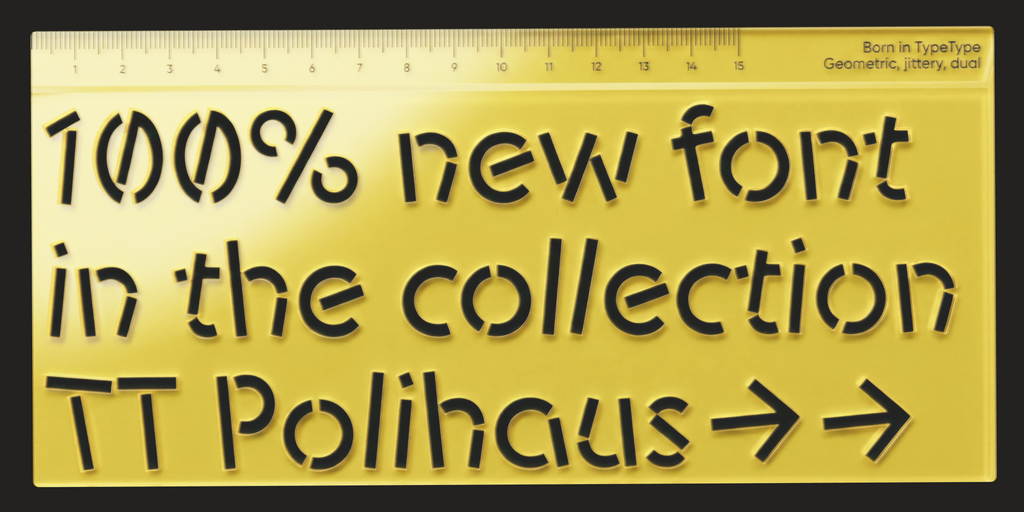
TT Polihaus is an experimental sans serif that, at first glance, looks ordinary, but then breaks apart, transforming into a stencil pattern.

New
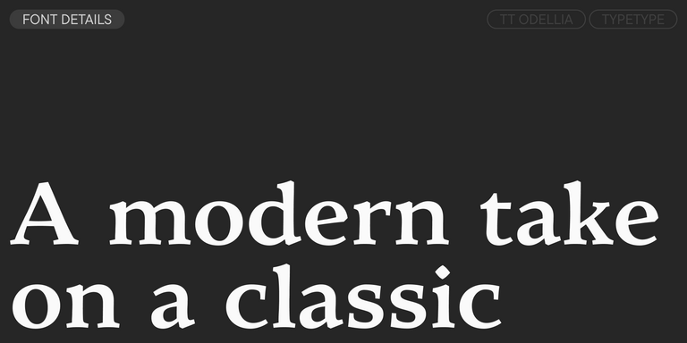
TT Odellia Regular
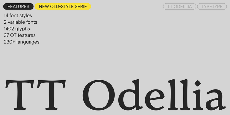
16 font styles

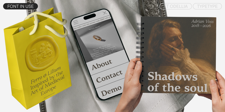
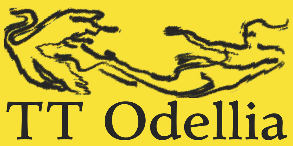
TT Odellia is an old-style serif with a modern design, inspired by Venetian typefaces and classical music.

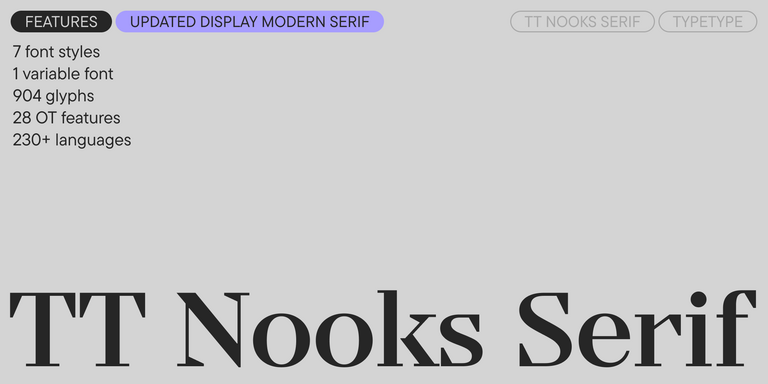
TT Nooks Serif Regular
8 font styles

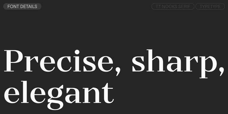
TT Nooks Serif is a display modern serif with a slight touch of egocentricity. It has a sharp and firm, yet elegant and stately character.
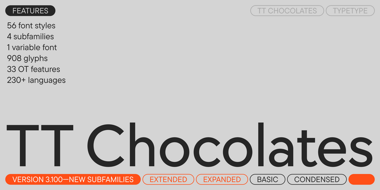
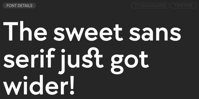
TT Chocolates Regular
57 font styles

TT Chocolates typeface consists of 14 fonts: 7 weights and 7 obliques. Due to the extended language support and the introduction of useful features.

New
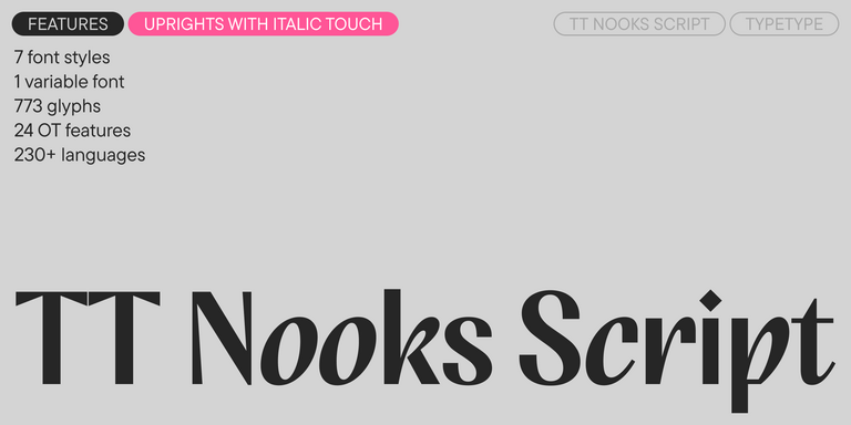
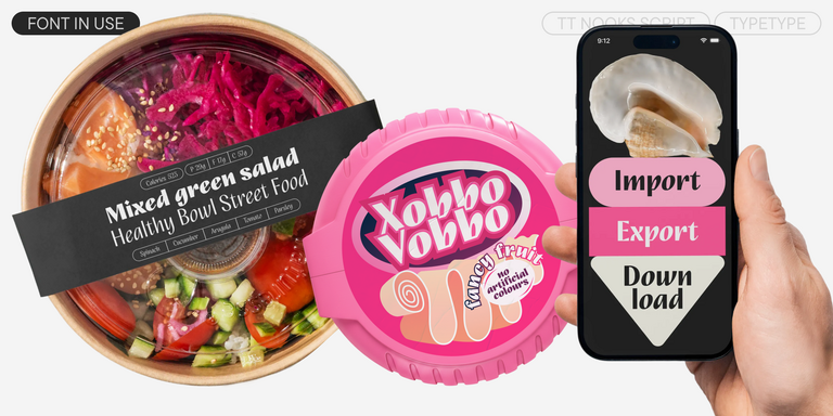
TT Nooks Script Regular
8 font styles

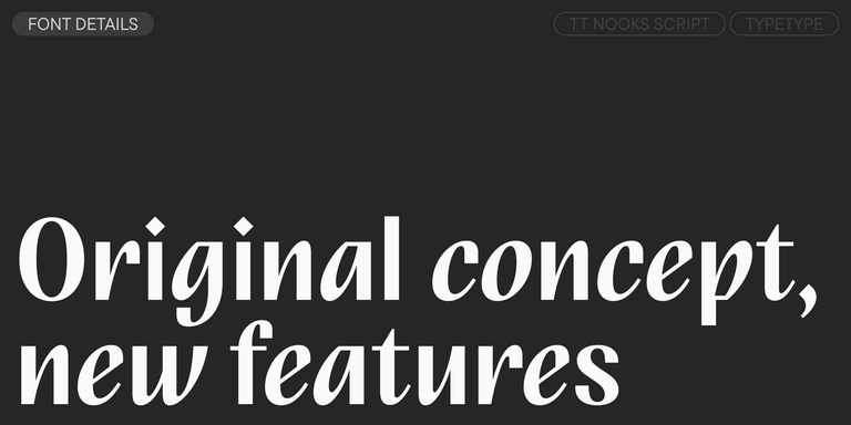
TT Nooks Script features a unique design that has no direct analogs.

Bestseller
TT Neoris Pro Regular
21 font styles

TT Neoris is an elegant Neo-Grotesque with unlimited potential and a font that encompasses all modern requirements and user desires.

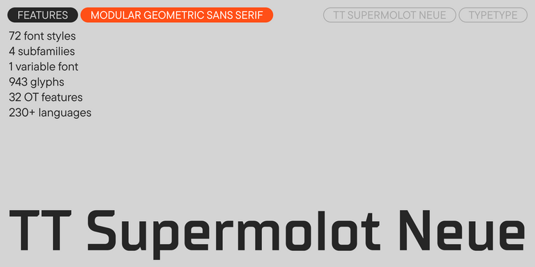
Bestseller
91 font styles

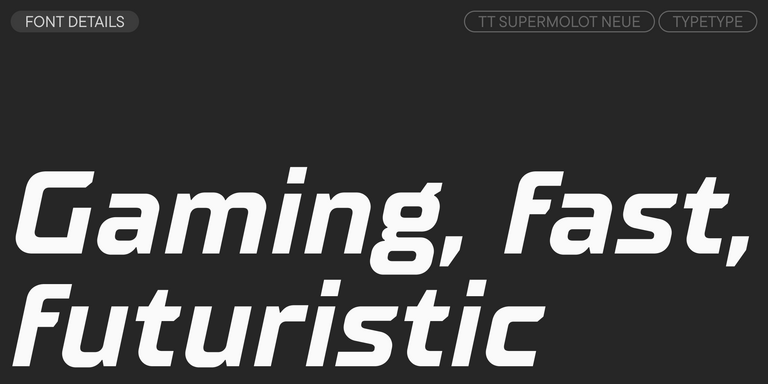
TT Supermolot Neue is a redesigned, extended, and greatly enhanced reincarnation of the popular font family

View all discounted fonts
Remaining time:
0 0
days
0 0
hours
0 0
minutes
0 0
seconds
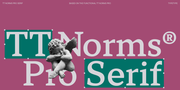
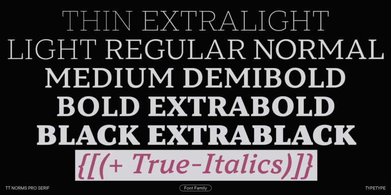
TT Norms® Pro Serif
  • from  Original price was: $47.99.Current price is: $33.59.
  • 30% off Special offer is valid until 16 Oct, 2026
TT Travels Text
  • from  Original price was: $47.99.Current price is: $33.59.
  • 30% off Special offer is valid until 16 Oct, 2026
TT Turns
  • from  Original price was: $47.99.Current price is: $33.59.
  • 30% off Special offer is valid until 23 Oct, 2026
TT Odellia
  • from  Original price was: $47.99.Current price is: $33.59.
  • 30% off Special offer is valid until 23 Oct, 2026
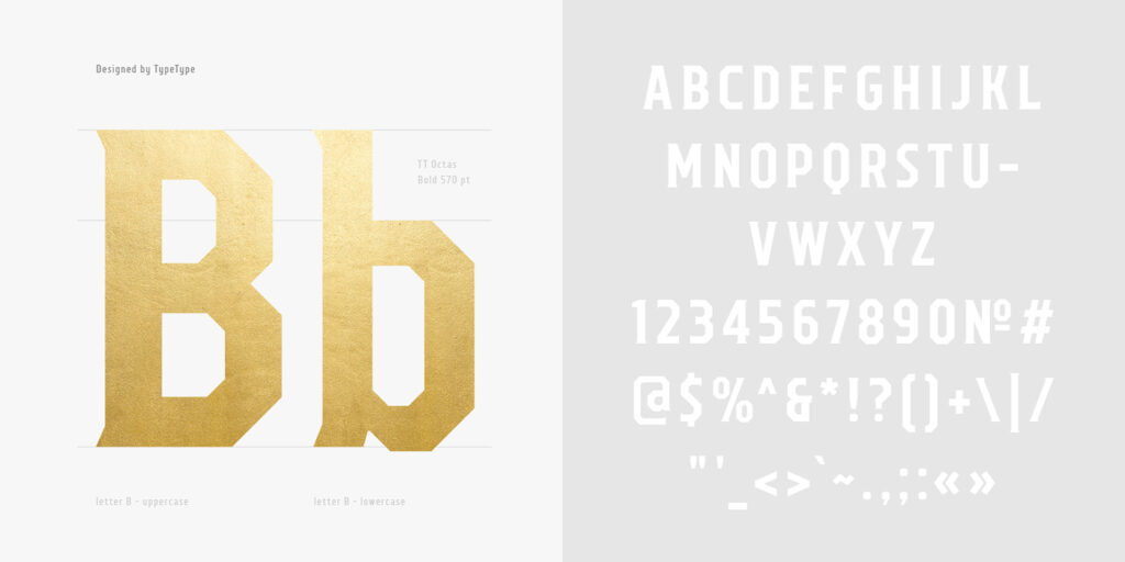
TT Octas
  • from  Original price was: $43.99.Current price is: $30.79.
  • 30% off Special offer is valid until 30 Oct, 2026
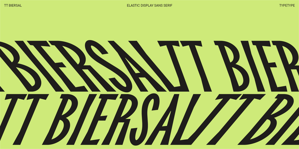
TT Biersal
  • from  Original price was: $43.99.Current price is: $30.79.
  • 30% off Special offer is valid until 30 Oct, 2026
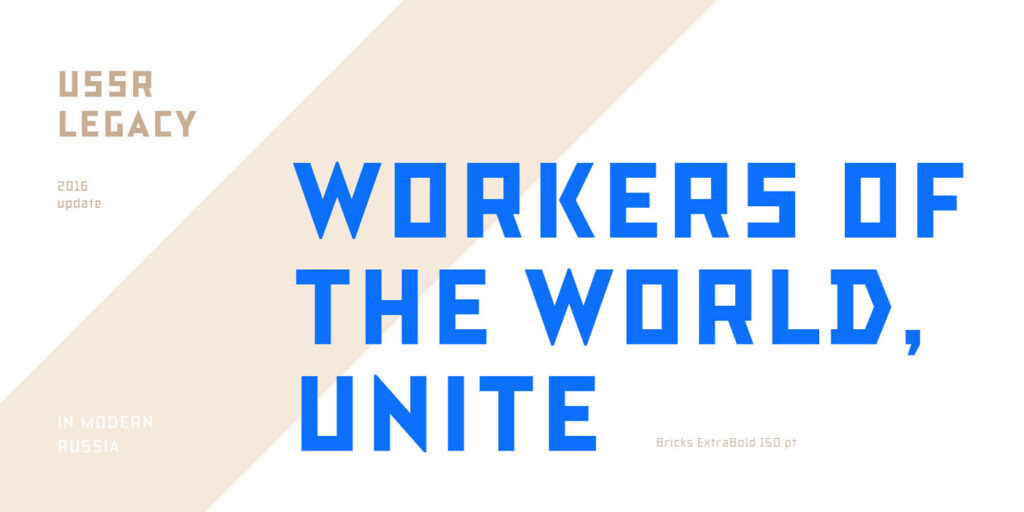
TT Bricks
  • from  Original price was: $43.99.Current price is: $30.79.
  • 30% off Special offer is valid until 6 Nov, 2026
TT Bells
  • from  Original price was: $47.99.Current price is: $19.20.
  • 60% off Special offer is valid until 6 Nov, 2026
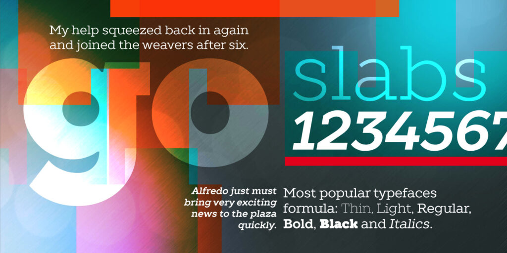
TT Slabs
  • from  Original price was: $43.99.Current price is: $24.19.
  • 45% off Special offer is valid until 13 Nov, 2026
TT Disruptors
  • from  Original price was: $43.99.Current price is: $30.79.
  • 30% off Special offer is valid until 13 Nov, 2026
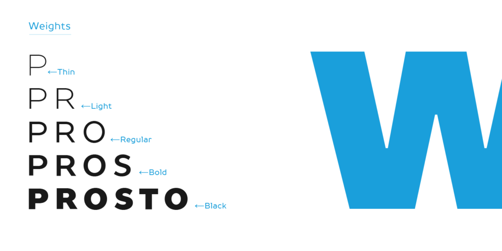
TT Prosto Sans
  • from  Original price was: $43.99.Current price is: $30.79.
  • 30% off Special offer is valid until 20 Nov, 2026
TT Polihaus
  • from  Original price was: $47.99.Current price is: $33.59.
  • 30% off Special offer is valid until 20 Nov, 2026
TT Rationalist Regular
22 font styles

TT Rationalist is functional and neutral slab serif typeface.

21 font styles

TT Commons™ Classic is a universal sans serif with a minimal contrast of strokes, a closed aperture, and geometric shapes of characters.

TT Runs Regular
19 font styles

TT Runs is a very stylish and charismatic display sans serif with irregular proportions of some characters.

91 font styles

TT Bluescreens is a upgraded geometric sans serif with narrow proportions

TT Bells Regular
14 font styles

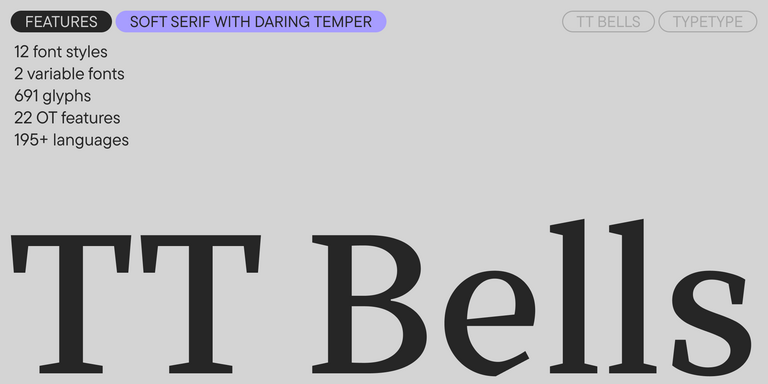
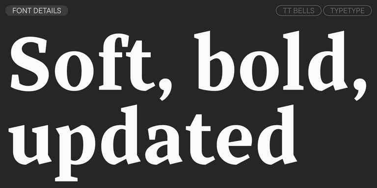
TT Bells combines the elegant softness of Antiqua with a complex and daring temper reflected in straight stroke terminals and arrowheaded serifs. The typeface is based on the broad nib, which creates these hallmark terminals and serifs.

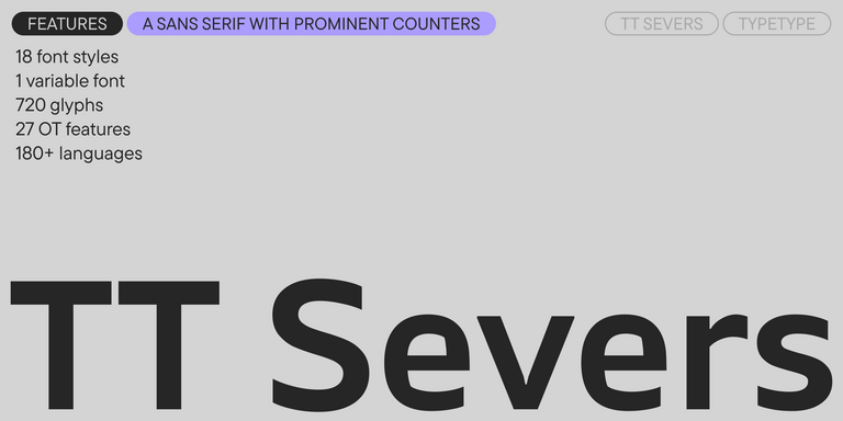
TT Severs Regular
19 font styles

TT Severs is a geometric sans serif with emphasized elements of internal brackets. The main visual feature of TT Severs is the unusual form of internal ovals.

New
TT Turns Regular
19 font styles

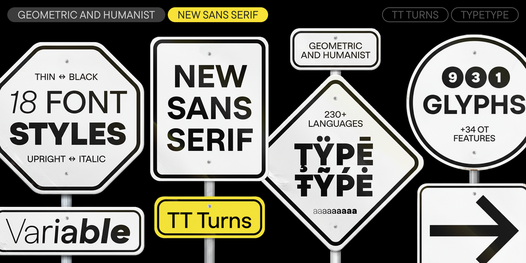
TT Turns is a striking geometric sans serif with expressive elements. This versatile font works exceptionally well for running text, while at large point sizes, it takes on a distinct display character.

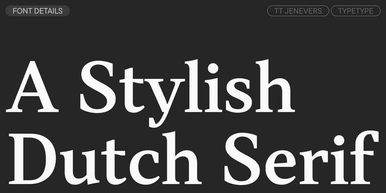
TT Jenevers Regular
14 font styles

TT Jenevers is a modern serif with a Dutch flavor. The font family features the characteristic details peculiar to Dutch serifs—these are the asymmetrical shape of serifs and an irregular slant of ovals.

New
TT Regins Display Light
38 font styles

TT Regins is a Scottish modern serif. Striking contrast and sharp triangular serifs give this font a stern and commanding character, while refined forms, enlarged lowercase letters, and slightly condensed, static proportions add grace to its design.

TT Frantz Variable
4 font styles

TT FRANTZ IS AN EXPERIMENTAL VARIABLE FONT, DISTINGUISHED BY ITS SLIMNESS AND LIGHTNESS. THE VARIATION IN THE FONT AFFECTS THE CHANGE IN THE HEIGHT OF THE MEAN LINE—BY MOVING THE AXIS ADJUSTMENT SLIDER YOU CAN EASILY RAISE OR LOWER THE MEAN LINE OF THE FONT.

New
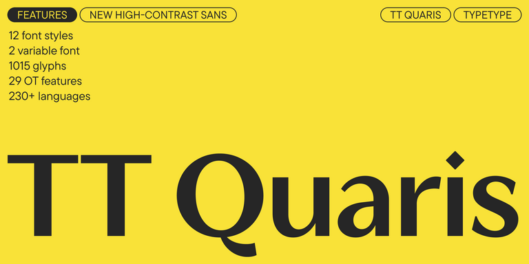
TT Quaris Regular
14 font styles

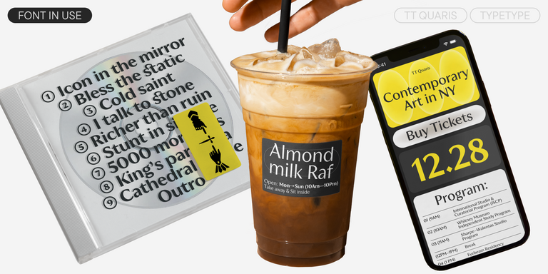
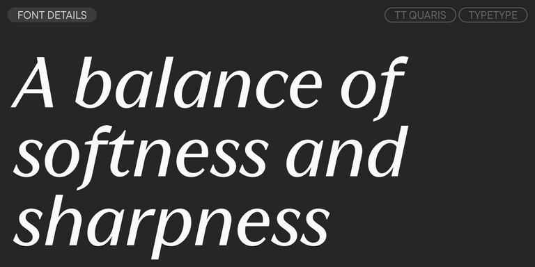
TT Quaris is an exquisite, modern high-contrast sans whose design balances between soft and sharp. The glyph shapes in the font are fluid and tend towards roundness, yet there are also sharp elements.

6 font styles

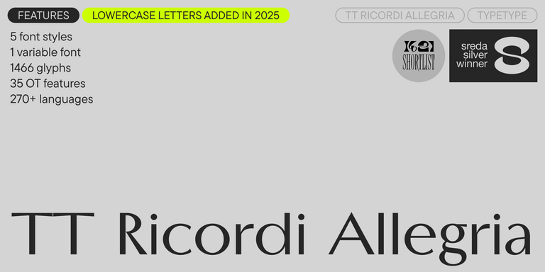
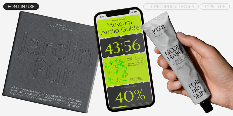
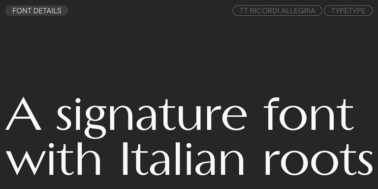
TT Ricordi Allegria is a sleek and intelligent contemporary Florentine grotesque.

What Are Turkmen Latin Fonts?

The Turkmen (lat) fonts selection groups typefaces that support Turkmen written in the Latin alphabet. This is a language category, not a decorative style. Choose within it according to the reading task, whether the project needs sustained text, concise labels, or expressive headlines.

Which Industries Use Turkmen Latin Typefaces Most Often?

Relevant applications include publishing, education, retail packaging, hospitality, and digital services addressing Turkmen readers. Requirements differ by format: teaching materials need clear letter recognition, packaging needs legible product information, and service interfaces need concise, readable labels. Choose for the communication task rather than an assumed industry aesthetic.

Can Turkmen Latin Fonts Be Used for Branding?

Yes. The Turkmen (lat) fonts selection can support a brand identity built around Turkmen communication. Establish a consistent treatment for the name, supporting copy, and other language versions. Include distinctive letters in early identity studies, and confirm the licensing required for a public logo.

What Should Be Considered When Pairing Turkmen Latin Fonts?

Pair by role, then compare lowercase height, stroke weight, spacing, and overall proportions. A distinctive heading style should not compete with the reading face. Both choices need the required language coverage. Review them together in a complete layout rather than judging isolated specimen lines.

Can You Buy or Download TypeType Fonts for Commercial Projects?

Yes. Purchase the selected styles with licenses covering the intended applications. Free trial downloads are for evaluation, not commercial release. Review Desktop, Webfont, App, and Logo options as relevant, and confirm the license holder and usage scope before delivering the final project.

Contact us!