Glossary of Typography Terms
The largest illustrated database of typography terms and definitions
TypeType Font Dictionary is a guide containing the definitions of typographic terminology from our articles and other font-related content. Diving a little deeper into the language of typography will give you a better understanding of specialized information sources and make you feel more comfortable with fonts.
Remember, there is no standardized type terminology in the font market. The definitions you will see here are the result of the collective expertise of TypeType specialists over many years, and we believe them to be the most accurate.
- Calligraphy
- Character density
- Character proportions
- Character set
- Connecting stroke
- Contrast
- Contrast sans
- Counter
- Counterform
- Cross(bar)
- Denominators
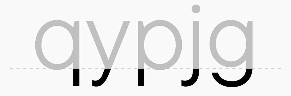
- Descender
- Descending element
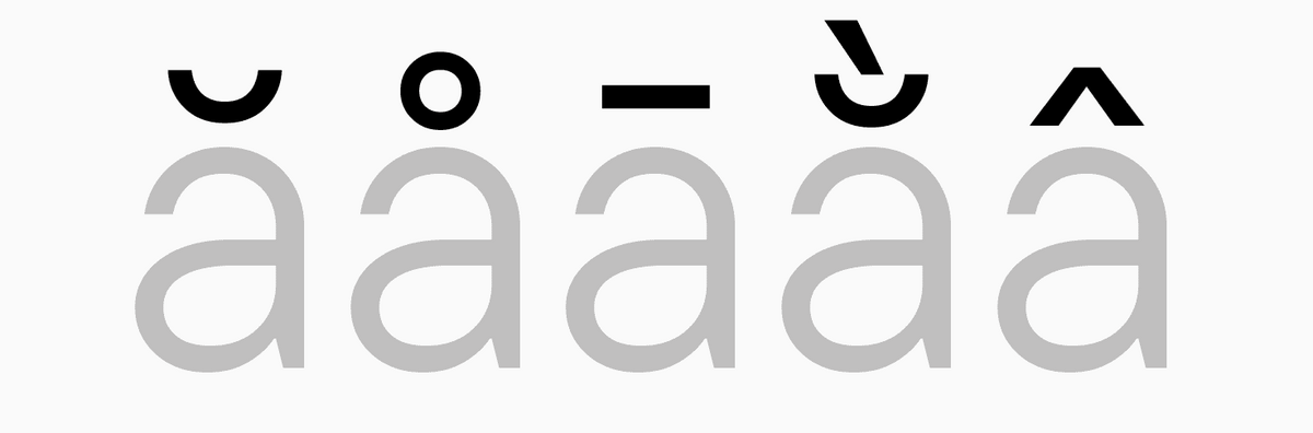
- Diacritical marks
- Display fonts
- Double-storey form
- Downstroke
- Drop
- Dynamic fonts
- Oblique fonts
- Old Style serif typefaces
- Old-style (minuscule) figures
- OpenType features
- Oval
- Overhang
- Sans Serif
- Script
- Serif
- Shoulder
- Single-storey form
- Slab, slab serif
- Small caps
- Spacing
- Spine
- Spur
- Spurless junction
- Static fonts
- Stem
- Stress
- Stroke ending
- Style
- Stylistic alternates
- Subfamily
- Superiors
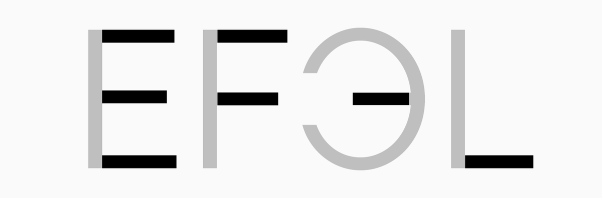
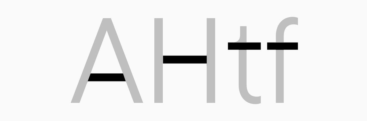
Additional stroke
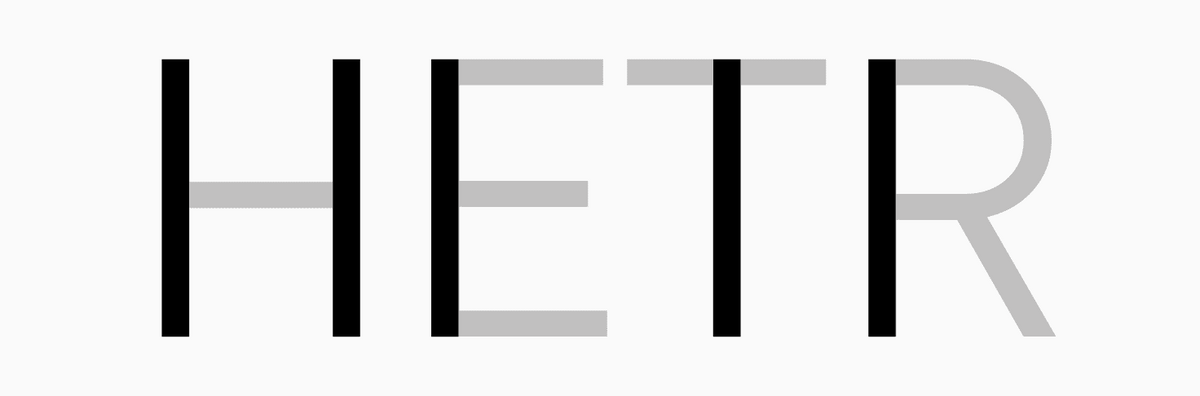
A stroke that is neither primary nor connecting (for example, horizontal elements of the letter "E").
Antiqua
(serif typeface)—a high-contrast font with serifs.
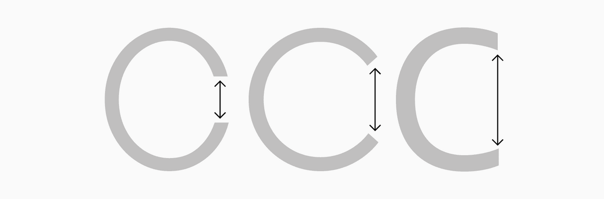
Aperture
A degree of openness in a character. Aperture can be open or closed. The letter "C" provides the simplest example to grasp the concept of aperture: more straight/horizontal terminals indicate an open aperture and more curved/vertical terminals mark a closed aperture.
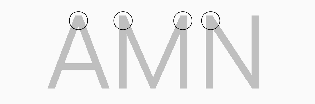
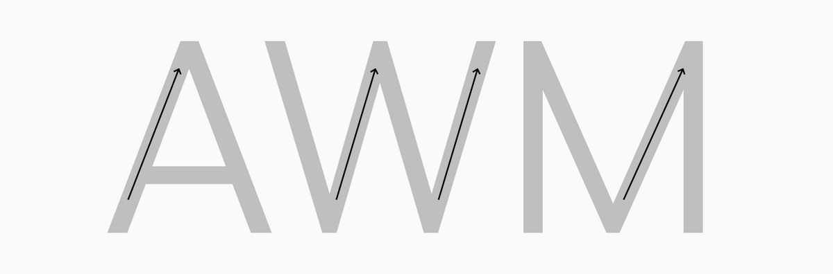
Apex
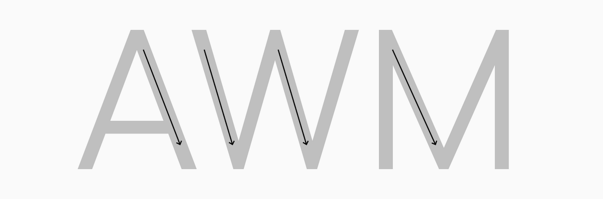
The intersection point of two strokes (both diagonal or one vertical and one diagonal) at the top of certain letters ("A", "M").
Arc
A bow-shaped element standing on two stems.
Arm
Upward diagonal stroke.
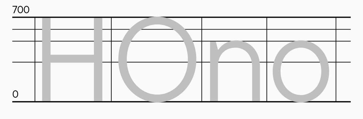
Ascender
A lowercase letter element that goes over x-height.
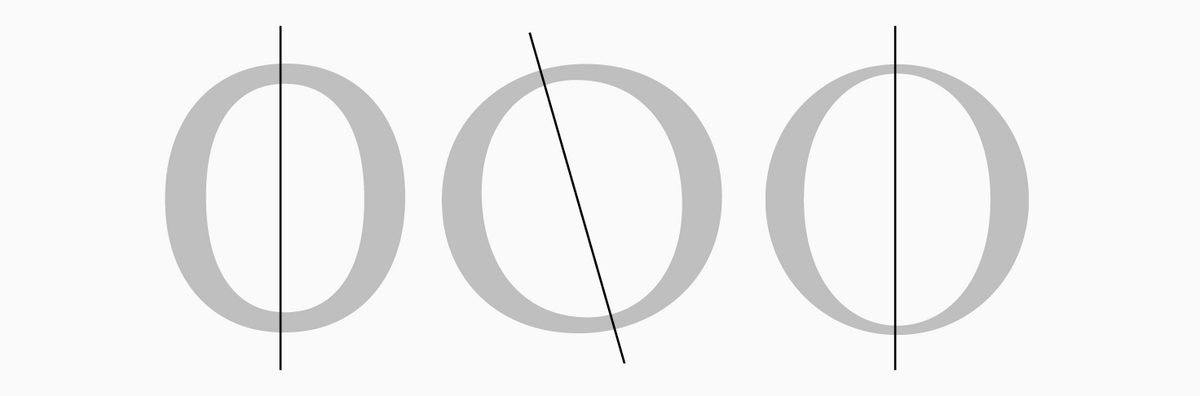
Axis
An imaginary line passing through the thinnest parts of the rounded characters. The slant angle is calculated in relation to the vertical. It is determined by the tradition of contrast distribution based on the movement of the writing tool.
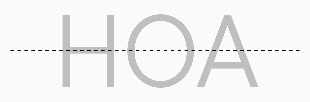
Baseline
A line where font glyphs sit, follows the bottom edge of characters, excluding overhangs and descenders.
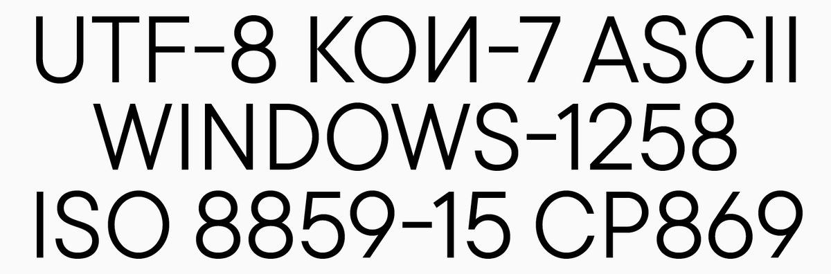
Basic Latin
A Unicode block including basic characters of Latin-based languages.
Bézier curve
Mathematically formulated curves used to describe character forms in fonts.
Bowl
A rounded part of a character that does not form a full circle. It can be open like in the letter "З" or attached to the stem like in the letter "B".
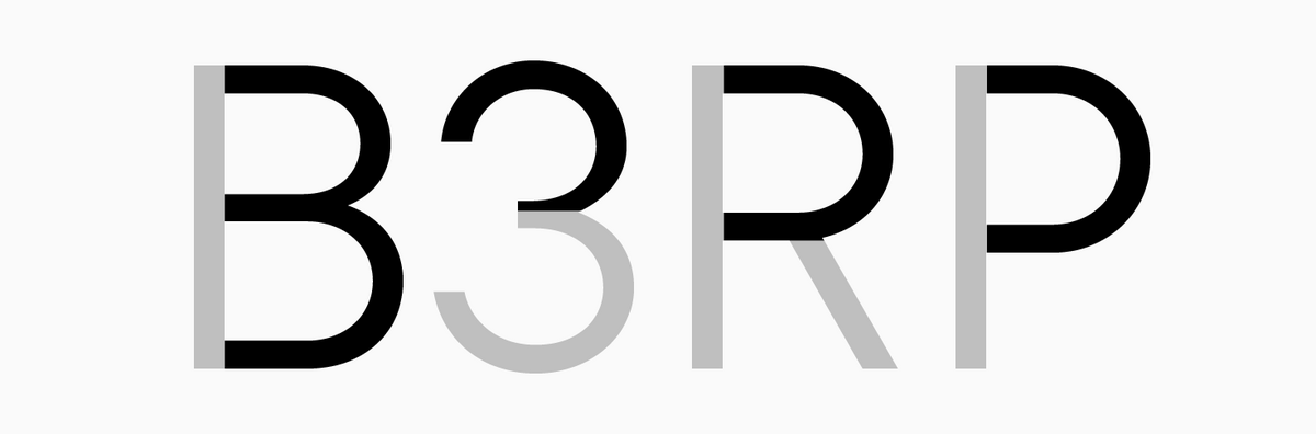
Bowl (1)
Part of a circle or rounded glyph element.
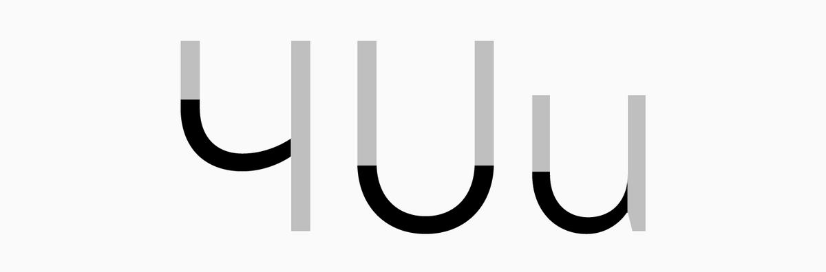
Bowl (2)
The lower arc of the letters like "Ч", "U", "u".
Branch
1) arm/leg; 2) ascender in the Cyrillic letter "б".
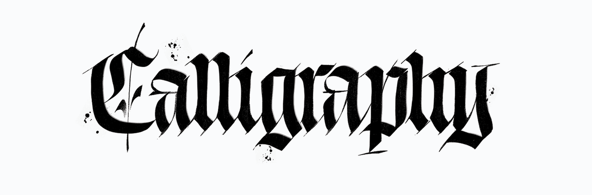
Calligraphy
The art of producing beautiful writing. Calligraphic text is always crafted manually and bears the imprint of the tool.
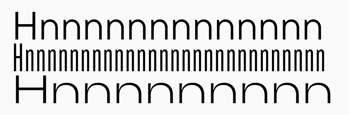
Character density
The number of characters accommodated within a line of a given format. Fonts can have higher and lower density.
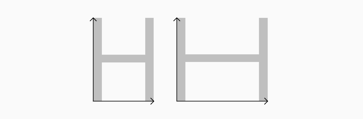
Character proportions
The relation between a character’s width and height.
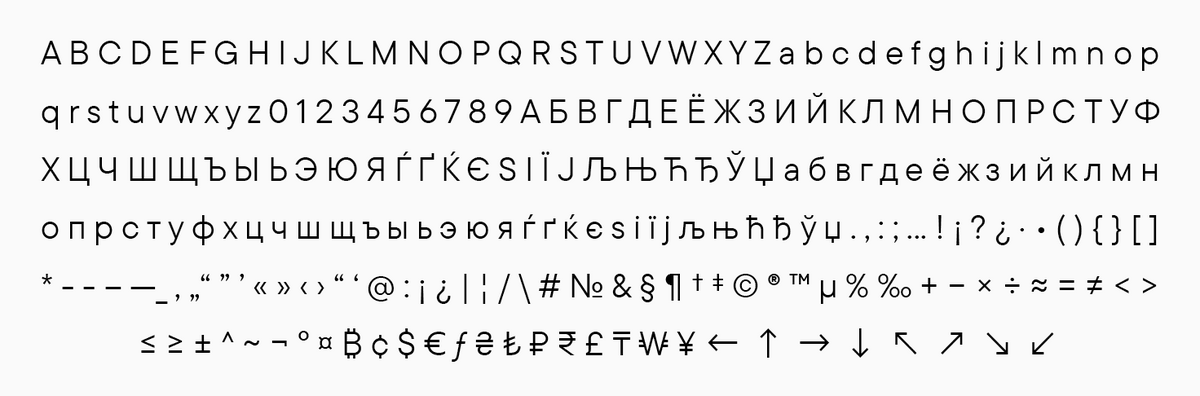
Character set
A collection of all font symbols.
Connecting stroke
An additional stroke connecting the primary ones. It can be horizontal or diagonal.
Contrast
The thickness proportion of main and additional strokes in a font. A font can be no-contrast, low-contrast, medium-contrast, and high-contrast.
Contrast sans
A high-contrast Antiqua without serifs.
Counter
An empty inner part of a glyph; white space inside a glyph.
Counterform
See Counter.
Cross(bar)
A horizontal, non-primary stroke.
Denominators
Smaller forms of lining figures that serve as denominators in fractions.
Descender
An element of a character positioned under the baseline (extending past it).
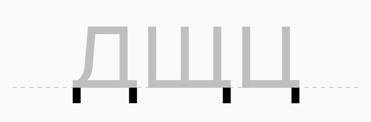
Descending element
Little legs of the Cyrillic letters "Дд", "Щщ", and "Цц".
Diacritical marks
Special symbols influencing (transforming or clarifying) the character’s meaning. They are placed above, below, or sometimes inside letterforms. For example, the dot in "i" is a diacritical mark.
Display fonts
Eye-catching, peculiar, and distinctive fonts often used in large point sizes (for example, for headlines).
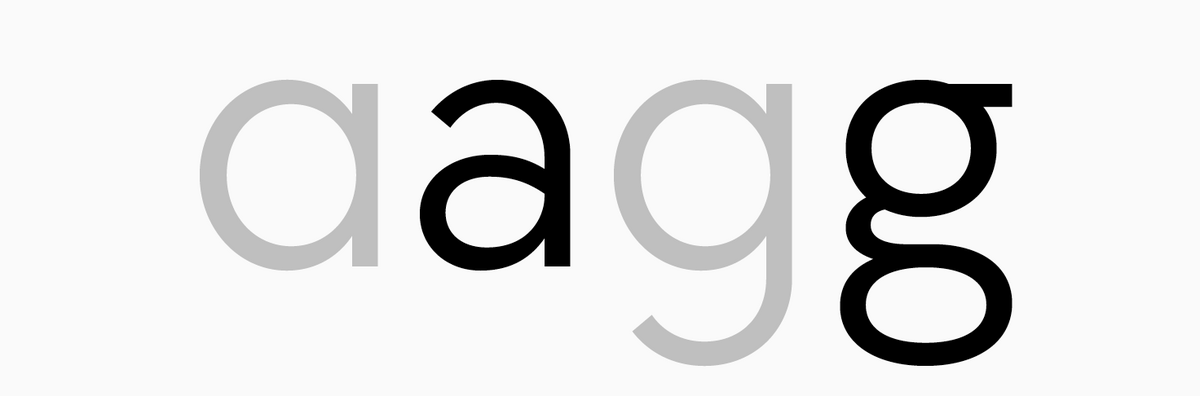
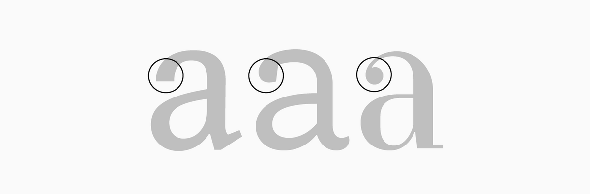
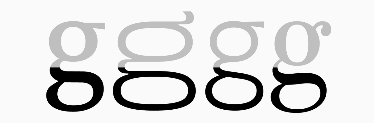
Double-storey form
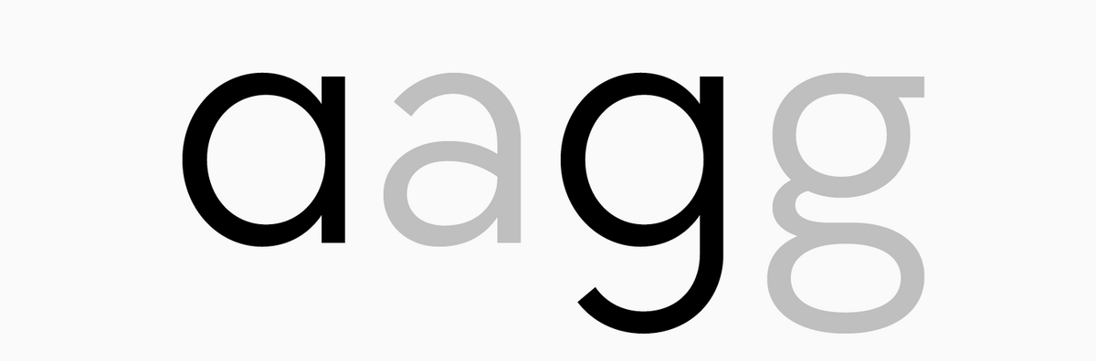
A traditional form of the letters "a" and "g" with the construction consisting of upper and lower parts.
Downstroke
A descending diagonal stroke (for example, the right stroke of the letter "A").
Drop
A modified vertical serif at the end of a terminal. A little vague and less geometric in Old Style serifs, this form resembles a circle or a drop in Didone.
Dynamic fonts
Fonts characterized by their origins in broad-nib pen calligraphy. They stand out for noticeable proportion dynamics, evident contrast, and open aperture.
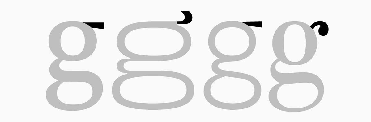
Ear
An element positioned at the top right of the lowercase double-storey "g".
Em-space
In metal typesetting, the flat surface of a letter where a character is positioned. Em-space (digital font) — a rectangle where the character’s contour is positioned. Em-space can be made wider or narrower by increasing or decreasing sidebearings of a glyph.
Encoding
A structured collection of font characters. Simply put, this system determines how symbols are represented in the device’s memory and how they are displayed on the screen. Each encoded symbol has a unique number — a code point. Encoding depends on the operating system the font is designed for. There exists a wide variety of encodings, and one of the best-known ones is Unicode.
Extended Latin
Unicode blocks consisting of characters based on Latin tradition but not included in the basic Latin block.

Extrapolation
Automatic (mathematical) generation of intermediate forms extending beyond the two extreme versions. For example, in font development: generation (extrapolation) of the Thin instance (see Instances) with Regular and Bold masters. See also: Interpolation.
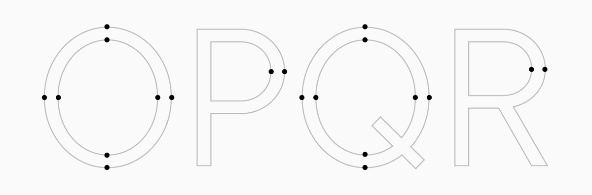
Extreme points
The outermost points on vertical and horizontal axes of rounded elements that form an arc.
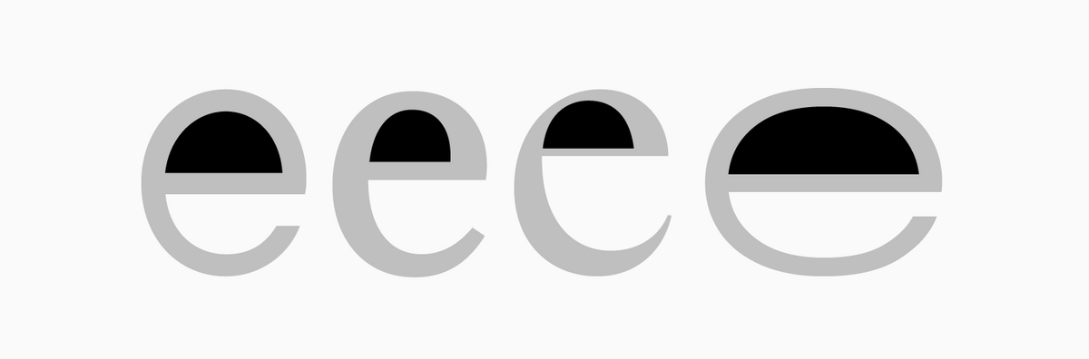
Eye
Counter of the lowercase letter "e".
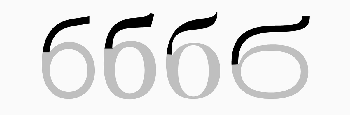
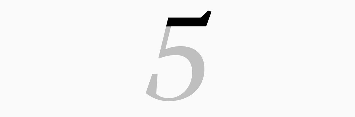
Flag
The top horizontal stroke of the figure 5 or the horizontal element in the cursive forms of "v" and "w".
Font
A collection of symbols united by a common idea: the design of the characters (letters, numbers, punctuation marks) integrated into a cohesive system and a file carrying the complete set of characters (alphabet or non-alphabet symbols) used for typing.
Font editor
Special software for designing and editing digital fonts.
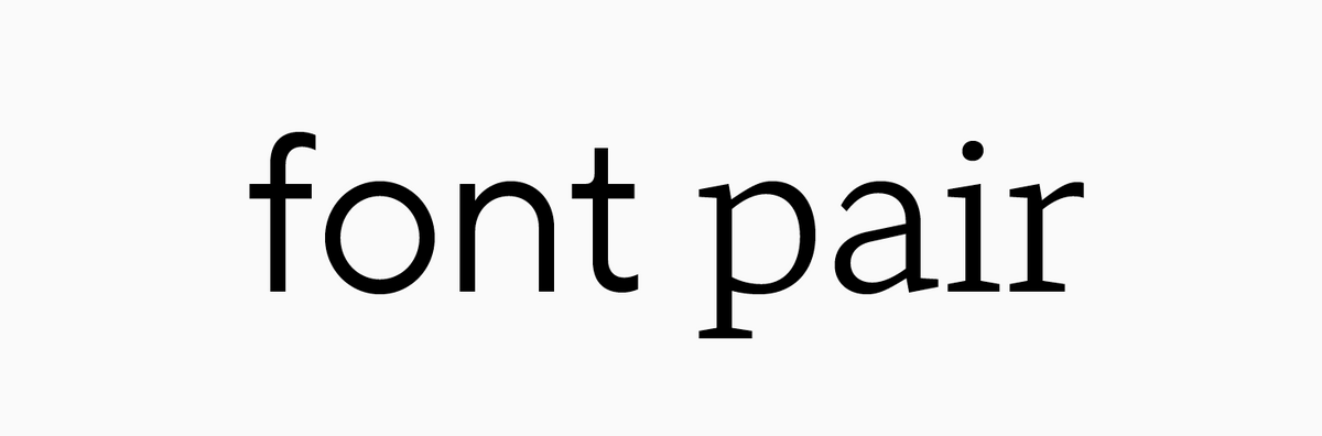
Font pair
A combination of two complementary fonts in one mockup. Most often, one font in a pair is used for headlines and conveying the necessary intonation, and the other serves to communicate information.
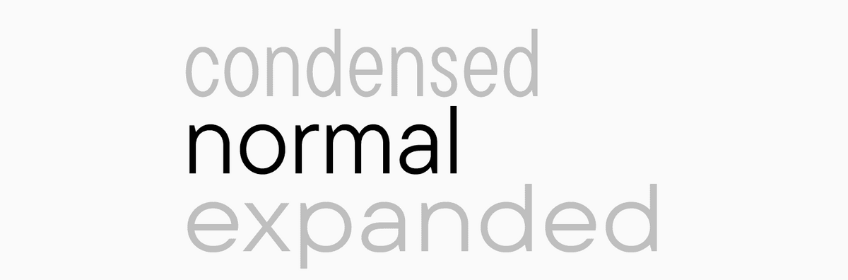
Fonts with dynamic proportions
Fonts with explicit width dynamics. Their proportions are reminiscent of Roman capital scripts or fonts from the Renaissance era.
Fonts with static proportions
Fonts where characters are designed to have a uniform width, except for the narrowest ones, such as "i" and "l".
Geometric sans serif typefaces
Fonts intentionally built upon elementary geometric forms (equilateral triangles, squares, circles). Originated in Germany in the 1930s. Their development was influenced by the ideas of constructivism and the Bauhaus design school.
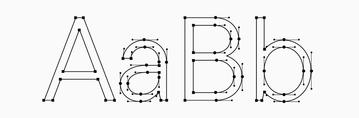
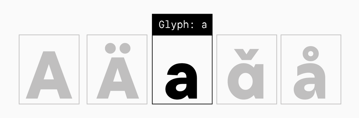
Glyph
A professional term used in typography and design to denote the specific graphic representation of a character (such as a letter, numeral, or symbol) within a particular typeface.
Grapheme
The idea of the character, its image, and the basic form that sets it apart from other symbols. One character can have several letterforms (for example, uppercase and lowercase, roman and cursive, single-storey and double-storey).
Grotesque
A category uniting the first sans serif typefaces that emerged in the XIX century. These fonts have noticeable contrast and simple forms, and the glyphs tend to have equal widths.
Handwritten font
A manually drawn font that visually resembles a typeset font (typically a title page font). Such fonts are used for designing books, posters, and more. This is a more specific term than Lettering.
Hinting
The TrueType format font optimization process aimed at achieving maximum readability on computer screens.
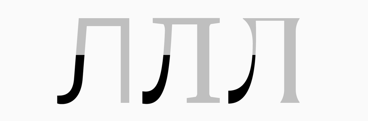
Hockey stick
The left stroke of the letter "Л", including the terminal.
Humanist sans serif typefaces
Sans serif fonts with a more pronounced contrast of thick and thin strokes than other Grotesques. They are also characterized by an open aperture and double-storey "a" and "g".
Inferiors
Smaller forms of lining figures that are used in various formulas and mathematical expressions.
Ink Trap
An ink trap is a specific form of optical compensation in type design. It’s created by adding an indentation to the acute angles in the internal spaces of a letterform. Originally, ink traps were a practical necessity for the printing process. In sharp corners, ink had a tendency to spread or «bleed,» which could disrupt the visual balance and clarity of the text. The traps were designed to capture this excess ink, mitigating the problem and improving the print quality. While printing technology has advanced, ink traps remain relevant, particularly for typefaces intended for use at very small sizes. In contemporary type design, however, ink traps have evolved beyond a purely technical feature. They are often used as a stylistic element, a deliberate graphic statement that adds character to the font.
Instances
Font styles that weren’t designed as masters. They are interpolated or extrapolated between the anchor font styles based on specific formulas for determining font family weights.
Interpolation
Automatic (mathematical) generation of intermediate forms from two extreme versions. For example, in font development: generation (interpolation) of the Demibold instance (see Instances) with Regular and Bold masters.
Italics
(true italics)—historically, this term referred to cursive fonts, but today, it is used in a broader sense and unites true italics and slanted fonts. These are fonts where letterforms transform to acquire a cursive shape. Italics can be created as independent fonts, not only as an addition to roman font styles. Such fonts are typical for serif typefaces.
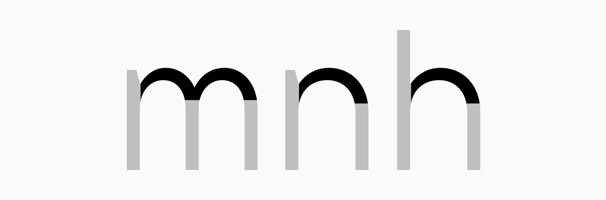
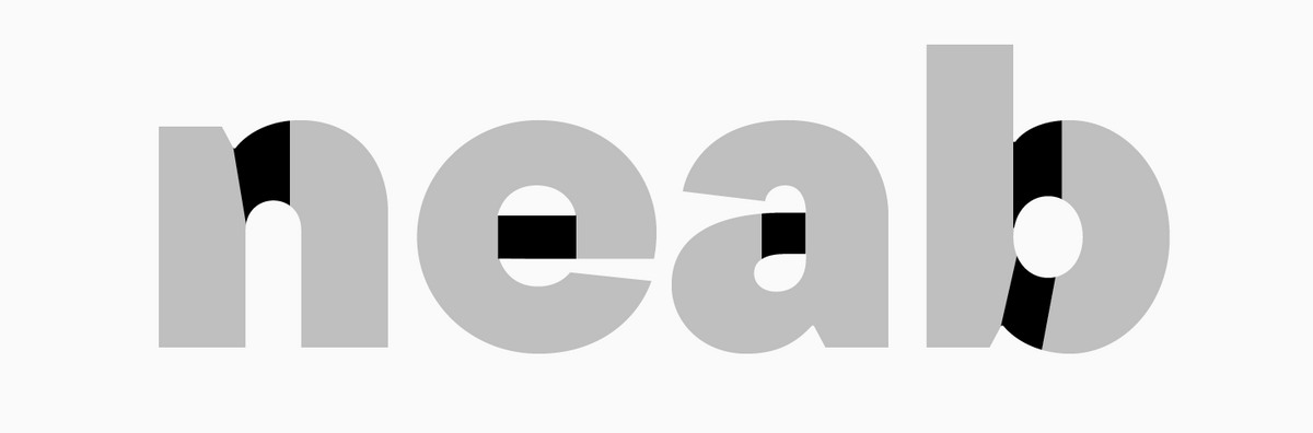
Junction
The point where the bowl or arc smoothly joins the stem.
Kerning
Targeted increase or reduction of the interval between two characters determined by the combination of their forms. Kerning is needed to achieve a perfectly even, uniform typesetting.

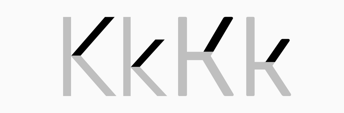
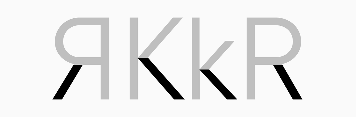
Leg
Downward diagonal stroke in letters like "K", "R", "Я", "Ж”.
Letter
1) Sort/Type — a block usually made of type metal or wood with a typographic character protruding on one of the sides, making it possible to print the symbol onto a surface through stamping (print);
2) Glyph/Character — in general terms, any symbol in the font.
Lettering
A hand-crafted type. Unlike calligraphy, lettering doesn’t bear the imprint of an instrument. There are numerous ways of designing letters for such fonts: they can be drawn, cut out, sculpted, etc.
Letterspace
(aprosh)—the distance between the letter’s edge and the em-square’s edge. Letterspace can be both positive and negative. The semi-aproshes (sidebearing) of two adjacent characters form one aprosh.
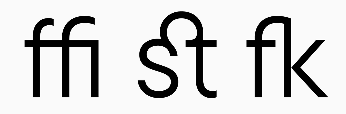
Ligature
(from Latin 'ligare' meaning 'to bind' or 'to connect')—a character (symbol) formed by merging two or more letters. The original purpose of the ligature is to create a harmonious configuration of letters that intersect if not enclosed in a ligature. Today, ligatures are often used for decorative purposes.
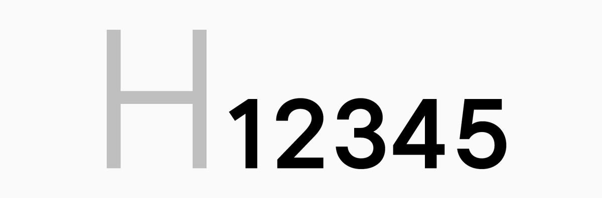
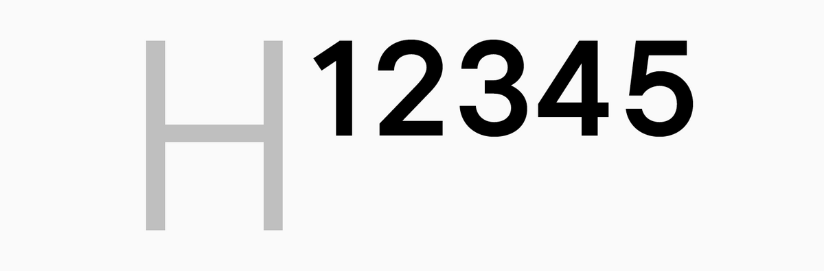
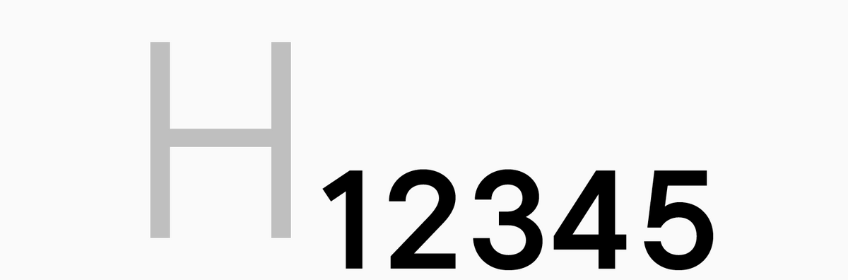
Lining (majuscule) figures
Figures that do not contain ascenders or descenders and are equal or similar in height to uppercase characters. They are often included in fonts by default.
Loop
An enclosed descender of the letter "g".
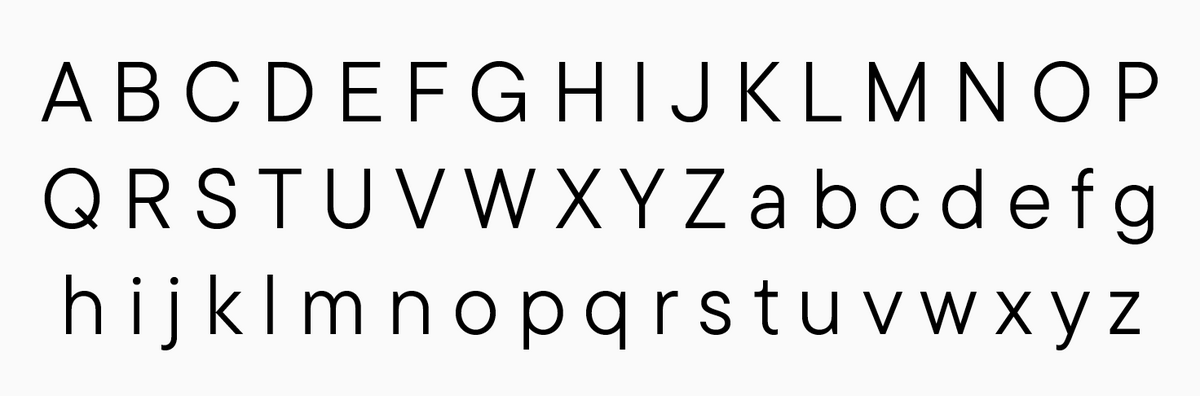
Lowercase
Small letters in a font. They are used for typing running text.
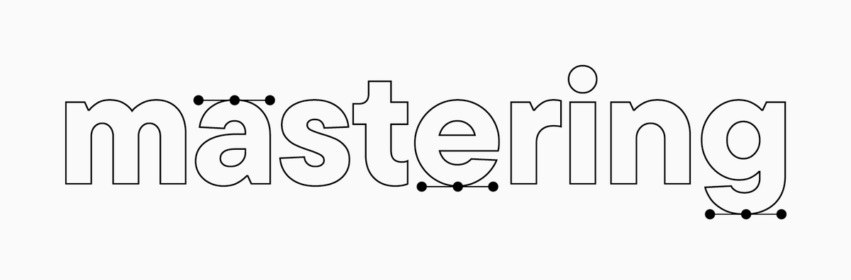
Mastering
A professional term in type design referring to the technical and software-related stages of preparing a font for its final release.
Masters
Anchor font styles designers handcraft in font editing software supporting the variability technology.
Metrics
Technical specifications integrated into the font file that describe spacing, kerning, and other glyph parameters.
Modern serif typefaces
(Didone)—a category of fonts with static proportions exhibiting glyphic nature, with their design grounded in construction rather than handwriting. These fonts developed their appearance through the extensive use of pointed-nib pens and metal engraving techniques. Modern Antiquas stand out for their high contrast, thin and symmetrical serifs, no dynamics, and vertical oval axis.
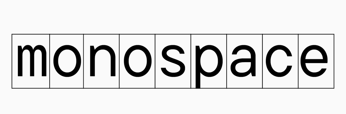
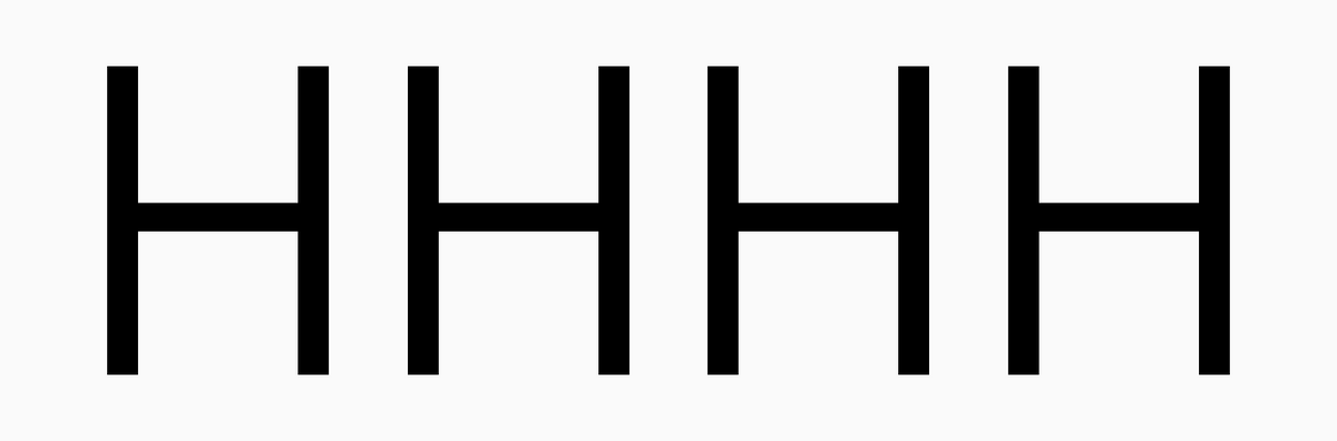
Monospaced fonts
Fonts with the same width of em-square in all characters. Traditionally, such fonts are used for coding and filling out tables; however, modern typography also uses them for various purposes.
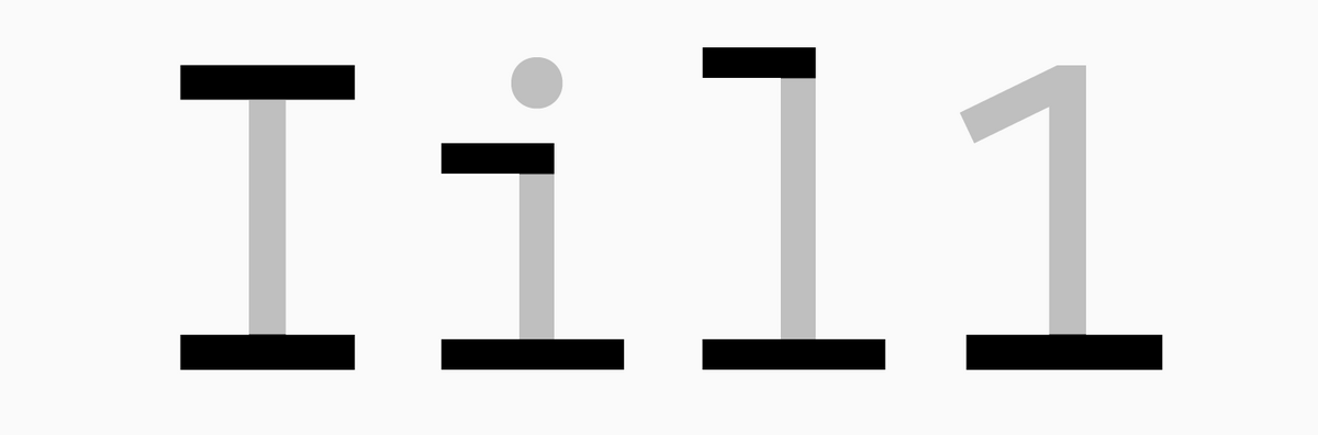
Monospaced serifs
Ultra-wide serifs that compensate for the width of an em-space of narrow characters in monospaced fonts. Monospaced serifs are typical for characters like "i", "l", "I", "1".
Neo-Grotesques
The legacy of Swiss design. Such fonts stand out for their static proportions, minimal or no contrast, squared ovals, and closed apertures.
Numerators
Smaller forms of lining figures that serve as numerators in fractions.
Oblique fonts
Fonts usually designed as a pair to the original roman font style. In this case, letterforms are just slanted but don’t change. Such fonts are typical for sans serifs.

Old Style serif typefaces
(Humanist) serif typefaces—serif fonts that emerged and thrived during the Renaissance era. These are dynamic fonts with low contrast, significantly slanted axes of ovals, and asymmetrical, rounded serifs. This font category is classified as ductal, based on the logic of broad-nib pen writing.
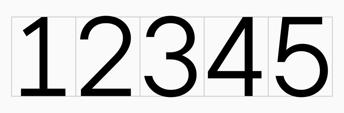
Old-style (minuscule) figures
Figures containing ascenders and descenders and similar in height to lowercase characters. They are sometimes called text figures because of being traditionally used in running text to make it easier to read. Non-lining figures are usually designed as an additional figure set that can be turned on using the Oldstyle Figures feature.
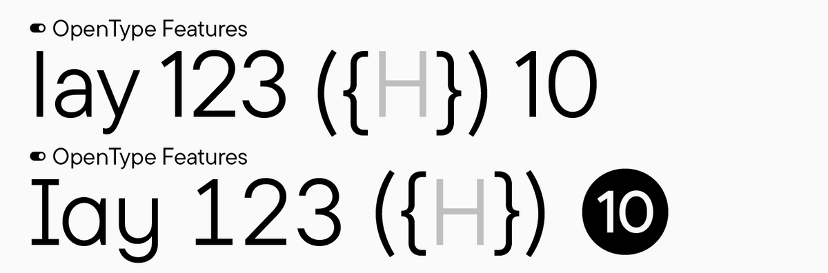
OpenType features
(or simply features)—code integrated during font development that allows users to invoke various transformations and use functions (intended by the font designer) in font editing software. For instance, replacing glyph forms with alternates, turning on tabular or minuscule figures, adjusting the punctuation baseline based on the case, etc.
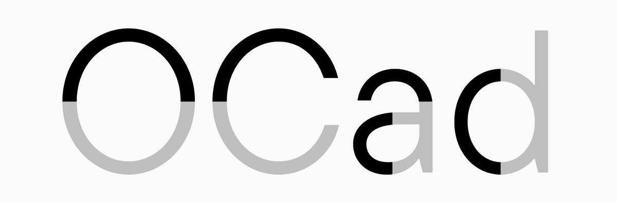
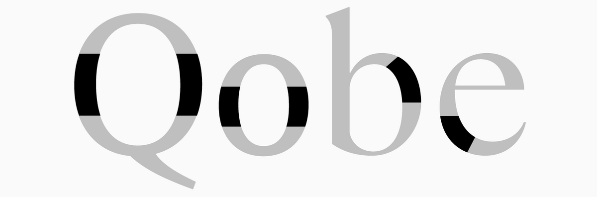
Oval
An enclosed segment of glyphs or glyph parts, forming a circle or ellipse.
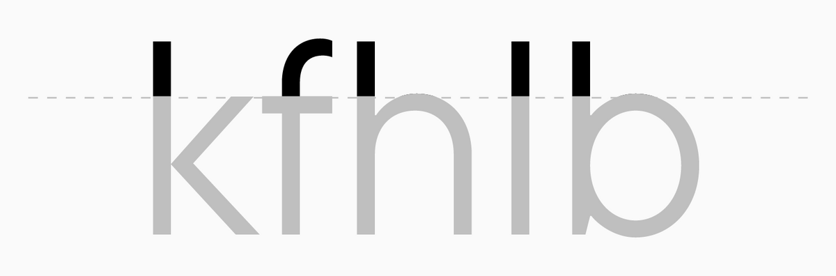
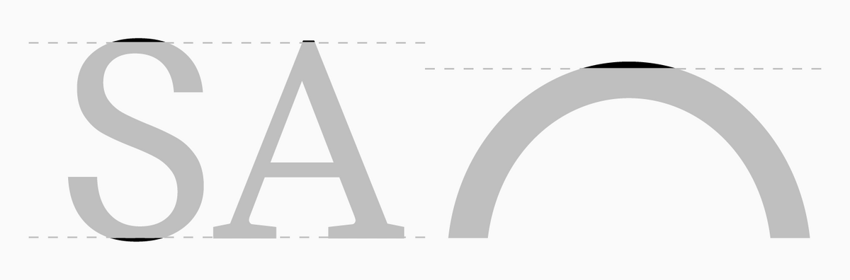
Overhang
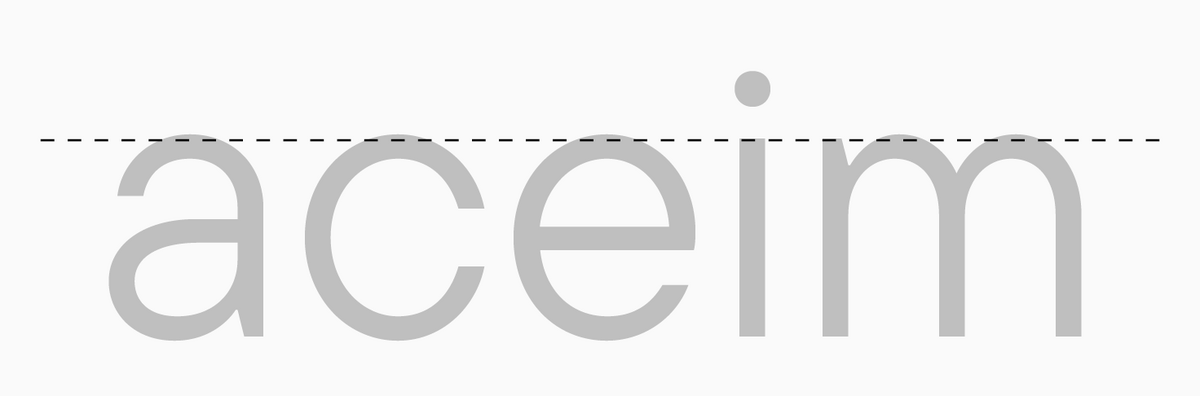
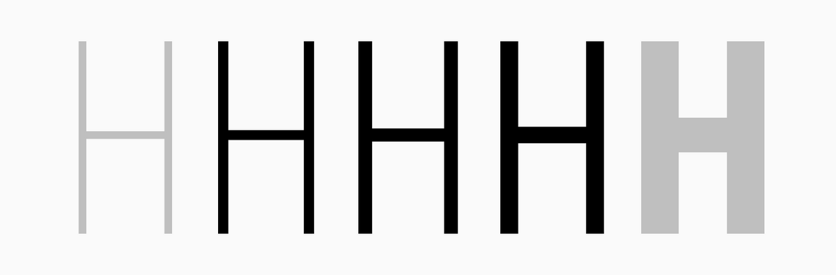
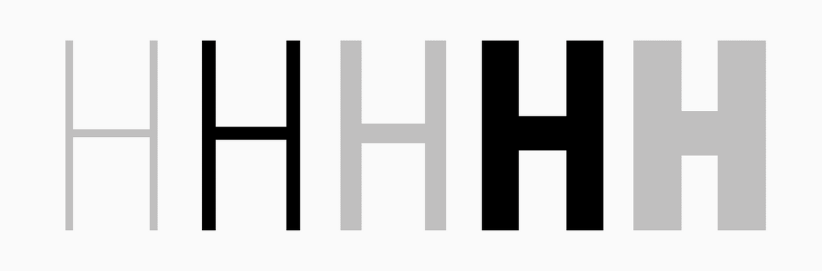
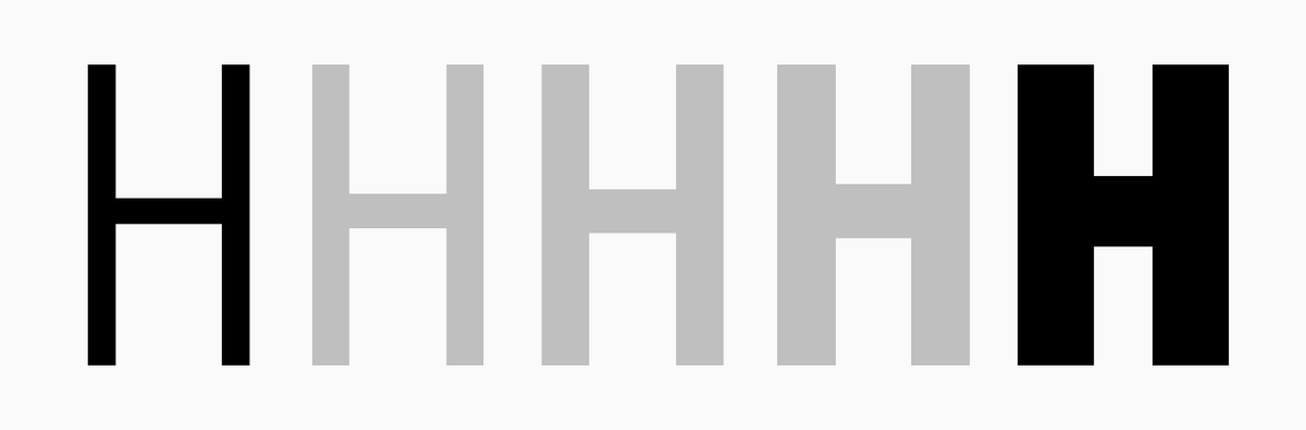
An extension of the outline of a circular characters or apex and vertex of the glyph beyond the baseline or the x-height/cap height line, intended for optical adjustment of the glyphs. Without overhangs, glyphs will seem smaller than the reference letters "Hh" and other upright forms.
Pablo Impallari formula
One of the most popular formulas for calculating stem weights for font families.
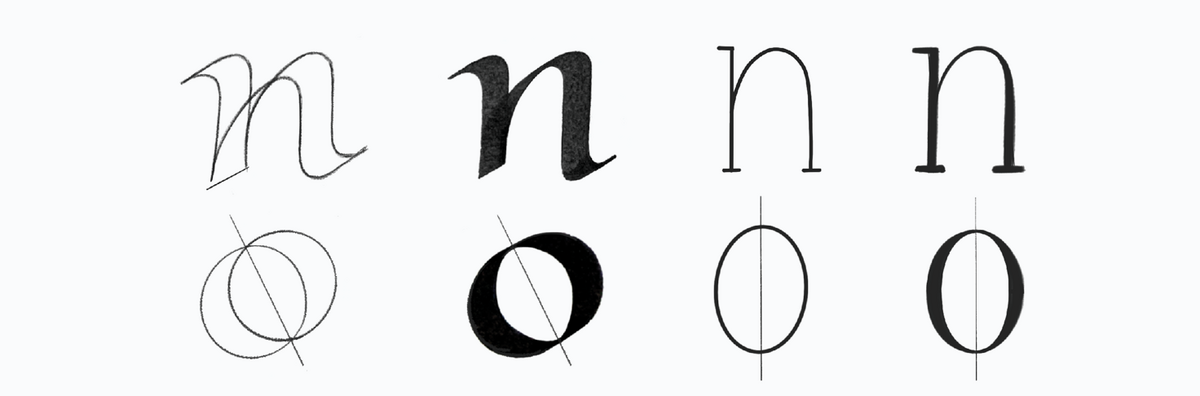
Pen logic
The foundation for understanding font construction rules and their classification. This is a set of writing rules for various historical handwritings, including the concepts of slant, contrast, and pen movement (pointed-nib or broad-nib).
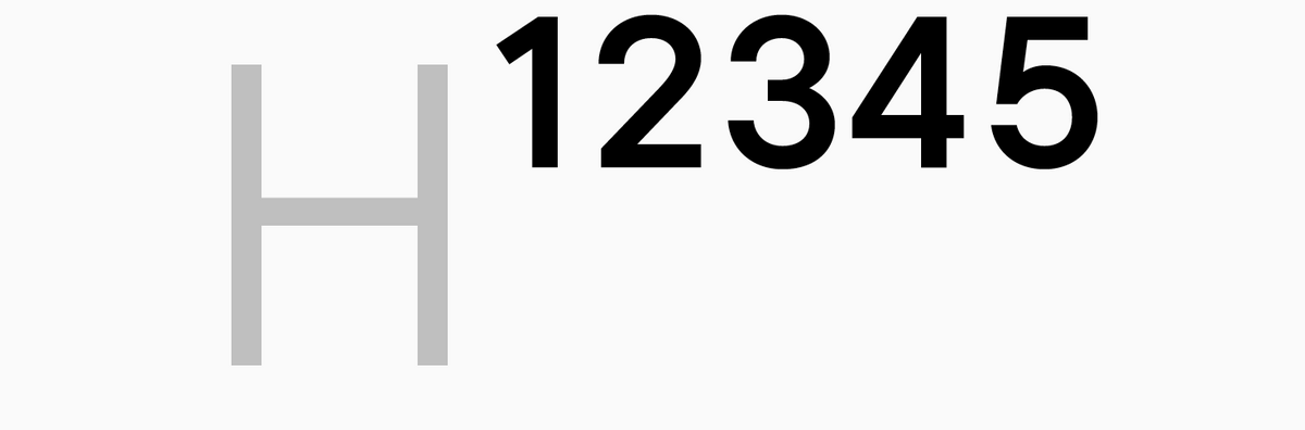
Point
A unit of measuring font size; a basic unit of typometric system. A point equals approximately 1/72 of an inch. In different metric systems, like American or French, these numerical values may differ.
Point size
Character height, their vertical size. It is measured in typographic points.
Raster
A grid of pixels (color dots) utilized to display images on output devices.
Rhythm
A pattern formed by letter spacing and counters and depending on the design of character elements (primarily, stems), their directions and symmetry.
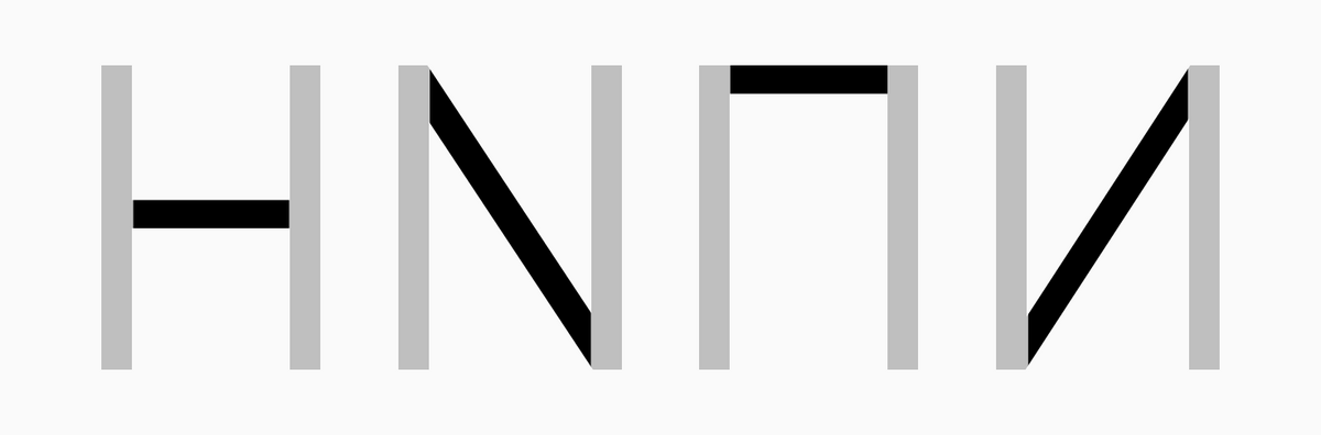
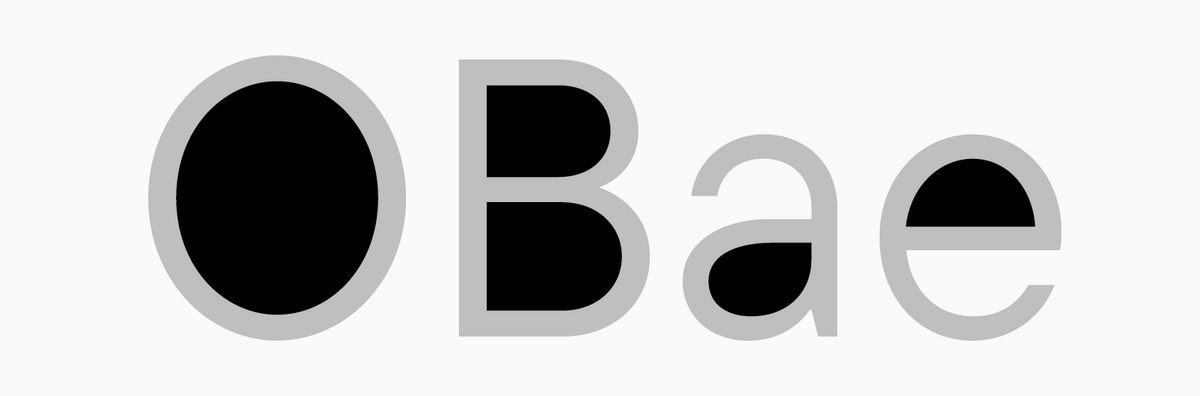
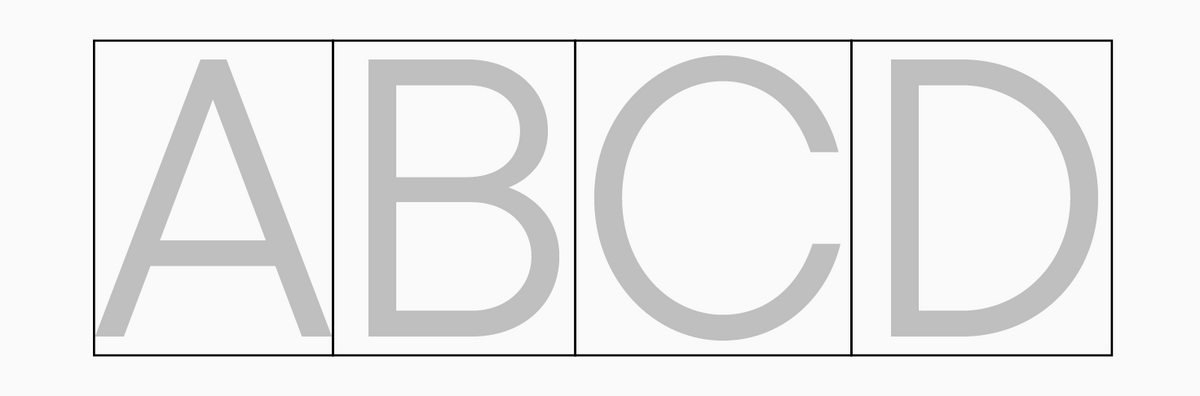
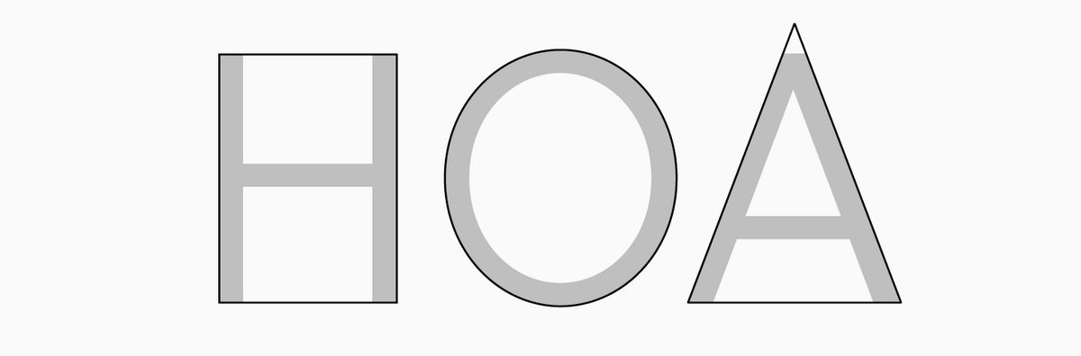
Rounded, rectangular, and triangular characters
Character grouping based on their shape. Rectangular characters are "H", "П", or "F". Rounded characters are "O" or "C", and triangular characters have diagonals like "A", "K", "Y", etc.
Sans Serif
Low or no-contrast font without serifs.
Script
see Handwritten Font.
Serif
Short additional lines at the ends of the character’s main strokes, usually perpendicular. Serifs are typical for Antiqua typefaces and slab serifs.
Shoulder
see Arc.
Single-storey form
A simplified form of the letters "a" and "d" that first appeared in geometric sans serifs and is circle-based.
Slab, slab serif
A font with large, bulky serifs. Slabs are characterized by minimal or no contrast compared to standard serifs.
Small caps
Character forms that feature the graphics of uppercase letters but are reduced in height and weight. These forms are often a little higher than the lowercase characters, but according to the Latin tradition, they may have the same height as the lowercase characters. Small caps are used in abbreviations or other situations requiring typing running text in uppercase letters.
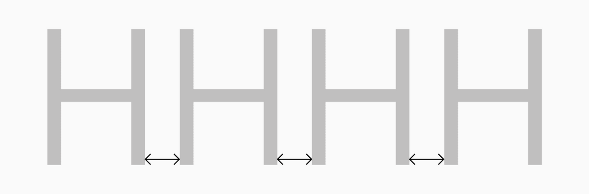
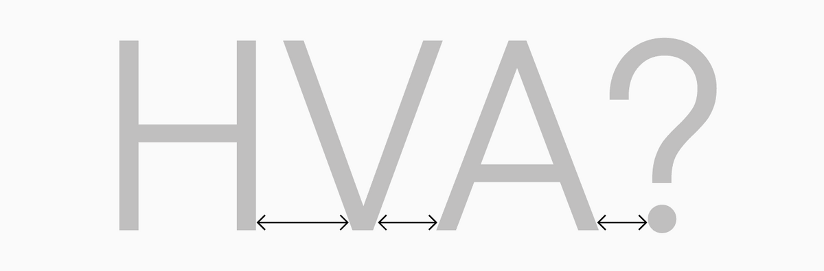
Spacing
A general term for a set of all horizontal intervals around each glyph in a font: sidebearing and kerning settings. Spacing can be tight or loose.
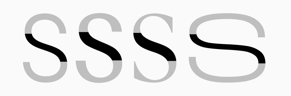
Spine
The central curved stroke of the Latin letter "s" and related glyphs.
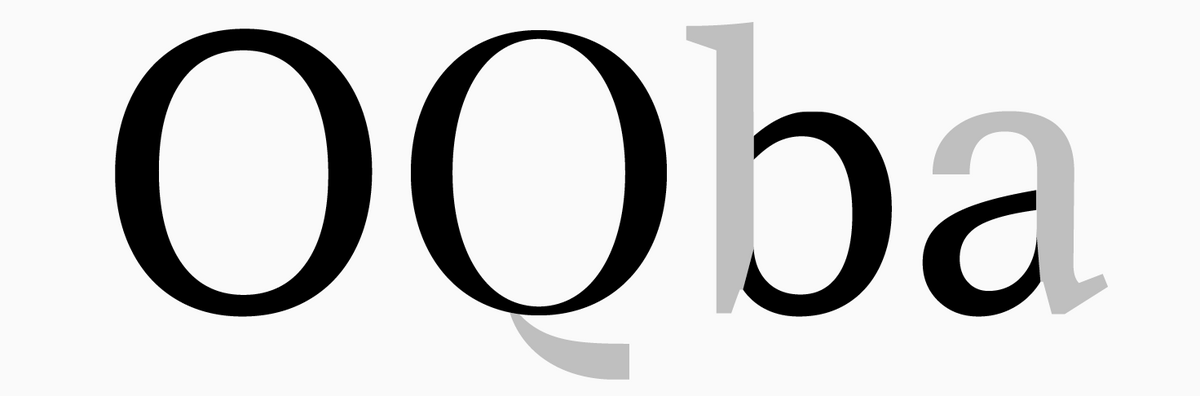
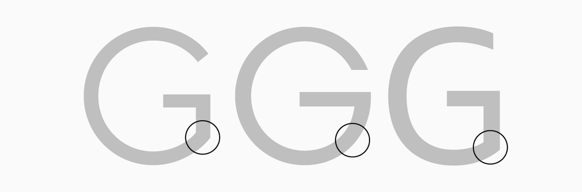
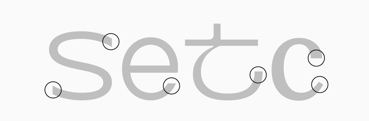
Spur
A small extension, forming the part of the stem at the junction point in some forms of letters like "G" or "d".

Spurless junction
The opposite of the intersection with a spur existing in some forms of letters like "G" or "b".
Static fonts
Fonts characterized by their origins in pointed-nib pen writing. They feature high contrast and less dynamic proportions (all letters tend to be equal in width, with a straight oval axis). Such fonts usually have narrower glyph proportions than dynamic ones. The glyphs visually move towards uniform width, the aperture is closed.
Stem
The key dominant vertical (or diagonal) stroke.
Stress
The maximum thickening area of the arc in round characters or rounded elements.
Stroke ending
See Terminal.
Style
Visual characteristic of a font. Within one font style, all characters are designed with consistent weight and width or, for instance, are all slanted. So, a font family can include different font styles united by one particular trait, and a typeface unites different subfamilies.
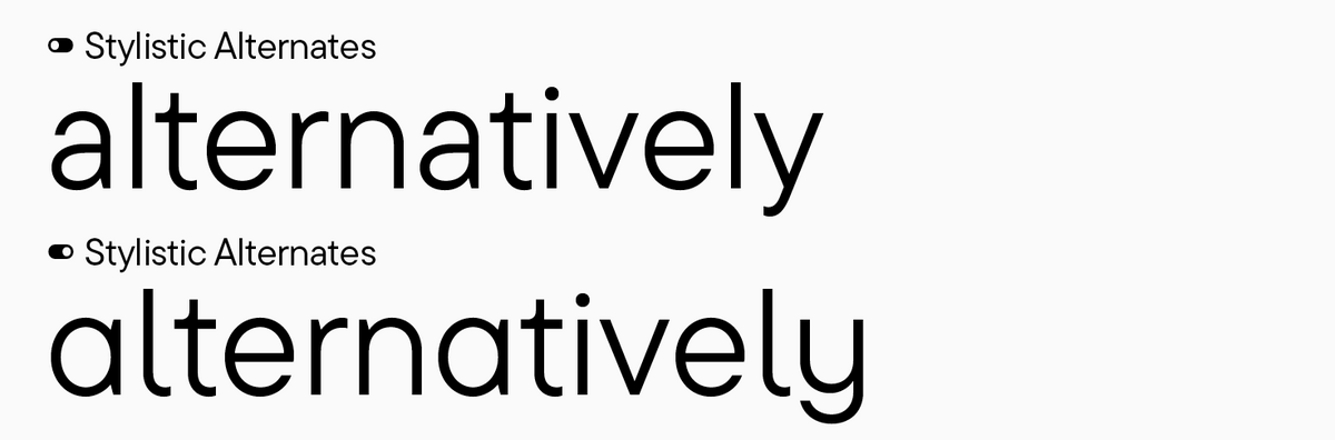
Stylistic alternates
Alternate glyph forms integrated into a typeface. For example, the basic font character set may include a double-storey "a", whereas a single-storey "a" will be in the set of stylistic alternates. Alternate characters can be turned on in OpenType features.
Subfamily
A font set inside the typeface that is united stylistically by slant, weight, width, etc.
Superiors
Smaller forms of lining figures used for footnotes and mathematical expressions.
Tabular figures
A set of figures with equal em-spaces (can also be called monospaced). They are designed in different letter cases and used for easy table filling.
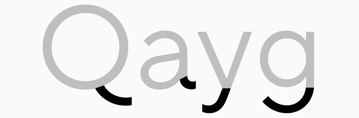
Tail
Curved descender of letters like "Q" or "y".
Terminal
A straight or curved stroke ending.
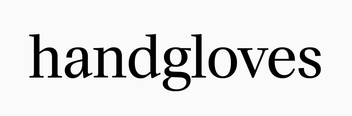
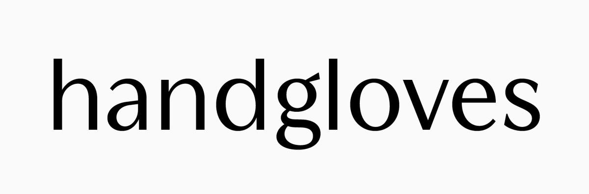
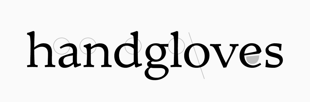
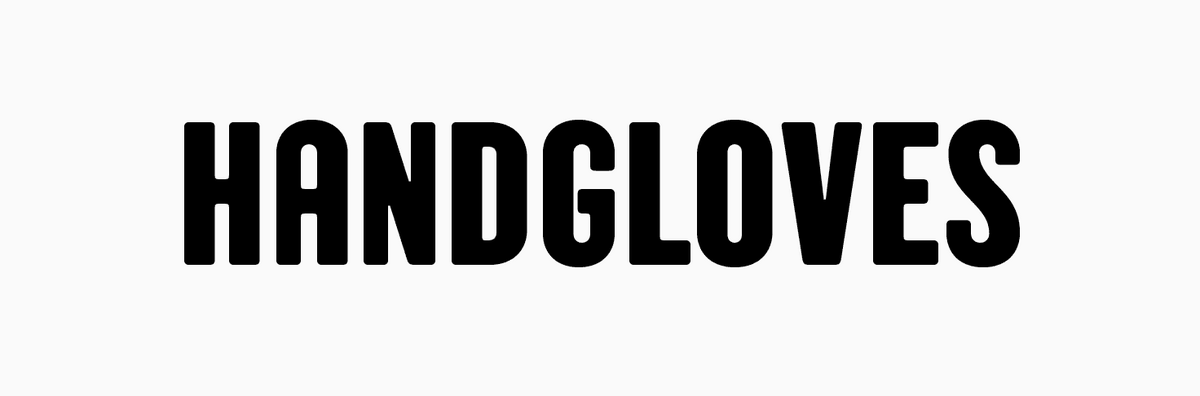
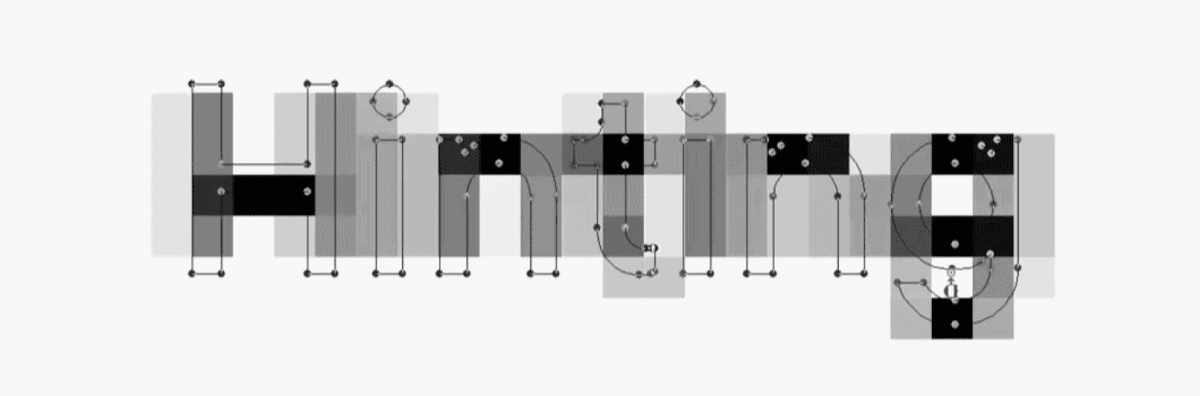
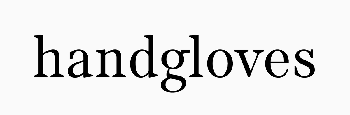
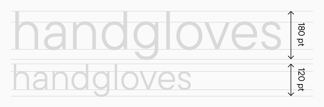
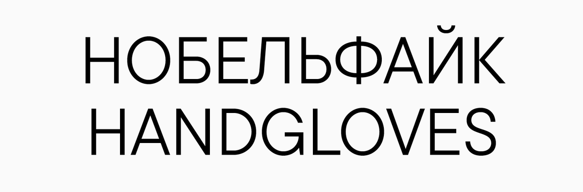
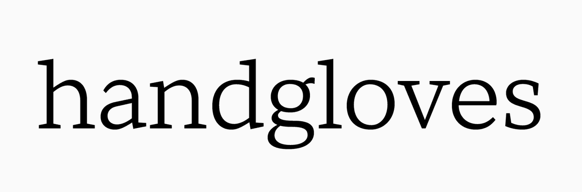
Test words
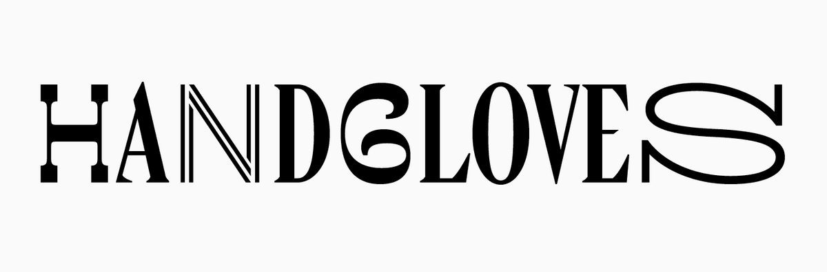
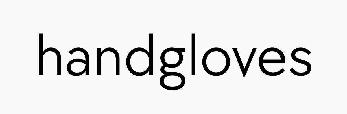
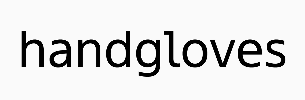
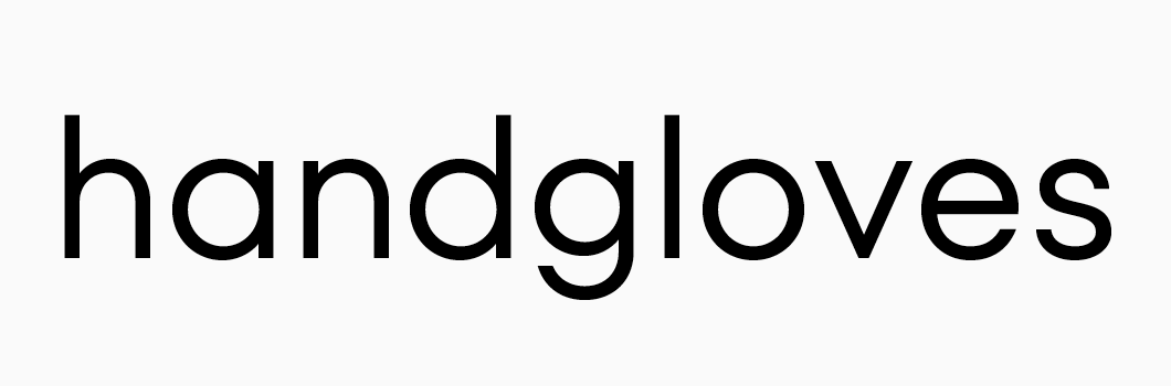
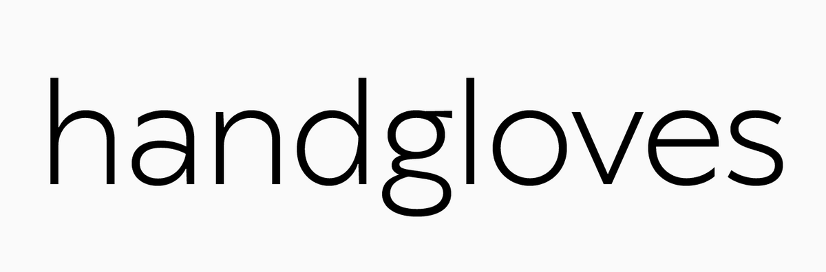
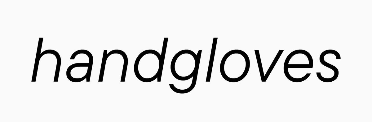
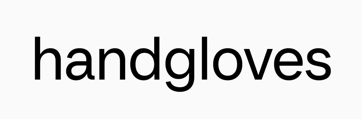
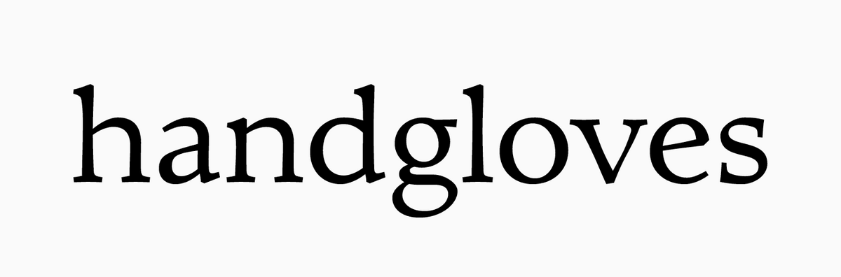
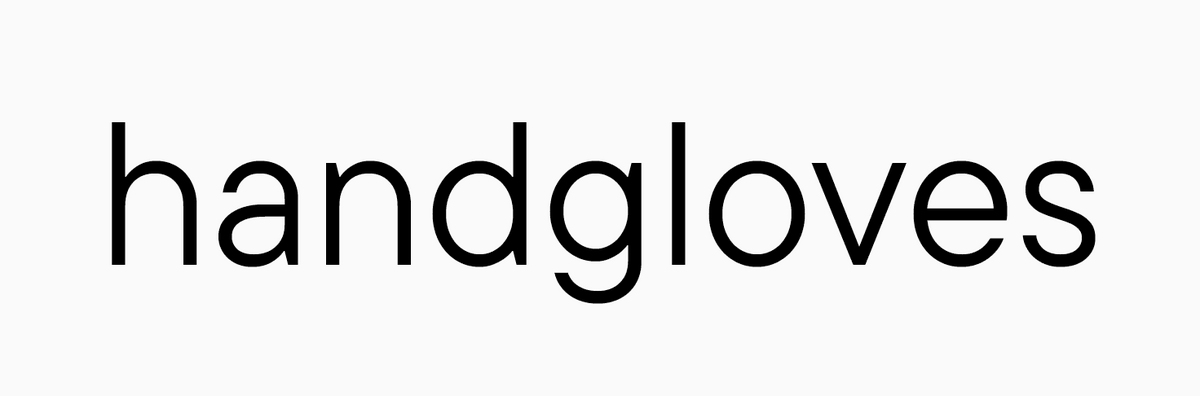
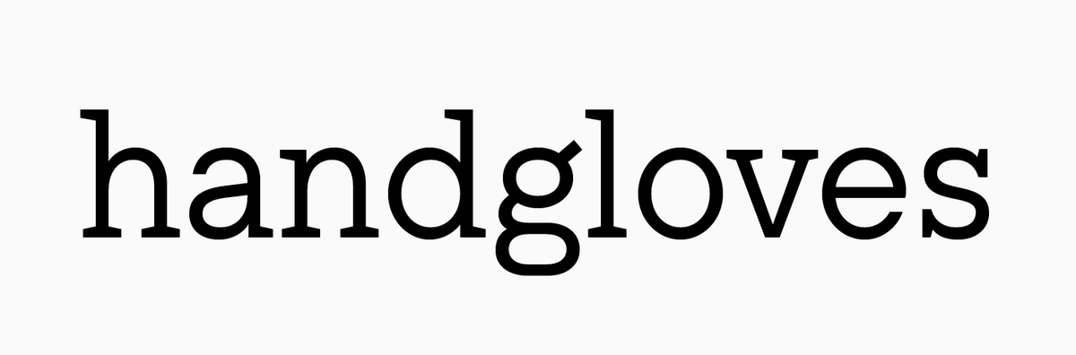
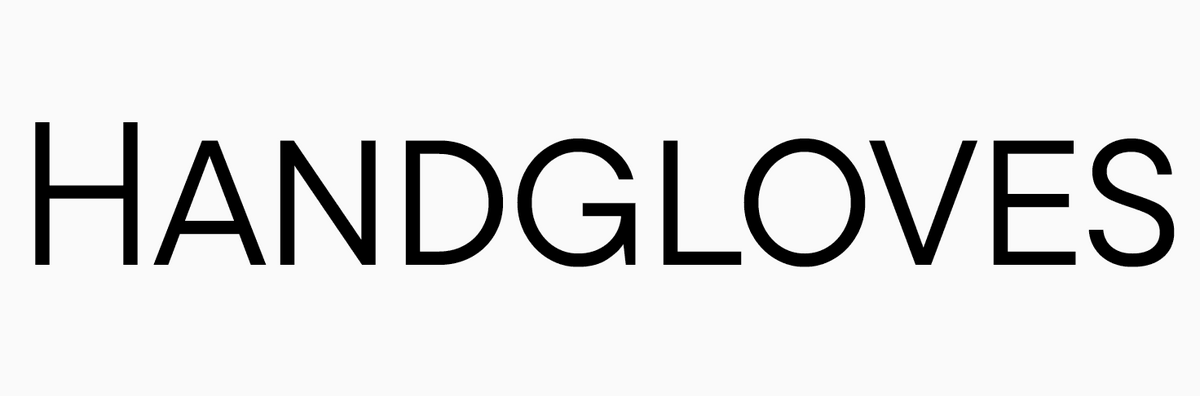
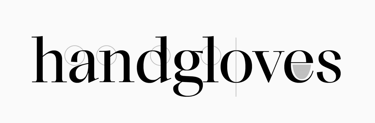
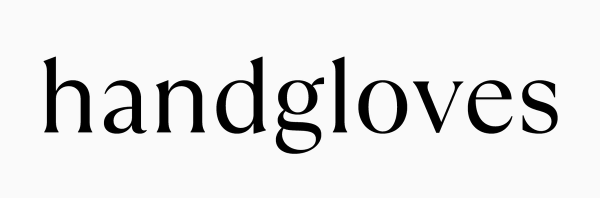
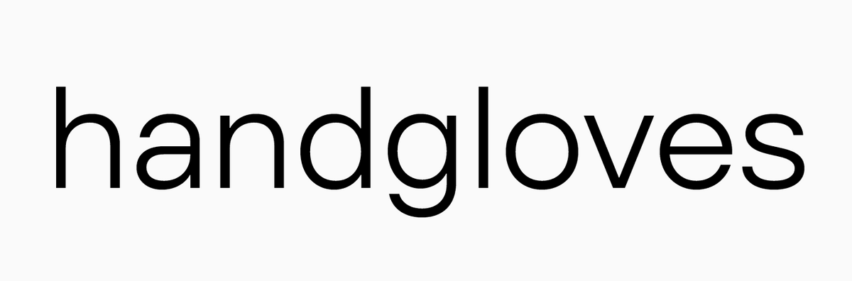
Non-existent words НОБЕЛЬФАЙК (or КИБЕРНОСУФА) and HANDGLOVES traditionally used by font designers at the start of the font development because these words contain the majority of style-defining font features.
Text typefaces
Simple and neutral fonts without excessive details. They are easy to read and suitable for typing running text.
Transitional serif typefaces
Are named so because, historically and graphically, they transition from Old Style to Modern Antiquas. It is generally accepted that Transitional serifs appeared in the middle of the 18th century. Visually, the Transitional serifs have a more refined, contrasting, and hand-drawn style compared to the Old Style serifs.
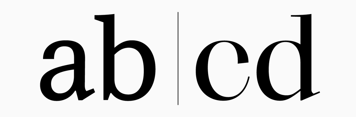
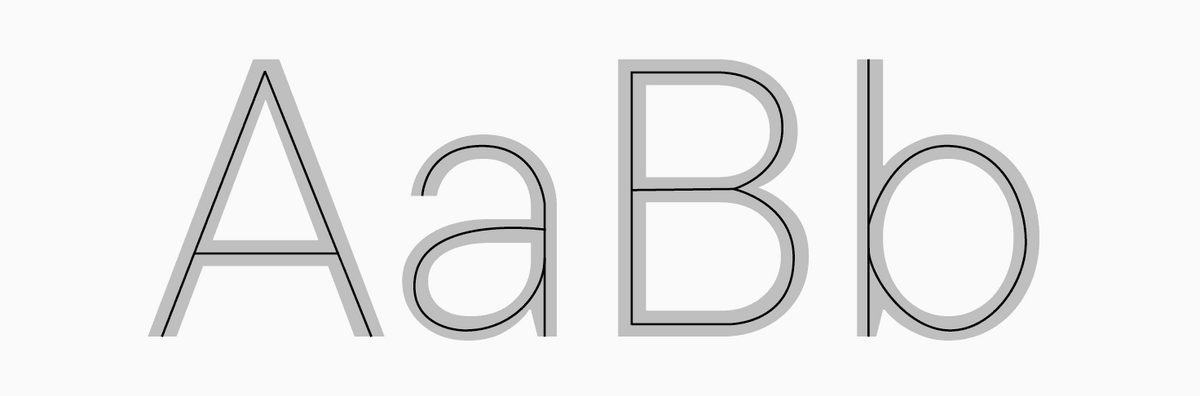
Type, Font, Typeface
A font used for typing text with a printing press or computer and can be both text and display. Opposite of lettering.
Typeface
(font family)—a collection of fonts united by certain characteristics (stylistic and technical). Fonts with varying styles (roman, italic, light, bold, etc.) can form part of the same typeface.

Unicode
An international character encoding standard that supports the majority of the world’s writing systems, including their non-alphabetic symbols. Unicode provides a unique number for every character.
Uppercase
Capitals in a font. Uppercase letters are used for the beginning of sentences, proper nouns, geographical names, etc.
Upstroke
An ascending diagonal stroke (for example, the left stroke of the letter "A").
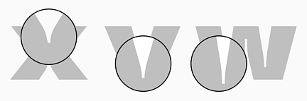
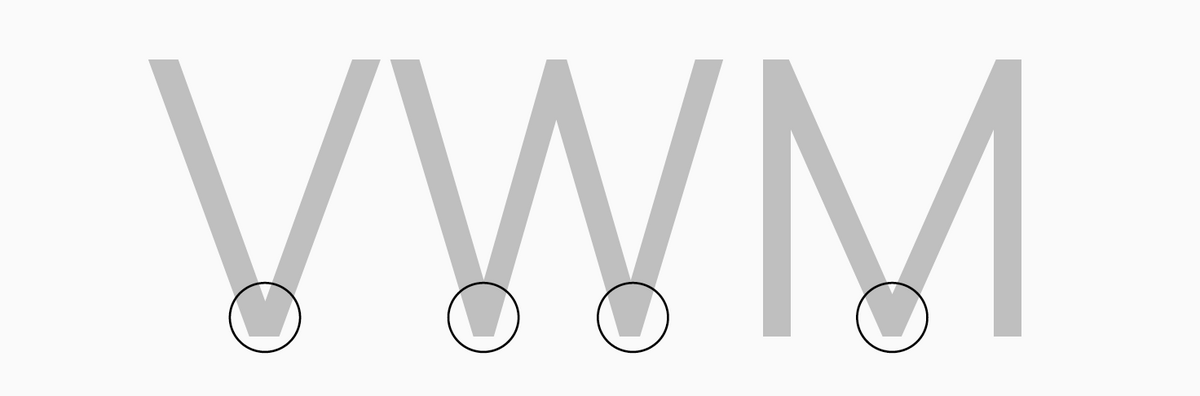
Vertex
The intersection point of two strokes (both diagonal or one vertical and one diagonal) at the bottom of certain letters like "V" or "W".
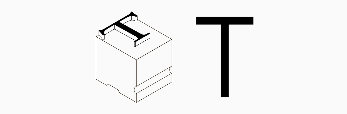
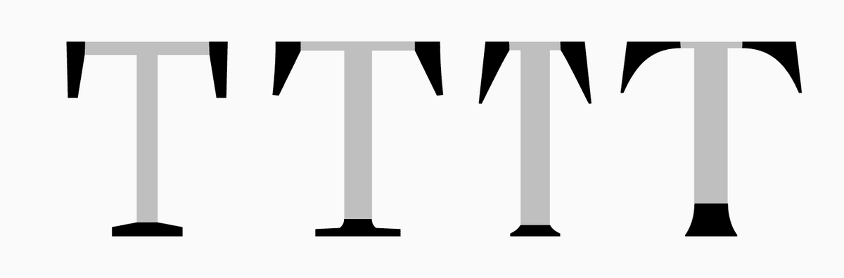
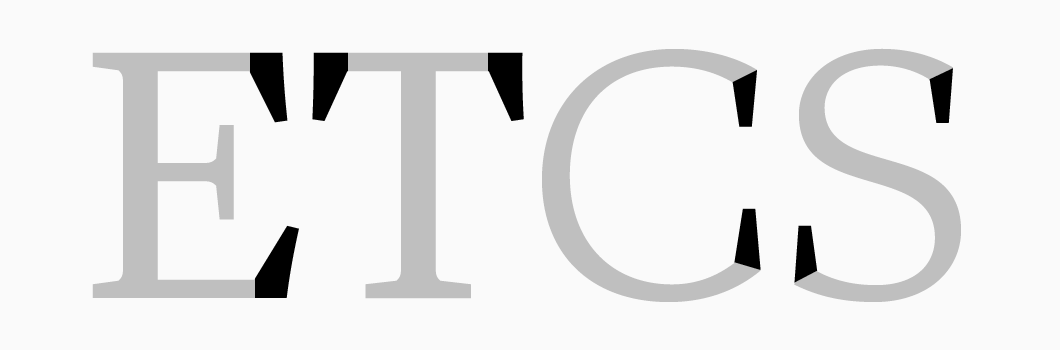
Vertical serif
A serif at the end of the horizontal elements of the characters like "E" or "T" and terminals of characters like "C", "S", etc. In some fonts, vertical serifs of lowercase characters transform into drops (characters like "a" or "c").
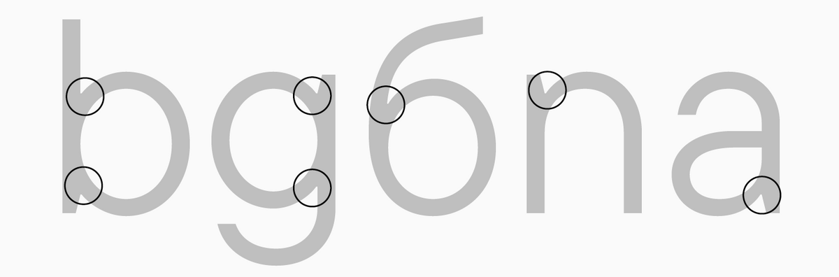
Visual compensations
Graphic techniques used to correct undesired effects that may appear in fonts in particular use scenarios (for example, when printing or typing in a small point size). One of the popular methods is thinning certain glyph elements in bold font styles.
Waist
An imaginary line passing through the optical center of a character. It can be high or low, depending on the font type and style.
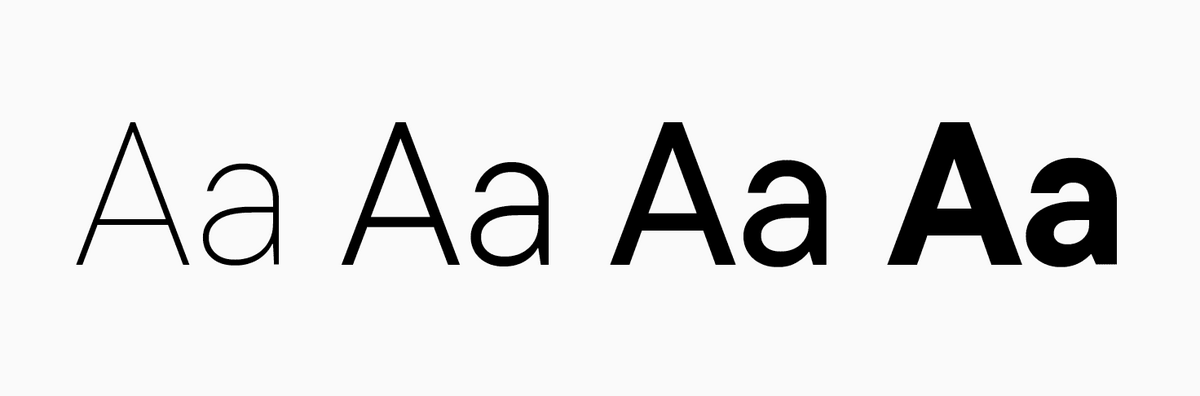
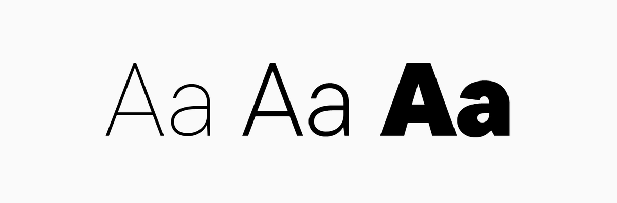
Weight
Character element thickness in relation to the height. Fonts can be light (e.g., Thin or Light font styles) and bold/dark (e.g., Bold or Black font styles).
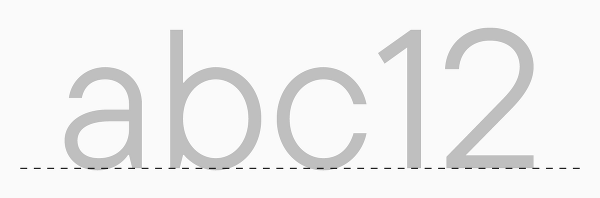
X-height
A determined height parameter of lowercase letters within one font, excluding overhangs.