The bestseller TT Norms® Pro—a geometric sans serif, trouble-free workhorse
Fonts similar to DIN
- All fonts 74
- Sans Serif 48
- Serif 27
- Slab Serif 6
- Display 40
- Script 10
- Variable 46
- Font sale 14
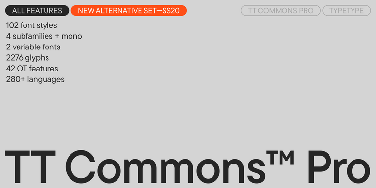
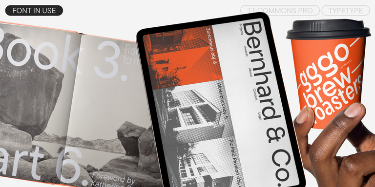
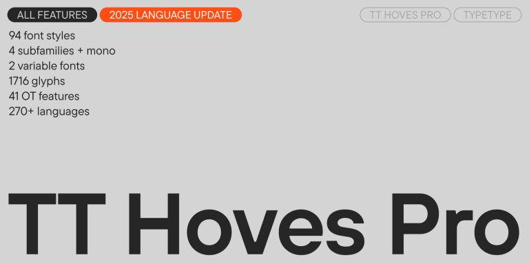
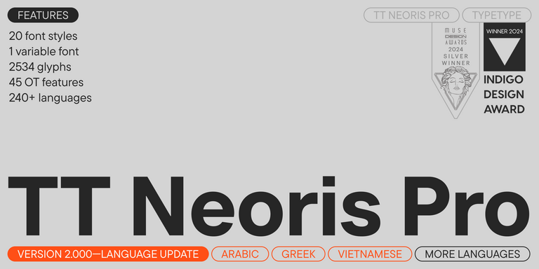
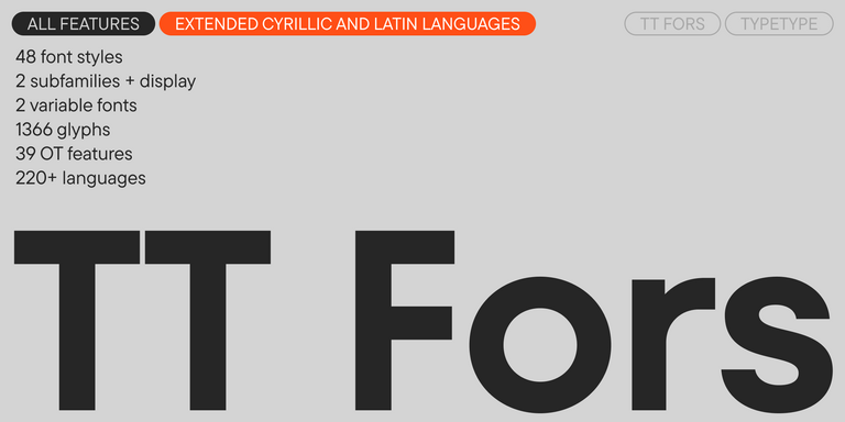
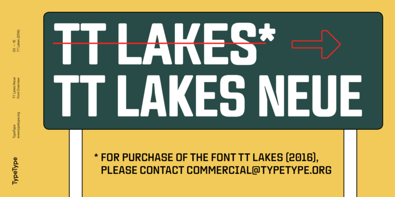
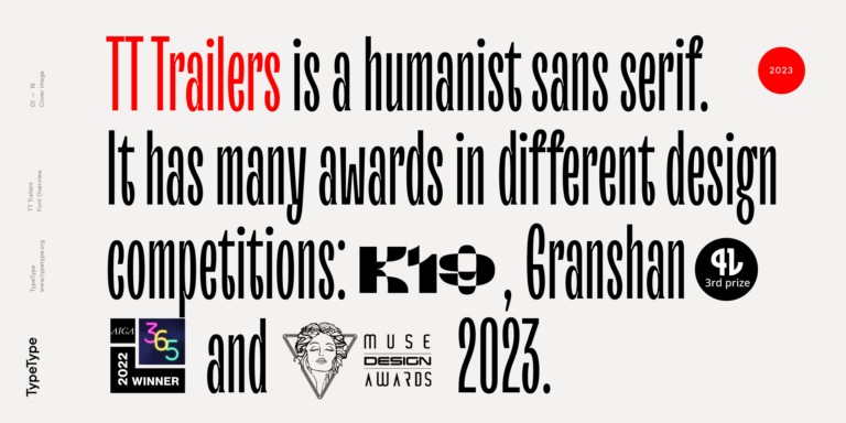
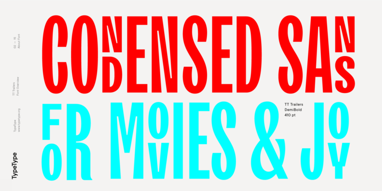
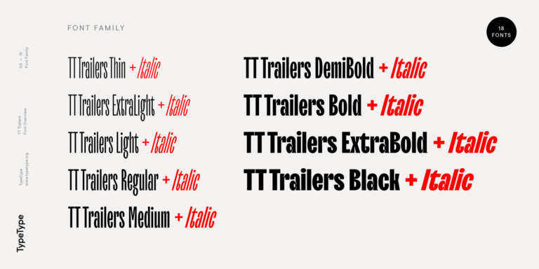
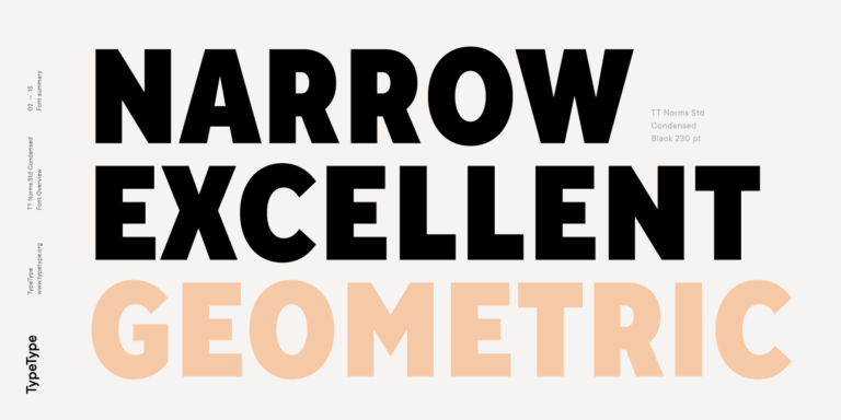
If you are tired of overused typefaces and are looking for fonts similar to DIN, check out our best free-to-try DIN alternatives, which have similar characteristics as well as new, unique design features. Some of the fonts belong to the same type category, and others are suitable for the same tasks or have similar traits but stand out for their distinct details or proportions.
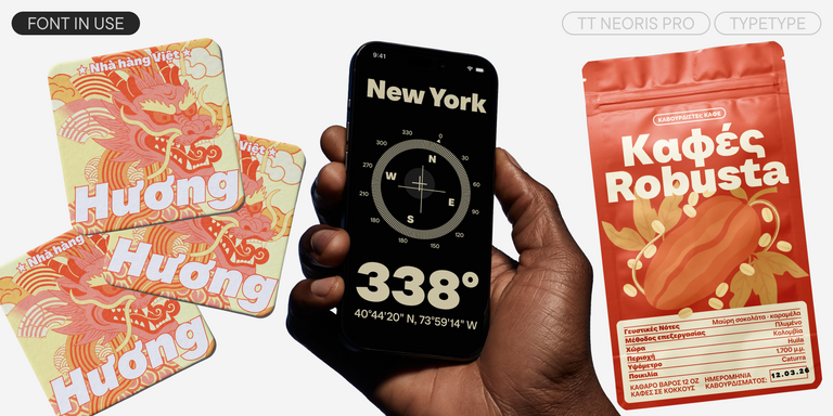
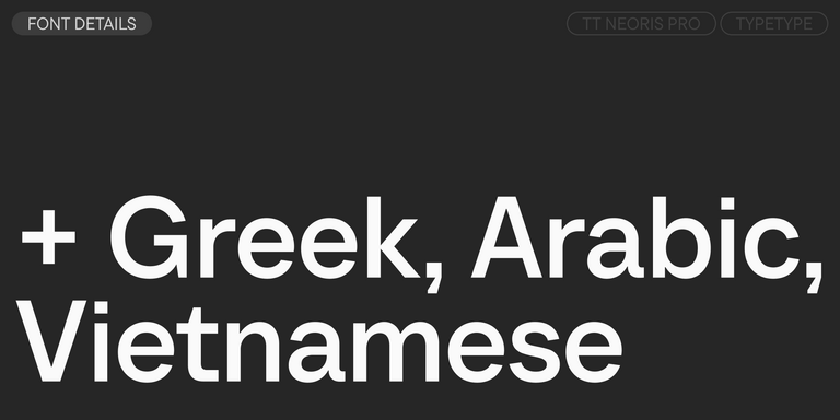
At TypeType, you’ll find cutting-edge fonts like DIN and even better: here are some stunning and not-so-ubiquitous DIN alternatives. Use this list of highest-quality DIN-like fonts as you prefer. Our list provides a broader range of options for choosing the best font match for your project and refreshing your designs. All fonts featured in this collection are available in multiple formats and at affordable prices, so you can find one to fit your every need!
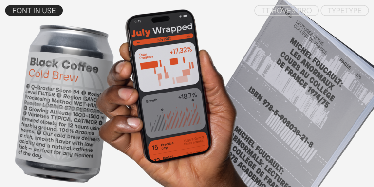
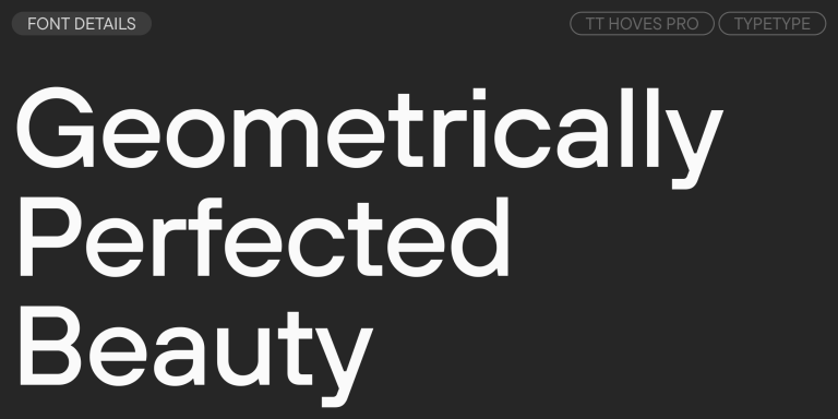
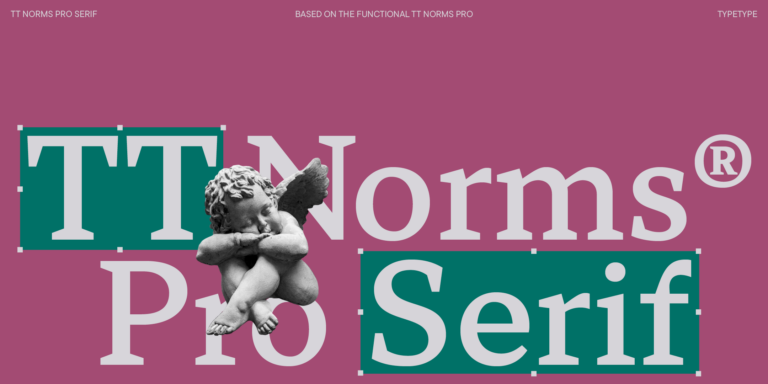
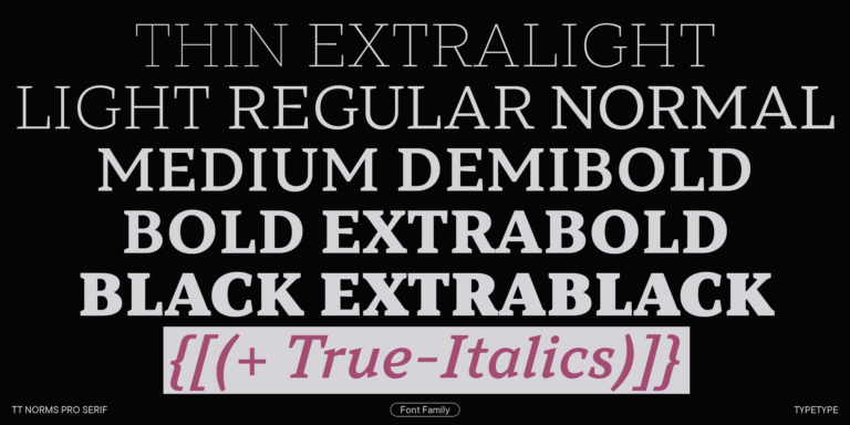
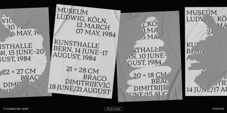
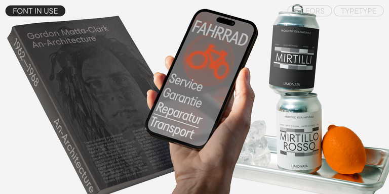
Find a great DIN replacement font and try to recreate a similar mood and capture the feeling you aim for by using it in your designs. Each font presented on this page is a twin of the DIN font, practically identical to it.
- The quick brown fox jumps over a lazy dog.
- Pack my box with five dozen liquor jugs.
- Sphinx of black quartz, judge my vow
- 0123456789 !?.,:;—–()[]{}<> “quotes” ‘apostrophe’ @#%&*_+=/\| № $ € £ ₽ +−×÷=≠≤≥ … % © ® ™
- Aa Bb Cc Dd Ee Ff Gg Hh Ii Jj Kk Ll Mm Nn Oo Pp Qq Rr Ss Tt Uu Vv Ww Xx Yy Zz
TT Commons™ Pro is a completely redesigned version of the well-established classic font family TT Commons.
TT Hoves Pro is a versatile sans-serif with a recognizable geometry
We continue to expand the line of the studio's main bestseller TT Norms® Pro!
TT Neoris is an elegant Neo-Grotesque with unlimited potential and a font that encompasses all modern requirements and user desires.
TT Supermolot Neue is a redesigned, extended, and greatly enhanced reincarnation of the popular font family
TT Bells combines the elegant softness of Antiqua with a complex and daring temper reflected in straight stroke terminals and arrowheaded serifs. The typeface is based on the broad nib, which creates these hallmark terminals and serifs.
TT Jenevers is a modern serif with a Dutch flavor. The font family features the characteristic details peculiar to Dutch serifs—these are the asymmetrical shape of serifs and an irregular slant of ovals.
TT Regins is a Scottish modern serif. Striking contrast and sharp triangular serifs give this font a stern and commanding character, while refined forms, enlarged lowercase letters, and slightly condensed, static proportions add grace to its design.
TT Bakers is a fluid serif with a gentle and lively character. This font is like freshly baked goods: it`s warm and soft, especially in its bolder weights.
TT Firs Neue is a contemporary reincarnation of the good old TT Firs sans serif.
TT Fors is a modern geometric sans serif with characters and shapes contrasting in width.
TT Tricks is a modern text serif with a design reflecting the style of Transitional serifs. This font has a calm, elegant, and moderately stern character.
TT Cometus is an expressive typeface that captivates from the first time.
TT Travels Text is a geometric grotesque with wide proportions and specific shapes of circles and fillets, which includes two stylistic sets with completely different natures.
We have released a brand-new font. Meet TT Firs Text—a geometric sans serif with a Nordic character!
A technological font family for game design
The starting point of the TT Trailers project was the idea to develop a new generation of narrow typefaces for use in movie credits and posters.
TT Marxiana Elzevir is a title or header font and is a compilation of monastic Elzevir that were actively used in the Niva magazine for all its prints.
TT Norms Condensed continues to develop the ideas of neutrality and versatility stemming from our bestselling TT Norms.
The TT Tsars font family is a collection of serif display fonts that are stylized to resemble the fonts of the beginning, the middle, and the end of the XVIII century.
TT Corals is a modern humanistic sans serif which has many typical traits of the beginning of the 20th century. For an increased functionality of the font family, we`ve created 6 styles of various weights.
