top_banner_ttnormspro0426
TT Globs
4 styles
Type foundryFonts & StylesVariableTT Globs

TT Globs

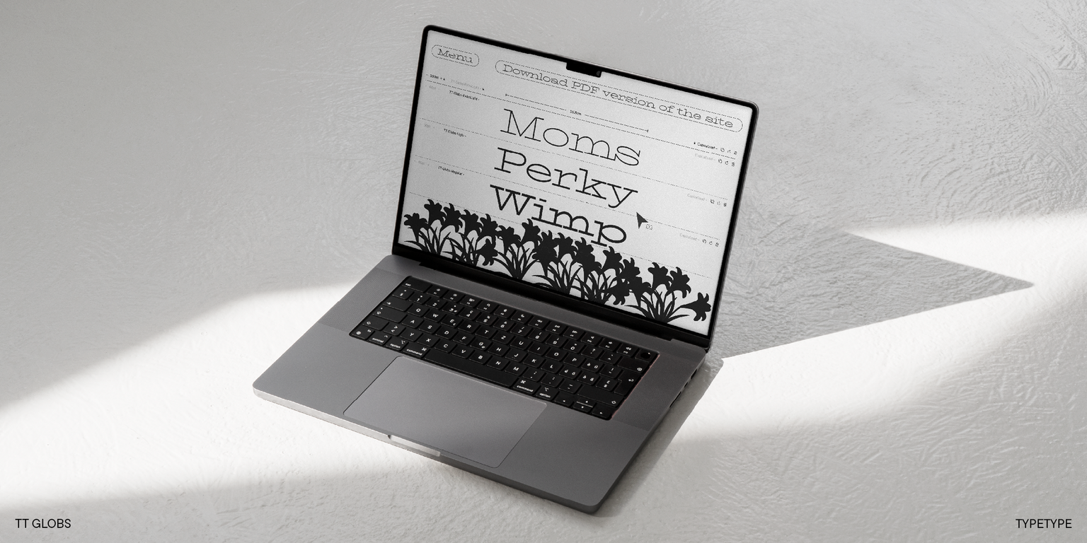
TT Globs is a summery slab serif with wide proportions and friendly personality. It is perfect for projects requiring warmth and distinctive character.
Single style: from $43.99
Full family: from $109 4 styles

Buying Options

To purchase a font, first select the styles you need, then choose your licenses and proceed to checkout. To test the font in your project, download the free trial version.

Select at least one style before choosing licenses

To purchase a font, first select the styles you need, then choose your licenses and proceed to checkout. To test the font in your project, download the free trial version.
Package offer:
per style $27.25
from  $109
4 styles
from  $109
from $43.99
from $43.99
from $43.99
from $99
from $99
1 style
from $99
from $99
Package offer:
per style $33
from  $99
3 styles
from  $99
from $43.99
from $43.99
from $43.99
On request
Perpetual
On request
On request
Perpetual
On request
On request
On request
On request
On request
On request
On request
On request
Perpetual
On request
On request
Perpetual
On request
On request
Perpetual
On request
On request
Perpetual
On request
On request
On request
On request
On request
Your order:
Nothing selected yet

Select styles first, then licenses.

Questions about the font or licensing?

Testers

TT Globs
Size
Features
Turn on all

The main visual feature of TT Globs are the long display serifs

TT Globs
Size
Features
Turn on all
Variable axes
Weight

Thanks to the long serifs and rather narrow spacing, the result of working with the text will always be a little different, and depending on the words you choose, you can even create particular images. In addition, TT Globs stands out by its very wide letter proportions, tall lowercase characters, and long ascenders and descenders. To mix up the rigid font rhythm, we created asymmetric wave-like terminals and flowing elements in some letters.

TT Globs
Size
Features
Turn on all

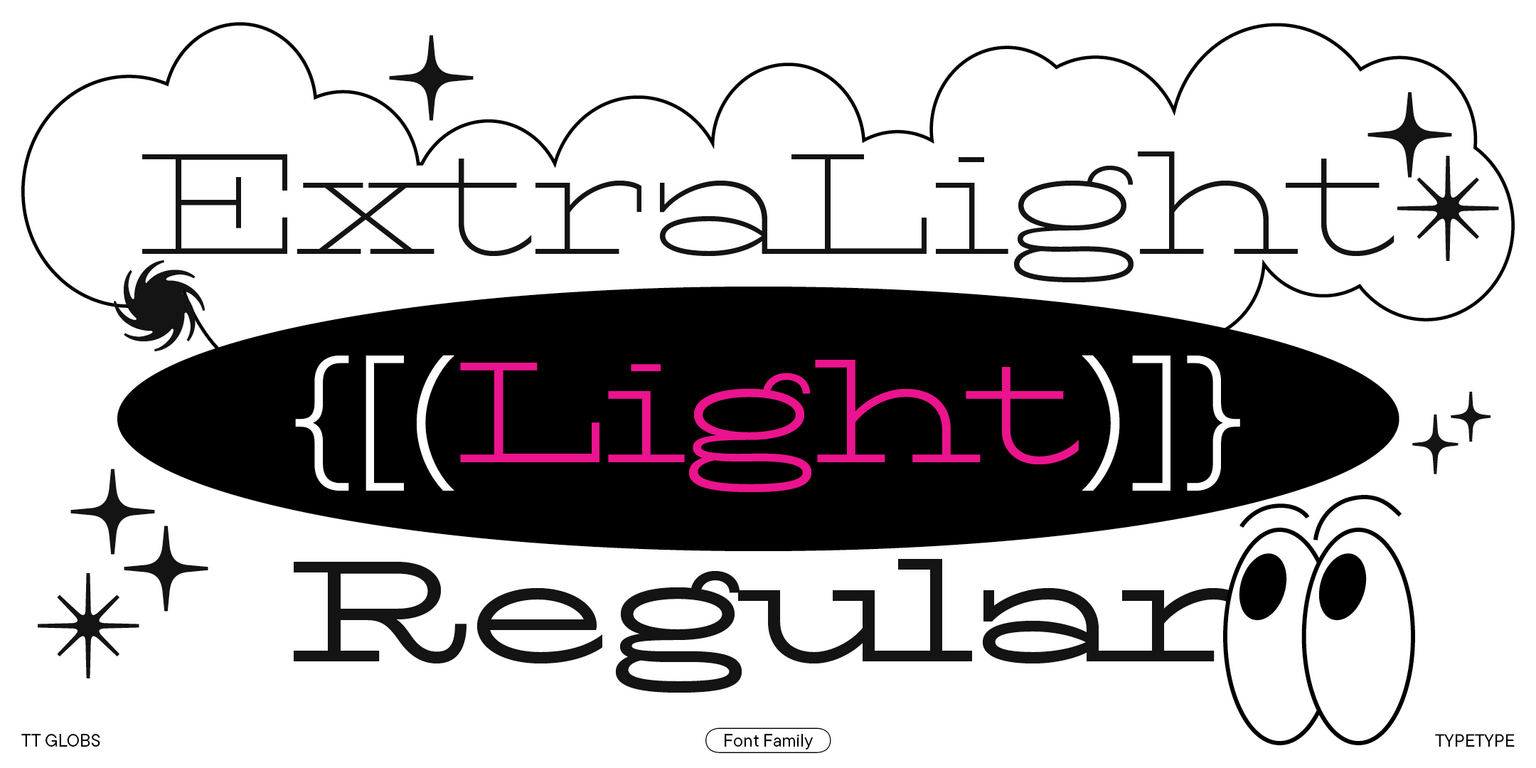
The family consists of 4 font styles: 3 upright and 1 variable font

TT Globs in design

Description

About font family TT Globs
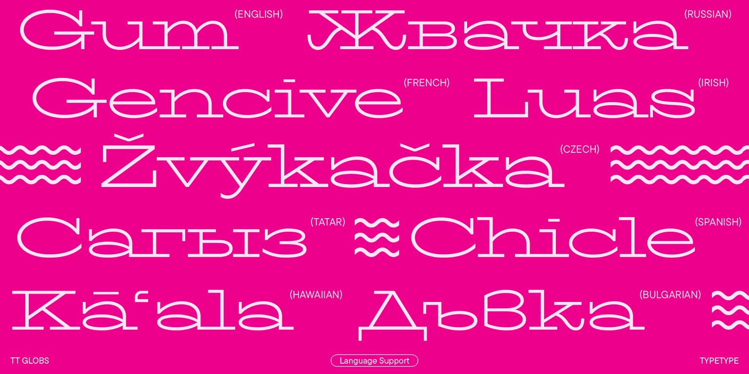
230+ Language support

Introducing the updated TT Globs, which now supports Cyrillic alphabets! This charismatic typeface now boasts a significantly expanded character set and functionality.

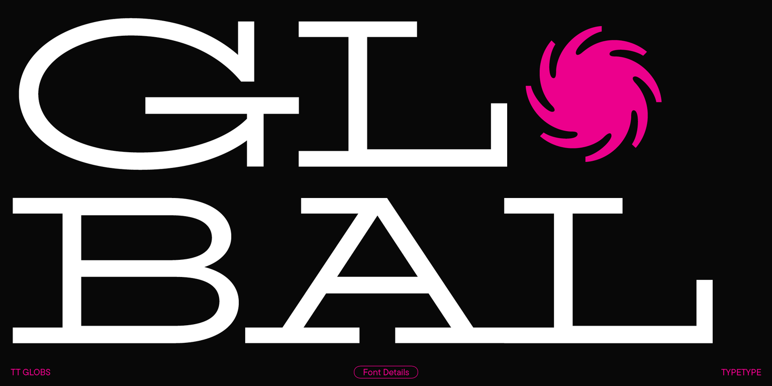
TT Globs is a stylish, wild-proportioned slab serif with a friendly nature and summer vibes. When we designed it, we aimed to combine historical slab serif forms with modern font design concepts. As a result, we got a relevant, fresh, and distinctive designer typeface.

The key visual characteristic of TT Globs is its long serifs that, together with the
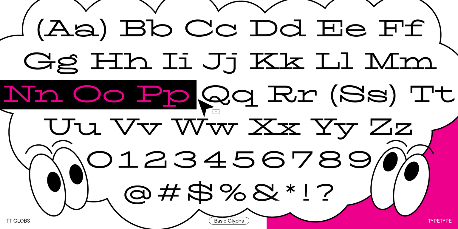
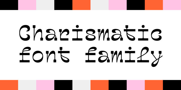
“stretched” proportions, make the text setting resemble a pattern. Curiously, the vertical serifs are also quite long, which emphasizes the closed forms of glyphs and gives the font an extra flair. The typeface’s asymmetrical and wave-like legs and tails, plus fluid elements in certain glyphs, add a touch of playfulness. Some characters, such as Q, R, a, s, g, ß, etc., are particularly interesting to explore.

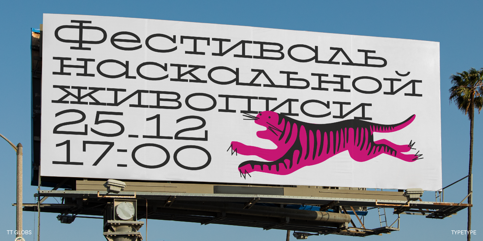
The Cyrillic alphabet characters we integrated into the updated version of TT Globs are highly flexible and have an unusual appearance. Among the particularly intriguing details are the unconventional legs of the letters К, Ж, and Я, and the captivating terminals of the letters У, б, ф.

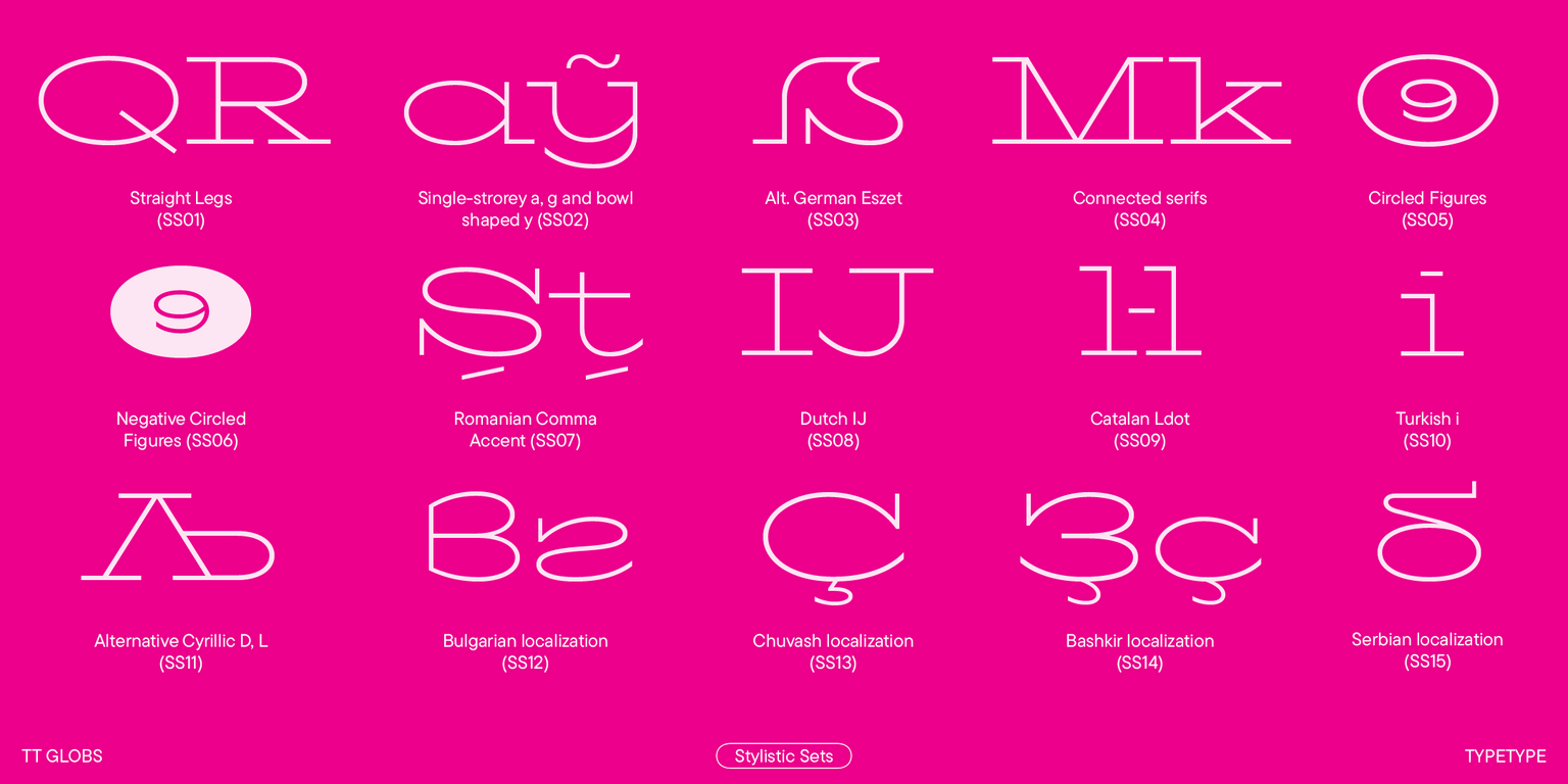
The updated TT Globs also has a significantly expanded character set, renewed kerning, improved hinting, and new OpenType features. We also enlarged the standard set of currency symbols, added a minuscule lettercase, and integrated fractions, figures for numerators and denominators, minuscule figures, and new stylistic sets.

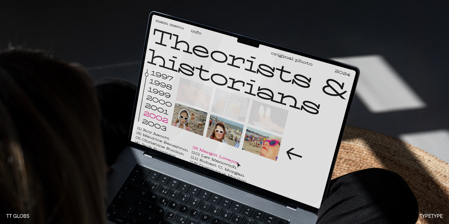
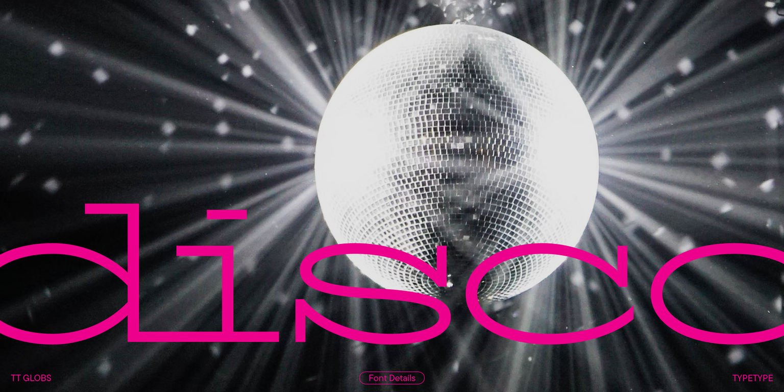
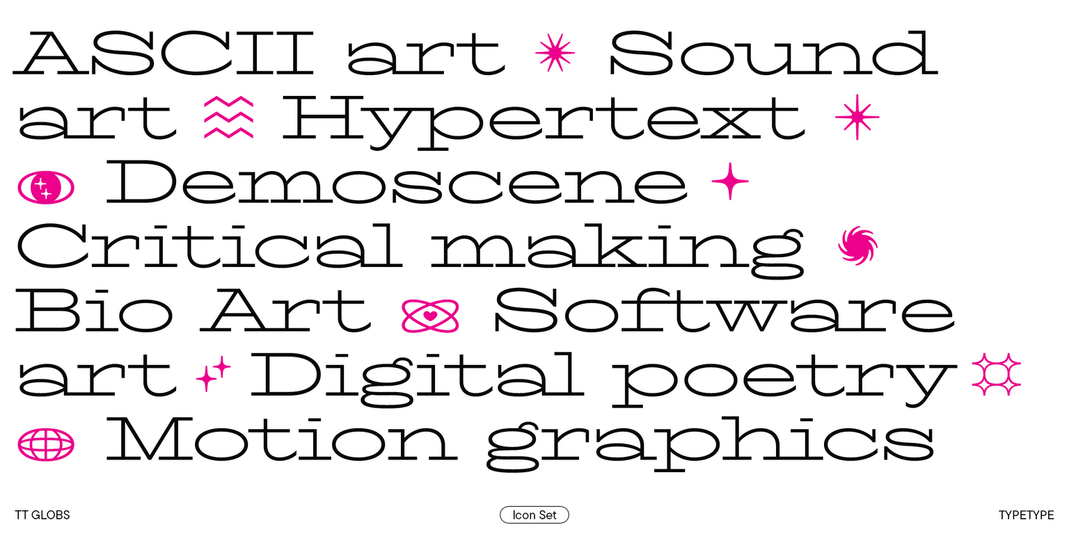
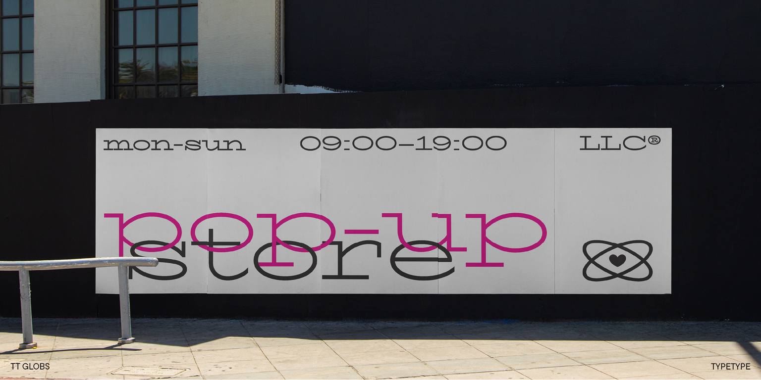
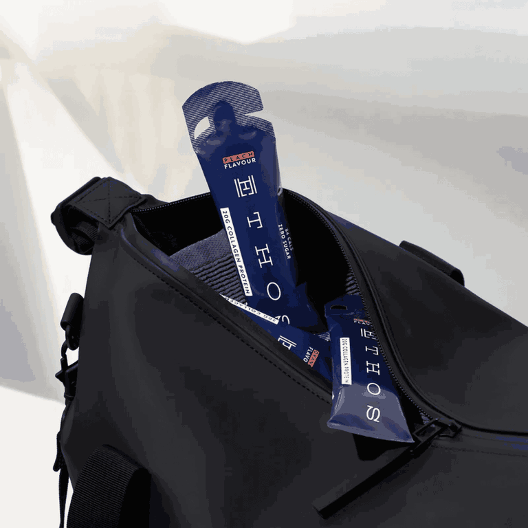
TT Globs is a typeface for special occasions that will match any “font wardrobe” and introduce more variety to the simpler options. This font can easily become part of the brand identity of a music festival, a clothing or jewelry brand with a youthful appeal, a trendy bar, or a street art exhibition.

The updated TT Globs now consists of:

  • 4 font styles: 3 roman and one variable font;
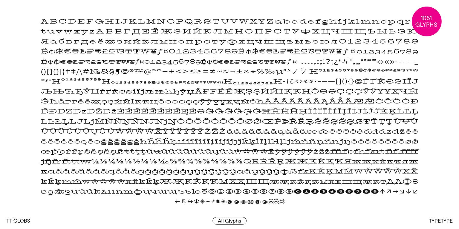
  • 1051 characters in each font style;
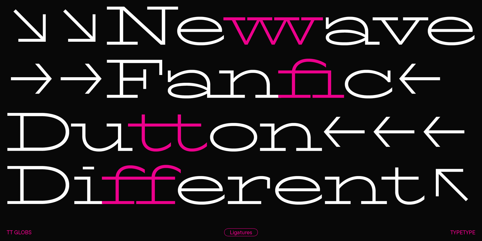
  • 33 OpenType features with the possibility to replace some glyphs with alternates;
  • 230+ languages support.

TT Globs is a bold choice for designer projects!
Team

Antonina Zhulkova
Ksenia Karataeva
Anastasia Vrublevskaya
Stanislav Tikhonov
+ TypeType Team

Release and update date

Release: 5 June, 2021

Last update: 2 April, 2024

What's changed in the font:
  • Expanded character set (1051 glyphs instead of 625);
  • New OpenType features (there are 33 of them instead of 26);
  • Cyrillic-based languages support;
  • 230+ supported languages instead of 170+;
  • Entirely redesigned kerning and improved hinting;
  • Larger basic currency symbol set, a minuscule lettercase for currency symbols, including tabular versions for both lettercases, and currency symbols for Numr and Dnom cases;
  • Fractions;
  • Figures for numerators/denominators and other features;
  • Minuscule figures;
  • New stylistic sets.

Additionally

Specimen

Download font specimen (pdf)

Poster Images

Graphic presentation at Behance

Custom version

Looking for a custom version of this font?

Character Set

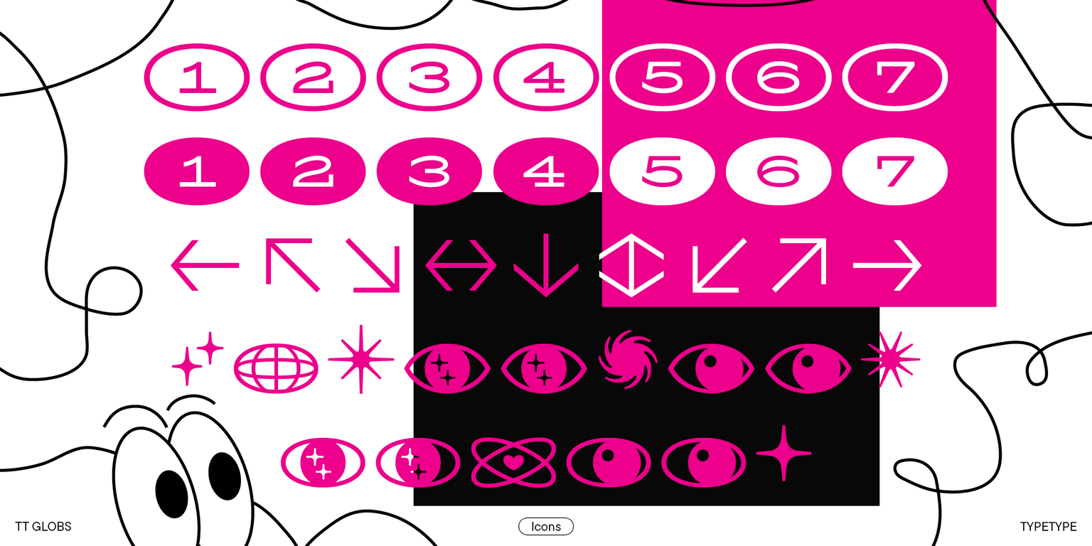
Basic Latin Basic Cyrillic Extended Latin Extended Cyrillic Standard and Discretionary Ligatures|salt,liga,dlig Numerators|numr Punctuation, Symbols, Mathematical Symbols, Arrows Icons Figures Currencies Figures in circles
A B C D E F G H I J K L M N O P Q R S T U V W X Y Z a b c d e f g h i j k l m n o p q r s t u v w x y z

OpenType features

ss01 | Alternative Latin Q, R

QR

QR

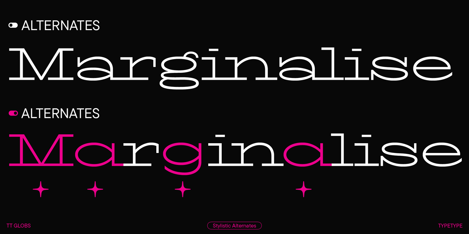
ss02 | Alternative Latin a, g, y

agy

agy

ss04 | Alternative Latin K, M, W, X, k, m, w, x

Kwx

Kwx

ss11 | Alternative Cyrillic D, L

ДЉ дл

ДЉ дл

ss12 | Bulgarian localization

ЛФ тч

ЛФ тч

case | Case Sensitive Forms

[(H)]

[(H)]

Show all

Ideal font pairs with TT Globs

Choosing Combinations for Brand Personality

Typography contributes strongly to how a brand feels: precise, approachable, premium, energetic, traditional, or unconventional. When choosing complementary fonts, start with the personality the project needs to communicate. One typeface can establish the main character while the second brings balance and functionality. Test the combination across several touchpoints to make sure it supports the wider identity rather than only one individual layout. A strong system should remain recognizable across websites, campaigns, packaging, presentations, and other brand materials without becoming visually repetitive.

Why Readability Matters When Combining Typefaces

Strong font pairings should improve the way information is understood, not simply make a layout more decorative. An expressive headline style can attract attention, while the supporting typeface should remain comfortable in longer text, captions, or interface elements. Check spacing, character differentiation, and performance at smaller sizes so that visual contrast supports hierarchy without creating unnecessary reading friction. This becomes especially important in content-heavy layouts, where users need to move quickly between headlines, details, labels, and longer passages of information.

Testing Combinations with Real Project Content

Generic samples are useful for early exploration, but final decisions should be made with actual content. Test brand names, headlines, paragraphs, numbers, navigation labels, and other elements at realistic sizes. If you start with curated recommendations or a font pairing generator, replace the sample copy early. This helps reveal whether the combination works not only visually, but also in hierarchy, readability, and tone. Real content can also expose spacing issues, awkward word shapes, or differences in rhythm that may not appear in short specimen phrases.

Similar fonts

3 font styles
22 font styles
5 font styles
Select licenses
Contact us!