Setting Bulgarian in Latin script looks simple until transliterated names, addresses, and bilingual layouts start exposing gaps in a typeface's character set. The Bulgarian (lat) fonts selection gathers TypeType families that, according to the studio, include the Bulgarian (lat) alphabet. Romanized text can then run through headlines, interfaces, and print without substitutions, mismatched glyphs, or broken spacing.
The Challenge The Bulgarian (lat) fonts selection Solves
Bulgarian is usually written in Cyrillic, yet romanized versions appear constantly. They show up in passports and addresses, transport signage, international brand names, and web interfaces aimed at readers abroad. A typeface that handles standard English copy may still render transliterated text unevenly. It might drop to a fallback for a missing character or produce inconsistent spacing where Cyrillic and Latin lines sit side by side. These flaws are easy to miss in a mockup and costly once a sign is printed or a site goes live. The Bulgarian (lat) fonts selection addresses this by grouping families listed as covering the required alphabet. Designers should still test their actual copy before committing.
What Makes These Bulgarian (lat) Typefaces Distinct
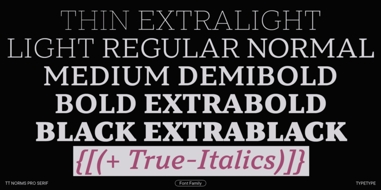
TypeType states that every family here includes the Bulgarian (lat) alphabet, but coverage goes further than one language. The character sets extend across the Latin writing system with diacritical marks, so the same typeface can serve text for many other countries. Currency and punctuation symbols are included. Each family offers multiple weights or variants alongside OpenType features for finer typographic control. Many families in the Bulgarian (lat) fonts selection also come with a variable version, which lets designers tune the design more precisely for a specific layout instead of choosing only from fixed steps. Technical quality is consistent, so switching between families does not introduce new rendering problems.
Where The Bulgarian (lat) fonts selection Is Used
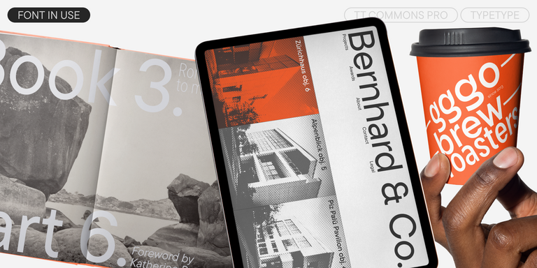
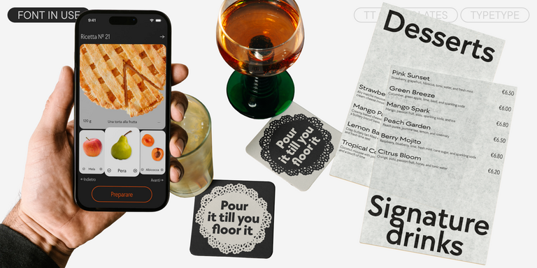
The range of applications is wide, and the selection is built to cover it. Long text blocks call for a calm, even rhythm, while headings for websites and printed publications need presence without losing clarity. Some projects leave paper behind entirely. The families suit printing on various materials, including fabric, as well as signs and posters where romanized Bulgarian must read at a distance. Magazines, newsletters, and advertising form another group, and each makes its own demands on density and tone. Romanized Bulgarian also matters in less obvious settings. Hotels, museums, and transit operators often label locations in Latin script for visitors. Exporters and startups present company names to international partners, and digital products localize menus and forms. In each case, the Bulgarian (lat) fonts selection gives teams one dependable source. Local and international materials can then share the same typographic voice instead of relying on improvised substitutes.
Explore TypeType's Collection: The Bulgarian (lat) fonts selection
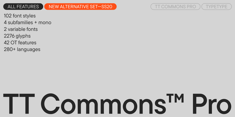
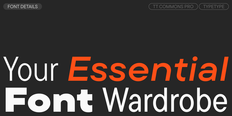
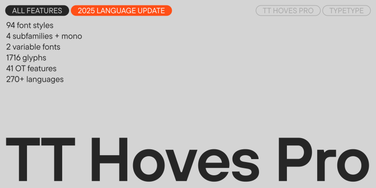
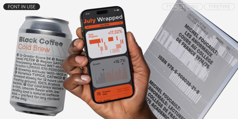
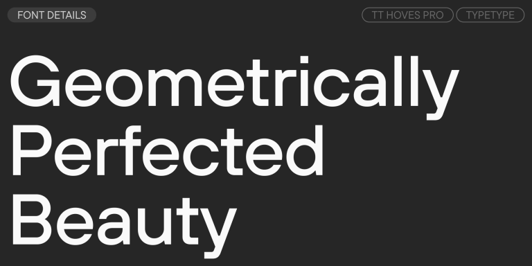
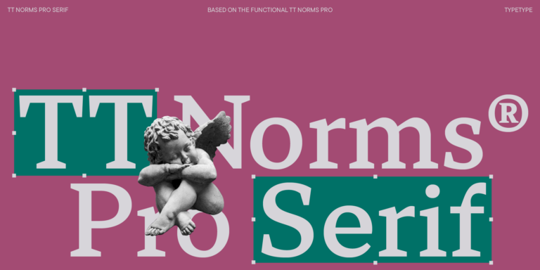
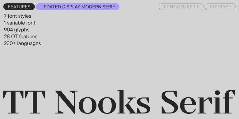
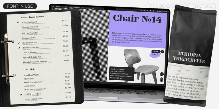
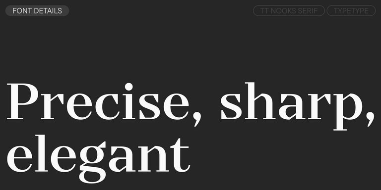
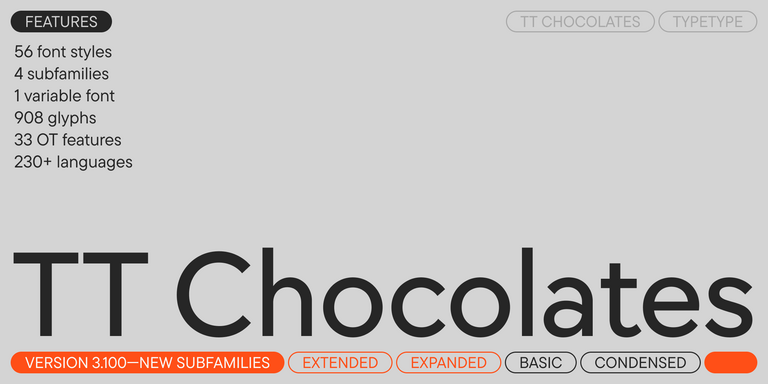
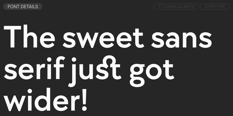
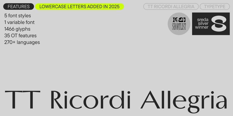
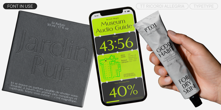
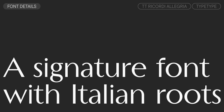
The range includes families such as TT Norms® Pro, TT Commons™ Pro, TT Hoves Pro, TT Chocolates, TT Firs Neue, TT Nooks Serif, and TT Ricordi Allegria, along with many others on this page. To narrow the list, browse by tags that describe character and identity: geometric or dynamic, versatile or classic, powerful or delicate. A purpose-based search also helps by surfacing typefaces suited to magazines, websites, newsletters, or advertising. Before licensing, any family can be tested through the free Trial License. Press the "Trial font" button and fill in the short form. The trial version matches the commercial one in its character and technical set, so tests reflect real results. If a family needs adjustment, TypeType offers technical and graphic customization. Options include adding or removing letters, inserting a company logo, or trimming the character set to lighten the file. Studios with specific requirements can also commission a new typeface, built on an existing design or on their own ideas.
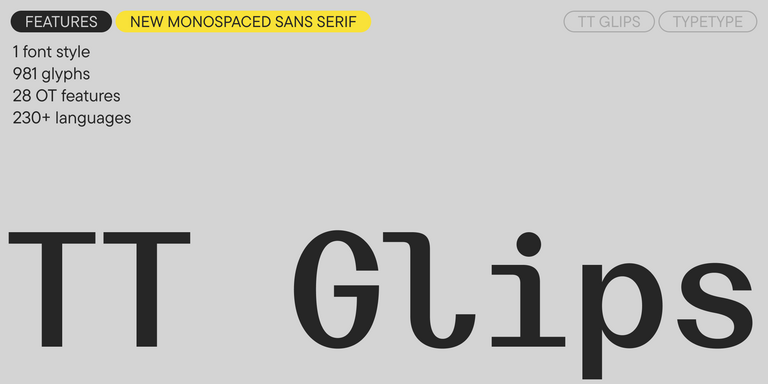
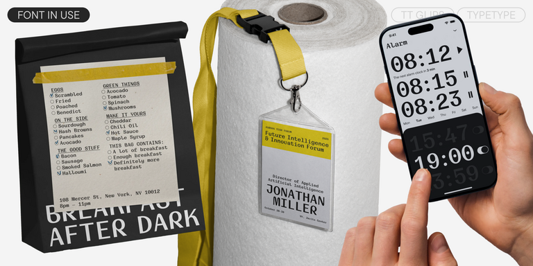
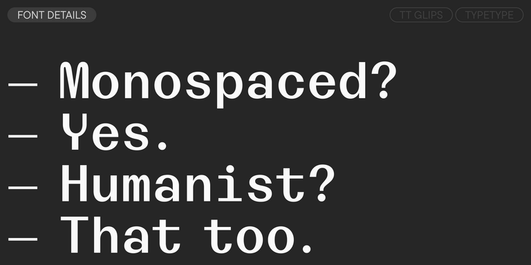
TT Glips is an experimental monospaced sans serif with a handmade feel. At small sizes it looks technological, but as the size grows, rounded details and soft forms come through.
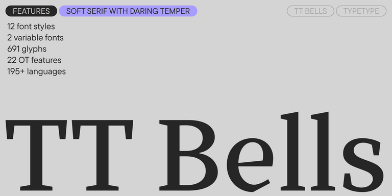
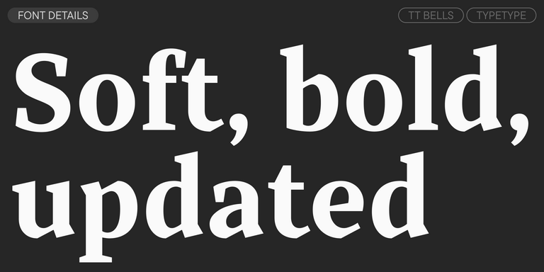
TT Bells combines the elegant softness of Antiqua with a complex and daring temper reflected in straight stroke terminals and arrowheaded serifs. The typeface is based on the broad nib, which creates these hallmark terminals and serifs.
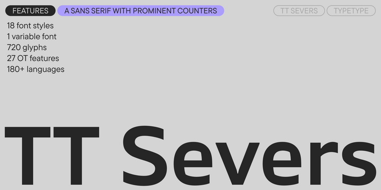
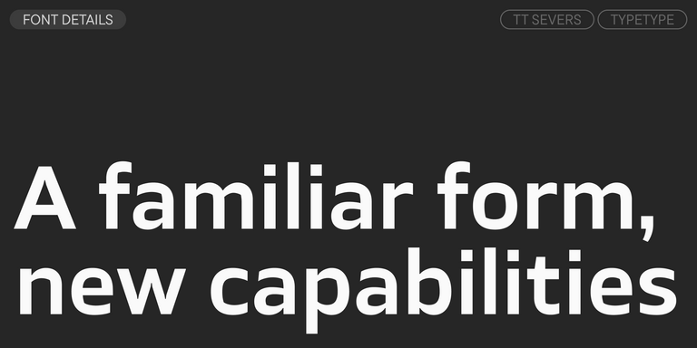
TT Severs is a geometric sans serif with emphasized elements of internal brackets. The main visual feature of TT Severs is the unusual form of internal ovals.
TT Turns is a striking geometric sans serif with expressive elements. This versatile font works exceptionally well for running text, while at large point sizes, it takes on a distinct display character.
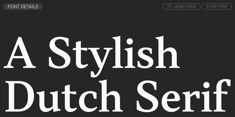
TT Jenevers is a modern serif with a Dutch flavor. The font family features the characteristic details peculiar to Dutch serifs—these are the asymmetrical shape of serifs and an irregular slant of ovals.
TT Regins is a Scottish modern serif. Striking contrast and sharp triangular serifs give this font a stern and commanding character, while refined forms, enlarged lowercase letters, and slightly condensed, static proportions add grace to its design.
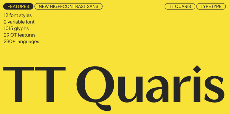
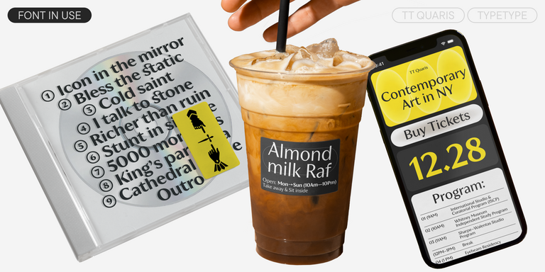
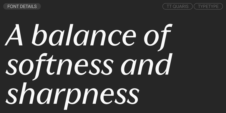
TT Quaris is an exquisite, modern high-contrast sans whose design balances between soft and sharp. The glyph shapes in the font are fluid and tend towards roundness, yet there are also sharp elements.
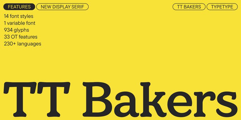
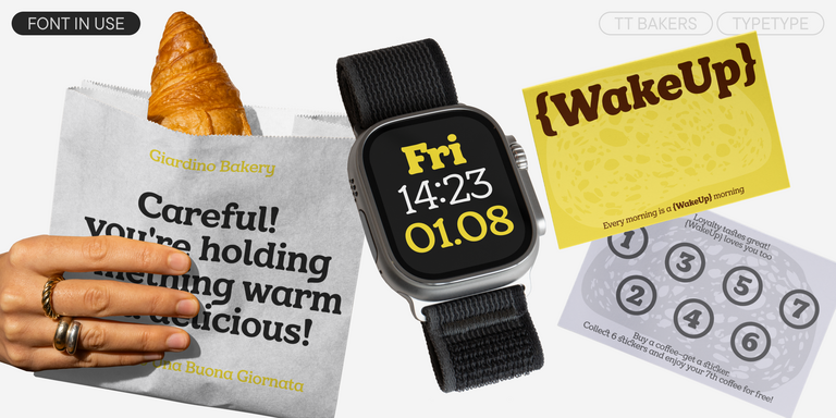
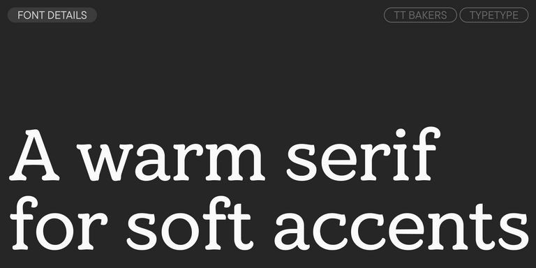
TT Bakers is a fluid serif with a gentle and lively character. This font is like freshly baked goods: it`s warm and soft, especially in its bolder weights.
What Are the Typefaces in The Bulgarian (lat) fonts selection?
They are TypeType families whose character sets, according to the studio, include the alphabet used to write Bulgarian in Latin script, often called romanized or transliterated Bulgarian. Each one also extends across the wider Latin system with diacritics, currency and punctuation symbols, multiple weights or variants, and OpenType features. This makes them usable well beyond one language.
Which Industries Use Bulgarian (lat) Typefaces Most Often?
Romanized Bulgarian appears wherever local content meets an international audience. Typical areas include publishing, web and digital products, advertising, packaging, signage and wayfinding, and textile printing. Magazines and newsletters rely on comfortable long-form reading. Posters, signs, and printed fabric need clear shapes that hold up at larger sizes and on varied surfaces.
Can Bulgarian (lat) Typefaces Be Used for Branding?
Yes. Reliable Latin-script coverage lets a brand present its name and messaging consistently across local and international materials, from websites to signage. Style tags such as geometric, classic, or delicate help match a typeface to the identity. Customization can add a company logo as a glyph or adapt the character set to the brand's needs.
What Should Be Considered When Pairing Bulgarian (lat) Typefaces?
Contrast is usually the starting point. Combine an expressive display face with a calm, readable text face, or stay within one family and use its weights for hierarchy. Confirm that both choices appear in The Bulgarian (lat) fonts selection. For bilingual layouts with Cyrillic, check Cyrillic support separately on each family page before finalizing.
Can You Browse and License TypeType Fonts for Commercial Projects?
Yes. Every family on this page can be tested first with the free Trial License, which matches the commercial version in its character and technical set. Commercial licenses for finished projects are then arranged directly with TypeType. For more specific requirements, the studio also offers customization and can develop an entirely new typeface to order.
Enter your email address and spin the sun to win up to 100% off or TypeType services
Giveaway rules:
Each user can only play once;
Each promo code is unique and can only be used once;
The promo code discount applies only to purchases up to $5,000 in the online store;
Please note that the "Font Renaming," "Your Logo in a Font," and "Basic Customization" services do not apply to previously purchased fonts and are only available for new orders;
If you win a service, our manager will contact you within three business days with the details.