top_banner_ttchocolates0826
Type foundryFonts & StylesCorporate

Corporate Fonts

Corporate fonts shape how a brand communicates trust, clarity, and professionalism across every touchpoint. From logotypes and presentations to websites and packaging, the right typefaces build a consistent visual identity. Explore TypeType’s collection of carefully crafted typefaces designed for branding, business communication, and digital products.

Purpose: Corporate

Why Businesses Look for Professional Typefaces

Companies rarely need typography for just one isolated task. A brand may have to use the same visual language across a website, presentations, reports, advertising, product interfaces, packaging, and internal documents. That is why fonts for corporate identity are often chosen for consistency and flexibility as much as for appearance.

A suitable typeface should help communication feel reliable and recognizable without distracting from the message. Some companies need a restrained and neutral tone, while others look for more distinctive details that support a specific brand personality.

The practical challenge is to find a design that works across different sizes, formats, and levels of hierarchy. A solution that looks convincing in a logo but performs poorly in paragraphs or interfaces can make the wider identity harder to maintain.

Key Characteristics of Corporate Fonts

Strong corporate font styles usually combine clear proportions, good character differentiation, balanced spacing, and enough visual restraint to work with many types of content.

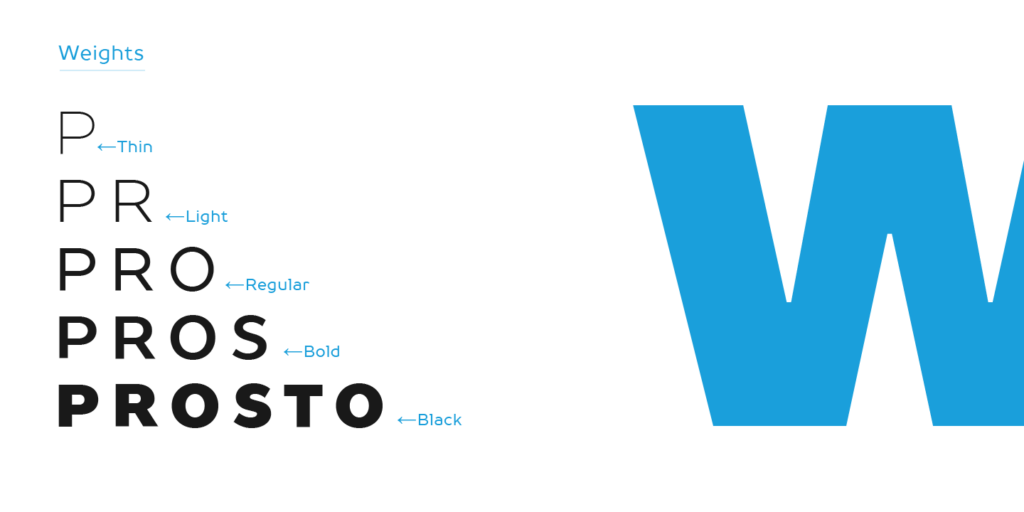
A broad range of weights and styles is especially useful because it allows designers to build hierarchy without constantly introducing additional typefaces. Light or regular styles may handle supporting copy, while medium and bold weights can create emphasis in headings, presentations, and digital products.

Language coverage also matters for organizations operating across markets. A family that supports the required scripts and diacritics can help keep communication consistent instead of forcing regional teams to find substitutes.

Technical performance should be considered alongside visual character. Screen readability, file formats, spacing, and reliable behavior in design and office workflows all influence whether a type system remains practical once it is used beyond the design team.

How to Choose the Right Typeface for Your Brand

Begin with the role typography needs to play in the identity. Should the company feel precise and technical, established and authoritative, open and approachable, or more expressive and innovative?

Next, test how the design performs at both ends of the hierarchy. Headlines should have enough personality to support recognition, while body text needs to remain comfortable and clear. If the same family will be used across presentations, websites, interfaces, reports, and campaigns, check whether it provides enough weights and styles to adapt to those situations.

Audience and language requirements should also influence the choice. International brands need to verify that the necessary characters are included and that different language versions remain visually coherent.

Finally, use real content during testing. Brand names, slide titles, tables, website navigation, and longer paragraphs reveal practical strengths and weaknesses much faster than isolated specimen words.

Best Corporate Fonts from the TypeType Collection

TypeType offers several families suited to large-scale identity systems and everyday brand communication. TT Norms® Pro is a versatile geometric sans serif that has been used by brands including ASUS, AliExpress, CBSN, DreamWorks, DoorDash, and Intercom.

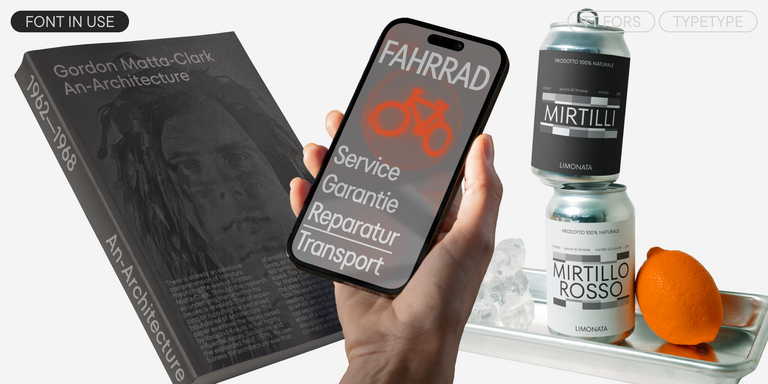
TT Commons™ Pro provides another broad, neutral foundation for identities that need flexibility across digital and print environments, while TT Hoves Pro offers a more contemporary and recognizable interpretation of a functional sans serif. TT Fors can be a strong option for companies that want geometric structure with more individual character. TypeType itself highlights these families among suitable choices for branding and professional design.

The best corporate fonts are not necessarily the most neutral ones. The right choice is the family that gives a brand enough personality while still supporting the full range of practical communication tasks.

Use Cases Across Branding and Communication

Good corporate fonts can work across everything from high-level brand expression to routine daily communication.

In identity systems, they may appear in logos, campaign headlines, packaging, and brand guidelines. Presentations and annual reports require clear hierarchy between titles, body copy, charts, and captions. Websites and interfaces add another layer, where readability at smaller sizes becomes more important.

A corporate text font may also need to perform in proposals, internal documents, product descriptions, and other high-volume content where visual restraint is valuable. Marketing materials, by contrast, can make greater use of heavier weights or more expressive styles.

The strongest type systems create continuity between these environments. Instead of making every touchpoint look identical, they provide enough variation to let each format serve its purpose while still feeling like part of the same brand.

  • The quick brown fox jumps over a lazy dog.
  • Pack my box with five dozen liquor jugs.
  • Sphinx of black quartz, judge my vow
  • 0123456789 !?.,:;—–()[]{}<> “quotes” ‘apostrophe’ @#%&*_+=/\| № $ € £ ₽ +−×÷=≠≤≥ … % © ® ™
  • Aa Bb Cc Dd Ee Ff Gg Hh Ii Jj Kk Ll Mm Nn Oo Pp Qq Rr Ss Tt Uu Vv Ww Xx Yy Zz
Leading
1.1
Tracking
0px
Bestseller
TT Norms® Pro Regular
104 font styles

The bestseller TT Norms® Pro—a geometric sans serif, trouble-free workhorse

Bestseller
104 font styles

TT Commons™ Pro is a completely redesigned version of the well-established classic font family TT Commons.

Bestseller
TT Hoves Pro Regular
96 font styles

TT Hoves Pro is a versatile sans-serif with a recognizable geometry

24 font styles

We continue to expand the line of the studio's main bestseller TT Norms® Pro!

TT Livret Text Regular
32 font styles

TT Livret is an elegant, modern and functional serif

Bestseller
TT Neoris Pro Regular
21 font styles

TT Neoris is an elegant Neo-Grotesque with unlimited potential and a font that encompasses all modern requirements and user desires.

TT Rationalist Regular
22 font styles

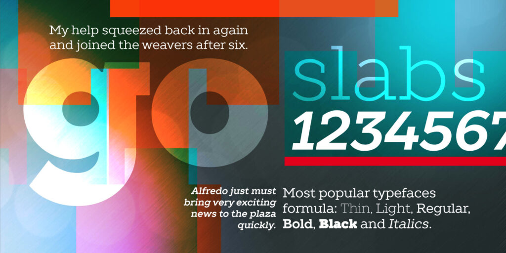
TT Rationalist is functional and neutral slab serif typeface.

21 font styles

TT Commons™ Classic is a universal sans serif with a minimal contrast of strokes, a closed aperture, and geometric shapes of characters.

New
TT Turns Regular
19 font styles

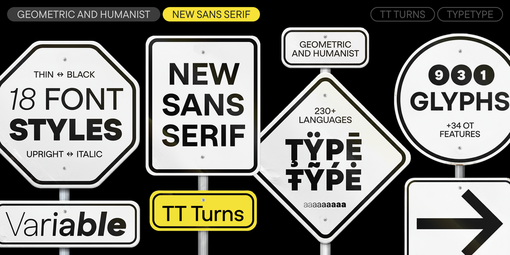
TT Turns is a striking geometric sans serif with expressive elements. This versatile font works exceptionally well for running text, while at large point sizes, it takes on a distinct display character.

New
TT Regins Display Light
38 font styles

TT Regins is a Scottish modern serif. Striking contrast and sharp triangular serifs give this font a stern and commanding character, while refined forms, enlarged lowercase letters, and slightly condensed, static proportions add grace to its design.

New
TT Quaris Regular
14 font styles

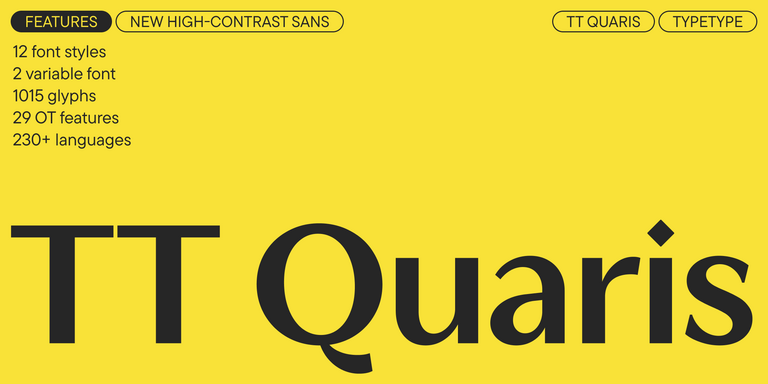
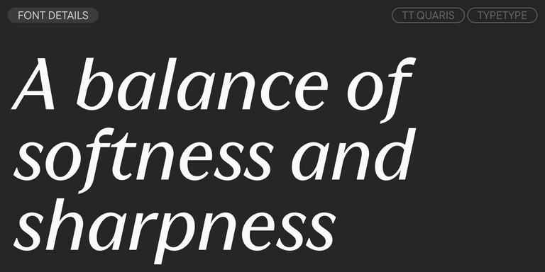
TT Quaris is an exquisite, modern high-contrast sans whose design balances between soft and sharp. The glyph shapes in the font are fluid and tend towards roundness, yet there are also sharp elements.

TT Modernoir Regular
6 font styles

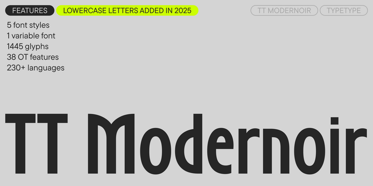
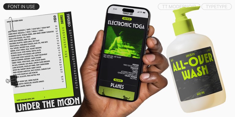
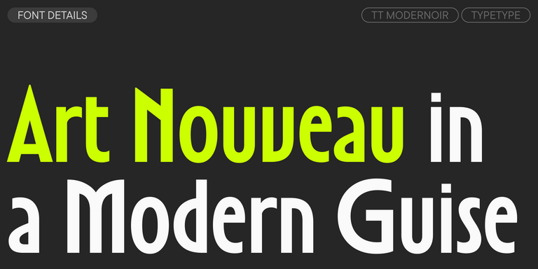
TT Modernoir is a display sans serif with dynamic proportions. Fluid lines and delicate Art Nouveau forms in this typeface blend seamlessly with the rhythmic flow and improvisational freedom of jazz.

Bestseller
TT Fors Regular
50 font styles

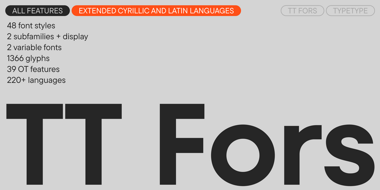
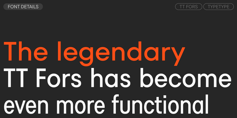
TT Fors is a modern geometric sans serif with characters and shapes contrasting in width.

TT Fellows Regular
19 font styles

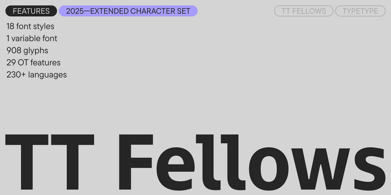
TT Fellows is a humanist sans serif with a mechanical touch.

Bestseller
43 font styles

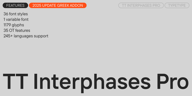
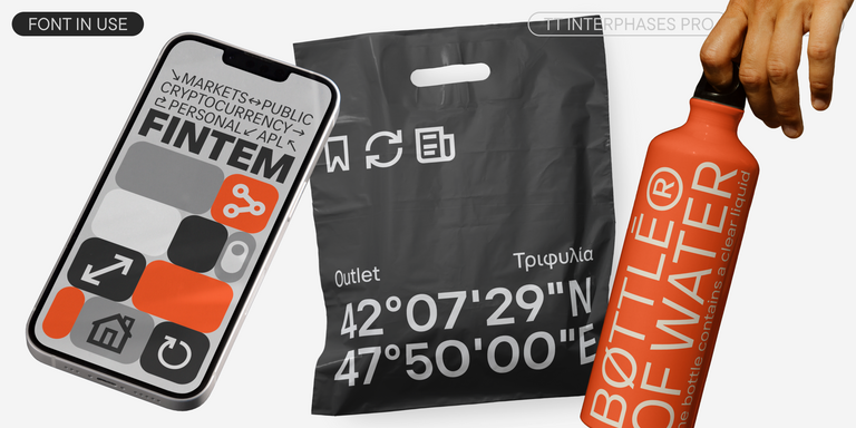
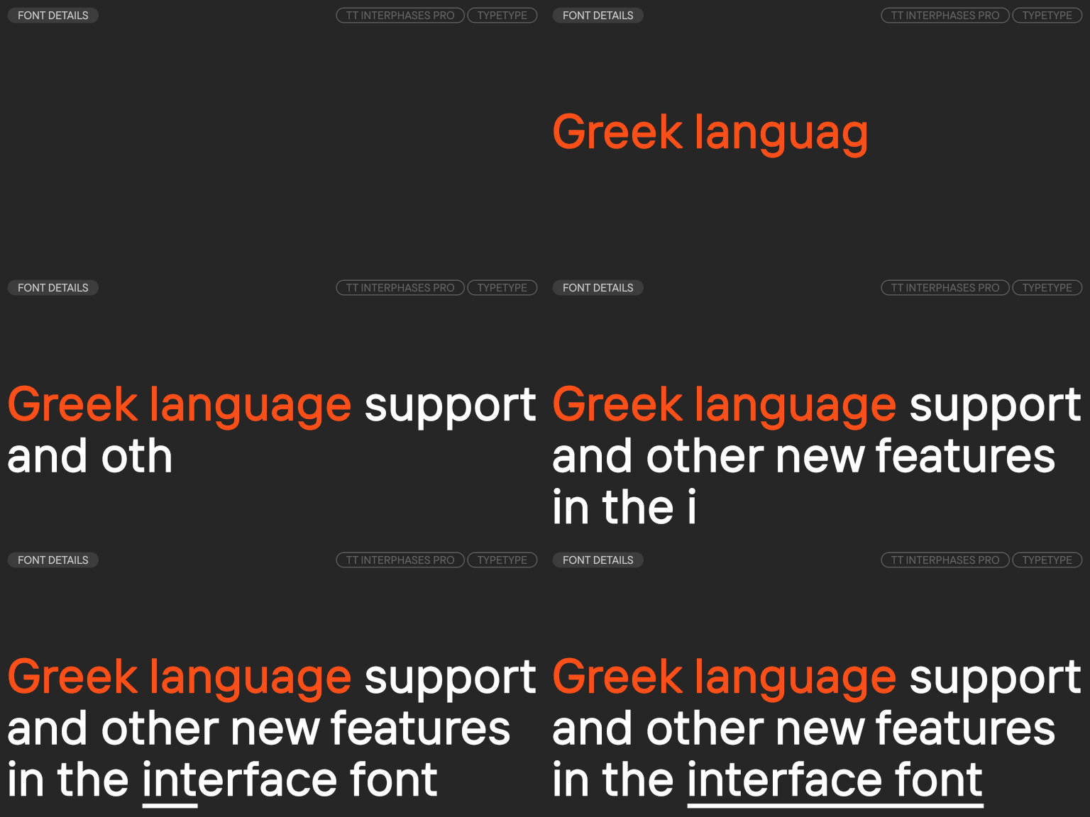
TT Interphases Pro is a neo-grotesque sans serif with equal-width proportions

New
TT Gertika Regular
4 font styles

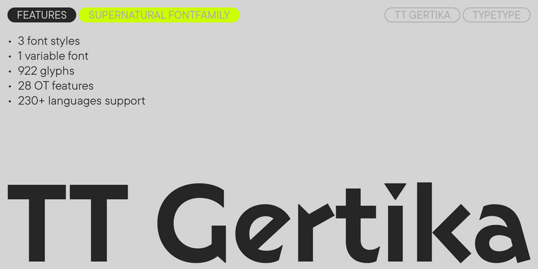
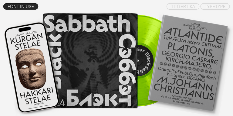
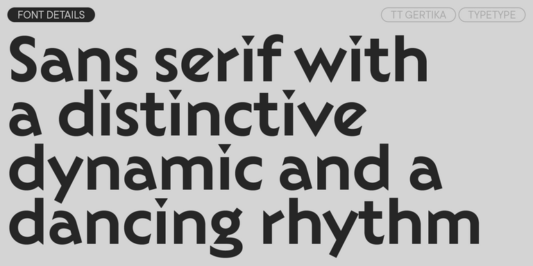
TT Gertika is a geometric sans serif with a dynamic character and a dancing rhythm. This font`s idea originates from the lettering featured on an American poster from the late 1930s.

New
TT Biersal Upright
6 font styles

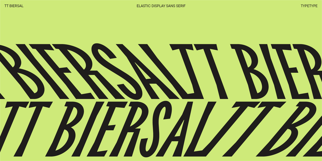
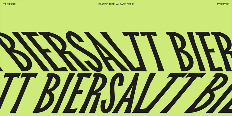
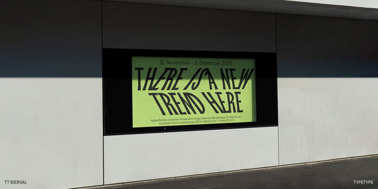
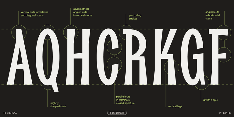
TT Biersal is a display sans serif with a free-spirited, playful, and adventurous nature. The concept of this font was sparked by a German poster from the early 1930s.

New
TT Carvist Regular
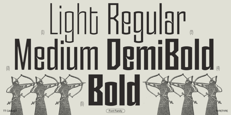
6 font styles

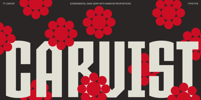
TT Carvist—peculiar, playful, and courageous—this font does an excellent job of grabbing attention!

New
TT Firs Text Regular
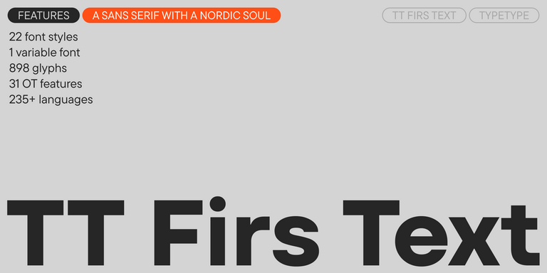
23 font styles

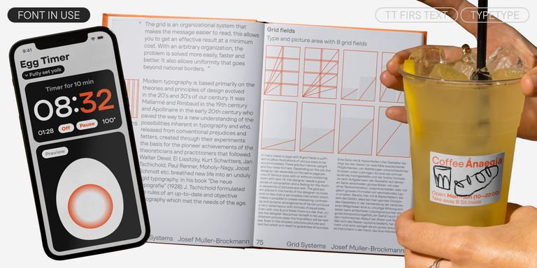
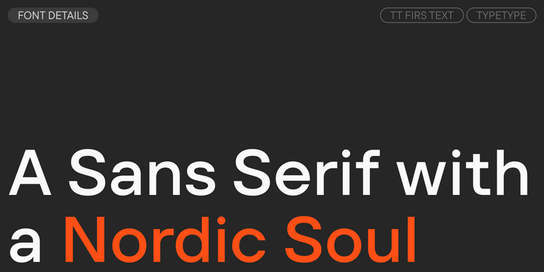
We have released a brand-new font. Meet TT Firs Text—a geometric sans serif with a Nordic character!

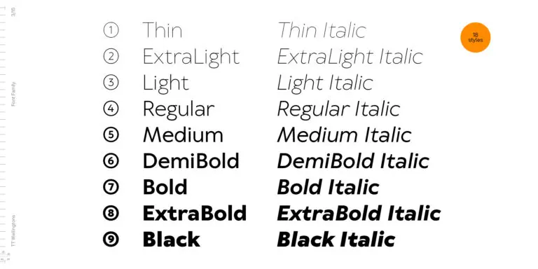
TT Wellingtons Regular
19 font styles

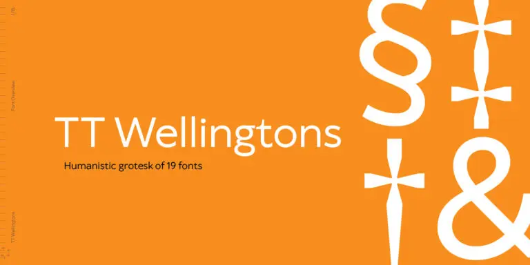
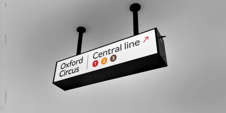
TT Wellingtons is an attempt to combine the style of English humanist sans serifs of the early 20th century with the requirements for modern geometric grotesques.

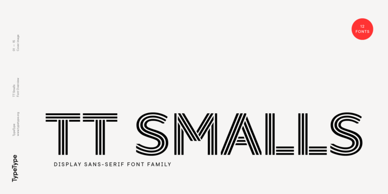
TT Smalls Regular
12 font styles

TT Smalls is now a decorative font that makes it easy to attract attention.

FAQ

What Are the Best Corporate Fonts?

The best corporate fonts usually combine clear letterforms, reliable readability, and enough styles to support different levels of hierarchy. Neutral sans serifs work well for broad communication systems, while more distinctive families can strengthen brand recognition. The right choice depends on how the typeface performs across websites, presentations, documents, campaigns, and other everyday applications.

Which Typeface Works Best for Brand Identity?

A strong corporate text font should be readable enough for longer content while still fitting the brand’s personality. Look for consistent proportions, several weights, strong headline performance, and language coverage that matches your markets. The best option should work as part of a complete visual system rather than only in a logo or isolated headline.

Can I Use These Fonts for Commercial Projects?

Modern corporate fonts can be used commercially when the selected license covers the intended application. TypeType offers different licensing options depending on whether the family is used in desktop materials, websites, apps, video, or other environments. Trial versions are also available for evaluation before purchase, allowing teams to test a design in real project layouts.

How Do I Test a Typeface Before Buying?

Evaluate several corporate font styles using actual brand content. Test headings, paragraphs, presentation slides, website elements, and documents at the sizes you expect to use. Check readability, available weights, language coverage, and how consistently the family works across different formats. Real layouts usually reveal whether a typeface is flexible enough for long-term use.

Contact us!