We continue to expand the line of the studio's main bestseller TT Norms® Pro!
The Luxembourgish fonts selection
- All fonts 74
- Sans Serif 48
- Serif 27
- Slab Serif 6
- Display 40
- Script 10
- Variable 46
- Font sale 17
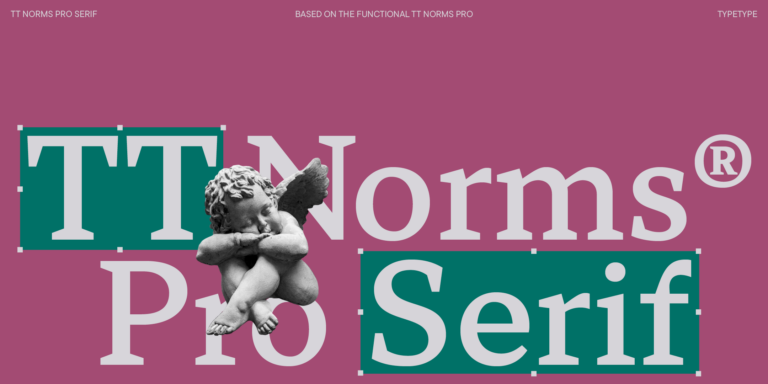
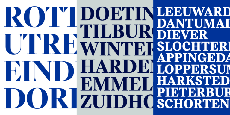
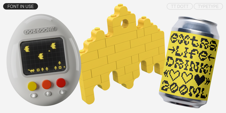
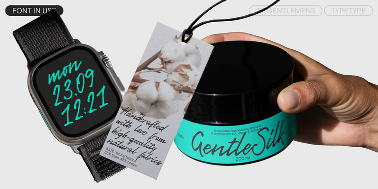
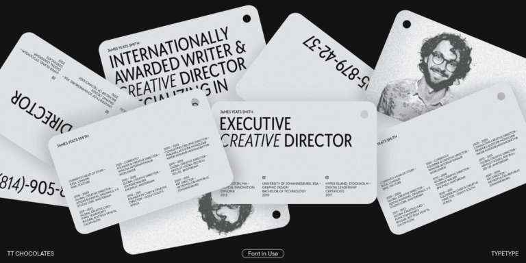
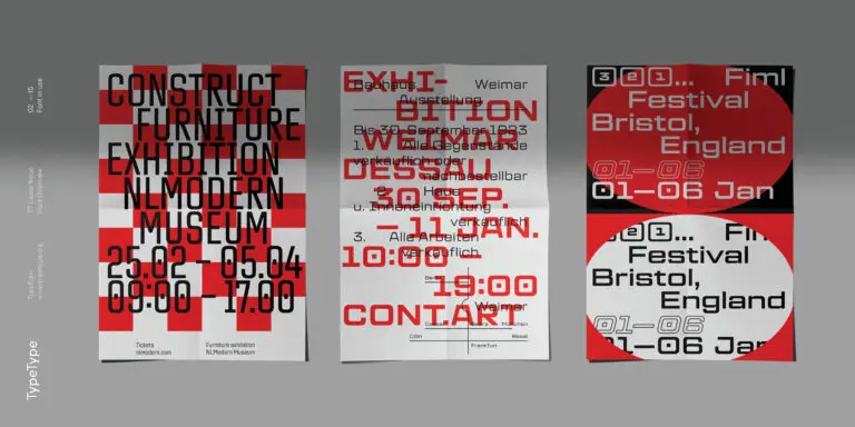
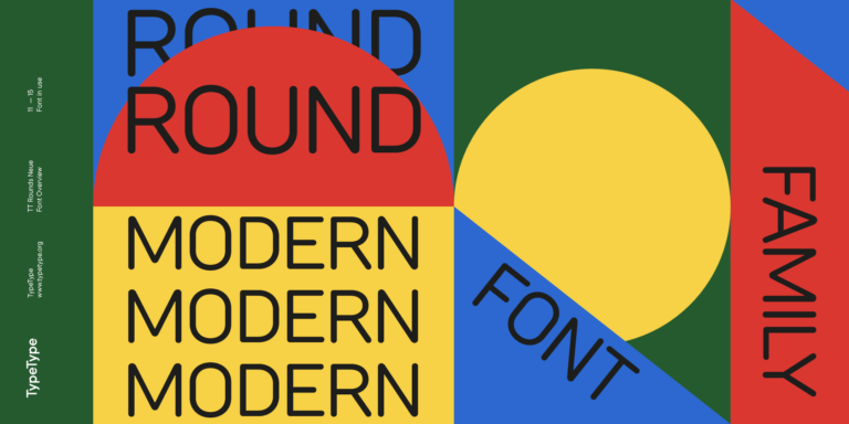
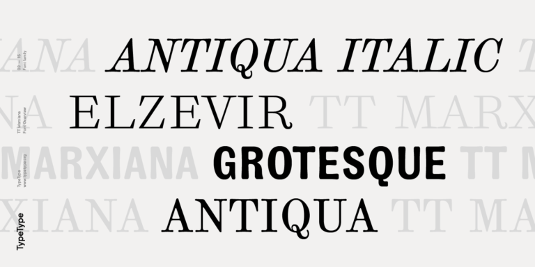
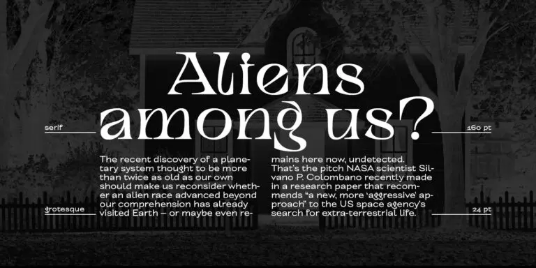
Choose a suitable font that supports the Luxembourgish language. We have a vast collection of font families to meet any creative needs, whether you are working on extensive text blocks, crafting headings for websites or printed publications, printing on various materials, including fabric, or designing signs and posters.
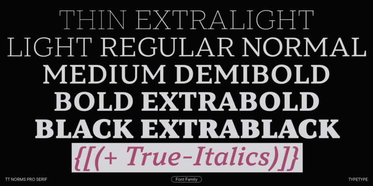
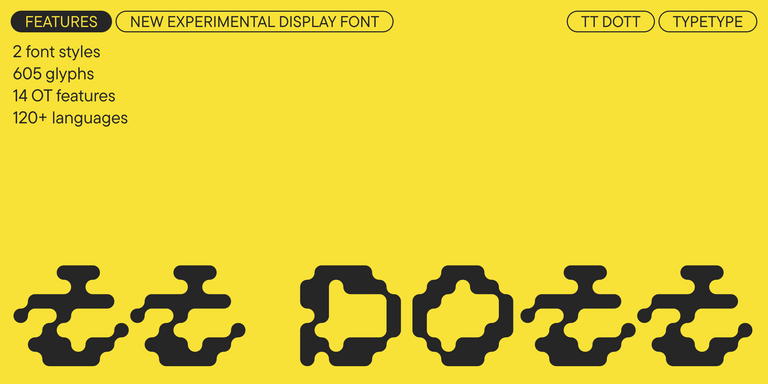
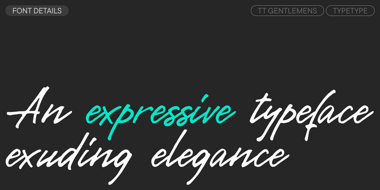
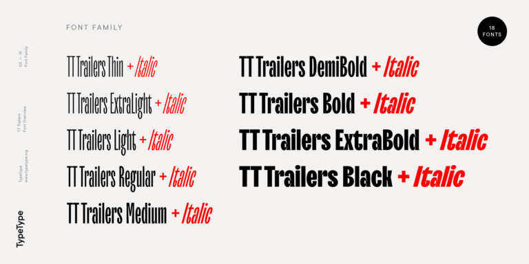
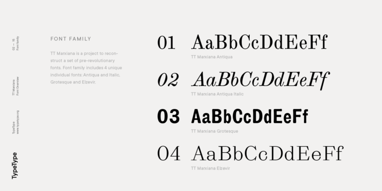
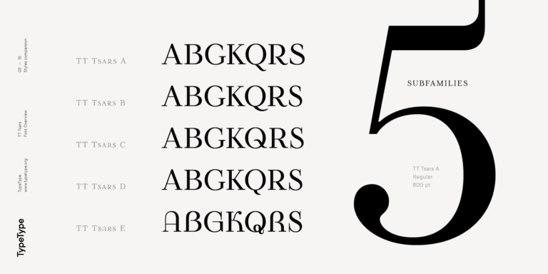
Each of the fonts includes the Luxembourgish alphabet. A wide range of characters, currency and punctuation symbols, font styles, and OpenType features will allow you to apply the same Luxembourgish fonts to different projects. Characters of the extended Latin writing system that include diacritical marks will increase the options of using the font for any country.
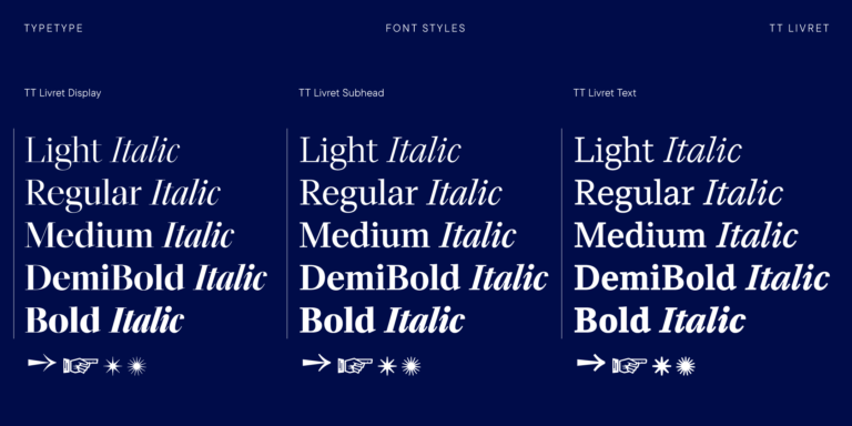
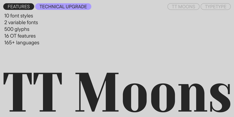
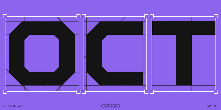
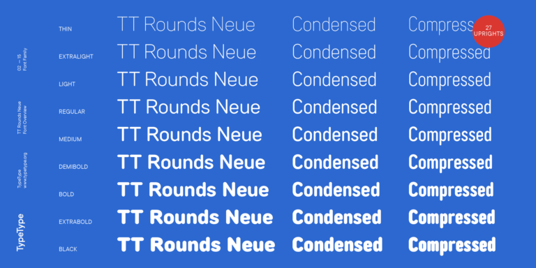
Each font demonstrates flawless technical quality. Many fonts in our collection include a variable font style that can be used to create a unique style for your project.
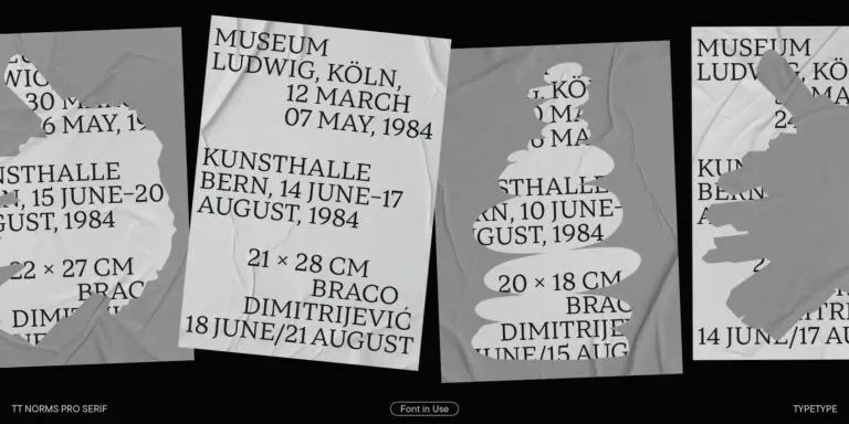
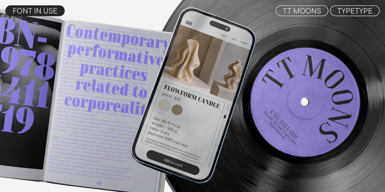
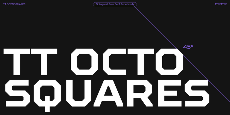
With the help of tags, you can select a font that aligns with your desired style and identity: geometric or dynamic, versatile or classic, powerful or delicate. The search feature categorized by purpose will also be useful, as you can look for fonts suitable for magazines, websites, newsletters, or advertising.
Each font from the collection can be customized technically or graphically. Customization gives an opportunity to add or remove a letter, add the company's logo, or reduce the character set to make the resulting font file lighter.
With the Trial License, a free testing period is available for the studio's fonts. To get the Trial License, click the "Trial font" button and fill out the form. The trial font is identical to its commercial version in character and technical set.
You can also commission the development of a commercial font from scratch, either based on a preferred font from our collection or your own design ideas.
- The quick brown fox jumps over a lazy dog.
- Pack my box with five dozen liquor jugs.
- Sphinx of black quartz, judge my vow
- 0123456789 !?.,:;—–()[]{}<> “quotes” ‘apostrophe’ @#%&*_+=/\| № $ € £ ₽ +−×÷=≠≤≥ … % © ® ™
- Aa Bb Cc Dd Ee Ff Gg Hh Ii Jj Kk Ll Mm Nn Oo Pp Qq Rr Ss Tt Uu Vv Ww Xx Yy Zz
TT Livret is an elegant, modern and functional serif
TT Rationalist is functional and neutral slab serif typeface.
TT Commons™ Classic is a universal sans serif with a minimal contrast of strokes, a closed aperture, and geometric shapes of characters.
TT Bluescreens is a upgraded geometric sans serif with narrow proportions
TT FRANTZ IS AN EXPERIMENTAL VARIABLE FONT, DISTINGUISHED BY ITS SLIMNESS AND LIGHTNESS. THE VARIATION IN THE FONT AFFECTS THE CHANGE IN THE HEIGHT OF THE MEAN LINE—BY MOVING THE AXIS ADJUSTMENT SLIDER YOU CAN EASILY RAISE OR LOWER THE MEAN LINE OF THE FONT.
TT Moons is a slim and contrast serif. This font family works especially smart in classic design themes. TT Moons is a typeface of the glyptal modern typeface.
The quick brown fox jumps over a lazy dog.
TT Octosquares is a fresh, revised, expanded, and significantly improved version of our first commercial font TT Squares & its narrow version.
TT Chocolates typeface consists of 14 fonts: 7 weights and 7 obliques. Due to the extended language support and the introduction of useful features.
A technological font family for game design
TT Rounds Neue soft, friendly, rounded sans serif fontfamily
The starting point of the TT Trailers project was the idea to develop a new generation of narrow typefaces for use in movie credits and posters.
TT Autonomous is a modern techno sans serif with wide angular proportions.
TT Marxiana Elzevir is a title or header font and is a compilation of monastic Elzevir that were actively used in the Niva magazine for all its prints.
TT Norms Condensed continues to develop the ideas of neutrality and versatility stemming from our bestselling TT Norms.
TT Geekette is an experimental variable serif with friendly and flexible character of shapes.
TT Alientz is a variable typeface that allows the user to make a visual journey from an extraterrestrial grotesque to a very prickly display serif.
The TT Tsars font family is a collection of serif display fonts that are stylized to resemble the fonts of the beginning, the middle, and the end of the XVIII century.
TT Nooks is an experimental project comprised of a high-contrast egocentric serif and an upright humanist italic.
TT Backwards Sans is a narrow grotesque, which takes us back to the book design of late 70s and early 80s with its ductile characters.
When designing TT Mussels, we paid great attention to the possibility of imposing large arrays of text, and we can state that TT Mussels is a rare type of technological text fonts.
TT Knickerbockers Grotesk is a narrow contrast sans serif with characteristic elements sending us back to the 19th century in New York.
