German fonts carry a distinctive heritage rooted in precision, structure, and clarity. From historic blackletter forms to clean contemporary letterforms, they help designers craft authentic identities. Explore TypeType’s collection of carefully crafted typefaces suited for branding, editorial layouts, web design, and digital products.
Designers may search for german looking fonts for very different reasons. Some projects need a historical or cultural reference, while others are looking for qualities commonly associated with German visual culture: structure, clarity, engineering precision, order, or functional restraint.
The right direction depends on context. A heritage-inspired identity may benefit from references to traditional lettering, whereas a technology company, manufacturer, architectural studio, or contemporary publication may need a cleaner sans serif with disciplined proportions and strong hierarchy.
It is also important to distinguish visual style from language support. A typeface can support German perfectly without looking historically German, and a decorative blackletter design may evoke a particular period without being suitable for long contemporary text. Defining the actual goal first helps avoid turning cultural references into a superficial visual stereotype.
Key Characteristics of German Font Styles
There is no single german font style. Typography associated with Germany includes several very different traditions, from historic blackletter to early grotesques, geometric sans serifs, industrial lettering, and highly functional contemporary families.
Historical forms often feature dense texture, angular construction, pronounced stroke contrast, and distinctive capitals. Modernist and grotesque traditions tend to move toward clearer proportions, reduced ornament, systematic spacing, and stronger emphasis on functional communication.
These differences matter because they create very different impressions. Blackletter can feel archival, ceremonial, dramatic, or culturally specific, while a restrained grotesque may suggest precision, rationality, or modern industry.
For contemporary projects, recognizable "German" character often comes less from one isolated detail than from the overall system: proportions, spacing, hierarchy, and disciplined use of typography within the layout.
Old and Classic German Letterforms
Old german fonts are most commonly associated with blackletter traditions, including Textura, Schwabacher, and especially Fraktur. These styles developed over centuries and were widely used in German-language printing before roman type became dominant in the 20th century. Historical blackletter typically has a dense rhythm, narrow forms, angular details, and shapes influenced by broad-nib writing.
Today, classic german fonts are usually used selectively rather than for long everyday reading. They can work in heritage branding, editorial titles, cultural projects, packaging, posters, or designs that deliberately refer to a particular historical atmosphere.
Modern interpretations often simplify the construction, improve legibility, or combine traditional details with contemporary spacing and proportions. When using this visual language, historical context matters: blackletter has a much longer history than 20th-century political associations, but some specific styles can still carry strong cultural connotations for modern audiences.
How to Choose the Right German Font for Your Project
Modern german fonts should be selected according to the job they need to perform rather than nationality alone. Start with the project’s tone. Do you need historical character, contemporary precision, industrial energy, editorial elegance, or a neutral foundation for corporate communication?
Next, consider readability and the amount of text. Expressive historical forms may work well in short headlines but become demanding in paragraphs. Websites, interfaces, annual reports, and other information-heavy formats usually require clearer proportions and stronger character differentiation.
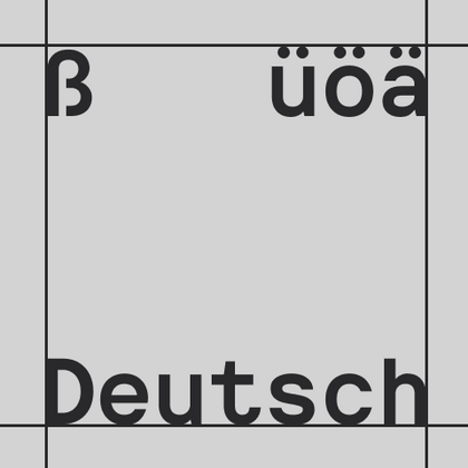
For German-language content, verify support for characters such as ä, ö, ü, and ß, together with punctuation and symbols required by the project. TypeType’s current German-language category includes extended Latin support and additional typographic features across its families.
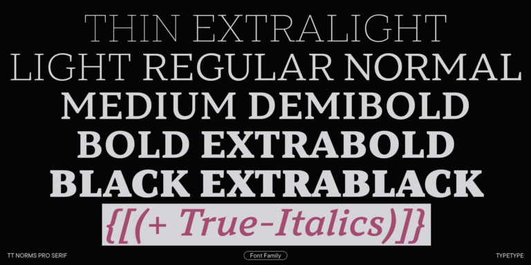
Finally, check available weights, technical formats, and licensing, and test real German copy rather than relying only on sample words.
Explore TypeType’s Collection of German Fonts
TypeType’s german fonts collection is best understood as a selection of families that support the language rather than a single visual genre. The category includes contemporary serifs, functional sans serifs, display designs, experimental families, and large systems with multiple styles.
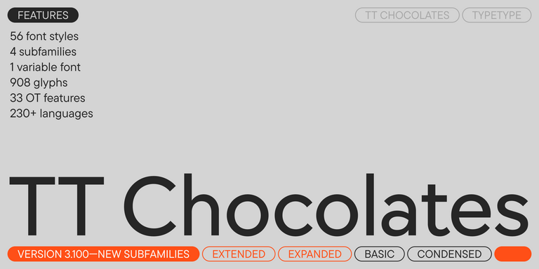
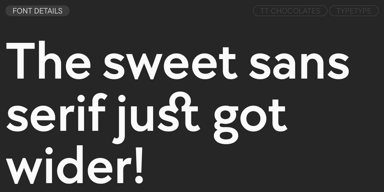
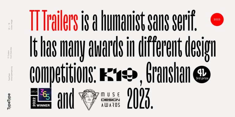
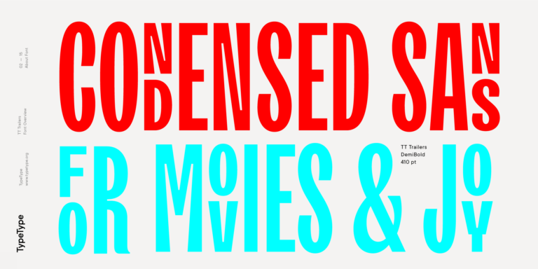
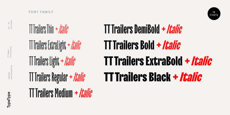
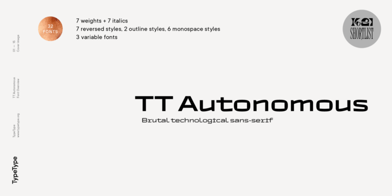
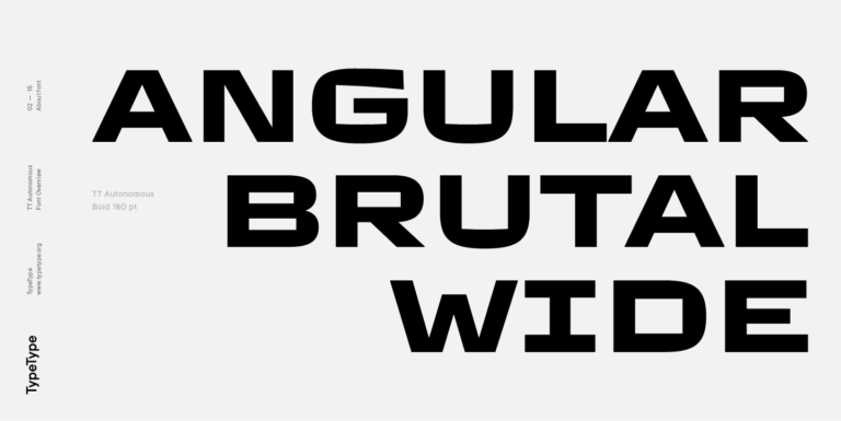
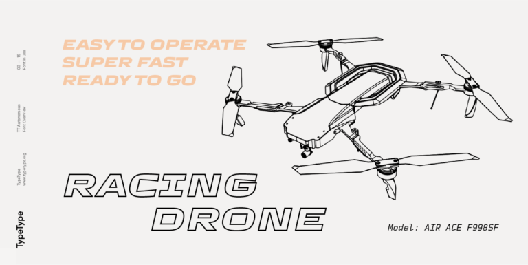
For versatile communication, TT Commons™ Classic offers a restrained geometric sans serif structure, while TT Rationalist provides a neutral slab-serif direction. TT Livret is a modern functional serif that can work in editorial and identity projects. For stronger display character, the current collection also includes TT Dott, TT Frantz, TT Trailers, and TT Autonomous, each approaching expression in a different way.
Rather than searching for one universally "German-looking" solution, compare families according to the actual application: brand identity, interface, packaging, publication, campaign, or signage. Trial versions on TypeType allow these options to be evaluated with real content before licensing.
Use Cases Across Branding and Digital Design
Famous german fonts and historical lettering traditions often influence contemporary design indirectly. A project may borrow the density of blackletter, the functional logic of industrial grotesques, or the structured simplicity associated with modernist typography without reproducing a historical style literally.
In branding, these references can support breweries, cultural institutions, manufacturers, fashion labels, automotive projects, hospitality, or products that want to emphasize heritage or craftsmanship. More restrained families work well for corporate identities, technology, architecture, and professional services.
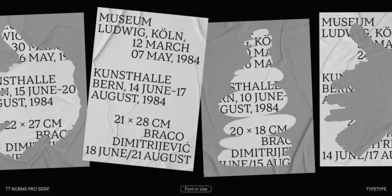
Packaging and advertising can accommodate stronger visual character because the copy is often short. Websites and applications generally demand greater restraint, especially for navigation and body text. Editorial design can combine both approaches: a distinctive headline face may establish the theme while a more readable family handles longer articles.
The most convincing result comes from matching the typographic language to the brand and audience rather than treating national style as a fixed visual formula.
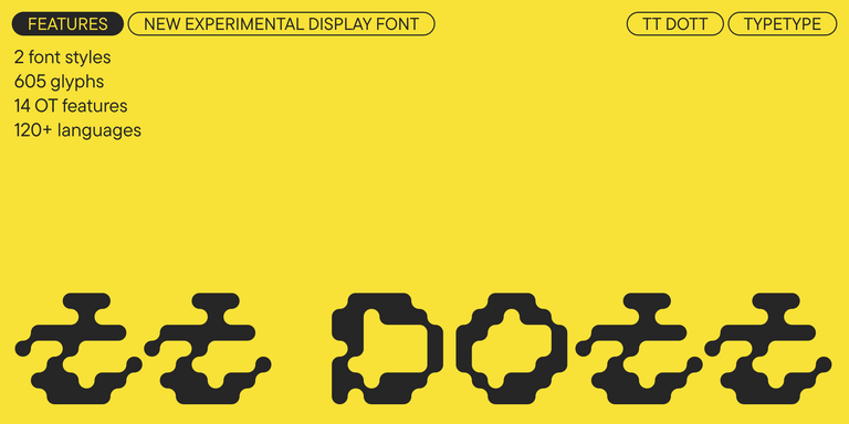
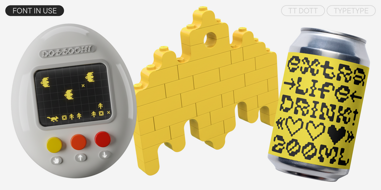
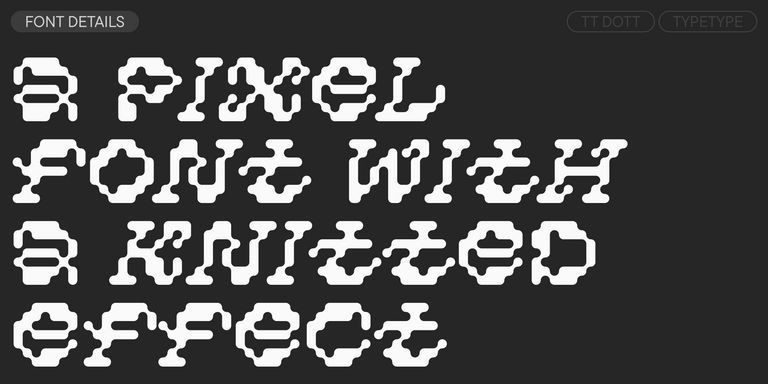
TT Dott is an experimental pixel grotesque where a circle is used as the base for the pixel. It is a fluid and unusual display font, evoking associations with embroidery and techno parties all at once.
TT FRANTZ IS AN EXPERIMENTAL VARIABLE FONT, DISTINGUISHED BY ITS SLIMNESS AND LIGHTNESS. THE VARIATION IN THE FONT AFFECTS THE CHANGE IN THE HEIGHT OF THE MEAN LINE—BY MOVING THE AXIS ADJUSTMENT SLIDER YOU CAN EASILY RAISE OR LOWER THE MEAN LINE OF THE FONT.
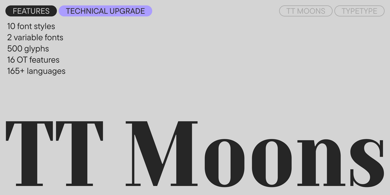
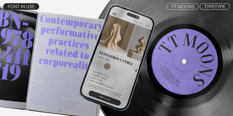
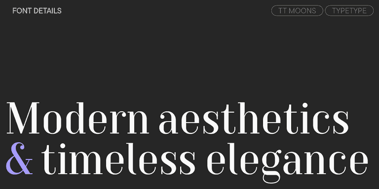
TT Moons is a slim and contrast serif. This font family works especially smart in classic design themes. TT Moons is a typeface of the glyptal modern typeface.
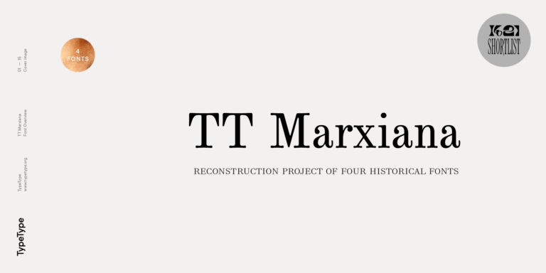
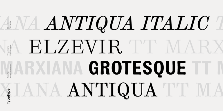
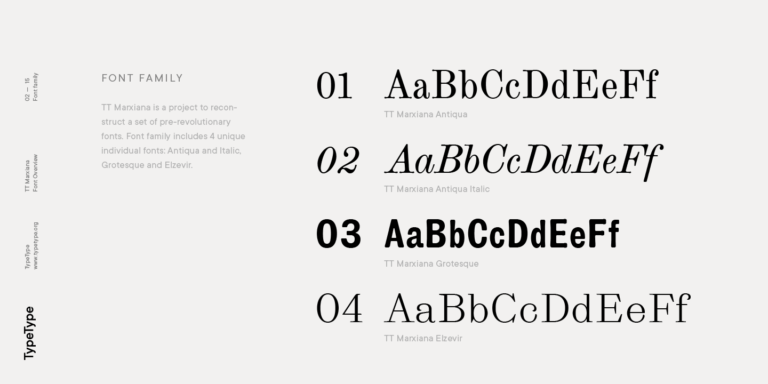
TT Marxiana Elzevir is a title or header font and is a compilation of monastic Elzevir that were actively used in the Niva magazine for all its prints.
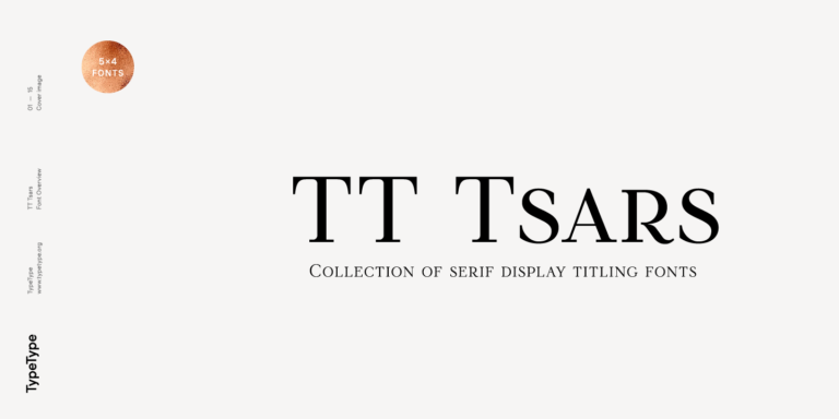
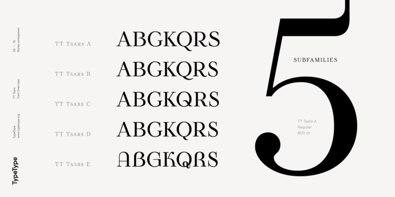
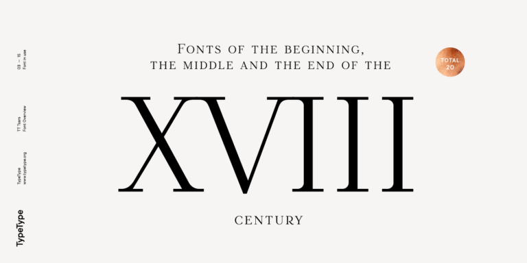
The TT Tsars font family is a collection of serif display fonts that are stylized to resemble the fonts of the beginning, the middle, and the end of the XVIII century.
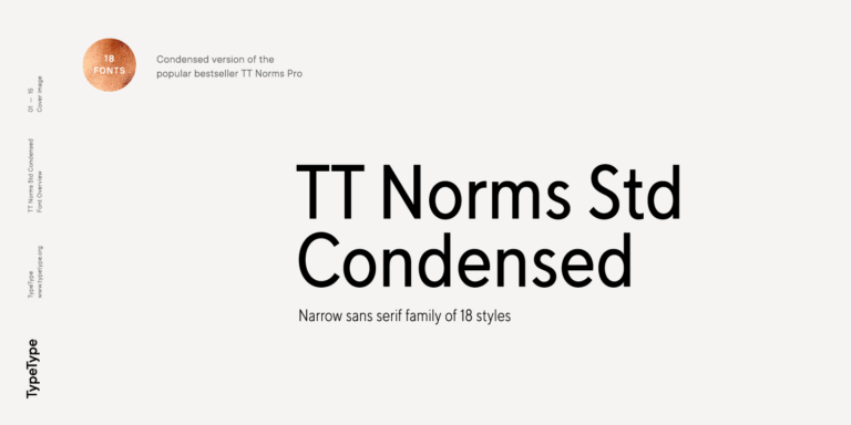
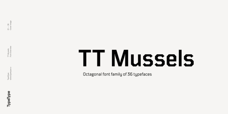
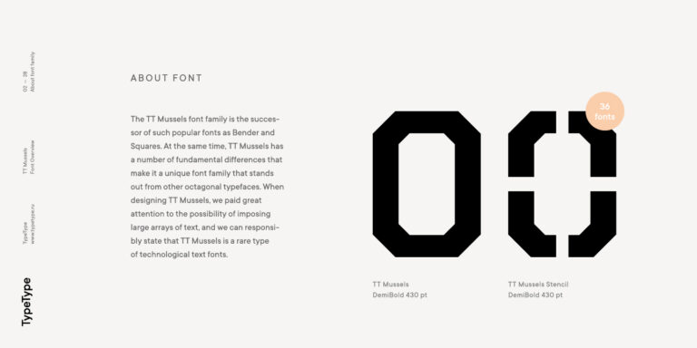
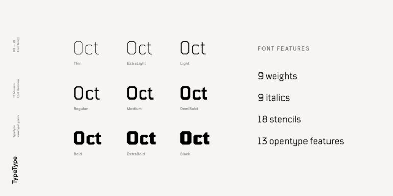
When designing TT Mussels, we paid great attention to the possibility of imposing large arrays of text, and we can state that TT Mussels is a rare type of technological text fonts.
German fonts can range from historical blackletter to clean grotesques and contemporary geometric sans serifs. For heritage or cultural projects, darker and more angular forms may be appropriate; for corporate, technology, or editorial work, restrained sans serifs often provide better versatility. Choose according to the project’s period, tone, readability requirements, and amount of text rather than nationality alone.
Which Typefaces Are Closest to a Classic German Look?
Classic german fonts are often associated with blackletter traditions such as Fraktur, which use narrow proportions, angular details, dense rhythm, and calligraphic stroke contrast. For a historical impression, look for these structural characteristics rather than simply decorative Gothic details. They are generally most effective in short display text, titles, packaging, or projects with an intentional heritage reference.
Are These Styles Suitable for Branding?
Yes, but the level of historical reference should match the brand. Modern german fonts with structured proportions and restrained details can work well for technology, architecture, manufacturing, or corporate identities. More expressive historical forms suit brands built around heritage or craftsmanship. In either case, check scalability, readability, and how the design performs beyond the logo.
Can I Use German Fonts for Commercial Projects?
Yes, TypeType’s german fonts are available for commercial licensing, with the required license depending on the intended use. The collection can be tested before purchase, while commercial applications may require rights for desktop, web, apps, video, or other media. Review the specific licensing terms for your project before publishing or distributing the final design.
How Do I Test a Typeface Before Buying?
Test the german font style with real project content rather than sample words alone. Use headlines, paragraphs, brand names, interface labels, and German-specific characters to evaluate readability and tone. Check available weights, spacing, language coverage, and performance at the sizes you expect to use. TypeType currently provides Trial License access for families in this category.
Enter your email address and spin the sun to win up to 100% off or TypeType services
Giveaway rules:
Each user can only play once;
Each promo code is unique and can only be used once;
The promo code discount applies only to purchases up to $5,000 in the online store;
Please note that the "Font Renaming," "Your Logo in a Font," and "Basic Customization" services do not apply to previously purchased fonts and are only available for new orders;
If you win a service, our manager will contact you within three business days with the details.