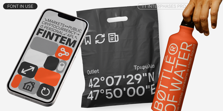
If you need a clear and functional sans serif, but are tired of typical fonts and seek something similar to DIN® Next, consider our alternatives. They retain the same technical aesthetic while offering more possibilities for modern design. Fonts from the TypeType selection serve as excellent replacements for the original: they perform equally well in navigation, interfaces, and corporate identity, all while adding a touch of individuality to your project.
If you are tired of overused typefaces and are looking for fonts similar to DIN® Next, check out our best free-to-try DIN® Next alternatives, which have similar characteristics as well as new, unique design features. Some of the fonts belong to the same type category, and others are suitable for the same tasks or have similar traits but stand out for their distinct details or proportions.
At TypeType, you’ll find cutting-edge fonts like DIN® Next and even better: here are some stunning and not-so-ubiquitous DIN® Next alternatives. Use this list of highest-quality DIN® Next-like fonts as you prefer. Our list provides a broader range of options for choosing the best font match for your project and refreshing your designs. All fonts featured in this collection are available in multiple formats and at affordable prices, so you can find one to fit your every need!
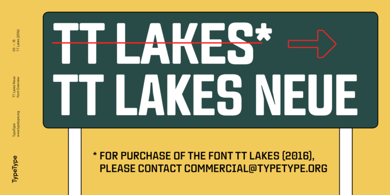
Find a great DIN® Next replacement font and try to recreate a similar mood and capture the feeling you aim for by using it in your designs. Each font presented on this page is a twin of the DIN® Next font, practically identical to it.
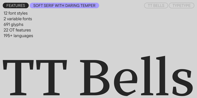
TT Bells combines the elegant softness of Antiqua with a complex and daring temper reflected in straight stroke terminals and arrowheaded serifs. The typeface is based on the broad nib, which creates these hallmark terminals and serifs.
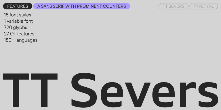
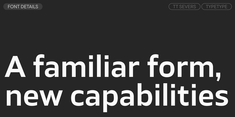
TT Severs is a geometric sans serif with emphasized elements of internal brackets. The main visual feature of TT Severs is the unusual form of internal ovals.
TT Regins is a Scottish modern serif. Striking contrast and sharp triangular serifs give this font a stern and commanding character, while refined forms, enlarged lowercase letters, and slightly condensed, static proportions add grace to its design.
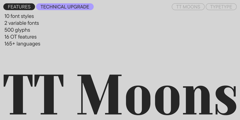
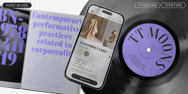
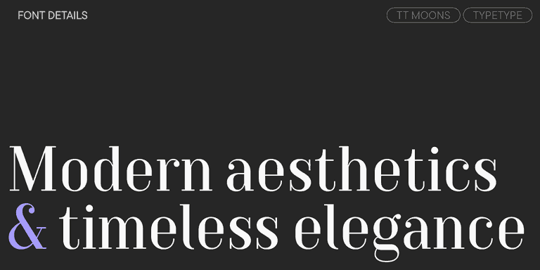
TT Moons is a slim and contrast serif. This font family works especially smart in classic design themes. TT Moons is a typeface of the glyptal modern typeface.
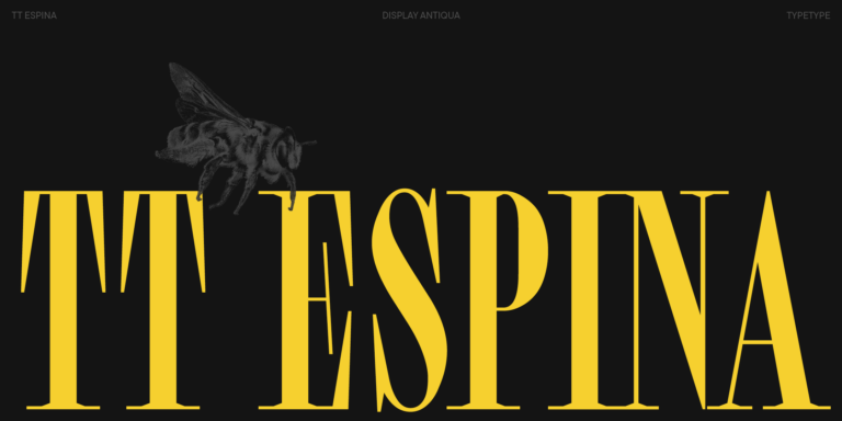
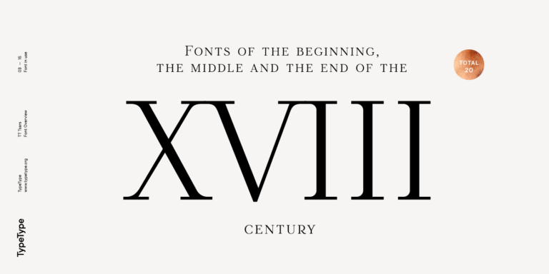
The TT Tsars font family is a collection of serif display fonts that are stylized to resemble the fonts of the beginning, the middle, and the end of the XVIII century.
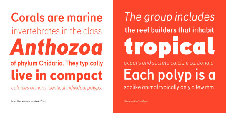
TT Corals is a modern humanistic sans serif which has many typical traits of the beginning of the 20th century. For an increased functionality of the font family, we`ve created 6 styles of various weights.
Enter your email address and spin the sun to win up to 100% off or TypeType services
Giveaway rules:
Each user can only play once;
Each promo code is unique and can only be used once;
The promo code discount applies only to purchases up to $5,000 in the online store;
Please note that the "Font Renaming," "Your Logo in a Font," and "Basic Customization" services do not apply to previously purchased fonts and are only available for new orders;
If you win a service, our manager will contact you within three business days with the details.