top_banner_ttnormspro0426
Type foundryFonts & StylesRoboto

Fonts similar to Roboto

Searching for typefaces that combine Roboto’s clean and versatile character with a fresh design perspective? Our carefully selected Roboto alternatives strike the right balance between functionality and individuality, making it easier to shape memorable brands and compelling digital products. Explore options designed for both visual appeal and reliable usability.

Similar to: Roboto

Why Designers Look for Fonts Similar to Roboto

Roboto has become one of the most familiar sans serifs in digital design. It is clean, practical, easy to read, and closely associated with Android, Google products, and everyday interface experiences. That reliability is exactly why designers keep returning to it. At the same time, its popularity can make a project feel predictable. When a typeface is seen almost everywhere, it may no longer help a brand express a unique point of view. Many teams want the same clarity and usability, but with a more distinctive voice—something polished, professional, and less tied to a default system look.

What Makes a Typeface Feel Like Roboto

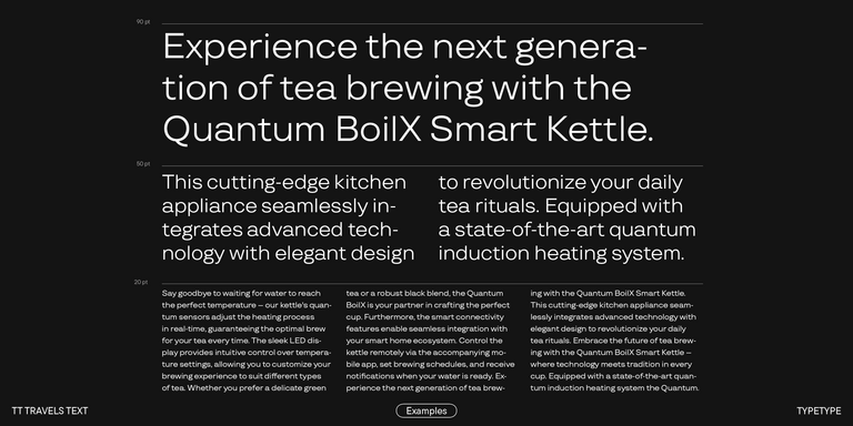
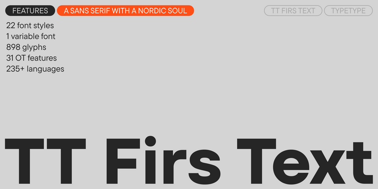
Roboto combines a structured, almost technical foundation with open curves and a natural reading rhythm. This balance makes it useful in apps, websites, long-form content, navigation, dashboards, and brand systems. Good fonts like Roboto usually share several traits: low visual noise, clear letterforms, stable proportions, multiple weights, and strong multilingual support. They should remain readable at small sizes, work across screens, and support clear hierarchy without looking too decorative. The best options do not copy Roboto directly; they preserve its practical logic while adding their own character, details, and typographic texture.

Choosing the Closest Fit for Your Project

When choosing Roboto alternatives, start with the role typography needs to play in your project. For a product interface, readability, spacing, rendering quality, and a flexible weight range may matter most. For branding, you may need a type family that feels familiar enough to be intuitive, yet distinctive enough to make the identity more memorable. For editorial, marketing, or packaging, tone becomes just as important as function.

A strong replacement should support the entire design system, not only resemble a well-known sans serif at first glance. Look at how it performs in headlines, body text, buttons, captions, numbers, and dense information blocks. Check language coverage, OpenType features, licensing, and available formats before making a final choice. The wrong option can make a product feel generic or visually inconsistent. The right one brings clarity, calm, and intention—while giving the brand more room to stand apart.

Discover TypeType’s Collection

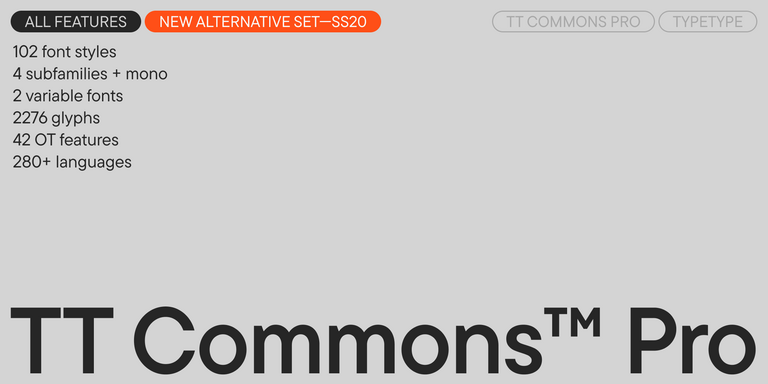
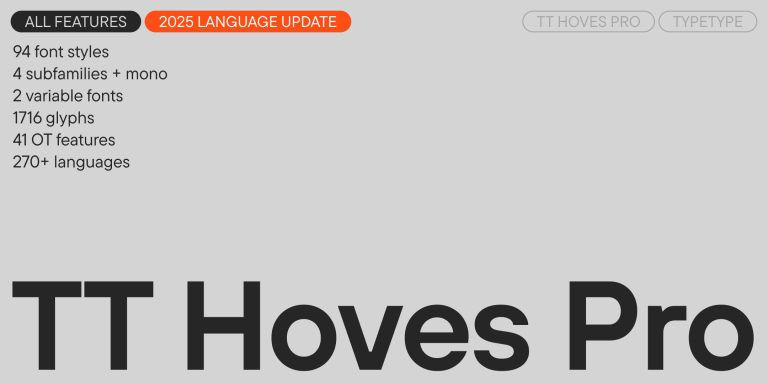
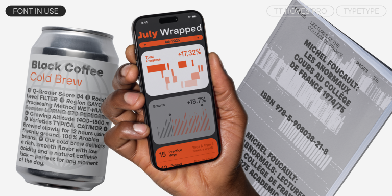
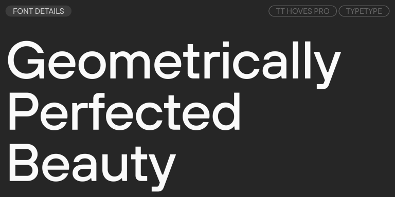
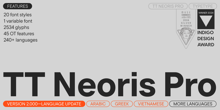
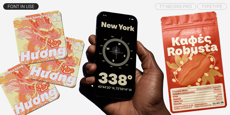
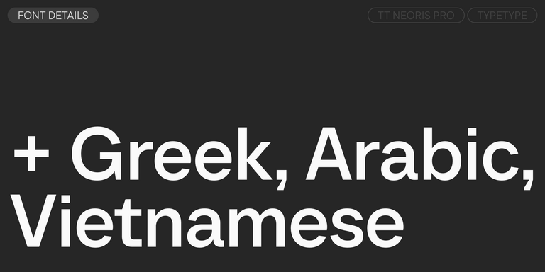
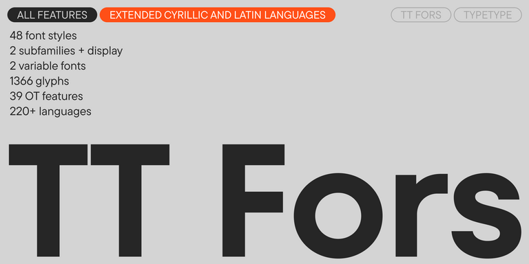
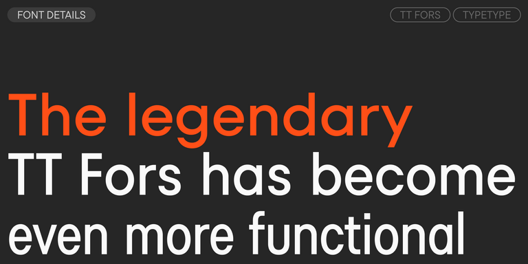
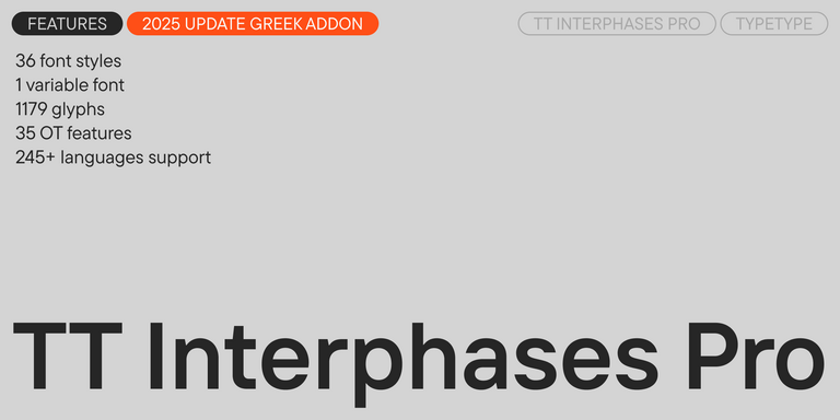
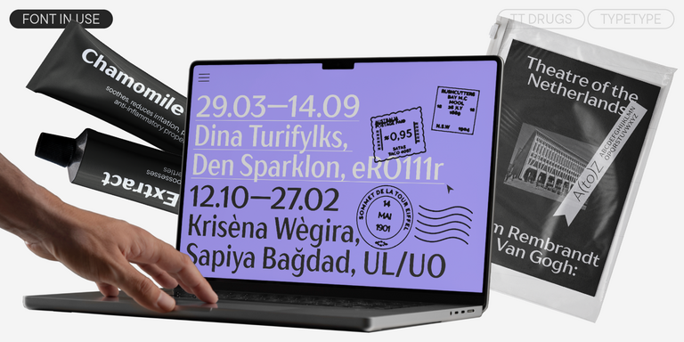
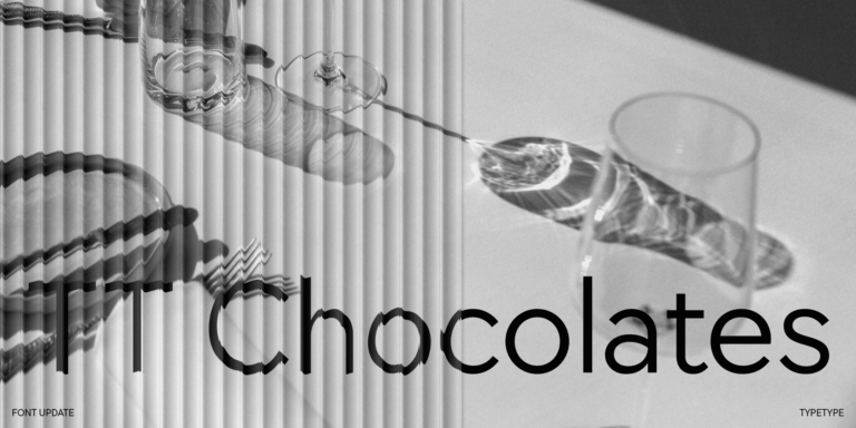
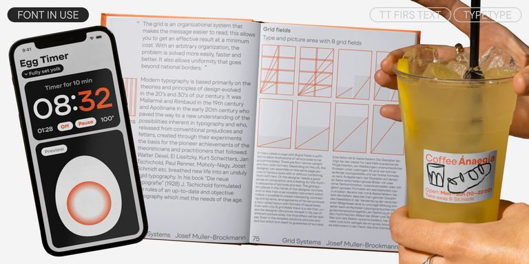
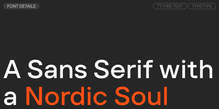
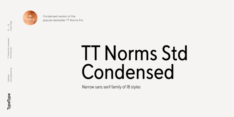
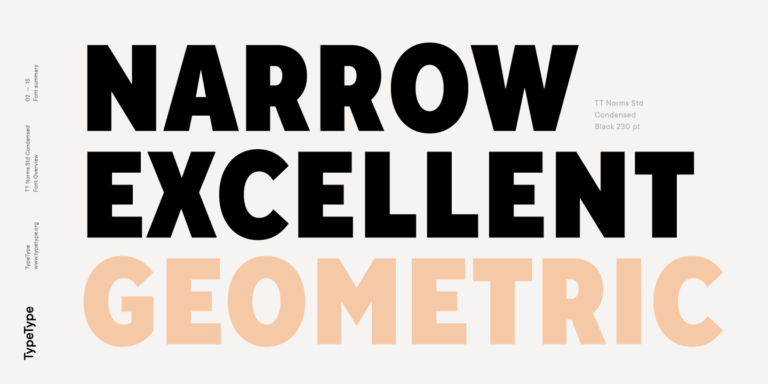
TypeType’s collection includes modern sans serifs that work well for teams looking for similar fonts to Roboto with a more individual design voice. Families such as TT Norms® Pro, TT Commons™ Pro, TT Hoves Pro, TT Interphases Pro, TT Neoris Pro, and TT Fors offer clean structure, broad usability, and carefully crafted details for digital and brand environments.

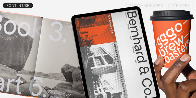
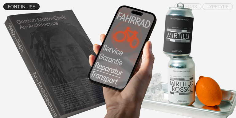
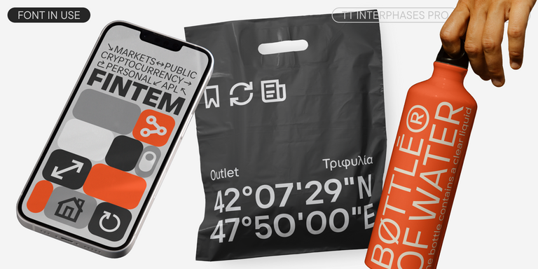
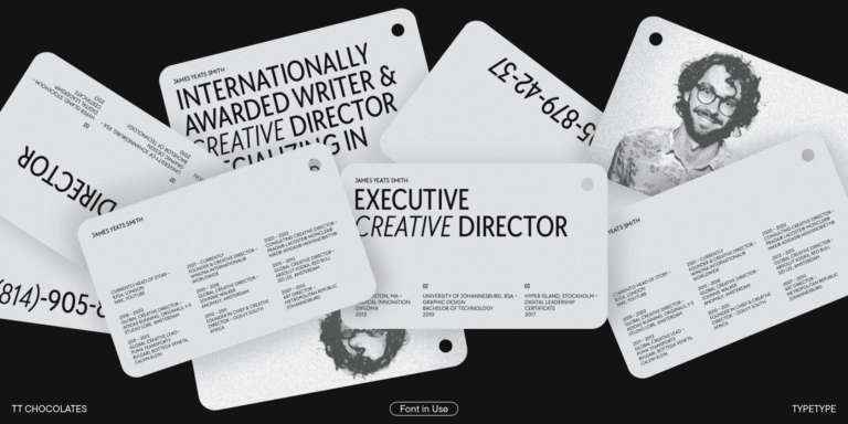
These typefaces are designed for real-world projects: interfaces, websites, apps, corporate identities, presentations, packaging, and editorial layouts. Many TypeType families include extensive language support, large style ranges, advanced OpenType features, and variable options that make typography easier to adapt across platforms and screen sizes. Instead of choosing a generic default, designers can build a system that feels clear, reliable, and more ownable. Each family can be tested before purchase, making it easier to compare rhythm, tone, and usability inside an actual layout.

  • The quick brown fox jumps over a lazy dog.
  • Pack my box with five dozen liquor jugs.
  • Sphinx of black quartz, judge my vow
  • 0123456789 !?.,:;—–()[]{}<> “quotes” ‘apostrophe’ @#%&*_+=/\| № $ € £ ₽ +−×÷=≠≤≥ … % © ® ™
  • Aa Bb Cc Dd Ee Ff Gg Hh Ii Jj Kk Ll Mm Nn Oo Pp Qq Rr Ss Tt Uu Vv Ww Xx Yy Zz
Leading
1.1
Tracking
0px
Bestseller
TT Norms® Pro Regular
104 font styles

The bestseller TT Norms® Pro—a geometric sans serif, trouble-free workhorse

Bestseller
104 font styles

TT Commons™ Pro is a completely redesigned version of the well-established classic font family TT Commons.

Bestseller
TT Hoves Pro Regular
96 font styles

TT Hoves Pro is a versatile sans-serif with a recognizable geometry

Bestseller
TT Neoris Pro Regular
21 font styles

TT Neoris is an elegant Neo-Grotesque with unlimited potential and a font that encompasses all modern requirements and user desires.

Bestseller
TT Fors Regular
50 font styles

TT Fors is a modern geometric sans serif with characters and shapes contrasting in width.

Bestseller
43 font styles

TT Interphases Pro is a neo-grotesque sans serif with equal-width proportions

TT Drugs Regular
37 font styles

TT Drugs is a typeface that doesn`t feature serifs but stands out for its high contrast.

New
TT Travels Text Regular
21 font styles

TT Travels Text is a geometric grotesque with wide proportions and specific shapes of circles and fillets, which includes two stylistic sets with completely different natures.

TT Chocolates Regular
29 font styles

TT Chocolates typeface consists of 14 fonts: 7 weights and 7 obliques. Due to the extended language support and the introduction of useful features.

New
TT Firs Text Regular
23 font styles

We have released a brand-new font. Meet TT Firs Text—a geometric sans serif with a Nordic character!

18 font styles

TT Norms Condensed continues to develop the ideas of neutrality and versatility stemming from our bestselling TT Norms.

FAQs

What are the best alternatives to Roboto?

The best alternatives are clean, versatile sans serifs that keep text easy to read while giving a project a more individual voice. For digital products, pay attention to screen performance, clear letterforms, balanced spacing, and a wide range of weights. Variable support and compatibility with design systems are also valuable when typography needs to scale across websites, apps, and brand materials.

What font is closest to Roboto?

There is no exact copy, since every typeface has its own proportions, rhythm, and details. However, the closest font to Roboto will usually share its mix of geometric structure and humanist influence. Look for open apertures, stable shapes, multiple weights, and strong multilingual support. The right choice depends on whether you need clarity for UI, personality for branding, or comfort for long-form reading.

Are Roboto-like typefaces suitable for branding projects?

Yes. These typefaces are a strong choice for brands that want to communicate simplicity, trust, and modernity. Their neutral structure makes them easy to use across logos, websites, presentations, ads, and product interfaces. A well-crafted alternative can keep the familiar clarity users expect while helping the brand avoid a generic default look.

Can I use Roboto similar fonts for commercial projects?

Yes, fonts similar to Roboto from TypeType can be used in commercial projects with the proper license. Choose the license based on where the typeface will appear: desktop, web, app, digital ads, video, publishing, games, server use, or another format. Trial versions are useful for testing and presentations, but commercial release requires a paid license.