
Introducing TT Tricks, version 2.000! We improved this modest serif by amplifying its character set, adding more supported languages, new OpenType features, and variable fonts, and enhancing its visual and technical characteristics.
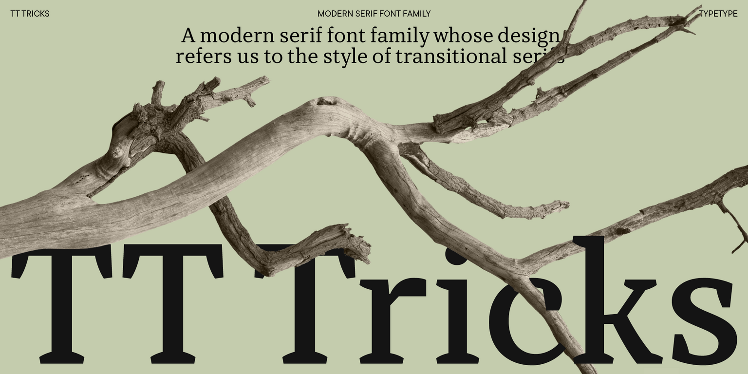
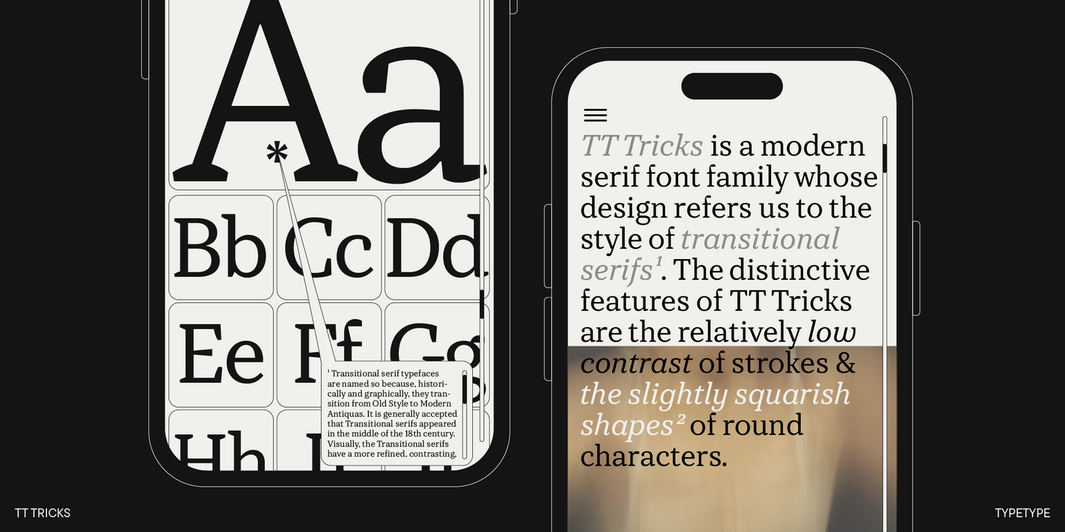
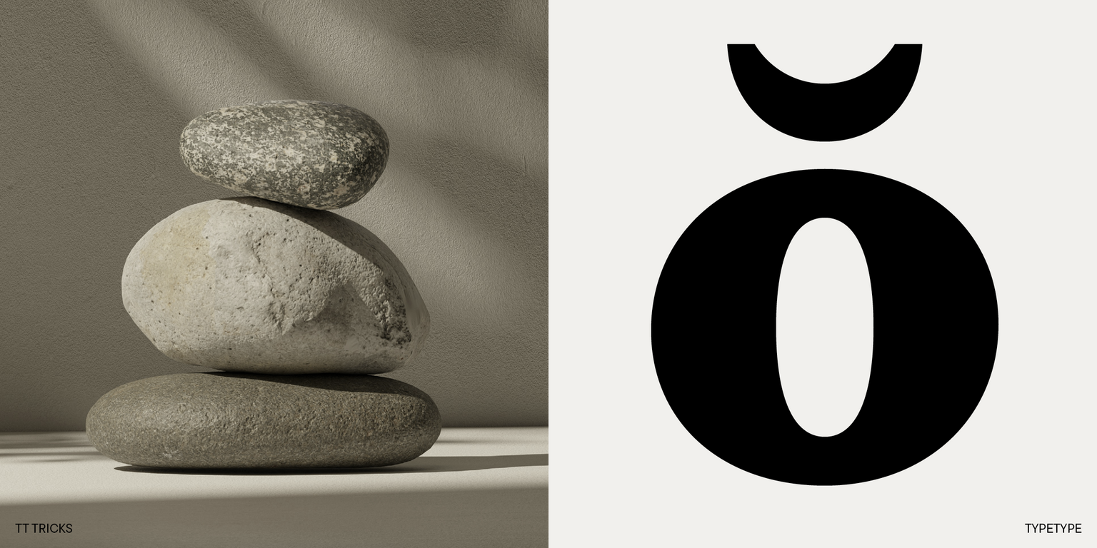
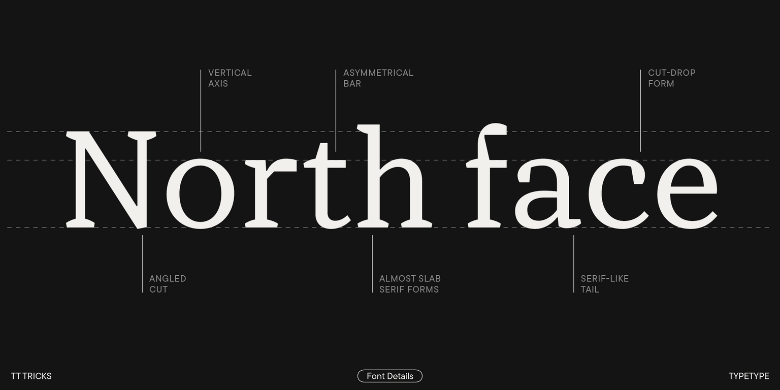
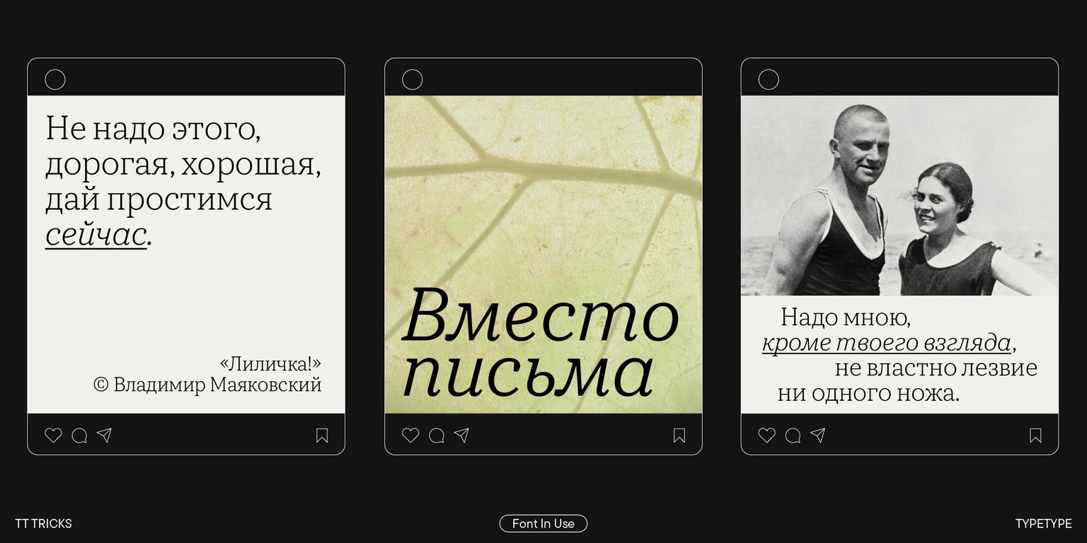
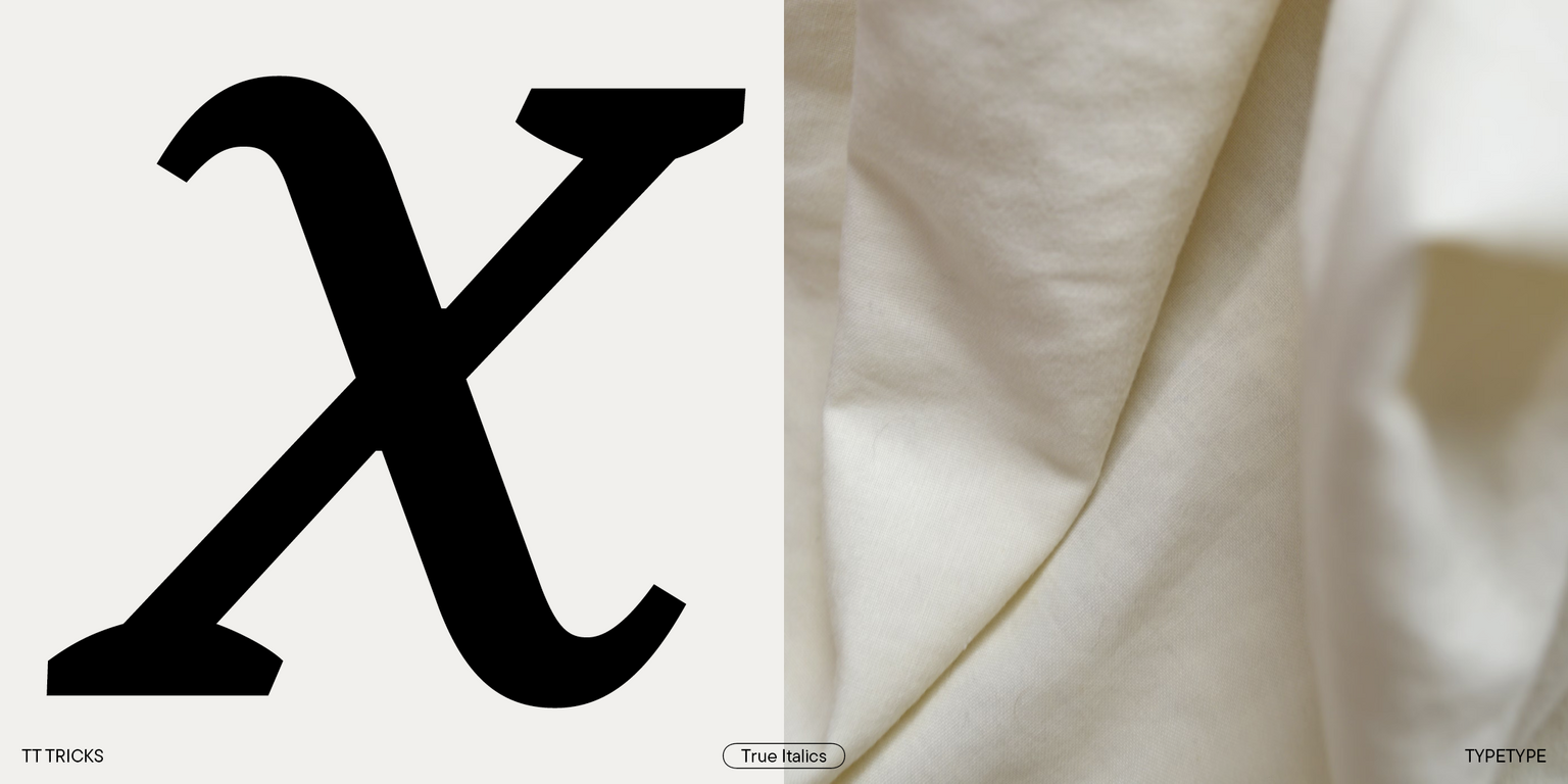
TT Tricks is a modern text serif with a design reflecting the style of Transitional serifs. This font has a calm, elegant, and moderately stern character. It stands out for its relatively low stroke contrast, large serifs, narrowed proportions, and slightly squared forms of round characters. All these visual aspects give the font a distinctly formal tone.
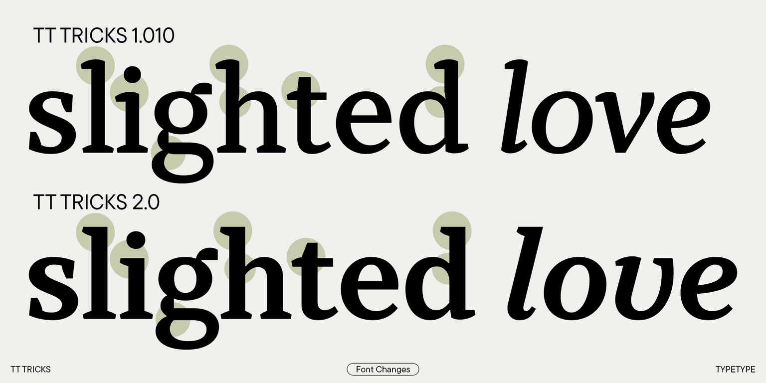
After the update, the font became calmer and less expressive, which made it more suitable for running text. Consequently, its application range has expanded. Besides, we introduced 11 new stylistic sets and two variable fonts with a weight variation axis: one for roman styles and the other for italics.
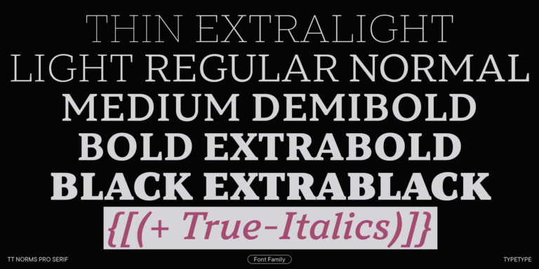
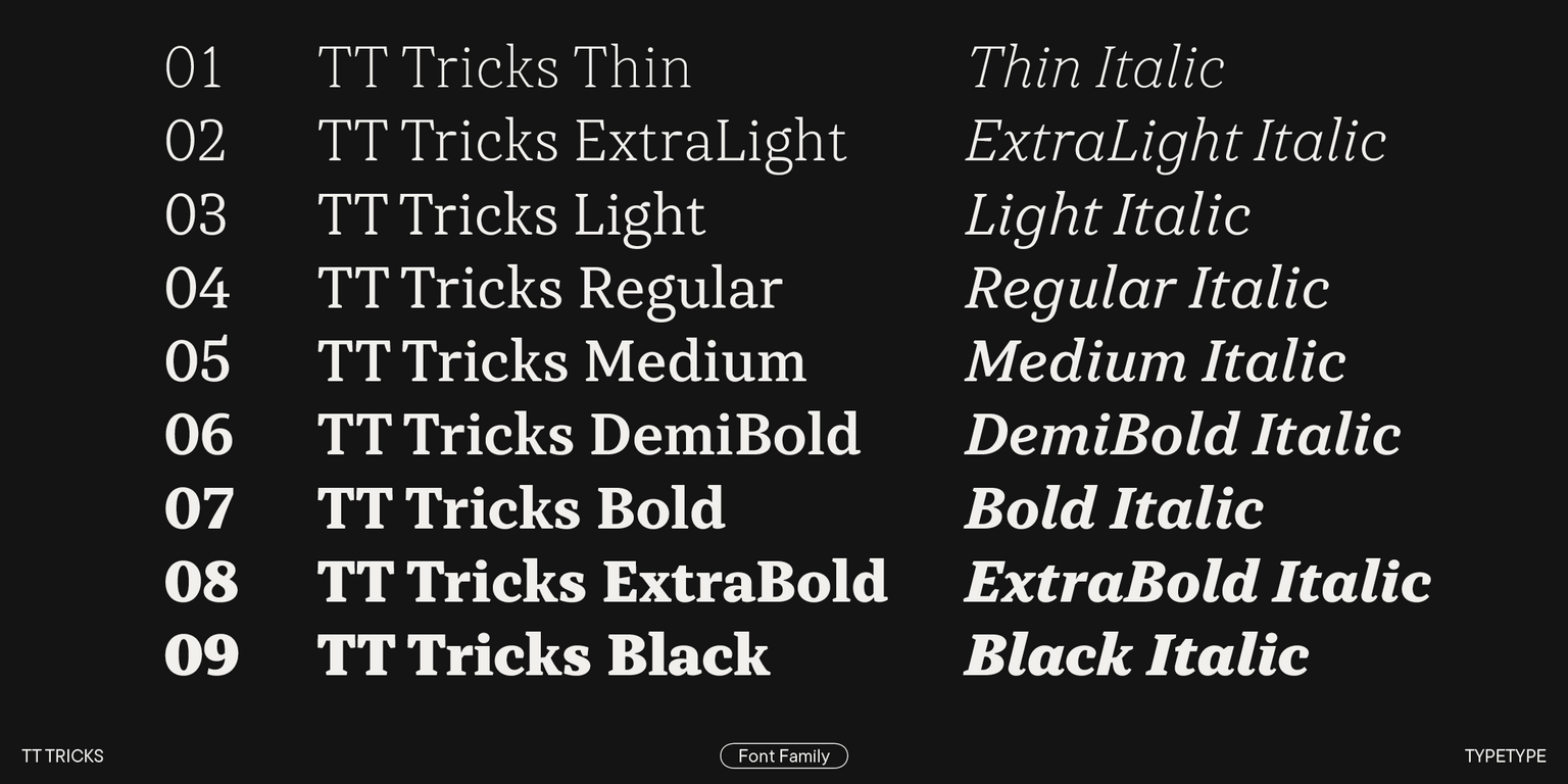
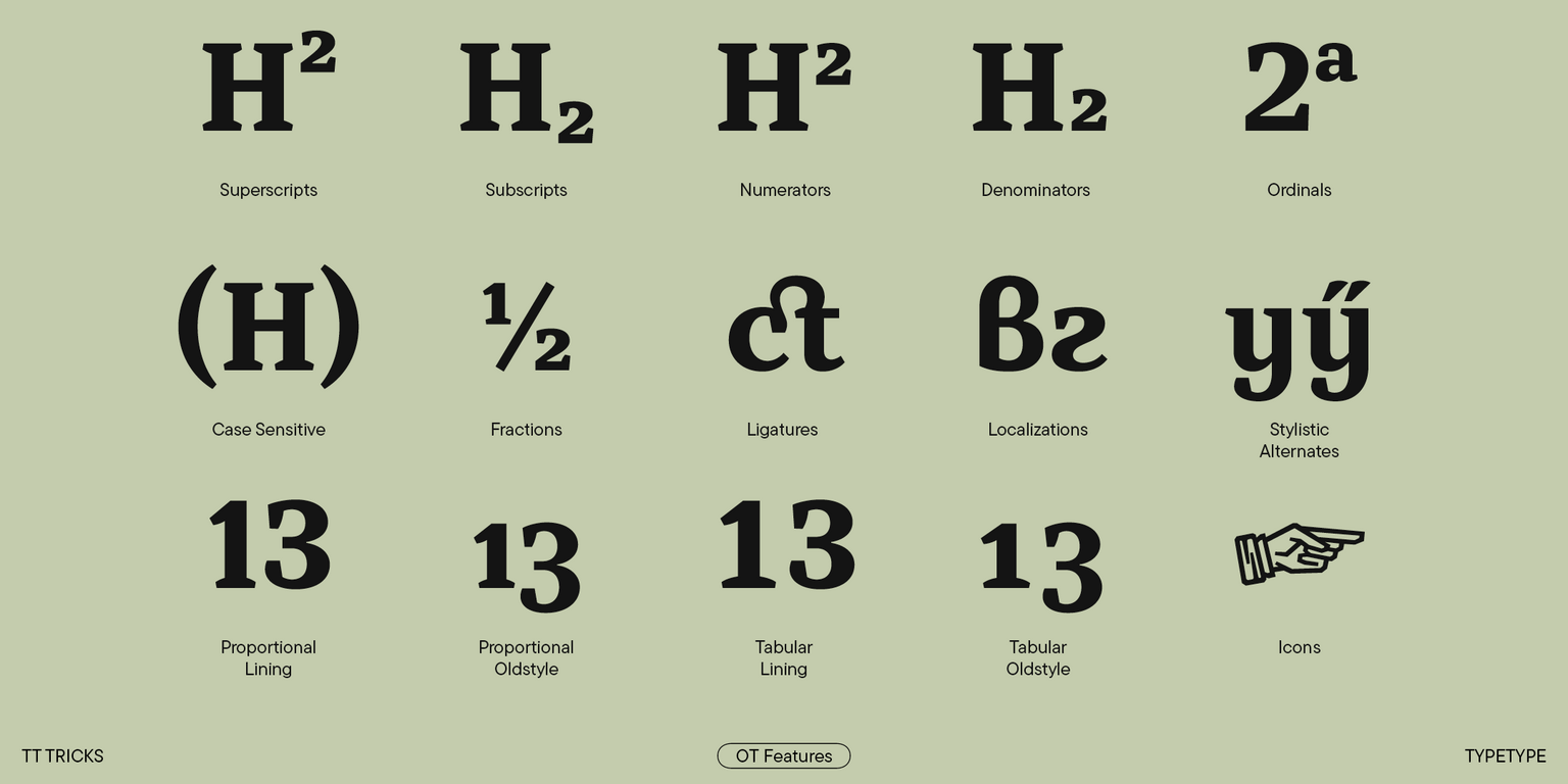
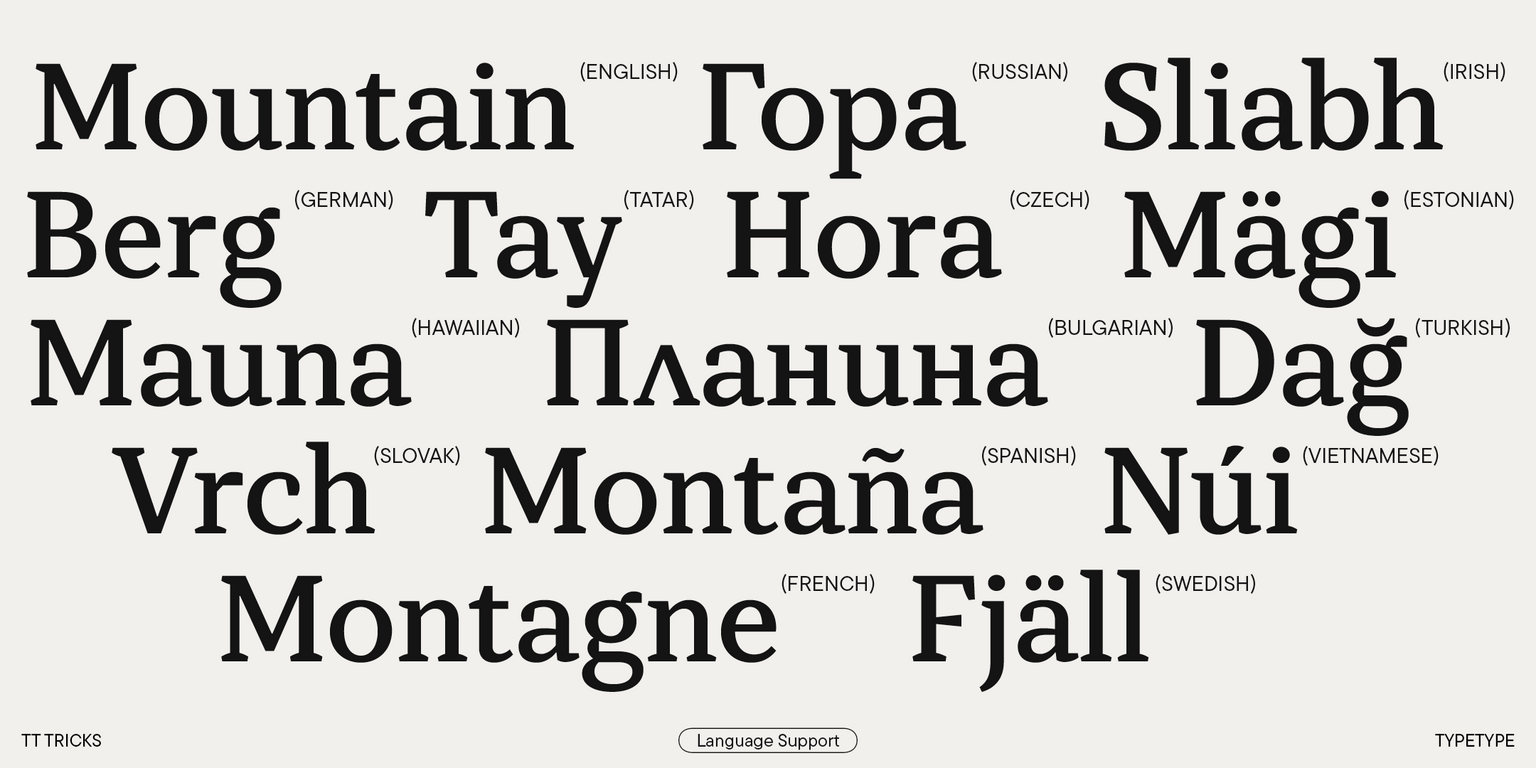
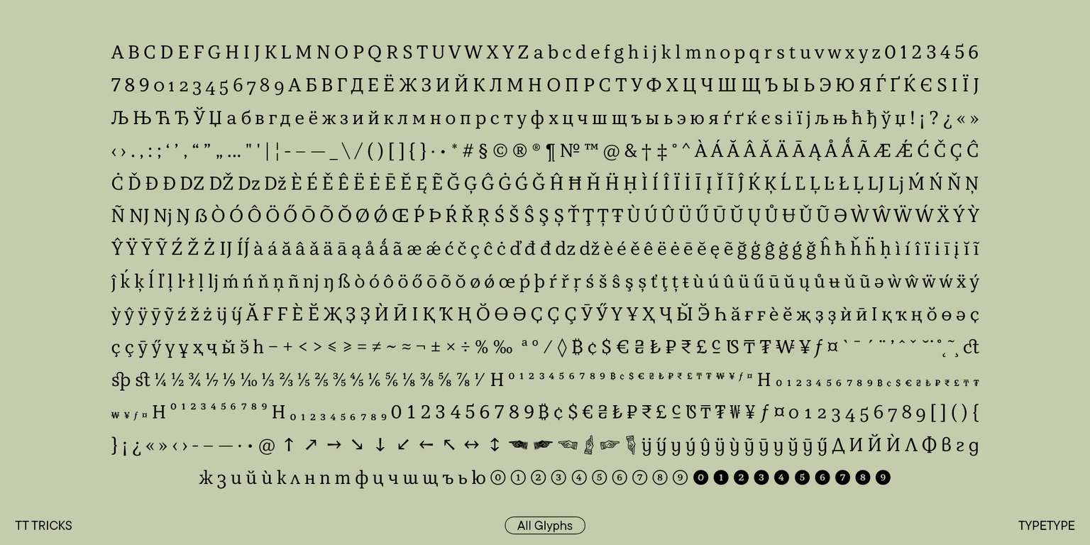
The 2.000 version also acquired new font styles: Thin, Thin Italic, ExtraLight, ExtraLight Italic, Medium, Medium Italic. We refined all contours, modified the form of serifs, and redesigned italic font styles. The typeface now has 12 more OpenType features and more supported languages, including Cyrillic-based ones. We improved kerning and enhanced hinting. The character set was significantly expanded. In particular, we completed the extended Cyrillic character set, amplified the Latin one, added more basic currency symbols, and implemented fractions, numerators, and denominators.
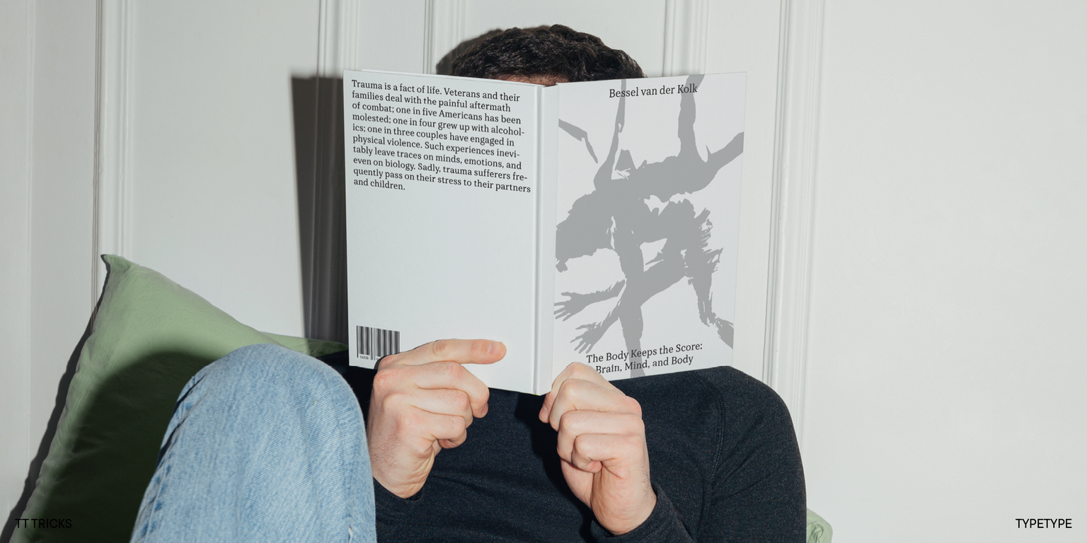
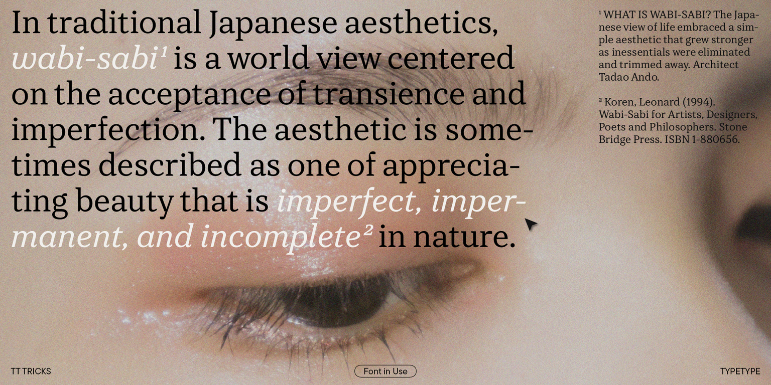
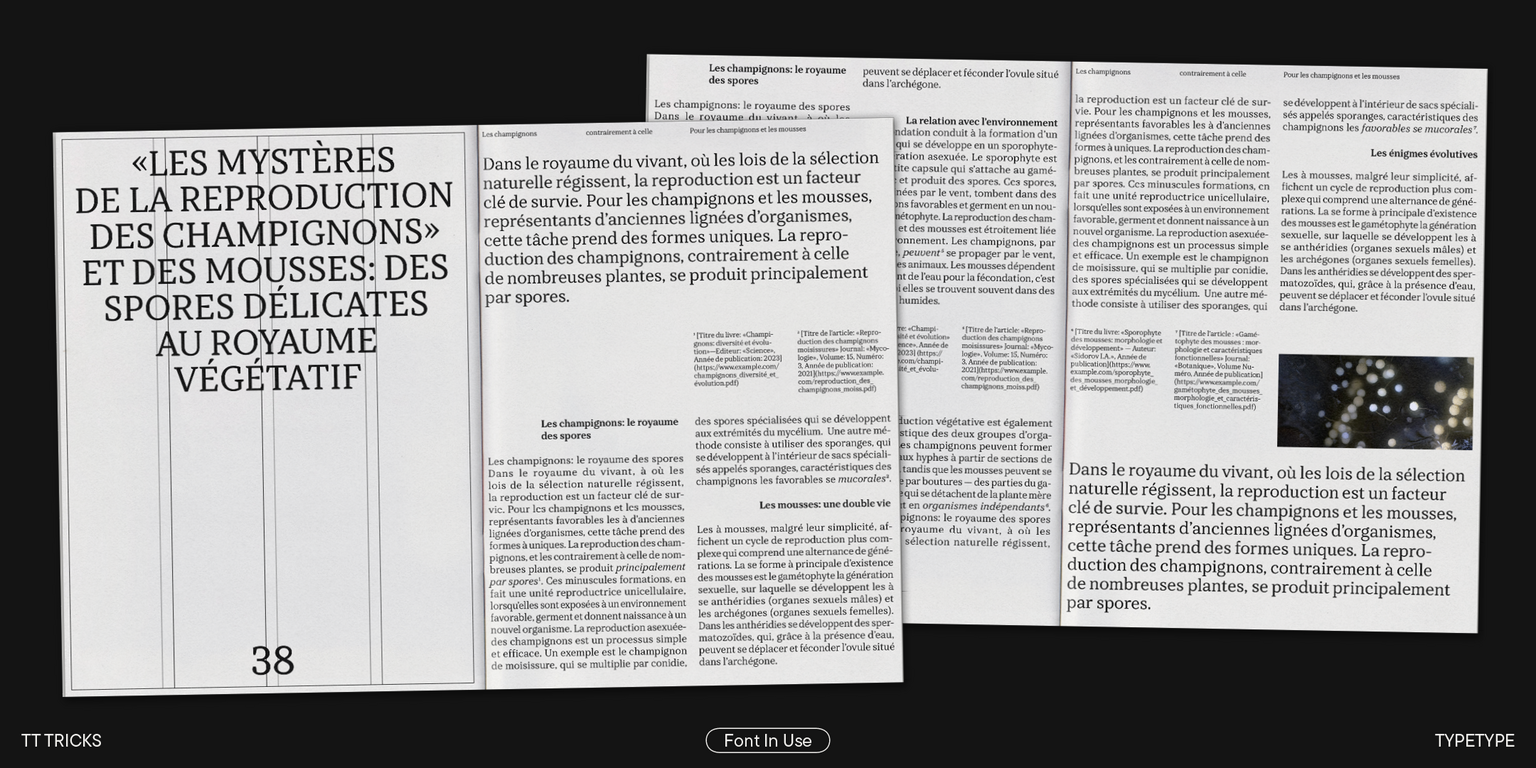
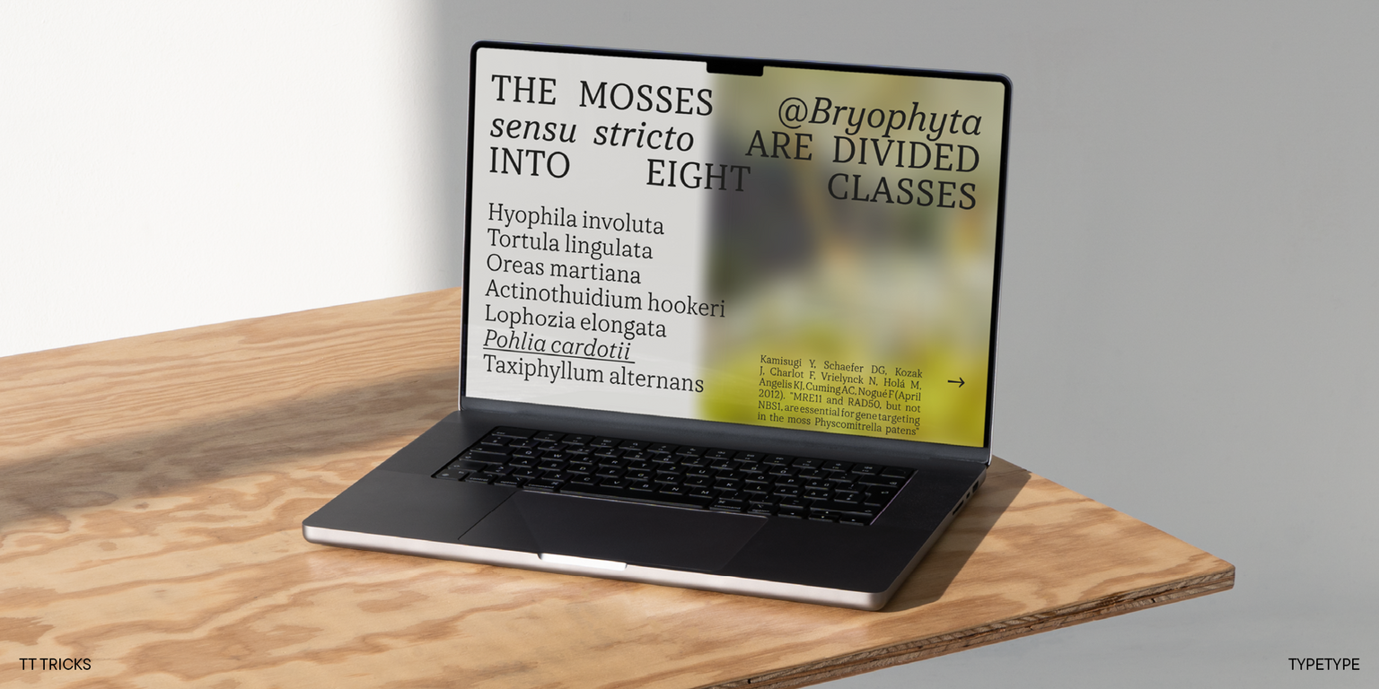
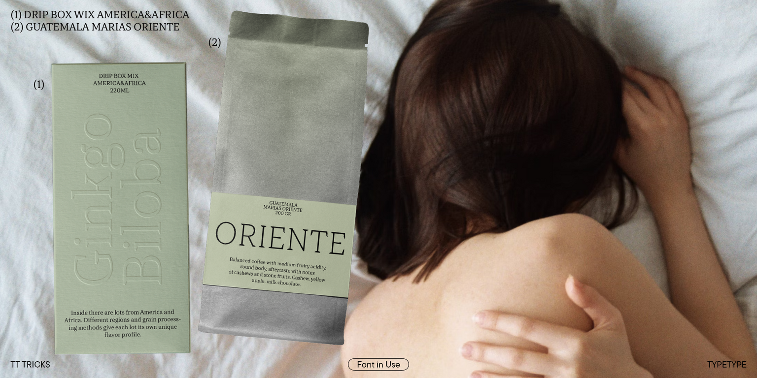
TT Tricks is a genuine classic: it looks modest but highly relevant. Due to this appearance, the font has an extensive application range. TT Tricks unveils a totally different potential depending on the context in which it is used. It has excellent readability in small point sizes and exhibits expressive details in large point sizes, looking very aesthetic.
The updated TT Tricks includes:
- 20 font styles: 9 roman, 9 italic, and 2 variable fonts;
- 866 characters in roman font styles and 858 characters in italic font styles;
- 29 OpenType features;
- 230+ languages support.
TT Tricks is a businesswoman of the serif world: determined, modern, and elegant!