top_banner_ttnormspro0426
Type foundryFonts & StylesCute

Cute Fonts

Charming and full of warmth, cute fonts feature playful serifs, rounded forms, and a friendly personality. Perfect for projects that convey positivity—such as children’s products, greeting cards, café branding, and social media—these fonts bring a touch of whimsy and joy to any design. In the TypeType collection, each character is thoughtfully crafted with love, ensuring a delightful visual experience.

Tags: Cute
Cute Fonts

What Makes a Typeface Feel Cute?

A cute typeface is not just «sweet-looking.» Its personality usually comes from a careful mix of shape, rhythm, and detail. Rounded corners, soft curves, playful proportions, open counters, relaxed spacing, and gentle terminals can make lettering feel warmer and more approachable. Some designs also use irregular forms, decorative details, or a slightly handmade mood to create a sense of joy and spontaneity.

Good cute typography feels friendly without becoming childish by default. It can express creativity, optimism, softness, care, or imagination depending on the visual context. The right lettering style helps a brand sound more human and emotionally open, making the audience feel welcome from the first glance.

Where Cute Fonts Work Best

Cute styles work especially well when a project needs warmth, charm, or a lighthearted tone. They are a natural fit for children’s products, greeting cards, café branding, dessert packaging, stationery, toys, lifestyle blogs, social media graphics, stickers, book covers, and event invitations. In these cases, lettering becomes part of the emotional experience, not just a way to display words.

A cutesy font can also be useful for modern brands that want to appear friendly rather than formal. Beauty, wellness, handmade goods, pet products, creative workshops, and small local businesses often benefit from this softer visual language. The key is balance: use expressive styles for headlines, logos, packaging accents, or short phrases, and pair them with a clearer text face when readability matters.

Finding the Right Style for Your Project

Before choosing a typeface, think about the emotion your audience should feel. Should the project seem playful, cozy, nostalgic, dreamy, innocent, bold, or imaginative? The answer will guide the level of softness and expression you need.

Also consider where the lettering will appear. A large poster, logo, or package label can handle more personality, while captions, menus, and interface text need better clarity at small sizes. Check the number of styles, language support, punctuation, numerals, and available OpenType features. If you are comparing different cute fonts to write in, test them with real words from your project, not only sample phrases. This will show whether the design feels natural in context and whether it supports your brand voice.

Explore TypeType’s Collection

TypeType’s collection brings together friendly, expressive, and carefully crafted typefaces for projects that need charm without losing professional quality. The page features a broad range of cute font names, from versatile families to more distinctive display options.

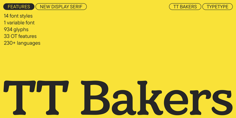
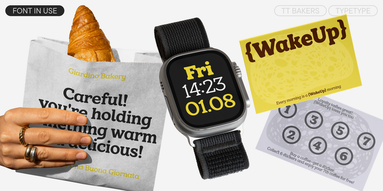
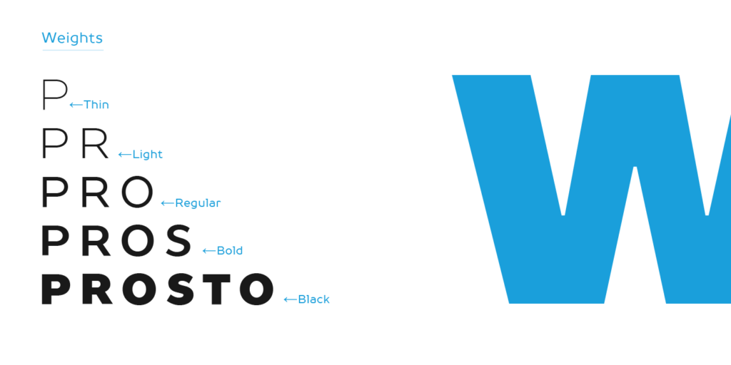
TT Commons™ Pro is a flexible choice for brands that need a clean and approachable foundation. TT Bakers has a warm, soft character that can feel right for food, lifestyle, and cozy visual identities. TT Biersal brings a playful and adventurous mood, while TT Dott offers an experimental pixel-based look for more unusual concepts. TT Quaris combines fluid shapes with refined contrast, and TT Ricordi Allegria adds elegance with a lively contemporary touch.

You can also explore expressive families such as TT Modernoir, TT Cometus, TT Travels Next, TT Trailers, and TT Ricordi Marmo when the project needs stronger visual character. Trial versions make it easier to test the selected style in real layouts before choosing the right license.

  • The quick brown fox jumps over a lazy dog.
  • Pack my box with five dozen liquor jugs.
  • Sphinx of black quartz, judge my vow
  • 0123456789 !?.,:;—–()[]{}<> “quotes” ‘apostrophe’ @#%&*_+=/\| № $ € £ ₽ +−×÷=≠≤≥ … % © ® ™
  • Aa Bb Cc Dd Ee Ff Gg Hh Ii Jj Kk Ll Mm Nn Oo Pp Qq Rr Ss Tt Uu Vv Ww Xx Yy Zz
Leading
1.1
Tracking
0px
Bestseller
104 font styles

TT Commons™ Pro is a completely redesigned version of the well-established classic font family TT Commons.

New
TT Dott Solid
2 font styles

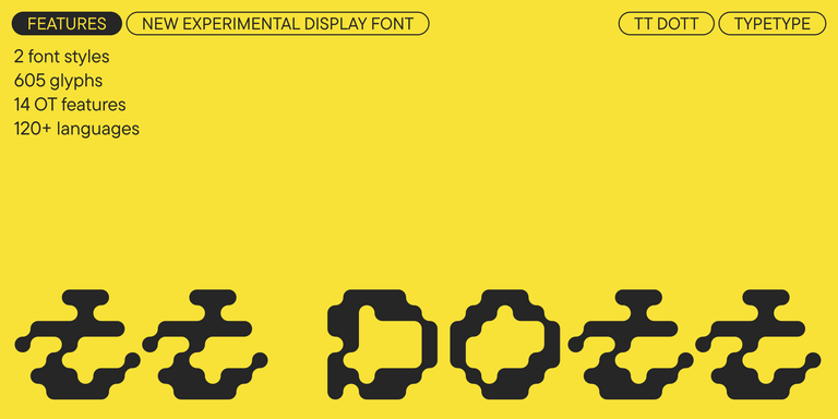
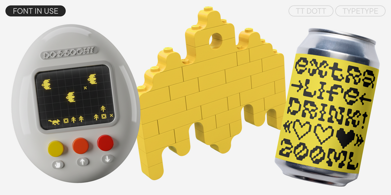
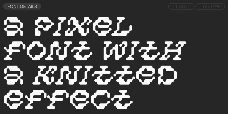
TT Dott is an experimental pixel grotesque where a circle is used as the base for the pixel. It is a fluid and unusual display font, evoking associations with embroidery and techno parties all at once.

TT Severs Regular
19 font styles

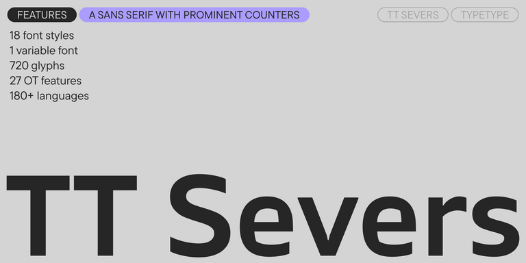
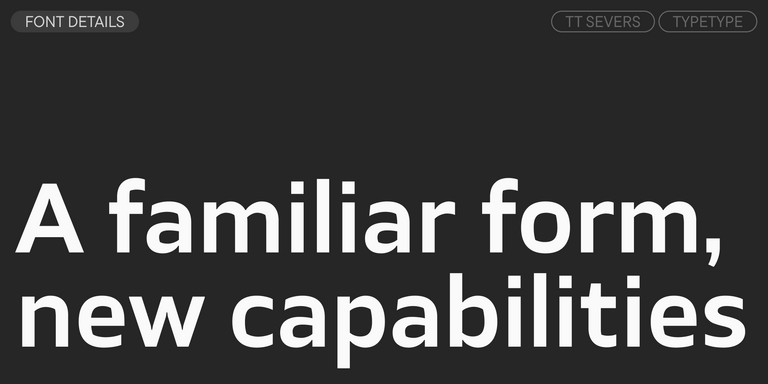
TT Severs is a geometric sans serif with emphasized elements of internal brackets. The main visual feature of TT Severs is the unusual form of internal ovals.

TT Jenevers Regular
14 font styles

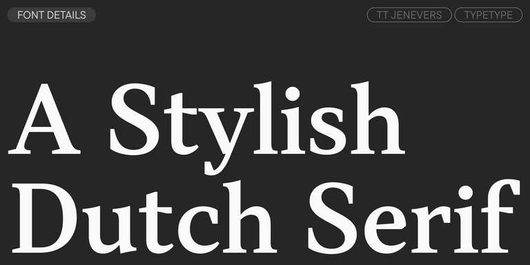
TT Jenevers is a modern serif with a Dutch flavor. The font family features the characteristic details peculiar to Dutch serifs—these are the asymmetrical shape of serifs and an irregular slant of ovals.

TT Frantz Variable
4 font styles

TT FRANTZ IS AN EXPERIMENTAL VARIABLE FONT, DISTINGUISHED BY ITS SLIMNESS AND LIGHTNESS. THE VARIATION IN THE FONT AFFECTS THE CHANGE IN THE HEIGHT OF THE MEAN LINE—BY MOVING THE AXIS ADJUSTMENT SLIDER YOU CAN EASILY RAISE OR LOWER THE MEAN LINE OF THE FONT.

New
TT Quaris Regular
14 font styles

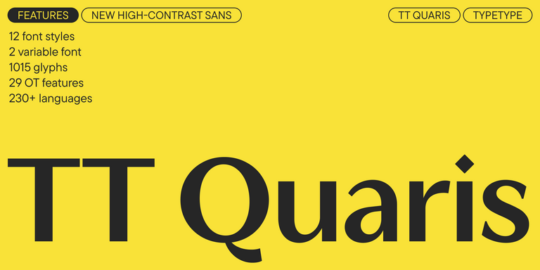
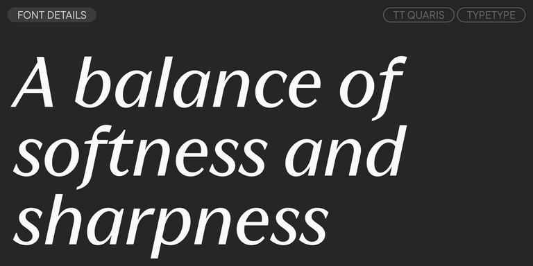
TT Quaris is an exquisite, modern high-contrast sans whose design balances between soft and sharp. The glyph shapes in the font are fluid and tend towards roundness, yet there are also sharp elements.

6 font styles

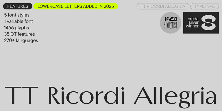
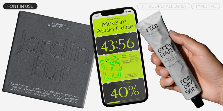
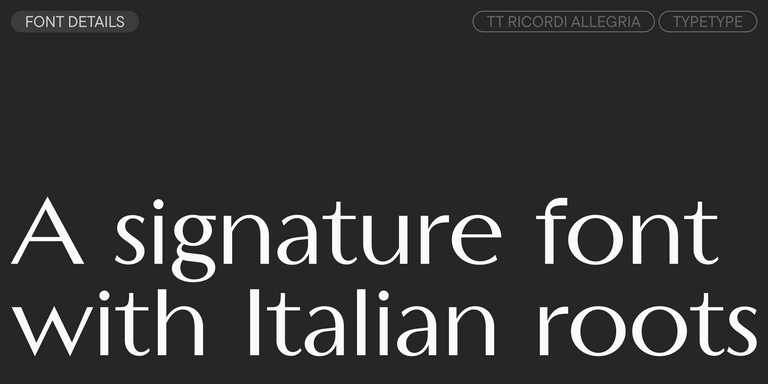
TT Ricordi Allegria is a sleek and intelligent contemporary Florentine grotesque.

New
TT Bakers Regular
15 font styles

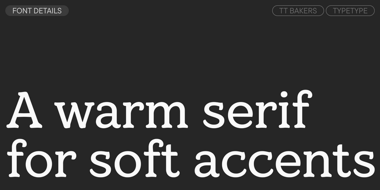
TT Bakers is a fluid serif with a gentle and lively character. This font is like freshly baked goods: it`s warm and soft, especially in its bolder weights.

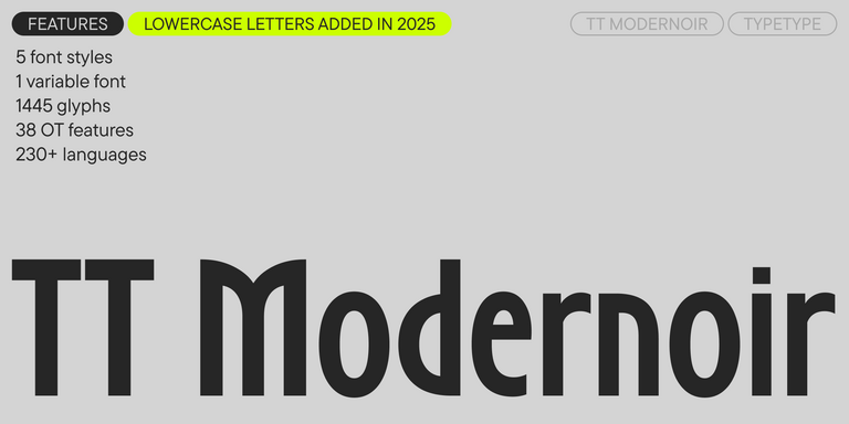
TT Modernoir Regular
6 font styles

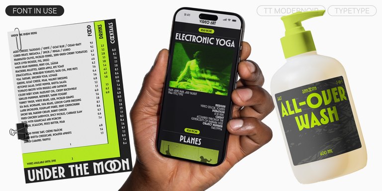
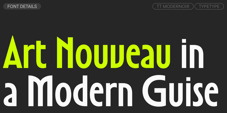
TT Modernoir is a display sans serif with dynamic proportions. Fluid lines and delicate Art Nouveau forms in this typeface blend seamlessly with the rhythmic flow and improvisational freedom of jazz.

4 font styles

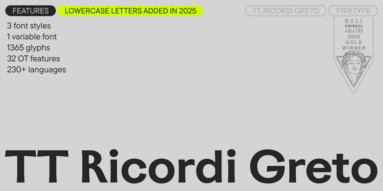
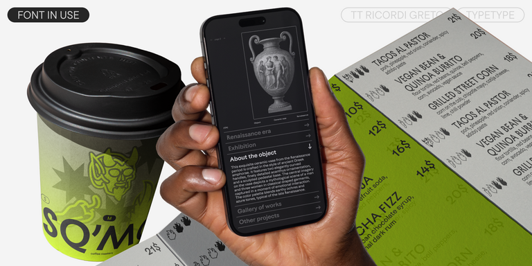
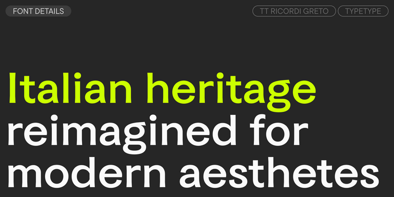
TT Ricordi Greto is an experimental project, inspired by a floor plaque dating from 1423 found in the Basilica di Santa Croce, Florence.

New
TT Biersal Upright
6 font styles

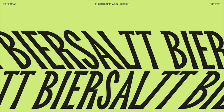
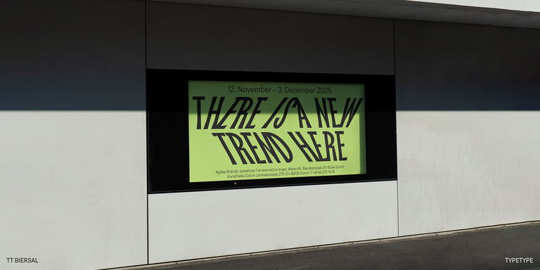
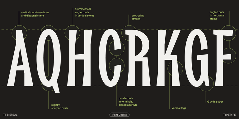
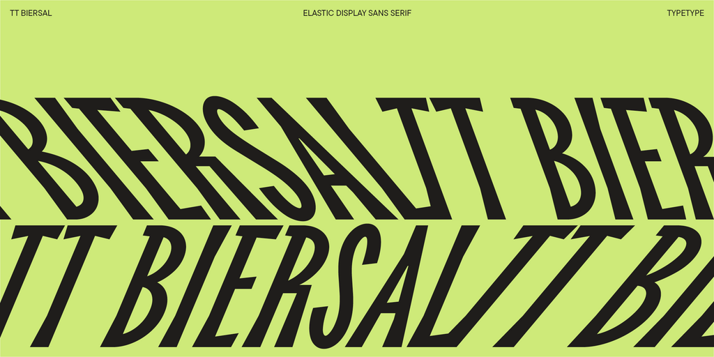
TT Biersal is a display sans serif with a free-spirited, playful, and adventurous nature. The concept of this font was sparked by a German poster from the early 1930s.

TT Tricks Regular
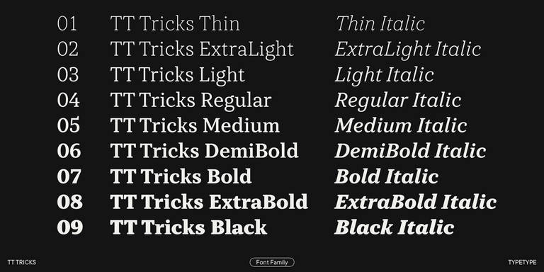
20 font styles

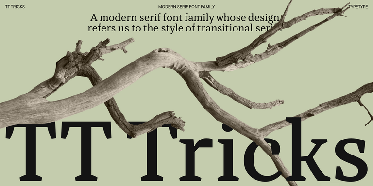
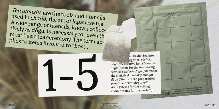
TT Tricks is a modern text serif with a design reflecting the style of Transitional serifs. This font has a calm, elegant, and moderately stern character.

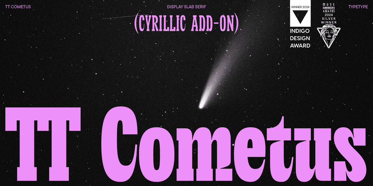
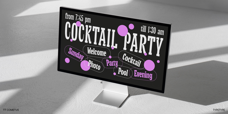
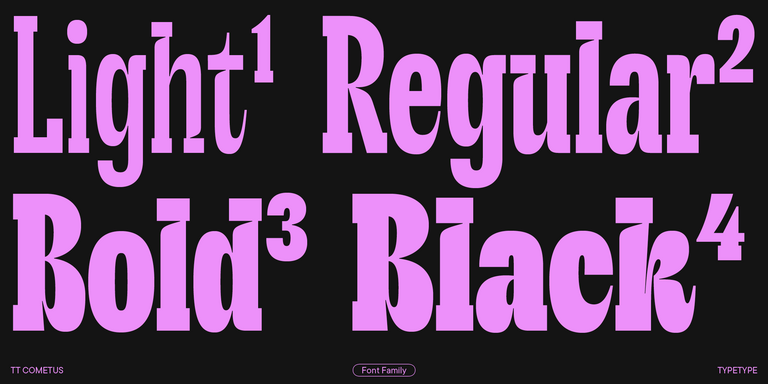
TT Cometus Regular
5 font styles

TT Cometus is an expressive typeface that captivates from the first time.

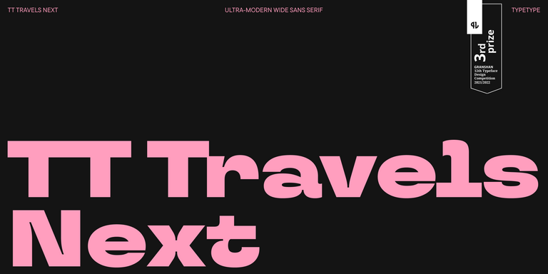
TT Travels Next Regular
21 font styles

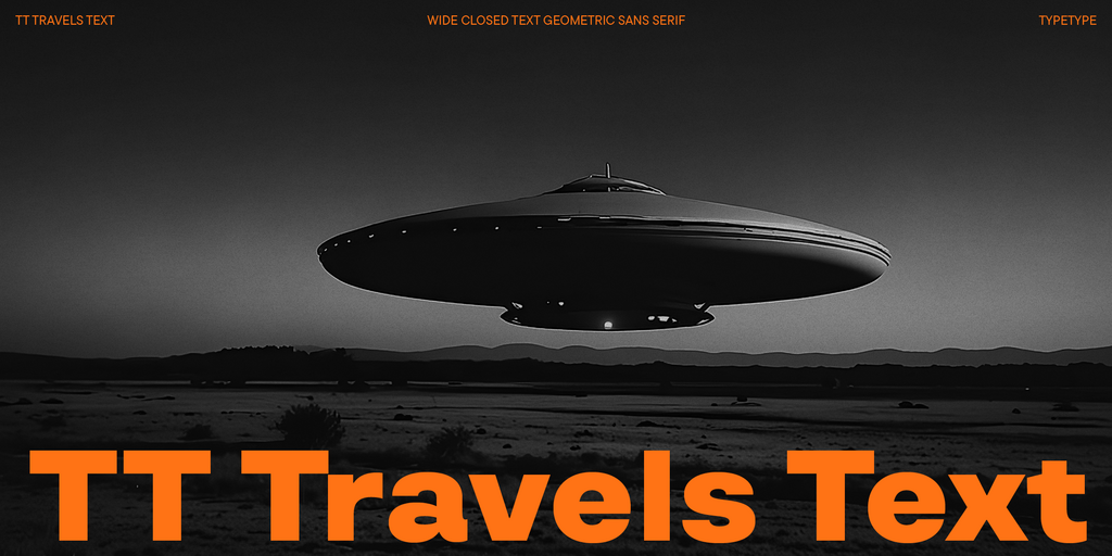
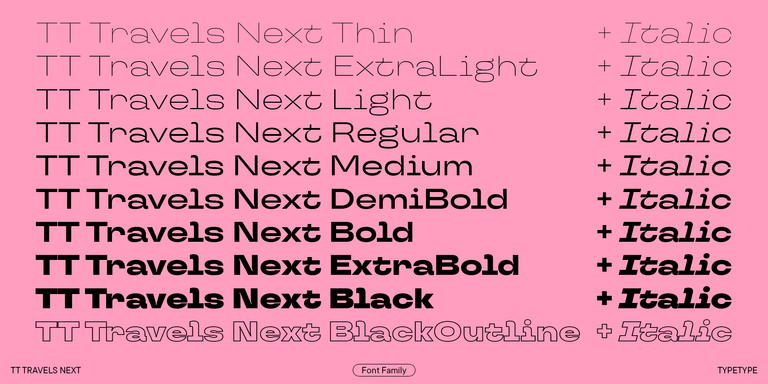
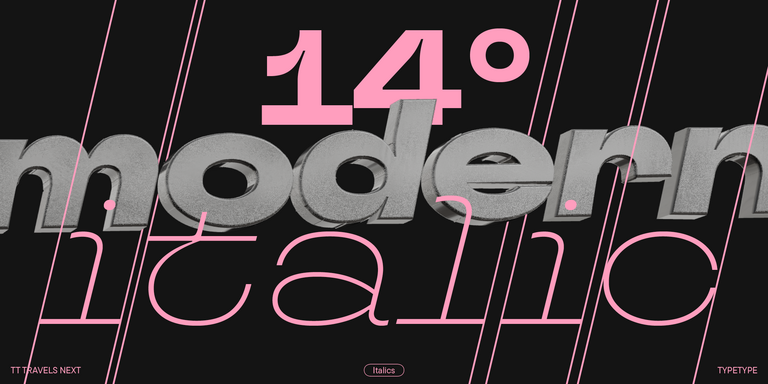
TT Travels Next is a very trendy and modern wide display sans serif for use in different sets, be they print or web.

New
TT Firs Text Regular
23 font styles

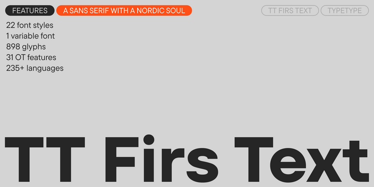
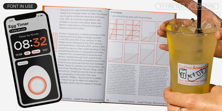
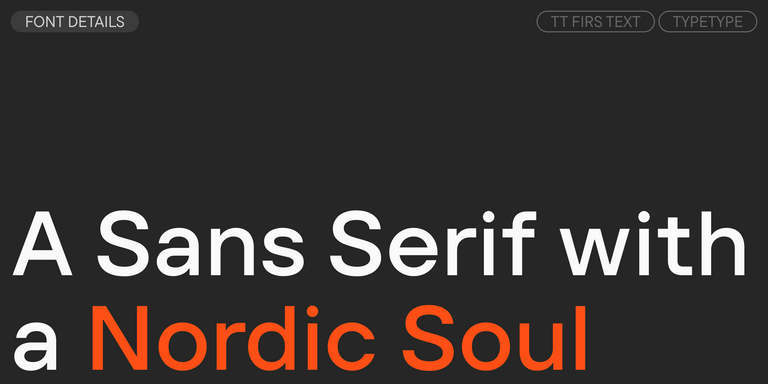
We have released a brand-new font. Meet TT Firs Text—a geometric sans serif with a Nordic character!

TT Wellingtons Regular
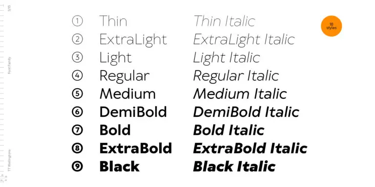
19 font styles

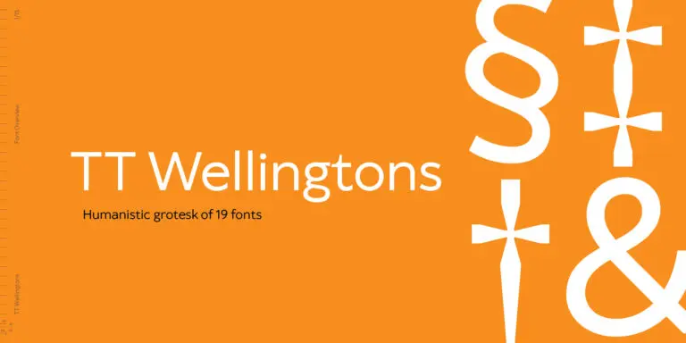
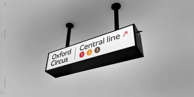
TT Wellingtons is an attempt to combine the style of English humanist sans serifs of the early 20th century with the requirements for modern geometric grotesques.

TT Trailers Regular
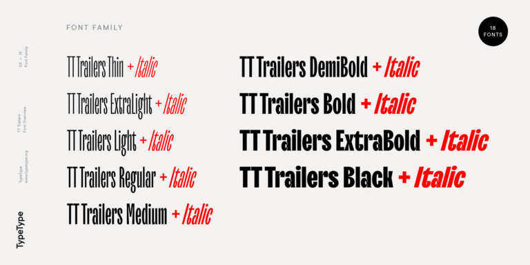
19 font styles

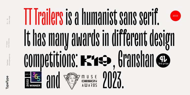
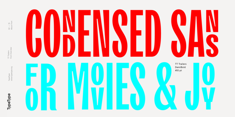
The starting point of the TT Trailers project was the idea to develop a new generation of narrow typefaces for use in movie credits and posters.

3 font styles

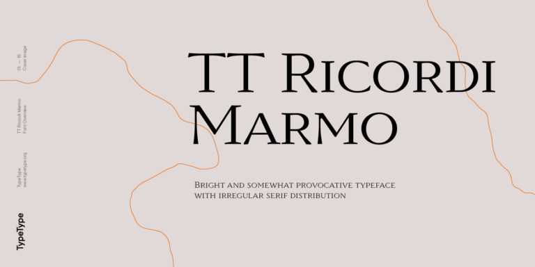
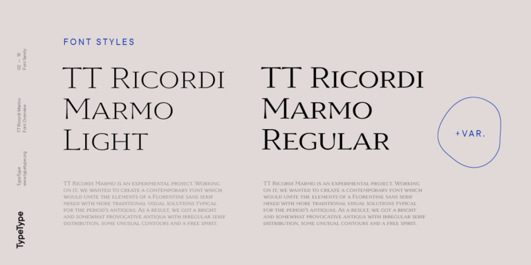
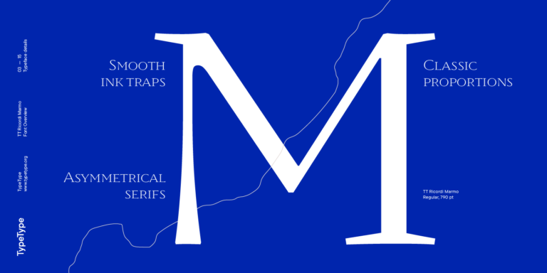
TT Ricordi Marmo is an original experimental project inspired by inscriptions at Basilica di Santa Croce in Florence.

TT Ricordi Todi
3 font styles

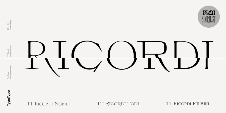
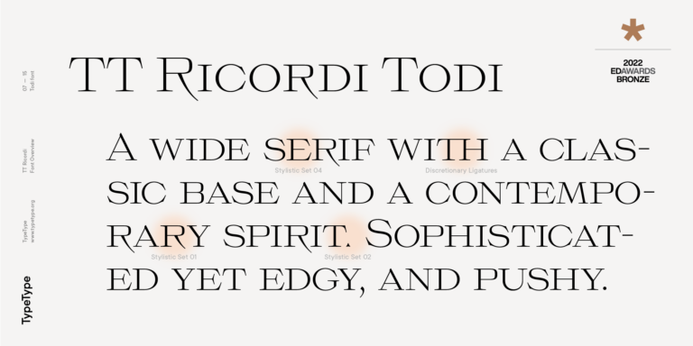
The TT Ricordi font family is a collection of three display heading serifs.

2 font styles

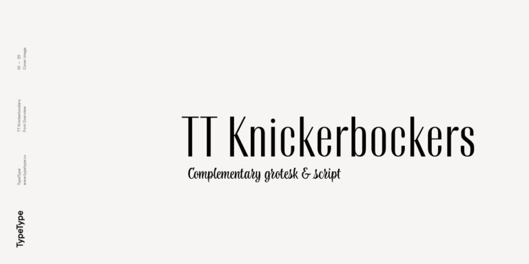
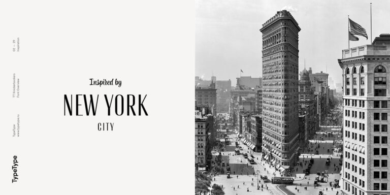
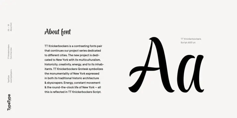
TT Knickerbockers Grotesk is a narrow contrast sans serif with characteristic elements sending us back to the 19th century in New York.

TT Slabs Regular
20 font styles

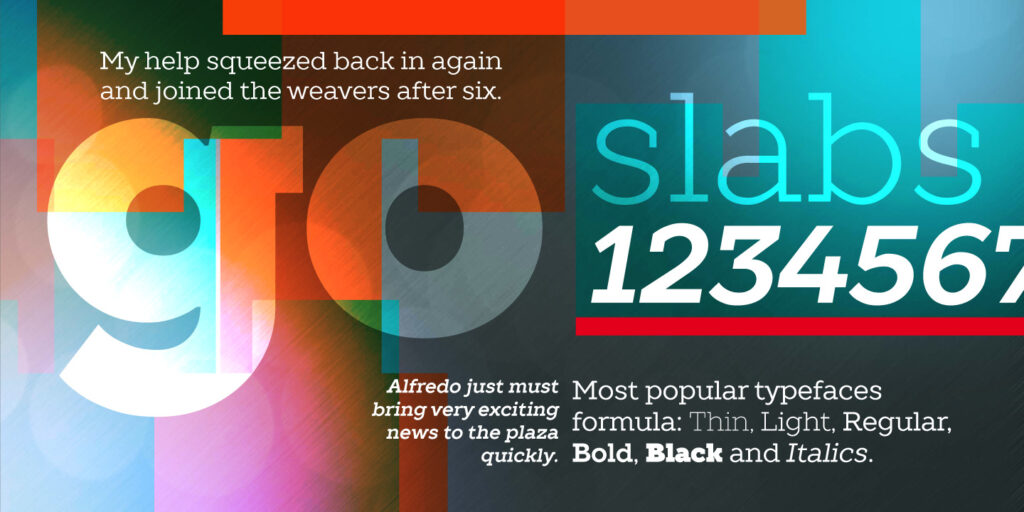
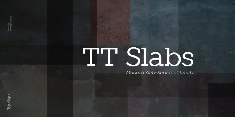
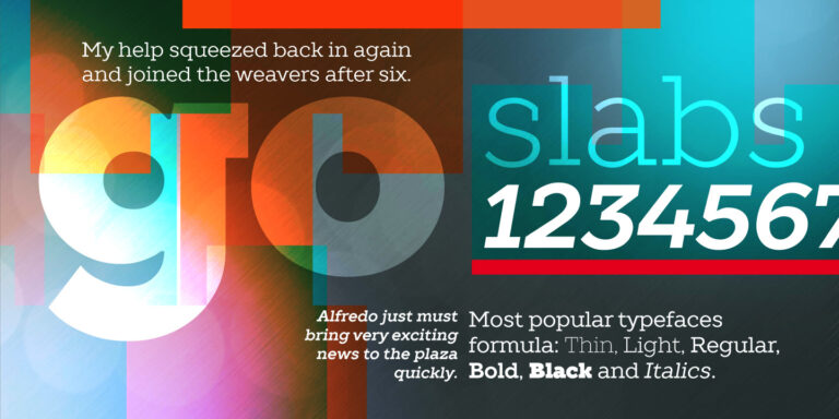
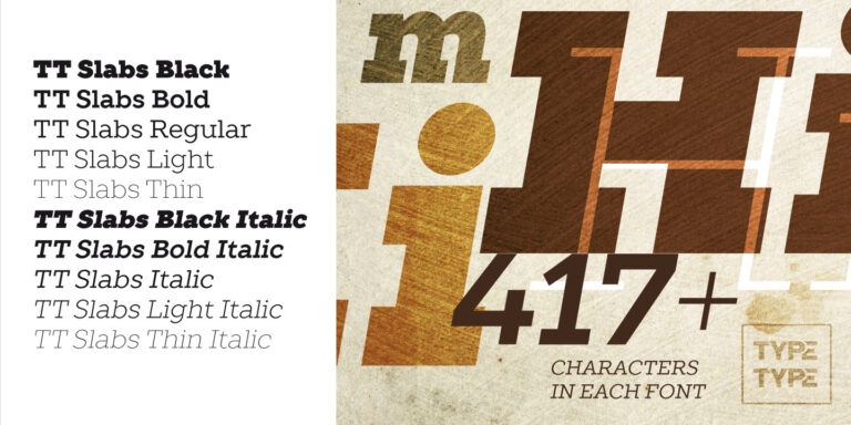
TT Slabs. Slab serif, also called «square serif». They originate shortly after the Industrial Revolution (1850), when the advertising industry began to grow.

FAQs

Are cute typefaces suitable for professional business projects?

Yes. «Cute» does not mean unprofessional. Well-designed cute font styles can make a brand feel more memorable, friendly, creative, and emotionally open. They work especially well for businesses that want a warmer voice: cafés, beauty brands, children’s products, wellness projects, pet brands, handmade goods, lifestyle companies, and creative studios.

How do I pair cute fonts with other typefaces?

The main rule is balance. If the cute typeface is expressive or decorative, pair it with a neutral sans serif or a calm serif for longer text. This contrast helps the design stay readable and organized. You can use the more playful style for headlines, logos, or accents, while the supporting typeface handles body copy, captions, and navigation. TypeType fonts can be tested in layouts to find the right pairing before licensing.

How do cute fonts affect user experience and readability?

Typography shapes how users feel and how easily they understand content. Cute letter fonts can create a positive emotional response, but they still need clear shapes, comfortable spacing, and good contrast. For UX, expressive styles are usually better for short text, while simpler companions work better for reading.

Are TypeType’s typefaces available for commercial use?

Yes. TypeType’s typefaces are available for commercial projects with the proper license. Depending on your use case, you can choose desktop, web, app, digital ads, video, publishing, games, server, unlimited, or custom licensing. Trial versions are intended for testing and mockups before purchase.