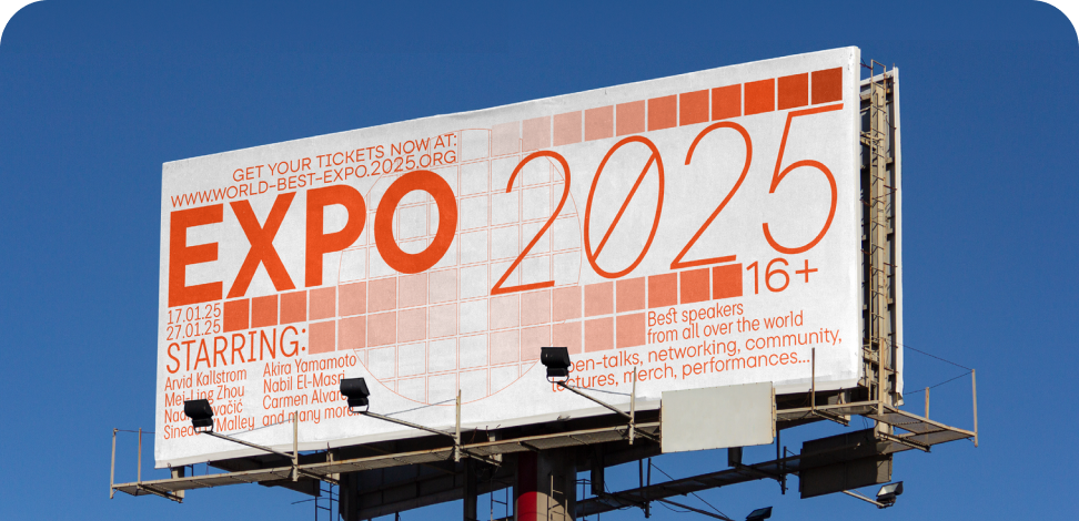
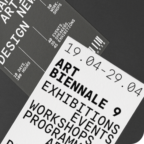
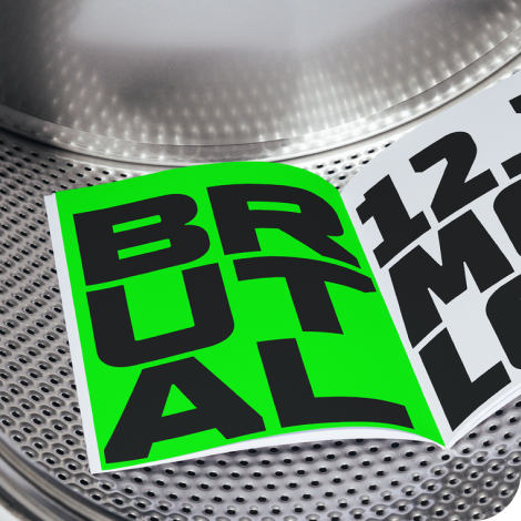
The bestseller TT Norms® Pro—a geometric sans serif, trouble-free workhorse
The Aleut (lat) fonts selection
The Aleut (lat) fonts selection brings together TypeType families with support for Aleut written in the Latin script. This collection offers starting points for publications, websites, identity systems, and signage. Compare visual character alongside language coverage, then test your own text to see how each candidate works at the sizes and in the settings your project requires.
- All fonts 78
- Sans Serif 46
- Serif 21
- Slab Serif 6
- Display 44
- Script 9
- Variable 49
- Font sale 14
Explore TypeType's Collection: The Aleut (lat) fonts selection
The Aleut (lat) fonts selection is organized around a shared language requirement, giving you a focused collection to examine before making visual decisions. Listed families include TT Commons™ Pro, TT Norms® Pro, and TT Neoris Pro; these are starting points for comparison, not a ranking of suitability. Begin with the role your typography needs to perform: sustained reading, a prominent heading, or a short message seen at a distance. Then examine individual family information against that brief. Keeping language support and visual fit as separate checks helps you narrow the options without assuming that every family behaves alike.
What Makes These Typefaces Distinct
Language coverage, rather than a single aesthetic, defines The Aleut (lat) fonts selection. The families gathered here include the Aleut Latin alphabet, while the collection also offers punctuation, currency symbols, and OpenType features. Those shared capabilities do not make every option visually interchangeable. Check the exact letters, diacritics, and combinations in your manuscript, including capitals and punctuation where relevant. Inspect how marks sit beside neighboring characters and how lines read as a whole. This practical review is more useful than assuming that Latin-script support automatically covers every orthographic variant or every other language using related characters.
Where The Aleut (lat) fonts selection Can Be Used
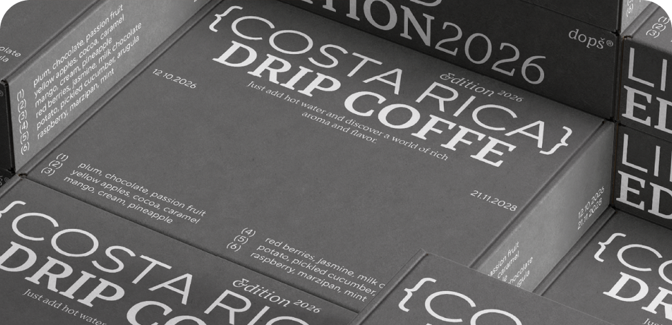
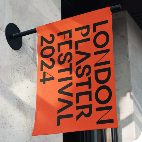
The Aleut (lat) fonts selection can support projects ranging from extended reading material to brief public messages. For publishing, consider the relationship between paragraphs, section headings, and captions. On websites, examine navigation labels alongside page titles and longer passages rather than judging a single sample in isolation. Signs and posters call for a different check: whether the message remains clear at its intended viewing distance. Printing on materials, including fabric, also makes the final output an important part of evaluation. These are potential applications, not claims about documented adoption by particular organizations or industries. An Aleut-language communication or identity project may involve several such formats, so compare representative examples together. A heading that feels appropriate on a poster still needs to work with the supporting text, spacing, and surrounding imagery elsewhere in the project.
How to Choose a Typeface From The Aleut (lat) fonts selection
Build a shortlist from the collection using TypeType's tags for visual direction and its purpose-based search for applications such as magazines, websites, newsletters, or advertising. Prepare authentic Aleut text that includes the characters and combinations your project actually uses. Set it at intended sizes, compare readability, and assess whether the tone fits the identity. Next, place each candidate beside any companion typeface to check hierarchy and consistency across layouts. Where variable options or particular OpenType features matter, verify availability in the individual family information. TypeType offers a Trial License and a request form for testing; review its terms before using trial files. Technical or graphical customization is also available, including character-set changes and adding a company logo. If your requirements go beyond the supplied set, discuss those changes rather than assuming they are included. Review commercial licensing information before moving into production.
- The quick brown fox jumps over a lazy dog.
- Pack my box with five dozen liquor jugs.
- Sphinx of black quartz, judge my vow
- 0123456789 !?.,:;—–()[]{}<> “quotes” ‘apostrophe’ @#%&*_+=/\| № $ € £ ₽ +−×÷=≠≤≥ … % © ® ™
- Aa Bb Cc Dd Ee Ff Gg Hh Ii Jj Kk Ll Mm Nn Oo Pp Qq Rr Ss Tt Uu Vv Ww Xx Yy Zz
TT Commons™ Pro is a completely redesigned version of the well-established classic font family TT Commons.
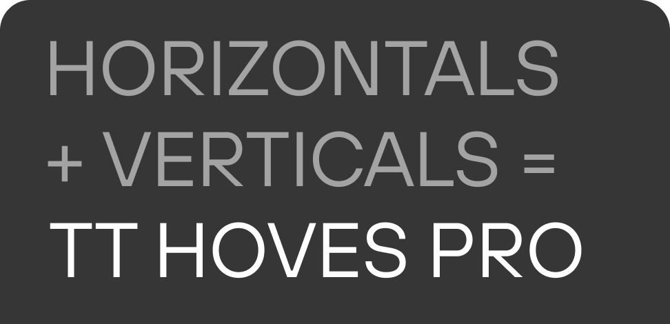
TT Hoves Pro is a versatile sans-serif with a recognizable geometry
We continue to expand the line of the studio’s main bestseller TT Norms® Pro!
TT Livret is an elegant, modern and functional serif
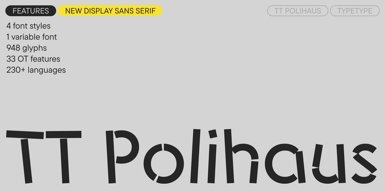
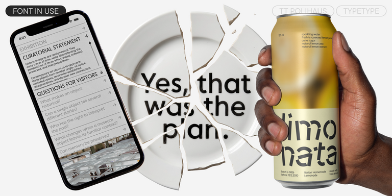
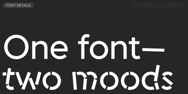
TT Polihaus is an experimental sans serif that, at first glance, looks ordinary, but then breaks apart, transforming into a stencil pattern.
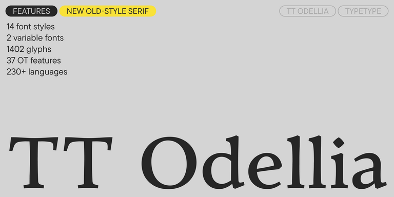
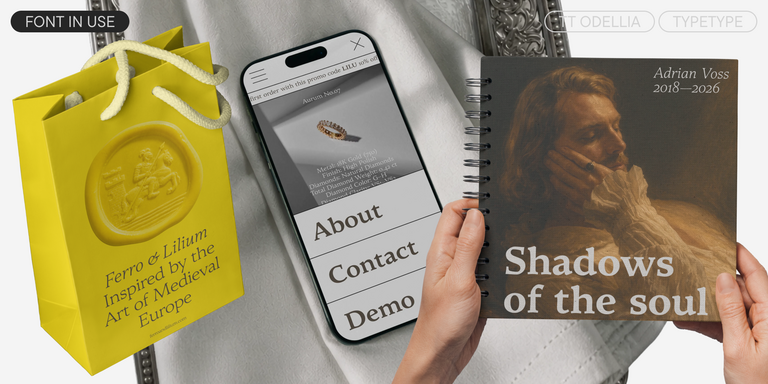
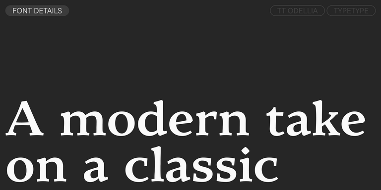
TT Odellia is an old-style serif with a modern design, inspired by Venetian typefaces and classical music.
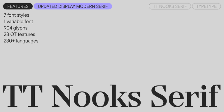
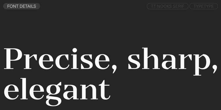
TT Nooks Serif is a display modern serif with a slight touch of egocentricity. It has a sharp and firm, yet elegant and stately character.
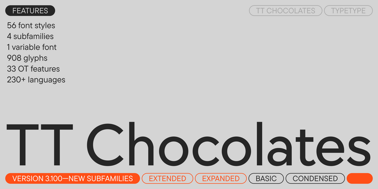
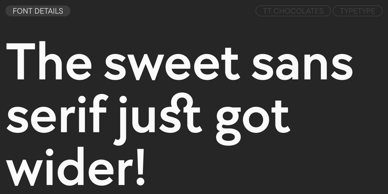
TT Chocolates typeface consists of 14 fonts: 7 weights and 7 obliques. Due to the extended language support and the introduction of useful features.
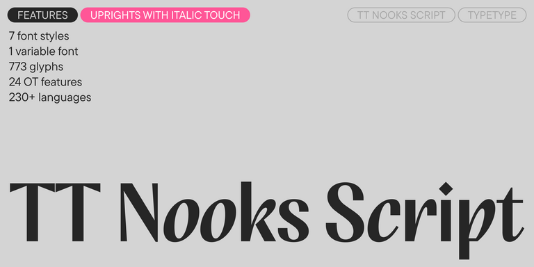
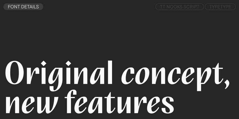
TT Nooks Script features a unique design that has no direct analogs.
TT Neoris is an elegant Neo-Grotesque with unlimited potential and a font that encompasses all modern requirements and user desires.
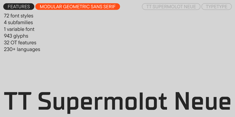
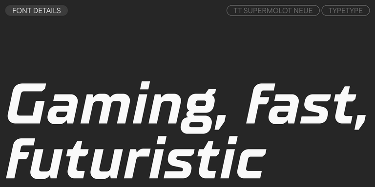
TT Supermolot Neue is a redesigned, extended, and greatly enhanced reincarnation of the popular font family
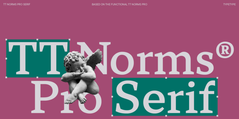
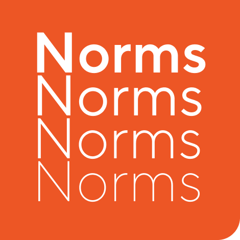
TT Norms® Pro is a typographic legend embraced by world-renowned brands. Evolved through multiple iterations, it has conquered MyFonts and redefined typographic versatility. A design workhorse that transforms from a humble tool to an essential creative companion.
- from $47.99
TT Commons™ Pro is the studio’s typographic powerhouse. A font so versatile it defies categorization, seamlessly bridging style and function. For designers seeking a universal foundation that elevates every project, this is the definitive choice.
- from $47.99
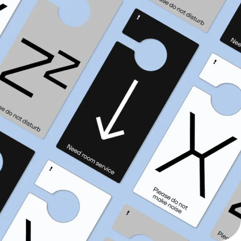
TT Hoves Pro is a Scandinavian sans serif that whispers minimalist elegance. Simultaneously understated and distinctive, it’s a designer’s secret weapon that transforms complex challenges into visual poetry with effortless precision.
- from $47.99
TT Supermolot Neue is a game-changer in visual communication! An advanced, modular sans serif that captures the pulse of technological innovation, bringing electrifying vision to everything from immersive game interfaces to bold visual narratives.
- from $47.99
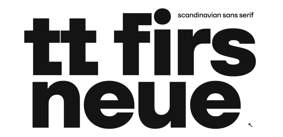
TT Firs Neue is a balanced sans serif infused with Scandinavian design philosophy. Elegant and versatile, polished through two deliberate revisions to achieve typographic perfection.
- from $47.99
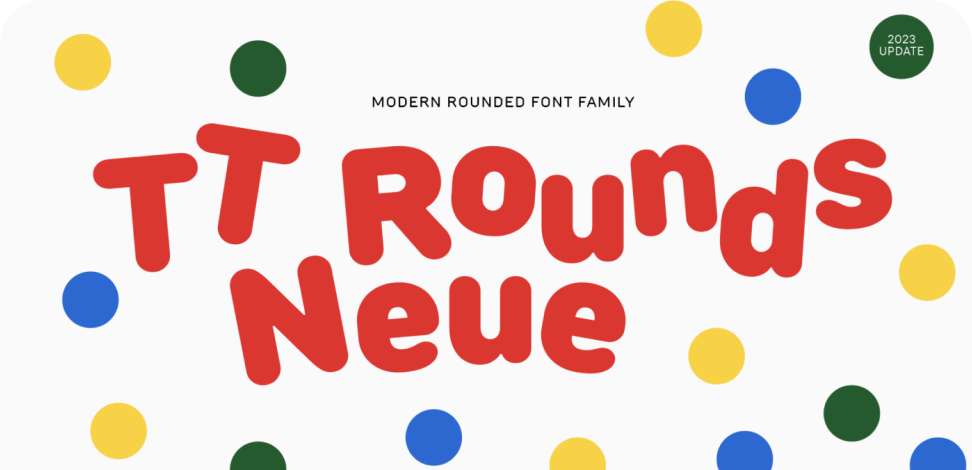
TT Rounds Neue is a soft and friendly font that knows how to be different. In lighter font styles it looks minimalist and neutral. The bold font styles make it puff up and achieve maximum roundness, exuding childlike charm.
- from $47.99
TT Fors is a design Swiss Army knife of typography. This geometric sans serif delivers pure versatility through clean, refined proportions. It can be used for defining interfaces or crafting visual accents.
- from $47.99
TT Ramillas is a stylish and contemporary serif that elevates design to an art form. Characterized by its unique decorative styles and initials with a floral ornament, it crafts visual experiences that are truly one-of-a-kind. Already adorning over 3000 websites globally, it’s a Modern Cyrillic award-winner that redefines typographic sophistication.
- from Original price was: $43.99.$30.79Current price is: $30.79.
- 30% off Special offer is valid until 23 Oct, 2026
TT Rationalist is functional and neutral slab serif typeface.
TT Commons™ Classic is a universal sans serif with a minimal contrast of strokes, a closed aperture, and geometric shapes of characters.
TT Runs is a very stylish and charismatic display sans serif with irregular proportions of some characters.
TT Bluescreens is a upgraded geometric sans serif with narrow proportions
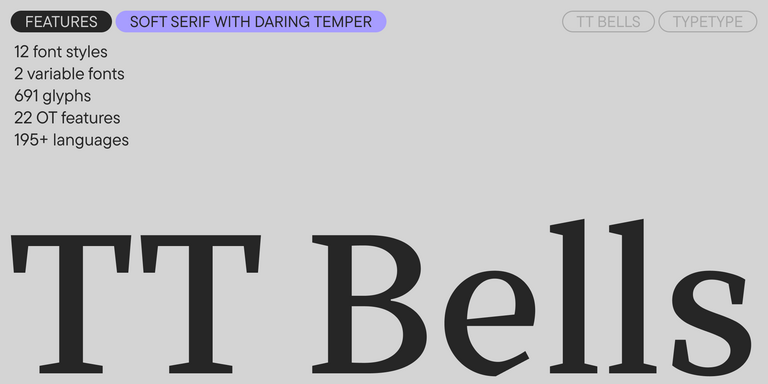
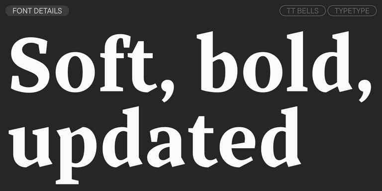
TT Bells combines the elegant softness of Antiqua with a complex and daring temper reflected in straight stroke terminals and arrowheaded serifs. The typeface is based on the broad nib, which creates these hallmark terminals and serifs.
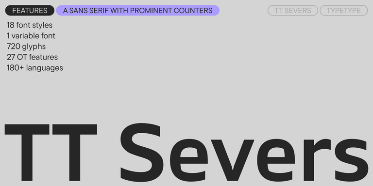
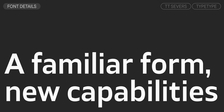
TT Severs is a geometric sans serif with emphasized elements of internal brackets. The main visual feature of TT Severs is the unusual form of internal ovals.
TT Turns is a striking geometric sans serif with expressive elements. This versatile font works exceptionally well for running text, while at large point sizes, it takes on a distinct display character.
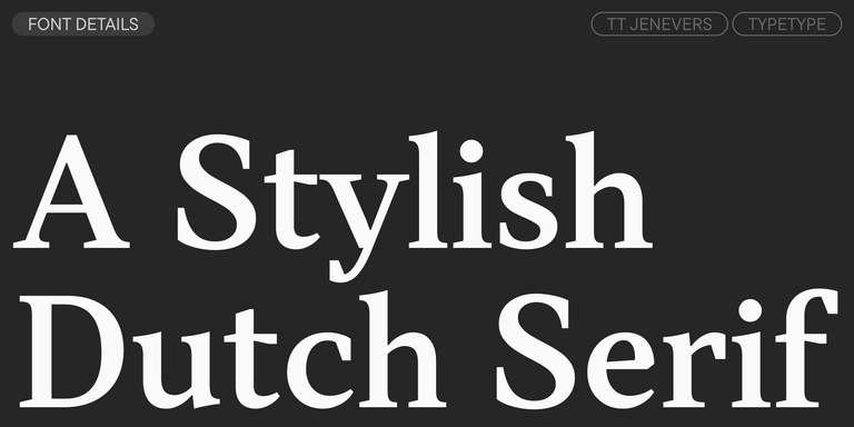
TT Jenevers is a modern serif with a Dutch flavor. The font family features the characteristic details peculiar to Dutch serifs—these are the asymmetrical shape of serifs and an irregular slant of ovals.
TT Regins is a Scottish modern serif. Striking contrast and sharp triangular serifs give this font a stern and commanding character, while refined forms, enlarged lowercase letters, and slightly condensed, static proportions add grace to its design.
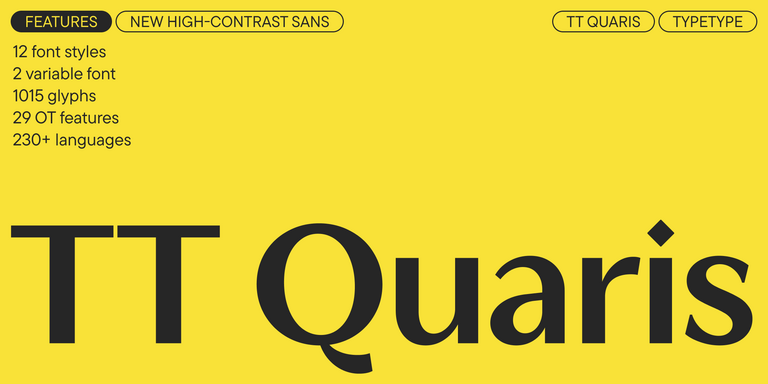
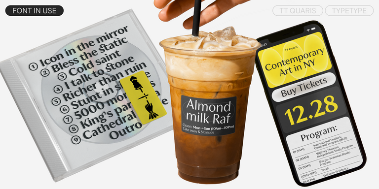
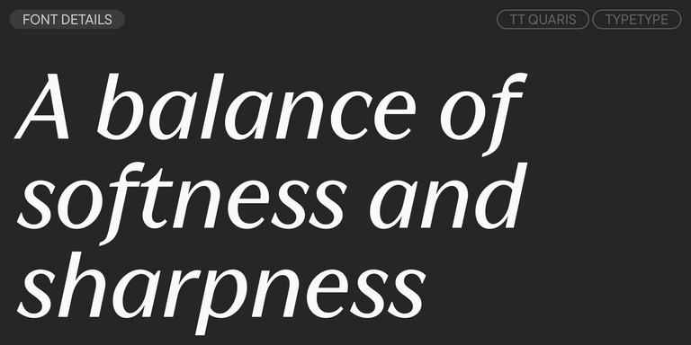
TT Quaris is an exquisite, modern high-contrast sans whose design balances between soft and sharp. The glyph shapes in the font are fluid and tend towards roundness, yet there are also sharp elements.
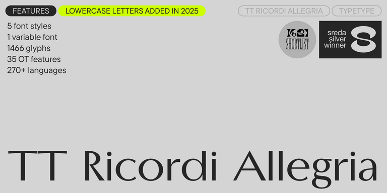
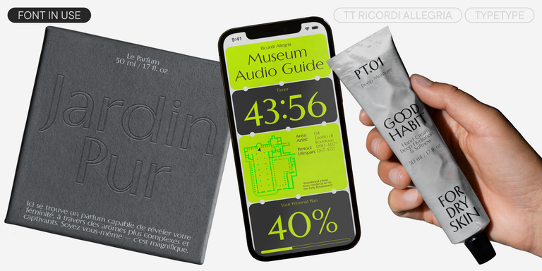
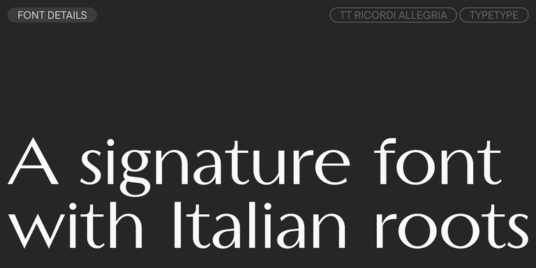
TT Ricordi Allegria is a sleek and intelligent contemporary Florentine grotesque.
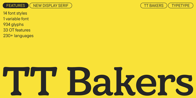
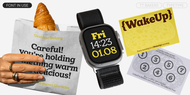
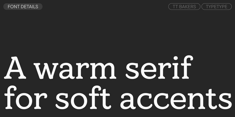
TT Bakers is a fluid serif with a gentle and lively character. This font is like freshly baked goods: it`s warm and soft, especially in its bolder weights.
What Is The Aleut (lat) fonts selection?
It is a group of TypeType families selected for setting Aleut in the Latin script. The defining feature is alphabet support, not a uniform visual style. Evaluate each candidate with your actual text to confirm the characters, combinations, and appearance needed for your project.
Which Industries Use Aleut Latin Typefaces Most Often?
Potential applications include publishing, education, website content, advertising, and signage wherever Aleut Latin-script text is needed. This is not an industry adoption ranking. Choose according to the communication task, and test representative content in the intended format before deciding which family to use.
Can These Typefaces Be Used for Branding?
Yes, they can be considered for an Aleut-language identity. Assess character coverage, readability, tone, and consistency across the materials you plan to produce. TypeType also offers technical and graphical customization, which may help address specific requirements; discuss the scope and review licensing before production.
What Should Be Considered When Pairing Aleut Latin Typefaces?
Test both candidates with the same Aleut passage, then compare their visual contrast, hierarchy, and readability in a realistic layout. When evaluating The Aleut (lat) fonts selection, check supporting text as carefully as headings. Neither a complementary appearance nor shared language support alone establishes a successful pairing.
Can You Buy TypeType Fonts for Commercial Projects?
Yes; consult current product pages and commercial licensing information for purchase details and permissions. To test first, select “Trial font” and complete the form. TypeType states that trial files match the commercial character and technical set. Review trial terms separately; testing access is not unrestricted production permission.