At TypeType® type foundry, we solve font tasks of any scale!
Our collection features 75+ font families, which are a killer combination of expressive design and the highest possible quality. We offer free trials, create fonts from scratch, and customize them for your projects.
Font Catalog


- from Original price was: $43.99.$30.79Current price is: $30.79.
- 30% off Special offer is valid until 15 May, 2026
- from Original price was: $43.99.$30.79Current price is: $30.79.
- 30% off Special offer is valid until 22 May, 2026
- from Original price was: $47.99.$33.59Current price is: $33.59.
- 30% off Special offer is valid until 22 May, 2026
- from Original price was: $43.99.$30.79Current price is: $30.79.
- 30% off Special offer is valid until 29 May, 2026
- from Original price was: $65.99.$46.19Current price is: $46.19.
- 30% off Special offer is valid until 12 June, 2026
Fonts in use
More use cases
The unique fonts WNTL and Bowtie were developed for the American mortgage company Rocket, becoming part of its new brand identity. Rocket is one of the largest mortgage companies in the United States, helping clients achieve their dream of homeownership. The sans serif WNTL (a customized version of TT Commons™ Pro) symbolizes accessibility, while the classic serif Bowtie (a customized…

The TT Commons™ Pro font is featured on the website and application of Uniqlo, a Japanese casual clothing retailer.

TT Commons™ Pro was customized for the international pizzeria chain Domino’s Pizza as part of its massive global rebranding. The new typefaces, Dominos Sans Display and Dominos Sans Text, were based on our bestseller and now shape the brand’s new corporate communications. Domino’s Pizza is one of the world’s largest pizzeria chains, operating in dozens…
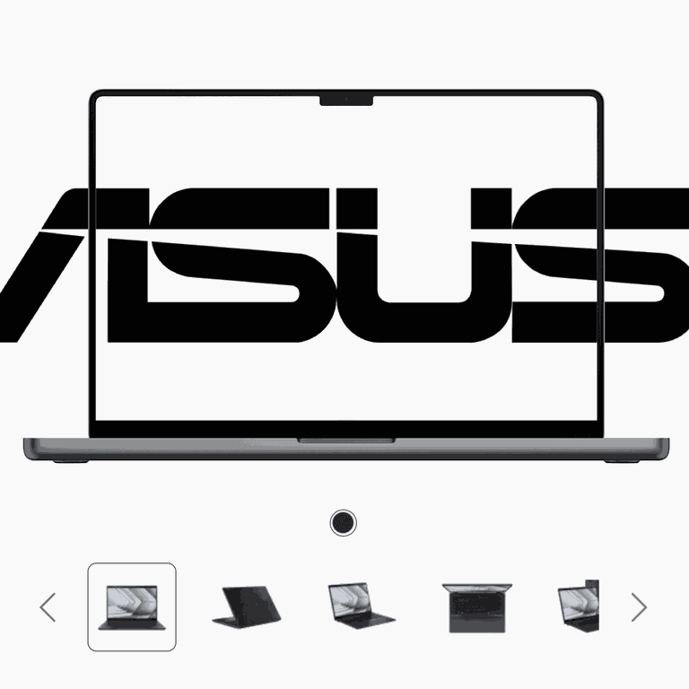
TT Norms became a part of Asus’ brand identity. ASUSTeK Computer Inc. is a multinational computer, phone hardware and electronics manufacturer headquartered in Taiwan. Company is passionate about technology and driven by innovation. They dream, they dare and they strive to create an effortless and joyful digital life for everyone.
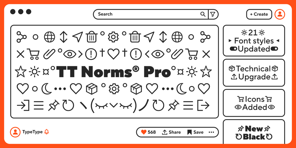
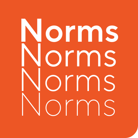
TT Norms® Pro is a functional geometric sans serif for aesthetic design choices and TypeType studio’s bestseller. It has been a massive success since its release, and rightfully so! This stylish, elegant, and versatile font will become the full-fledged core of your collection.
- from Original price was: $47.99.$33.59Current price is: $33.59.
- 30% off
TT Commons™ Pro is a geometric sans serif. This is one of the studio’s most popular fonts, known for its versatile nature, large character set that supports more than 275 languages, and functional set of OpenType features.
- from $47.99
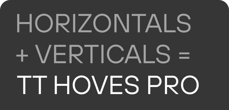
TT Hoves Pro is one of the studio’s bestsellers included in our core set of versatile fonts. It is a Scandinavian sans serif with a neutral but recognizable character. One of this font’s key characteristics is a visual lack of contrast.
- from $47.99
TT Supermolot Neue is an advanced, modular sans serif. It’s a highly powerful and dynamic font with a futuristic feel. Its squared forms give the typeface a robust appearance. However, the chopped angles of particular elements make it look flexible and ergonomic.
- from $47.99
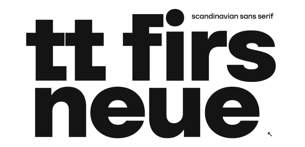
TT Firs Neue is a font well-suited for a wide range of contexts. It can be used for headings, text fragments, visual merchandising and building decoration, and the web. The font is visually aesthetic on podcast and video covers and is an ideal choice for packaging design and brand identity.
- from $47.99
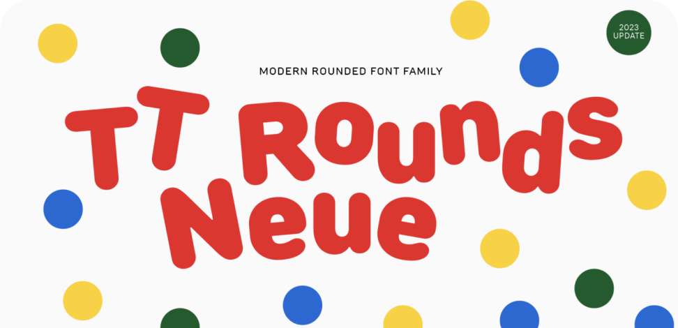
TT Rounds Neue is a sans serif with rounded forms. Its character is soft and friendly. In its lighter font styles, the typeface looks minimalistic and neutral: rounded stroke ends become almost invisible, and fluid lines come into focus. The bold font styles make TT Rounds Neue puff up and achieve maximum roundness, displaying childish traits.
- from $47.99
TT Fors is a geometric sans-serif with a neutral personality and refined proportions. The inspiration for creating TT Fors came from studying geometric sans-serifs from the early to mid-20th century and analyzing their contribution to the visual environment of that time.
- from $47.99
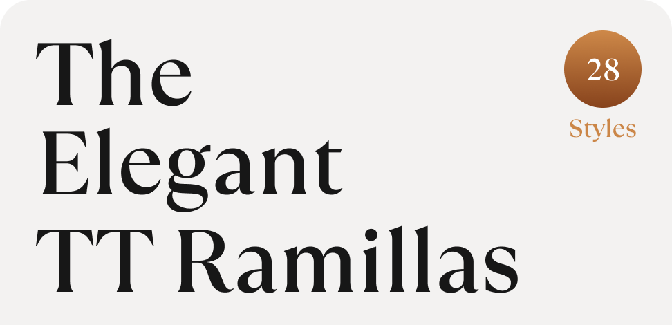
TT Ramillas is a stylish transitional serif perfectly adapted to modern reality and requirements. The idea behind this project was to experiment: we aimed to craft a modern serif with precisely balanced details by rethinking traditional forms and meticulously designing each glyph. And we achieved it!
- from $43.99

