Meet TT Rationalist version 1.100!
We have redrawn the font and added new features, glyphs, languages, and stylistic sets.
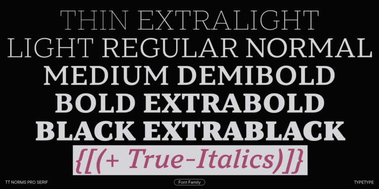
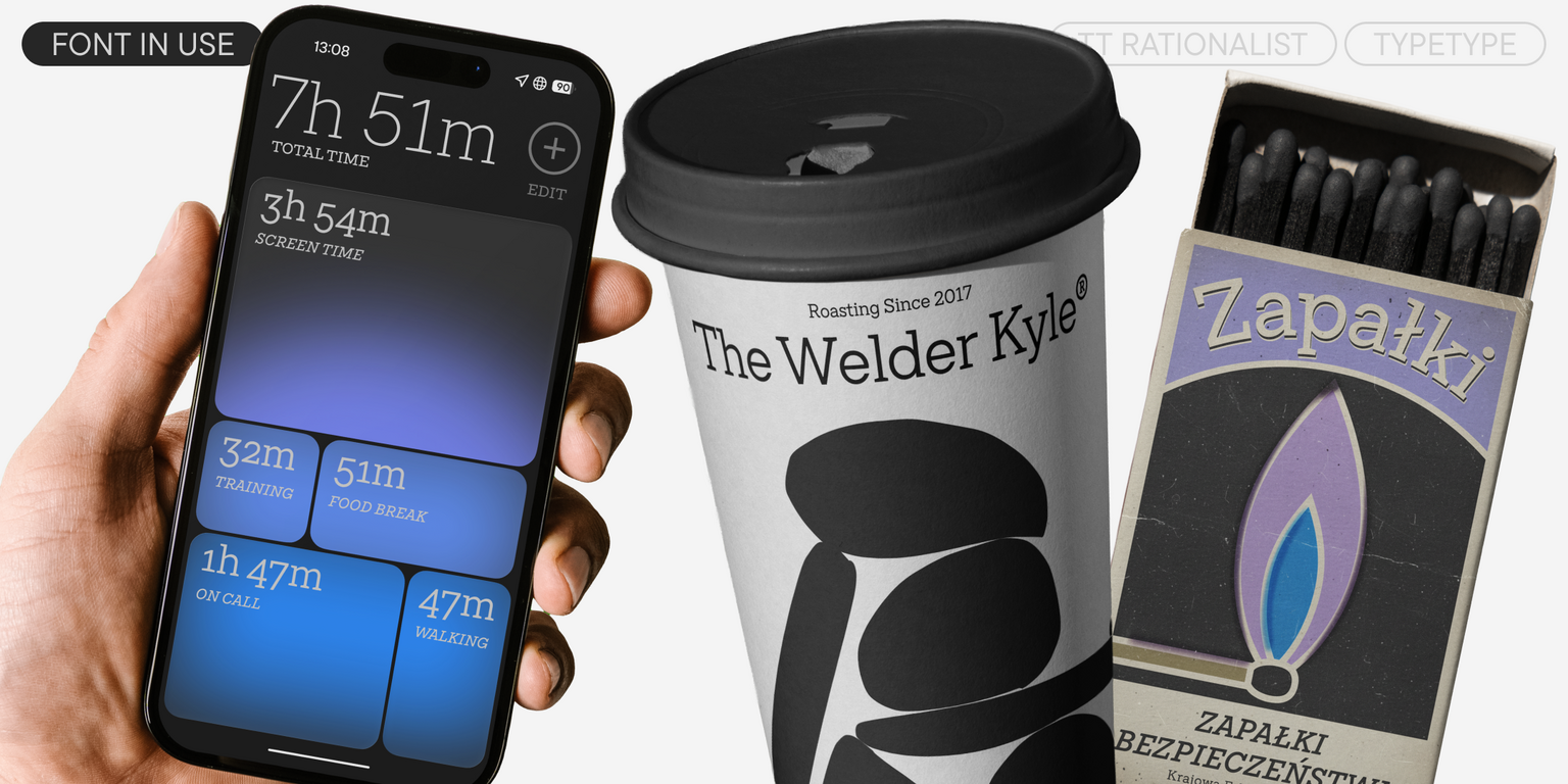
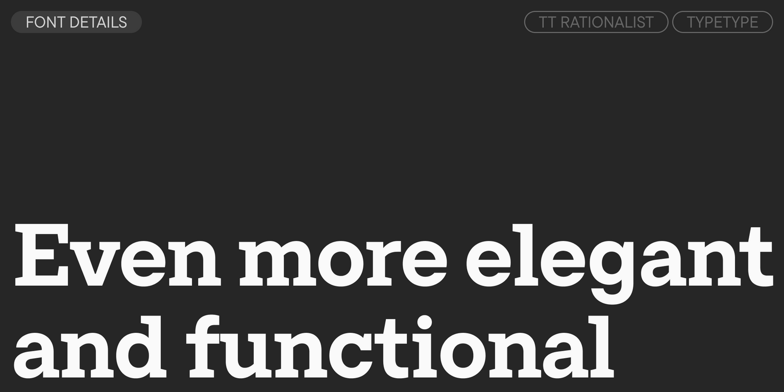
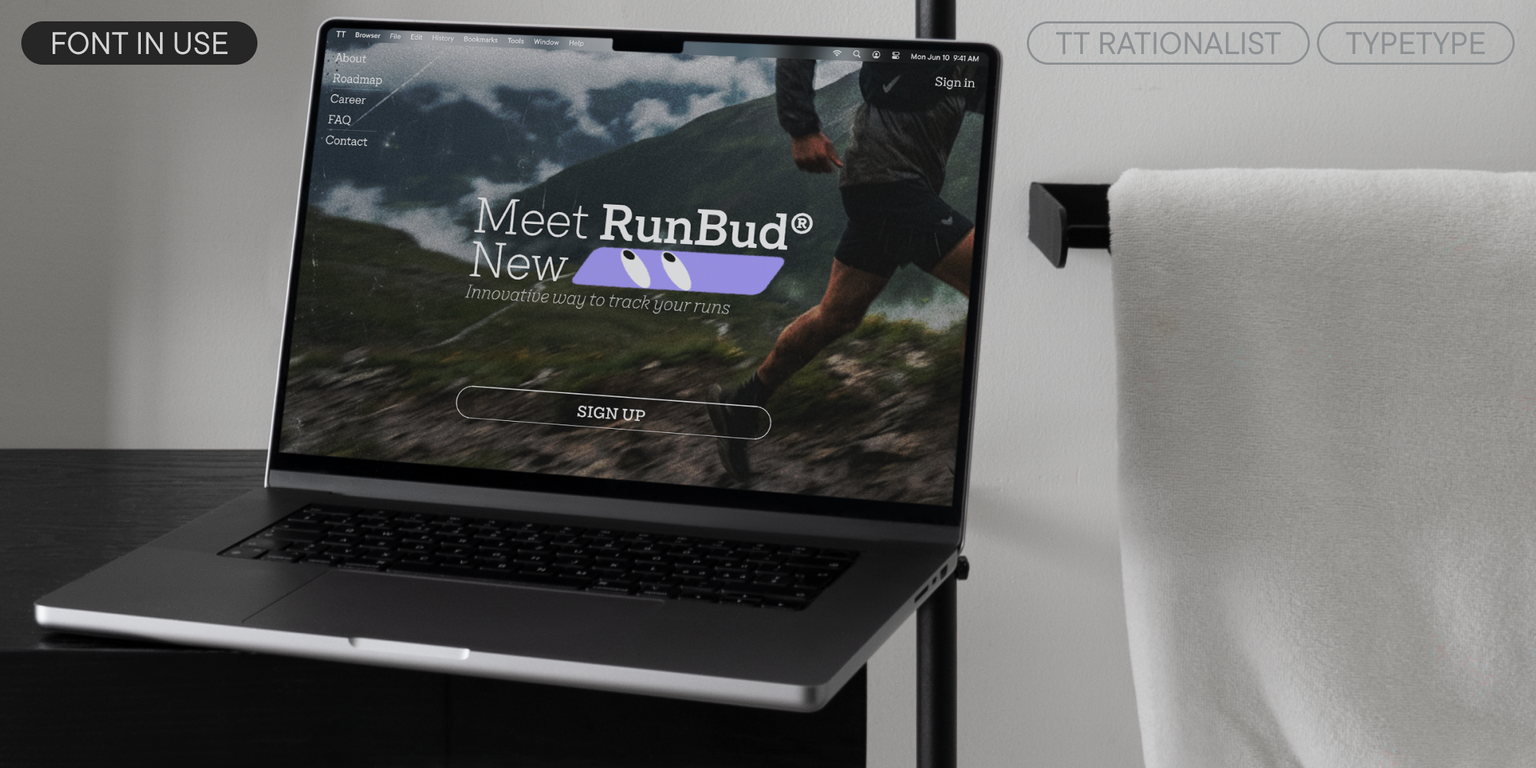
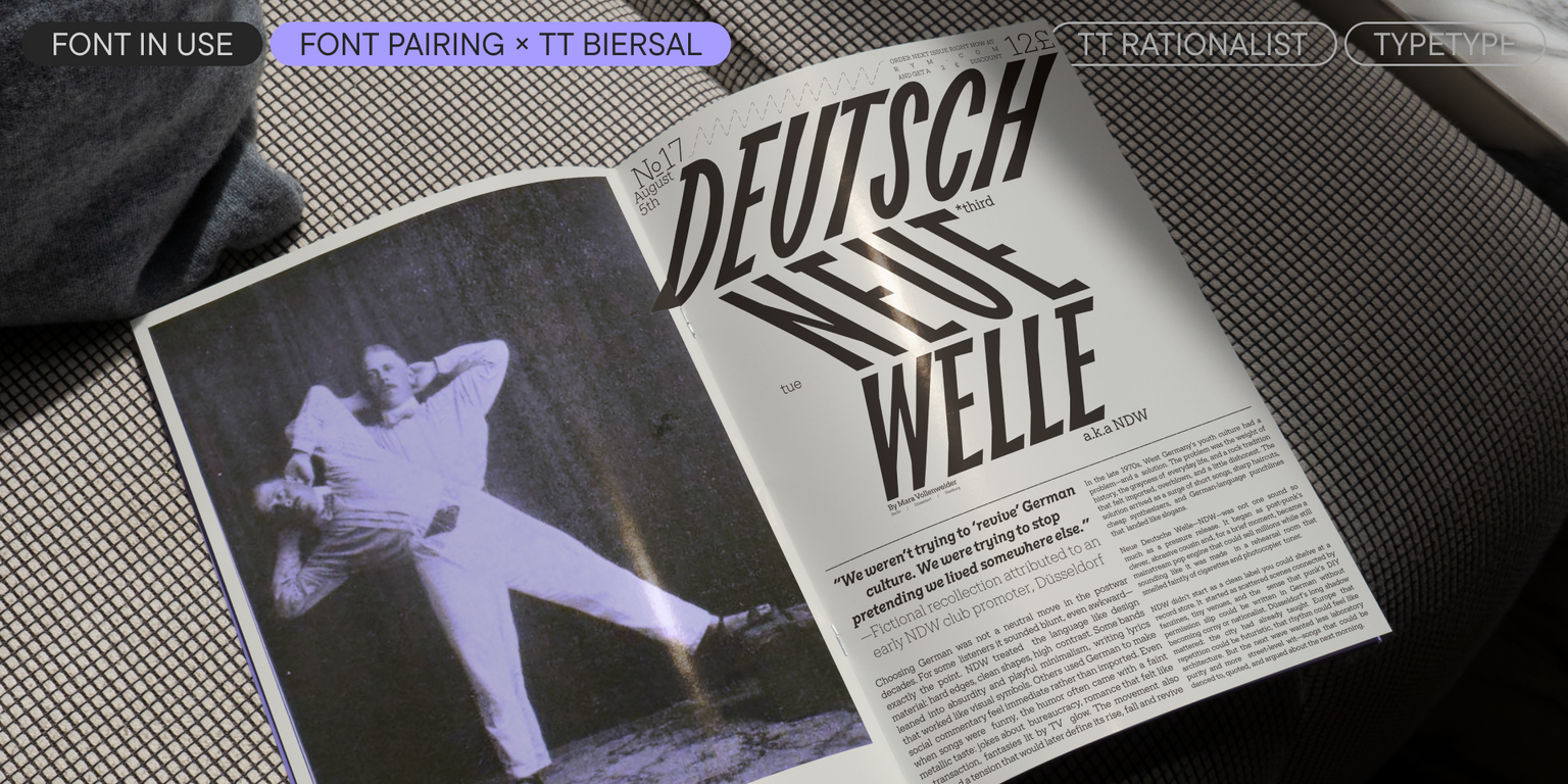
TT Rationalist is a functional and original slab serif with a contemporary design. When creating it, we aimed to avoid the excessive historicism found in many slab serifs. Therefore, one of the characteristic features of TT Rationalist is elegant trapezoidal serifs instead of the “traditional” massive rectangular ones. The low contrast also makes the font design more modern.
In this version, we reimagined and balanced the design of TT Rationalist: we changed the proportions and contrast, making the text typing softer and more uniform. As a result, the font has become more suitable for running text. Additionally, curved legs replaced serifs in all styles for characters like “R”, “Яя”, “Кк”, and “Жж”. This gave the font expressiveness and sophistication. The forms of the true italics also became more rounded and calligraphic—this is especially noticeable in the characters “k”, “y”, “x”, “v”, and “w”.
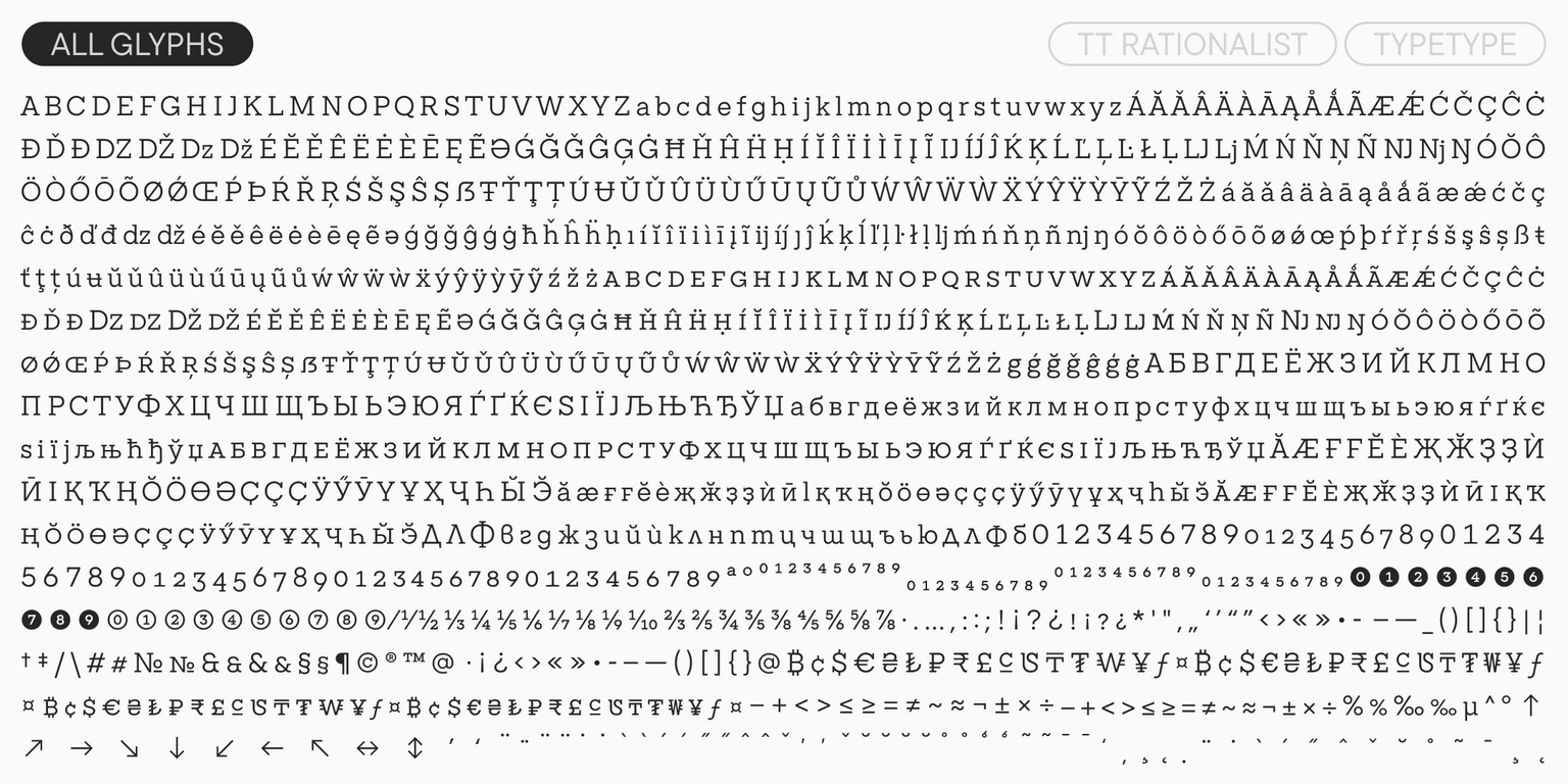
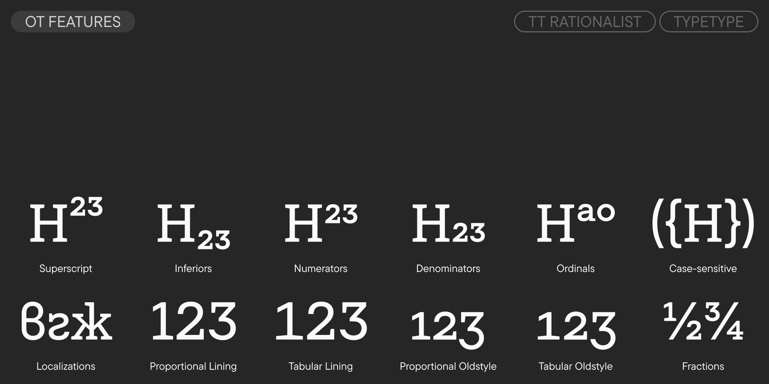
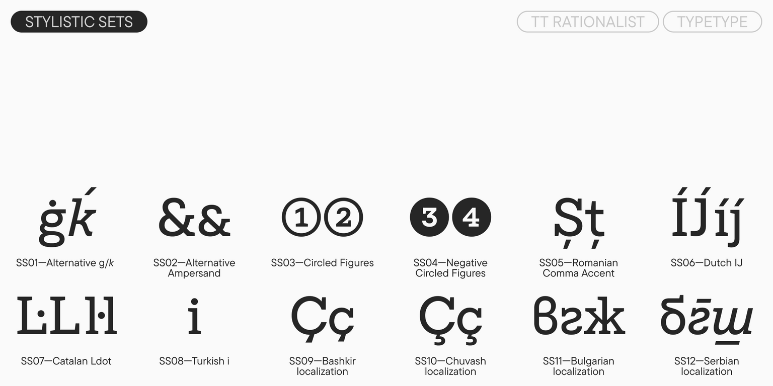
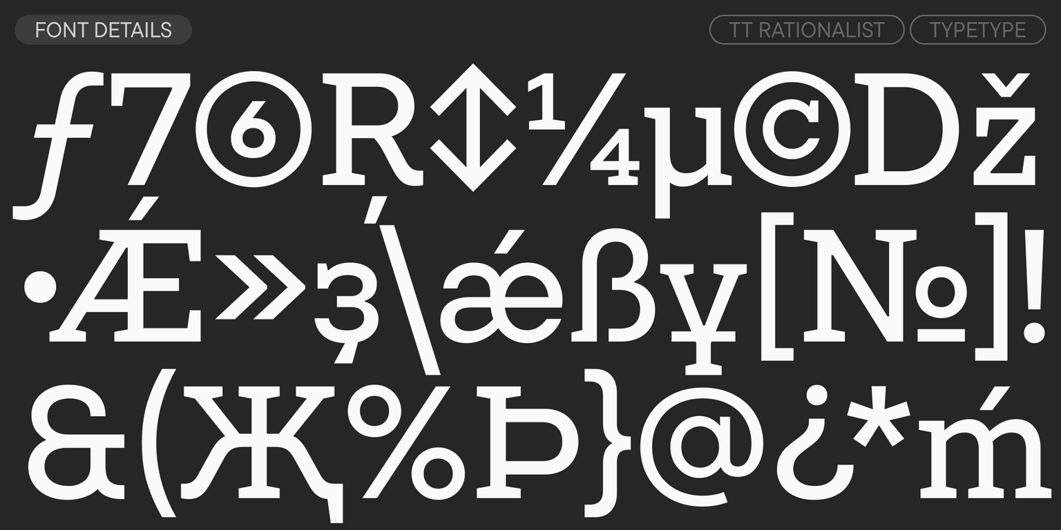
We also increased the number of OpenType features in the updated version, expanded the character set (supplementing Latin and Cyrillic), and added new stylistic sets and languages. The typeface includes small caps for Latin and Cyrillic fonts, and alternative versions of the ampersand, the letter “g” in upright styles, and “k” in italics.
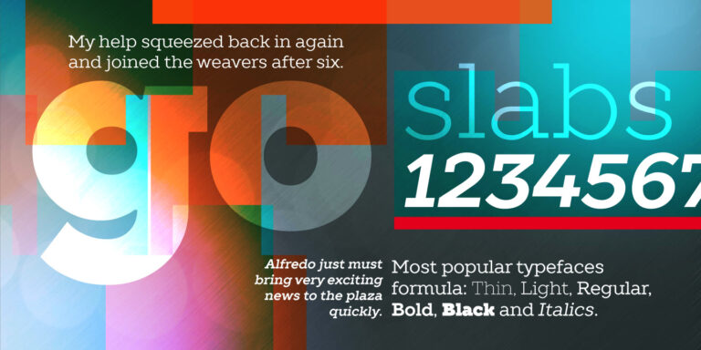
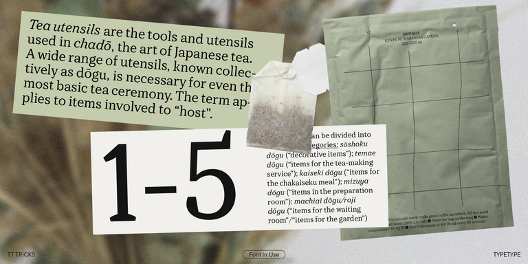
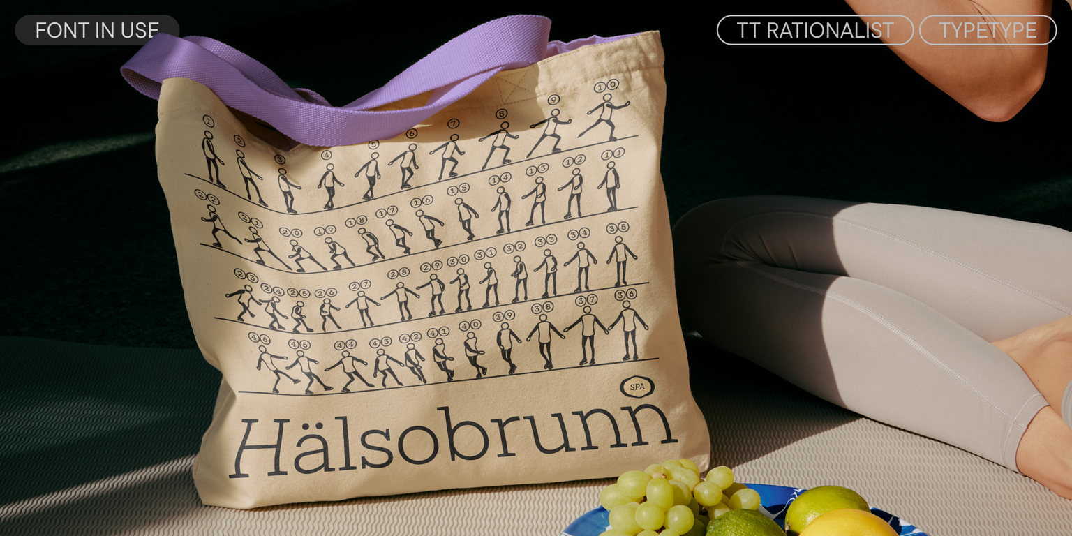
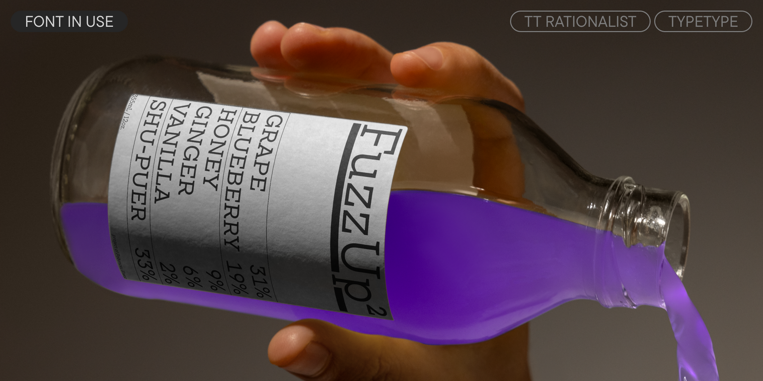
TT Rationalist is perfect for both headlines and running text. This font looks especially aesthetic in printed materials (books, magazines, brochures). The Black style is ideal for headlines, posters, and event announcements.
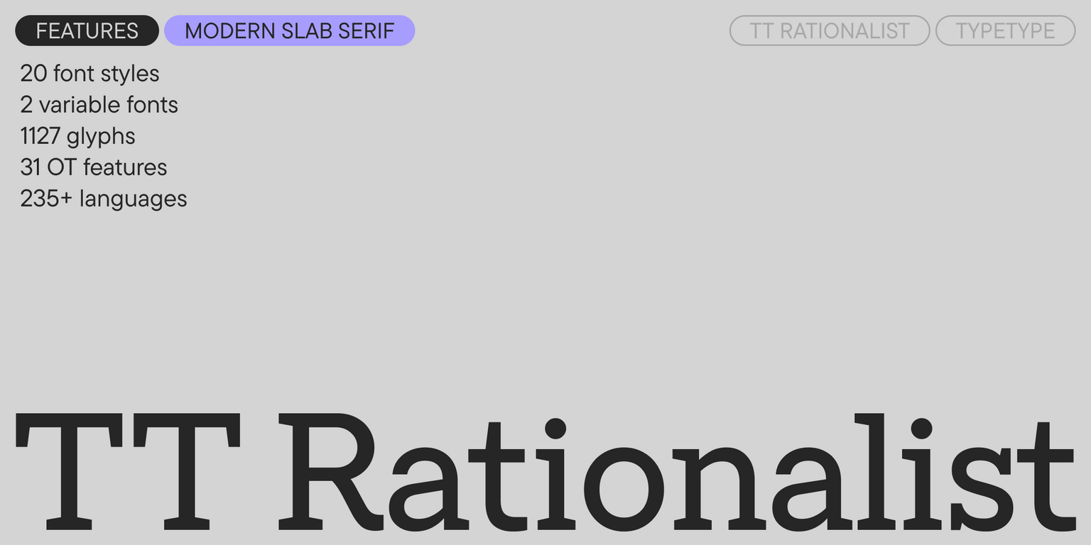
TT Rationalist 1.100 includes:
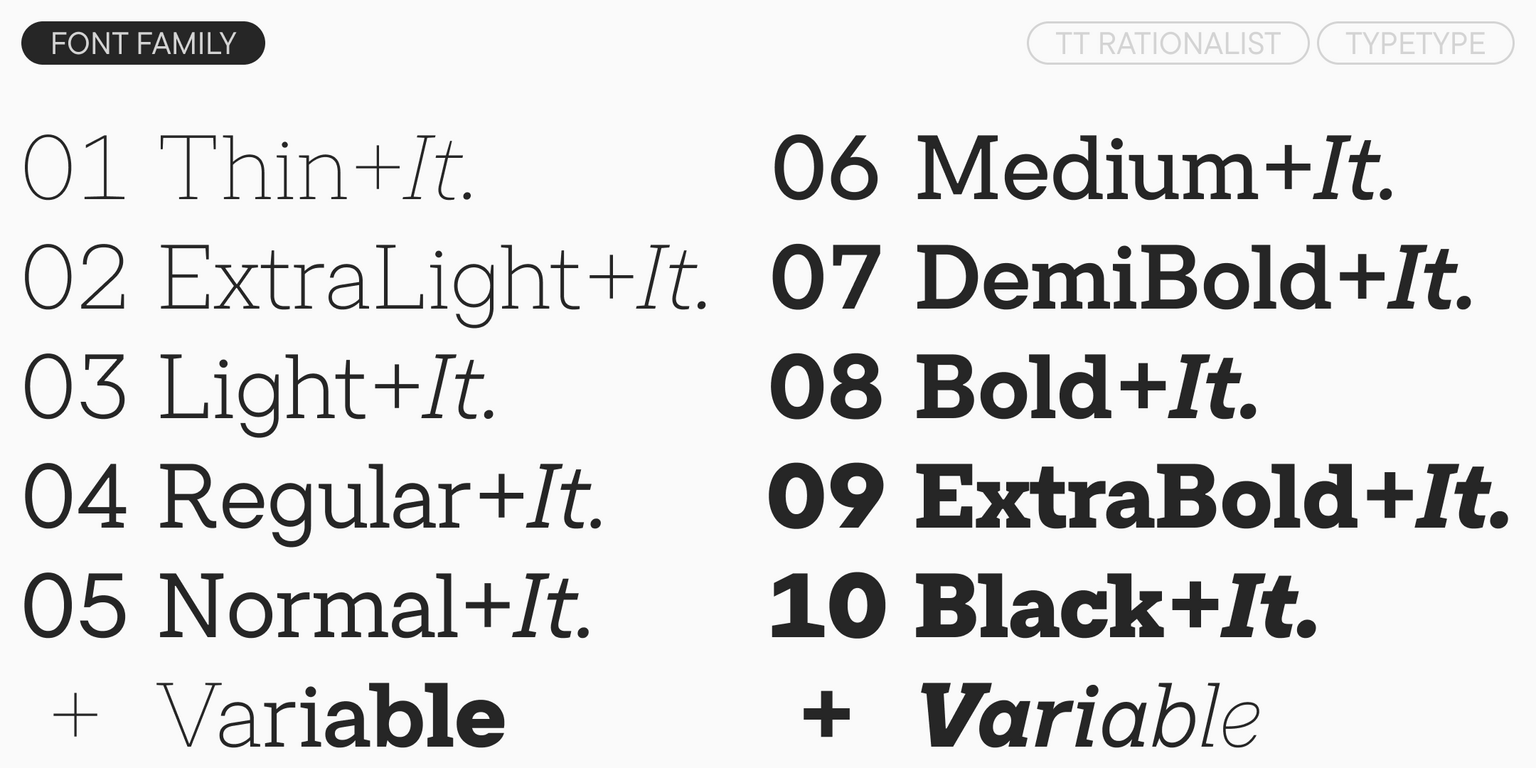
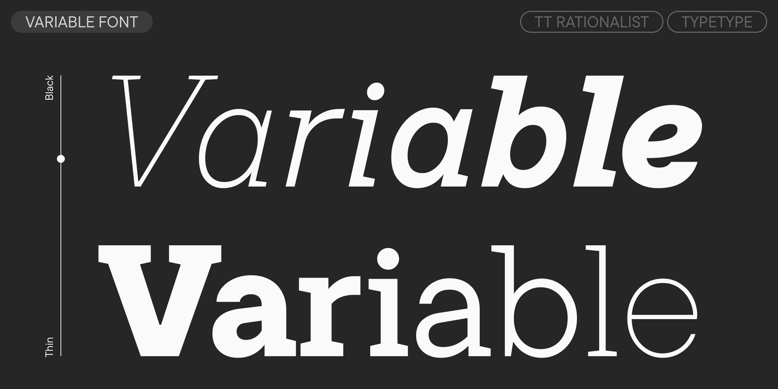
- 22 styles: 10 uprights, 10 italics, and 2 variable fonts
- 1,127 glyphs per style
- 31 OpenType features
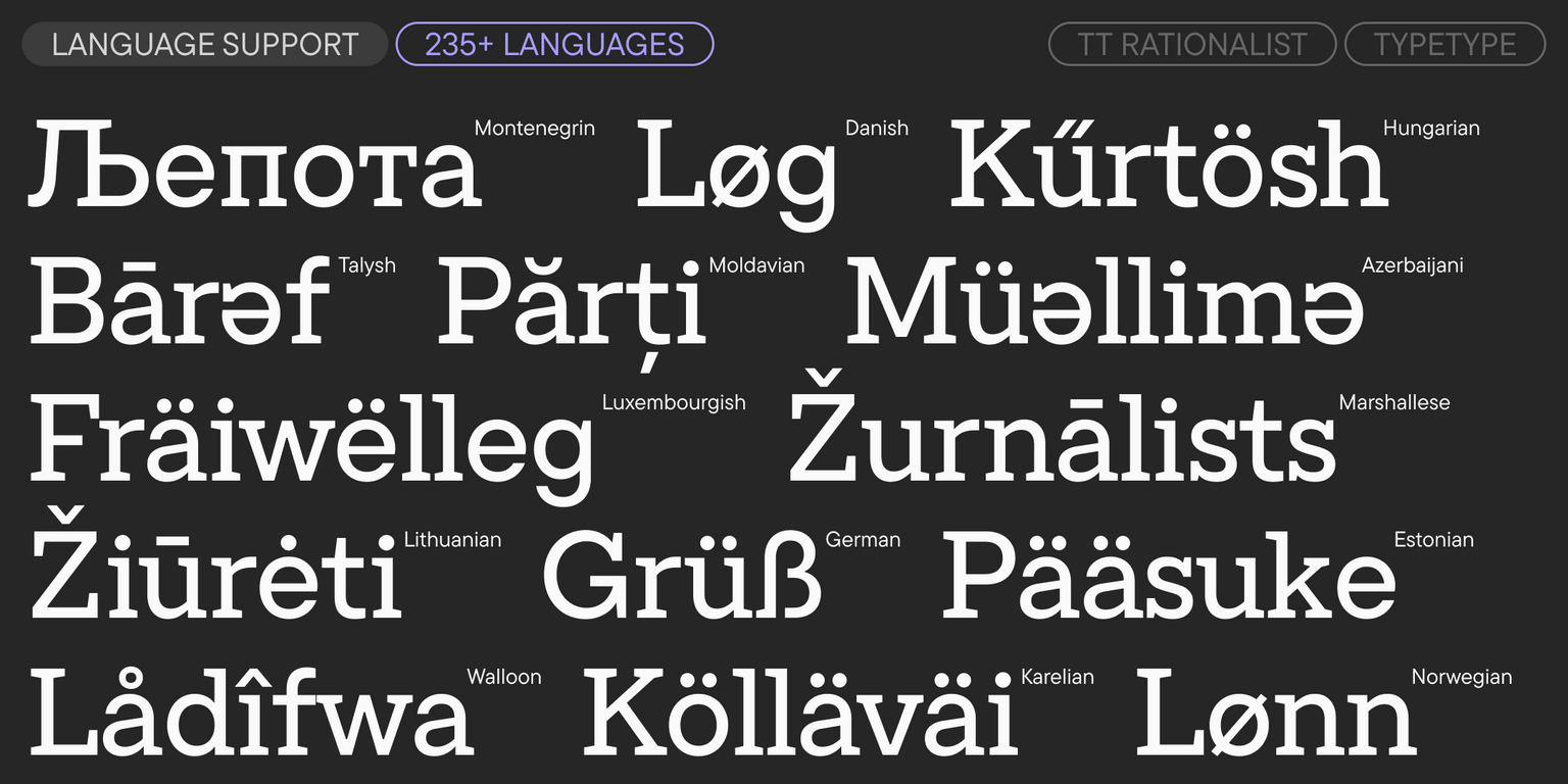
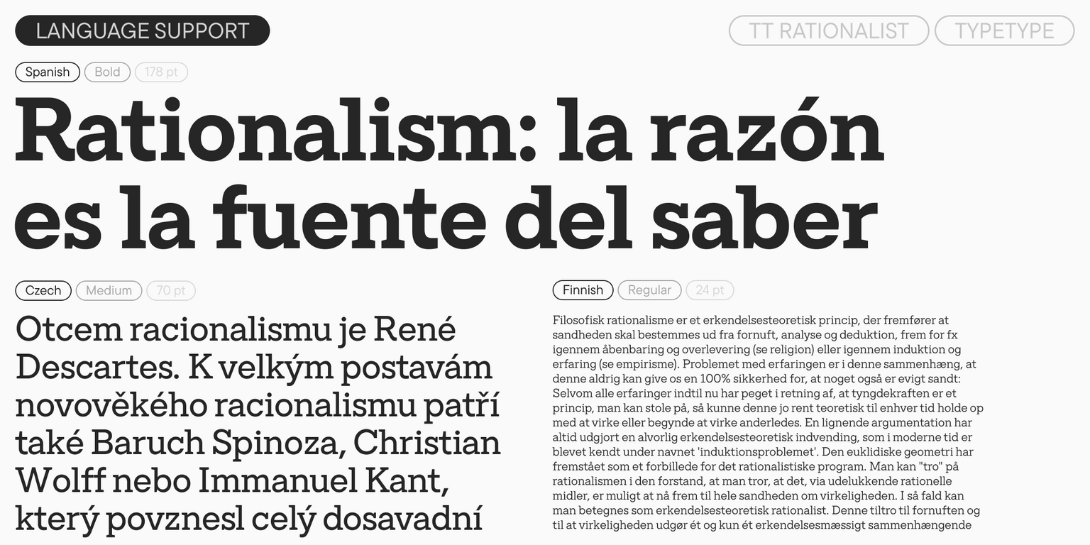
- Over 235 languages