Why Designers Look for Proxima Nova Font Alternatives
The Proxima Nova font has become one of the most recognizable references in modern typography. Its clean geometric structure, approachable character, and strong performance across digital and print environments made it a popular choice for branding, editorial design, websites, and product interfaces. Designers often look for alternatives when they need a similar visual tone but want a fresher brand voice, a broader typographic system, different licensing terms, or more flexibility for multilingual and digital-first projects. A Proxima Nova-inspired font can help preserve the familiar balance of clarity, neutrality, and warmth while giving a brand its own distinctive rhythm. This collection is designed to help designers, art directors, and product teams compare typefaces that feel close in function and mood to Proxima Nova and choose a practical option for real design work.
Key Characteristics of Proxima Nova Inspired Fonts
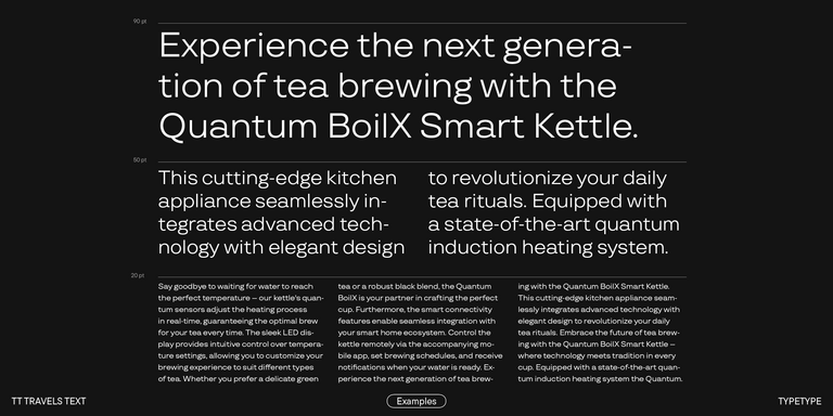
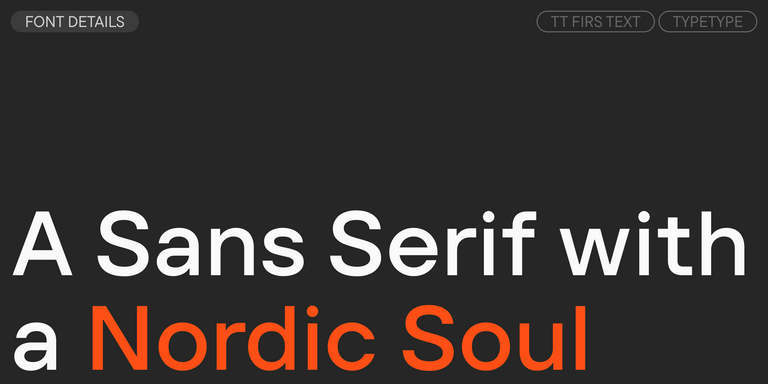
Fonts inspired by Proxima Nova usually combine geometric precision with humanist warmth. This balance is what makes them so useful: the letterforms feel clean and contemporary, yet not overly mechanical. Clear shapes, balanced proportions, open counters, and steady spacing help maintain readability in interfaces, presentations, brand systems, and long-form layouts. Different weights play different roles in a typographic hierarchy. A style similar to Proxima Nova Regular works well for body text, UI labels, and neutral communication, while options close to Proxima Nova Medium can add structure to navigation, subheadings, and emphasis without becoming too loud. Lighter styles can create a refined editorial feel, while bold and black weights help build contrast in headlines, calls to action, and key brand messages. The best alternatives keep this flexibility while adding their own personality.
How to Choose the Right Option for Your Project
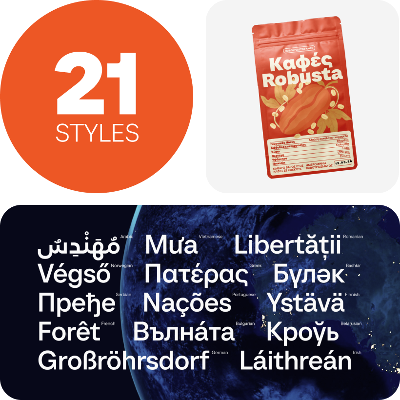
Choosing a Proxima Nova-style font starts with the needs of the project. For branding, look for a family with a clear personality, consistent weights, and enough range to support everything from logos to presentations. For web interfaces and apps, prioritize screen readability, spacing quality, language support, file formats, and compatibility with design and development workflows. Editorial layouts may need more nuance in lighter weights, while marketing pages often depend on strong display cuts such as Proxima Nova Bold-style or Proxima Nova ExtraBold-style options. Licensing is just as important as aesthetics: check whether the font covers desktop, web, app, or server use, and whether the license scales with your team, traffic, or product audience. A good choice should match the visual brief, technical requirements, and commercial context at the same time.
Explore TypeType’s Proxima Nova Style Collection
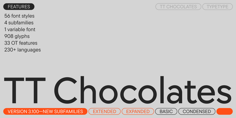
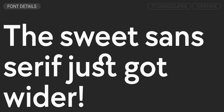
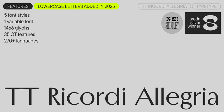
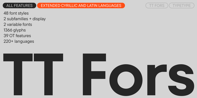
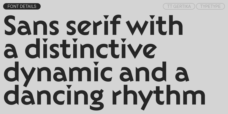
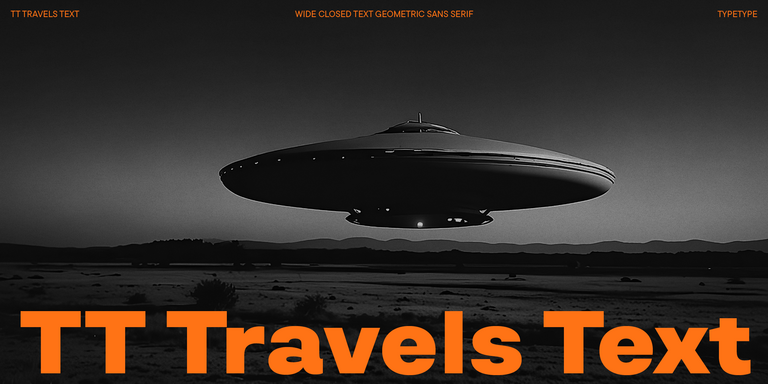
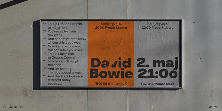
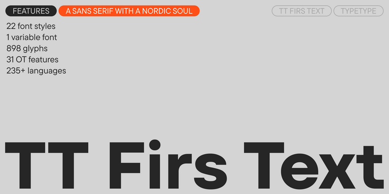
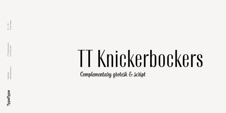
TypeType’s Proxima Nova style collection brings together font families that share the same broad design direction: clean sans serif forms, strong functionality, and a modern tone suitable for brands and digital products. Instead of treating the font Proxima Nova as a single visual formula, the collection helps designers explore related typefaces with different moods, proportions, and use cases. Some families may feel more geometric and tech-oriented, while others offer a softer, more human tone for editorial, lifestyle, or corporate communication. You can review available weights, compare styles, test trial versions in real layouts, and then choose the right license for commercial use. This structured approach helps teams move from inspiration to implementation: first exploring the Proxima Nova font family aesthetic, then testing alternatives, and finally integrating the chosen typeface into a design system.
Usage Scenarios and Licensing Considerations
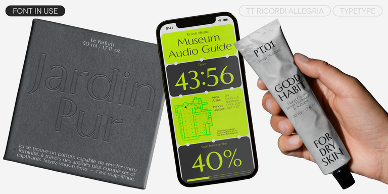
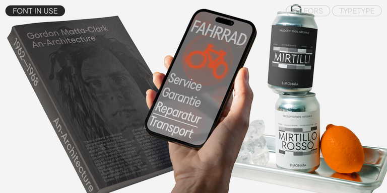
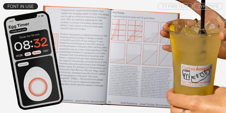
Fonts in the Proxima Nova visual category are especially useful for websites, mobile apps, brand identities, presentations, advertising layouts, editorial projects, and product design systems. Their strength lies in versatility: they can look neutral in interface text, confident in headlines, and polished in brand materials. However, before you download Proxima Nova font alternatives or any similar typeface for a commercial project, it is important to understand the license. Desktop licenses usually cover installation and work in design software, web licenses cover use on websites, and app licenses are required for embedding fonts into mobile or desktop applications. Some licenses also depend on the number of users, pageviews, app downloads, or company size. Reviewing these terms before implementation helps avoid legal risks and ensures the font can grow with your product, campaign, or brand ecosystem.
Comparing Different Proxima Nova Font Weights and Families
When comparing Proxima Nova-style families, pay attention not only to the overall look but also to how each weight performs. Light styles can work well for elegant headlines, secondary text, or spacious editorial layouts, but they may lose clarity in small UI sizes. Regular and medium weights are often the backbone of a typography system, supporting body copy, navigation, captions, and product text. Bold, extra bold, and black styles create stronger hierarchy for hero headlines, buttons, promotional blocks, and brand accents. A Proxima Nova Extra Bold-style cut can add energy to digital campaigns, while a Proxima Nova Black font alternative may be useful for high-impact titles and display compositions. The strongest systems combine several weights within one family, allowing designers to build consistent, scalable typography for complex products, websites, and brand communications.