top_banner_bees0926
TT Cometus
5 styles
Type foundryFonts & StylesSlab SerifTT Cometus

TT Cometus

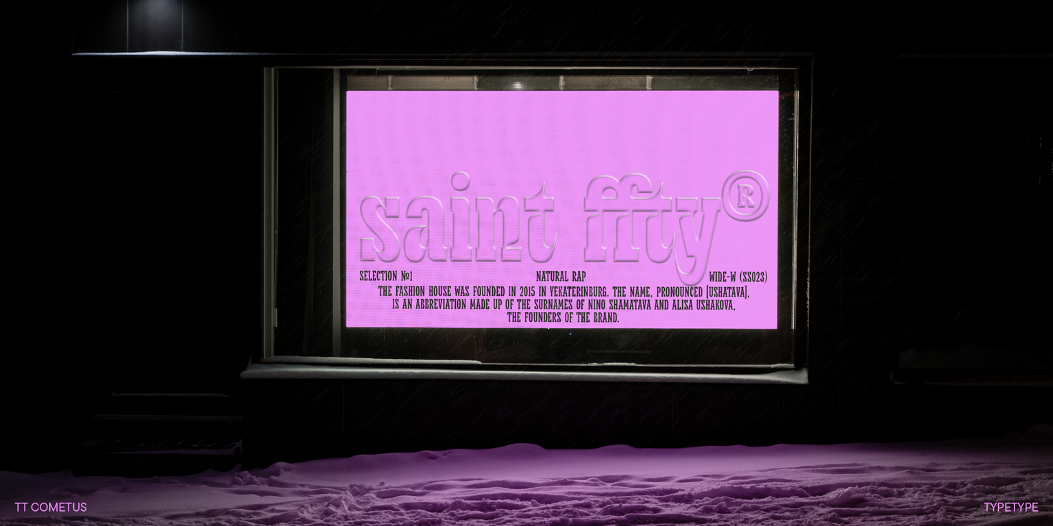
TT Cometus is a vibrant slab serif that balances authority with energy. It has substantial presence combined with lively, dynamic character.

Valid until 2 Oct, 2026

Single style: from  Original price was: $43.99.Current price is: $17.60.
Full family: from  Original price was: $129.Current price is: $51.60. 5 styles

Buying Options

To purchase a font, first select the styles you need, then choose your licenses and proceed to checkout. To test the font in your project, download the free trial version.

Select at least one style before choosing licenses

To purchase a font, first select the styles you need, then choose your licenses and proceed to checkout. To test the font in your project, download the free trial version.

Valid until 2 Oct, 2026

Package offer:
per style $10.32
from  $51.60
5 styles
from  $51.60
from  $17.60
from  $17.60
from  $17.60
from  $17.60
from  $47.60
Package offer:
per style $11.90
from  $47.60
4 styles
from  $47.60
from  $17.60
from  $17.60
from  $17.60
from  $17.60
from  $47.60
1 style
from  $47.60
from  $47.60
On request
Perpetual
On request
On request
Perpetual
On request
On request
On request
On request
On request
On request
On request
On request
Perpetual
On request
On request
Perpetual
On request
On request
Perpetual
On request
On request
Perpetual
On request
On request
On request
On request
On request

Valid until 2 Oct, 2026

Your order:
Nothing selected yet

Select styles first, then licenses.

Questions about the font or licensing?

Testers

TT Cometus
Size
Features
Turn on all

The naming of the font family refers to a flying comet

TT Cometus
Size
Features
Turn on all

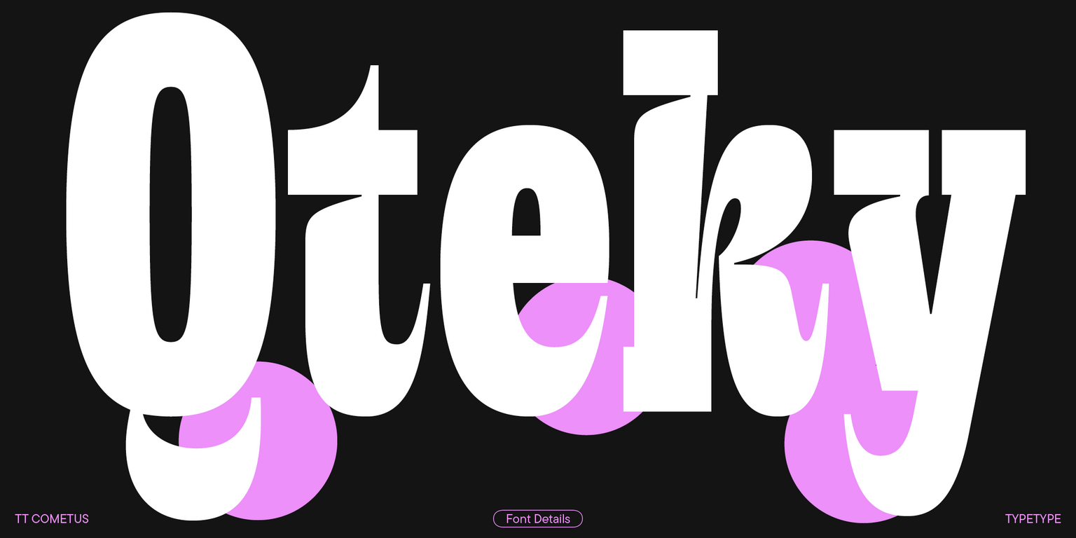
TT Cometus font family was originally conceived as a super display slab serif. If powerful and heavy serifs are essential for creating a slab serif, then why not to combine them with directly opposite forms and make the font family more dinamic? That’s how TT Cometus got the distinctive undercuts where the vertical stroke joins the serif. These undercuts were needed to make the typeface more man-made, not machine-like, as well as to create tension in the elements of the letters and to set important accents.

TT Cometus
Size
Features
Turn on all

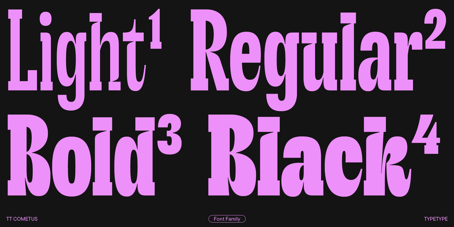
TT Cometus is a font family of 5 typefaces: Light, Regular, Bold, Black and Variable.

TT Cometus
Size
Features
Turn on all
Variable axes
Weight

TT Cometus works best in large sizes. It’s definitely not a neutral font!

Ideal font pairs with TT Cometus

Creating Contrast Without Breaking Visual Harmony

Contrast helps two typefaces take on different roles, but the strongest combinations are rarely built on difference alone. Successful font combinations often share proportions, rhythm, stroke character, or overall mood while differing enough in weight, construction, or style to create hierarchy. This balance makes headlines, supporting text, and secondary information easier to distinguish. The goal is to create clear visual separation without making the composition feel fragmented, accidental, or inconsistent with the wider design system.

Pairing Serif and Sans Serif Typefaces

Combining serif and sans serif designs is a reliable way to create contrast across branding, editorial, and digital projects. Good typeface pairing still depends on more than category. Compare x-height, proportions, weight, spacing, and visual tone to make sure the two designs feel connected. The strongest combinations clearly separate headlines from supporting text while maintaining a coherent overall character. This approach also gives designers flexibility when building hierarchy across websites, publications, presentations, packaging, and other communication formats.

How Type Scale Strengthens a Typeface Pairing

Contrast does not have to come entirely from different letterforms. Scale, weight, spacing, and line height can significantly change how two typefaces interact. A large display treatment may carry the main message, while a calmer style supports body copy or secondary information. Before rejecting a combination, test several hierarchy settings—the same two designs can feel much more compatible once their roles are clearly established. Adjusting scale can also help preserve consistency when the project needs both expressive headlines and highly functional supporting text

Description

About font family TT Cometus
230+ Language support

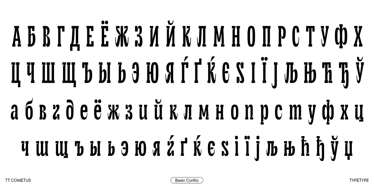
Introducing TT Cometus, version 2.000, which now supports Cyrillic alphabets! We significantly enhanced the font’s character set and technical features.

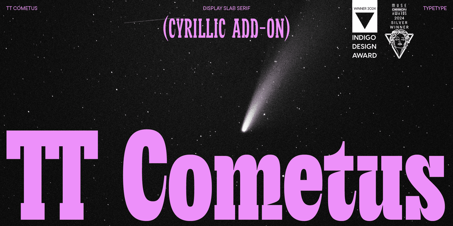
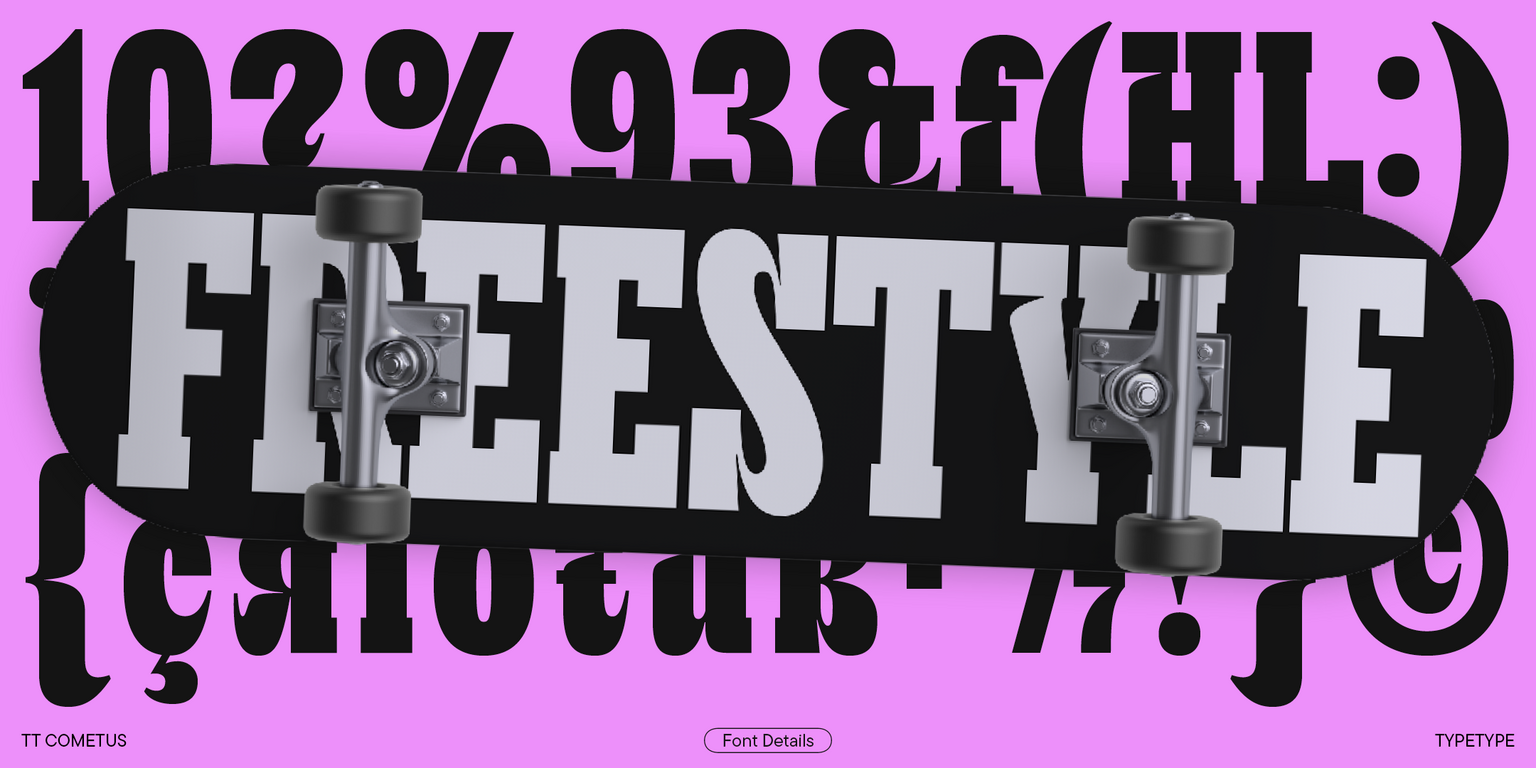
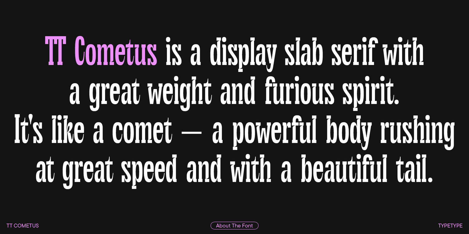
TT Cometus is a modern slab serif. The typeface’s name evokes the image of a comet—a powerful and weighty celestial body with a beautiful tail slicing through space at an incredible speed. This is the key to understanding this font.

TT Cometus embodies a balanced personality: impressive and sturdy but energetic and dynamic at the same time. When designing this typeface, we aimed to incorporate heavy serifs typical for slabs into a modern and dynamic appearance. To achieve this, we combined sturdy details with completely opposite shapes, added a handmade feel, and drew inspiration from brush movements in calligraphy.

So, TT Cometus stands out for its sharp terminals resembling comet tails, which are particularly noticeable in the letters c, y, e, and t. Another curious detail is the stylized junctions of arcs and bowls that add fluidity to the font. Also, the typeface’s sturdy serifs allow it to maintain stability. The font features a slight contrast between horizontal and vertical element weights and a high contrast in serifs, junctions, and glyph terminals.

The enhanced version of the typeface boasts long-awaited Cyrillic alphabet support, new stylistic sets and OpenType features, entirely reworked kerning, and improved hinting.

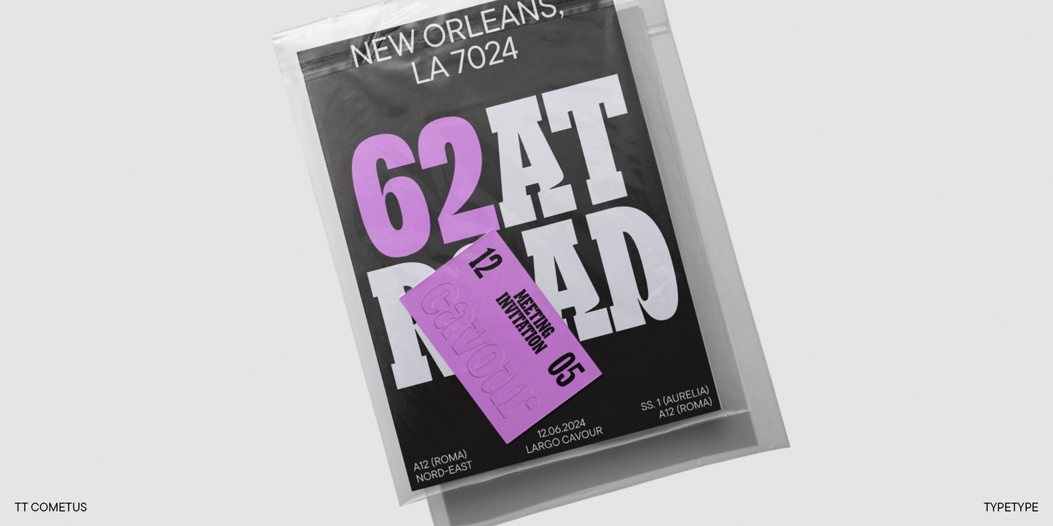
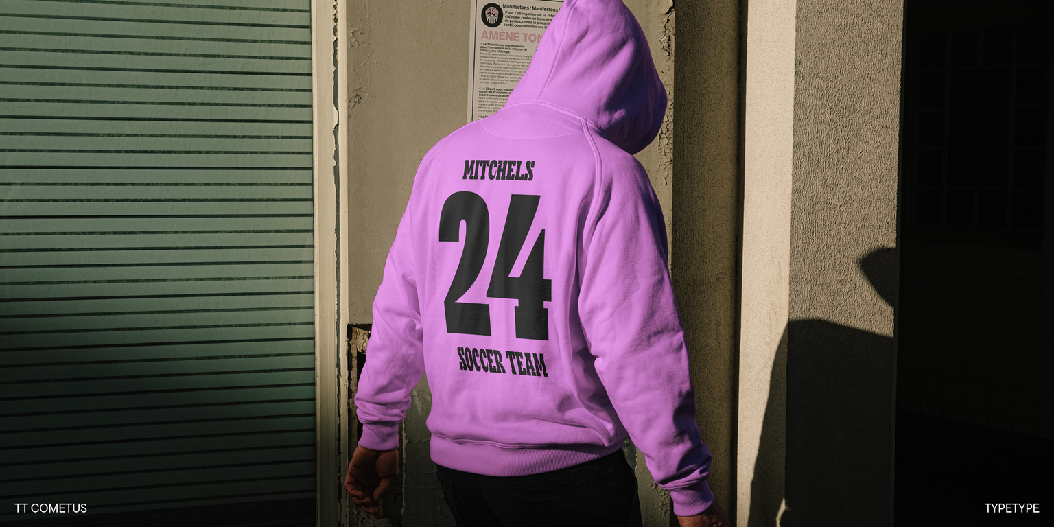
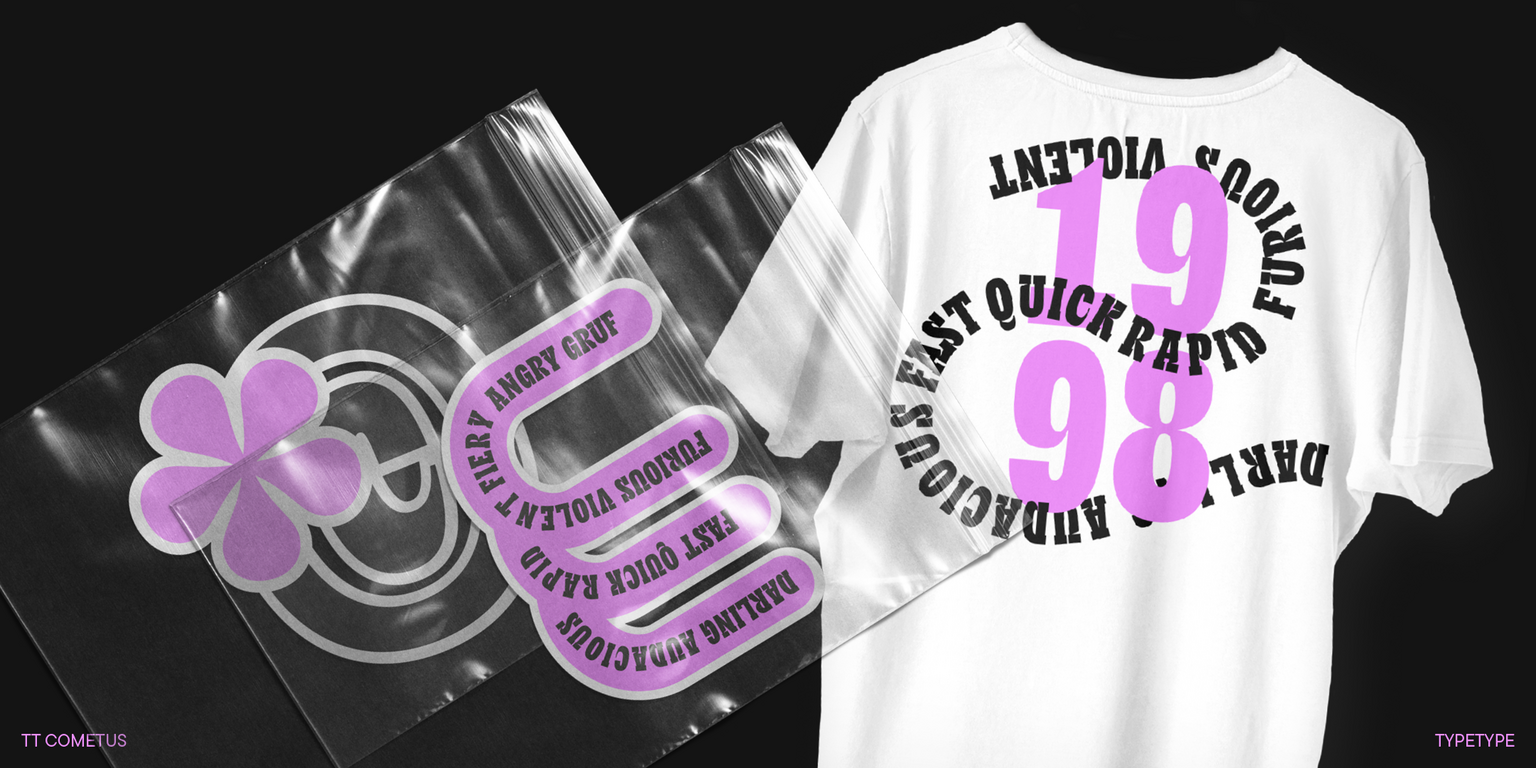
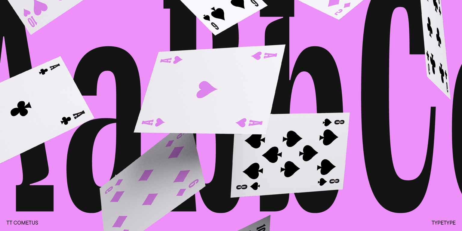
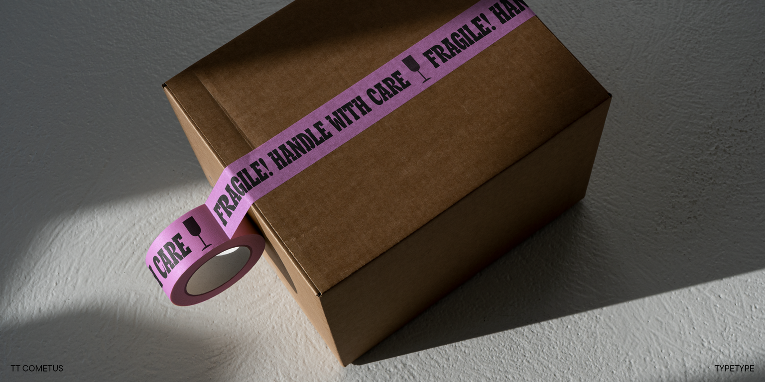
TT Cometus shines best in large point sizes. This font is anything but neutral! It’s eye-catching and looks flawless in headlines, logos, and branding — wherever attention needs to be captured.

The updated TT Cometus includes:

  • 5 font styles: 4 upright and one variable font with a weight variation axis;
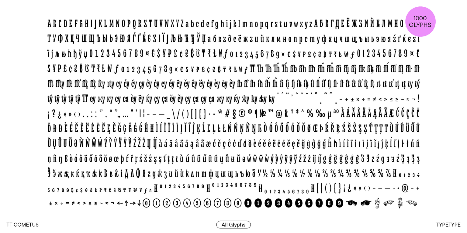
  • 1000 characters in each font style;
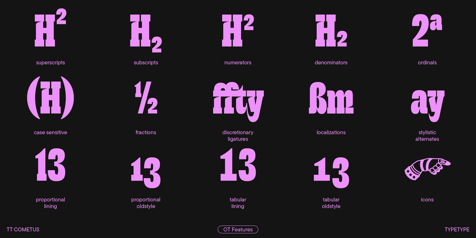
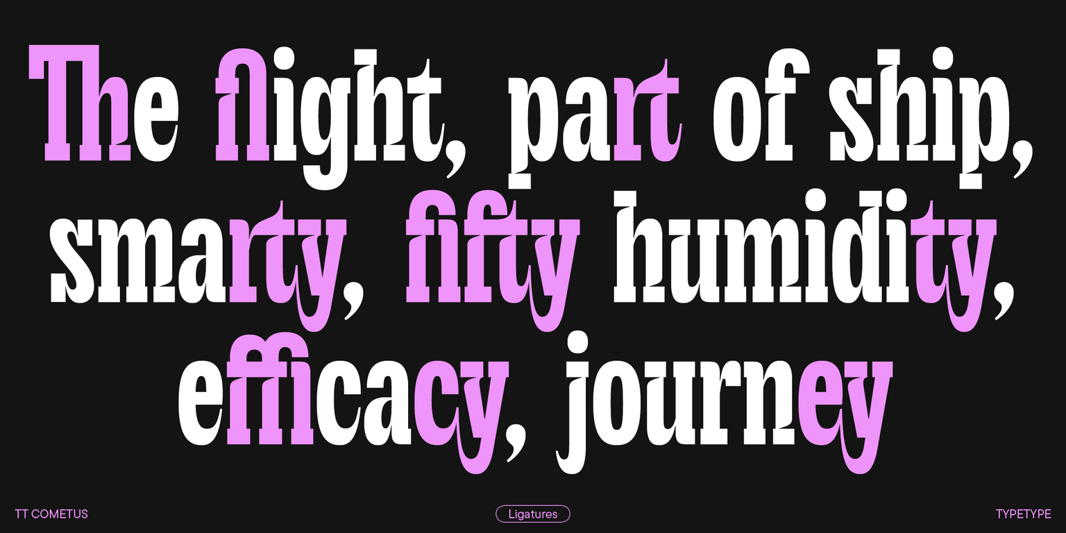
  • 33 OpenType features, counting in numerous ligatures and sets of alternate ampersand and letter g glyphs;
  • 230+ languages support.

Team

Marina Khodak
Anna Tikhonova
Ksenia Karataeva
Yuriy Nakonechny
+ TypeType Team

Release and update date

Release: 31 January, 2023

Last update: 21 May, 2024

What's changed in the font:
  • Cyrillic languages support, including Russian, and amplified Latin alphabets;
  • Larger character set that grew from 568 to 1000 glyphs;
  • More OpenType features: 33 instead of 18;
  • More extensive basic currency symbol set, a minuscule case for currency symbols (including tabular versions for both cases), and currency symbols for Numr and Dnom cases;
  • New fractions, numerators/denominators, and minuscule figures;
  • New stylistic sets;
  • Entirely redesigned kerning and improved hinting.

Additionally

Specimen

Download font specimen (pdf)

Poster Images

Graphic presentation at Behance

Custom version

Looking for a custom version of this font?

Character Set

Basic Latin Basic Cyrillic Extended Latin Extended Cyrillic Standard and Discretionary Ligatures|liga,dlig Lining Figures, Currencies Old-style Figures|onum Punctuation, Mathematical Symbols Figures in circles Icon Set
A B C D E F G H I J K L M N O P Q R S T U V W X Y Z a b c d e f g h i j k l m n o p q r s t u v w x y z

OpenType features

ss01 | Double-storey g

ǵ ğ

ǵ ğ

ss02 | Pointed Cyrillic tails

З Ҙ Э

З Ҙ Э

ss03 | Curved Cyrillic terminals

ж ќ ҡ

ж ќ ҡ

ss10 | Bulgarian localization

ДЛФ вк

ДЛФ вк

ss14 | Circled Figures

567

567

liga | Standard Ligatures

ffi fk

ffi fk

Show all

Similar fonts

4 font styles
4 font styles
3 font styles
Select licenses
Contact us!