Today’s websites demand a specialized approach to typography—that’s exactly what TypeType’s web fonts deliver. Crafted specifically for digital screens, they maintain crystal clarity across all devices while loading quickly. Our collection includes typefaces that bring expressive design without compromising your site’s performance.
These typefaces offer a simple way to enhance text legibility, whether in headlines or body copy. Every symbol is optimized for flawless browser rendering.
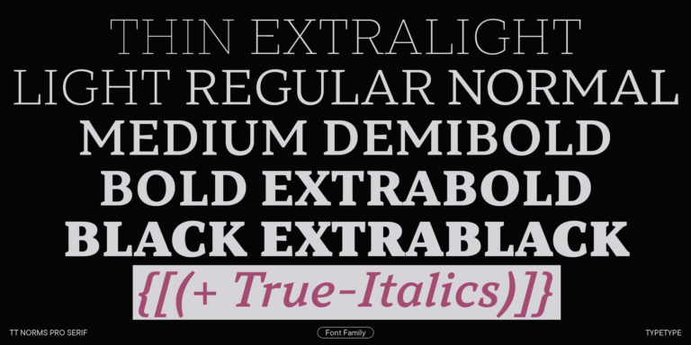
Typefaces for digital environments have to solve different problems than those created primarily for print. On a screen, every detail is affected by device size, resolution, rendering engine, background contrast, and loading performance. That is why strong website fonts need clear letterforms, open spacing, balanced proportions, and stable behavior across desktops, tablets, and mobile devices. A family for digital use should remain readable in small interface labels, long paragraphs, navigation, buttons, and large headlines. A wide range of weights also helps designers build hierarchy without switching between unrelated styles. Language support is another important factor for international products, while variable styles can give teams more flexibility in responsive systems. The best screen-ready typefaces combine visual character with technical reliability.
Common Types of Web Fonts
Different categories serve different tasks in digital design. Sans serifs are often used for interfaces, SaaS products, corporate sites, and navigation because they feel clean and direct. Serifs can bring editorial depth, elegance, and authority to long reads, landing pages, and brand storytelling. Display styles work best for hero sections, campaign headlines, and expressive visual identities where the goal is to create impact. Monospace options are useful for code, technical products, dashboards, and developer-focused communication. When choosing modern web fonts, designers often combine a functional text family with a more distinctive headline style to balance readability and personality.
Choosing Fonts for Modern Website Design
Choosing a typeface for a digital project starts with the content and user journey. First, define where the family will be used: product interface, marketing site, blog, landing page, dashboard, or brand system. Then test it at real sizes, not only in large specimen views. Navigation, forms, captions, cards, and mobile layouts often reveal whether the design is truly comfortable to read. Good web optimized fonts should support hierarchy through several weights, remain legible on different screens, and include the languages and symbols your audience needs. It is also worth checking file formats, loading strategy, licensing terms, and how the chosen style works with your brand voice. A typeface can look impressive in a hero block but fail in dense interface text, so the final decision should always be based on real layouts and production conditions.
TypeType’s Collection for Digital Projects
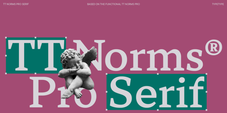
TypeType offers a collection of premium fonts for websites, interfaces, branding, and marketing systems. The library includes versatile families such as TT Norms® Pro, TT Commons™ Pro, TT Hoves Pro, TT Interphases Pro, and other options designed for modern communication. Some families are neutral and system-oriented, while others add more character for brand expression, editorial layouts, or campaign pages. Designers can explore available weights, test trial versions in their own mockups, and choose licenses for commercial use. This makes the collection useful for teams that need typography ready for real digital products, not just isolated visual experiments.
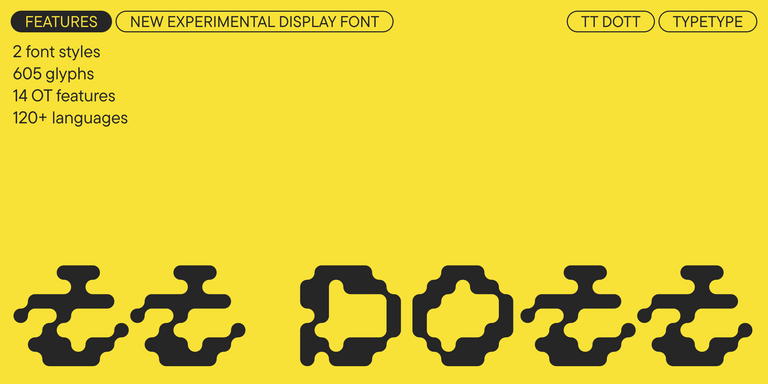
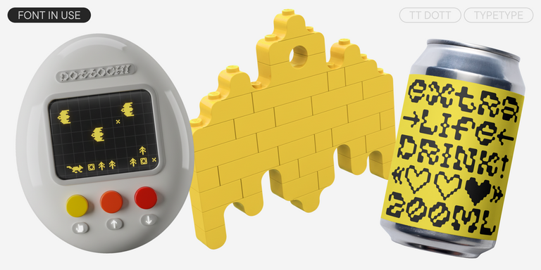
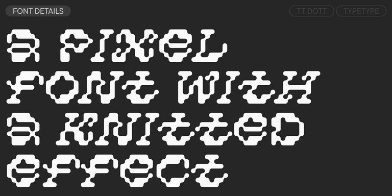
TT Dott is an experimental pixel grotesque where a circle is used as the base for the pixel. It is a fluid and unusual display font, evoking associations with embroidery and techno parties all at once.
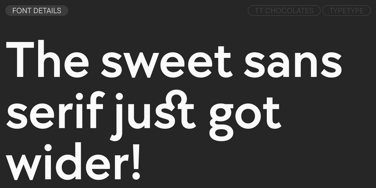
TT Turns is a striking geometric sans serif with expressive elements. This versatile font works exceptionally well for running text, while at large point sizes, it takes on a distinct display character.
TT FRANTZ IS AN EXPERIMENTAL VARIABLE FONT, DISTINGUISHED BY ITS SLIMNESS AND LIGHTNESS. THE VARIATION IN THE FONT AFFECTS THE CHANGE IN THE HEIGHT OF THE MEAN LINE—BY MOVING THE AXIS ADJUSTMENT SLIDER YOU CAN EASILY RAISE OR LOWER THE MEAN LINE OF THE FONT.
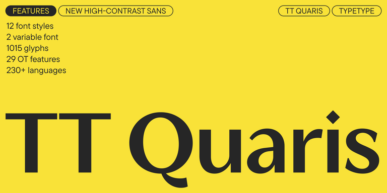
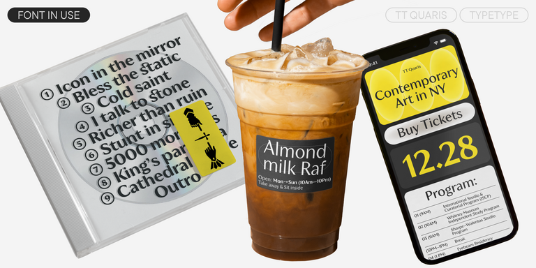
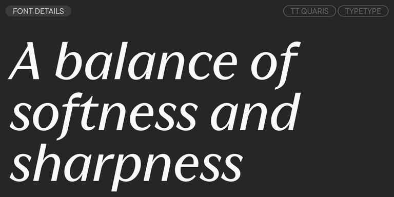
TT Quaris is an exquisite, modern high-contrast sans whose design balances between soft and sharp. The glyph shapes in the font are fluid and tend towards roundness, yet there are also sharp elements.
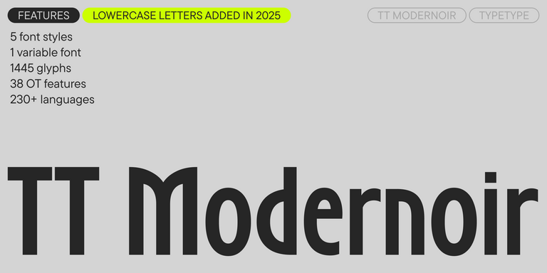
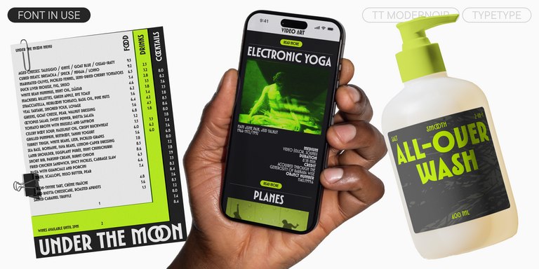
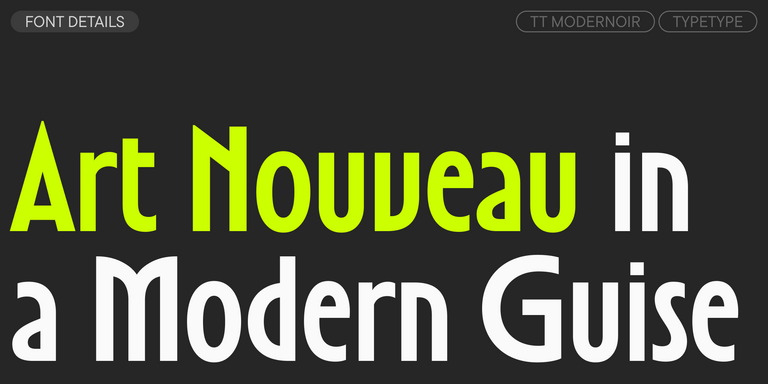
TT Modernoir is a display sans serif with dynamic proportions. Fluid lines and delicate Art Nouveau forms in this typeface blend seamlessly with the rhythmic flow and improvisational freedom of jazz.
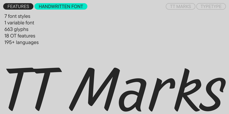
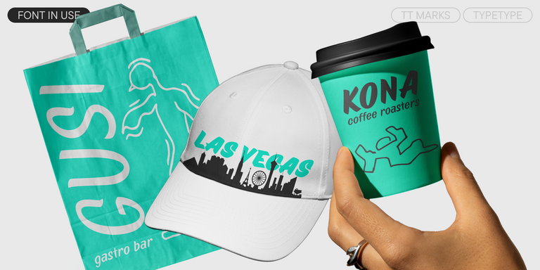
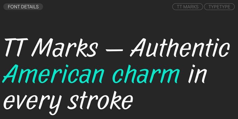
TT Marks delivers a script with dynamic rhythm, heartfelt character, and nostalgic appeal inspired by the classic art of American sign painting. This craft, where skilled artists hand-painted storefront signage with brushes and careful technique, is experiencing a well-deserved renaissance in today`s design world.
Web fonts are typefaces that are loaded through a website instead of relying only on the visitor’s device. They help keep typography consistent across browsers, screens, and operating systems. This makes them important for branding, user experience, readability, and digital design, especially when a site needs a recognizable visual style.
How Do Web Fonts Affect Website Performance?
Typography affects not only how a site looks, but also how quickly it loads and feels to use. Optimized files, variable styles, proper formats, and a limited number of weights help support better performance. The goal is to balance expressive design with technical efficiency, so the page remains clear, fast, and comfortable.
How Do I Pair Fonts for Web Design?
In most cases, two families or one large superfamily with several weights is enough. Pair styles that contrast but still support each other: for example, a distinctive headline style with a neutral text companion. Keep hierarchy consistent between headings, body copy, buttons, and navigation to avoid a fragmented interface.
How Many Fonts Should I Use on a Website?
For most projects, one or two families are enough. Using too many styles can make the interface feel overloaded, weaken hierarchy, and slow down loading. Large families with multiple weights often give fonts for web designers enough flexibility to create headings, text, captions, and interface elements within one system.
What License Do I Need to Use TypeType's Web Fonts on a Website?
To use TypeType web typefaces on a site, you need a Webfont license. It covers browser embedding through site files and is available for different project scales, from small websites to large commercial platforms. Before launch, check the license terms, pageview limits, domains, and any additional use cases.
Enter your email address and spin the sun to win up to 100% off or TypeType services
Giveaway rules:
Each user can only play once;
Each promo code is unique and can only be used once;
The promo code discount applies only to purchases up to $5,000 in the online store;
Please note that the "Font Renaming," "Your Logo in a Font," and "Basic Customization" services do not apply to previously purchased fonts and are only available for new orders;
If you win a service, our manager will contact you within three business days with the details.