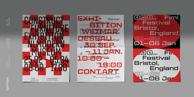
TT Commons™ Pro is a completely redesigned version of the well-established classic font family TT Commons.
Premium fonts
Premium fonts help define the visual tone of a project and make typography more distinctive, flexible, and expressive. On this page, explore selected typefaces designed for branding, digital products, and editorial work.
- All fonts 76
- Sans Serif 49
- Serif 27
- Slab Serif 6
- Display 42
- Script 9
- Variable 47
- Font sale 15
Why People Look for Premium Alternatives
Designers, brand teams, and product owners look for the best premium fonts when a project needs more than a common free typeface. Free fonts can work for quick mockups or personal use, but commercial brands often need stronger quality control, wider families, reliable licensing, and a more distinctive visual voice. Premium typefaces help solve practical design problems: building a recognizable identity, creating a consistent interface, improving readability across touchpoints, and supporting long-term brand growth. They also give teams access to better spacing, kerning, language support, and technical preparation. For companies working across websites, apps, presentations, packaging, and marketing campaigns, a premium font is not just a visual choice. It becomes part of the brand system and helps make communication more polished, consistent, and memorable.
What Makes a Premium Typeface Distinctive
Fonts premium in quality stand out through a combination of design, functionality, and production detail. A strong premium typeface has a clear visual idea, carefully balanced proportions, and a rhythm that works across different sizes and media. It usually includes a broad range of weights and styles, making it easier to build hierarchy for headlines, body text, captions, buttons, and display elements. Premium fonts also offer more refined typography: better kerning, thoughtful spacing, OpenType features, and consistent drawing across the full family. This matters in both expressive branding and highly functional interfaces. A premium typeface should feel distinctive enough to support a brand personality, but flexible enough to work in everyday communication. That balance is what separates a professional font family from a simple decorative choice.
How to Choose the Right Option for a Project
Before you buy premium fonts, define what the typeface needs to do. A brand identity may require a memorable shape, strong display weights, and long-term recognition. A web or app interface needs readability, clear hierarchy, technical reliability, and support for different screen sizes. Editorial projects may benefit from contrast, nuance, and comfortable long-form reading, while advertising materials often need expressive headlines and flexible styling. Language support is another key factor, especially for international brands. Licensing should also be reviewed early: desktop, web, app, and other formats may cover different use cases. The best choice is the font that fits the visual tone, technical environment, and commercial scope of the project. Testing trial versions in real layouts is the most reliable way to compare options before making a final decision.
TypeType Collection Overview
The TypeType collection includes modern premium fonts for branding, digital products, editorial design, presentations, packaging, and marketing systems. The catalog features versatile sans serifs for interfaces and corporate communication, expressive display families for campaigns and headlines, refined serifs for editorial and premium brand contexts, and characterful typefaces for projects that need a stronger voice. Some families are designed for neutral clarity, while others bring more personality, rhythm, or visual contrast. This variety helps designers choose not only by style, but also by function: readability, hierarchy, language support, and licensing needs. Users can explore families, compare weights, test trial versions in their own layouts, and then select the right license for commercial use. TypeType’s approach is built for teams that need fonts ready for real design systems, not just isolated visual experiments.
Where Premium Fonts Work Best
Premium typefaces are especially valuable in projects where typography has to carry brand meaning and remain reliable across many formats. They work well in visual identities, websites, mobile apps, digital products, presentations, packaging, editorial layouts, advertising campaigns, and social media systems. When teams download premium fonts for testing, they can evaluate how each family performs in real scenarios: large headlines, small UI labels, long paragraphs, product cards, navigation, or brand templates. A premium font helps unify these touchpoints and makes the design system feel intentional. It also reduces the risk of inconsistent typography when a brand grows, expands into new markets, or launches new products. For designers and art directors, premium fonts offer a practical way to combine visual character, readability, and professional production quality.
- The quick brown fox jumps over a lazy dog.
- Pack my box with five dozen liquor jugs.
- Sphinx of black quartz, judge my vow
- 0123456789 !?.,:;—–()[]{}<> “quotes” ‘apostrophe’ @#%&*_+=/\| № $ € £ ₽ +−×÷=≠≤≥ … % © ® ™
- Aa Bb Cc Dd Ee Ff Gg Hh Ii Jj Kk Ll Mm Nn Oo Pp Qq Rr Ss Tt Uu Vv Ww Xx Yy Zz
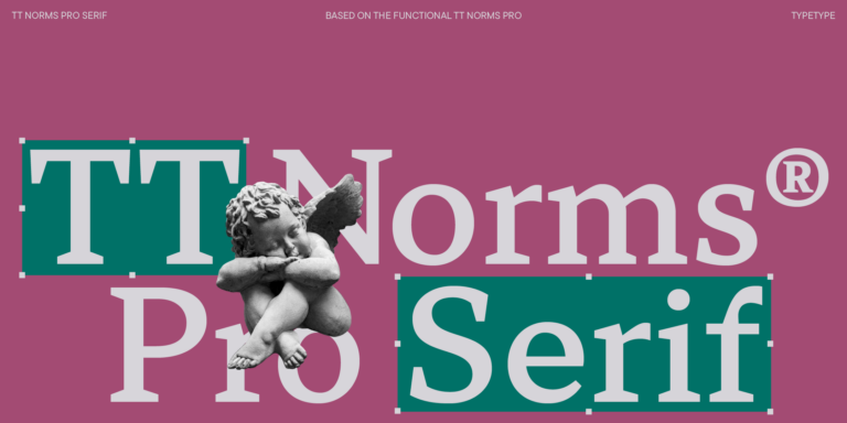
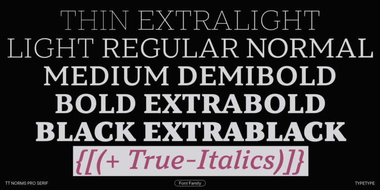
We continue to expand the line of the studio's main bestseller TT Norms® Pro!
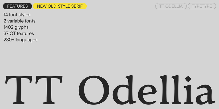
TT Livret is an elegant, modern and functional serif
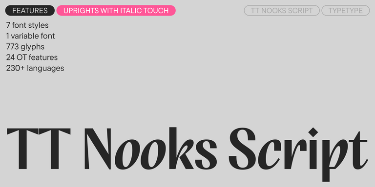
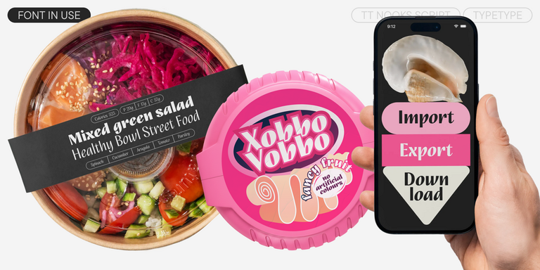
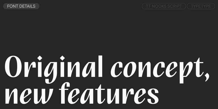
TT Nooks Script features a unique design that has no direct analogs.
TT Neoris is an elegant Neo-Grotesque with unlimited potential and a font that encompasses all modern requirements and user desires.
TT Turns is a striking geometric sans serif with expressive elements. This versatile font works exceptionally well for running text, while at large point sizes, it takes on a distinct display character.
TT Regins is a Scottish modern serif. Striking contrast and sharp triangular serifs give this font a stern and commanding character, while refined forms, enlarged lowercase letters, and slightly condensed, static proportions add grace to its design.
TT FRANTZ IS AN EXPERIMENTAL VARIABLE FONT, DISTINGUISHED BY ITS SLIMNESS AND LIGHTNESS. THE VARIATION IN THE FONT AFFECTS THE CHANGE IN THE HEIGHT OF THE MEAN LINE—BY MOVING THE AXIS ADJUSTMENT SLIDER YOU CAN EASILY RAISE OR LOWER THE MEAN LINE OF THE FONT.
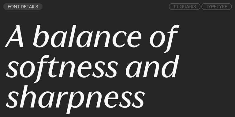
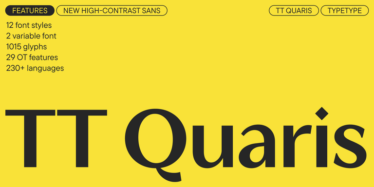
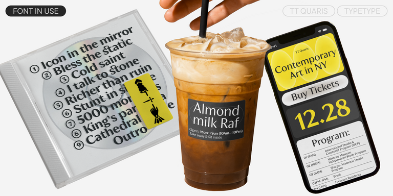
TT Quaris is an exquisite, modern high-contrast sans whose design balances between soft and sharp. The glyph shapes in the font are fluid and tend towards roundness, yet there are also sharp elements.
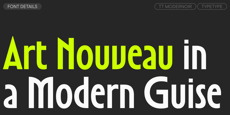
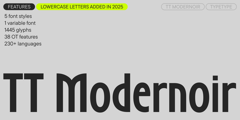
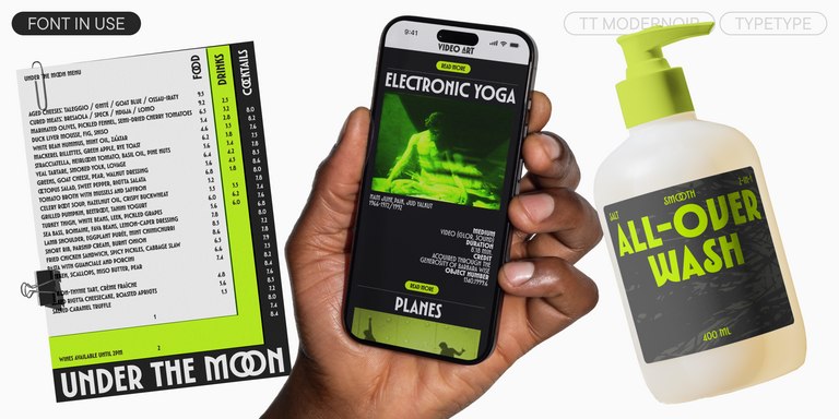
TT Modernoir is a display sans serif with dynamic proportions. Fluid lines and delicate Art Nouveau forms in this typeface blend seamlessly with the rhythmic flow and improvisational freedom of jazz.
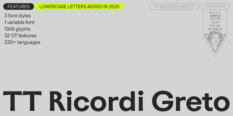
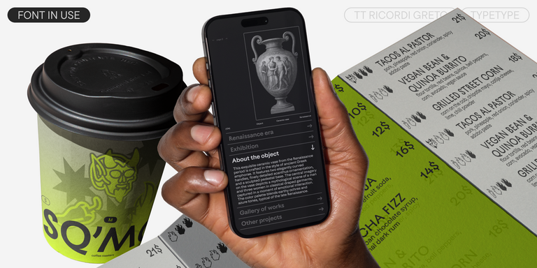
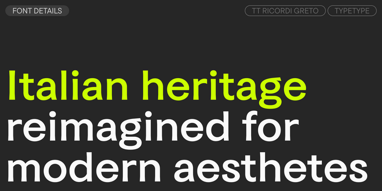
TT Ricordi Greto is an experimental project, inspired by a floor plaque dating from 1423 found in the Basilica di Santa Croce, Florence.
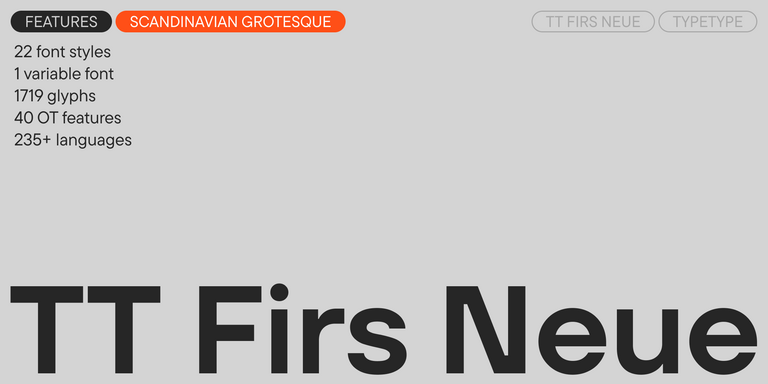
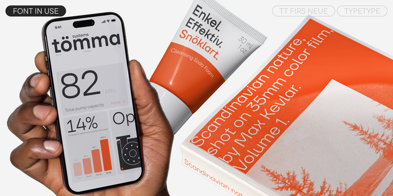
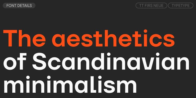
TT Firs Neue is a contemporary reincarnation of the good old TT Firs sans serif.
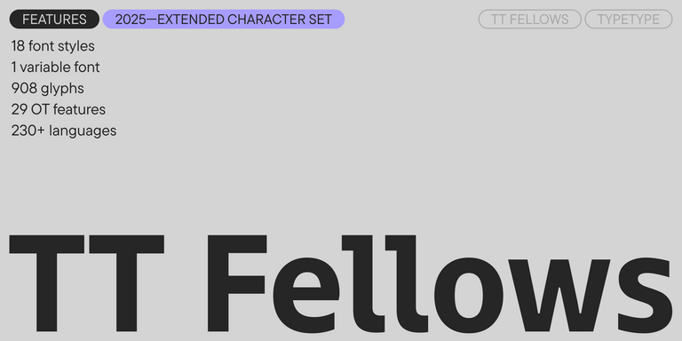
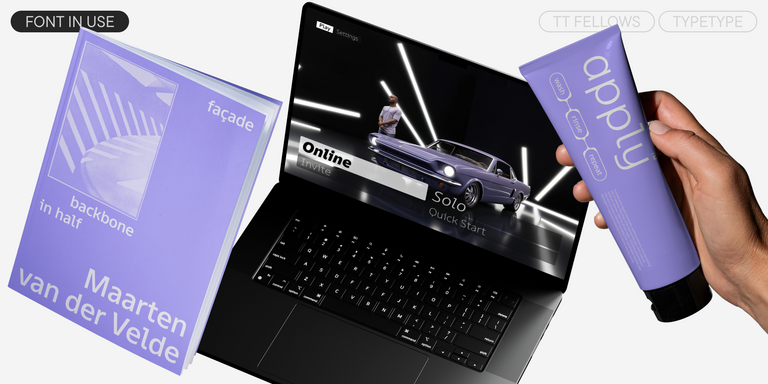
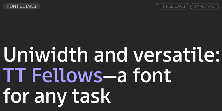
TT Fellows is a humanist sans serif with a mechanical touch.
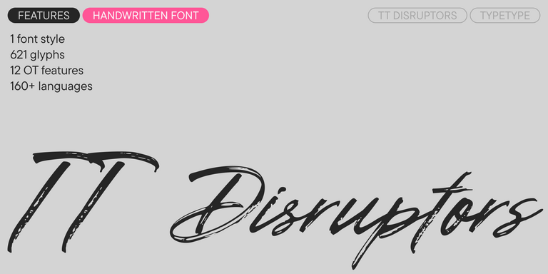
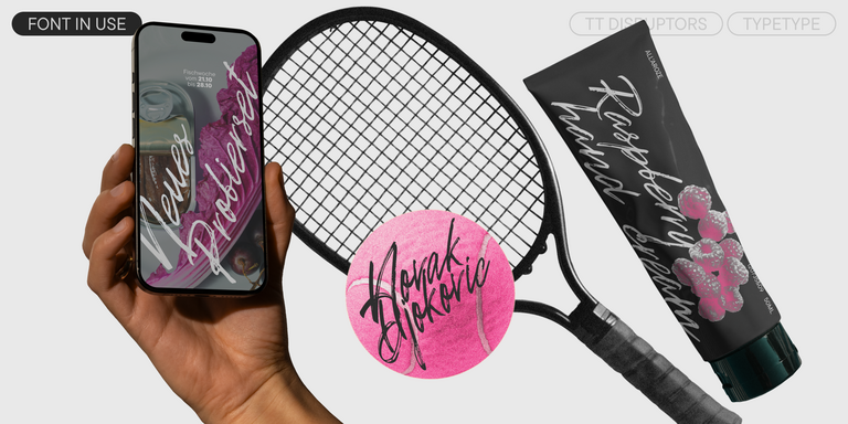
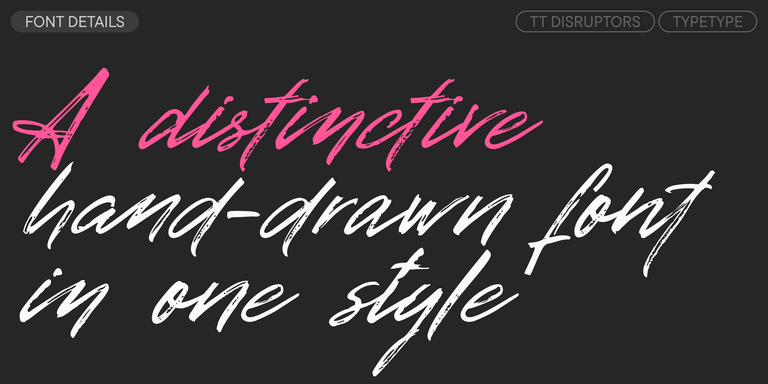
TT Disruptors is a ductile marker-drawn handwritten typeface. Its design is one-of-a-kind: worn edges, varying stroke thickness, and elongated ascenders and descenders give it a lively, dynamic texture and handcrafted feel. The personality of this font is spirited and emotional, yet warm and soulful.
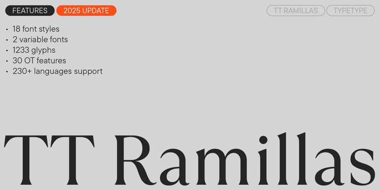
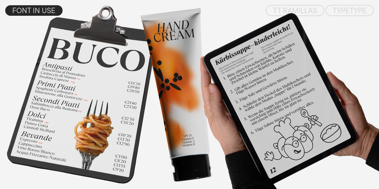
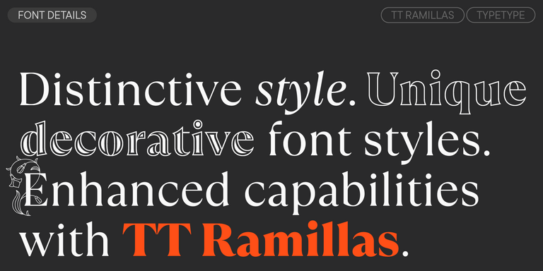
TT Ramillas is a contemporary serif with editorial versatility. It features decorative styles and ornamental initials with floral motifs.
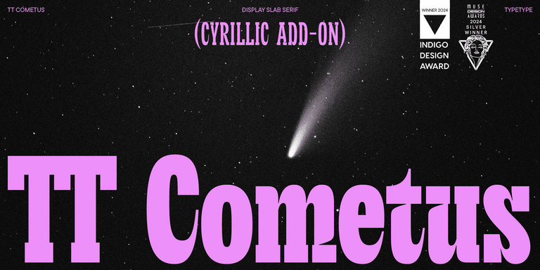
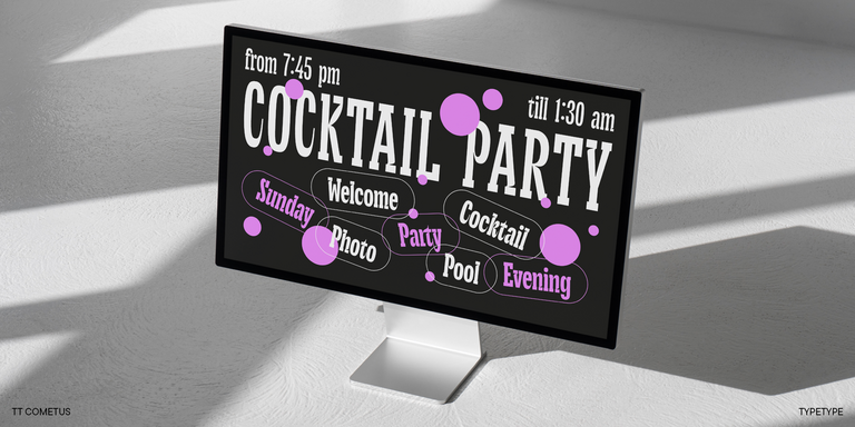
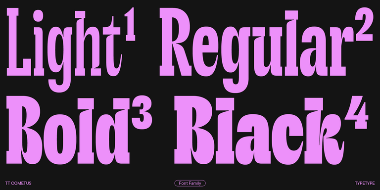
TT Cometus is an expressive typeface that captivates from the first time.
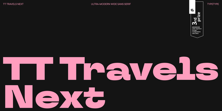
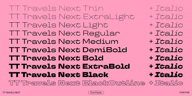
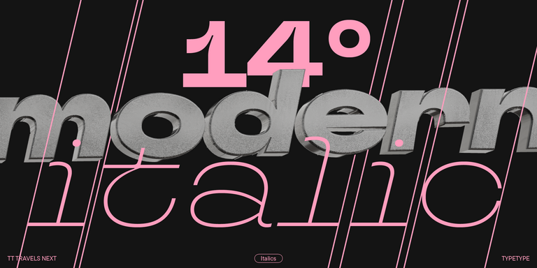
TT Travels Next is a very trendy and modern wide display sans serif for use in different sets, be they print or web.
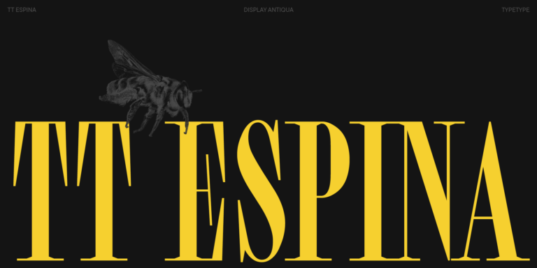
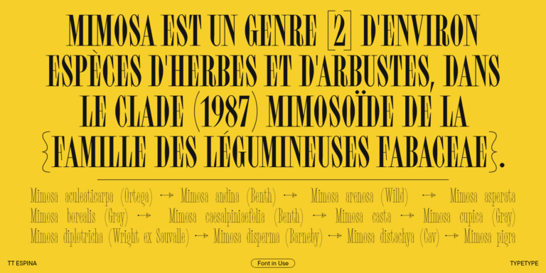
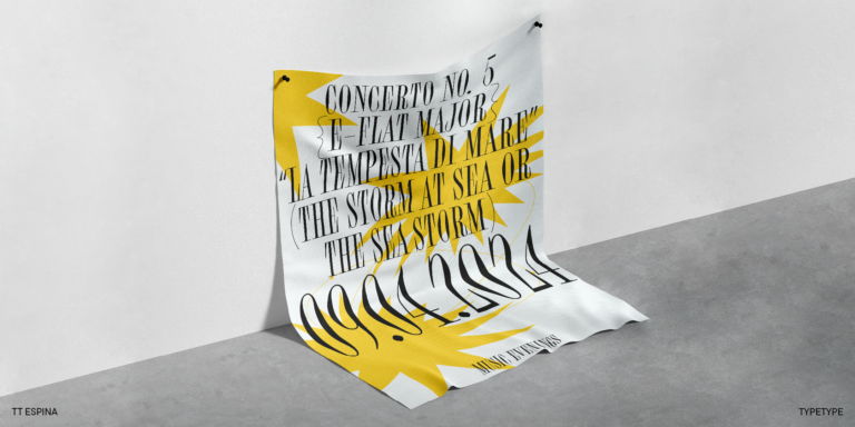
TT Espina is a display antiqua with expressive serifs
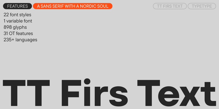
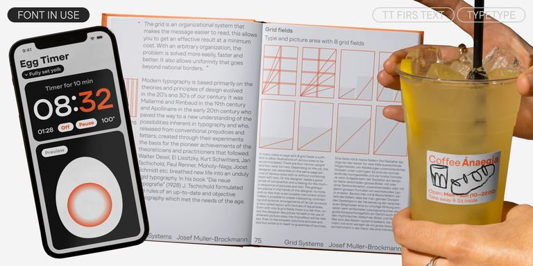
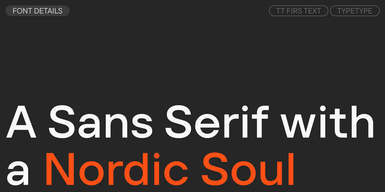
We have released a brand-new font. Meet TT Firs Text—a geometric sans serif with a Nordic character!
A technological font family for game design
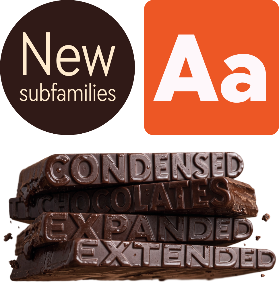
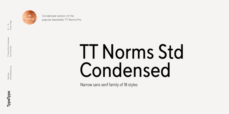
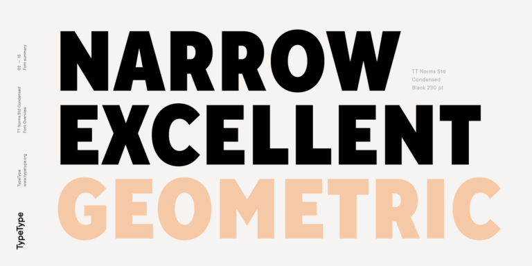
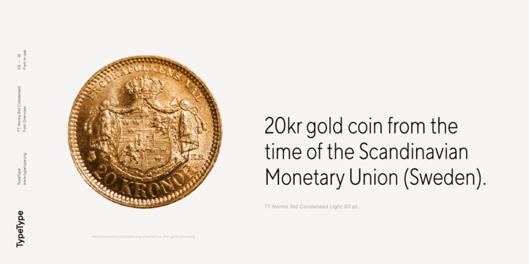
TT Norms Condensed continues to develop the ideas of neutrality and versatility stemming from our bestselling TT Norms.
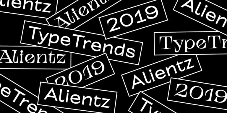
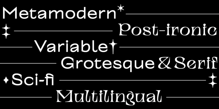
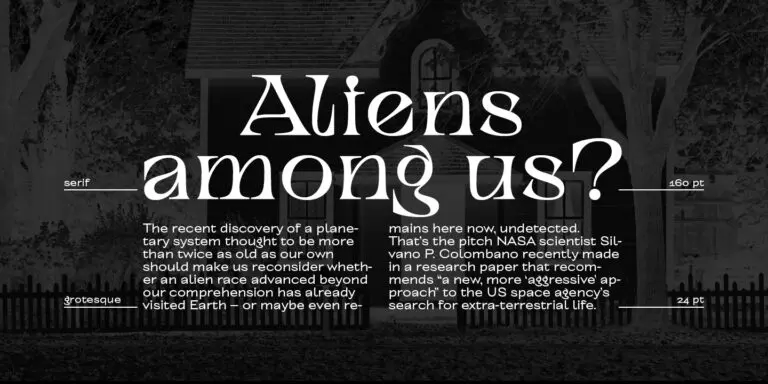
TT Alientz is a variable typeface that allows the user to make a visual journey from an extraterrestrial grotesque to a very prickly display serif.
FAQ
What are the best premium fonts alternatives for design projects?
The best premium fonts for design projects are typefaces that combine strong visual character with practical usability. For branding, they help build a recognizable tone of voice; for digital products, they support readability, hierarchy, and consistency across screens. The right alternative depends on whether you need a refined serif, a versatile sans serif, or a more expressive display family.
Can these typefaces be used in branding?
Yes, premium typefaces are often a strong choice for visual identity systems when their style matches the brand strategy. Fonts for premium brands can make logos, headlines, packaging, campaigns, and presentations feel more consistent and memorable. The key is to choose a typeface that supports the desired tone: elegant, confident, minimal, editorial, or expressive.
How do I choose the right option for my project?
Before you buy premium elegant fonts, define where and how the typeface will be used. Consider the project goal, media formats, readability in different sizes, available weights, language support, and license type. A good choice should work not only in one layout, but across the full brand system, website, app, or campaign.
Can I use these fonts in commercial projects?
Yes, but commercial use always depends on the license. Fonts premium in quality may require different licenses for desktop design, websites, apps, servers, or other formats. Before implementing a typeface, check the allowed use, number of users, traffic limits, embedding rules, and any restrictions that may affect your project.
What content should I expect on this page?
This page helps you explore and compare TypeType’s premium font options for branding, digital products, editorial layouts, and marketing materials. You can review different families, understand where they work best, and download premium fonts for testing before choosing the right license for commercial use.