What Is the Latin Writing System?
The Latin alphabet developed from writing traditions of the ancient Mediterranean and became closely associated with the Roman world. Over centuries, its letterforms changed through monumental inscriptions, handwriting, manuscript culture, printing, and eventually digital typography. Today, the script is used by a large number of languages around the world, including English, Spanish, French, German, Italian, Portuguese, and many others.
For designers, this broad linguistic reach makes it much more than a familiar set of A–Z characters. A professional latin script font may need accented letters, punctuation, currency signs, mathematical symbols, and other glyphs required by different languages and markets. The exact character set therefore matters whenever a project is intended for more than one country.
Modern type design builds on this long history while adapting letterforms to contemporary contexts, from books and packaging to interfaces and global brand systems.
Key Characteristics of Professional Typefaces
A strong typeface combines visual personality with practical performance. Clear character shapes, balanced spacing, reliable kerning, and comfortable proportions all influence how easily text can be read. The requirements become even more demanding when the same family has to work across headlines, long passages, interfaces, advertising, and multiple screen sizes.
The number of available weights and styles is also important. A larger family can create hierarchy without forcing designers to combine unrelated designs. Italics, condensed or expanded widths, and variable options can provide even greater flexibility.
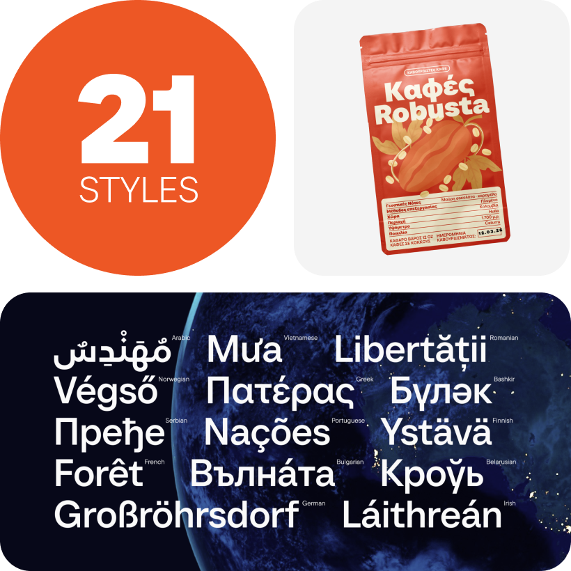
For international work, character coverage deserves particular attention. A basic latin letters font may be sufficient for English, but projects involving languages such as Polish, Czech, Romanian, Vietnamese, or Portuguese require additional diacritics and letterforms. Choosing appropriate language support from the beginning helps maintain a consistent visual identity instead of introducing substitute typefaces later.
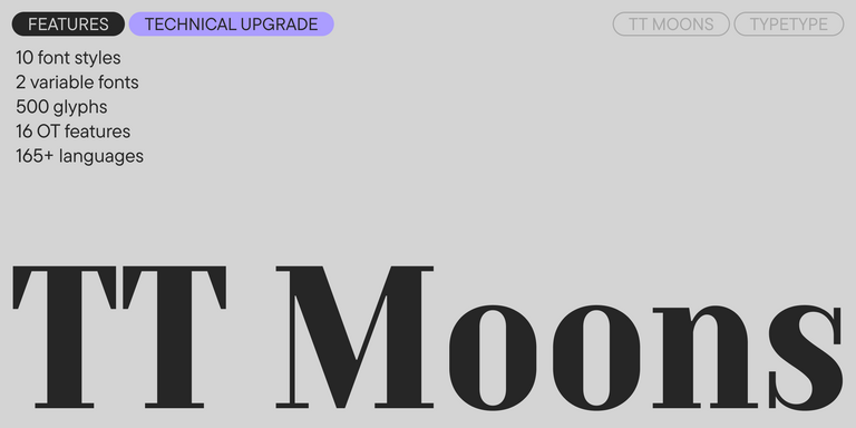
OpenType features, numerals, alternate characters, and other technical options can also become important depending on whether the project involves editorial layouts, data-heavy interfaces, branding, or specialized content.
How to Choose the Right Latin Font for Your Project
There is no universal list of the best latin fonts because the right choice depends on what the typography needs to accomplish.
For branding, begin with personality. Consider whether the design should communicate authority, friendliness, precision, heritage, innovation, or another quality central to the brand. For websites and applications, legibility at small sizes and a clear hierarchy often become more important. Editorial projects may demand comfortable reading over long passages, while advertising can give more space to expressive display styles.
Also consider how much text the project contains and where it will appear. A distinctive headline face may work beautifully in a campaign but become tiring in an interface. Conversely, a highly neutral family may be ideal for functional information but provide too little personality for a prominent identity.
Before making a final choice, check available styles, language coverage, technical features, and the licensing required for the intended media. Testing real copy in actual layouts is usually more useful than judging isolated specimen words.
Where Latin Style Fonts Are Commonly Used
Because the writing system supports so many languages and visual traditions, latin style fonts appear across nearly every area of contemporary communication.
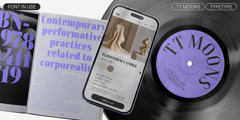
In websites and applications, typography organizes navigation, interfaces, product information, and long-form content. In branding, it helps establish a recognizable visual voice across logos, packaging, presentations, and marketing materials. Publishing places different demands on the same system, where rhythm, spacing, and prolonged readability can become central considerations.
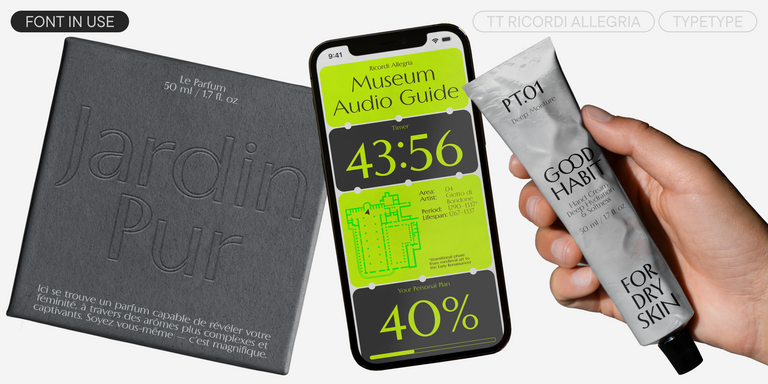
Advertising and social media often favor more distinctive forms because text needs to communicate quickly and compete for attention. Packaging combines both roles: a strong display treatment may establish personality, while ingredients, descriptions, and technical details require clarity at smaller sizes.
The typeface itself does not determine how a brand will be perceived, but its proportions, contrast, rhythm, and details contribute strongly to the overall tone. Typography that feels appropriate in context can make communication appear more coherent and intentional.
From Classical Letterforms to Modern Typography
Contemporary designers still work with ideas shaped by centuries of lettering and printing. Roman inscriptions influenced formal capital proportions, handwritten traditions contributed to the development of lowercase forms, and early printing transformed manuscript-inspired letters into reproducible typographic systems.
Later periods introduced new approaches as communication changed. Serif designs evolved for books and publishing, industrial-era display lettering became bolder and more attention-grabbing, and sans serifs gained an increasingly important role in modern visual communication.
Latin modern fonts continue this process rather than abandoning the past. Some reinterpret historical proportions directly; others reduce letterforms to geometric structures or adapt them for interfaces and variable systems. Even highly contemporary designs are part of the same ongoing evolution between writing tools, technology, aesthetic preferences, and the way people read.
Explore TypeType’s Collection
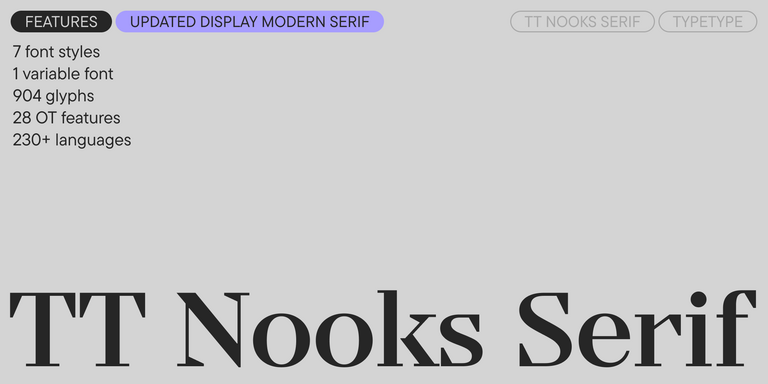
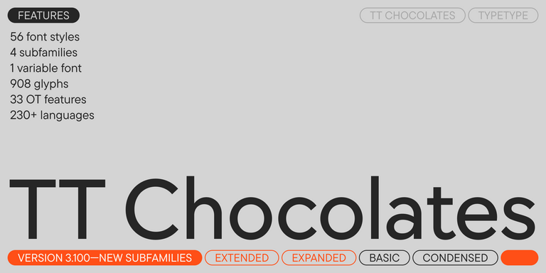
TypeType’s collection of latin fonts covers a broad range of visual directions, from versatile sans serifs and text-oriented serifs to expressive display and experimental families. The current catalog includes large systems such as TT Norms® Pro and TT Commons™ Pro alongside more distinctive designs intended for specific moods and creative tasks.
Instead of choosing by category alone, compare candidates in the context of your project. Test the actual brand name, headline, interface copy, or editorial text and look at how the available styles work together. For international projects, confirm that the required languages are supported before building a broader design system around the family.
The most useful choice is one that combines the right visual character with the practical range your project requires today and enough flexibility to remain effective as it develops.