top_banner_ttchocolates0826
Type foundryFonts & StylesApp

Best Fonts for Apps in UI and Mobile Design

Choosing the best fonts for apps means balancing readability, clarity, and personality across small screens. Typefaces shape how users perceive an interface, navigate content, and trust a product. Explore TypeType’s collection of carefully crafted typefaces built for mobile interfaces, digital products, and seamless user experiences.

Purpose: App

Why Designers Search for the Best Fonts for Apps

Typography in digital products has to work under tighter conditions than many print applications. Users read navigation labels, buttons, notifications, forms, prices, and instructions on limited screen space, often while moving quickly through an interface. A design that looks clear in a large mockup can lose legibility once it is reduced to real UI sizes.

That is why designers looking for the best font for mobile apps usually prioritize clear character shapes, reliable spacing, strong differentiation between similar glyphs, and enough weights to build hierarchy. The typeface also has to behave consistently across devices and platforms.

Visual neutrality can be useful because interface text should support interaction rather than constantly demand attention. At the same time, the chosen family should still fit the product’s personality and contribute to a coherent experience across screens.

Key Characteristics of Effective App Typography

Good interface typography makes information easy to scan without drawing attention to its own mechanics. Open shapes, sufficient counters, clear proportions, and distinguishable characters help text remain readable at compact sizes. A generous x-height can also improve the visibility of lowercase letters on screens.

Mobile app fonts usually need several weights so designers can separate headings, labels, supporting information, buttons, and body copy without relying on multiple unrelated families. Consistent numerals are particularly useful in products involving prices, statistics, finance, schedules, or dashboards.

Spacing and rhythm matter just as much as individual letterforms. UI text frequently appears in short fragments, so poorly balanced labels can become noticeable even when longer paragraphs look acceptable.

Technical quality, language coverage, and reliable rendering should therefore be considered together with visual character when building a scalable interface system.

Use Cases Across Digital Products and Interfaces

The best fonts for apps need to support far more than body copy. They may appear in onboarding screens, navigation bars, buttons, search fields, product cards, settings, notifications, dashboards, and transactional messages. Each of these elements has a different role in the hierarchy.

A functional family can also extend beyond the product itself. The same typography may appear on landing pages, help centers, promotional screens, presentations, or product marketing, helping connect the interface with the wider brand.

Different products create different requirements. A banking service may prioritize clarity for figures and compact data, while a lifestyle platform can allow more personality in headings. Content-heavy products need comfortable reading over longer passages, whereas utility interfaces may rely heavily on short labels and numeric information.

A flexible type system makes it easier to adapt these situations without losing consistency from one screen to another.

How to Choose the Right Typeface for Your Project

Start with real interface conditions rather than a specimen. Identify the smallest sizes, longest labels, densest screens, and most important hierarchy levels in the product. Then test candidate families in those situations.

Readability is essential, but it should not be considered in isolation. The design also needs to match the product’s tone, whether that is technical, friendly, premium, understated, or energetic. Check how many weights and widths are available and whether the required languages are supported.

For international products, test actual localized strings because translations can be considerably longer than their English equivalents. Also evaluate numerals and symbols if the interface contains prices, dates, statistics, or technical information.

Finally, verify licensing before implementation. Testing prototypes first helps teams judge visual fit and usability before committing to a type system that may be used throughout the product.

TypeType Collection of App Fonts

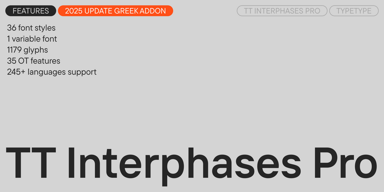
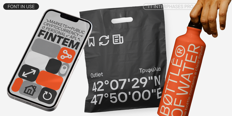
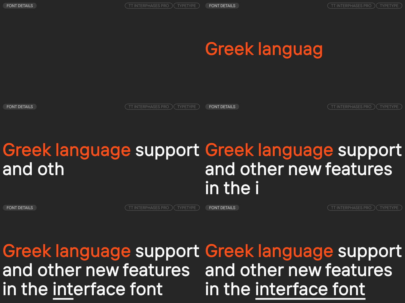
TypeType’s current collection includes both interface-focused families and versatile designs that can adapt to digital products. TT Interphases Pro is the most specialized option: TypeType designed this neo-grotesque specifically for interfaces, with a larger lowercase height, static proportions, screen legibility at small sizes, 43 styles, variable options, and support for more than 245 languages.

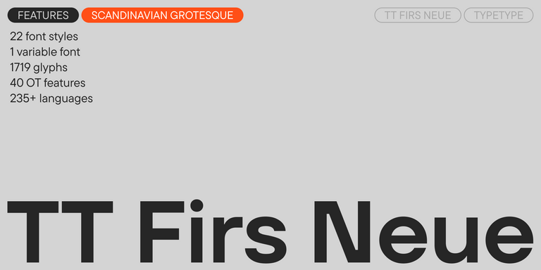
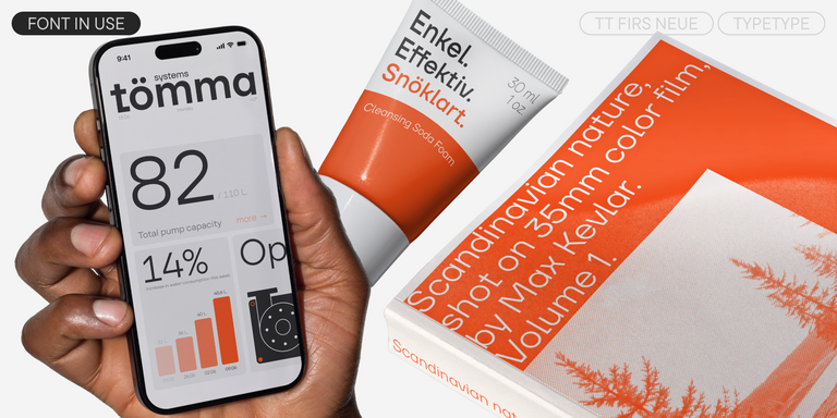
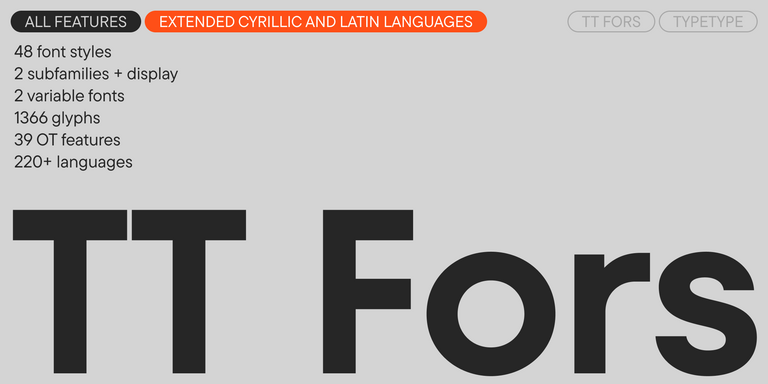
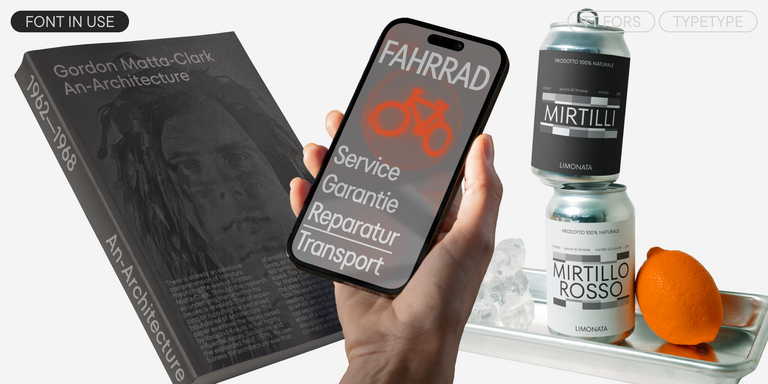
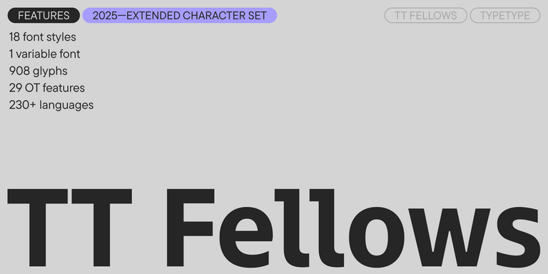
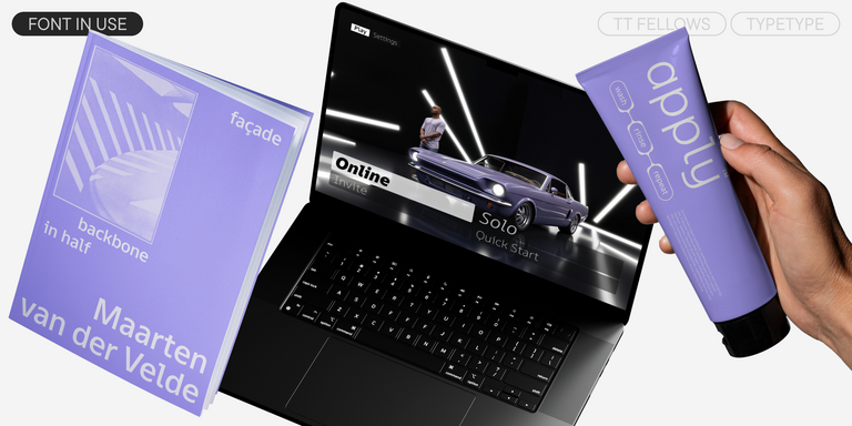
TT Hoves Pro offers a more recognizable geometric character with a large style range, while TT Fors provides a contemporary geometric direction for products that need greater personality. TT Firs Neue and TT Fellows offer additional approaches within the current category.

The best fonts for mobile app design should ultimately be compared inside actual screens. TypeType provides trial versions, allowing product teams to test typography in prototypes before selecting the appropriate commercial license.

  • The quick brown fox jumps over a lazy dog.
  • Pack my box with five dozen liquor jugs.
  • Sphinx of black quartz, judge my vow
  • 0123456789 !?.,:;—–()[]{}<> “quotes” ‘apostrophe’ @#%&*_+=/\| № $ € £ ₽ +−×÷=≠≤≥ … % © ® ™
  • Aa Bb Cc Dd Ee Ff Gg Hh Ii Jj Kk Ll Mm Nn Oo Pp Qq Rr Ss Tt Uu Vv Ww Xx Yy Zz
Leading
1.1
Tracking
0px
Bestseller
TT Norms® Pro Regular
104 font styles

The bestseller TT Norms® Pro—a geometric sans serif, trouble-free workhorse

Bestseller
104 font styles

TT Commons™ Pro is a completely redesigned version of the well-established classic font family TT Commons.

Bestseller
TT Hoves Pro Regular
96 font styles

TT Hoves Pro is a versatile sans-serif with a recognizable geometry

24 font styles

We continue to expand the line of the studio’s main bestseller TT Norms® Pro!

TT Livret Text Regular
32 font styles

TT Livret is an elegant, modern and functional serif

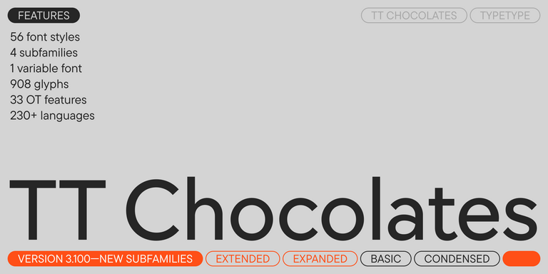
TT Chocolates Regular
57 font styles

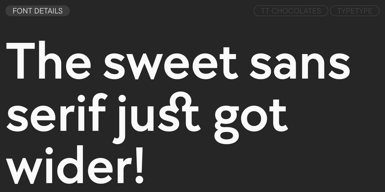
TT Chocolates typeface consists of 14 fonts: 7 weights and 7 obliques. Due to the extended language support and the introduction of useful features.

Bestseller
TT Neoris Pro Regular
21 font styles

TT Neoris is an elegant Neo-Grotesque with unlimited potential and a font that encompasses all modern requirements and user desires.

Bestseller
91 font styles

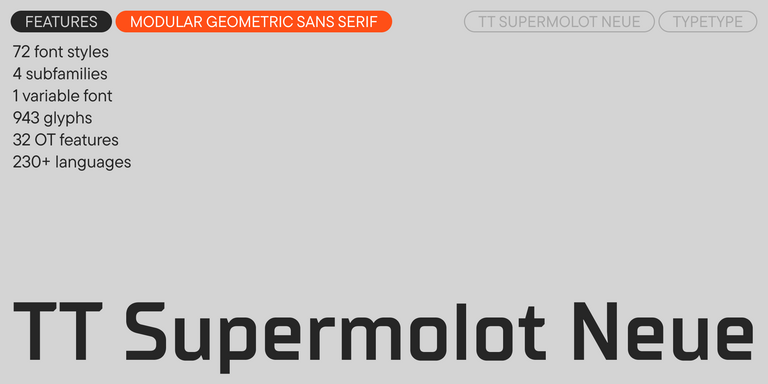
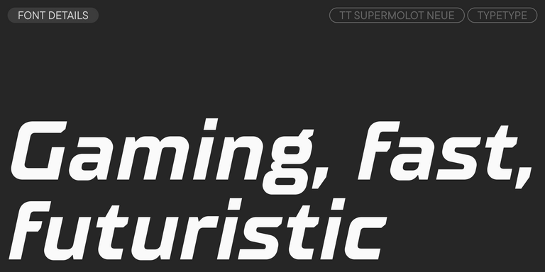
TT Supermolot Neue is a redesigned, extended, and greatly enhanced reincarnation of the popular font family

TT Rationalist Regular
22 font styles

TT Rationalist is functional and neutral slab serif typeface.

21 font styles

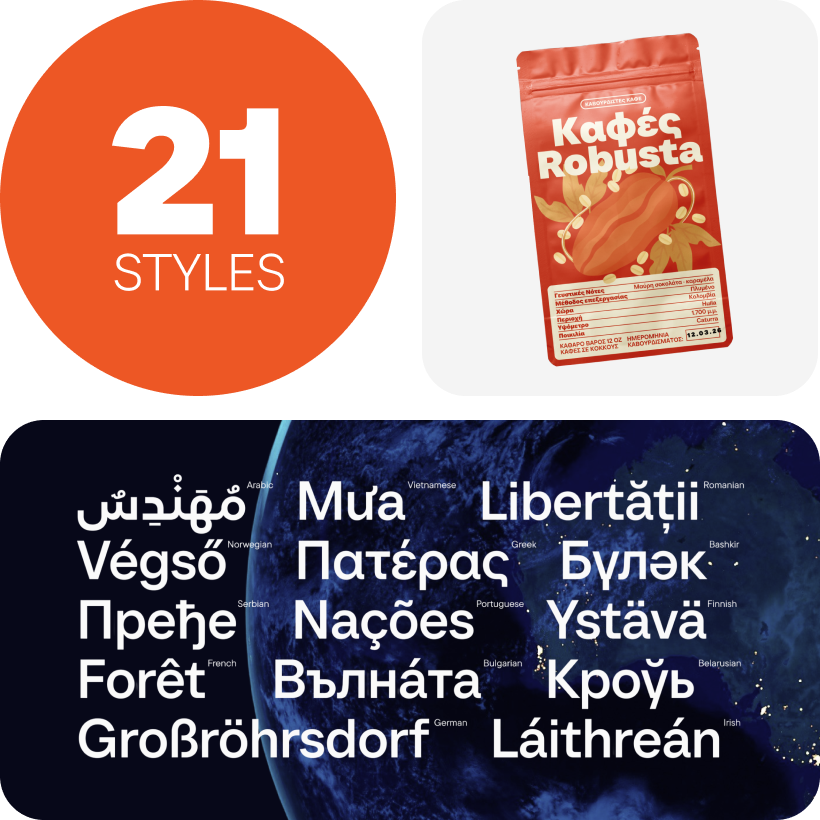
TT Commons™ Classic is a universal sans serif with a minimal contrast of strokes, a closed aperture, and geometric shapes of characters.

TT Runs Regular
19 font styles

TT Runs is a very stylish and charismatic display sans serif with irregular proportions of some characters.

91 font styles

TT Bluescreens is a upgraded geometric sans serif with narrow proportions

TT Severs Regular
19 font styles

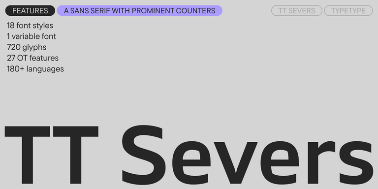
TT Severs is a geometric sans serif with emphasized elements of internal brackets. The main visual feature of TT Severs is the unusual form of internal ovals.

New
TT Turns Regular
19 font styles

TT Turns is a striking geometric sans serif with expressive elements. This versatile font works exceptionally well for running text, while at large point sizes, it takes on a distinct display character.

TT Frantz Variable
4 font styles

TT FRANTZ IS AN EXPERIMENTAL VARIABLE FONT, DISTINGUISHED BY ITS SLIMNESS AND LIGHTNESS. THE VARIATION IN THE FONT AFFECTS THE CHANGE IN THE HEIGHT OF THE MEAN LINE—BY MOVING THE AXIS ADJUSTMENT SLIDER YOU CAN EASILY RAISE OR LOWER THE MEAN LINE OF THE FONT.

New
TT Quaris Regular
14 font styles

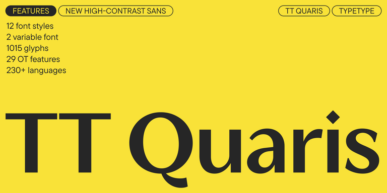
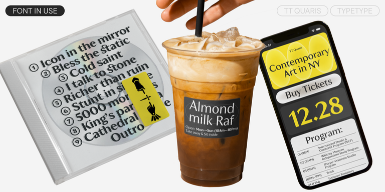
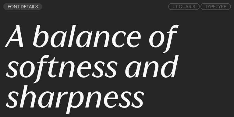
TT Quaris is an exquisite, modern high-contrast sans whose design balances between soft and sharp. The glyph shapes in the font are fluid and tend towards roundness, yet there are also sharp elements.

6 font styles

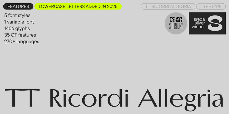
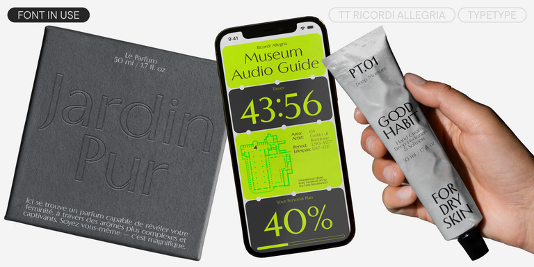
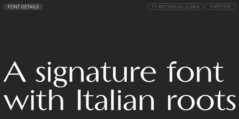
TT Ricordi Allegria is a sleek and intelligent contemporary Florentine grotesque.

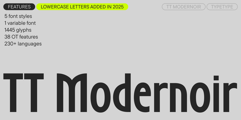
TT Modernoir Regular
6 font styles

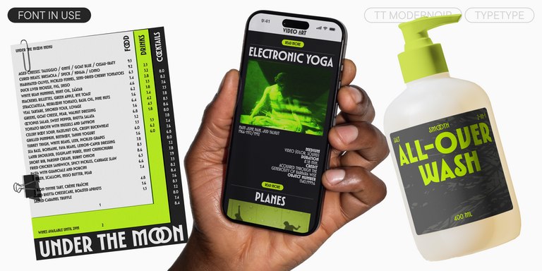
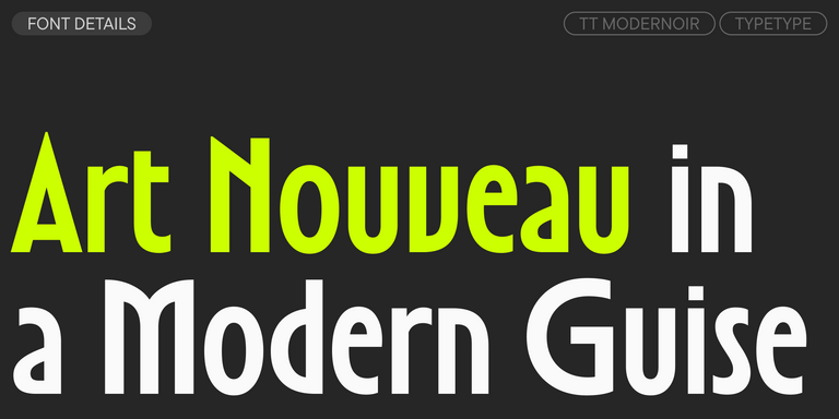
TT Modernoir is a display sans serif with dynamic proportions. Fluid lines and delicate Art Nouveau forms in this typeface blend seamlessly with the rhythmic flow and improvisational freedom of jazz.

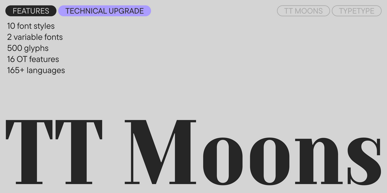
TT Moons Regular
12 font styles

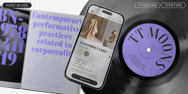
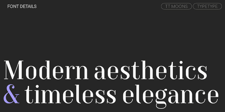
TT Moons is a slim and contrast serif. This font family works especially smart in classic design themes. TT Moons is a typeface of the glyptal modern typeface.

4 font styles

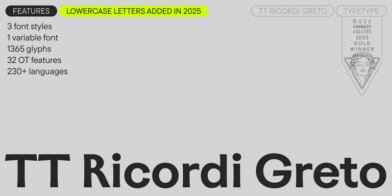
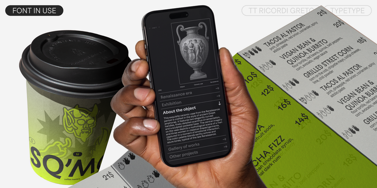
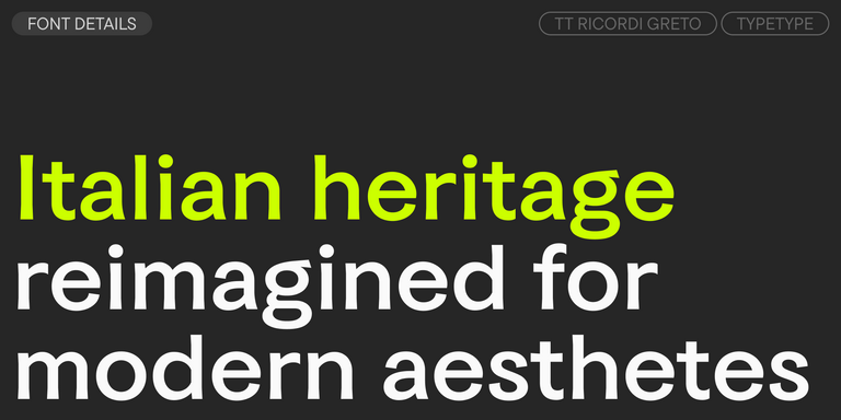
TT Ricordi Greto is an experimental project, inspired by a floor plaque dating from 1423 found in the Basilica di Santa Croce, Florence.

Bestseller
TT Firs Neue Regular
23 font styles

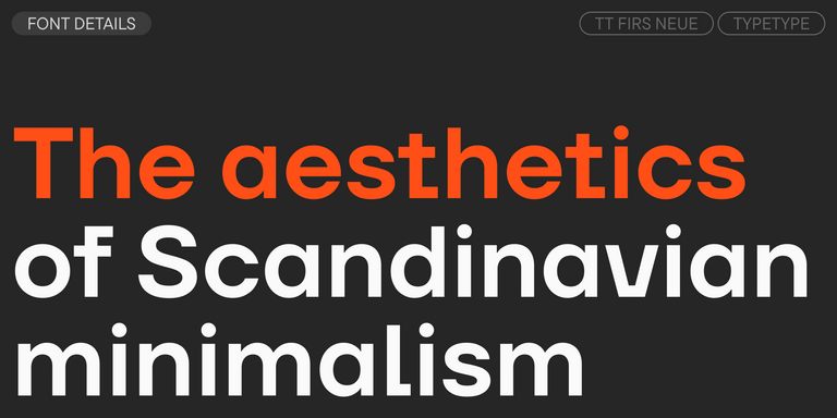
TT Firs Neue is a contemporary reincarnation of the good old TT Firs sans serif.

Bestseller
TT Fors Regular
50 font styles

TT Fors is a modern geometric sans serif with characters and shapes contrasting in width.

TT Fellows Regular
19 font styles

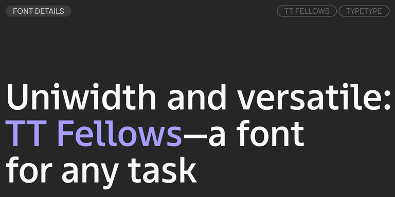
TT Fellows is a humanist sans serif with a mechanical touch.

Bestseller
43 font styles

TT Interphases Pro is a neo-grotesque sans serif with equal-width proportions

FAQ

What Are the Best Fonts for Apps?

The best fonts for apps usually have clear character shapes, good spacing, strong small-size legibility, and enough weights to create hierarchy. Neutral neo-grotesques and humanist sans serifs are common choices, but the right solution depends on the product. Test navigation, buttons, body copy, numbers, and dense screens rather than judging a family only from large samples.

Which Typeface Works Best for Small Screens?

The best font for mobile apps should preserve clear shapes when text becomes compact. Look for open counters, a practical x-height, sufficient spacing, and strong distinction between similar characters such as I, l, and 1. Test the design at the actual UI sizes and on real devices, because a typeface that performs well in a large design file may behave differently on screen.

Are These Styles Suitable for Branding?

Yes. Interface typography can become an important part of a product’s visual identity when functionality and character are balanced carefully. A relatively neutral family can create consistency throughout the experience, while distinctive details can make the product more recognizable. Check whether the same type system also works across landing pages, marketing materials, presentations, and other brand touchpoints.

Can I Use These Fonts for Commercial Projects?

Yes, TypeType families can be licensed for commercial digital products. Mobile app fonts intended to be embedded in an application require the appropriate usage rights, while websites or other materials may involve different licenses. Trial versions are available for evaluation, so teams can test the selected design in prototypes before purchasing the permissions required for release.

Contact us!