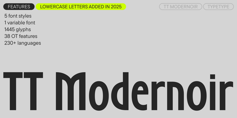
TT Qurdisma
Regular
1 font style


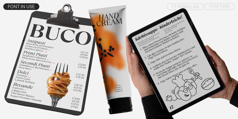
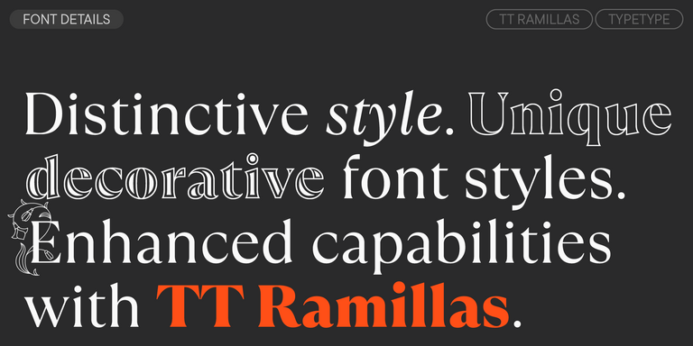
TT Qurdisma is a narrow and dense decorative font reminiscent of a whimsical plant. The winding, smooth contours give rise to a botanical ornament.