top_banner_ttnormspro0426
Type foundryFonts & StylesGeometric

Geometric Fonts

Geometric fonts are defined by clean construction, balanced proportions, and visual clarity. Built on simple shapes and precise forms, they remain a popular choice for branding, digital products, editorial layouts, and contemporary design systems. Explore TypeType’s collection and discover typefaces suitable for a wide range of professional creative projects.

Tags: Geometric

What Defines Geometric Typography?

Geometric typography is built around clearly structured forms inspired by circles, squares, straight lines, and other simple shapes. This does not mean every character follows perfect mathematical geometry. Type designers often adjust proportions, curves, and spacing to make the result feel balanced and comfortable to read.

The visual effect is usually clean, deliberate, and organized. Round letters may appear especially circular, while vertical and horizontal strokes create a strong sense of structure. These qualities can make text feel contemporary, rational, precise, or confident.

The approach remains popular because it adapts easily to modern visual systems. It can support minimalist branding, technology products, editorial layouts, or expressive display work depending on how strictly the underlying geometry is interpreted.

Key Characteristics of Geometric Typefaces

The most recognizable feature of this category is the use of simplified, clearly constructed letterforms. Circular counters, regular proportions, restrained details, and consistent stroke logic often give the design a cohesive rhythm.

However, geometric typefaces are not all neutral. Some are highly functional and understated, while others exaggerate width, curves, terminals, or proportions to create a stronger personality. This distinguishes the category from humanist sans serifs, which usually show more calligraphic influence, and neo-grotesques, which often rely on more neutral industrial forms.

Readability depends on more than visual simplicity. Character differentiation, spacing, apertures, x-height, and weight distribution all affect how the text performs in real use. A professionally designed family balances structural clarity with optical corrections that prevent the letters from feeling overly mechanical.

How to Choose the Right Typeface for Your Project

Start by defining the role typography needs to play. Branding may require distinctive forms that help create recognition, while an interface needs clarity across navigation, buttons, forms, and smaller text. Editorial projects demand comfortable reading over longer passages, and advertising can support more expressive styles.

A geometric font family with many weights or widths gives designers more control over hierarchy without introducing unrelated typefaces. Check whether the available styles cover everything from headlines to supporting copy.

Language coverage is equally important for international projects. Review the actual character set rather than assuming that every family supports the same languages.

For digital use, test readability at realistic screen sizes and consider how the design behaves across responsive layouts. The strongest choice balances visual personality with the functional demands of the project rather than relying on category alone.

Why Designers Choose Modern Geometric Styles

Modern geometric typefaces fit naturally into contemporary design systems because their structured forms create visual consistency. Clear proportions and restrained details can work well alongside grids, icons, interface components, photography, and other modular elements.

Their versatility is another advantage. A relatively neutral family can support a complete brand system, while more distinctive versions can give headlines or campaign materials stronger personality. This makes the category useful for companies that want a contemporary appearance without committing to an overly decorative visual language.

These designs are also easy to combine with other typographic styles. A clean sans serif can serve as a functional base while a serif or display face adds contrast elsewhere in the system.

The result is not automatically «modern» simply because the construction is geometric. What matters is how proportions, spacing, and details are interpreted within the broader visual identity.

Applications Across Branding, Web and Editorial Design

Geometric sans serif fonts are frequently used where designers need clarity and a strong visual structure. In branding, they can support logos, packaging, corporate communications, and identity systems. In websites and applications, their regular rhythm can work well for navigation, interface labels, product information, and headlines.

Presentations and advertising often benefit from their clean shapes because typography can remain visually strong without competing with imagery. Editorial projects may use more restrained families for body text or more expressive variants for titles and section openings.

The category is particularly effective in technology, architecture, fashion, culture, sports, and consumer branding, but industry alone should not determine the choice. The right design depends on the tone a project needs to communicate and how much text it has to handle.

Explore TypeType’s Collection

TypeType’s catalog includes a broad selection for projects ranging from complex identity systems to expressive display work. Among the best geometric fonts for versatile branding are TT Norms® Pro, TT Commons™ Pro, and TT Hoves Pro, all of which provide extensive style ranges.

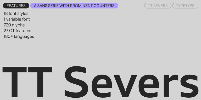
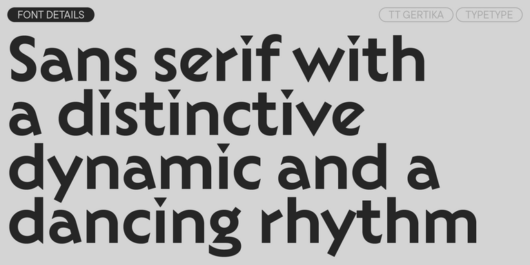
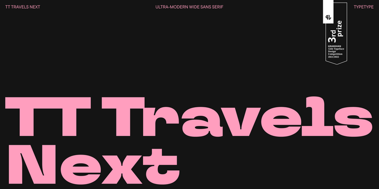
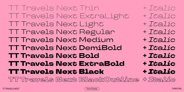
TT Fors offers a more recognizable contemporary character, while TT Severs introduces unusual internal forms. TT Travels Next is designed for more expressive display applications, and TT Gertika uses a livelier rhythm inspired by historical lettering.

When comparing options, test them with the actual content of your project. Look at headlines, paragraphs, interface elements, brand names, and multiple languages where relevant. TypeType also provides trial versions, making it possible to evaluate a family in real layouts before choosing the appropriate commercial license.

  • The quick brown fox jumps over a lazy dog.
  • Pack my box with five dozen liquor jugs.
  • Sphinx of black quartz, judge my vow
  • 0123456789 !?.,:;—–()[]{}<> “quotes” ‘apostrophe’ @#%&*_+=/\| № $ € £ ₽ +−×÷=≠≤≥ … % © ® ™
  • Aa Bb Cc Dd Ee Ff Gg Hh Ii Jj Kk Ll Mm Nn Oo Pp Qq Rr Ss Tt Uu Vv Ww Xx Yy Zz
Leading
1.1
Tracking
0px
Bestseller
TT Norms® Pro Regular
104 font styles

The bestseller TT Norms® Pro—a geometric sans serif, trouble-free workhorse

Bestseller
104 font styles

TT Commons™ Pro is a completely redesigned version of the well-established classic font family TT Commons.

Bestseller
TT Hoves Pro Regular
96 font styles

TT Hoves Pro is a versatile sans-serif with a recognizable geometry

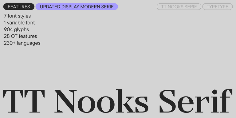
TT Nooks Serif Regular
8 font styles

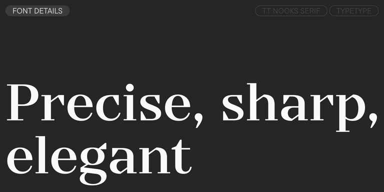
TT Nooks Serif is a display modern serif with a slight touch of egocentricity. It has a sharp and firm, yet elegant and stately character. High contrast and a slight squarishness of the characters give it strictness and angularity, while wide proportions make this font stand out among other contemporary serifs.

Bestseller
TT Neoris Pro Regular
21 font styles

TT Neoris is an elegant Neo-Grotesque with unlimited potential and a font that encompasses all modern requirements and user desires.

Bestseller
91 font styles

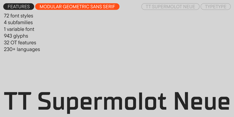
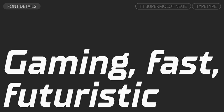
TT Supermolot Neue is a redesigned, extended, and greatly enhanced reincarnation of the popular font family

TT Rationalist Regular
22 font styles

TT Rationalist is functional and neutral slab serif typeface.

21 font styles

TT Commons™ Classic is a universal sans serif with a minimal contrast of strokes, a closed aperture, and geometric shapes of characters.

91 font styles

TT Bluescreens is a upgraded geometric sans serif with narrow proportions

TT Bells Regular
14 font styles

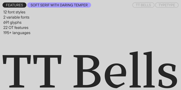
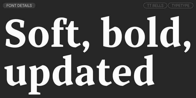
TT Bells combines the elegant softness of Antiqua with a complex and daring temper reflected in straight stroke terminals and arrowheaded serifs. The typeface is based on the broad nib, which creates these hallmark terminals and serifs.

TT Severs Regular
19 font styles

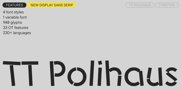
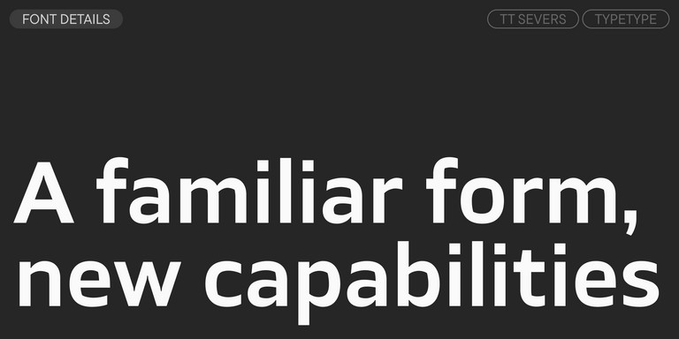
TT Severs is a geometric sans serif with emphasized elements of internal brackets. The main visual feature of TT Severs is the unusual form of internal ovals.

New
TT Turns Regular
19 font styles

TT Turns is a striking geometric sans serif with expressive elements. This versatile font works exceptionally well for running text, while at large point sizes, it takes on a distinct display character.

Bestseller
TT Firs Neue Regular
23 font styles

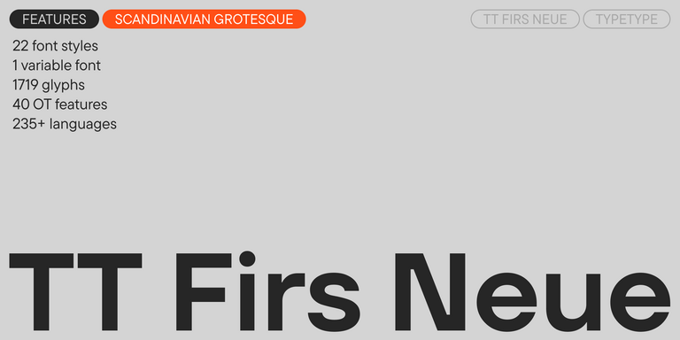
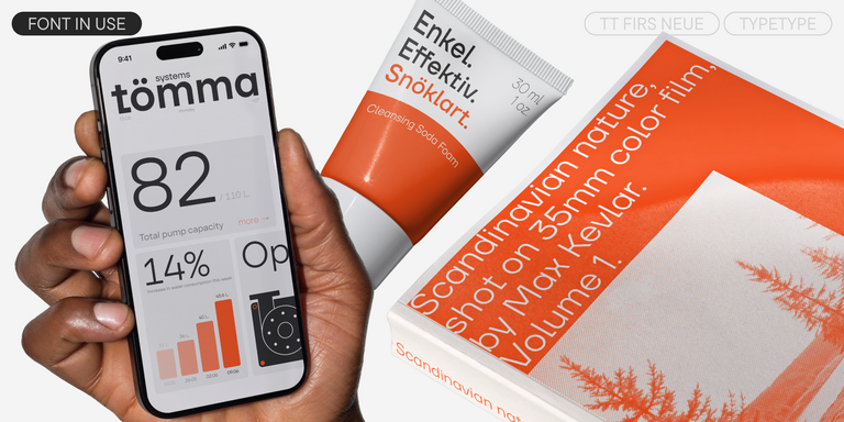
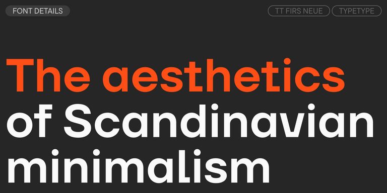
TT Firs Neue is a contemporary reincarnation of the good old TT Firs sans serif.

Bestseller
TT Fors Regular
50 font styles

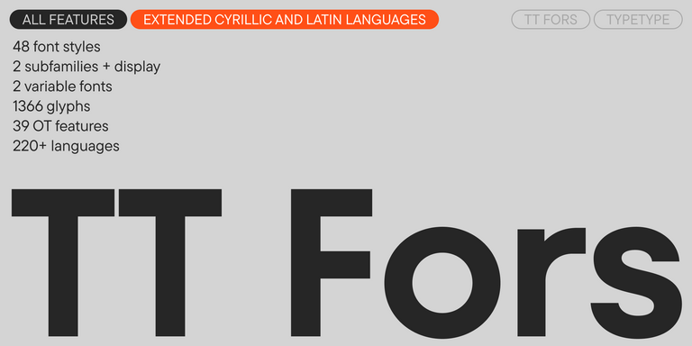
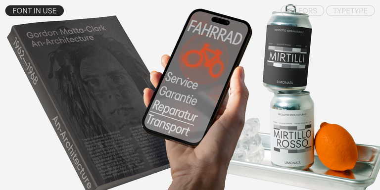
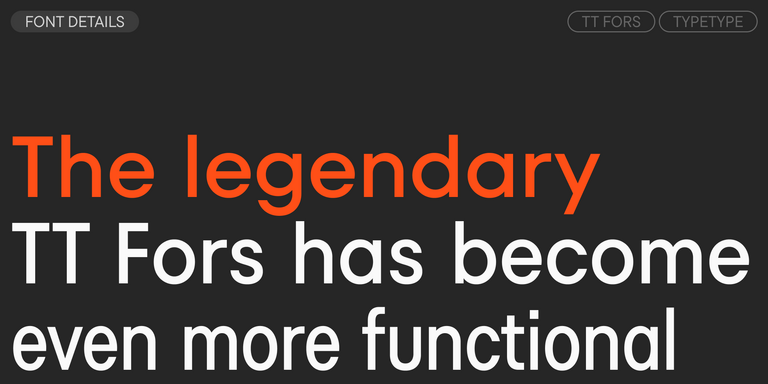
TT Fors is a modern geometric sans serif with characters and shapes contrasting in width.

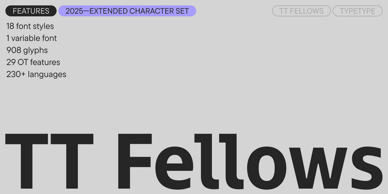
TT Fellows Regular
19 font styles

TT Fellows is a humanist sans serif with a mechanical touch.

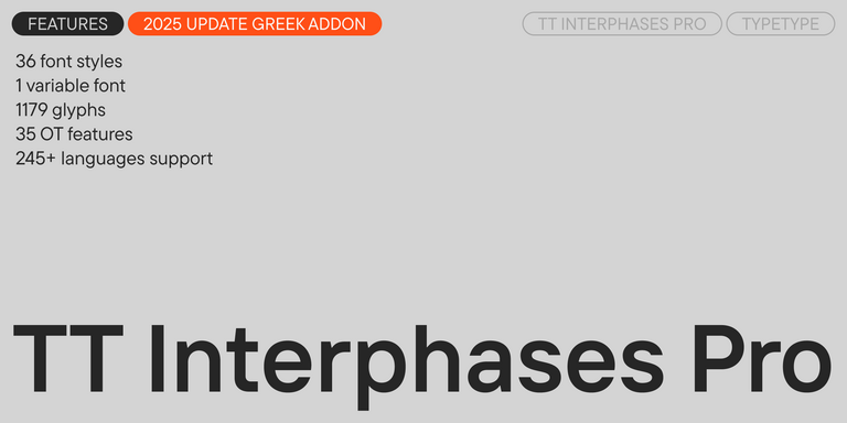
Bestseller
43 font styles

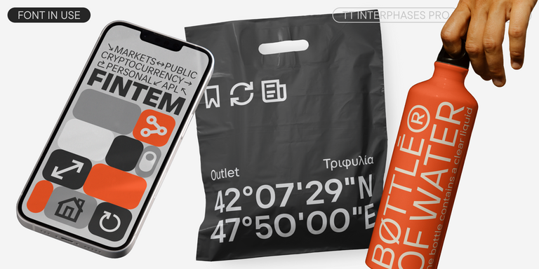
TT Interphases Pro is a neo-grotesque sans serif with equal-width proportions

New
TT Gertika Regular
4 font styles

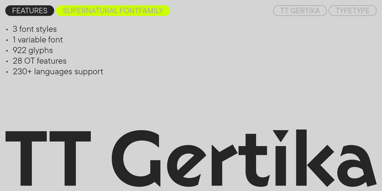
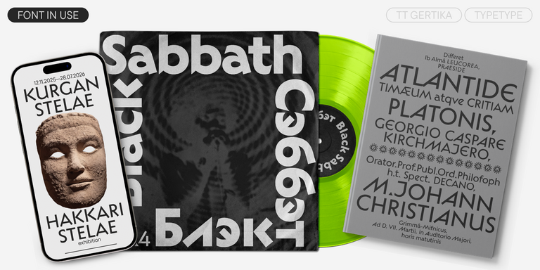
TT Gertika is a geometric sans serif with a dynamic character and a dancing rhythm. This font`s idea originates from the lettering featured on an American poster from the late 1930s.

New
TT Biersal Upright
6 font styles

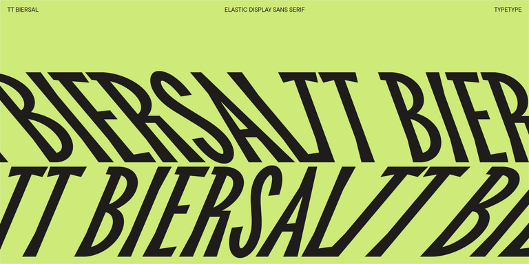
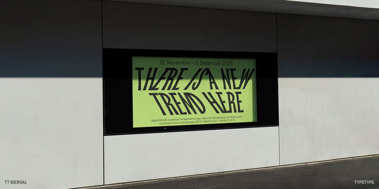
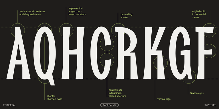
TT Biersal is a display sans serif with a free-spirited, playful, and adventurous nature. The concept of this font was sparked by a German poster from the early 1930s.

New
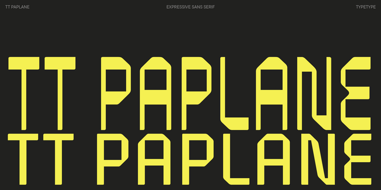
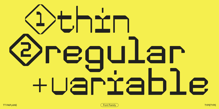
TT Paplane Regular
3 font styles

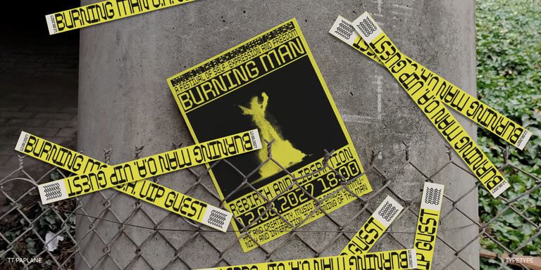
TT Paplane is a squared-looking display sans serif.

TT Travels Next Regular
21 font styles

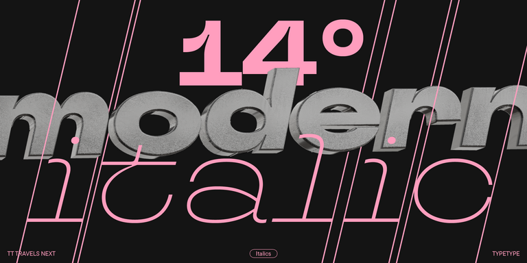
TT Travels Next is a very trendy and modern wide display sans serif for use in different sets, be they print or web.

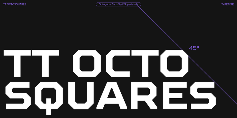
TT Octosquares Regular
73 font styles

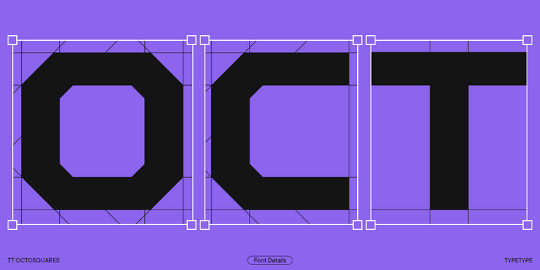
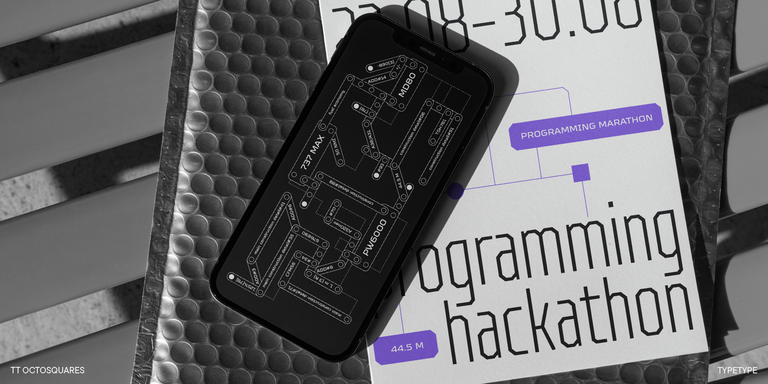
TT Octosquares is a fresh, revised, expanded, and significantly improved version of our first commercial font TT Squares & its narrow version.

New
TT Travels Text Regular
21 font styles

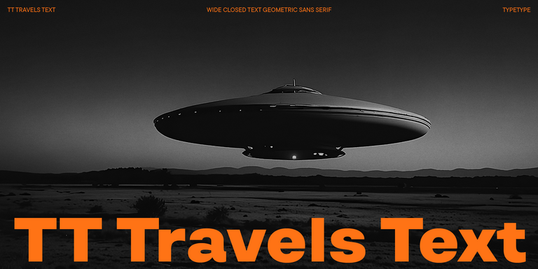
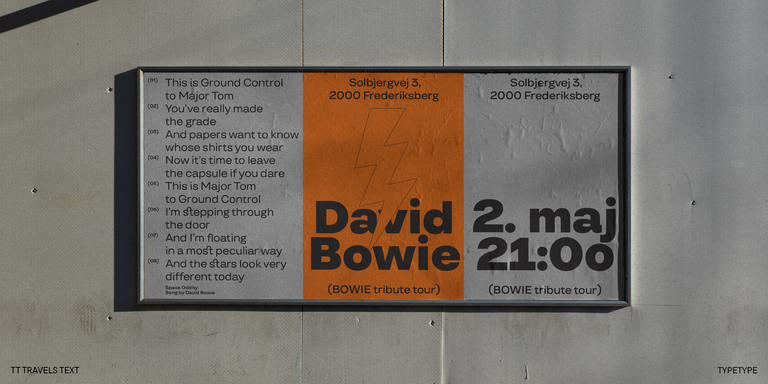
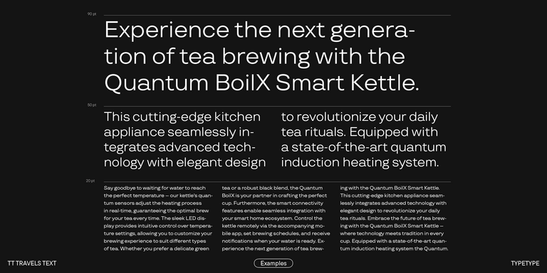
TT Travels Text is a geometric grotesque with wide proportions and specific shapes of circles and fillets, which includes two stylistic sets with completely different natures.

New
TT Carvist Regular
6 font styles

TT Carvist—peculiar, playful, and courageous—this font does an excellent job of grabbing attention!

TT Chocolates Regular
29 font styles

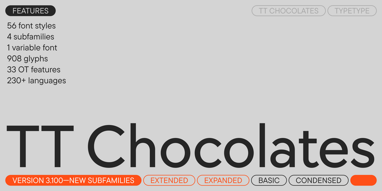
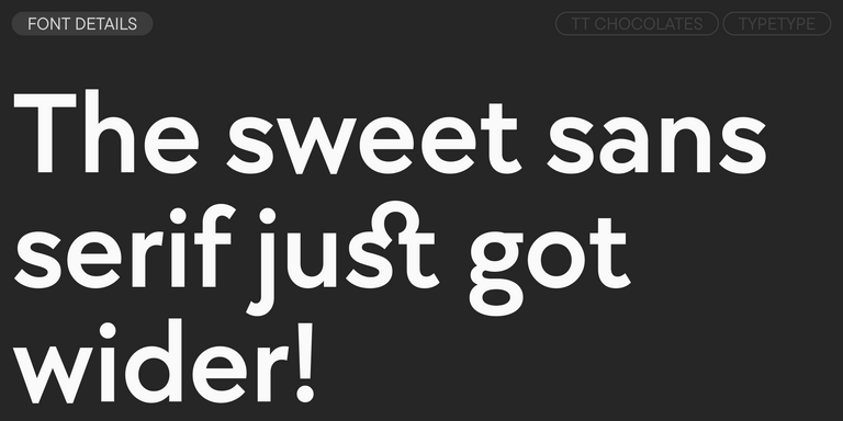
TT Chocolates typeface consists of 14 fonts: 7 weights and 7 obliques. Due to the extended language support and the introduction of useful features.

FAQ

What Are the Best Alternatives for Contemporary Geometric Design?

The best alternative depends on the tone you want to create. Humanist sans serifs introduce more calligraphic movement and often feel warmer, while neo-grotesques tend to look more neutral and utilitarian. Designs based on simple shapes usually feel more structured and deliberate. Comparing these categories in actual layouts is more useful than choosing by classification alone.

What Makes This Style Different From Other Sans Serif Categories?

Sans serif geometric fonts rely more strongly on circles, straight lines, and simplified proportions. Humanist designs often show traces of handwriting or calligraphy, while neo-grotesques typically emphasize neutrality and functional consistency. Geometric styles can feel cleaner and more constructed, although professional designs use optical adjustments to keep the letters balanced and readable rather than mathematically rigid.

Are These Typefaces Suitable for Branding Projects?

Yes. Their clear structure can create a consistent visual language across logos, packaging, websites, presentations, and advertising. More neutral families work well as flexible identity systems, while distinctive proportions or details can add recognition. For branding, it is important to evaluate not only appearance but also available styles, language coverage, scalability, and performance across different media.

Can They Be Used in Commercial Projects?

Geometric fonts can be used commercially when the selected license covers the intended application. Different permissions may be required for desktop work, websites, applications, logos, video, or other formats. Because licensing terms vary by family and usage, check the relevant conditions before publishing or distributing a project rather than assuming one license applies everywhere.

How Do I Choose a Typeface for Digital Products?

Modern geometric sans serif fonts for interfaces should remain clear at small sizes and work consistently across screens and responsive layouts. Check character differentiation, spacing, x-height, weight range, language support, and available technical formats. The design should also fit the broader design system, including icons, grids, controls, and hierarchy, without sacrificing usability for visual character.