


TT Rationalist
Regular
22 font styles


TT Rationalist is functional and neutral slab serif typeface.

A slab serif font combines sturdy serifs with a clear, structured rhythm, making it suitable for branding, editorial layouts, and digital interfaces. TypeType’s collection offers options for projects that need a confident visual voice, balanced readability, and flexible use across print and web.
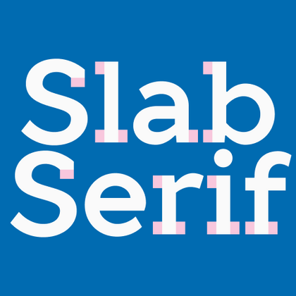
One of the main features of slab serif typefaces is the size and mass of their serifs. These forms can be rectangular, trapezoidal, or rounded, but unlike lighter serif designs, they stand out through a stronger visual presence. That makes the style useful when a project needs clarity, structure, and a more confident tone.
At present, you can find different slab serif fonts in the TypeType collection. Each one has its own character and is created for a specific niche and task. In addition, a new neutral family is planned to cover the text-family niche and expand the collection’s functional range.
TypeType’s first slab serif font was TT Slabs, released in 2014. It has a geometric character and well-defined serif shapes, which make it suitable for headings, subheadings, and logos. In 2015, the condensed version appeared as TT Slabs Condensed, designed to work as a companion family for text blocks and to save space in layouts.
The next addition to the library was TT Polls, part of a larger family that combines a script and a slab-serif style. Its visual direction was influenced by American sports culture and graphics, which is reflected in its modular, narrow, and square oval shapes. TT Globs is a more expressive display option for posters, announcements, branding, and web use, while TT Geekette brings an experimental character with variability and support for coding and programming.
Each slab serif typeface in the TypeType library is built for a specific purpose rather than for general use only. Some families work best in large sizes and visual headlines, while others are better suited for text blocks, branding systems, or special editorial tasks. This makes the collection flexible for designers who need both personality and practical functionality.
The planned release of a new serif slab font will add a more neutral option to the collection. It is intended to become a text pair for bestseller sans serifs such as TT Norms Pro, TT Commons Pro, and TT Hoves Pro. This direction shows how the library is expanding beyond expressive display use toward more universal typography needs.
TT Rationalist is functional and neutral slab serif typeface.
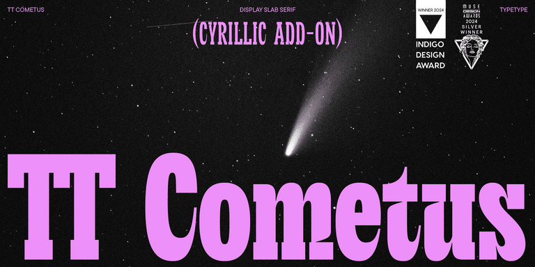
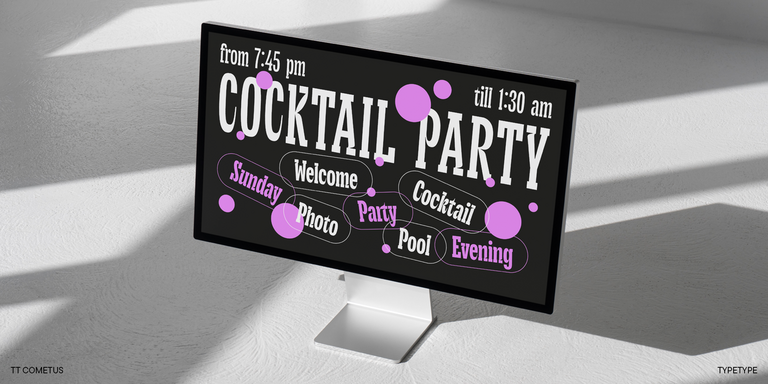
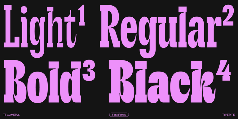
TT Cometus is an expressive typeface that captivates from the first time.
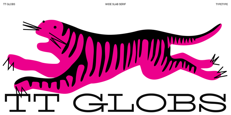
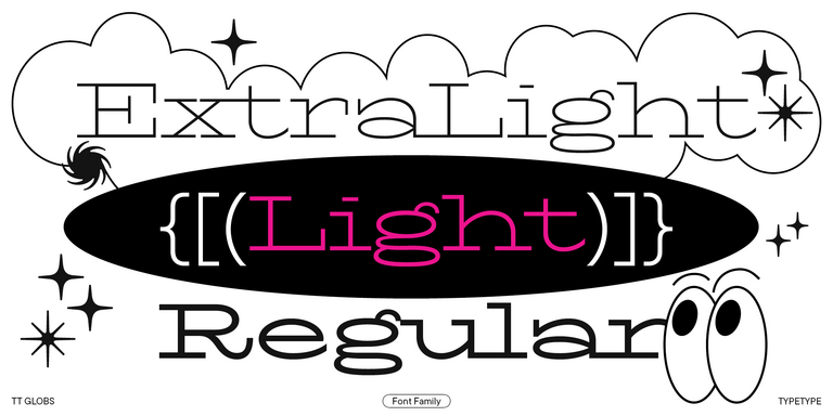
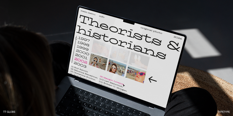
TT Globs is the first font from the TypeType Starter Kit line.
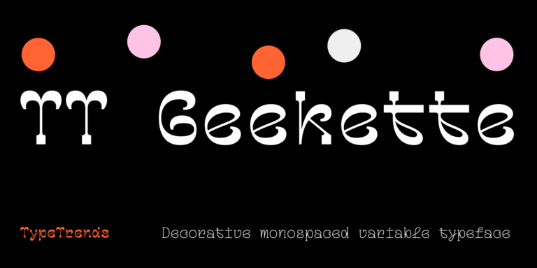
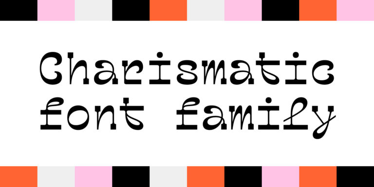
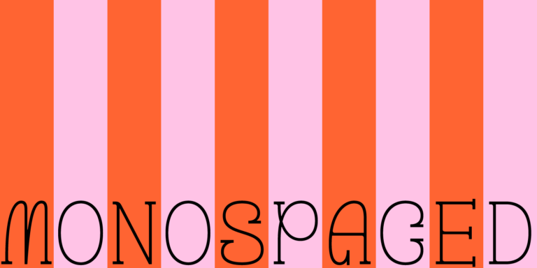
TT Geekette is an experimental variable serif with friendly and flexible character of shapes.
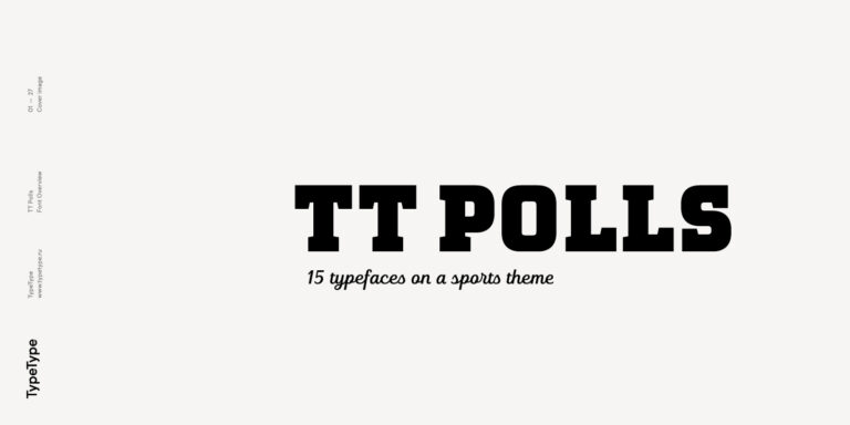
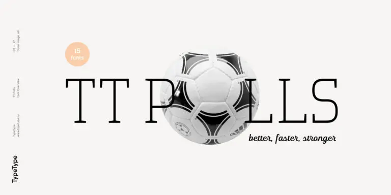
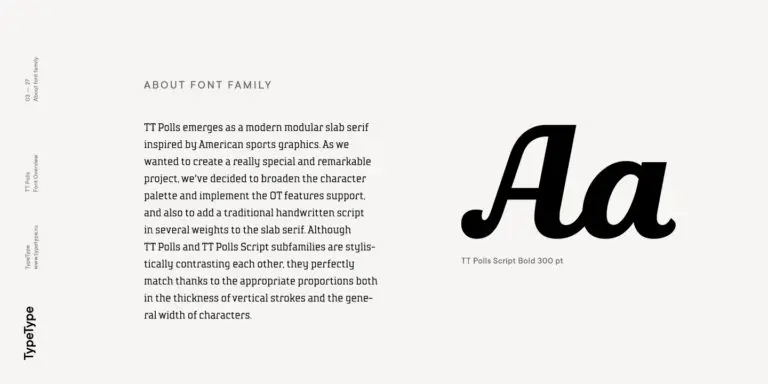
TT Polls is the modern modular slab serif family for using in sports-related design.
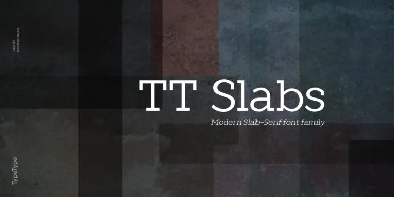
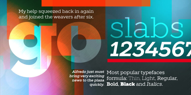
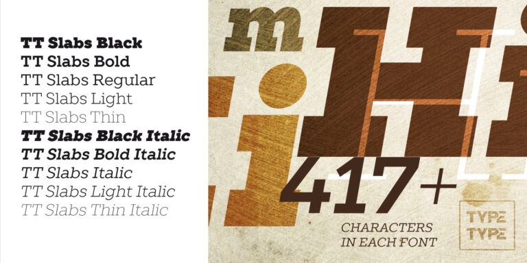
TT Slabs. Slab serif, also called «square serif». They originate shortly after the Industrial Revolution (1850), when the advertising industry began to grow.
The best alternatives to slab serif fonts depend on the tone and function of your project. For a softer brand voice, consider humanist serifs; for a cleaner digital look, geometric sans serifs may work better. If you need strong headlines, editorial impact, or a confident identity system, compare options by readability, weight range, and visual hierarchy.
The closest match is usually a slab serif typeface with similar contrast, proportions, and serif construction. Low-contrast slabs can feel sturdy and modern, while more refined versions may work closer to editorial serifs. Two fonts are interchangeable only when their rhythm, spacing, and serif shapes support the same tone and use case.
Yes, slab serif typography can work very well for branding, especially when a company needs a bold, reliable, or distinctive voice. It is often used in logos, headlines, packaging, and campaign systems. The key is matching the font’s character to the brand: some slabs feel industrial and strong, while others look friendly or editorial.
Yes, a slab serif font can be used in commercial projects if the proper license covers the intended use. Before publishing or embedding the font, check whether you need a desktop, web, app, or other license. Pay attention to limits such as users, pageviews, installations, products, and redistribution rules.
To choose among the best slab serif fonts, start with readability, brand fit, language support, and available formats. Test how the typeface performs in real layouts: logos, headlines, body text, UI elements, or campaign materials. A good choice should support your visual hierarchy, technical workflow, and long-term brand communication.