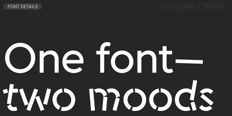
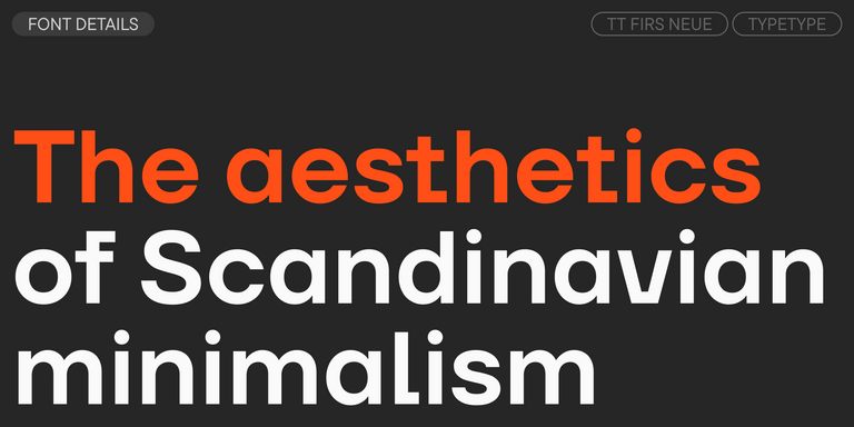
Variable fonts are a flexible typographic solution for web, branding, and digital products. They let designers adapt weight, width, and other style axes within a single family, which makes them useful for responsive systems and more efficient implementation.
Variable fonts are an important step forward in digital typography. Instead of using many separate files for different weights, widths, or slants, one file can contain a full design space that changes in real time. Designers and developers can adjust parameters through variation settings and create precise styles for a specific layout, interface, or brand system. Variability can be applied to traditional axes such as weight, width, and slant, but it can also affect more expressive aspects of the design. For web typography, this technology is especially useful because one compact file can replace a large static family, improving flexibility and helping teams build more adaptive visual systems.
Compatibility Considerations
Although variable technology opens up many possibilities, it is important to check compatibility before implementation. Not every operating system, browser, design tool, or production environment supports OpenType variable fonts in the same way. Some software may display variable axes correctly, while other tools can limit editing, exporting, or rendering options. For digital products, teams should test the typeface in real layouts, across browsers and devices, before launch. This helps avoid unexpected visual differences and technical issues. If a project has strict production requirements, it is better to confirm support in advance and contact the TypeType team for additional guidance.
Variable Fonts by TypeType Foundry
The TypeType library includes 17 type families with variable format support, created for different design tasks and visual styles. They can be divided into several groups: flexible workhorses with three axes, families with two axes, simpler systems with one axis, and experimental designs where variability directly changes the visual character. This structure helps designers choose the right level of control for their project. Some families are made for complex brand systems, interfaces, and responsive typography. Others are better suited for expressive headlines, editorial layouts, or campaigns where dynamic visual transformation becomes part of the concept.
Group One: Three Variability Axes
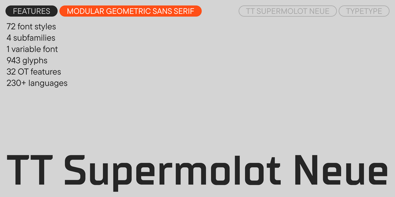
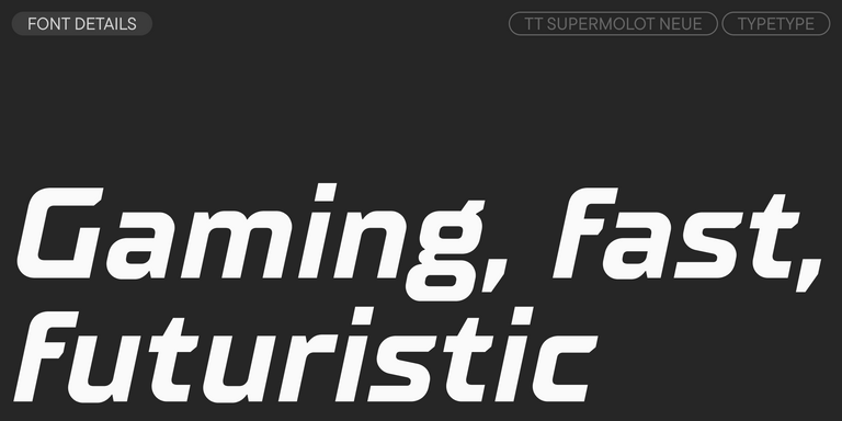
The first group includes TT Commons™ Pro, TT Lakes Neue, TT Octosquares, and TT Supermolot Neue. These families support three variability axes: weight, width, and slant. This gives designers a wide range of options within one system and makes it possible to fine-tune typography for different formats. A narrow style can work well in compact UI areas, a wider style can support headlines, and slanted forms can add emphasis without introducing another unrelated family. These solutions are especially useful for large design systems, brand identities, websites, and product interfaces that require flexibility and consistency at the same time.
Group Two: Two Variability Axes
The second group includes TT Hoves Pro, TT Fors, and TT Autonomous. These families do not include the width axis, but they give users freedom to adjust weight, slant, or both within the available range. This makes them practical for projects that need typographic flexibility without a complex multidimensional system. Designers can create subtle differences between interface states, headlines, captions, and emphasis styles while keeping the overall rhythm stable. These typefaces are useful for branding, editorial layouts, websites, and digital products where the main priority is a balance between clarity, personality, and controlled variation.
Group Three: One Variability Axis
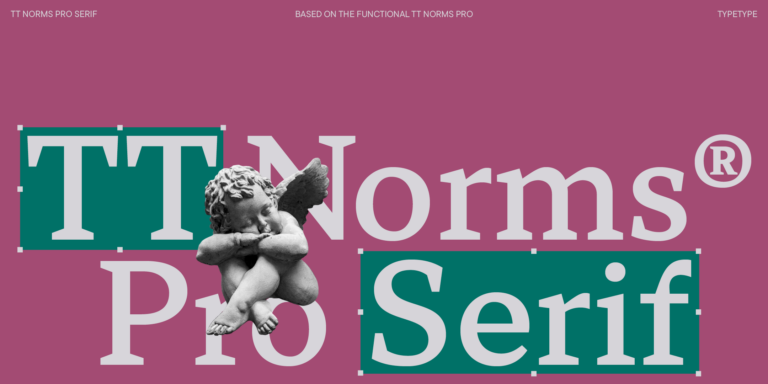
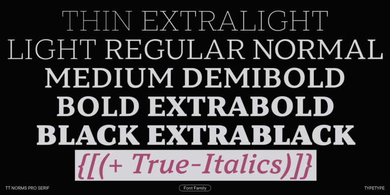
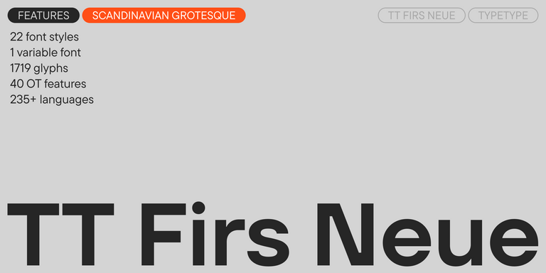
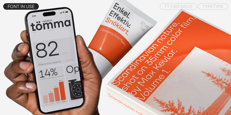
The third group includes TT Globs, TT Autonomous Mono, TT Ramillas, TT Runs, TT Interphases Pro, TT Interphases Mono, TT Trailers, TT Norms® Pro, and TT Firs Neue. These families include one variable axis, while other parameters are available through separate files. This format works well when a project needs control over one key feature, such as weight or width, without requiring a more complex setup. It allows designers to adjust typography to specific tasks while keeping the system easy to manage. These families can support interfaces, editorial projects, branding, presentations, and marketing layouts where adaptability matters, but simplicity is still important.
Group Four: Variability Affecting Design Itself
The fourth group includes TT Alientz, TT Frantz, and TT Geekette. These typefaces use variability not only as a technical tool, but also as a way to transform the visual style itself. In TT Frantz, the mean line can shift from a tall art nouveau-inspired look to a shorter, more avant-garde form. TT Alientz can move from a bright display sans serif to a sharper, more energetic serif-like design. TT Geekette transforms from a monospace slab into a flexible slab with reverse contrast. This group is especially useful for expressive branding, experimental layouts, campaigns, and projects where motion, transformation, and visual character are part of the idea.
Why Designers Search for Variable Font Alternatives
Designers search for a variable font when they need a type system that can adapt to many contexts without losing consistency. This is common in web projects, UI systems, branding, editorial platforms, and interfaces with a large amount of content. Static styles can be enough for simple projects, but variable technology gives teams more control over hierarchy, spacing, emphasis, and responsive behavior. It can also reduce the number of files used in a digital product and make long-term design maintenance easier. For brands that work across many channels, this flexibility helps keep typography precise, efficient, and visually unified.
Variable Fonts in Real Projects
A variable width font can be especially useful in projects where typography must respond to different spaces, screen sizes, and communication needs. In identity systems, it helps create flexible rules for logos, headlines, and supporting text. On websites, it can improve adaptation between desktop and mobile layouts. In product interfaces, it allows teams to fine-tune labels, menus, buttons, and dense information blocks. Variable type also works well in packaging, presentations, corporate communication, and campaign design, where consistency must be combined with visual variety. The main advantage is control: designers can build a scalable typographic system that feels coherent across every touchpoint.
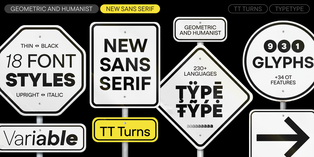
TT Turns is a striking geometric sans serif with expressive elements. This versatile font works exceptionally well for running text, while at large point sizes, it takes on a distinct display character.
TT Regins is a Scottish modern serif. Striking contrast and sharp triangular serifs give this font a stern and commanding character, while refined forms, enlarged lowercase letters, and slightly condensed, static proportions add grace to its design.
TT FRANTZ IS AN EXPERIMENTAL VARIABLE FONT, DISTINGUISHED BY ITS SLIMNESS AND LIGHTNESS. THE VARIATION IN THE FONT AFFECTS THE CHANGE IN THE HEIGHT OF THE MEAN LINE—BY MOVING THE AXIS ADJUSTMENT SLIDER YOU CAN EASILY RAISE OR LOWER THE MEAN LINE OF THE FONT.
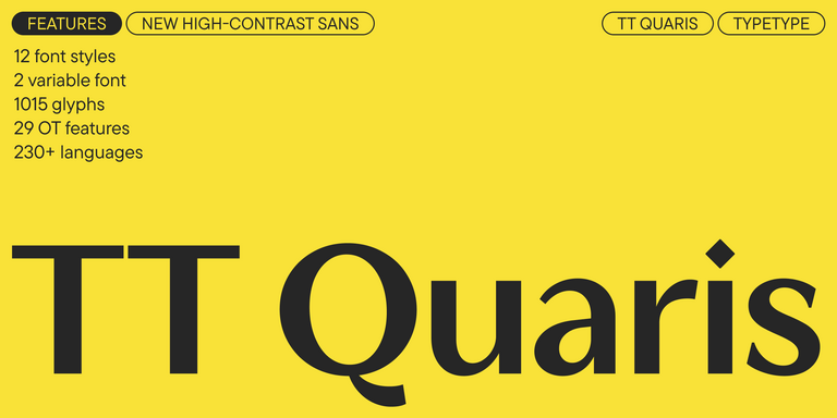
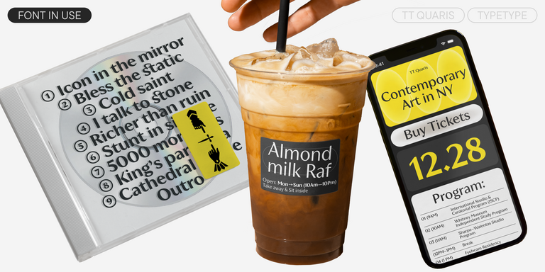
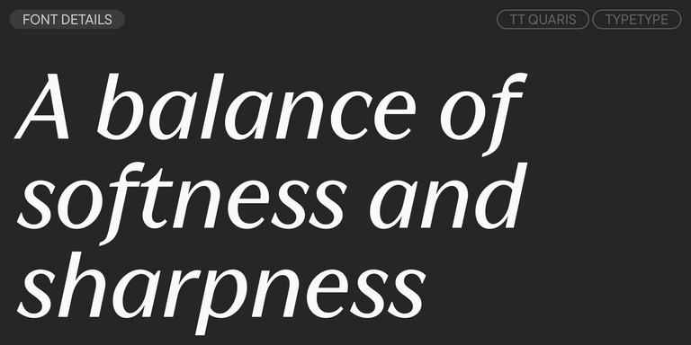
TT Quaris is an exquisite, modern high-contrast sans whose design balances between soft and sharp. The glyph shapes in the font are fluid and tend towards roundness, yet there are also sharp elements.
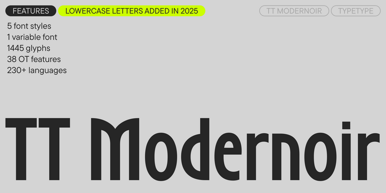
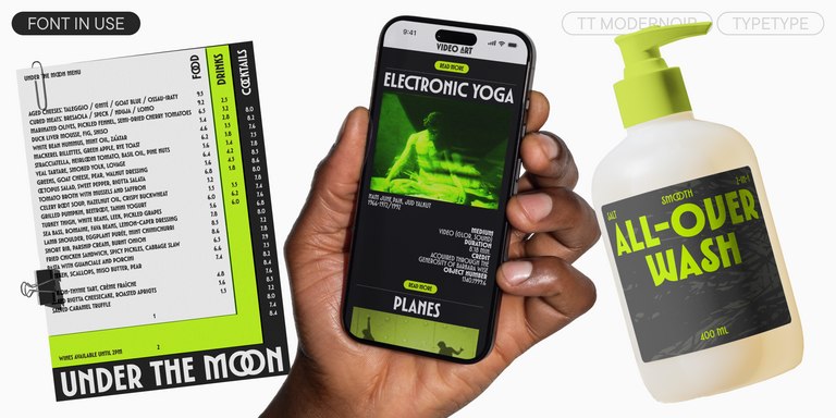
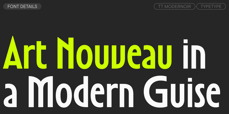
TT Modernoir is a display sans serif with dynamic proportions. Fluid lines and delicate Art Nouveau forms in this typeface blend seamlessly with the rhythmic flow and improvisational freedom of jazz.
The best variable font alternatives depend on the project’s needs. Some families offer multiple axes for weight, width, or slant, while others focus on one flexible parameter. When comparing options, look at readability, design range, file setup, language support, and licensing. A good choice should fit both the visual system and the technical workflow.
What is closest to a variable typeface?
The closest options are usually other variable typefaces or technically flexible families with similar axes and proportions. Similarity depends not only on available settings, but also on spacing, rhythm, contrast, and overall tone. For example, two designs may share weight variation but feel very different in branding, UI, or editorial layouts.
Are variable fonts good for branding?
Yes, variable fonts can be especially useful for branding because they adapt across many channels while keeping one coherent visual system. They help teams control hierarchy, emphasis, and expression in logos, websites, interfaces, campaigns, and presentations. This makes them valuable for brands that need flexible but consistent typography.
Can I use variable fonts in commercial projects?
Yes, a variable font can be used commercially if the selected license covers your use case. Before implementation, check the terms for desktop work, websites, apps, product embedding, and other environments. Licensing should be reviewed before launch to ensure the typeface can be used safely across all planned touchpoints.
Enter your email address and spin the sun to win up to 100% off or TypeType services
Giveaway rules:
Each user can only play once;
Each promo code is unique and can only be used once;
The promo code discount applies only to purchases up to $5,000 in the online store;
Please note that the "Font Renaming," "Your Logo in a Font," and "Basic Customization" services do not apply to previously purchased fonts and are only available for new orders;
If you win a service, our manager will contact you within three business days with the details.