How Broader Letterforms Influence Visual Communication
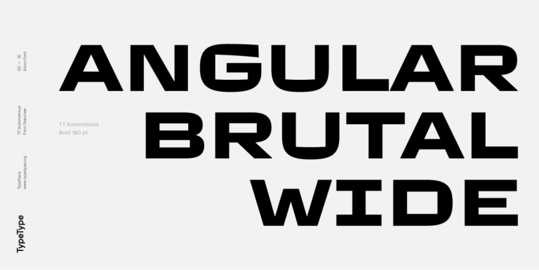
Letter width changes more than the amount of space a word occupies. Broader proportions give characters a stronger horizontal presence, which can make typography feel stable, confident, open, and visually substantial. In a composition, this extra space inside and between letterforms can also create a sense of scale and give short phrases a distinctive silhouette.
That is why wide typefaces often work particularly well where typography has to become an active part of the visual identity rather than simply deliver information. Their proportions can reinforce hierarchy, make headlines easier to recognize at a glance, and influence the rhythm of an entire layout. Depending on the design, the result can feel futuristic and energetic, spacious and refined, or bold and unconventional.
Wide typography works best when these proportions are part of the original design concept. Simply stretching a regular typeface changes stroke widths, curves, spacing, and other relationships between characters, often making the result look distorted. A properly designed expanded style preserves the intended balance of the letterforms.
When to Choose Wide Fonts
Broader proportions are especially effective when text needs to command attention. They can turn a short headline, logo, campaign message, or product name into a strong visual anchor and make good use of horizontal formats such as banners, website hero sections, packaging panels, posters, and video titles.
Wide letters can also help establish a particular brand personality. Clean geometric forms may create a contemporary or technology-driven impression, while more unusual shapes can add an experimental, fashion-oriented, or expressive tone. In identities with plenty of negative space, expanded proportions can make typography feel deliberately spacious rather than visually isolated.
The available area still matters. An extended headline that looks powerful across a desktop screen may become difficult to fit into a mobile layout or a narrow package label. For flexible design systems, it is useful to consider families with several widths or variable options, allowing the composition to adapt without losing its typographic character.
TypeType’s Top Picks for Your Project
The TypeType collection includes wide fonts for both expressive display work and larger visual systems.
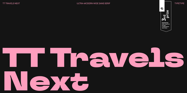
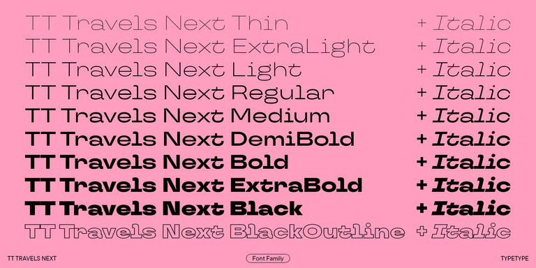
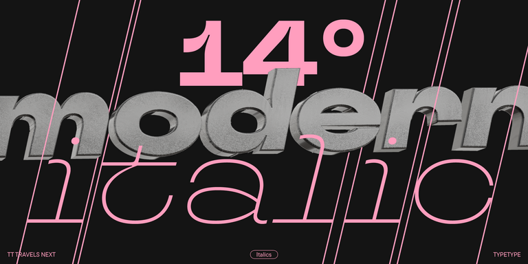
TT Travels Next is one of the most direct choices for projects where expanded proportions should take center stage. Its distinctive display character works well for branding, fashion-oriented graphics, posters, packaging, web headers, and other applications where typography needs to attract attention.
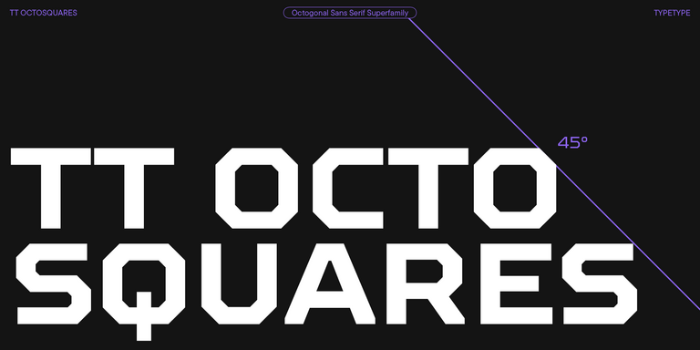
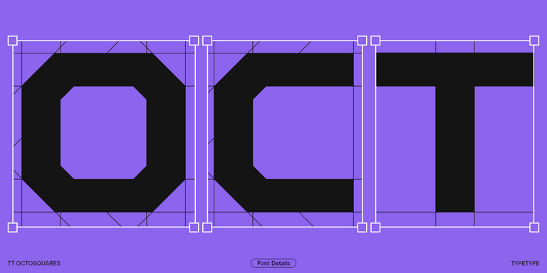
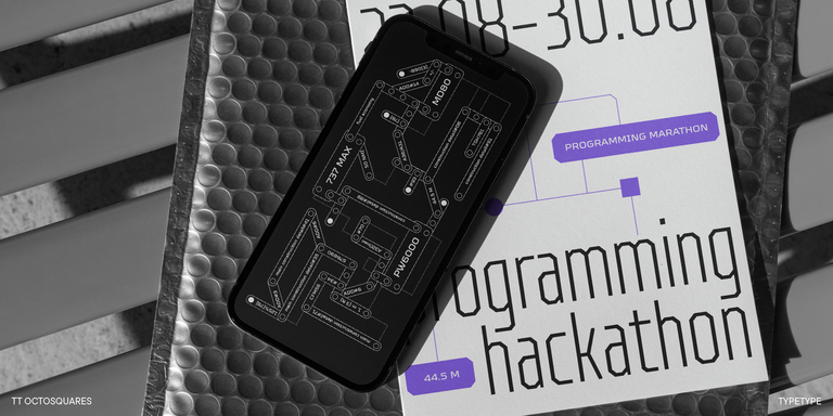
TT Octosquares offers a different direction. Its structured forms and extensive family make it a strong option for technology, sports, gaming, motion graphics, and identities that call for a more engineered visual language.
For projects that need greater versatility, TT Norms® Pro and TT Commons™ Pro offer large systems with multiple widths and numerous styles. Their broader variants can create more visual presence in headlines while remaining connected to narrower or standard proportions used elsewhere in the same identity. This makes them useful when a brand needs both expressive hierarchy and consistency across many formats.
The right choice ultimately depends on the space available, the amount of text, and the role typography plays in the composition. Testing real headlines, interface elements, packaging copy, or brand names is the most reliable way to see whether expanded proportions strengthen the design rather than simply make it larger.