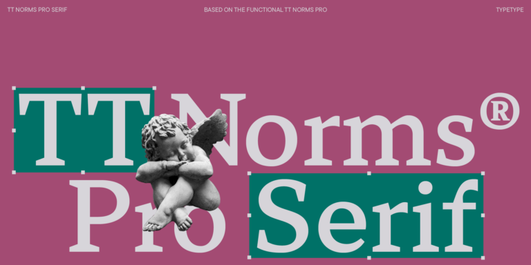
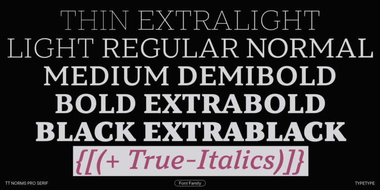
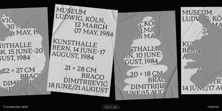
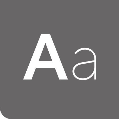
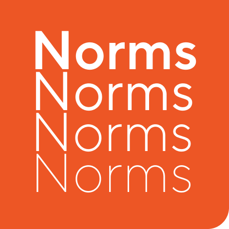
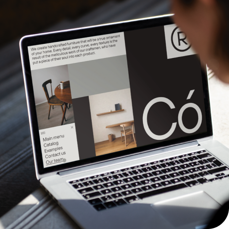
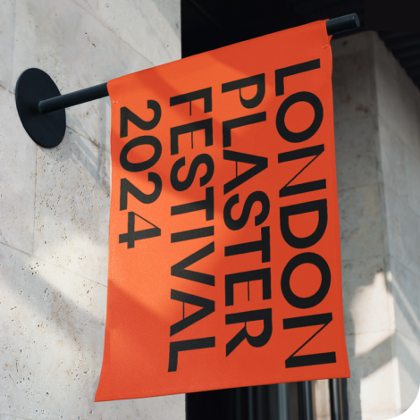
The bestseller TT Norms® Pro—a geometric sans serif, trouble-free workhorse
Supports English Fonts
English fonts are designed to display the language accurately and consistently across different applications and devices. These typefaces work well in brand identities, websites, publications, and digital products, offering engaging visual experiences while maintaining excellent readability. Discover the TypeType collection of professionally crafted typefaces with English language support.
- All fonts 76
- Sans Serif 49
- Serif 27
- Slab Serif 6
- Display 42
- Script 9
- Variable 47
- Font sale 15
Why Language Support Matters in Typography
Language support is one of the foundations of professional typography. A typeface should include not only basic letters, but also punctuation, numerals, currency signs, diacritics, special symbols, and typographic features that allow text to appear correctly in different contexts. When a project uses english fonts with incomplete character sets, the result can look inconsistent: missing symbols, fallback styles, broken spacing, or unexpected rendering in layouts and interfaces. This affects readability, user experience, and the way people perceive a brand. For websites, apps, packaging, presentations, and editorial materials, reliable language coverage helps teams keep communication clear and visually consistent. It also reduces production risks, especially when content appears across multiple platforms, markets, and design tools.
Where Typefaces with English Support Are Used
Typefaces with English support are used far beyond English-speaking countries. They are essential for international brands, SaaS products, corporate websites, mobile apps, marketing campaigns, presentations, packaging, and editorial projects where English is the main language of communication. Fonts in english are also important for global design systems, because they help teams keep typography consistent across regions, departments, and digital products. A well-prepared family can support headlines, body text, navigation, captions, forms, and brand materials within one coherent visual system.
Choosing the Right Style for Your Project
The right style depends on the role typography plays in your project. Minimalist sans serifs often work well for interfaces, technology companies, dashboards, and corporate communication because they feel clean, functional, and easy to read. Serif styles can be a stronger choice for publishing, cultural institutions, premium brands, and long-form content. When choosing an english language font, look at readability, available weights, spacing, OpenType features, and how well the design matches the brand’s tone. A good typeface should be flexible enough for real layouts, not only for a single headline.
Discover TypeType’s Collection of English Fonts
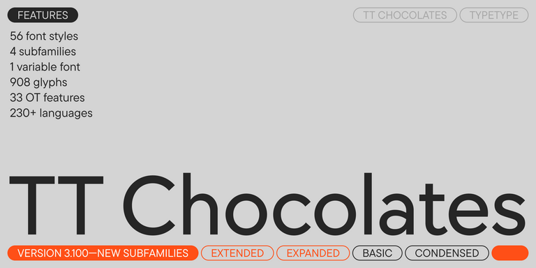
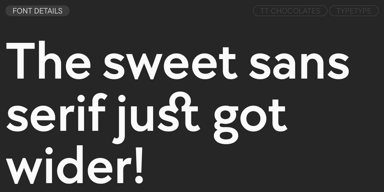
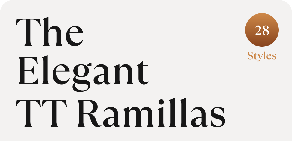
TypeType’s collection includes a wide range of typefaces with carefully developed English-language support for commercial and creative projects. The library covers versatile sans serifs, expressive display families, refined serifs, geometric grotesques, and functional solutions for interfaces and brand systems. Popular families such as TT Norms® Pro, TT Commons™ Pro, TT Hoves Pro, TT Neoris Pro, TT Interphases Pro, and TT Ramillas offer multiple weights, polished spacing, OpenType features, and broad language coverage. This makes the collection useful for designers, art directors, product teams, marketers, and studios that need reliable typography for websites, apps, identities, editorial layouts, and campaigns. Users can explore styles, test trial versions in real mockups, and choose the right license for professional use.
- The quick brown fox jumps over a lazy dog.
- Pack my box with five dozen liquor jugs.
- Sphinx of black quartz, judge my vow
- 0123456789 !?.,:;—–()[]{}<> “quotes” ‘apostrophe’ @#%&*_+=/\| № $ € £ ₽ +−×÷=≠≤≥ … % © ® ™
- Aa Bb Cc Dd Ee Ff Gg Hh Ii Jj Kk Ll Mm Nn Oo Pp Qq Rr Ss Tt Uu Vv Ww Xx Yy Zz
TT Commons™ Pro is a completely redesigned version of the well-established classic font family TT Commons.
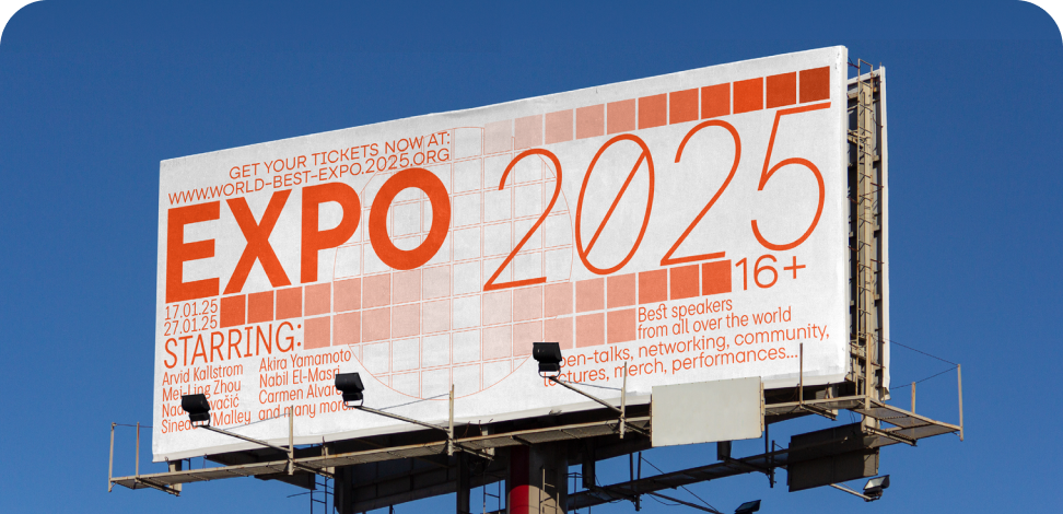
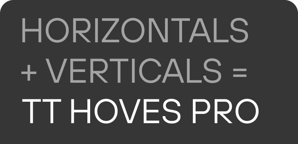
TT Hoves Pro is a versatile sans-serif with a recognizable geometry
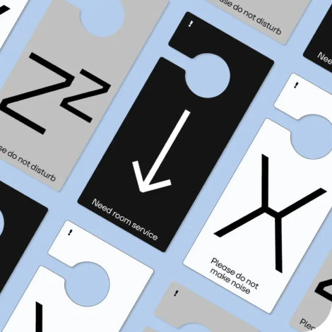
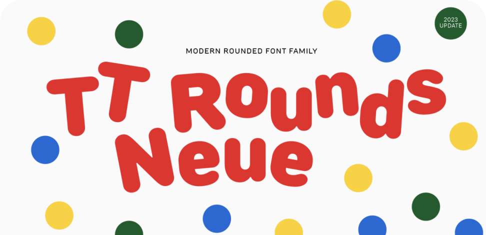
We continue to expand the line of the studio's main bestseller TT Norms® Pro!
TT Livret is an elegant, modern and functional serif
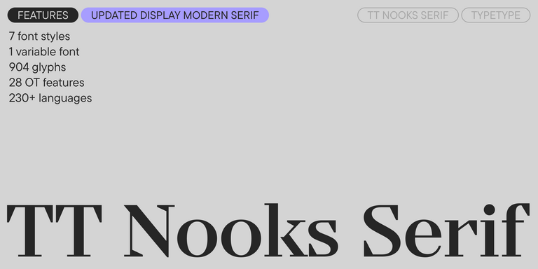
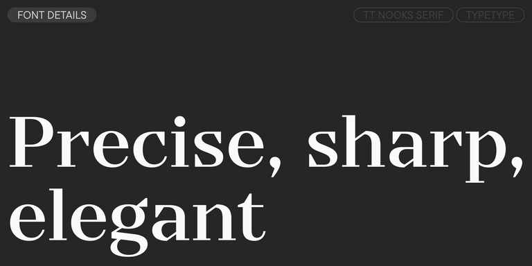
TT Nooks Serif is a display modern serif with a slight touch of egocentricity. It has a sharp and firm, yet elegant and stately character. High contrast and a slight squarishness of the characters give it strictness and angularity, while wide proportions make this font stand out among other contemporary serifs.
TT Neoris is an elegant Neo-Grotesque with unlimited potential and a font that encompasses all modern requirements and user desires.
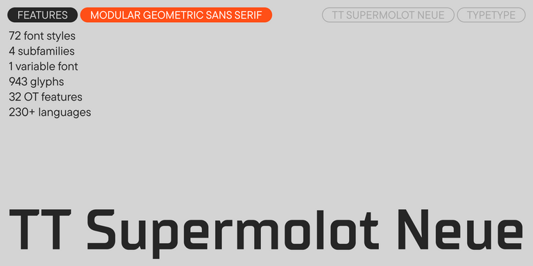
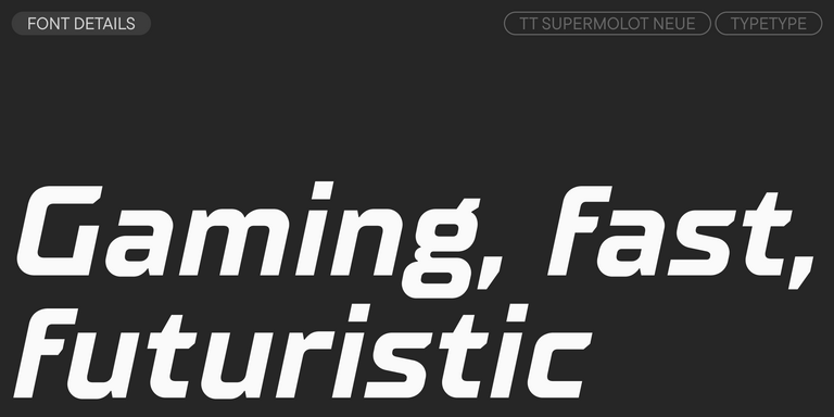
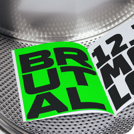
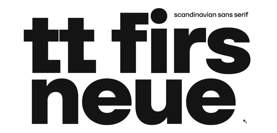
TT Supermolot Neue is a redesigned, extended, and greatly enhanced reincarnation of the popular font family
TT Rationalist is functional and neutral slab serif typeface.
TT Commons™ Classic is a universal sans serif with a minimal contrast of strokes, a closed aperture, and geometric shapes of characters.
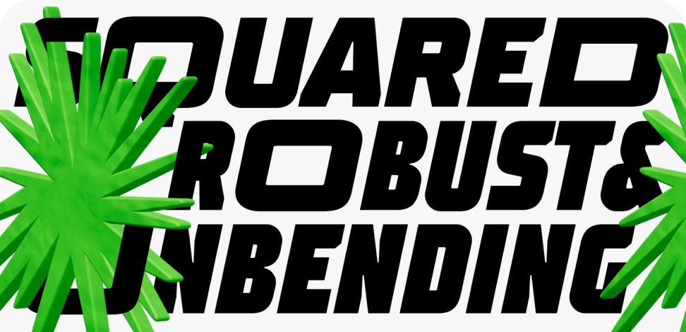
TT Runs is a very stylish and charismatic display sans serif with irregular proportions of some characters.
TT Bluescreens is a upgraded geometric sans serif with narrow proportions
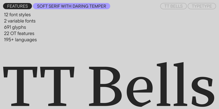
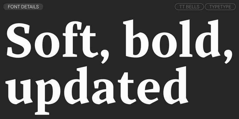
TT Bells combines the elegant softness of Antiqua with a complex and daring temper reflected in straight stroke terminals and arrowheaded serifs. The typeface is based on the broad nib, which creates these hallmark terminals and serifs.
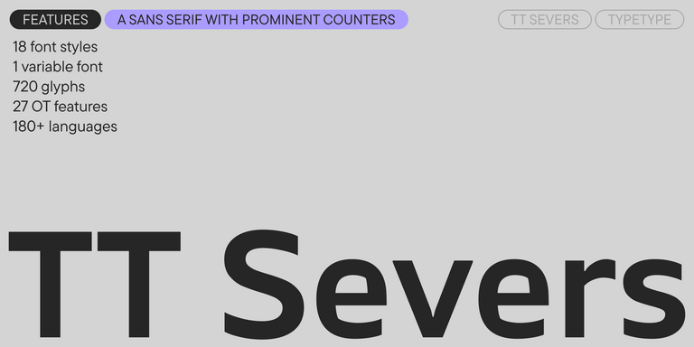
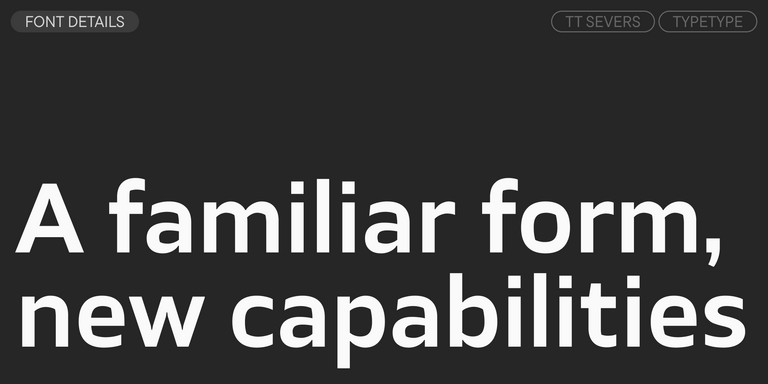
TT Severs is a geometric sans serif with emphasized elements of internal brackets. The main visual feature of TT Severs is the unusual form of internal ovals.
TT Turns is a striking geometric sans serif with expressive elements. This versatile font works exceptionally well for running text, while at large point sizes, it takes on a distinct display character.
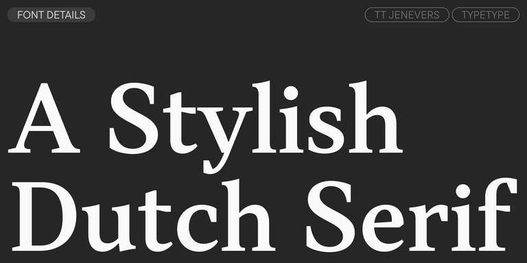
TT Jenevers is a modern serif with a Dutch flavor. The font family features the characteristic details peculiar to Dutch serifs—these are the asymmetrical shape of serifs and an irregular slant of ovals.
TT Regins is a Scottish modern serif. Striking contrast and sharp triangular serifs give this font a stern and commanding character, while refined forms, enlarged lowercase letters, and slightly condensed, static proportions add grace to its design.
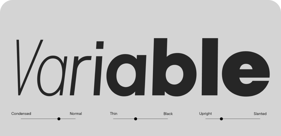
TT FRANTZ IS AN EXPERIMENTAL VARIABLE FONT, DISTINGUISHED BY ITS SLIMNESS AND LIGHTNESS. THE VARIATION IN THE FONT AFFECTS THE CHANGE IN THE HEIGHT OF THE MEAN LINE—BY MOVING THE AXIS ADJUSTMENT SLIDER YOU CAN EASILY RAISE OR LOWER THE MEAN LINE OF THE FONT.
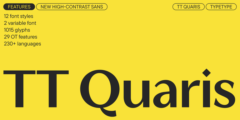
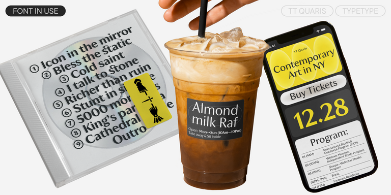
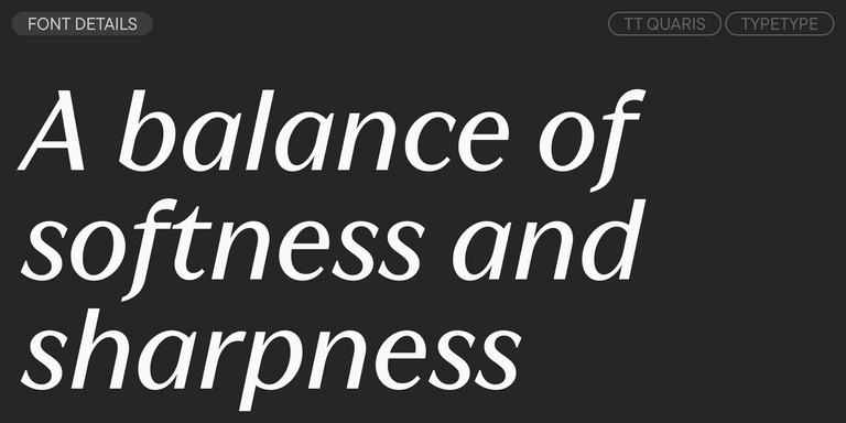
TT Quaris is an exquisite, modern high-contrast sans whose design balances between soft and sharp. The glyph shapes in the font are fluid and tend towards roundness, yet there are also sharp elements.
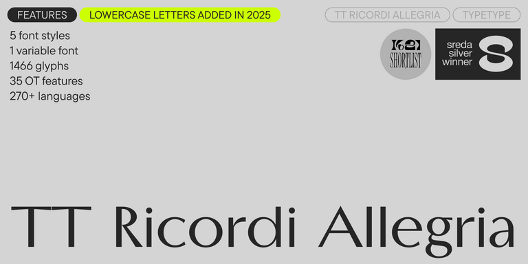
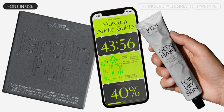
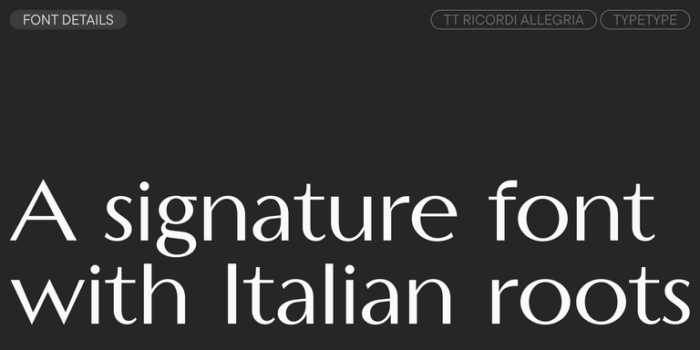
TT Ricordi Allegria is a sleek and intelligent contemporary Florentine grotesque.
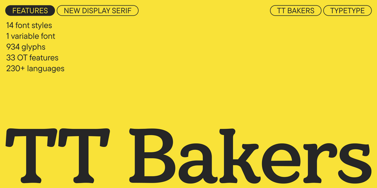
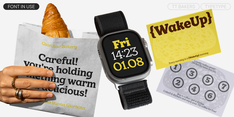
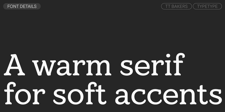
TT Bakers is a fluid serif with a gentle and lively character. This font is like freshly baked goods: it`s warm and soft, especially in its bolder weights.
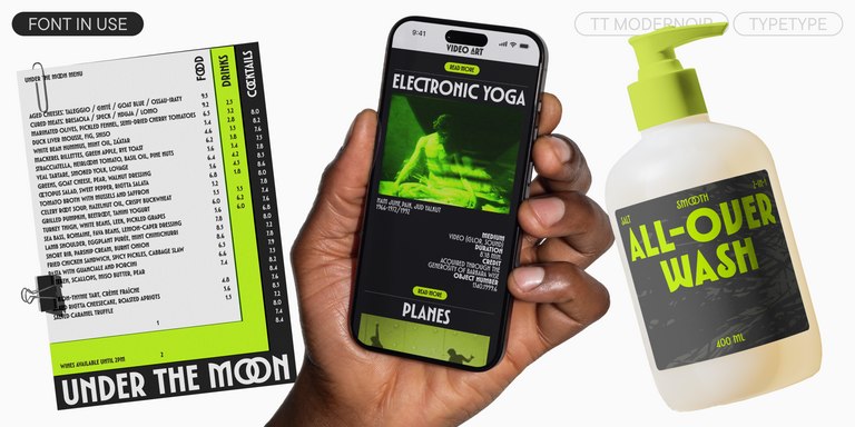
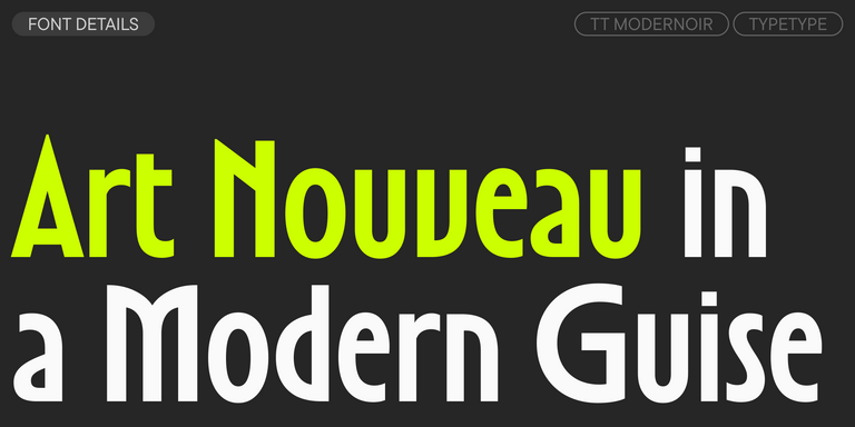
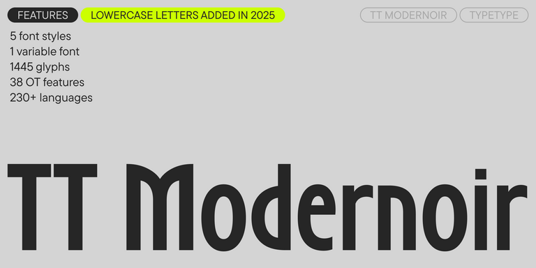
TT Modernoir is a display sans serif with dynamic proportions. Fluid lines and delicate Art Nouveau forms in this typeface blend seamlessly with the rhythmic flow and improvisational freedom of jazz.
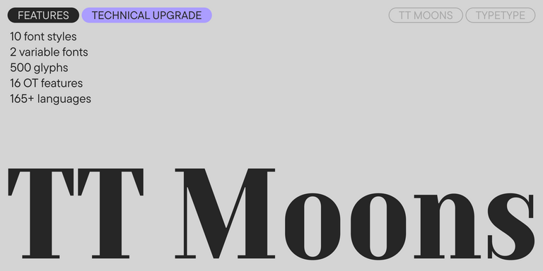
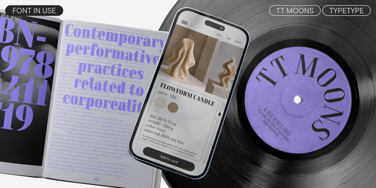
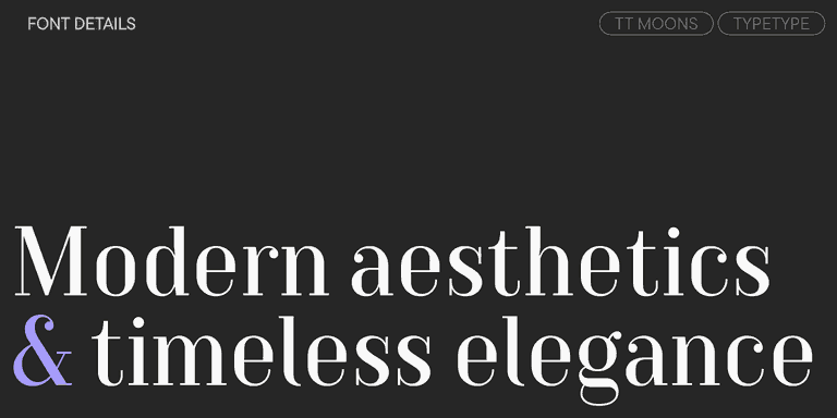
TT Moons is a slim and contrast serif. This font family works especially smart in classic design themes. TT Moons is a typeface of the glyptal modern typeface.
TT Ricordi Greto is an experimental project, inspired by a floor plaque dating from 1423 found in the Basilica di Santa Croce, Florence.
FAQ
Why Is Language Support Important When Choosing a Typeface?
Language support ensures that all letters, punctuation marks, numerals, and special symbols display correctly. This is especially important for english text fonts used across websites, apps, presentations, and print materials. Complete character coverage helps maintain readability, a professional appearance, and consistent design in different environments.
Which Font Styles Work Best for English Text?
Good english typography can be built with many styles, from clean sans serifs to refined serifs and expressive display families. The best choice depends on the project context and desired visual tone. For strong performance, look for clear letterforms, balanced proportions, distinguishable similar characters, and comfortable reading in both headlines and body text.
Can I Use One Typeface for Both Print and Digital Projects?
Yes, many modern typefaces are designed to work in both print and digital environments. Before choosing one family for all media, test it on screens and in printed layouts. Pay attention to readability, spacing, available weights, file formats, and OpenType features that support your design system.
What Should I Know About Licensing English Fonts?
Licensing depends on how and where the typeface will be used. Common options may cover desktop design work, websites, apps, logos, videos, broadcasts, or publications. Before using english fonts styles in a commercial project, choose a license that matches the exact format, audience, and distribution model.