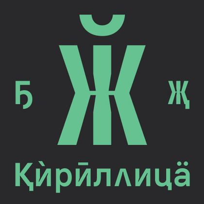
TypeType’s Cyrillic fonts guarantee perfect rendering of all Cyrillic characters, including "ё", "й", and other language-specific symbols. These versatile typefaces are essential for any Russian language project—spanning web design, print work, and mobile applications.
Each family undergoes extensive quality testing to eliminate kerning issues, ensure readability, and guarantee compatibility across different software. This makes them the optimal choice for designers, developers, and brands reaching international audiences.
Cyrillic is a writing system used by many languages across Eastern Europe, the Balkans, the Caucasus, and Central and Northern Asia. It is associated with languages such as Russian, Ukrainian, Bulgarian, Serbian, Macedonian, Kazakh, Kyrgyz, and others, although their character requirements are not identical.
Professional cyrillic typefaces do more than add a basic set of familiar letters. Good localization considers language-specific characters, proportions, rhythm, spacing, and the way the script interacts with the Latin part of the same family. This is especially important in multilingual branding and digital products, where both writing systems may appear side by side.
Basic support may cover only the most common characters, while extended localization addresses additional languages and regional requirements. For international work, designers should check the actual character set rather than assuming that any Cyrillic-enabled family will cover every target market.
Why Projects Need Fonts With Cyrillic Support
International brands often need one visual system to work across several languages without losing its identity. Fonts with cyrillic support make it possible to maintain consistent typography when a website, application, package, campaign, or publication is adapted for audiences using this writing system.
Without appropriate language coverage, teams may have to introduce a substitute family for localized content. That can change proportions, hierarchy, line breaks, and overall brand character. A well-designed multilingual family helps avoid this fragmentation.
Readability is equally important. Individual characters need to be recognizable to native readers, while spacing and rhythm should remain comfortable in real text rather than only in specimen words. For digital products in particular, this consistency affects navigation, interfaces, forms, notifications, and other functional content where clarity matters as much as visual character.
How to Choose the Right Typeface for Multilingual Design
Start with the languages your project actually needs to support. Do not evaluate only the Latin alphabet or a short Russian sample; check language-specific letters, punctuation, numerals, and other symbols relevant to every target market.
Next, consider readability and visual consistency. The different scripts should feel like parts of one family without being forced into identical shapes. Compare proportions, weight, contrast, and overall rhythm in realistic layouts.
The size of the family also matters. Branding systems, interfaces, and editorial projects may require several weights, italics, widths, or display and text styles. For digital use, test small sizes and different screens, and check whether the available formats and technical features suit your workflow.
Finally, review licensing for the intended media. The strongest choice balances language coverage, brand character, functionality, and technical requirements rather than treating multilingual support as an extra feature.
Best Cyrillic Fonts for Branding and Digital Products
The best cyrillic fonts depend on the role typography plays in the project. Branding often benefits from distinctive shapes that create a recognizable voice, but the family also needs enough flexibility to work beyond a logo or campaign headline.
Digital products place greater emphasis on clarity. Navigation, buttons, forms, product cards, and longer interface text require comfortable character differentiation and reliable performance at smaller sizes. A broad range of weights can also help create hierarchy without introducing another family.
Marketing materials may allow more expressive display styles, while publishing requires careful rhythm and sustained readability. For multilingual brands, another important consideration is whether Latin and Cyrillic sections feel equally developed.
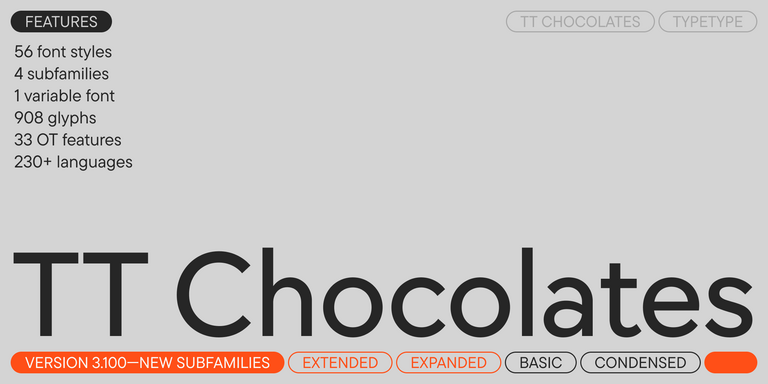
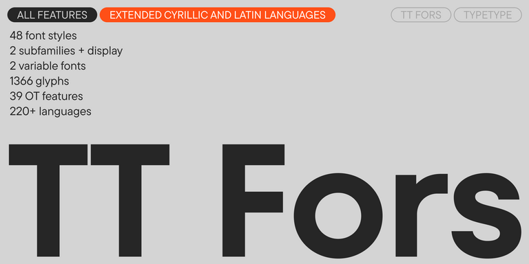
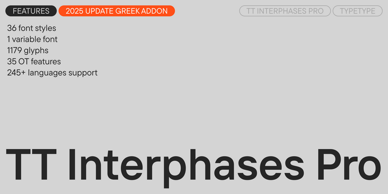
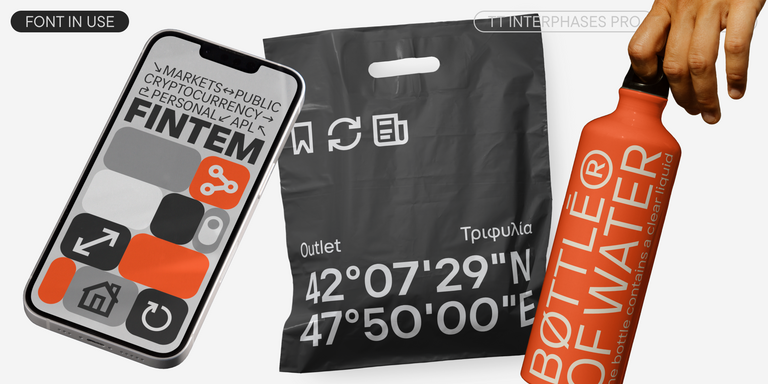
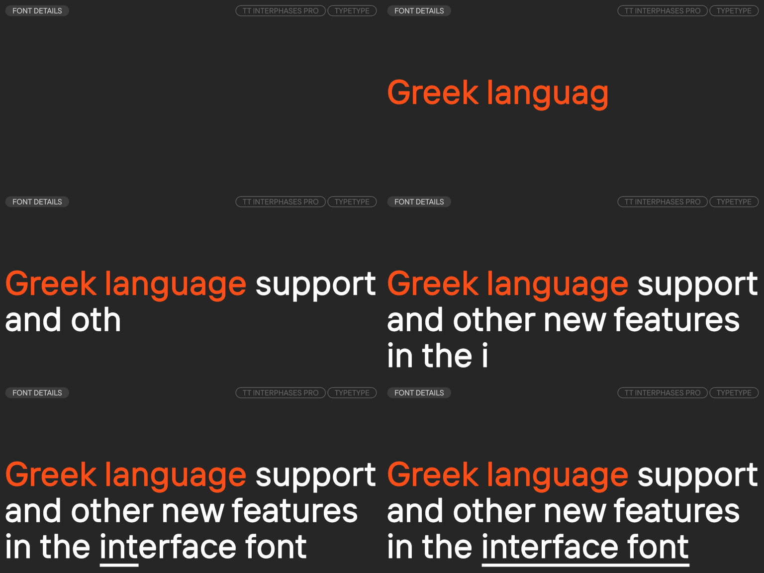
Large families such as TT Norms® Pro, TT Commons™ Pro, TT Hoves Pro, TT Fors, and TT Interphases Pro provide different approaches to these practical requirements within TypeType’s current collection.
Explore TypeType’s Collection
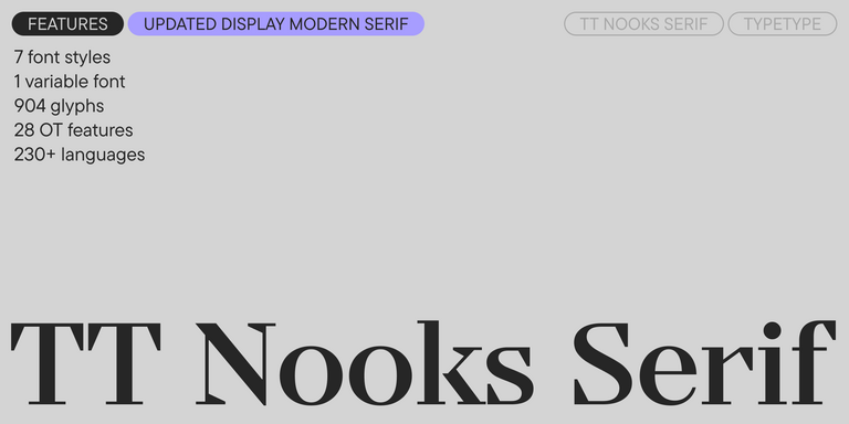
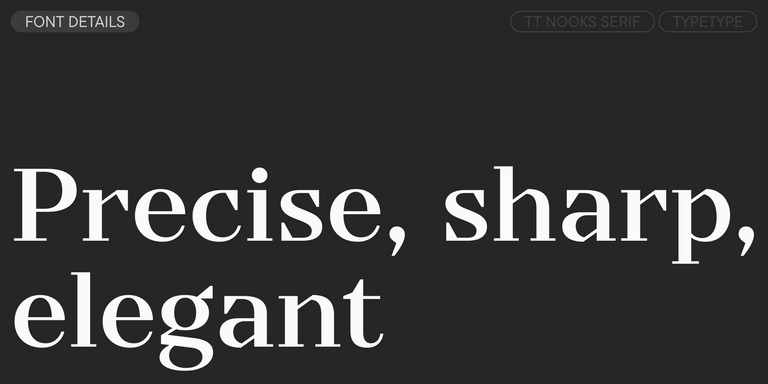
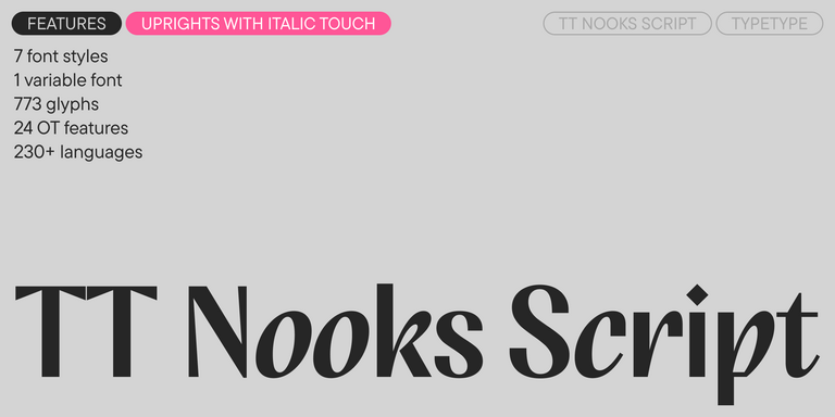
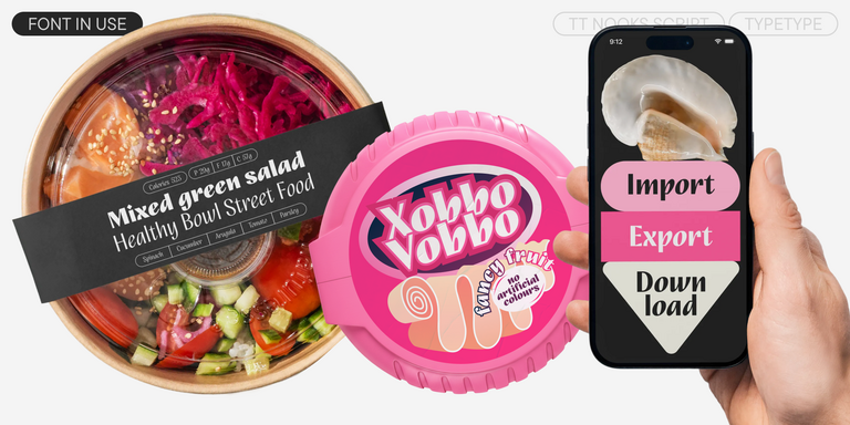
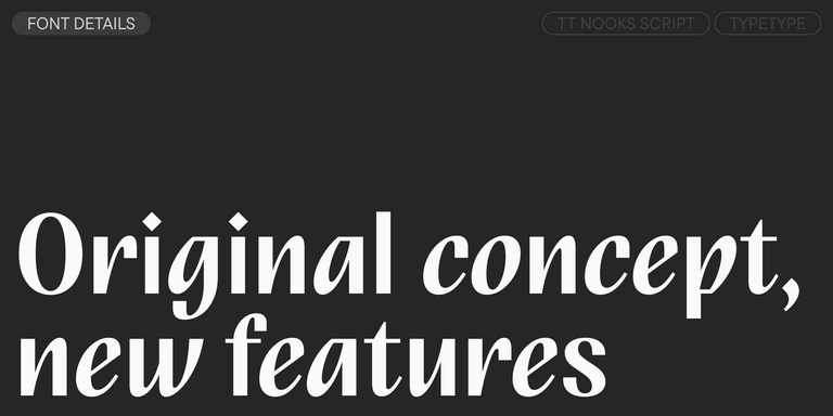
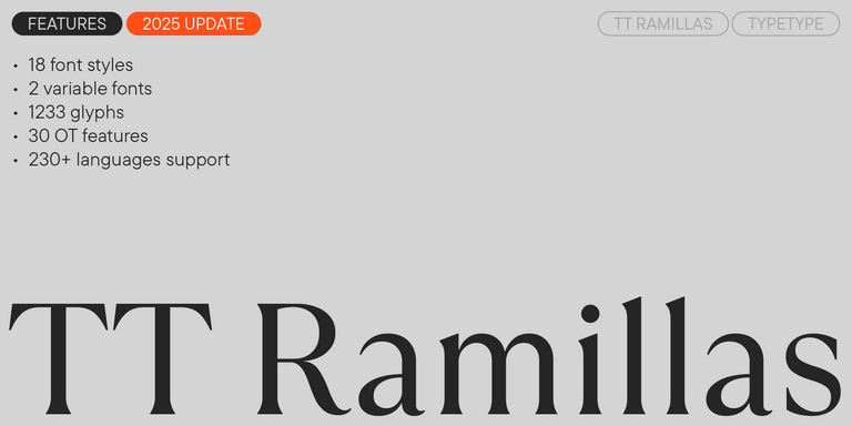
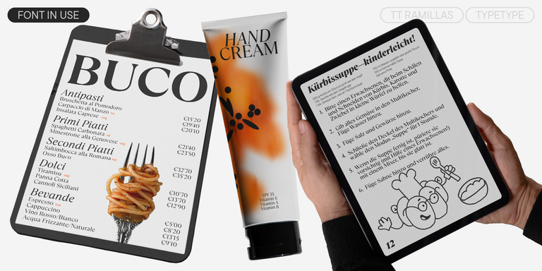
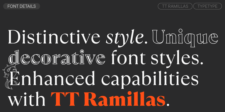
TypeType’s collection of cyrillic fonts includes sans serifs, serifs, display families, scripts, and variable designs for a wide range of visual tasks. The current category features versatile systems such as TT Norms® Pro and TT Commons™ Pro alongside more expressive options including TT Nooks Serif, TT Nooks Script, TT Ramillas, and other families.
When comparing options, use real project content rather than relying only on preset specimens. Test brand names, headings, interface labels, paragraphs, and the languages required for launch. This makes it easier to assess both visual character and practical readability.
Trial versions can also help teams evaluate a family in layouts before choosing a commercial license. TypeType currently provides trial access to the families in this category and offers different licensing options depending on how the design will be used.
Applications Across Print and Digital Media
Cyrillic alphabet fonts are used across virtually the same communication environments as other professional writing systems, but localization introduces an additional requirement: the design must remain convincing to readers of each language.
In branding, they can support logos, packaging, signage, and corporate identity systems. Websites and mobile applications rely on them for navigation, product information, forms, dashboards, and editorial content. Publishing uses them in books, magazines, reports, and long-form reading, while advertising and social media often allow stronger display treatments.
Print and digital environments place different demands on the same family. Small interface text requires clarity and efficient spacing, whereas packaging or campaign headlines can prioritize expression. A flexible multilingual system helps designers preserve a consistent visual voice across these contexts without sacrificing readability or introducing unrelated substitutes.
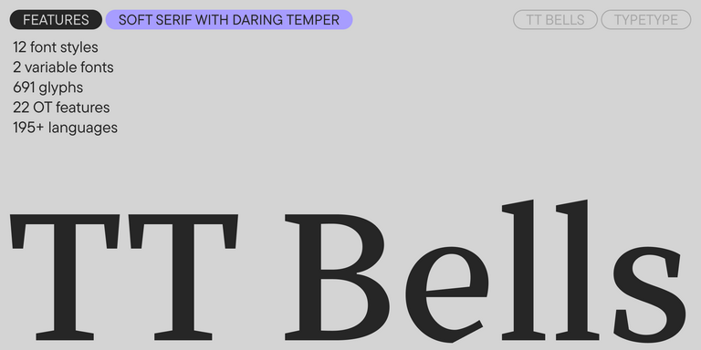
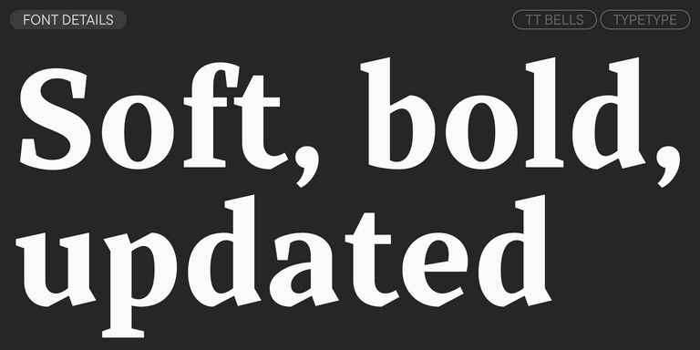
TT Bells combines the elegant softness of Antiqua with a complex and daring temper reflected in straight stroke terminals and arrowheaded serifs. The typeface is based on the broad nib, which creates these hallmark terminals and serifs.
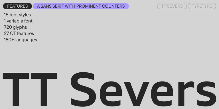
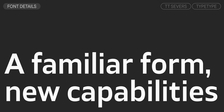
TT Severs is a geometric sans serif with emphasized elements of internal brackets. The main visual feature of TT Severs is the unusual form of internal ovals.
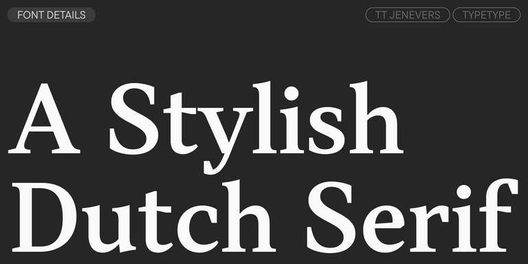
TT Jenevers is a modern serif with a Dutch flavor. The font family features the characteristic details peculiar to Dutch serifs—these are the asymmetrical shape of serifs and an irregular slant of ovals.
TT FRANTZ IS AN EXPERIMENTAL VARIABLE FONT, DISTINGUISHED BY ITS SLIMNESS AND LIGHTNESS. THE VARIATION IN THE FONT AFFECTS THE CHANGE IN THE HEIGHT OF THE MEAN LINE—BY MOVING THE AXIS ADJUSTMENT SLIDER YOU CAN EASILY RAISE OR LOWER THE MEAN LINE OF THE FONT.
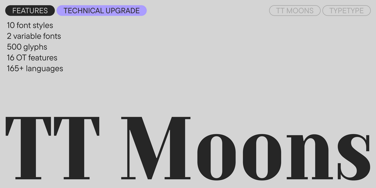
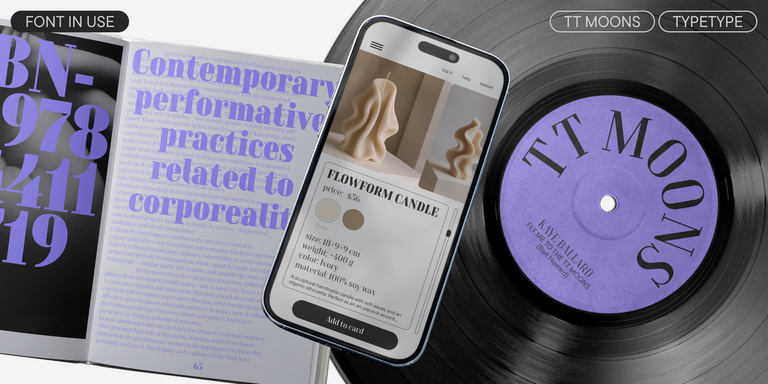
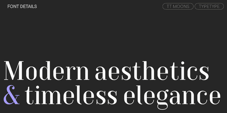
TT Moons is a slim and contrast serif. This font family works especially smart in classic design themes. TT Moons is a typeface of the glyptal modern typeface.
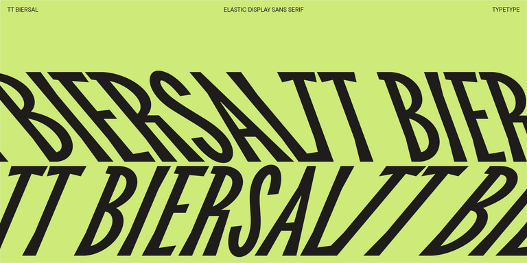
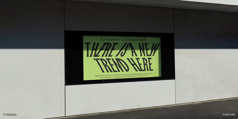
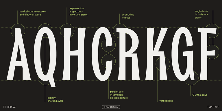
TT Biersal is a display sans serif with a free-spirited, playful, and adventurous nature. The concept of this font was sparked by a German poster from the early 1930s.
How Do I Choose a Typeface for Multilingual Projects?
Start by checking exactly which languages and characters the project requires. A good cyrillic typeface should remain readable across scripts, offer enough weights and styles for your hierarchy, and fit the brand’s visual character. For websites, apps, and other flexible systems, also test small sizes, different devices, and the formats needed for production.
Which Options Work Best for Branding Projects?
The best cyrillic fonts for branding combine recognizable character with enough flexibility to work across more than a logo. Look for a family that performs consistently in headlines, packaging, websites, presentations, and smaller supporting text. Language coverage, multiple styles, and a coherent relationship between Latin and Cyrillic characters are especially useful for international identities.
Are These Suitable for Websites and Applications?
Yes. Fonts with cyrillic support can work effectively in interfaces when they remain clear at small sizes and across different screen conditions. Check spacing, character differentiation, available weights, and how the family handles navigation, forms, product cards, and longer text. More expressive styles are generally better reserved for larger headings and promotional elements.
Can Cyrillic Fonts Be Used in Commercial Projects?
Yes, if the selected license permits the intended commercial use. The appropriate terms can depend on whether the typeface appears on a website, in an app, logo, advertisement, package, publication, video, or another format. Always review the licensing conditions for the specific family and usage scenario before releasing the finished project.
What Is the Difference Between Basic and Extended Language Support?
Basic coverage may include the core characters needed for one or several major languages, while extended cyrillic alphabet fonts can contain additional letters required by languages such as Ukrainian, Serbian, Bulgarian, Kazakh, or Kyrgyz. The exact set varies by family, so multilingual projects should verify every required language rather than relying on the category label alone.
Why Is Character Quality Important for Localization?
Localization is not simply a matter of adding missing glyphs. Each character needs to match the family’s proportions, stroke logic, spacing, and overall personality while remaining natural to native readers. Poorly adapted forms can make text harder to read and can make an otherwise polished brand or interface feel inconsistent, unfamiliar, or less professionally designed.
The European Design Awards honor each year’s finest design achievements across Europe. Covering everything from branding and digital interfaces to packaging and editorial design, this annual showcase brings together Europe’s premier agencies and solo practitioners. What sets it apart is its commitment to celebrating local design flavors while highlighting Europe’s cultural tapestry through visual storytelling.
Enter your email address and spin the sun to win up to 100% off or TypeType services
Giveaway rules:
Each user can only play once;
Each promo code is unique and can only be used once;
The promo code discount applies only to purchases up to $5,000 in the online store;
Please note that the "Font Renaming," "Your Logo in a Font," and "Basic Customization" services do not apply to previously purchased fonts and are only available for new orders;
If you win a service, our manager will contact you within three business days with the details.