New fonts shape how brands and digital products communicate visually, reflecting current design trends while solving practical typographic challenges. This collection brings together TypeType’s latest typefaces, each developed with attention to language support, technical performance, and versatility. Whether you are building a brand identity or a digital interface, these releases offer fresh options worth exploring before your next project begins.
Designers regularly explore the newest fonts because typography can quickly make a visual system feel dated or overly familiar. A fresh release can provide an alternative to widely used free families, introduce a more distinctive voice, or solve a specific problem that older designs do not address as effectively.
This is especially relevant in branding, where recognizable typography can help separate one company from another. Product teams may also look for newer families when updating interfaces, while editorial and campaign designers often need something that reflects a current visual direction without simply following a short-lived trend.
The goal is not to replace established classics every year. New releases are most useful when they combine contemporary character with practical advantages such as broader language support, improved screen performance, variable technology, or a more flexible style system.
What Sets a Good New Typeface Apart
A recent release should offer more than a fashionable appearance. Well-developed cool new font styles are usually supported by careful kerning, balanced spacing, technical testing, and a complete character set rather than a limited collection of decorative glyphs.
OpenType features can add useful alternatives, ligatures, figure styles, or language-specific forms. Variable technology may provide additional control over weight, width, or other axes while reducing the need for many separate files. For international projects, broad language coverage can be just as important as visual character.
Style range matters too. Some display designs intentionally contain only one or two styles, while families intended for larger systems may need numerous weights and italics.
This is one of the main differences between a professionally produced release and many quick free downloads: technical depth and long-term usability matter alongside first impressions.
How to Choose the Right Font for Your Project
Stylish new fonts should still be judged by the same practical criteria as established families. Begin with the project itself. Branding may prioritize personality and distinctiveness, while websites and interfaces require consistent screen readability. Editorial and print work can place greater emphasis on rhythm, texture, and performance across longer passages.
Test the design at the sizes you expect to use. A dramatic display style may work beautifully in a campaign headline but become unsuitable for body copy. Also check the number of available weights, language support, OpenType options, and any variable features that could help the system adapt.
Licensing should be reviewed before production, especially if the project will appear across several media.
Most importantly, test the typeface with real content. Brand names, UI labels, headlines, paragraphs, and localized copy reveal much more about suitability than a specimen viewed in isolation.
Downloading and Installing New Fonts
Before you install new fonts, check which file formats are included and whether they are compatible with your operating system and design software. Common desktop formats can normally be installed through the built-in font management tools in Windows or macOS, after which supported applications should recognize them.
If a newly installed family does not appear immediately, restarting the application or checking for duplicate or conflicting files can help. For software-specific issues, consult the application’s documentation or the type foundry’s support team.
Designers who want to find new modern fonts should also distinguish between trial and full commercial files. TypeType provides trial versions for evaluation, but they are intended for testing rather than final commercial production.
Explore TypeType’s Newest Typefaces
TypeType’s current selection of new typefaces covers very different visual directions rather than one single trend. TT Qurdisma, released in June 2026, is a narrow decorative design with botanical, winding forms, 464 glyphs, 19 OpenType features, and support for more than 120 languages.
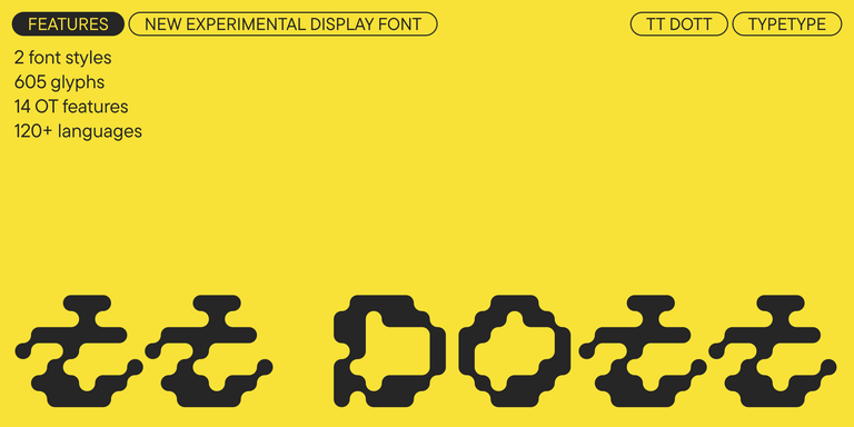
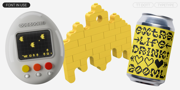
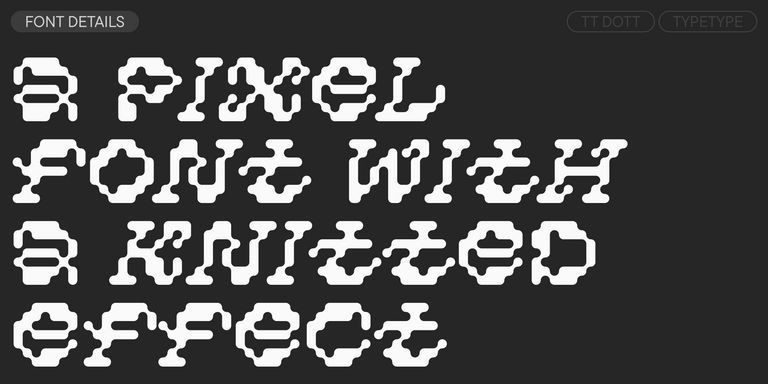
TT Dott takes a very different approach: it is an experimental pixel grotesque built around circular modules and currently includes Solid and Outline styles.
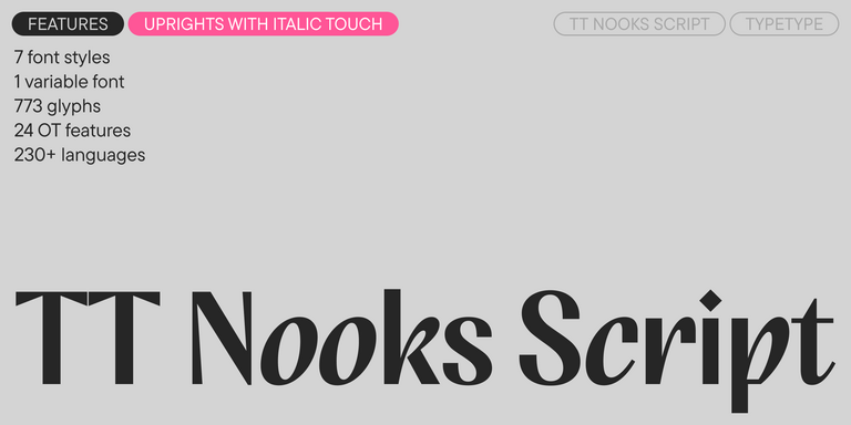
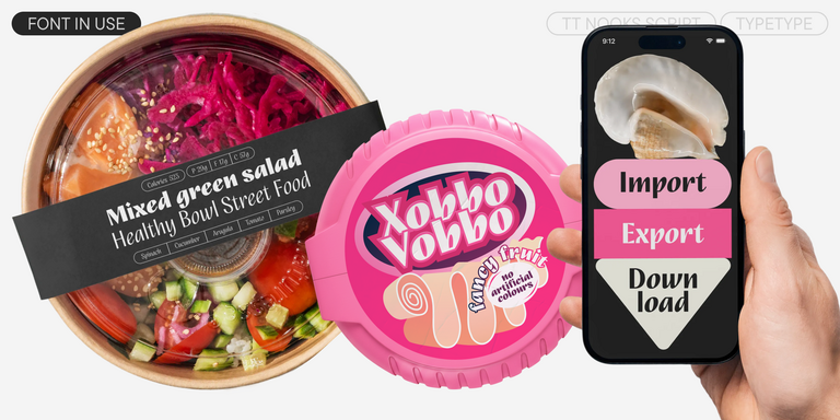
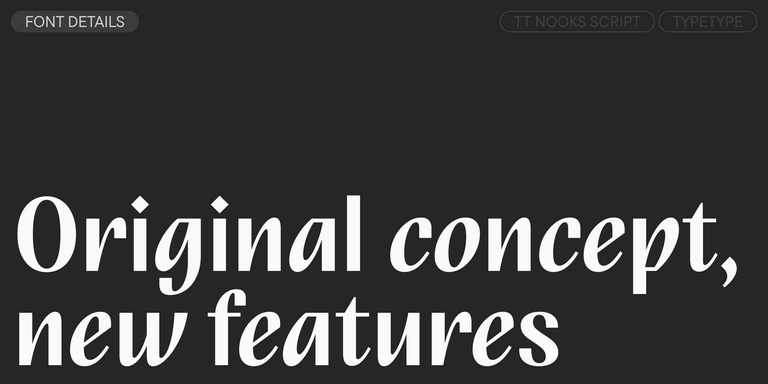
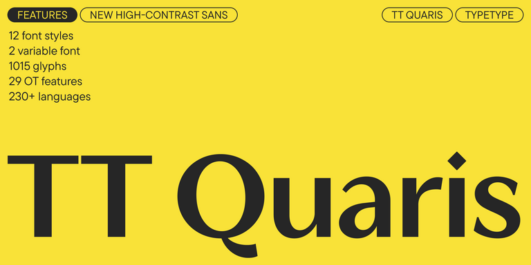
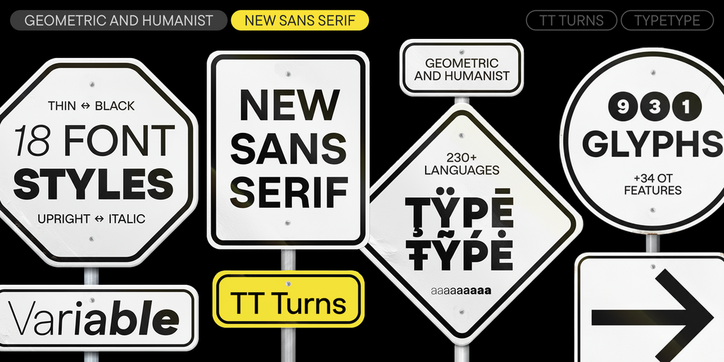
The current New section also features TT Turns, a geometric sans with both text and display potential; TT Regins, a high-contrast Scottish modern serif; TT Quaris, a contemporary high-contrast sans; and the updated TT Nooks Script.
When exploring recent releases, compare them according to the actual role they need to play. A distinctive display face may be ideal for packaging or campaign work, while a larger family can be better suited to branding systems, editorial layouts, or digital products.
TT Dott is an experimental pixel grotesque where a circle is used as the base for the pixel. It is a fluid and unusual display font, evoking associations with embroidery and techno parties all at once.
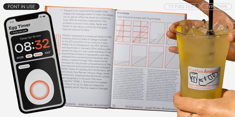
TT Turns is a striking geometric sans serif with expressive elements. This versatile font works exceptionally well for running text, while at large point sizes, it takes on a distinct display character.
TT Regins is a Scottish modern serif. Striking contrast and sharp triangular serifs give this font a stern and commanding character, while refined forms, enlarged lowercase letters, and slightly condensed, static proportions add grace to its design.
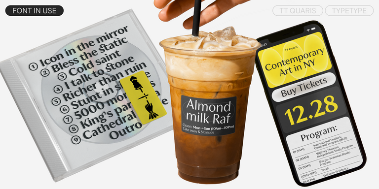
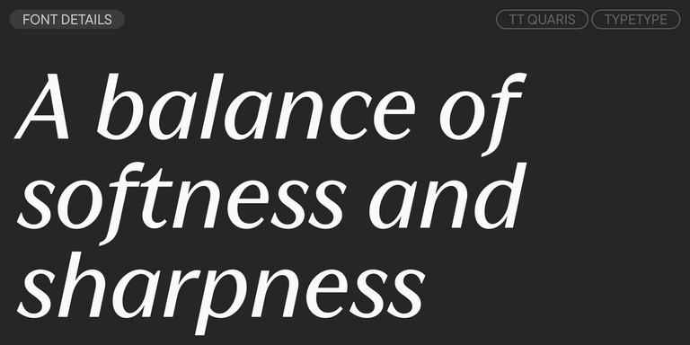
TT Quaris is an exquisite, modern high-contrast sans whose design balances between soft and sharp. The glyph shapes in the font are fluid and tend towards roundness, yet there are also sharp elements.
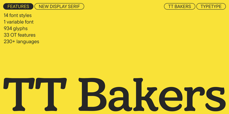
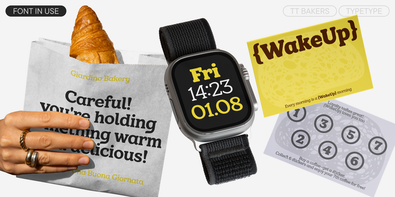
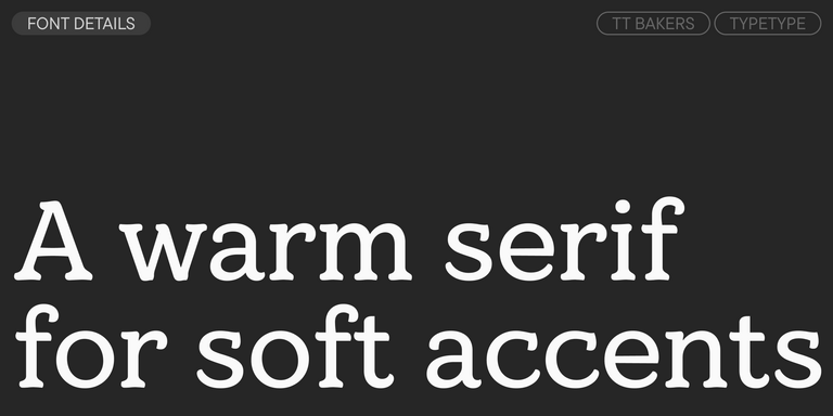
TT Bakers is a fluid serif with a gentle and lively character. This font is like freshly baked goods: it`s warm and soft, especially in its bolder weights.
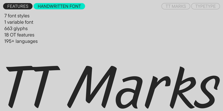
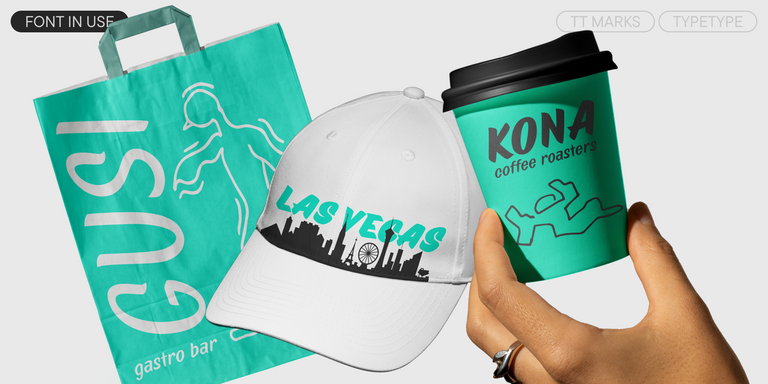
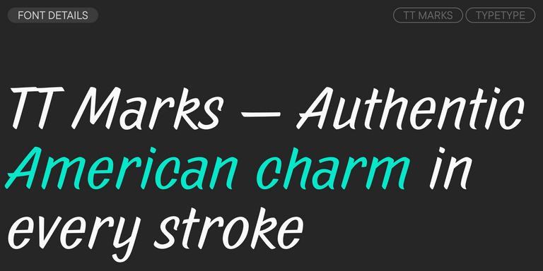
TT Marks delivers a script with dynamic rhythm, heartfelt character, and nostalgic appeal inspired by the classic art of American sign painting. This craft, where skilled artists hand-painted storefront signage with brushes and careful technique, is experiencing a well-deserved renaissance in today`s design world.
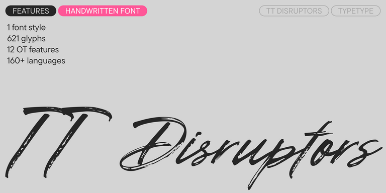
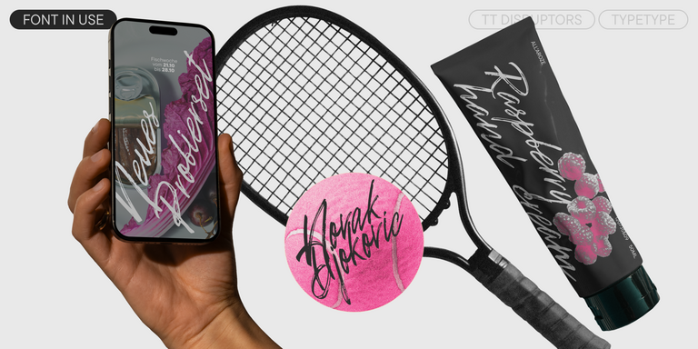
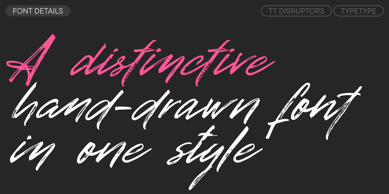
TT Disruptors is a ductile marker-drawn handwritten typeface. Its design is one-of-a-kind: worn edges, varying stroke thickness, and elongated ascenders and descenders give it a lively, dynamic texture and handcrafted feel. The personality of this font is spirited and emotional, yet warm and soulful.
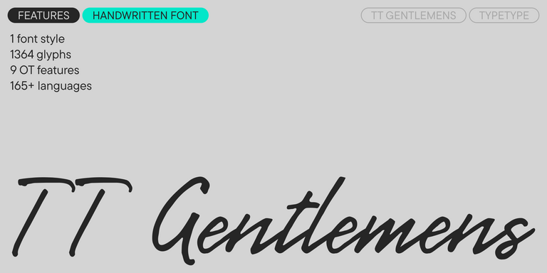
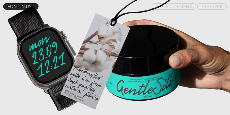
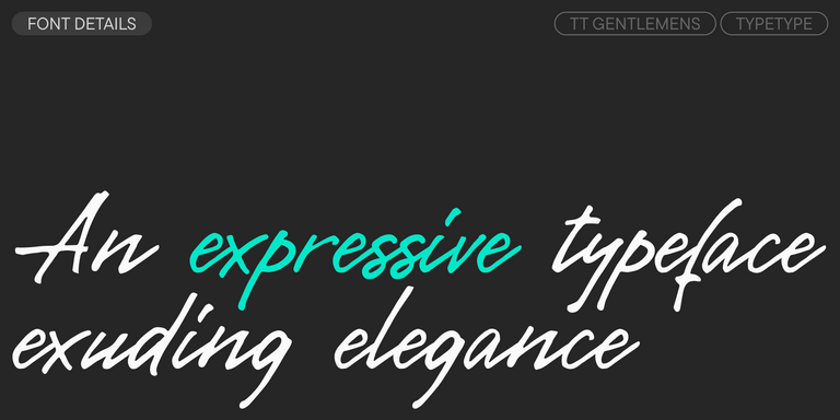
TT Gentlemens is a dynamic handwritten typeface that combines the seriousness and precision in writing with elegance and sophistication. It has the character and style of a true gentleman: restrained and always appropriate, yet confident and striking.
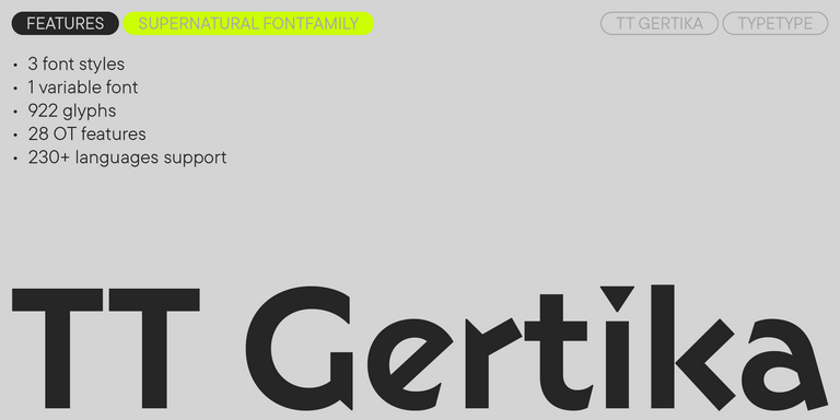
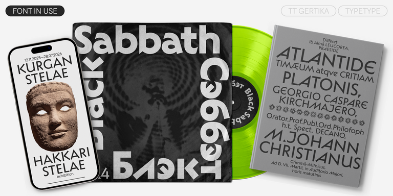
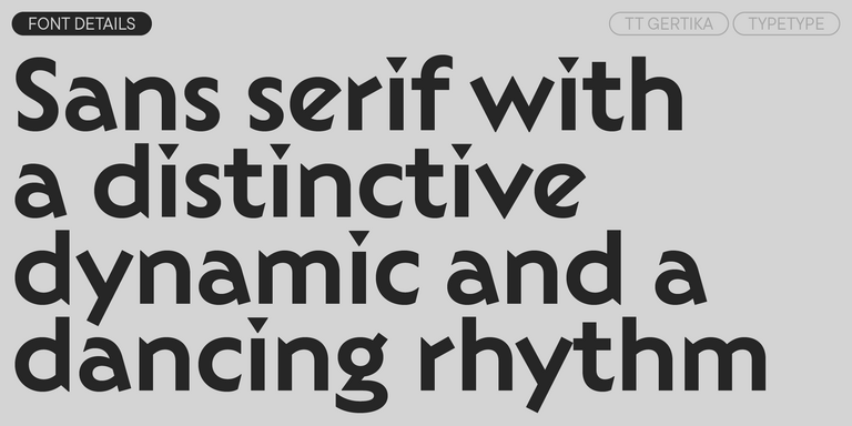
TT Gertika is a geometric sans serif with a dynamic character and a dancing rhythm. This font`s idea originates from the lettering featured on an American poster from the late 1930s.
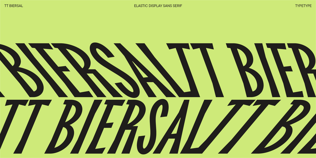
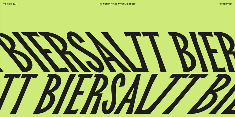
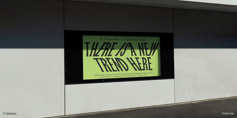
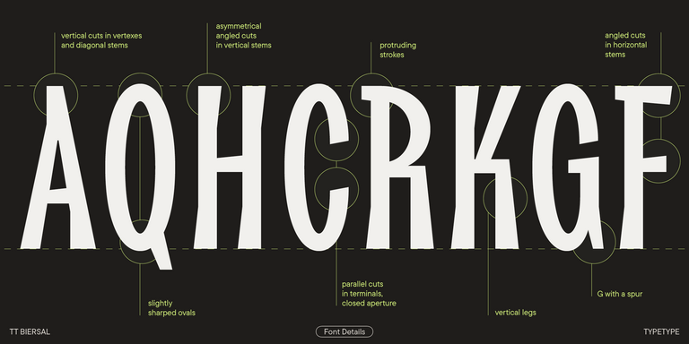
TT Biersal is a display sans serif with a free-spirited, playful, and adventurous nature. The concept of this font was sparked by a German poster from the early 1930s.
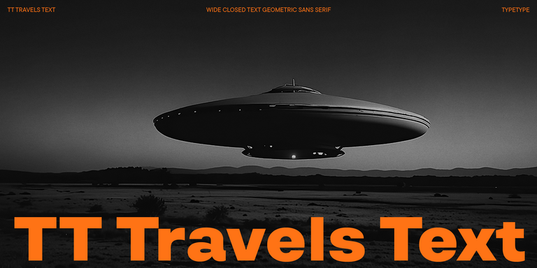
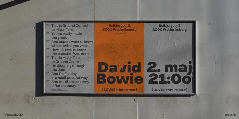
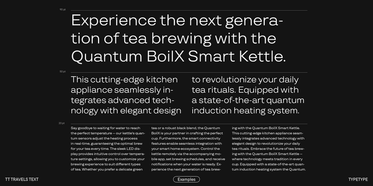
TT Travels Text is a geometric grotesque with wide proportions and specific shapes of circles and fillets, which includes two stylistic sets with completely different natures.
The best new fonts 2026 are not necessarily the most visually unusual releases. Look for a design that fits your project while offering solid technical execution, appropriate language coverage, and the styles you actually need. Recent releases are especially worth exploring when they provide a fresh visual direction without sacrificing readability, flexibility, or long-term usability.
Which Release Feels Closest to a Timeless Sans Serif?
New collections often include contemporary reinterpretations of classic grotesque or geometric proportions. These designs keep familiar, readable structures while introducing updated spacing, details, proportions, or technical features. If longevity matters, look for restrained shapes, a broad style range, and enough personality to feel current without depending heavily on a temporary visual trend.
Are These Typefaces Suitable for Branding Work?
Yes. Many new font styles are developed for contemporary identity systems and may include multiple weights, OpenType features, variable technology, and broad character sets. For branding, check whether the family can move comfortably from large headlines or logos to supporting copy, websites, presentations, packaging, and other applications without losing its visual consistency.
Can I Use New Fonts in Commercial Projects?
Latest fonts from TypeType can be licensed for commercial use, but trial files are intended for evaluation rather than final production. The required license depends on where the typeface appears, such as desktop materials, websites, applications, publishing, or video. Review the relevant licensing terms before releasing the finished project.
How Do I Install and Add These Fonts to My Software?
To download new fonts, first obtain the appropriate files and check that their format is supported by your operating system and software. Install them through the system’s font management tools, then reopen the design application if necessary. If the family does not appear, check for duplicate files, compatibility issues, or software-specific installation requirements.
How Often Does TypeType Add Fresh Releases?
TypeType describes its library as being continually updated, and its current New section contains several 2026 releases, including TT Qurdisma and TT Dott. However, the company does not publish a fixed release schedule on the page, so it would be inaccurate to promise a specific monthly or quarterly cadence for 2026 new fonts.
Enter your email address and spin the sun to win up to 100% off or TypeType services
Giveaway rules:
Each user can only play once;
Each promo code is unique and can only be used once;
The promo code discount applies only to purchases up to $5,000 in the online store;
Please note that the "Font Renaming," "Your Logo in a Font," and "Basic Customization" services do not apply to previously purchased fonts and are only available for new orders;
If you win a service, our manager will contact you within three business days with the details.