Some typefaces stand the test of time, becoming essential tools in design and typography. Popular fonts strike the perfect balance between recognition and functionality, making them the go-to choice for branding, web design, and print materials. Their versatility allows them to seamlessly adapt to different media while maintaining clarity and style. The TypeType library showcases modern interpretations of classic designs, refined for contemporary applications. These typefaces don’t just follow trends—they set standards for readability and aesthetics, ensuring lasting impact in any project.
The most popular typefaces today are not always the loudest or most decorative. In most cases, they become widely used because they solve many design tasks at once: they are easy to read, technically reliable, visually flexible, and suitable for both digital and print environments. A successful family can work in a logo, website, mobile app, presentation, packaging, and advertising campaign without losing its character.
Popularity is also shaped by habit and trust. Designers return to typefaces that perform well, clients approve them faster, and teams can scale them across brand systems with fewer risks. Over time, certain solutions become industry standards because they support consistency, accessibility, multilingual communication, and clear hierarchy. The best-known choices stay relevant not only because they look good, but because they make design work smoother and more predictable.
Why Designers Choose Popular Typefaces
Designers often choose proven options because they reduce uncertainty. Familiar, well-built families help brands look professional, maintain visual consistency, and communicate clearly across many formats. This is especially important for companies that need one typographic system for websites, apps, presentations, social media, and printed materials.
At the same time, designers rarely want a project to feel generic. The real challenge is finding balance: using popular font types for their reliability while selecting details, weights, pairings, and layouts that make the result feel individual. A familiar typeface can still create a distinctive identity when it is used with intention.
How to Select a Typeface That Fits Your Goals
Start with the purpose of the project. A SaaS interface needs clarity, strong spacing, and comfortable reading at small sizes. A fashion campaign may need elegance and expressive contrast. A corporate identity requires stability, scalability, and a tone that matches the company’s values.
Before choosing, test the family in real layouts. Check headlines, body text, numbers, buttons, captions, and multilingual content if your brand works internationally. Pay attention to the number of styles, OpenType features, variable options, licensing, and how the typeface behaves on light and dark backgrounds. A good choice should support the whole visual system, not only look attractive in a preview.
Inside TypeType’s Typeface Collection
TypeType’s collection includes a broad list of popular fonts for modern branding, interfaces, editorial layouts, packaging, and marketing design. The library combines practical workhorse families with more expressive options, giving designers room to build both neutral and distinctive visual systems.
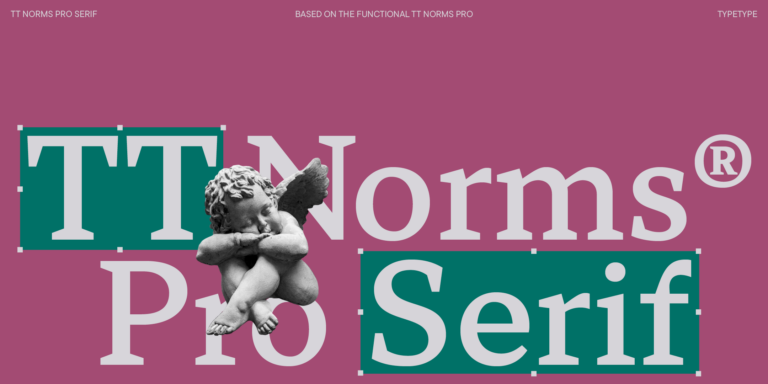
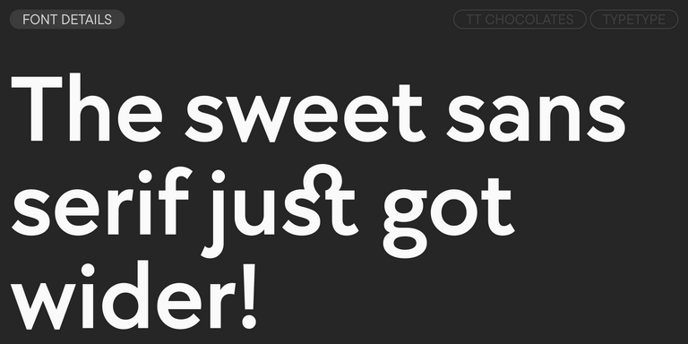
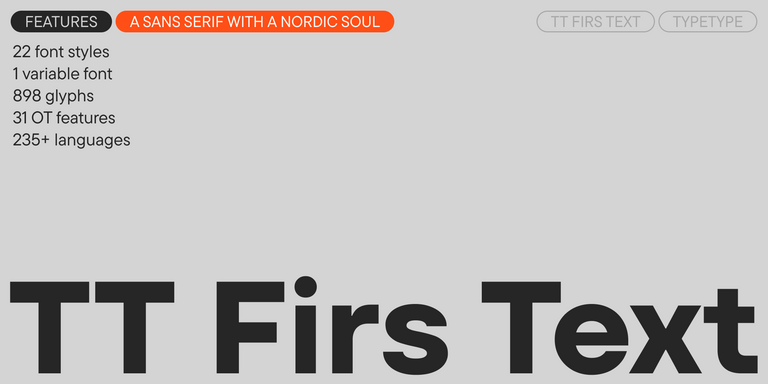
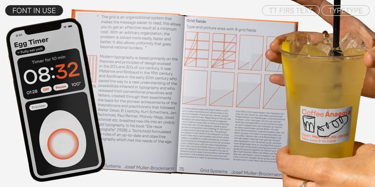
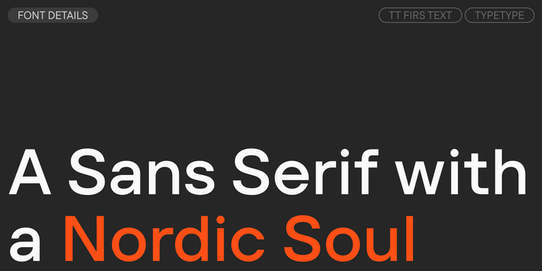
TT Norms® Pro is one of TypeType’s best-known geometric sans serifs, valued for its clean structure and broad usability. TT Commons™ Pro is another highly versatile family, suitable for brand communication, web design, applications, and corporate materials. TT Hoves Pro brings a confident contemporary tone, while TT Firs Neue and TT Fors offer strong personalities for projects that need more recognizable forms.
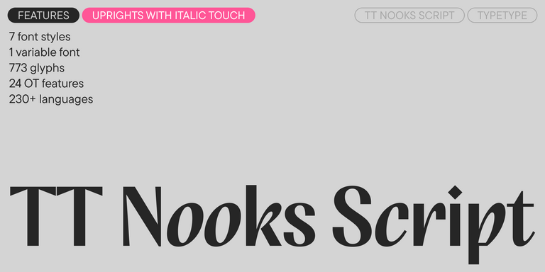
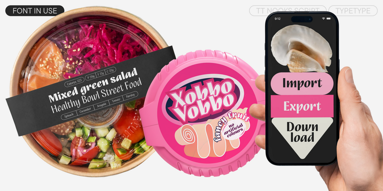
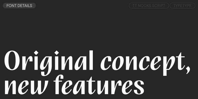
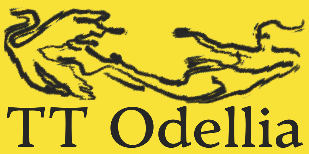
For interface-heavy work, TT Interphases Pro provides clarity and functional rhythm. For brands seeking a more refined or editorial voice, the collection also includes serif and display families with distinctive details. Many TypeType typefaces offer extensive language support, advanced OpenType features, variable versions, and trial options, making it easier to test each family before choosing the right license.
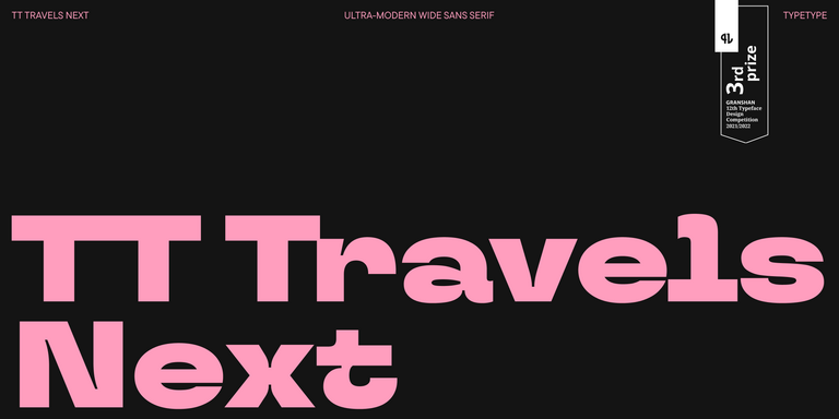
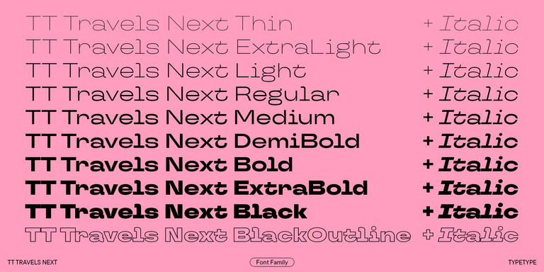
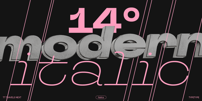
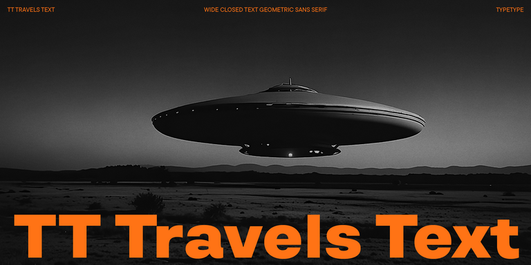
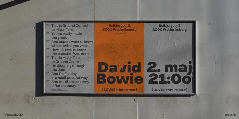
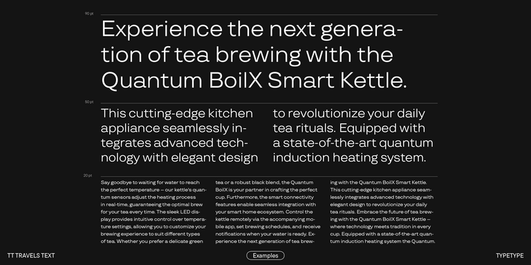
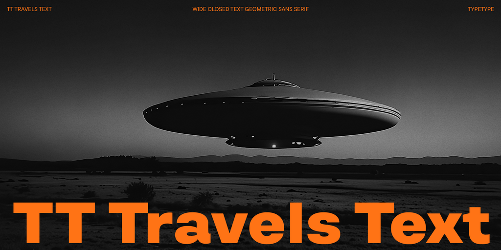
TT Travels Text is a geometric grotesque with wide proportions and specific shapes of circles and fillets, which includes two stylistic sets with completely different natures.
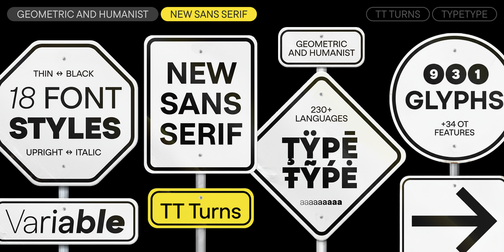
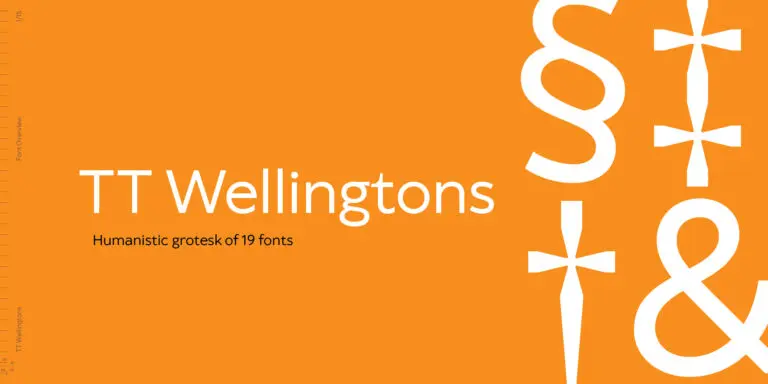
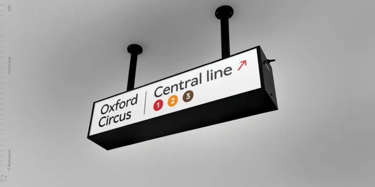
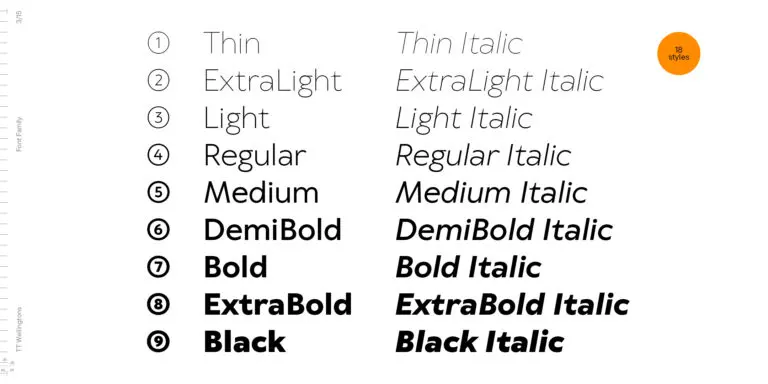
TT Wellingtons is an attempt to combine the style of English humanist sans serifs of the early 20th century with the requirements for modern geometric grotesques.
A typeface usually becomes popular when it combines visual appeal with practical performance. The most widely used families are easy to read, flexible across formats, technically reliable, and suitable for many industries. Over time, some of them become industry standards because designers, brands, and users already trust how they work in real projects.
Are popular typefaces suitable for websites and apps?
Yes. Many popular fonts for design work well in digital products because they offer strong screen readability, balanced spacing, multiple weights, and solid technical quality. They can support clear navigation, interface hierarchy, and consistent brand communication. Still, the final choice should depend on the project goals, audience, content volume, and platform requirements.
Which popular fonts work best for editorial and marketing design?
Editorial projects usually need comfortable long-form reading, clear hierarchy, and balanced proportions. Marketing design often requires stronger personality, recognition, and the ability to catch attention quickly. The most versatile typefaces can serve both purposes, especially when they include several styles and weights for headlines, body text, captions, and promotional layouts.
Is TypeType’s Collection Available for Commercial Use?
Yes. TypeType’s collection can be used in commercial projects with the appropriate license. Different options are available for desktop, web, app, digital ads, video, publishing, games, server use, unlimited use, and custom cases. Trial versions help designers test popular typography in real layouts before purchasing a commercial license.
Enter your email address and spin the sun to win up to 100% off or TypeType services
Giveaway rules:
Each user can only play once;
Each promo code is unique and can only be used once;
The promo code discount applies only to purchases up to $5,000 in the online store;
Please note that the "Font Renaming," "Your Logo in a Font," and "Basic Customization" services do not apply to previously purchased fonts and are only available for new orders;
If you win a service, our manager will contact you within three business days with the details.