top_banner_ttnormspro0426
Type foundryFonts & StylesExperimental

Experimental Fonts

Letterforms that bend, fracture, stretch or rebuild themselves from unexpected parts give a layout an instant point of tension. Experimental Fonts on TypeType gather families built for designers who want type to act as an image as much as a message. Browse the selection, compare personalities, test trial versions in real layouts, and request a commercial license when a typeface fits.

Tags: Experimental

What Makes Experimental Fonts Distinct

Experimental typography starts where conventional rules loosen. Instead of prioritizing neutral, invisible reading, these designs question how a letter should be built: strokes may break apart, counters may swell or collapse, proportions may shift from one glyph to the next, and familiar details can be replaced by modular, geometric or deliberately irregular construction. Experimental Fonts often treat the alphabet as raw material for visual ideas, so a single word can carry mood, rhythm and texture before anyone reads it. The result is type with a strong voice, designed to be noticed first and decoded second, which makes context and scale especially important.

Where Experimental Fonts Are Used

Brands aimed at young, culturally engaged audiences are frequent users of expressive type, from fashion labels and music projects to festivals, galleries and independent publishers. For these clients, Experimental Fonts help a poster, album cover or event identity stand apart in a crowded feed. Creative agencies use them for campaign headlines and packaging accents, while motion designers and digital artists animate their unusual shapes on screens. Most applications share one trait: the lettering appears at display sizes, where every detail stays visible. Longer passages are usually handed to a calmer companion so the message remains easy to follow.

How to Choose an Experimental Font for Your Project

Start with the personality you need. A sharp, angular design sends a different signal from a soft, bubbly one, so describe the mood of the brand or campaign in a few words and look for letterforms that express it. Next, test legibility at the actual sizes you plan to use: a headline on a billboard, a logo on a mobile screen and a label on packaging each put different demands on detail. Check the family page for available variants and character sets, especially if the project involves several languages or needs numerals and punctuation that match the headline tone. Trial versions let you set real copy instead of judging from specimens alone. Finally, think about the whole system rather than one word. Experimental Fonts work most convincingly when they have a steady partner for body text and interface elements, so plan that pairing early and make sure the two voices contrast instead of competing.

Explore TypeType's Experimental Fonts Collection

TypeType has grouped a wide range of families under this tag, from TT Qurdisma, TT Globs and TT Alientz to TT Backwards, TT Modernoir and TT Nooks Serif. The list also includes versatile families such as TT Commons Pro and TT Travels Next, so the page helps both with finding a bold headline voice and with seeing what might sit alongside it. Each typeface has its own page where you can study the specimen and check the details that matter for your brief. Browse the families here, then get trial versions to test them in your own layouts before committing. When a design proves right, leave a request for a suitable license type for commercial use. If you are unsure which option fits the project, the TypeType design and client care teams can advise through the contact form on the website.

  • The quick brown fox jumps over a lazy dog.
  • Pack my box with five dozen liquor jugs.
  • Sphinx of black quartz, judge my vow
  • 0123456789 !?.,:;—–()[]{}<> “quotes” ‘apostrophe’ @#%&*_+=/\| № $ € £ ₽ +−×÷=≠≤≥ … % © ® ™
  • Aa Bb Cc Dd Ee Ff Gg Hh Ii Jj Kk Ll Mm Nn Oo Pp Qq Rr Ss Tt Uu Vv Ww Xx Yy Zz
Leading
1.1
Tracking
0px
Bestseller
104 font styles

TT Commons™ Pro is a completely redesigned version of the well-established classic font family TT Commons.

New
TT Polihaus Regular
5 font styles

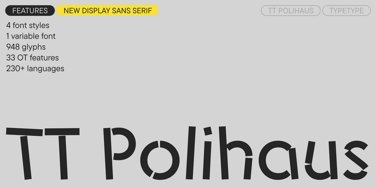
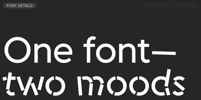
TT Polihaus is an experimental sans serif that, at first glance, looks ordinary, but then breaks apart, transforming into a stencil pattern.

TT Nooks Serif Regular
8 font styles

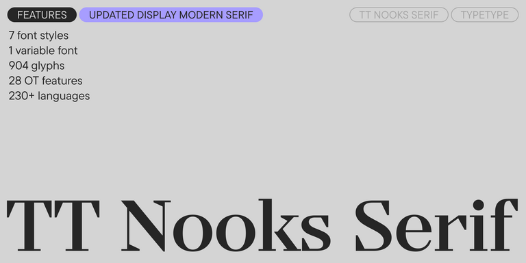
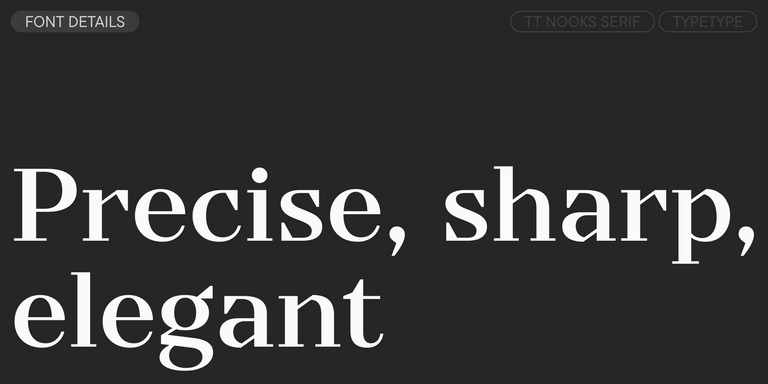
TT Nooks Serif is a display modern serif with a slight touch of egocentricity. It has a sharp and firm, yet elegant and stately character.

New
TT Nooks Script Regular
8 font styles

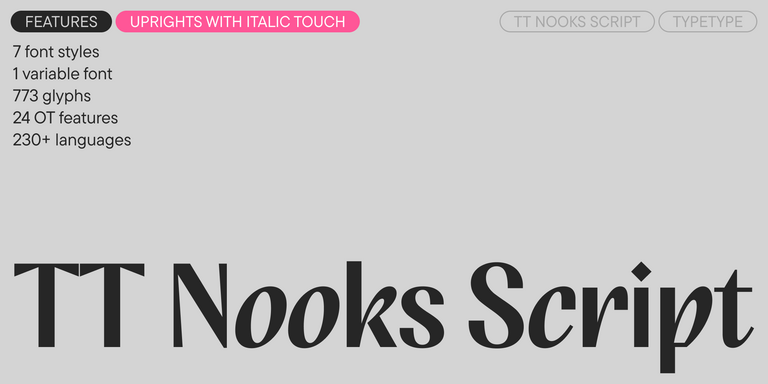
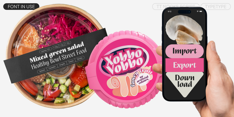
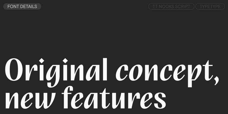
TT Nooks Script features a unique design that has no direct analogs.

New
TT Qurdisma Regular
1 font style

TT Qurdisma is a narrow and dense decorative font reminiscent of a whimsical plant. The winding, smooth contours give rise to a botanical ornament.

New
TT Dott Solid
2 font styles

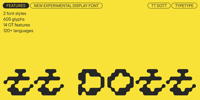
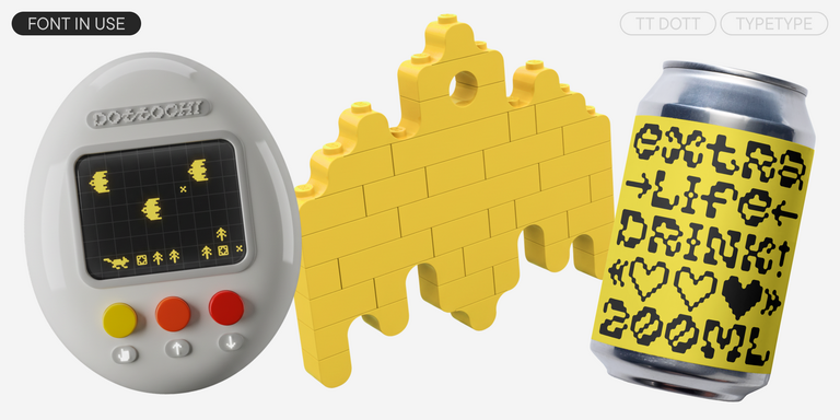
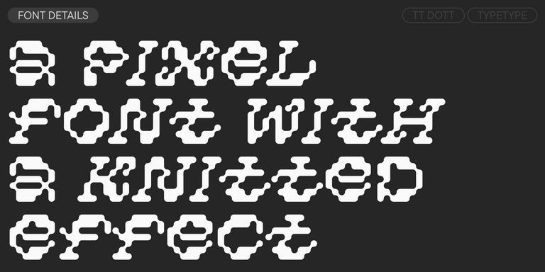
TT Dott is an experimental pixel grotesque where a circle is used as the base for the pixel. It is a fluid and unusual display font, evoking associations with embroidery and techno parties all at once.

Bestseller
TT Neoris Pro Regular
21 font styles

TT Neoris is an elegant Neo-Grotesque with unlimited potential and a font that encompasses all modern requirements and user desires.

21 font styles

TT Commons™ Classic is a universal sans serif with a minimal contrast of strokes, a closed aperture, and geometric shapes of characters.

TT Runs Regular
19 font styles

TT Runs is a very stylish and charismatic display sans serif with irregular proportions of some characters.

TT Severs Regular
19 font styles

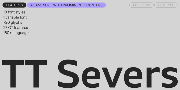
TT Severs is a geometric sans serif with emphasized elements of internal brackets. The main visual feature of TT Severs is the unusual form of internal ovals.

New
TT Turns Regular
19 font styles

TT Turns is a striking geometric sans serif with expressive elements. This versatile font works exceptionally well for running text, while at large point sizes, it takes on a distinct display character.

TT Frantz Variable
4 font styles

TT FRANTZ IS AN EXPERIMENTAL VARIABLE FONT, DISTINGUISHED BY ITS SLIMNESS AND LIGHTNESS. THE VARIATION IN THE FONT AFFECTS THE CHANGE IN THE HEIGHT OF THE MEAN LINE—BY MOVING THE AXIS ADJUSTMENT SLIDER YOU CAN EASILY RAISE OR LOWER THE MEAN LINE OF THE FONT.

6 font styles

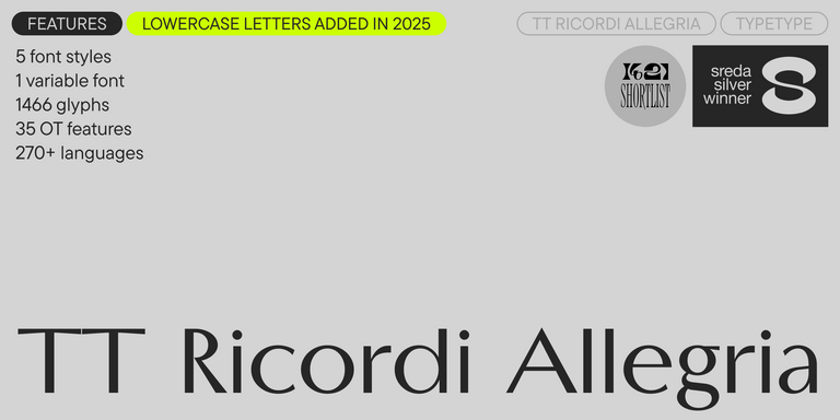
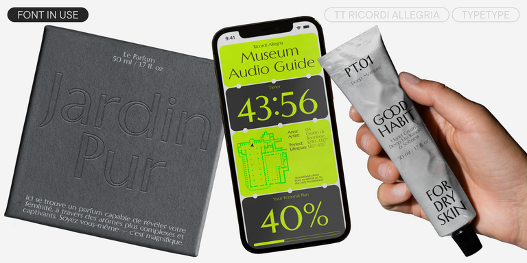
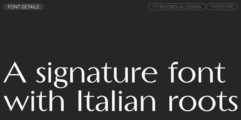
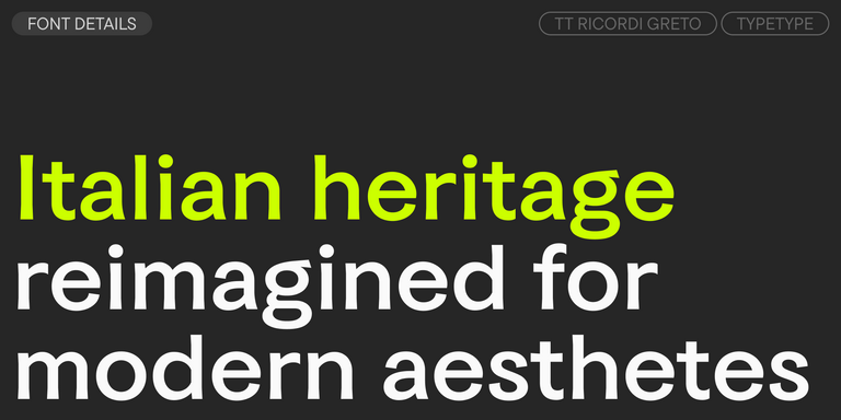
TT Ricordi Allegria is a sleek and intelligent contemporary Florentine grotesque.

TT Modernoir Regular
6 font styles

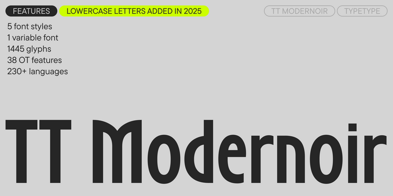
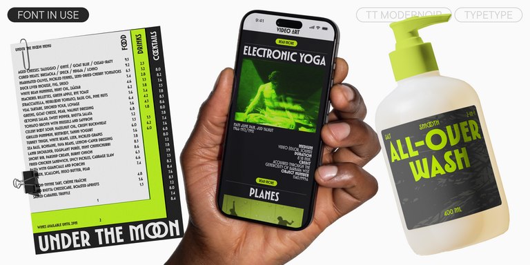
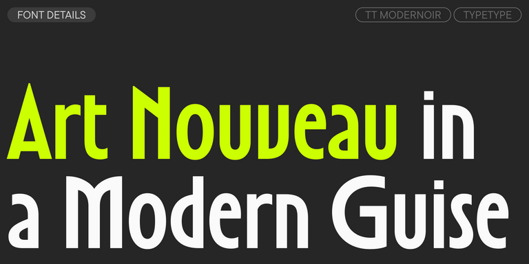
TT Modernoir is a display sans serif with dynamic proportions. Fluid lines and delicate Art Nouveau forms in this typeface blend seamlessly with the rhythmic flow and improvisational freedom of jazz.

4 font styles

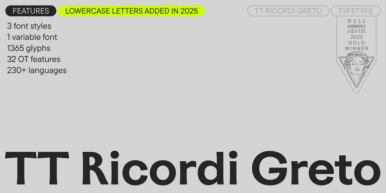
TT Ricordi Greto is an experimental project, inspired by a floor plaque dating from 1423 found in the Basilica di Santa Croce, Florence.

New
TT Gertika Regular
4 font styles

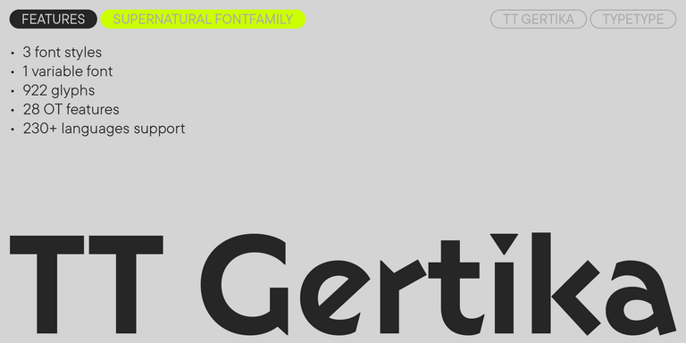
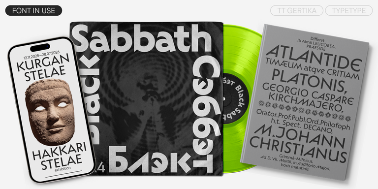
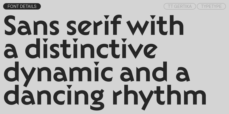
TT Gertika is a geometric sans serif with a dynamic character and a dancing rhythm. This font`s idea originates from the lettering featured on an American poster from the late 1930s.

New
TT Biersal Upright
6 font styles

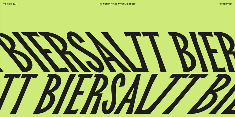
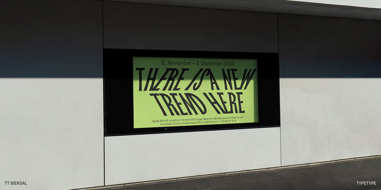
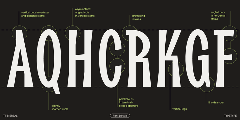
TT Biersal is a display sans serif with a free-spirited, playful, and adventurous nature. The concept of this font was sparked by a German poster from the early 1930s.

New
TT Paplane Regular
3 font styles

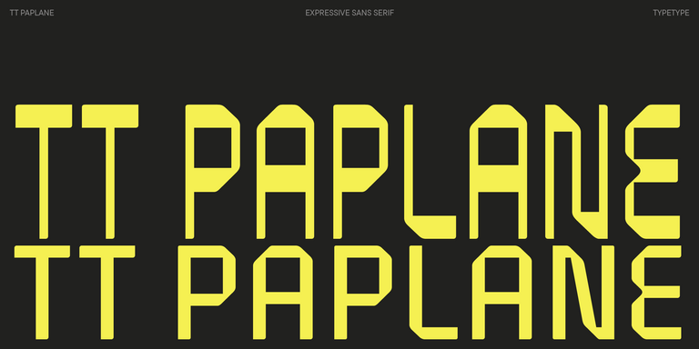
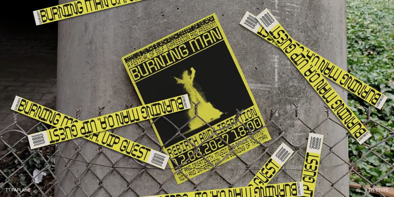
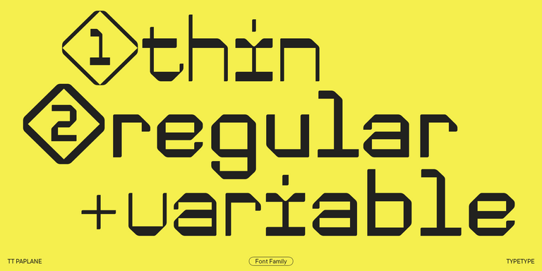
TT Paplane is a squared-looking display sans serif.

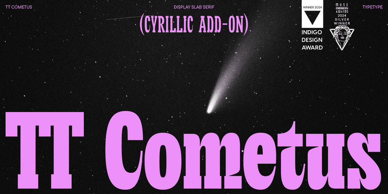
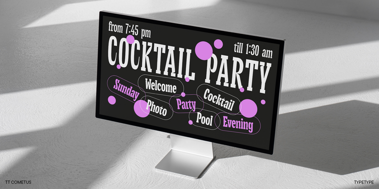
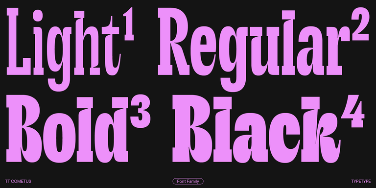
TT Cometus Regular
5 font styles

TT Cometus is an expressive typeface that captivates from the first time.

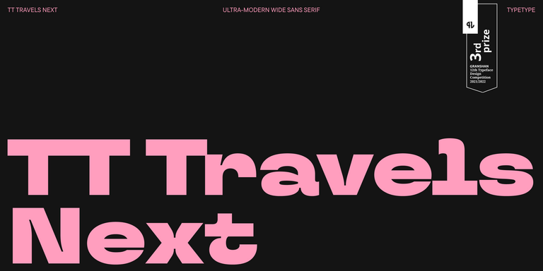
TT Travels Next Regular
21 font styles

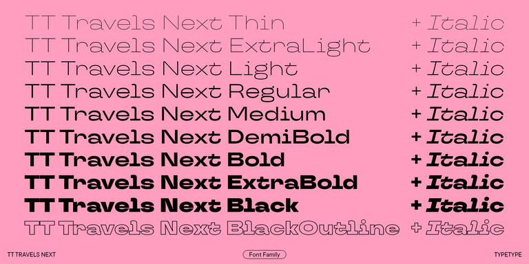
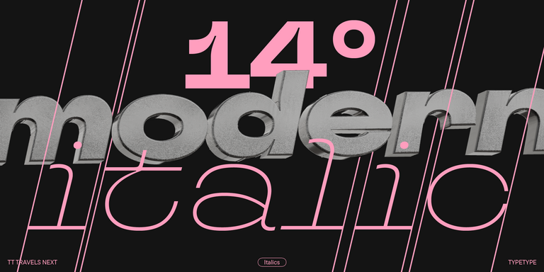
TT Travels Next is a very trendy and modern wide display sans serif for use in different sets, be they print or web.

New
TT Travels Text Regular
21 font styles

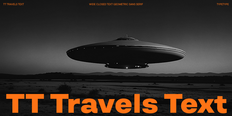
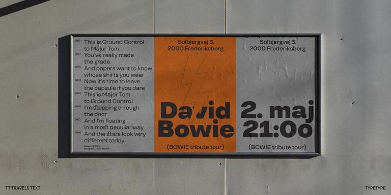
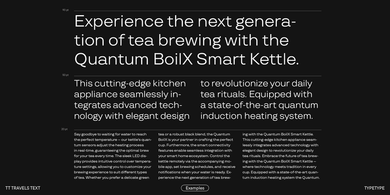
TT Travels Text is a geometric grotesque with wide proportions and specific shapes of circles and fillets, which includes two stylistic sets with completely different natures.

TT Globs Regular
4 font styles

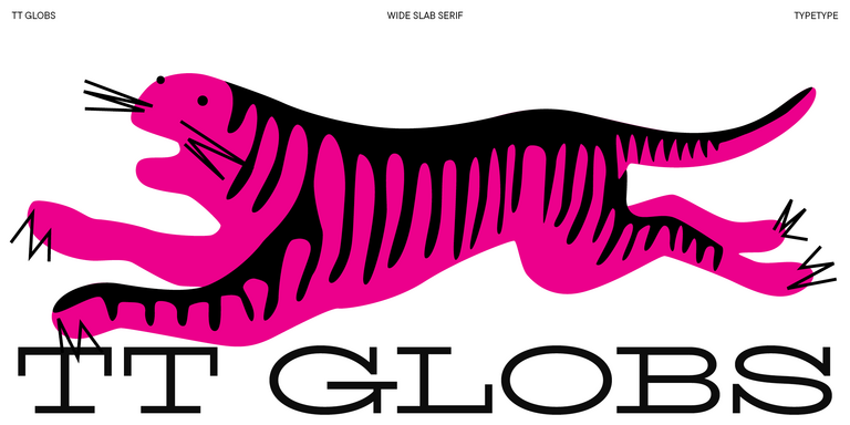
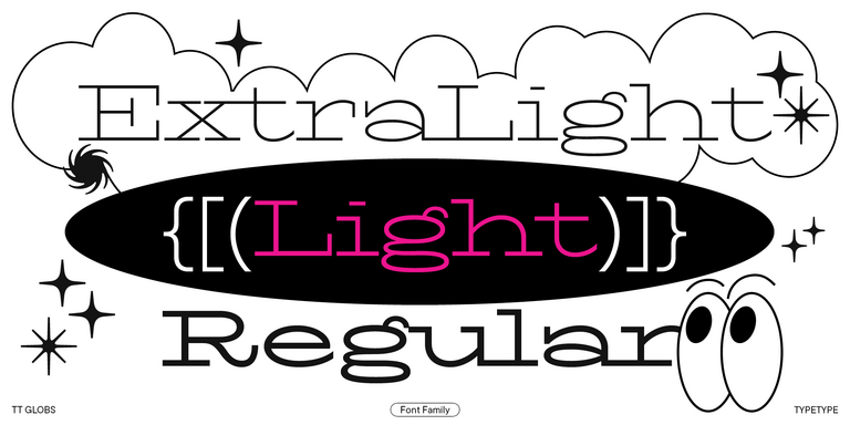
TT Globs is the first font from the TypeType Starter Kit line.

TT Ricks Regular
4 font styles

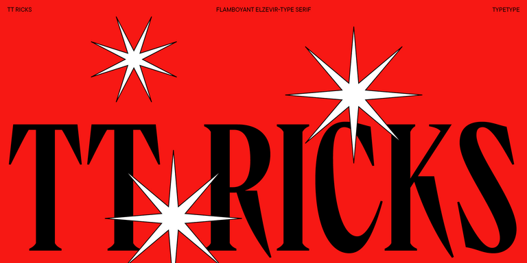
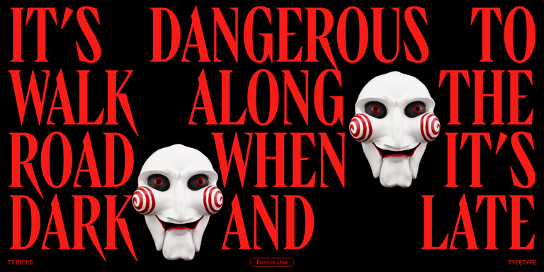
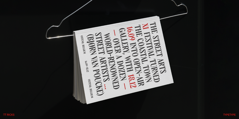
TT Ricks is a flamboyant elzevir-type serif, for which the words “cute” or “calm” are not a fitting definition.

New
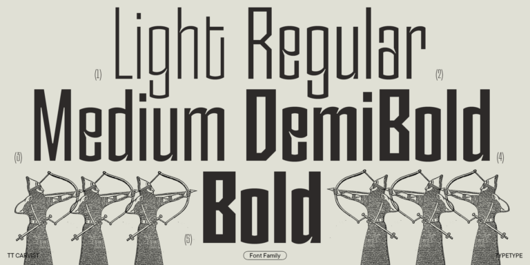
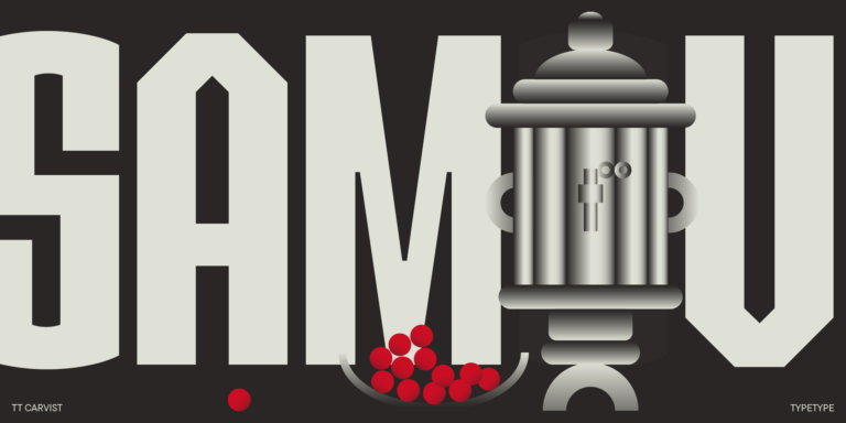
TT Carvist Regular
6 font styles

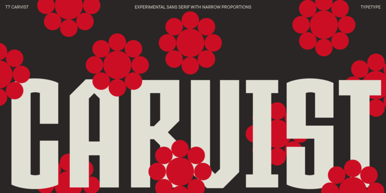
TT Carvist—peculiar, playful, and courageous—this font does an excellent job of grabbing attention!

What Are Experimental Fonts?

They are typefaces that step away from conventional letterform rules to create expressive, attention-grabbing visuals. Designers may break strokes apart, distort proportions, mix construction principles or build letters from unusual modules. The goal is character and visual impact, so these designs are usually judged as much by feeling as by readability.

Which Industries Use Experimental Typefaces Most Often?

Expressive type is common in fashion, music and entertainment, where visual identity changes quickly and needs to stand out. Advertising, art and culture, gaming, tech startups and creative agencies also rely on it for campaigns, covers, event graphics and digital content that must capture attention within seconds.

Can Experimental Fonts Be Used for Branding?

Yes. An unconventional typeface can give a brand a memorable, distinctive voice, especially in logos, headlines and key visual accents. It is most effective alongside a readable secondary family that handles longer text. Test legibility across print, screens and small sizes before finalizing the identity.

What Should Be Considered When Pairing Experimental Typefaces?

Let one expressive voice lead and give it a calm partner. Experimental Fonts usually pair well with a neutral sans or serif for body copy, captions and navigation. Aim for clear contrast in character rather than two competing personalities, and limit the number of unconventional faces in a single layout.

Can You Buy TypeType Fonts for Commercial Projects?

Yes. TypeType offers trial versions so you can test a typeface in your own work before deciding. For commercial use, leave a request for a suitable license type through the website. License details can be clarified with the client care team via the contact form.

Contact us!