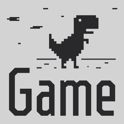
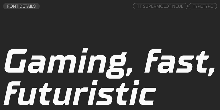
Typography in gaming is more than just letters; it enhances the atmosphere, intensifies the experience, and makes gameplay even more immersive. Gaming fonts are specially designed to bring players into virtual worlds, balancing expressiveness with usability. Their styles vary—from futuristic symbols perfect for sci-fi adventures to handwritten, textured fonts ideal for fantasy settings. In the TypeType collection, you’ll find modern solutions where every detail is optimized for use in interfaces, logos, and in-game text, ensuring that typography becomes a key component of storytelling.
Great visuals need the right typeface. Before players interact with mechanics, characters, or environments, they encounter a title, interface, loading screen, or promotional artwork. The style of lettering helps establish expectations and creates an emotional connection from the very first impression.
A carefully selected typeface can make an interface feel modern, a fantasy adventure feel epic, or a competitive title feel energetic and dynamic. Well-designed game fonts strengthen the atmosphere, help make a title more memorable, and support the overall creative direction of a project. The best results come from designs where form and function work together instead of competing with each other.
What Makes a Great Typeface for Digital Entertainment
Not every display style belongs in entertainment-driven design. Strong visual character should never come at the expense of usability. Menus, inventory systems, tutorials, and dialogue windows all require clear and comfortable reading.
Good gaming text needs to remain legible, scalable, and consistent across different uses. Players should be able to navigate information quickly without distraction, while still experiencing a cohesive visual environment.
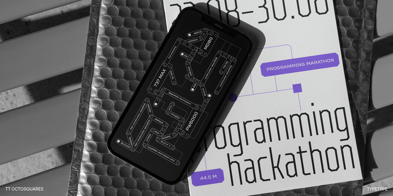
In practice, many teams prefer fonts that are versatile enough for UI, branding, thumbnails, motion graphics, and editorial use. If a typeface feels distinctive but still easy to adapt, it can become a reliable part of a larger design system.
Popular Styles of Gaming Fonts
Every genre has its own visual language, and each typeface is designed to support a particular atmosphere and visual direction.
Futuristic designs often feature geometric shapes, sharp angles, and clean lines that work well in sci-fi and cyberpunk projects. Fantasy worlds may rely on expressive details inspired by historical lettering, while horror titles frequently feature dramatic shapes that reinforce suspense and unease.
Retro styles create a sense of nostalgia, while horror-oriented lettering adds suspense and unease. Competitive and sports-related projects frequently rely on bold, energetic forms that communicate movement and intensity.
The point is that every project aims to create a unique experience, so there is no universal solution.
TypeType’s Collection of Gamer Fonts
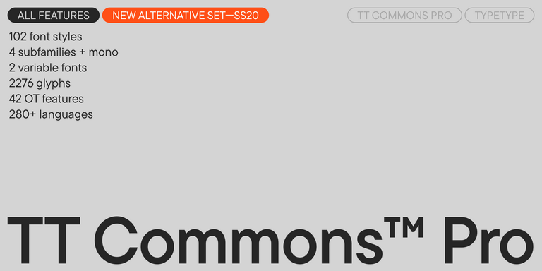
From indie projects to large-scale entertainment brands, typography helps define the visual language of the experience. TypeType’s library includes typefaces that resonate with the world of interactive entertainment. Our gaming typography delivers the clarity, attitude, and technical sophistication that modern projects demand.
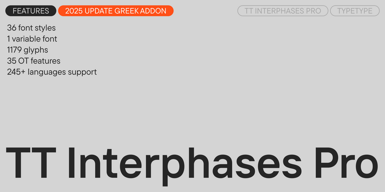
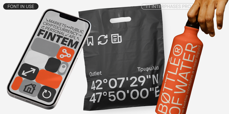
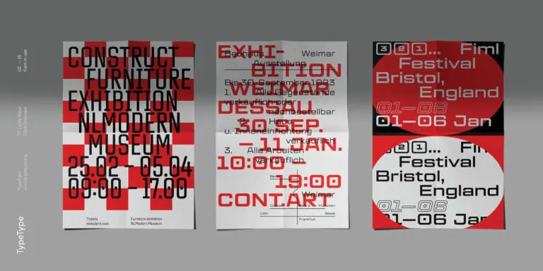
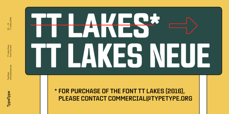
TT Commons™ Pro’s organic forms feel right at home in cozy life sims and indie darlings. TT Interphases handles dense UI text with ease, and families like TT Lakes offer a range of widths for HUD elements that need to fit tight spaces.
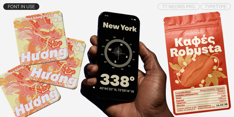
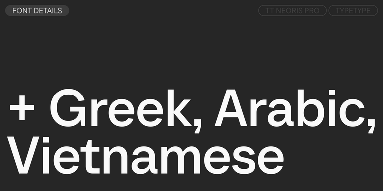
Each family supports an extensive character set — Cyrillic, Greek, and Latin — making global launches effortless. OpenType features like tabular figures and alternate glyphs give you extra control for scoreboards and logo lockups. Trial versions let you test everything in-engine before you commit.
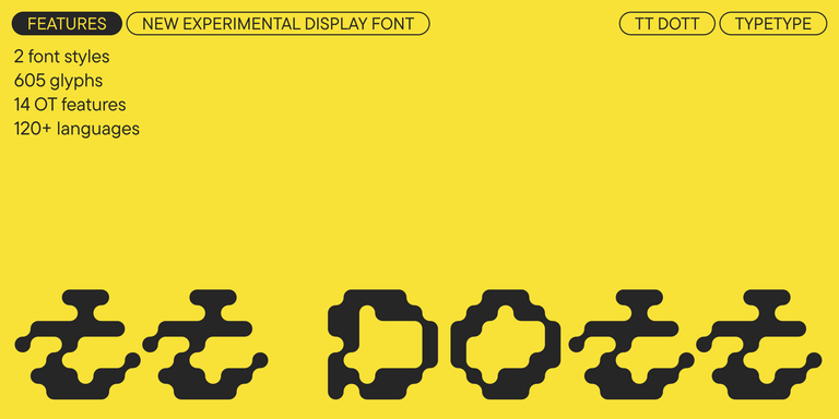
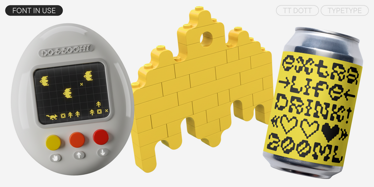
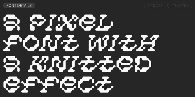
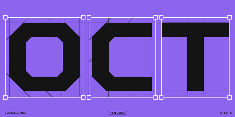
TT Dott is an experimental pixel grotesque where a circle is used as the base for the pixel. It is a fluid and unusual display font, evoking associations with embroidery and techno parties all at once.
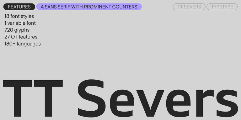
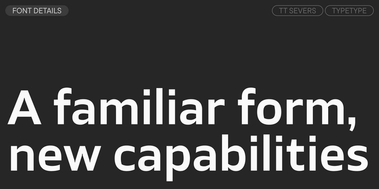
TT Severs is a geometric sans serif with emphasized elements of internal brackets. The main visual feature of TT Severs is the unusual form of internal ovals.
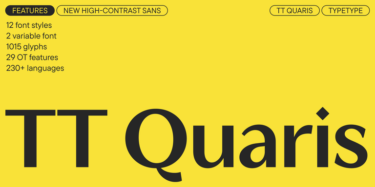
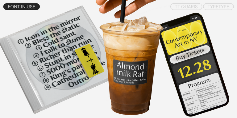
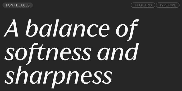
TT Quaris is an exquisite, modern high-contrast sans whose design balances between soft and sharp. The glyph shapes in the font are fluid and tend towards roundness, yet there are also sharp elements.
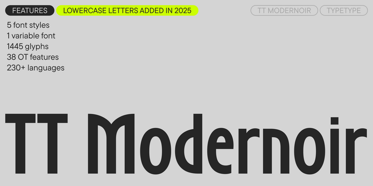
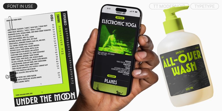
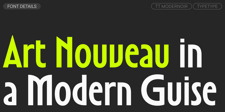
TT Modernoir is a display sans serif with dynamic proportions. Fluid lines and delicate Art Nouveau forms in this typeface blend seamlessly with the rhythmic flow and improvisational freedom of jazz.
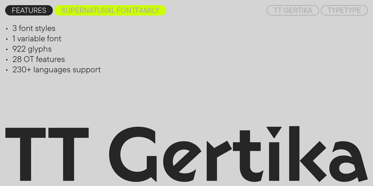
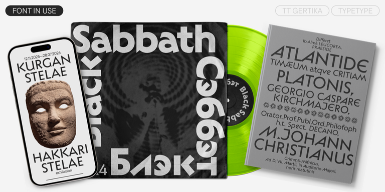
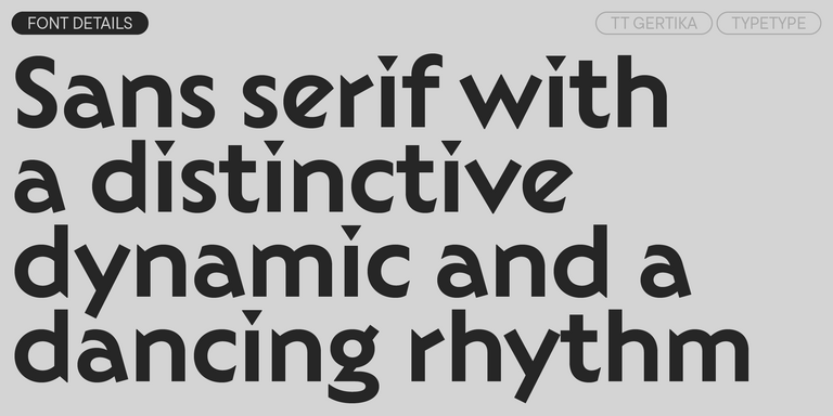
TT Gertika is a geometric sans serif with a dynamic character and a dancing rhythm. This font`s idea originates from the lettering featured on an American poster from the late 1930s.
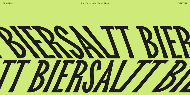
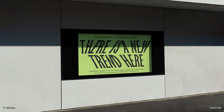
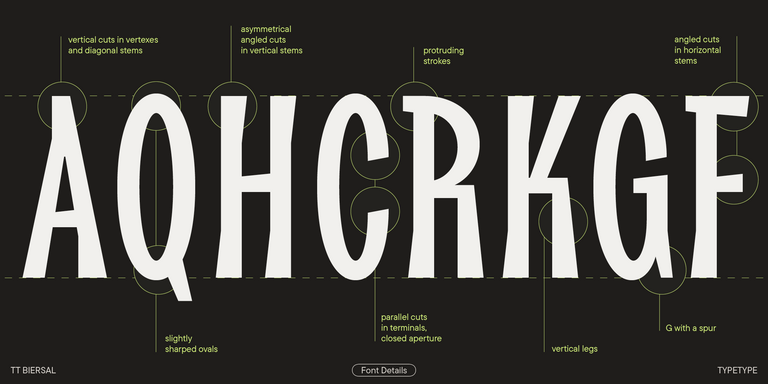
TT Biersal is a display sans serif with a free-spirited, playful, and adventurous nature. The concept of this font was sparked by a German poster from the early 1930s.
Choose a typeface that matches the genre, atmosphere, and visual identity of your project. The typeface should support the atmosphere you want to create while remaining clear and functional in interfaces and other on-screen elements. It is also important to evaluate language support, available styles, and technical features. Before making a final decision, test the typeface in real-world scenarios to ensure it performs well across different screen sizes and applications.
Can I use one typeface for both promotional design and in-game text?
In many cases, yes. Many modern font families include multiple weights and styles, allowing them to work in logos, promotional materials, and interface elements alike. However, readability should always be tested carefully, especially for menus, dialogue, and other on-screen content.
Are gaming fonts only for video games?
Not at all. While these typefaces are often chosen for video game projects, they can also be effective in posters, event graphics, packaging, YouTube content, apparel, and digital marketing materials. These typefaces are suitable for a wide range of creative and commercial projects.
Are there licensing restrictions for commercial use?
Yes. Commercial use typically requires an appropriate license. The type of license you need depends on how the typeface will be used, whether in branding, websites, applications, marketing materials, or digital products. Always review the licensing terms before using a font in a commercial project.
Enter your email address and spin the sun to win up to 100% off or TypeType services
Giveaway rules:
Each user can only play once;
Each promo code is unique and can only be used once;
The promo code discount applies only to purchases up to $5,000 in the online store;
Please note that the "Font Renaming," "Your Logo in a Font," and "Basic Customization" services do not apply to previously purchased fonts and are only available for new orders;
If you win a service, our manager will contact you within three business days with the details.