TT Livret
Text Regular
32 font styles
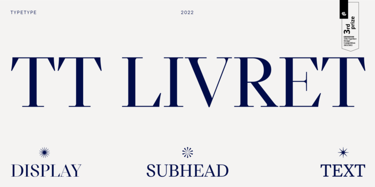
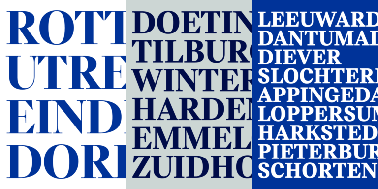
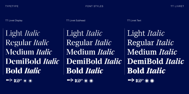
TT Livret is an elegant, modern and functional serif

If you are tired of overused typefaces and are looking for fonts similar to Maiandra GD, check out our best free-to-try Maiandra GD alternatives, which have similar characteristics as well as new, unique design features. Some of the fonts belong to the same type category, and others are suitable for the same tasks or have similar traits but stand out for their distinct details or proportions.
At TypeType, you’ll find cutting-edge fonts like Maiandra GD and even better: here are some stunning and not-so-ubiquitous Maiandra GD alternatives. Use this list of highest-quality Maiandra GD-like fonts as you prefer. Our list provides a broader range of options for choosing the best font match for your project and refreshing your designs. All fonts featured in this collection are available in multiple formats and at affordable prices, so you can find one to fit your every need!
Find a great Maiandra GD replacement font and try to recreate a similar mood and capture the feeling you aim for by using it in your designs. Each font presented on this page is a twin of the Maiandra GD font, practically identical to it.
TT Livret is an elegant, modern and functional serif


TT Runs is a very stylish and charismatic display sans serif with irregular proportions of some characters.


TT Bluescreens is a upgraded geometric sans serif with narrow proportions
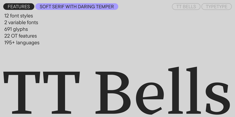

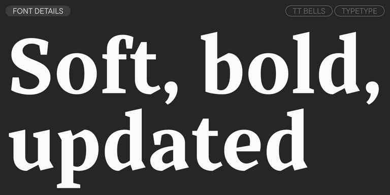
TT Bells combines the elegant softness of Antiqua with a complex and daring temper reflected in straight stroke terminals and arrowheaded serifs. The typeface is based on the broad nib, which creates these hallmark terminals and serifs.


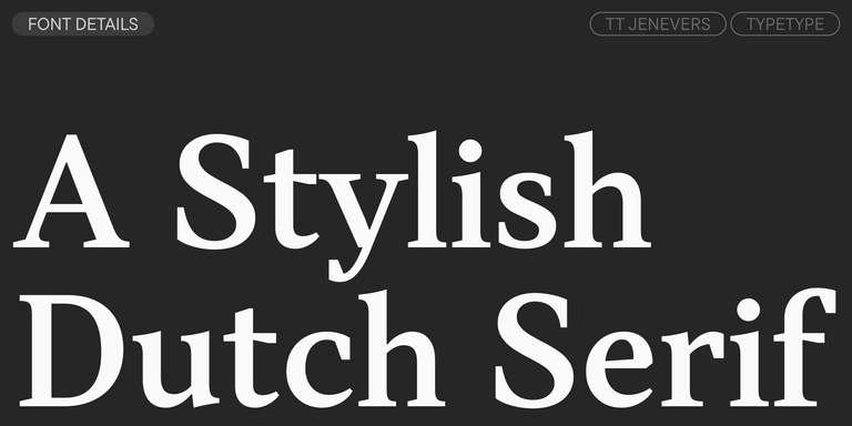
TT Jenevers is a modern serif with a Dutch flavor. The font family features the characteristic details peculiar to Dutch serifs—these are the asymmetrical shape of serifs and an irregular slant of ovals.


TT Regins is a Scottish modern serif. Striking contrast and sharp triangular serifs give this font a stern and commanding character, while refined forms, enlarged lowercase letters, and slightly condensed, static proportions add grace to its design.
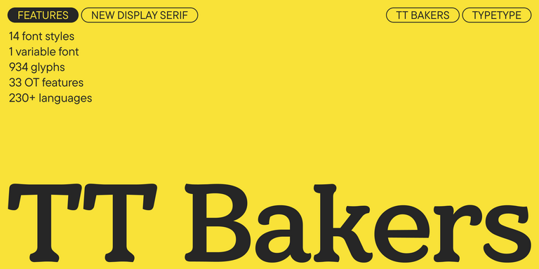
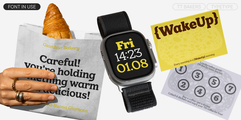
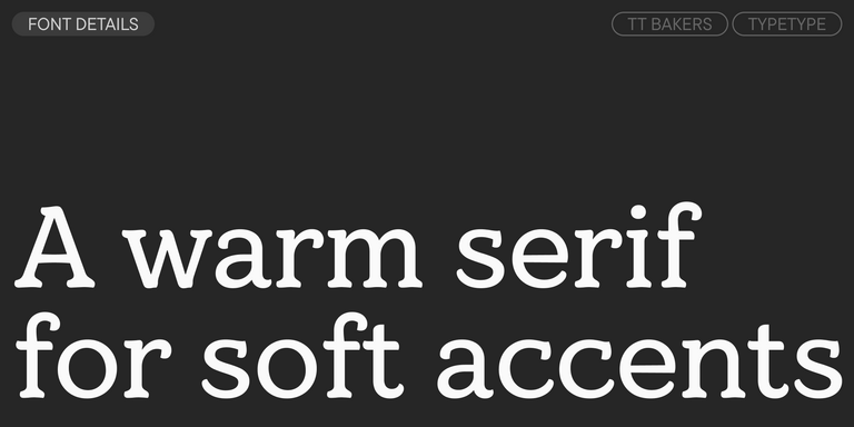
TT Bakers is a fluid serif with a gentle and lively character. This font is like freshly baked goods: it`s warm and soft, especially in its bolder weights.
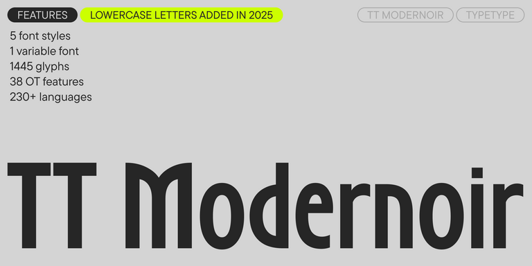
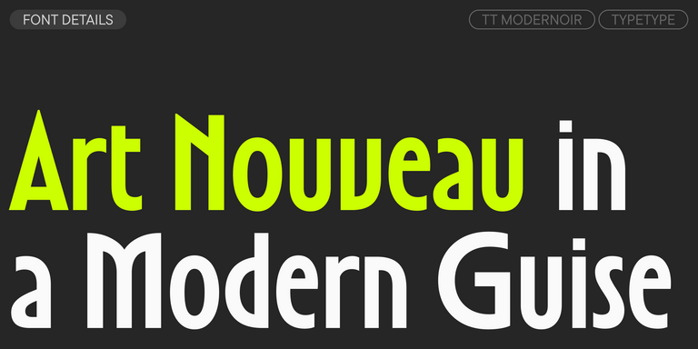
TT Modernoir is a display sans serif with dynamic proportions. Fluid lines and delicate Art Nouveau forms in this typeface blend seamlessly with the rhythmic flow and improvisational freedom of jazz.
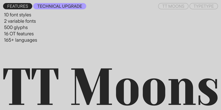
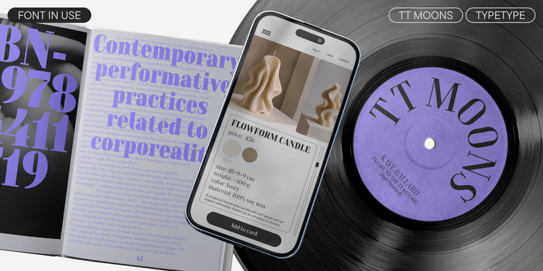
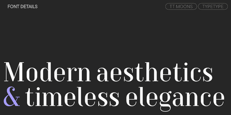
TT Moons is a slim and contrast serif. This font family works especially smart in classic design themes. TT Moons is a typeface of the glyptal modern typeface.
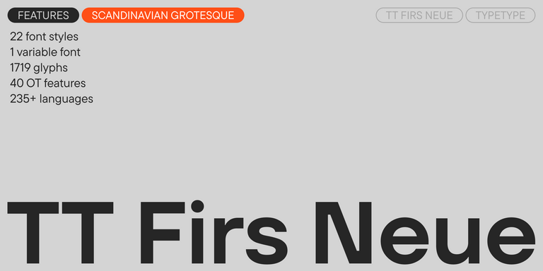
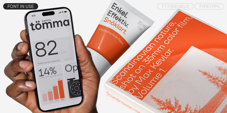
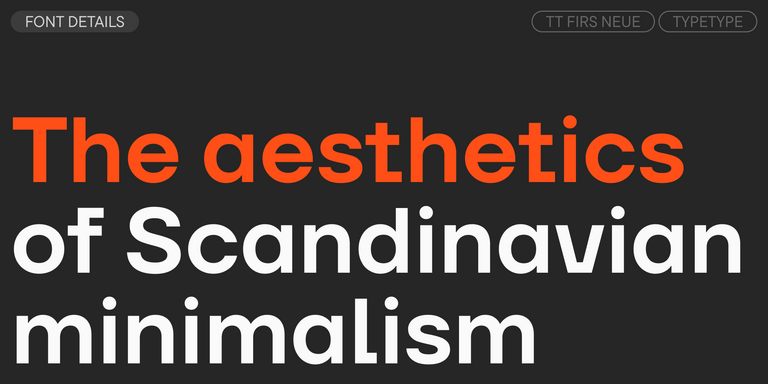
TT Firs Neue is a contemporary reincarnation of the good old TT Firs sans serif.
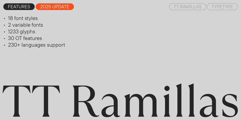
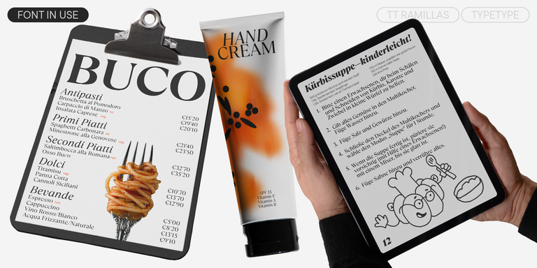
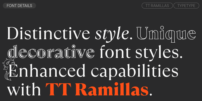
TT Ramillas is a contemporary serif with editorial versatility. It features decorative styles and ornamental initials with floral motifs.
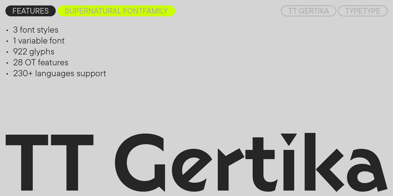
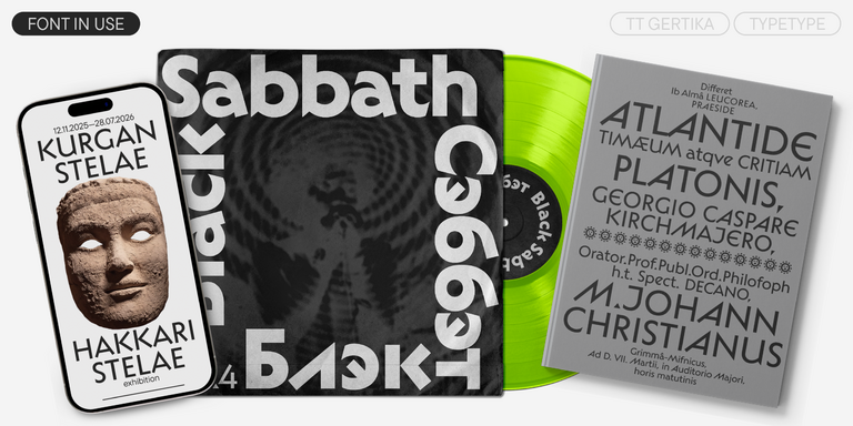
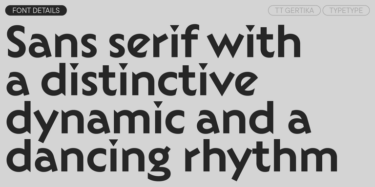
TT Gertika is a geometric sans serif with a dynamic character and a dancing rhythm. This font`s idea originates from the lettering featured on an American poster from the late 1930s.

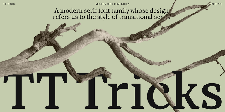
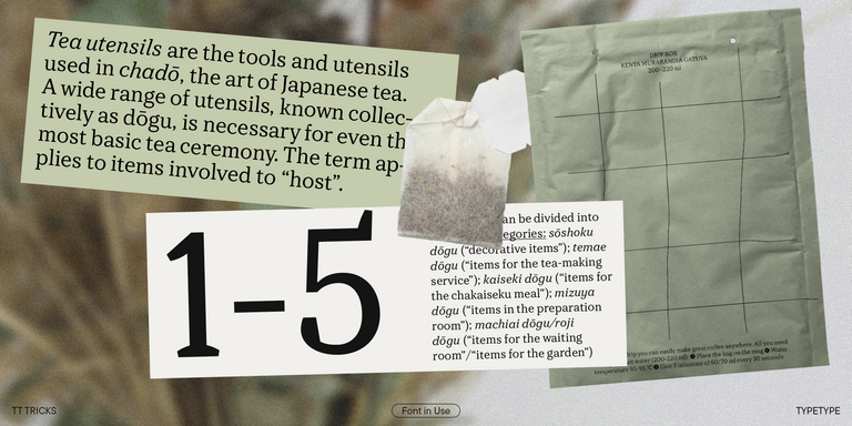
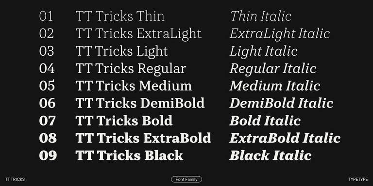
TT Tricks is a modern text serif with a design reflecting the style of Transitional serifs. This font has a calm, elegant, and moderately stern character.
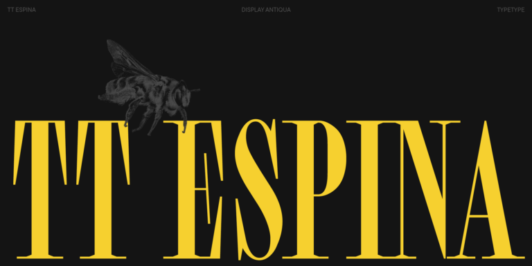
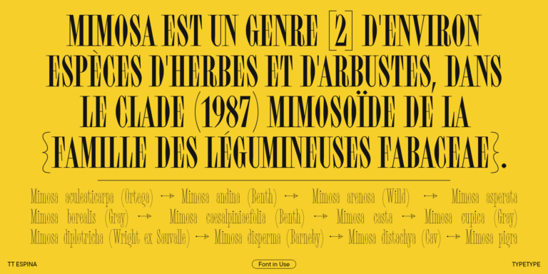
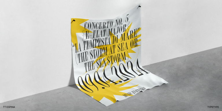
TT Espina is a display antiqua with expressive serifs
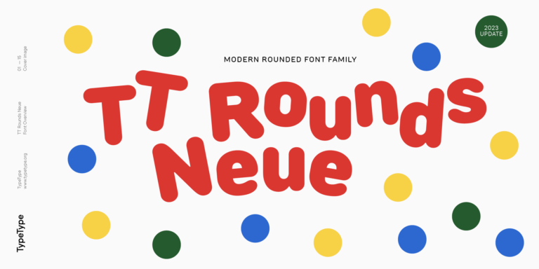
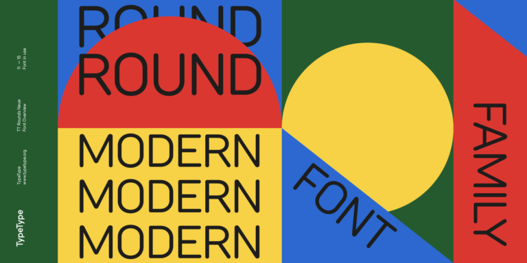
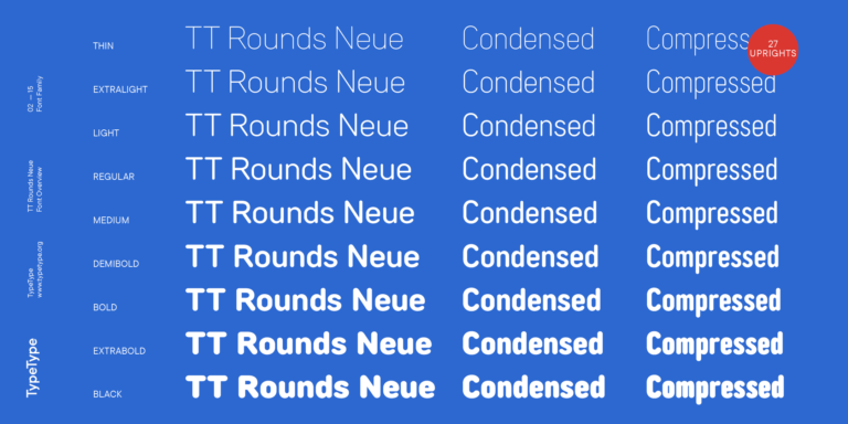
TT Rounds Neue soft, friendly, rounded sans serif fontfamily
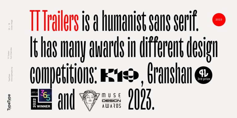
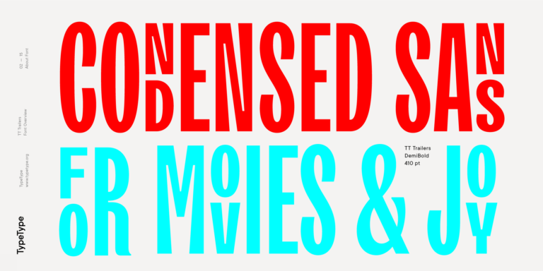
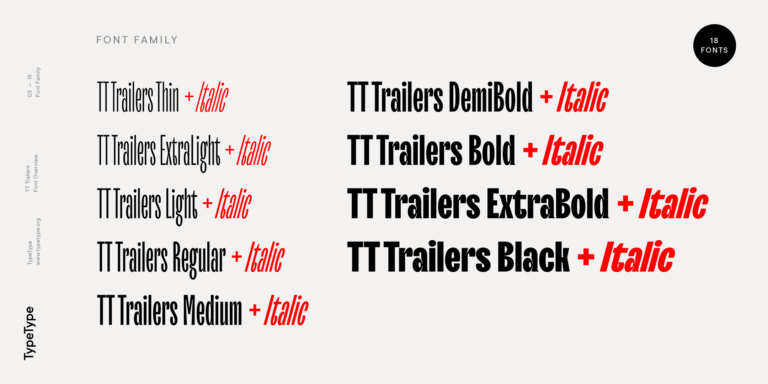
The starting point of the TT Trailers project was the idea to develop a new generation of narrow typefaces for use in movie credits and posters.

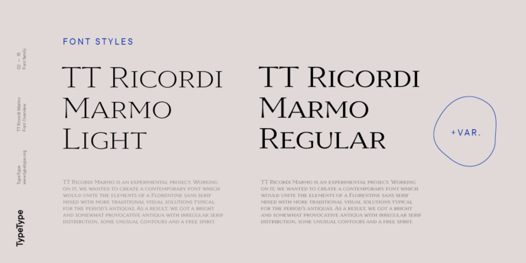
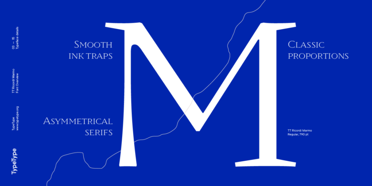
TT Ricordi Marmo is an original experimental project inspired by inscriptions at Basilica di Santa Croce in Florence.

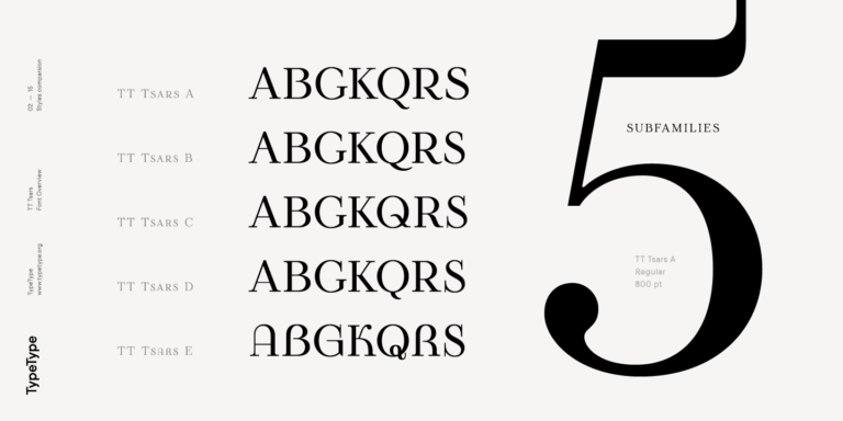
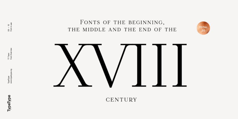
The TT Tsars font family is a collection of serif display fonts that are stylized to resemble the fonts of the beginning, the middle, and the end of the XVIII century.
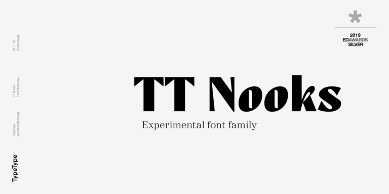
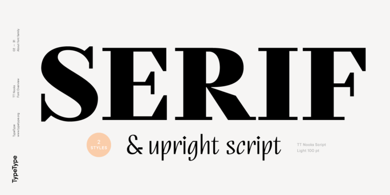
TT Nooks is an experimental project comprised of a high-contrast egocentric serif and an upright humanist italic.