top_banner_ttchocolates0826
Type foundryFonts & StylesAdvertising

Advertising Fonts

Advertising fonts shape the way audiences perceive a brand, product, or message. The right typeface creates immediate visual impact, supports recognition across touchpoints, and helps communication feel consistent and intentional. Explore TypeType’s collection of typefaces crafted for use in campaigns, branding, digital media, and print advertising.

Purpose: Advertising

What Makes a Typeface Effective in Advertising?

Advertising typography has to communicate quickly. Whether someone sees a billboard for several seconds or scrolls past a sponsored post on a phone, the message needs to be clear enough to understand and distinctive enough to remember. This makes readability, character, and visual hierarchy equally important.

When choosing fonts for advertising, designers often look at how well a typeface performs at different sizes, how clearly its characters can be distinguished, and whether its personality supports the brand. A strong headline style may create an immediate focal point, while a more restrained family can keep product details, prices, or calls to action easy to scan.

Typography also shapes first impressions. Rounded forms may feel approachable, precise geometry can suggest technology or efficiency, and expressive details can make a campaign feel more distinctive. The right solution supports the message rather than competing with it.

Advertising Fonts for Different Campaign Goals

The right typographic approach depends on what a campaign needs people to notice, feel, and do.

Sales-focused communication usually benefits from a strong hierarchy. Headlines, offers, prices, and calls to action should be easy to distinguish quickly. A product launch may require more distinctive lettering to establish a recognizable visual identity, while an image campaign can give typography a more expressive role in building mood and brand perception.

Social media creates another set of priorities. Text often appears for only a moment and on relatively small screens, so clarity matters even when the visual direction is bold.

This is why there is no single category of fonts for advertising that works for every campaign. Some projects require an attention-grabbing display face; others need a flexible family capable of handling headlines, captions, product information, and multiple formats while maintaining one consistent visual language.

Best Fonts for Ads: From Print to Digital

Different media create very different conditions for reading. The best fonts for ads are therefore the ones that fit both the creative idea and the environment in which the message will appear.

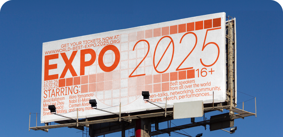
Outdoor advertising is viewed from a distance and often in motion, making strong proportions and immediate recognition especially important. Print materials allow more detail because readers can spend longer with the composition. Social posts and display banners require clear lettering at small sizes and layouts that remain effective across different screen dimensions.

Email campaigns need dependable hierarchy for headings, offers, and supporting copy, while video introduces movement, timing, and changing backgrounds. A title that works perfectly on a static poster may need different spacing, weight, or scale when animated.

Rather than evaluating a typeface only in a specimen, designers should test it in the actual format and at realistic viewing sizes.

How to Choose the Right Typeface for Your Campaign

Start with the audience and the communication goal. A campaign for a financial service, fashion label, technology product, or children’s brand may require completely different levels of neutrality, authority, energy, or expression.

The best fonts for advertising also need enough flexibility for the campaign system. Check the available weights and styles if typography will appear across headlines, supporting copy, promotional graphics, banners, and social content. For international campaigns, confirm that all required languages are supported.

Readability should be evaluated at the smallest and largest expected sizes, particularly when one campaign has to adapt from mobile screens to outdoor media. Licensing is another practical consideration: the usage rights need to cover the formats in which the campaign will run.

Finally, test real copy in actual layouts. A design that looks compelling in isolation may behave very differently next to photography, product imagery, buttons, or motion graphics.

TypeType Collection — Typefaces Built for Advertising

TypeType’s collection includes advertising fonts with different levels of personality and versatility, allowing designers to choose according to the campaign rather than relying on one visual formula.

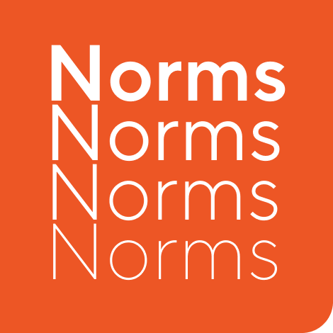
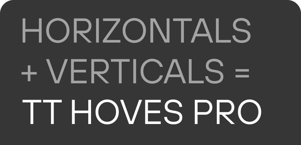
TT Norms® Pro is a practical option for systems that need a clean, adaptable typographic foundation across multiple materials. TT Hoves Pro combines versatility with a recognizable contemporary character, making it useful when a campaign needs both functional text and stronger headlines.

TT Fors offers a more distinctive geometric direction for modern branding and communication, while TT Interphases Pro is particularly suited to projects where digital readability and interface use are important alongside promotional graphics.

When comparing these families, consider not only individual headlines but the entire campaign ecosystem: landing pages, social media, banners, presentations, video, and supporting materials. Available styles, language coverage, and appropriate commercial licensing can all become important when one visual concept has to scale across channels and markets.

  • The quick brown fox jumps over a lazy dog.
  • Pack my box with five dozen liquor jugs.
  • Sphinx of black quartz, judge my vow
  • 0123456789 !?.,:;—–()[]{}<> “quotes” ‘apostrophe’ @#%&*_+=/\| № $ € £ ₽ +−×÷=≠≤≥ … % © ® ™
  • Aa Bb Cc Dd Ee Ff Gg Hh Ii Jj Kk Ll Mm Nn Oo Pp Qq Rr Ss Tt Uu Vv Ww Xx Yy Zz
Leading
1.1
Tracking
0px
Bestseller
TT Norms® Pro Regular
104 font styles

The bestseller TT Norms® Pro—a geometric sans serif, trouble-free workhorse

Bestseller
104 font styles

TT Commons™ Pro is a completely redesigned version of the well-established classic font family TT Commons.

Bestseller
TT Hoves Pro Regular
96 font styles

TT Hoves Pro is a versatile sans-serif with a recognizable geometry

24 font styles

We continue to expand the line of the studio's main bestseller TT Norms® Pro!

TT Livret Text Regular
32 font styles

TT Livret is an elegant, modern and functional serif

TT Nooks Serif Regular
8 font styles

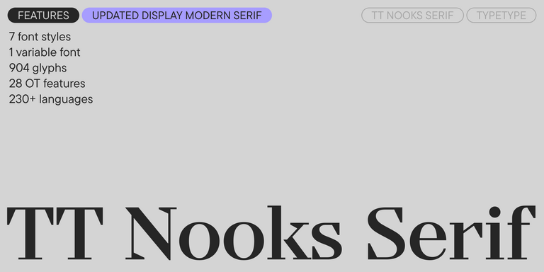
TT Nooks Serif is a display modern serif with a slight touch of egocentricity. It has a sharp and firm, yet elegant and stately character.

TT Chocolates Regular
57 font styles

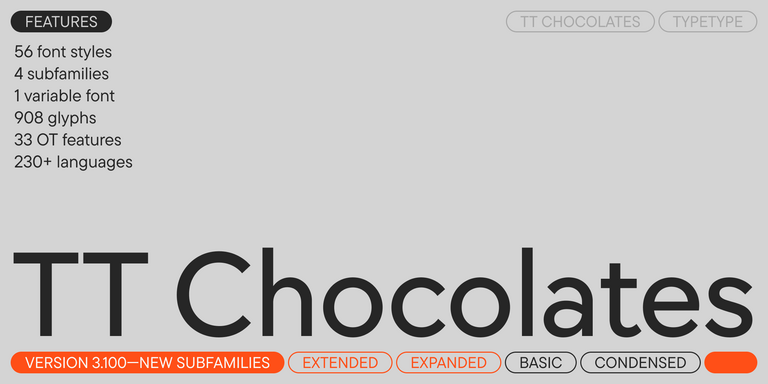
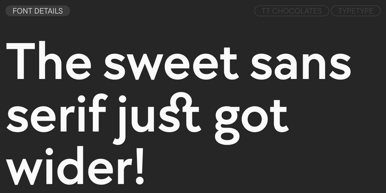
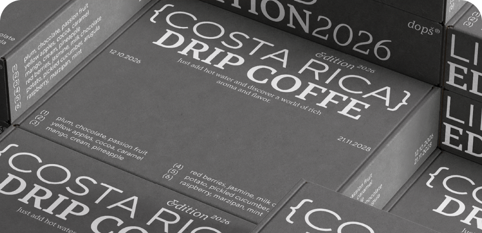
TT Chocolates typeface consists of 14 fonts: 7 weights and 7 obliques. Due to the extended language support and the introduction of useful features.

New
TT Nooks Script Regular
8 font styles

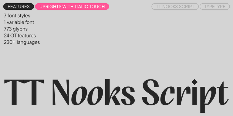
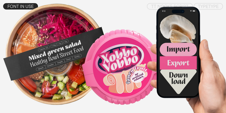
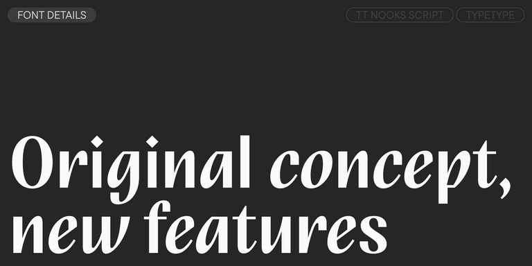
TT Nooks Script features a unique design that has no direct analogs.

New
TT Qurdisma Regular
1 font style

TT Qurdisma is a narrow and dense decorative font reminiscent of a whimsical plant. The winding, smooth contours give rise to a botanical ornament.
New
TT Dott Solid
2 font styles

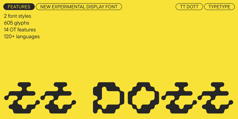
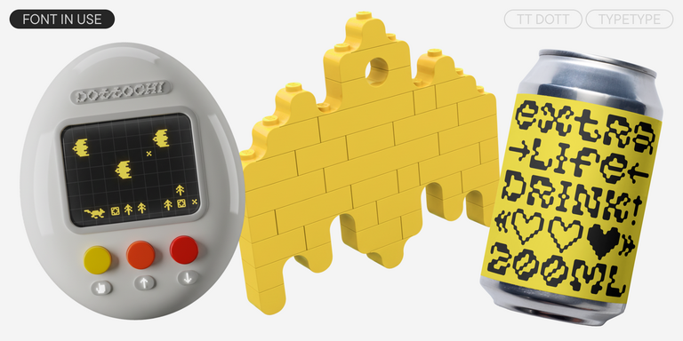
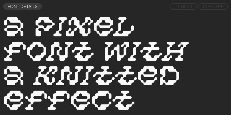
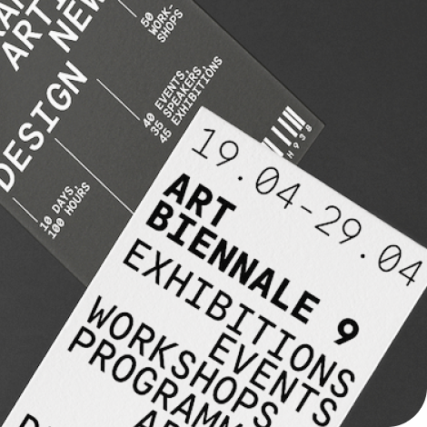
TT Dott is an experimental pixel grotesque where a circle is used as the base for the pixel. It is a fluid and unusual display font, evoking associations with embroidery and techno parties all at once.

Bestseller
TT Neoris Pro Regular
21 font styles

TT Neoris is an elegant Neo-Grotesque with unlimited potential and a font that encompasses all modern requirements and user desires.

Bestseller
91 font styles

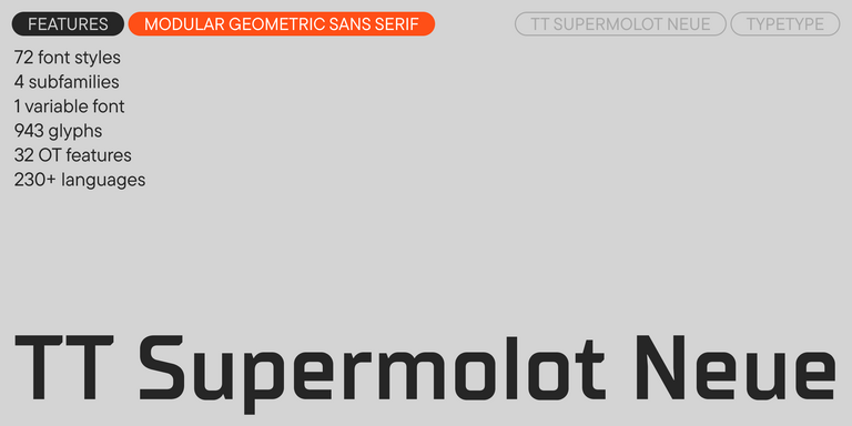
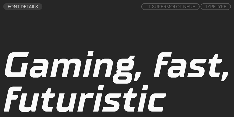
TT Supermolot Neue is a redesigned, extended, and greatly enhanced reincarnation of the popular font family

TT Rationalist Regular
22 font styles

TT Rationalist is functional and neutral slab serif typeface.

21 font styles

TT Commons™ Classic is a universal sans serif with a minimal contrast of strokes, a closed aperture, and geometric shapes of characters.

TT Runs Regular
19 font styles

TT Runs is a very stylish and charismatic display sans serif with irregular proportions of some characters.

91 font styles

TT Bluescreens is a upgraded geometric sans serif with narrow proportions

TT Bells Regular
14 font styles

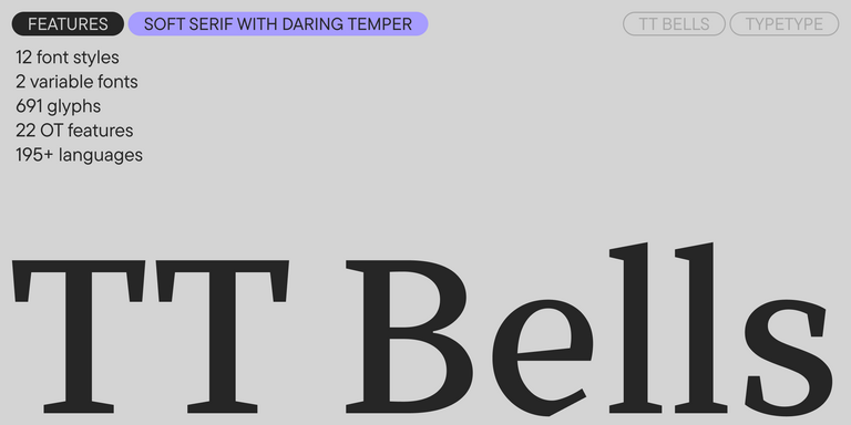
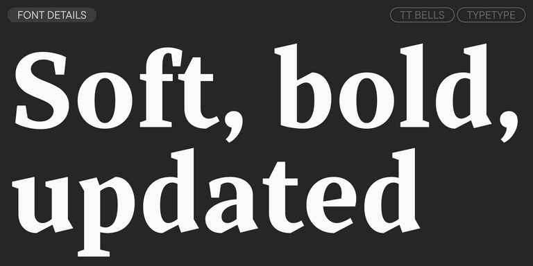
TT Bells combines the elegant softness of Antiqua with a complex and daring temper reflected in straight stroke terminals and arrowheaded serifs. The typeface is based on the broad nib, which creates these hallmark terminals and serifs.

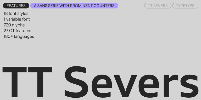
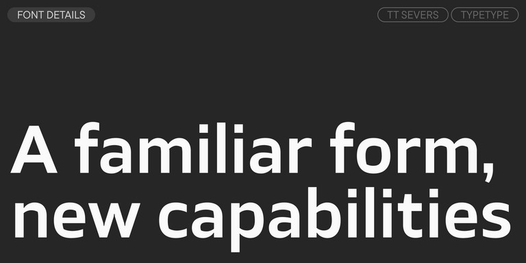
TT Severs Regular
19 font styles

TT Severs is a geometric sans serif with emphasized elements of internal brackets. The main visual feature of TT Severs is the unusual form of internal ovals.

New
TT Turns Regular
19 font styles

TT Turns is a striking geometric sans serif with expressive elements. This versatile font works exceptionally well for running text, while at large point sizes, it takes on a distinct display character.

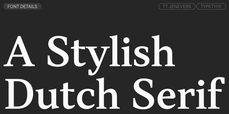
TT Jenevers Regular
14 font styles

TT Jenevers is a modern serif with a Dutch flavor. The font family features the characteristic details peculiar to Dutch serifs—these are the asymmetrical shape of serifs and an irregular slant of ovals.

New
TT Regins Display Light
38 font styles

TT Regins is a Scottish modern serif. Striking contrast and sharp triangular serifs give this font a stern and commanding character, while refined forms, enlarged lowercase letters, and slightly condensed, static proportions add grace to its design.

TT Frantz Variable
4 font styles

TT FRANTZ IS AN EXPERIMENTAL VARIABLE FONT, DISTINGUISHED BY ITS SLIMNESS AND LIGHTNESS. THE VARIATION IN THE FONT AFFECTS THE CHANGE IN THE HEIGHT OF THE MEAN LINE—BY MOVING THE AXIS ADJUSTMENT SLIDER YOU CAN EASILY RAISE OR LOWER THE MEAN LINE OF THE FONT.

New
TT Quaris Regular
14 font styles

TT Quaris is an exquisite, modern high-contrast sans whose design balances between soft and sharp. The glyph shapes in the font are fluid and tend towards roundness, yet there are also sharp elements.

6 font styles

TT Ricordi Allegria is a sleek and intelligent contemporary Florentine grotesque.

Contact us!