top_banner_bees0926
TT Bells
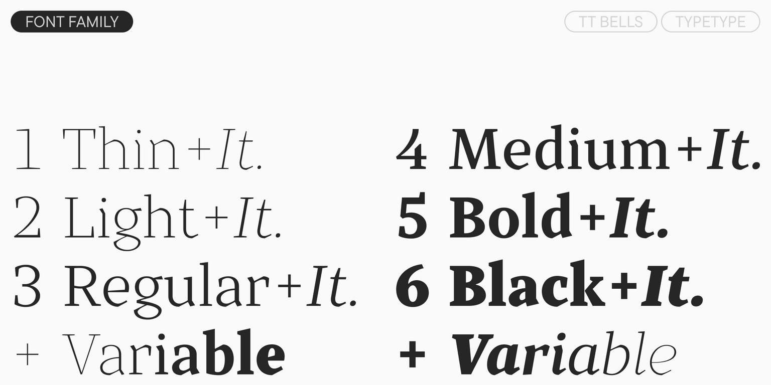
14 styles
Type foundryFonts & StylesSerifTT Bells

TT Bells

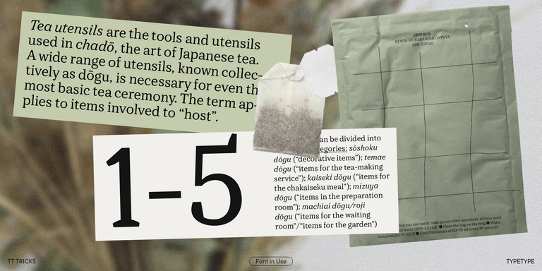
TT Bells is a serif balancing elegant curves with assertive character. It is suitable for both headlines and continuous text.

Valid until 6 Nov, 2026

Single style: from  Original price was: $47.99.Current price is: $19.20.
Full family: from  Original price was: $249.Current price is: $99.60. 14 styles

Buying Options

To purchase a font, first select the styles you need, then choose your licenses and proceed to checkout. To test the font in your project, download the free trial version.

Select at least one style before choosing licenses

To purchase a font, first select the styles you need, then choose your licenses and proceed to checkout. To test the font in your project, download the free trial version.

Valid until 6 Nov, 2026

Package offer:
per style $7.11
from  $99.60
14 styles
from  $99.60
from  $19.20
from  $19.20
from  $19.20
from  $19.20
from  $19.20
from  $19.20
from  $19.20
from  $19.20
from  $19.20
from  $19.20
from  $19.20
from  $19.20
from  $55.60
from  $55.60
Package offer:
per style $7.63
from  $91.60
12 styles
from  $91.60
from  $19.20
from  $19.20
from  $19.20
from  $19.20
from  $19.20
from  $19.20
from  $19.20
from  $19.20
from  $19.20
from  $19.20
from  $19.20
from  $19.20
Package offer:
per style $45.80
from  $91.60
2 styles
from  $91.60
from  $55.60
from  $55.60
On request
Perpetual
On request
On request
Perpetual
On request
On request
On request
On request
On request
On request
On request
On request
Perpetual
On request
On request
Perpetual
On request
On request
Perpetual
On request
On request
Perpetual
On request
On request
On request
On request
On request

Valid until 6 Nov, 2026

Your order:
Nothing selected yet

Select styles first, then licenses.

Questions about the font or licensing?

Testers

TT Bells
Size
Features
Turn on all

Elegant softness of antiqua with a daring temper

TT Bells
Size
Features
Turn on all

The family is based on broad nib, which was typically used for old style fonts and creates these hallmark terminals and serifs. We’ve taken the best from old style fonts created before the digital age and added sharp and contemporary geometric shapes to the traditional style. That’s how TT Bells refers the spectators and font enthusiasts to the origins and, at the same time, reminds us that we live in the digital era when geometry and screens rule the world.

TT Bells
Size
Features
Turn on all

When the font size is decreased, the boldness and sharpness of the font soften, it becomes more classic

TT Bells
Size
Features
Turn on all

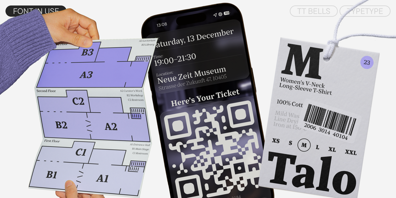
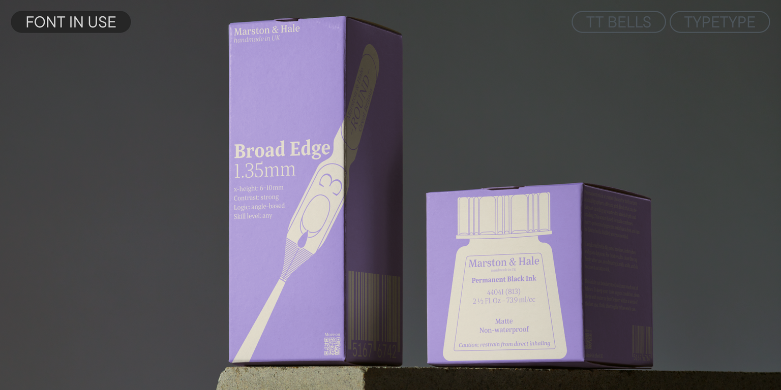
TT Bells is suited for different types of text

TT Bells
Size
Features
Turn on all
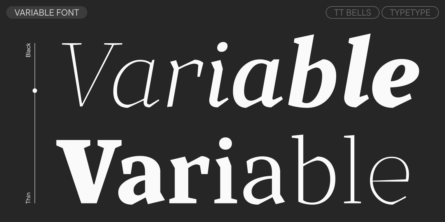
Variable axes
Weight

flask (1912)

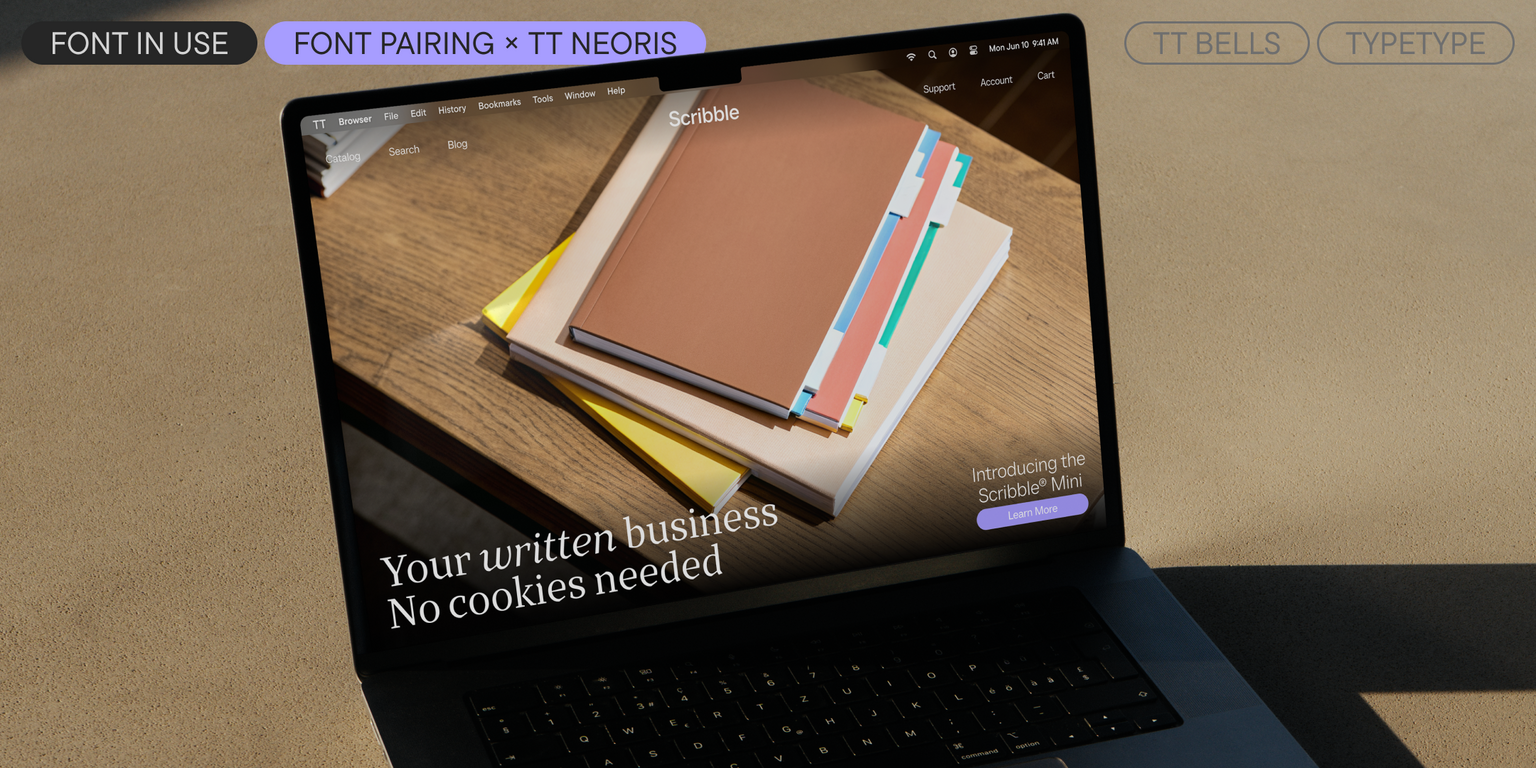
Ideal font pairs with TT Bells

Creating Contrast Without Breaking Visual Harmony

Contrast helps two typefaces take on different roles, but the strongest combinations are rarely built on difference alone. Successful font combinations often share proportions, rhythm, stroke character, or overall mood while differing enough in weight, construction, or style to create hierarchy. This balance makes headlines, supporting text, and secondary information easier to distinguish. The goal is to create clear visual separation without making the composition feel fragmented, accidental, or inconsistent with the wider design system.

Pairing Serif and Sans Serif Typefaces

Combining serif and sans serif designs is a reliable way to create contrast across branding, editorial, and digital projects. Good typeface pairing still depends on more than category. Compare x-height, proportions, weight, spacing, and visual tone to make sure the two designs feel connected. The strongest combinations clearly separate headlines from supporting text while maintaining a coherent overall character. This approach also gives designers flexibility when building hierarchy across websites, publications, presentations, packaging, and other communication formats.

How Type Scale Strengthens a Typeface Pairing

Contrast does not have to come entirely from different letterforms. Scale, weight, spacing, and line height can significantly change how two typefaces interact. A large display treatment may carry the main message, while a calmer style supports body copy or secondary information. Before rejecting a combination, test several hierarchy settings—the same two designs can feel much more compatible once their roles are clearly established. Adjusting scale can also help preserve consistency when the project needs both expressive headlines and highly functional supporting text

Description

About font family TT Bells
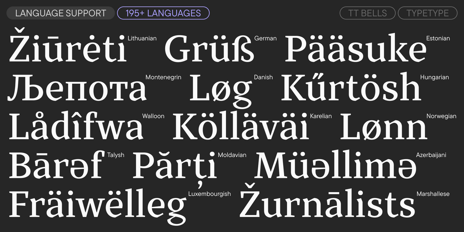
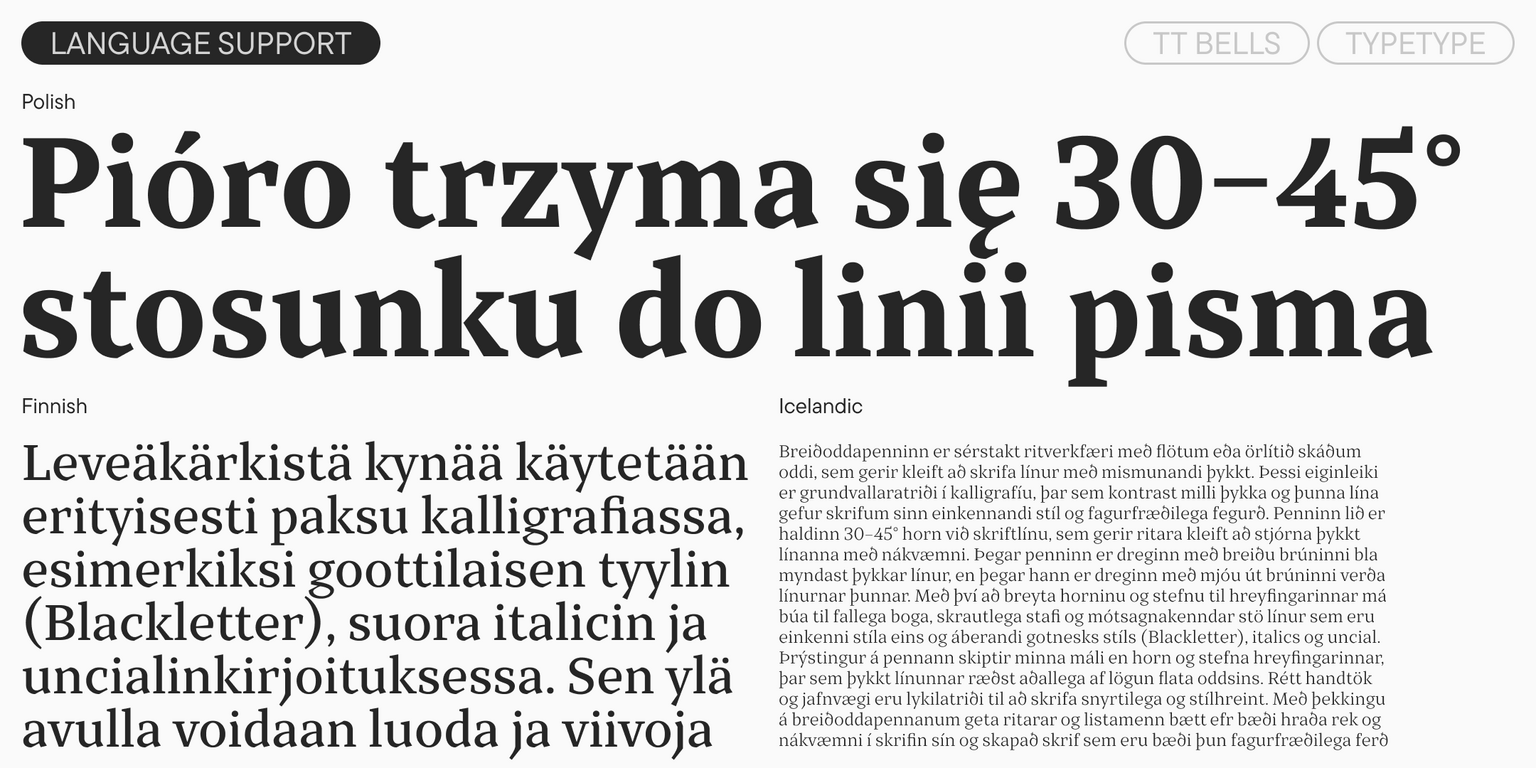
190+ Language support

Introducing TT Bells version 3.000!

We’ve updated the font by adding new styles, glyphs, features, and languages, and have also enhanced its technical components.

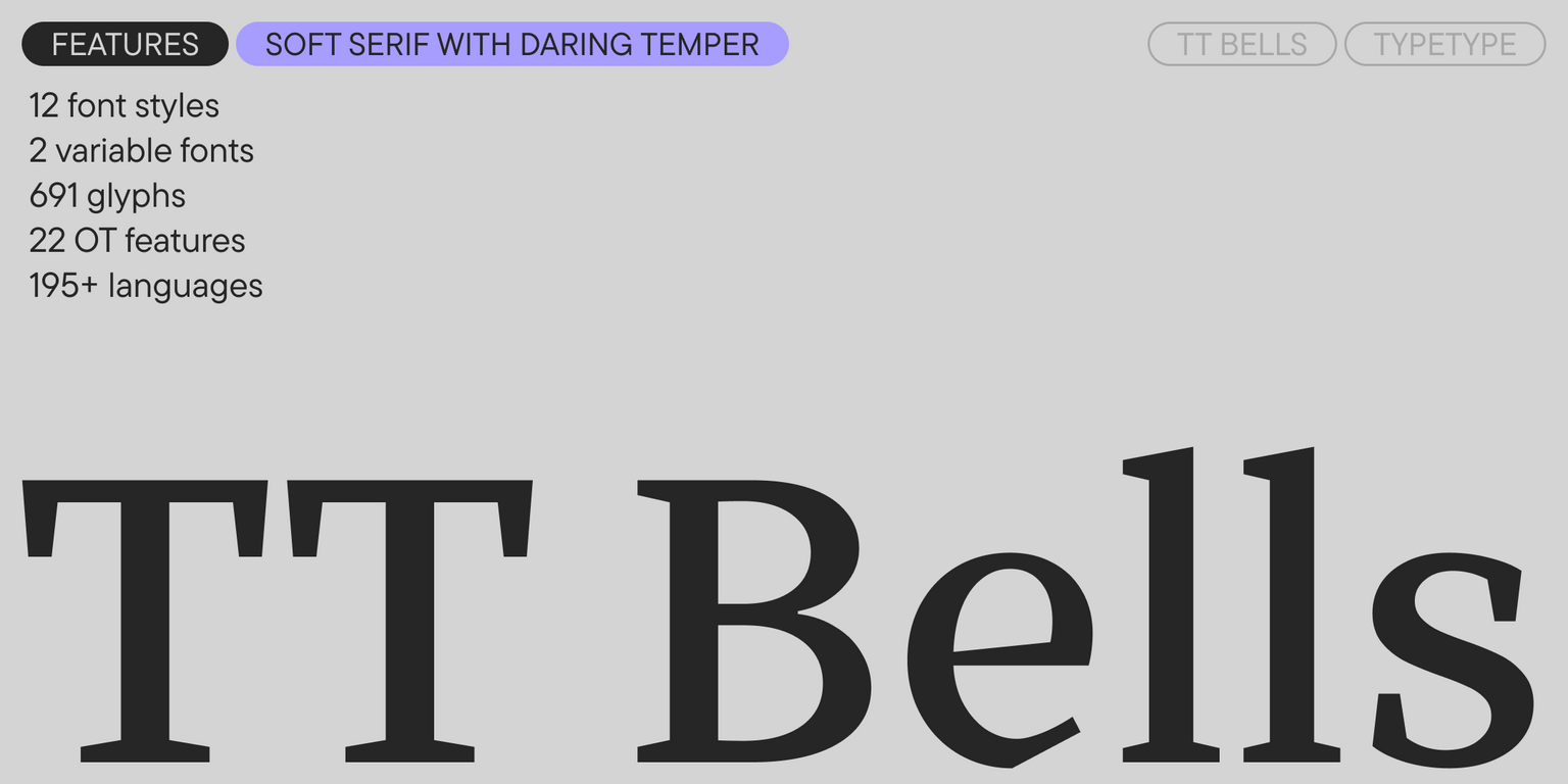
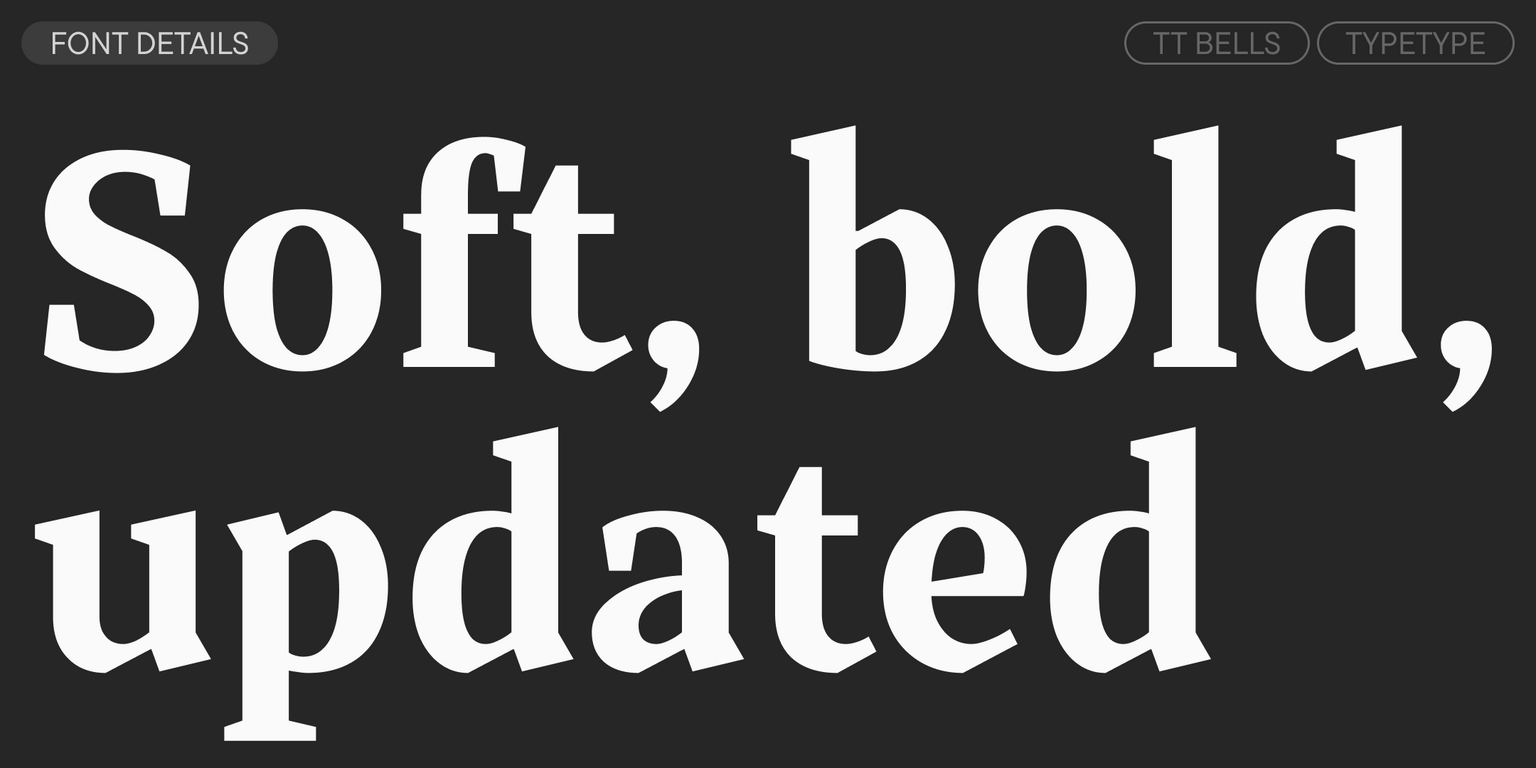
TT Bells is a serif where elegant softness combines with a complex, daring character. This is expressed in the straight stroke terminals and wedge serifs characteristic of old-style typefaces.

In TT Bells, we preserved all the best features of the traditional style but added sharp elements and modern geometric touches. Therefore, the font’s design simultaneously harkens back to its origins and looks modern, reminding us that we live in the digital age.

In the updated version, we added two new variable font styles (upright and italic) that change along the weight axis. We expanded the character set—drawing glyphs for extended Latin, currency symbols, and fractions. We also added new languages and OpenType features, and completely redid the hinting and kerning.

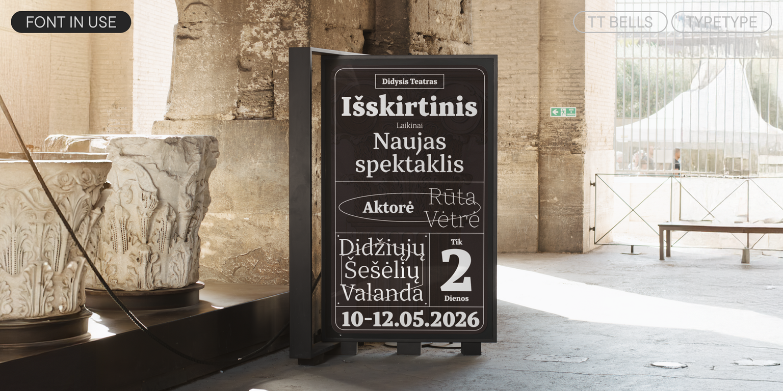
TT Bells is suitable for various tasks: it can be used both in display inscriptions and in running text. When the point size is reduced, the sharpness and boldness of the font soften; it acquires a more classic look and maintains readability.

TT Bells 3.000 includes:

  • 14 styles: 6 uprights, 6 italics, and 2 variable fonts
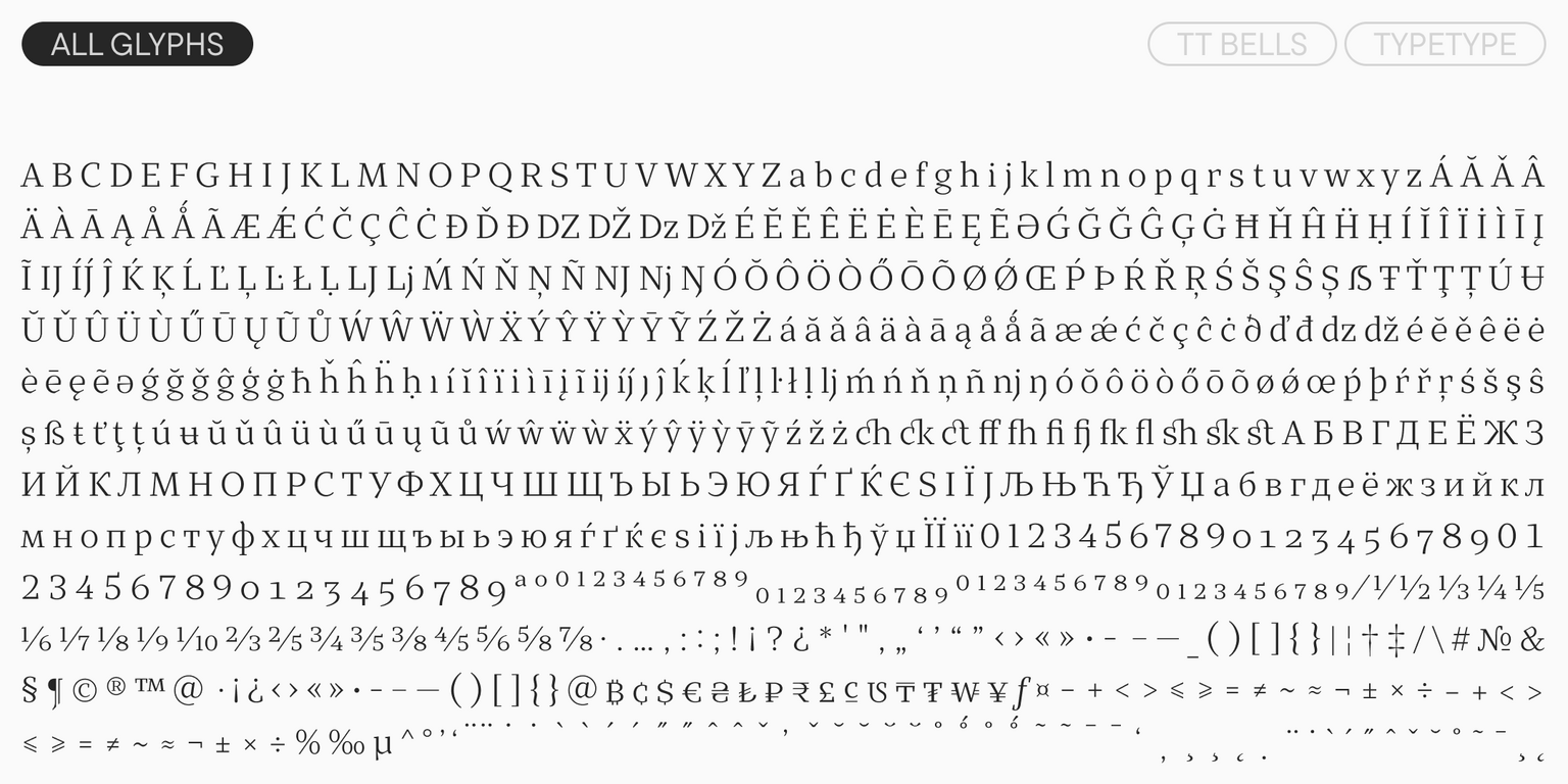
  • 691 glyphs per style
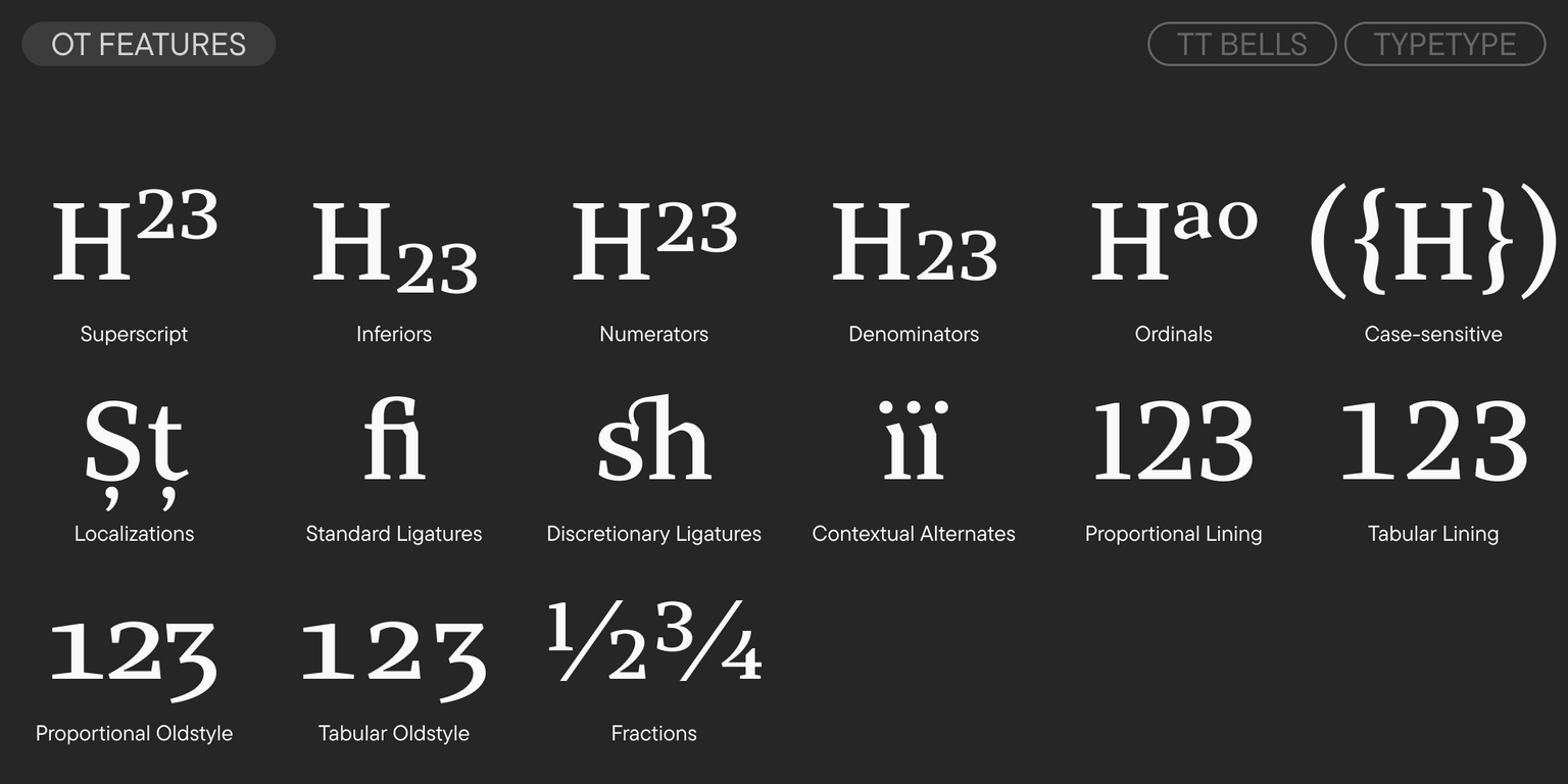
  • 22 OpenType features
  • Support for 195 languages

Team

Marina Khodak
Nadyr Rakhimov
Ivan Gladkikh
+ TypeType Team

Release and update date

Release: 18 October, 2016

Last update: 13 January, 2026

What's changed in the font:
  • The number of styles increased from 12 to 14: two new variable font styles (upright and italic) have been added, changing along the weight axis.
  • The number of glyphs per style increased from 540 to 691, including new glyphs for extended Latin, currency symbols, and fractions.
  • The number of OpenType features increased from 15 to 22.
  • The number of languages increased from over 160 to 195.
  • Hinting and kerning have been fully updated.

Additionally

Specimen

Download font specimen (pdf)

Custom version

Looking for a custom version of this font?

Character Set

Basic Latin Basic Cyrillic Extended Latin Fractions Proportional Lining Figures and Currencies Other Figures Punctuation and Symbols Math Symbols
A B C D E F G H I J K L M N O P Q R S T U V W X Y Z a b c d e f g h i j k l m n o p q r s t u v w x y z

OpenType features

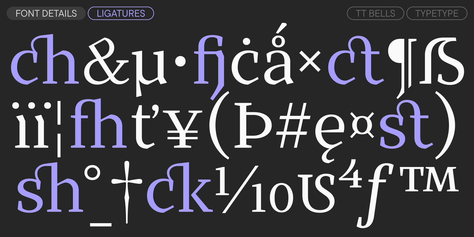
liga | Standard Ligatures

ff fl fj

ff fl fj

dlig | Discretionary Ligatures

ct sk

ct sk

onum | Oldstyle Figures

1638

1638

case | Case Sensitive Forms

({[H]})

({[H]})

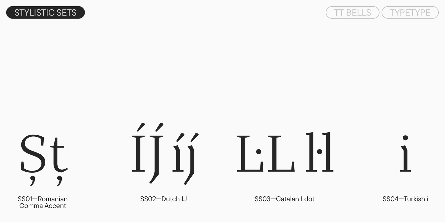
ss02 | Dutch IJ

ÍJ íj

ÍJ íj

ss03 | Catalan Ldot

L·L l·l

L·L l·l

Show all

Similar fonts

20 font styles
8 font styles
38 font styles
Select licenses
Contact us!