top_banner_ttnormspro0426
Type foundryFonts & StylesLogo

Logo Fonts

Logo fonts play a key role in how a brand is recognized, remembered, and trusted. From clean corporate marks to expressive visual identities, the right typeface helps communicate character, industry, and ambition at a glance. Explore TypeType’s collection of professionally crafted typefaces for logo design—created to support distinctive branding across digital, print, and commercial use.

Purpose: Logo

Why Designers Search for the Right Logo Fonts

A logo is often the first thing people notice about a brand, and typography plays a major role in that first impression. The right typeface can make a company feel reliable, modern, elegant, bold, friendly, or innovative before the audience reads a single line of copy. That is why designers spend so much time looking for fonts for logo design that match not only the visual concept, but also the brand’s personality.

A strong choice helps the logo become recognizable and memorable. It sets the tone for the entire identity system and influences how the brand will appear across websites, packaging, presentations, ads, social media, and physical products.

What Makes a Typeface Work for a Logo

A good logo typeface should be expressive, but still clear. It needs to remain readable at small sizes, scale well for large formats, and keep its character in different environments. Details that look beautiful in a poster may disappear on a business card or app icon, so balance is essential.

Each logo font style creates a different impression. Serif designs often feel elegant, classic, or editorial. Sans serifs communicate clarity, confidence, and modernity. Display styles can add a distinctive visual voice, while script lettering may feel personal, artistic, or premium. When evaluating a typeface, consider legibility, proportions, spacing, uniqueness, and how naturally it supports the brand’s message.

How to Choose the Best Font for Your Brand

Start with the industry, audience, and tone of voice. A tech startup, law firm, fashion label, and children’s product will not need the same typographic personality. The typeface should also work with the logo symbol or icon, not compete with it. Test it on light and dark backgrounds, in horizontal and vertical layouts, and at very small sizes.

When choosing professional fonts for logos, think about originality. A familiar family can make a brand feel accessible and safe, while a more distinctive design can create stronger recognition. Both approaches can work, depending on the strategy. For commercial projects, licensing is just as important as appearance. Make sure the selected family can be legally used in logos, brand materials, websites, apps, and other planned touchpoints.

Discover TypeType’s Collection of Logo Typefaces

TypeType’s collection offers unique logo fonts for brands that need more than a generic visual solution. The library includes clean sans serifs, elegant serifs, expressive display faces, scripts, and variable families that can support different creative directions. Many TypeType typefaces feature broad language support, advanced OpenType features, and carefully crafted details for professional identity design.

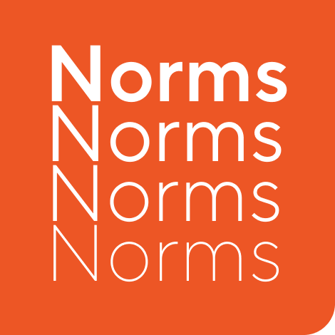
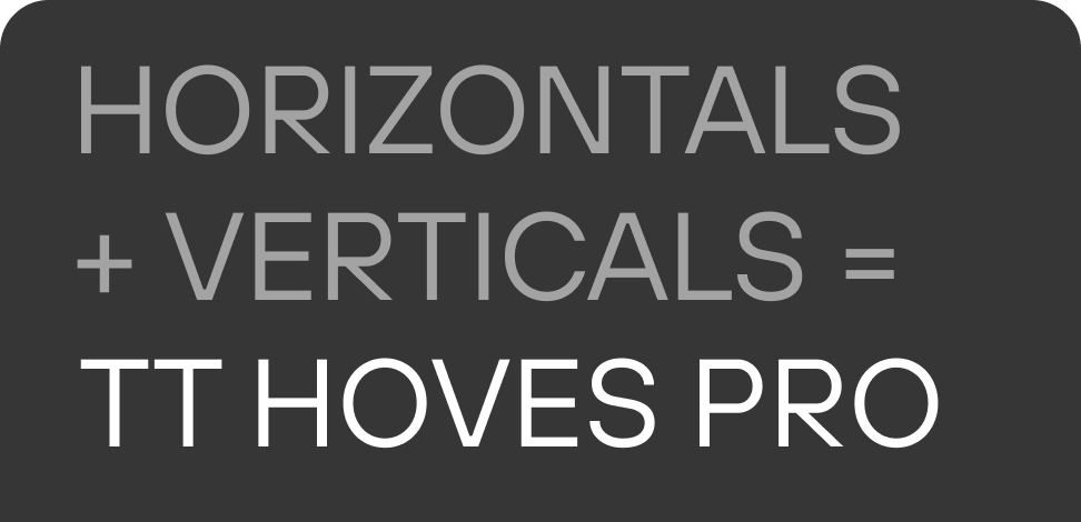
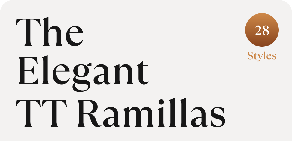
TT Norms® Pro is a versatile geometric sans serif that works well for clean and stable brand systems. TT Commons™ Pro offers flexibility for modern communication across print and digital media. TT Hoves Pro brings recognizable geometry and a confident tone, while TT Ramillas or TT Livret can add elegance to more editorial or premium identities. Trial versions help designers test each family in real logo concepts before choosing a license.

Typefaces for Business: From Startups to Enterprise

Different companies need different levels of typographic flexibility. A startup may look for a memorable and affordable choice that helps it stand out quickly. A growing company may need a family that works across pitch decks, websites, product interfaces, and marketing campaigns. Larger organizations often prioritize stability, neutrality, multilingual support, and long-term consistency.

For company logo fonts, practical performance matters as much as visual style. The selected typeface should work in multiple formats, from a small favicon to outdoor signage. It should also support future brand growth without becoming limiting. Professionally designed typefaces give business identities a stronger foundation: they look more polished, reduce visual inconsistencies, and make brand communication easier to scale across teams, markets, and channels.

Pairing Fonts for Stronger Brand Identity

A logo rarely exists on its own. It becomes part of a broader typographic system that includes headlines, body text, captions, navigation, presentations, packaging, and advertising. This is why pairing matters. Strong logo typography fonts should either set the tone for the system or work smoothly with a supporting family.

A common approach is to combine contrast with harmony. An expressive logo typeface can be paired with a neutral sans serif for clear communication. A refined serif mark may work well with a modern sans serif to create balance. Look at proportions, x-height, stroke contrast, and overall mood. The goal is not to make every element match perfectly, but to create a system where each typeface has a clear role and the brand feels consistent.

  • The quick brown fox jumps over a lazy dog.
  • Pack my box with five dozen liquor jugs.
  • Sphinx of black quartz, judge my vow
  • 0123456789 !?.,:;—–()[]{}<> “quotes” ‘apostrophe’ @#%&*_+=/\| № $ € £ ₽ +−×÷=≠≤≥ … % © ® ™
  • Aa Bb Cc Dd Ee Ff Gg Hh Ii Jj Kk Ll Mm Nn Oo Pp Qq Rr Ss Tt Uu Vv Ww Xx Yy Zz
Leading
1.1
Tracking
0px
Bestseller
TT Norms® Pro Regular
104 font styles

The bestseller TT Norms® Pro—a geometric sans serif, trouble-free workhorse

Bestseller
104 font styles

TT Commons™ Pro is a completely redesigned version of the well-established classic font family TT Commons.

Bestseller
TT Hoves Pro Regular
96 font styles

TT Hoves Pro is a versatile sans-serif with a recognizable geometry

24 font styles

We continue to expand the line of the studio's main bestseller TT Norms® Pro!

TT Livret Text Regular
32 font styles

TT Livret is an elegant, modern and functional serif

New
TT Qurdisma Regular
1 font style

TT Qurdisma is a narrow and dense decorative font reminiscent of a whimsical plant. The winding, smooth contours give rise to a botanical ornament.
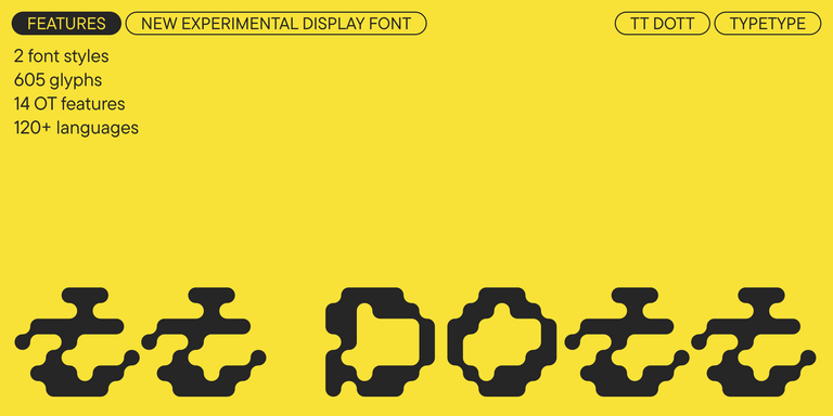
TT Dott Solid
2 font styles

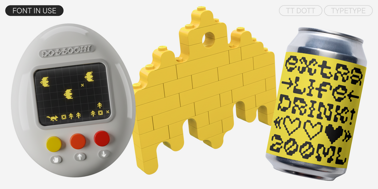
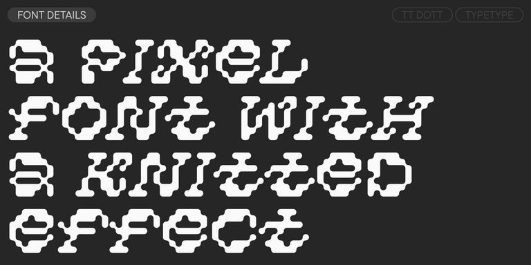
TT Dott is an experimental pixel grotesque where a circle is used as the base for the pixel. It is a fluid and unusual display font, evoking associations with embroidery and techno parties all at once.

Bestseller
TT Neoris Pro Regular
21 font styles

TT Neoris is an elegant Neo-Grotesque with unlimited potential and a font that encompasses all modern requirements and user desires.

Bestseller
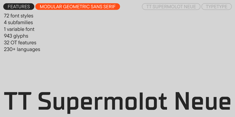
91 font styles

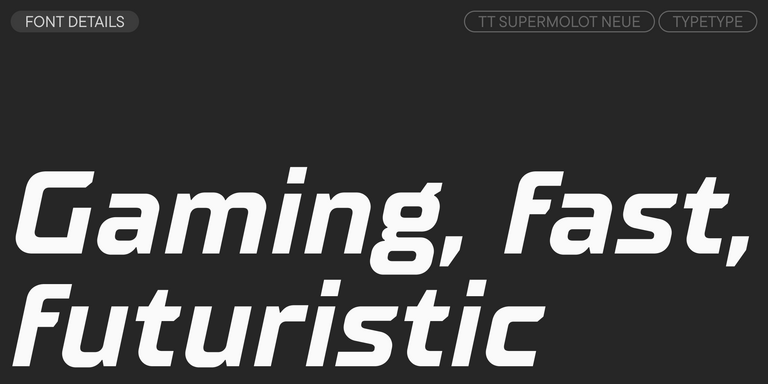
TT Supermolot Neue is a redesigned, extended, and greatly enhanced reincarnation of the popular font family

TT Rationalist Regular
22 font styles

TT Rationalist is functional and neutral slab serif typeface.

21 font styles

TT Commons™ Classic is a universal sans serif with a minimal contrast of strokes, a closed aperture, and geometric shapes of characters.

TT Runs Regular
19 font styles

TT Runs is a very stylish and charismatic display sans serif with irregular proportions of some characters.

91 font styles

TT Bluescreens is a upgraded geometric sans serif with narrow proportions

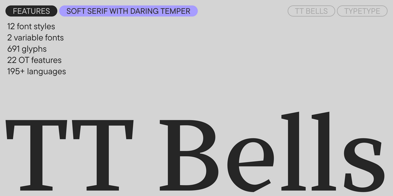
TT Bells Regular
14 font styles

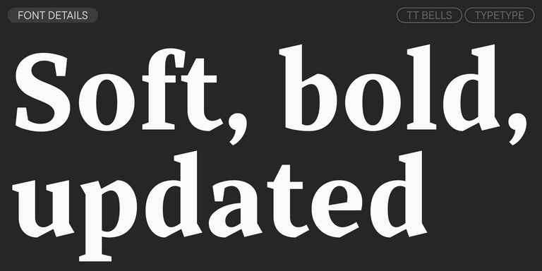
TT Bells combines the elegant softness of Antiqua with a complex and daring temper reflected in straight stroke terminals and arrowheaded serifs. The typeface is based on the broad nib, which creates these hallmark terminals and serifs.

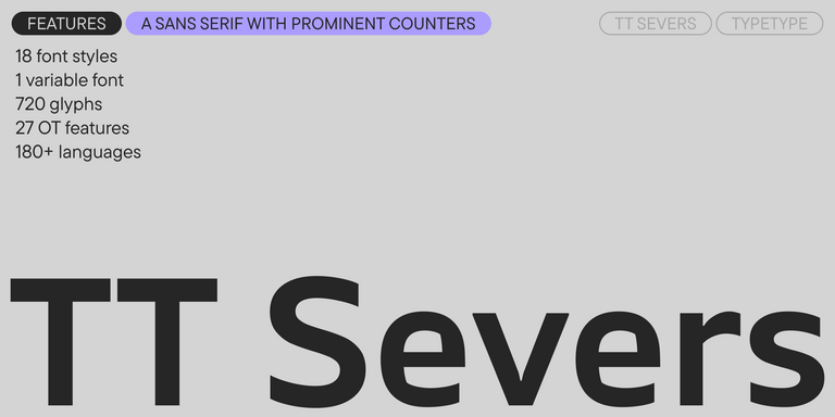
TT Severs Regular
19 font styles

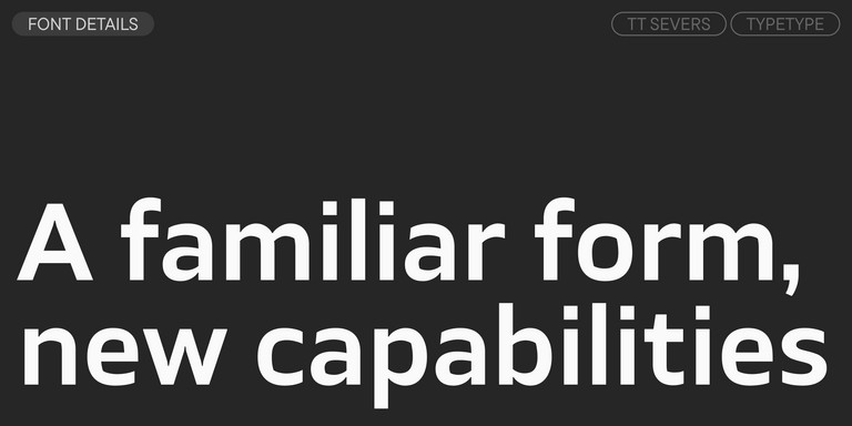
TT Severs is a geometric sans serif with emphasized elements of internal brackets. The main visual feature of TT Severs is the unusual form of internal ovals.

New
TT Turns Regular
19 font styles

TT Turns is a striking geometric sans serif with expressive elements. This versatile font works exceptionally well for running text, while at large point sizes, it takes on a distinct display character.

TT Jenevers Regular
14 font styles

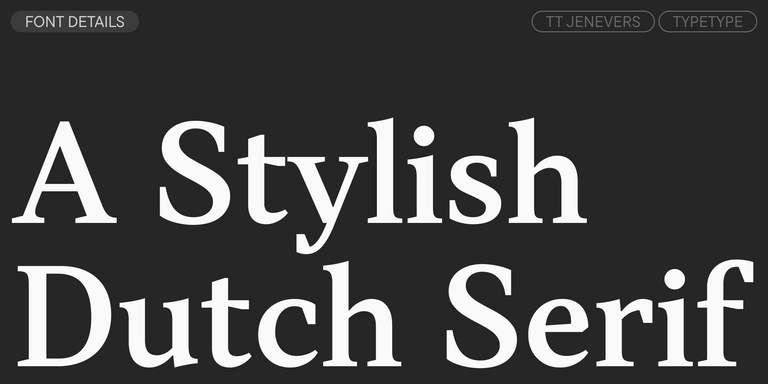
TT Jenevers is a modern serif with a Dutch flavor. The font family features the characteristic details peculiar to Dutch serifs—these are the asymmetrical shape of serifs and an irregular slant of ovals.

New
TT Regins Display Light
38 font styles

TT Regins is a Scottish modern serif. Striking contrast and sharp triangular serifs give this font a stern and commanding character, while refined forms, enlarged lowercase letters, and slightly condensed, static proportions add grace to its design.

TT Frantz Variable
4 font styles

TT FRANTZ IS AN EXPERIMENTAL VARIABLE FONT, DISTINGUISHED BY ITS SLIMNESS AND LIGHTNESS. THE VARIATION IN THE FONT AFFECTS THE CHANGE IN THE HEIGHT OF THE MEAN LINE—BY MOVING THE AXIS ADJUSTMENT SLIDER YOU CAN EASILY RAISE OR LOWER THE MEAN LINE OF THE FONT.

New
TT Quaris Regular
14 font styles

TT Quaris is an exquisite, modern high-contrast sans whose design balances between soft and sharp. The glyph shapes in the font are fluid and tend towards roundness, yet there are also sharp elements.

6 font styles

TT Ricordi Allegria is a sleek and intelligent contemporary Florentine grotesque.

New
TT Bakers Regular
15 font styles

TT Bakers is a fluid serif with a gentle and lively character. This font is like freshly baked goods: it`s warm and soft, especially in its bolder weights.

TT Modernoir Regular
6 font styles

TT Modernoir is a display sans serif with dynamic proportions. Fluid lines and delicate Art Nouveau forms in this typeface blend seamlessly with the rhythmic flow and improvisational freedom of jazz.

TT Moons Regular
12 font styles

TT Moons is a slim and contrast serif. This font family works especially smart in classic design themes. TT Moons is a typeface of the glyptal modern typeface.

FAQs

What are the best typefaces for professional branding?

The best professional fonts for logos combine readability, character, and technical quality. They should stay clear on screens, in print, at small sizes, and in large formats. A strong choice supports the brand’s tone instead of simply following a visual trend.

What styles work best for logo design?

Common logo font styles include serifs, sans serifs, scripts, display faces, and slab serifs. Serifs often suggest tradition and trust, while sans serifs feel clean and modern. Scripts can look personal or elegant, and display styles add stronger individuality. The right style depends on brand positioning, not personal taste.

Are these fonts suitable for business and corporate logos?

Yes. Professional business logo fonts are designed to work in real brand systems. For corporate use, the most important qualities are clarity, scalability, neutral or controlled character, multilingual support, and consistent performance across presentations, websites, documents, signage, and marketing materials.

Can I use typefaces from TypeType in commercial projects?

Yes. TypeType logo fonts can be used in commercial projects with the proper license. For branding and static logo assets, a Desktop license is usually relevant. If the same typeface is also used on a website or inside an app, Web or App licensing may be required as well.
What makes a logo typeface unique?

Unique fonts for logo design usually have recognizable letterforms, custom details, unusual proportions, or a distinct rhythm. Unlike generic options, they help a brand become more memorable. Overused typefaces can make an identity feel predictable, especially in competitive markets.

How many fonts should a logo use?

Most fonts for logo design work best when the logo uses one typeface, or two at most. A second option can be useful for a descriptor, tagline, or broader identity system, but too many choices can weaken recognition and make the mark feel less focused.