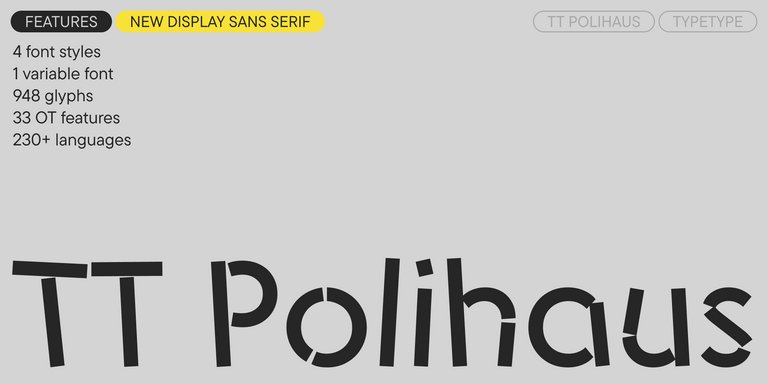
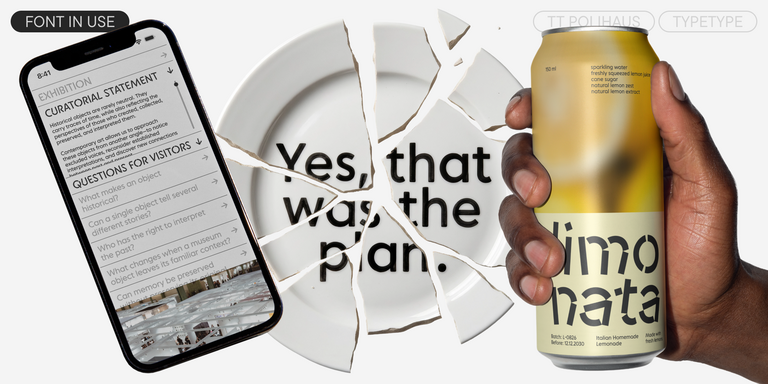
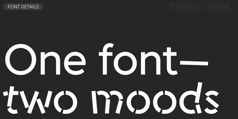
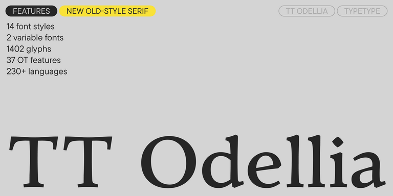
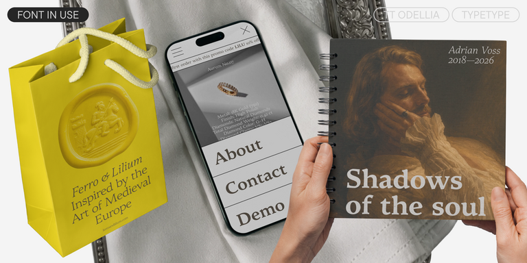
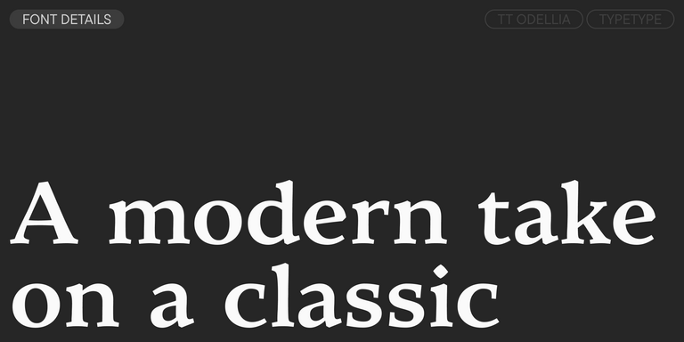
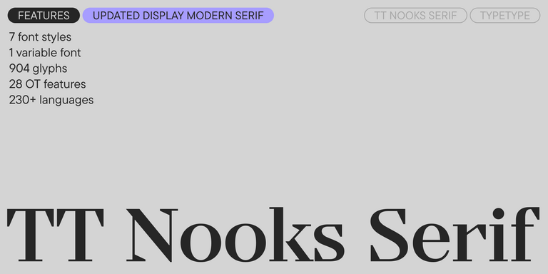
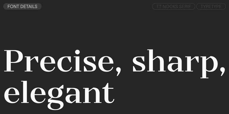
A company’s visual identity starts with its typography, where each typeface becomes the voice of the brand. Branding fonts are crafted for impeccable adaptability, ensuring recognition across every scale—from tiny favicons to towering billboards. The TypeType collection includes specialized solutions, from stately Antiquas for luxury brands to inviting Grotesques for startups, with each letter working to shape the perfect brand image.
Typography is one of the clearest ways a company expresses its personality. Through type, a brand can feel modern, strict, technological, premium, friendly, editorial, or experimental before a user reads the full message. Brand fonts influence first impressions, trust, recognition, and the overall tone of communication across every touchpoint: websites, products, advertising, social media, presentations, packaging, and internal materials. A strong typographic system helps a company look consistent even when content changes from channel to channel. It also makes the brand easier to remember, because repeated type choices become part of the visual identity alongside logo, color, imagery, and voice. In modern branding, typography is not a decorative layer — it is a strategic tool that shapes how people perceive, navigate, and connect with a company.
What Makes a Typeface Work for Branding
The best fonts for brands combine personality with reliability. A branding typeface should have enough character to support a distinctive visual identity, but it also needs to stay readable, flexible, and technically stable in everyday use. Important qualities include clear letterforms, a useful range of weights, balanced spacing, strong kerning, broad language support, and the ability to work in different sizes and formats. A typeface may look impressive in a logo or headline, but it also has to perform in product interfaces, legal text, presentations, social posts, and marketing layouts. This is why brands should look beyond beautiful shapes and evaluate how the family behaves as a system. The strongest choices balance individuality and function, helping teams create recognizable communication without sacrificing clarity or usability.
Choosing the Right Typeface for Your Brand
Choosing branding fonts should start with strategy, not personal taste. First, define the company’s position: is the brand premium or accessible, bold or restrained, innovative or traditional, emotional or functional? Then consider the audience, industry, product type, and communication channels. A tech company may need a clean sans serif with excellent screen readability. A cultural project may benefit from a more expressive serif. A global product may prioritize language coverage, interface performance, and a wide range of styles. It is also important to test the typeface in real situations: logos, headlines, body text, navigation, product screens, ads, packaging, and presentations. A preview can show beauty, but only a real layout reveals whether the typeface supports hierarchy, tone, and long-term brand consistency.
TypeType’s Collection Overview
TypeType’s collection offers brand typography solutions for companies with different voices, markets, and design tasks. The catalog includes neutral sans serifs for corporate systems and digital products, expressive display families for campaigns, refined serifs for editorial and premium identities, and versatile type families for large-scale visual systems. These options help teams build a consistent style across websites, apps, presentations, packaging, advertising, and social media. Many TypeType families include broad language support, multiple weights, OpenType features, trial versions for testing, and licensing options for commercial use. Designers can compare styles, test typefaces in real layouts, and choose a family that supports both the brand’s personality and its practical needs. The goal is to make typography work as a scalable identity asset, not just a visual accent.
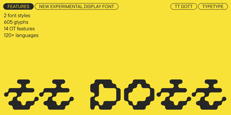
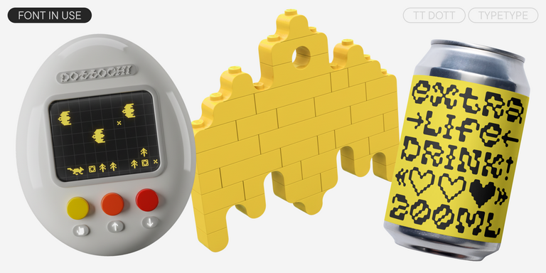
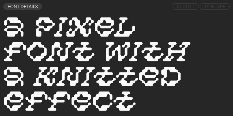
TT Dott is an experimental pixel grotesque where a circle is used as the base for the pixel. It is a fluid and unusual display font, evoking associations with embroidery and techno parties all at once.
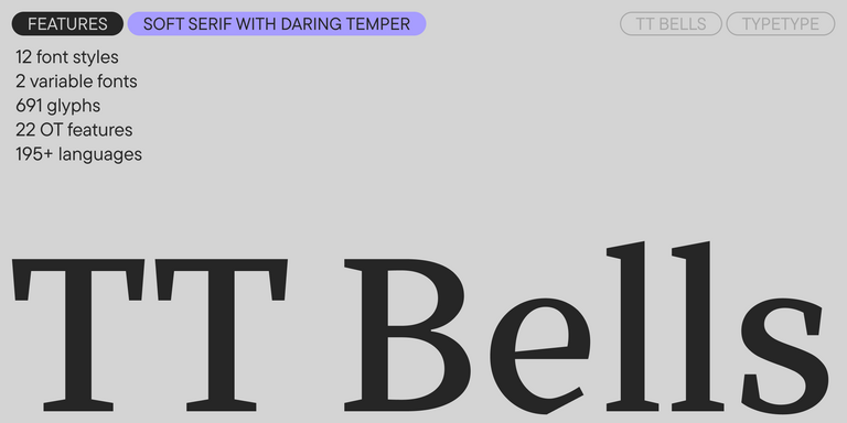
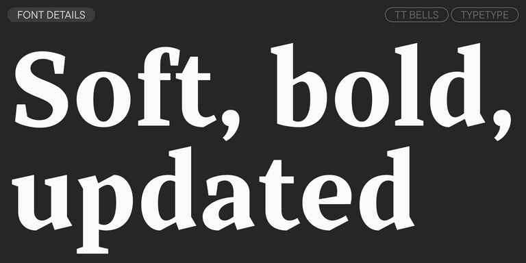
TT Bells combines the elegant softness of Antiqua with a complex and daring temper reflected in straight stroke terminals and arrowheaded serifs. The typeface is based on the broad nib, which creates these hallmark terminals and serifs.
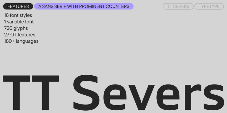
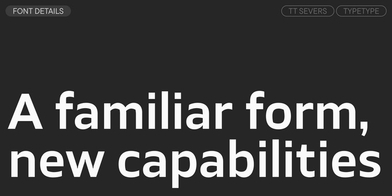
TT Severs is a geometric sans serif with emphasized elements of internal brackets. The main visual feature of TT Severs is the unusual form of internal ovals.
TT Turns is a striking geometric sans serif with expressive elements. This versatile font works exceptionally well for running text, while at large point sizes, it takes on a distinct display character.
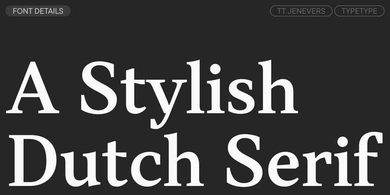
TT Jenevers is a modern serif with a Dutch flavor. The font family features the characteristic details peculiar to Dutch serifs—these are the asymmetrical shape of serifs and an irregular slant of ovals.
TT Regins is a Scottish modern serif. Striking contrast and sharp triangular serifs give this font a stern and commanding character, while refined forms, enlarged lowercase letters, and slightly condensed, static proportions add grace to its design.
TT FRANTZ IS AN EXPERIMENTAL VARIABLE FONT, DISTINGUISHED BY ITS SLIMNESS AND LIGHTNESS. THE VARIATION IN THE FONT AFFECTS THE CHANGE IN THE HEIGHT OF THE MEAN LINE—BY MOVING THE AXIS ADJUSTMENT SLIDER YOU CAN EASILY RAISE OR LOWER THE MEAN LINE OF THE FONT.
Branding fonts are typefaces chosen to shape a company’s visual language. Unlike a random decorative choice, a branding typeface works as part of a system: it supports the logo, website, interface, advertising materials, presentations, packaging, social media, and other touchpoints where the brand communicates with its audience.
Why Is Typography Important for Brand Identity?
Typography is one of the core elements of identity, along with the logo, color palette, imagery, and tone of voice. It helps a brand look consistent, recognizable, and professional. The right type choice can express trust, innovation, elegance, friendliness, or authority before the user reads the full message.
What Makes a Good Branding Typeface?
A strong branding typeface combines visual character with practical reliability. It should be readable, flexible, well-spaced, and supported by quality kerning and a useful range of weights. Language coverage, screen readability, and stable behavior across sizes and formats also matter, especially for brands working across digital and print environments.
Should a Brand Use One Font or Multiple Typefaces?
There is no universal rule. One large branding font family can help keep a system simple, coherent, and easy to manage. Several typefaces can offer more flexibility and stronger hierarchy. The key is that all styles should feel connected, support clear roles, and avoid visual conflict across brand materials.
When Should a Company Update Its Brand Typography?
Brand fonts can serve a company for years and do not need frequent changes. An update makes sense during a rebrand, a shift in positioning, expansion to new markets, new digital channels, or when the current system has readability, scalability, licensing, or technical issues. Changing typography only to follow trends is usually less effective than building consistency.
Enter your email address and spin the sun to win up to 100% off or TypeType services
Giveaway rules:
Each user can only play once;
Each promo code is unique and can only be used once;
The promo code discount applies only to purchases up to $5,000 in the online store;
Please note that the "Font Renaming," "Your Logo in a Font," and "Basic Customization" services do not apply to previously purchased fonts and are only available for new orders;
If you win a service, our manager will contact you within three business days with the details.