The bestseller TT Norms® Pro—a geometric sans serif, trouble-free workhorse
The Karakalpak (lat) fonts selection
Many typefaces cover basic Latin but stumble when a text needs the full Karakalpak alphabet. The result is gaps, mismatched accents or substitute glyphs from a system fallback. The Karakalpak (lat) fonts selection gathers TypeType families that include the Latin-script Karakalpak alphabet, so headlines, body copy and signage keep one consistent voice. Filter by style or purpose and compare candidates side by side.
- All fonts 78
- Sans Serif 47
- Serif 21
- Slab Serif 6
- Display 44
- Script 9
- Variable 49
- Font sale 12
The Challenge The Karakalpak (lat) fonts selection Solves
Karakalpak, spoken mainly in Karakalpakstan in Uzbekistan, is written in both Cyrillic and Latin scripts. The Latin orthography relies on extended Latin letters with diacritical marks, and this is where generic typefaces often fail. When a glyph is missing, software borrows the character from another family, so a single word suddenly mixes two designs, weights and heights. Poorly positioned accents can also collide with neighbouring letters or crowd the line spacing. The Karakalpak (lat) fonts selection addresses the problem at its source. Every family here includes the Latin-script alphabet, while Cyrillic text is served by a separate Karakalpak (cyr) page.
What Makes Karakalpak Latin Typefaces Distinct
Beyond the alphabet itself, each family in The Karakalpak (lat) fonts selection offers a broad character set. It includes currency and punctuation symbols, extended Latin letters with diacritics that also serve many other languages, and OpenType features for refined typesetting. Several weights within one family let a single design carry a project from captions to display lines. Many TypeType families also include a variable style, which allows intermediate settings that give a layout its own tone. Technical quality is a stated studio priority, so the files behave dependably in print and on screen.
Where The Karakalpak (lat) fonts selection Is Used
Because the alphabet is built in, one typeface family can serve Karakalpak Latin content across very different media. Publishers can set extended reading passages in books and reports, while editorial teams choose more expressive designs for magazine covers and newsletter mastheads. On websites, headings and interface text keep their diacritics intact and avoid the patchy look of substituted characters. Away from the screen, the same families work for posters, shop signs, wayfinding and advertising, and even for printing on fabric, where clear letterforms matter. Starting with The Karakalpak (lat) fonts selection also simplifies the search. Tags describe character, such as geometric or dynamic, versatile or classic, powerful or delicate. A purpose-based search then narrows the results to magazines, websites, newsletters or advertising. Combining both filters helps a team move quickly from a long list to two or three serious candidates worth testing in real layouts.
Explore The Karakalpak (lat) fonts selection at TypeType
The collection is organized by classification, so a search can begin with the broad shape of a project: sans serif, serif, slab serif, display or script. Families such as TT Norms® Pro, TT Commons™ Pro, TT Hoves Pro, TT Firs Neue, TT Nooks Serif and TT Chocolates appear among the options. Each specimen page is the right place to check weights, variants and details before deciding. Testing is straightforward. The Trial License grants a free evaluation period, and the trial version matches the commercial one in characters and technical set, so Karakalpak Latin samples can be checked accurately. If a family needs adjustment, TypeType offers technical or graphic customization, such as adding or removing letters, inserting a company logo or trimming the character set for lighter files. For a unique voice, a new typeface can be commissioned from scratch, based on an existing design or on your own ideas.
- The quick brown fox jumps over a lazy dog.
- Pack my box with five dozen liquor jugs.
- Sphinx of black quartz, judge my vow
- 0123456789 !?.,:;—–()[]{}<> “quotes” ‘apostrophe’ @#%&*_+=/\| № $ € £ ₽ +−×÷=≠≤≥ … % © ® ™
- Aa Bb Cc Dd Ee Ff Gg Hh Ii Jj Kk Ll Mm Nn Oo Pp Qq Rr Ss Tt Uu Vv Ww Xx Yy Zz
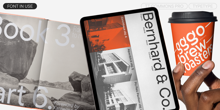
TT Commons™ Pro is a completely redesigned version of the well-established classic font family TT Commons.
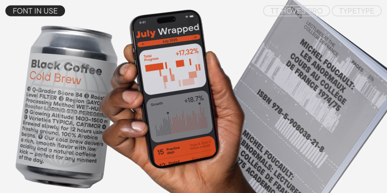
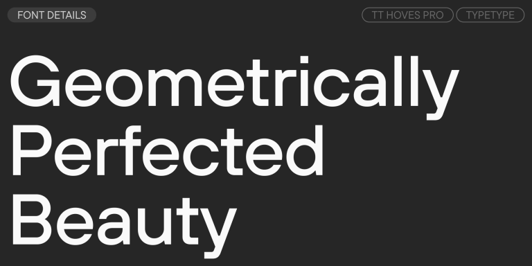
TT Hoves Pro is a versatile sans-serif with a recognizable geometry
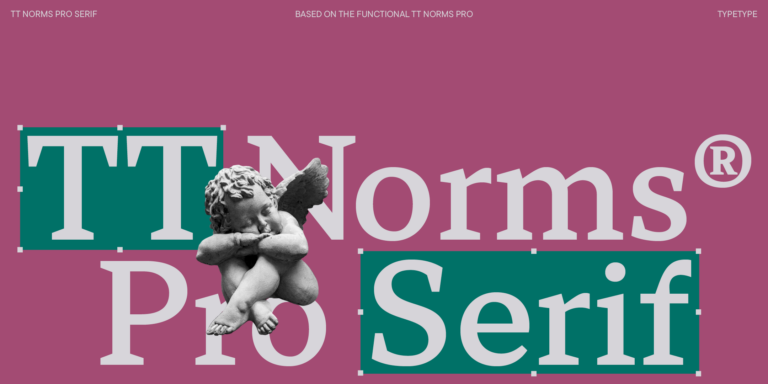
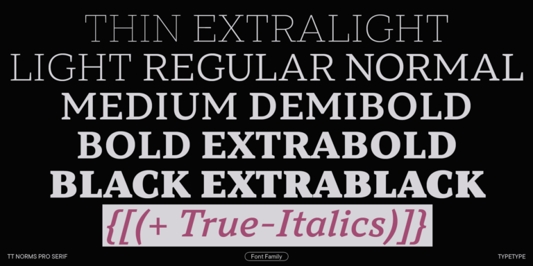
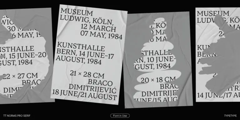
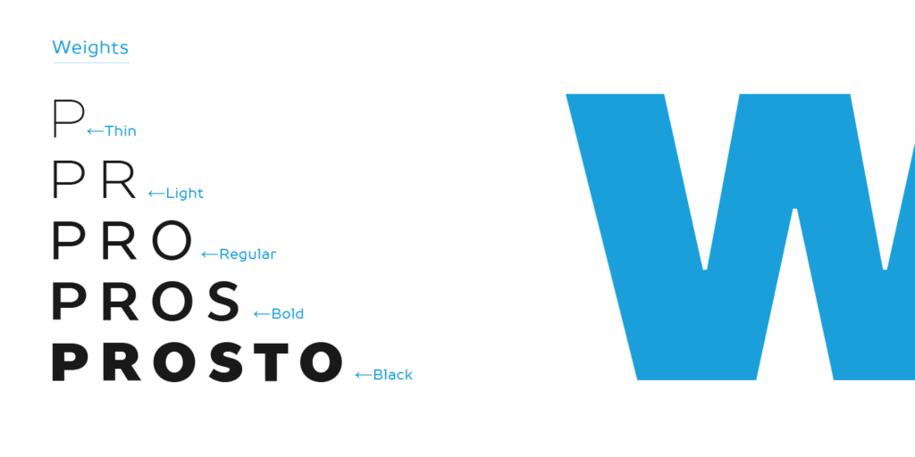
We continue to expand the line of the studio’s main bestseller TT Norms® Pro!
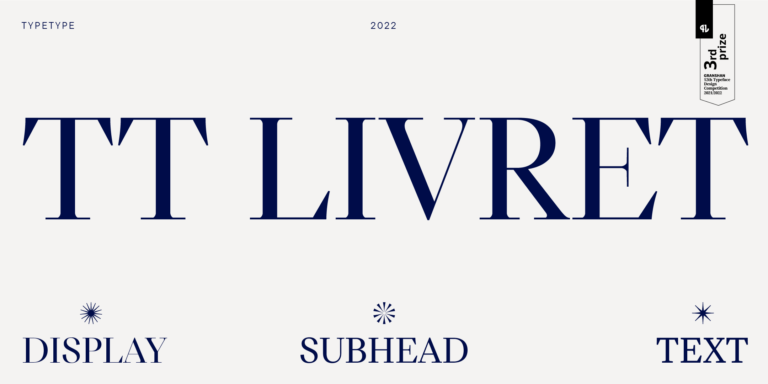
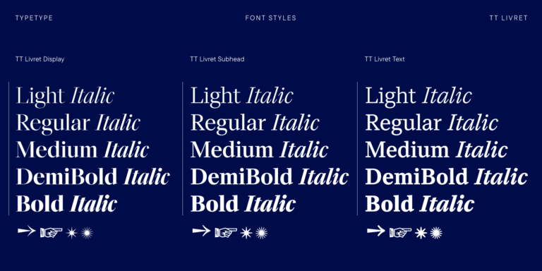
TT Livret is an elegant, modern and functional serif
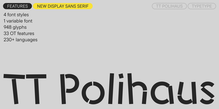
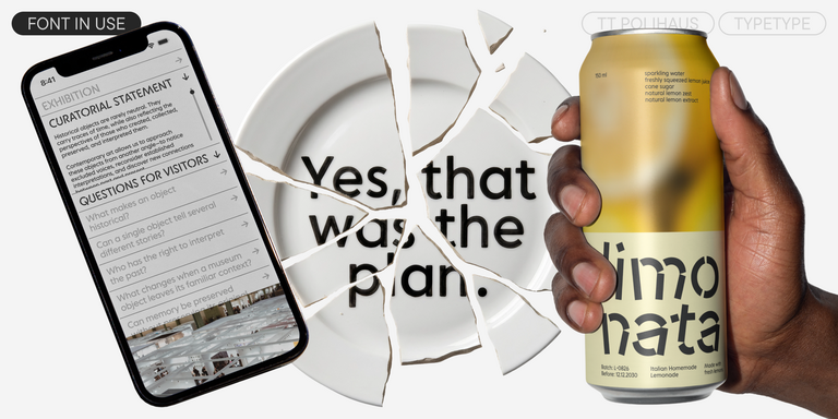
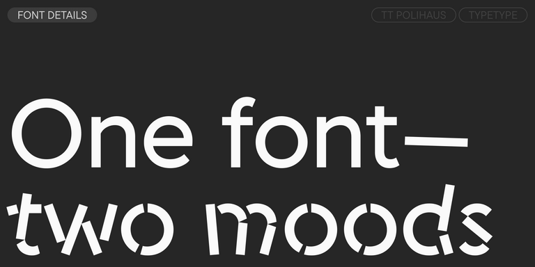
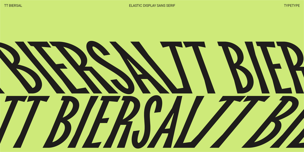
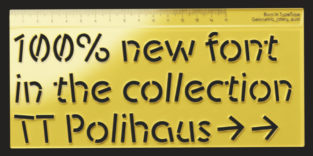
TT Polihaus is an experimental sans serif that, at first glance, looks ordinary, but then breaks apart, transforming into a stencil pattern.
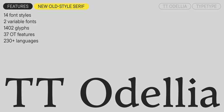
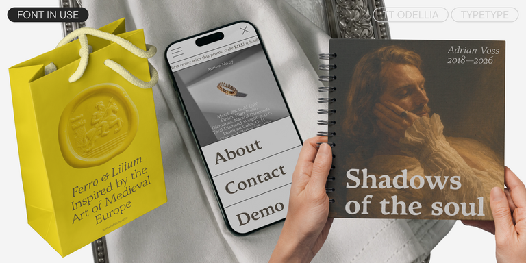
TT Odellia is an old-style serif with a modern design, inspired by Venetian typefaces and classical music.
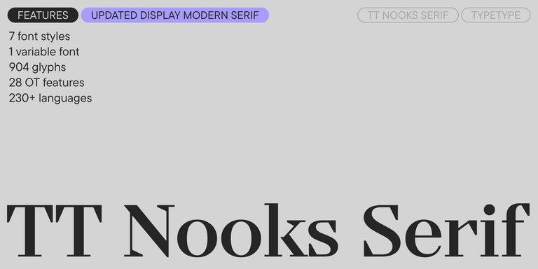
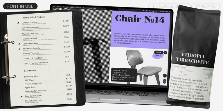
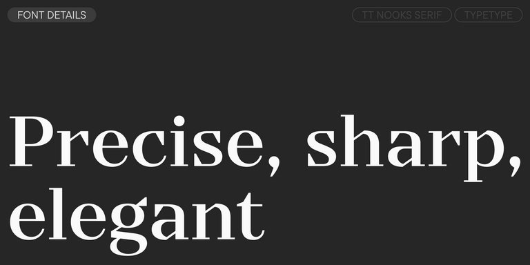
TT Nooks Serif is a display modern serif with a slight touch of egocentricity. It has a sharp and firm, yet elegant and stately character.
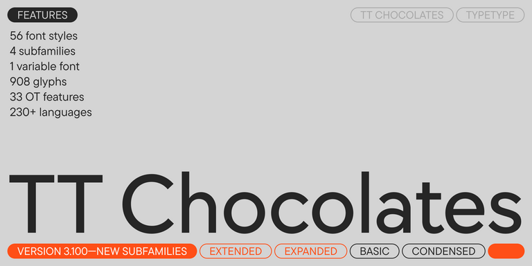
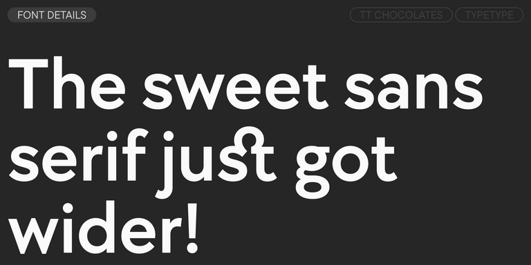
TT Chocolates typeface consists of 14 fonts: 7 weights and 7 obliques. Due to the extended language support and the introduction of useful features.
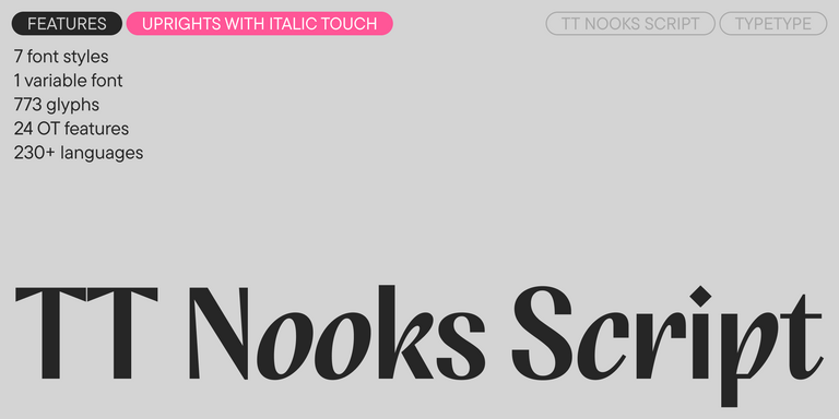
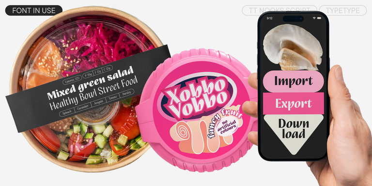
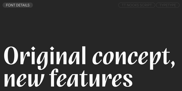
TT Nooks Script features a unique design that has no direct analogs.
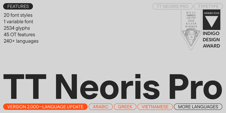
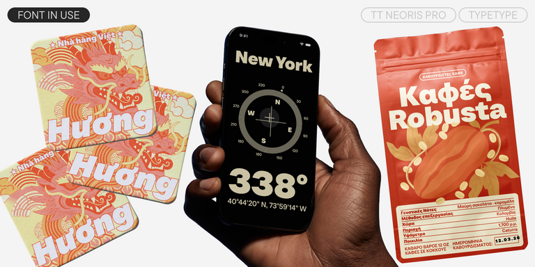
TT Neoris is an elegant Neo-Grotesque with unlimited potential and a font that encompasses all modern requirements and user desires.
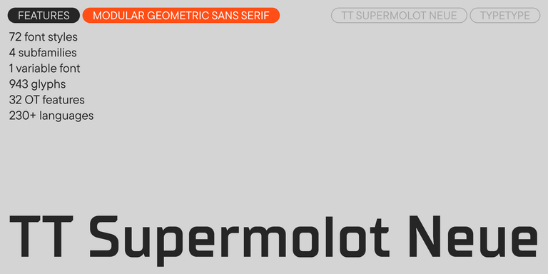
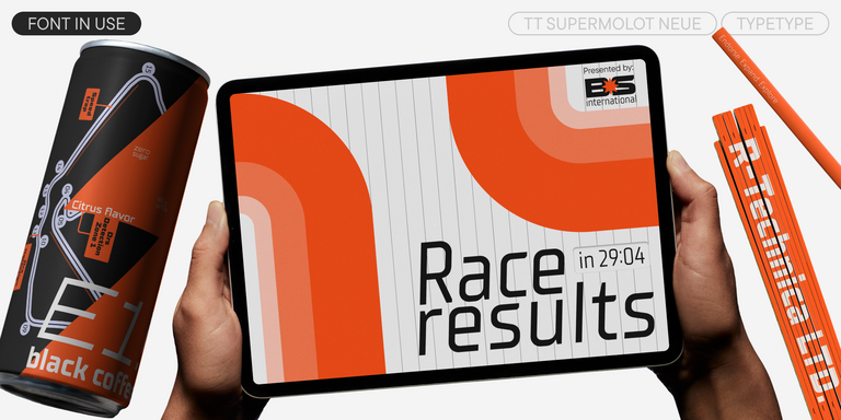
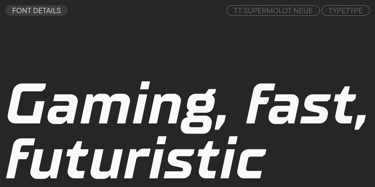
TT Supermolot Neue is a redesigned, extended, and greatly enhanced reincarnation of the popular font family
- from Original price was: $43.99.$30.79Current price is: $30.79.
- 30% off Special offer is valid until 30 Oct, 2026
- from Original price was: $43.99.$30.79Current price is: $30.79.
- 30% off Special offer is valid until 13 Nov, 2026
- from Original price was: $43.99.$30.79Current price is: $30.79.
- 30% off Special offer is valid until 20 Nov, 2026
- from Original price was: $47.99.$33.59Current price is: $33.59.
- 30% off Special offer is valid until 20 Nov, 2026
- from Original price was: $43.99.$30.79Current price is: $30.79.
- 30% off Special offer is valid until 27 Nov, 2026
- from Original price was: $43.99.$30.79Current price is: $30.79.
- 30% off Special offer is valid until 4 Dec, 2026
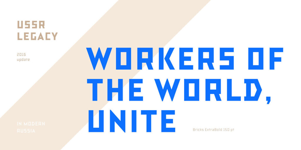
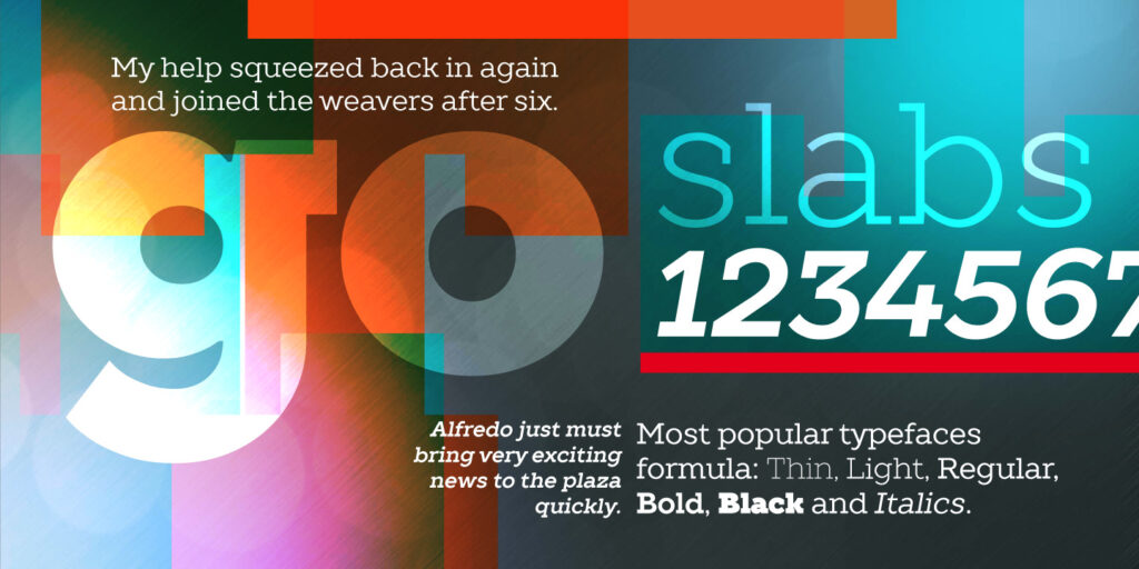
TT Rationalist is functional and neutral slab serif typeface.
TT Commons™ Classic is a universal sans serif with a minimal contrast of strokes, a closed aperture, and geometric shapes of characters.
TT Runs is a very stylish and charismatic display sans serif with irregular proportions of some characters.
TT Bluescreens is a upgraded geometric sans serif with narrow proportions
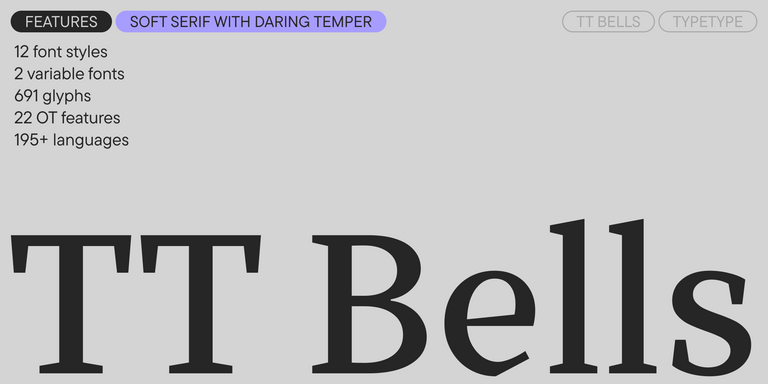
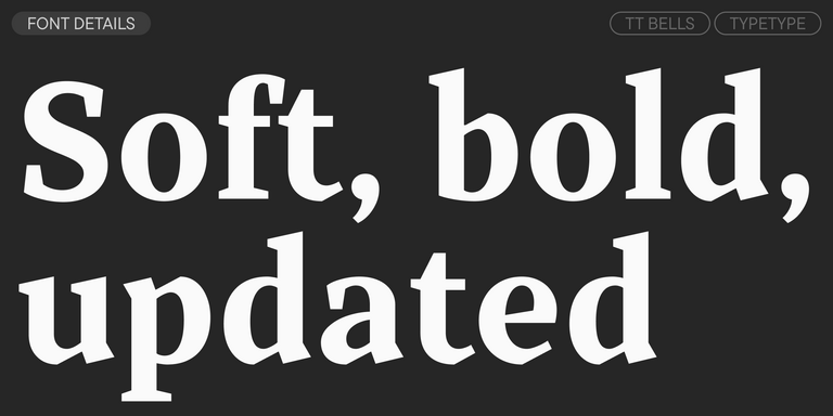
TT Bells combines the elegant softness of Antiqua with a complex and daring temper reflected in straight stroke terminals and arrowheaded serifs. The typeface is based on the broad nib, which creates these hallmark terminals and serifs.
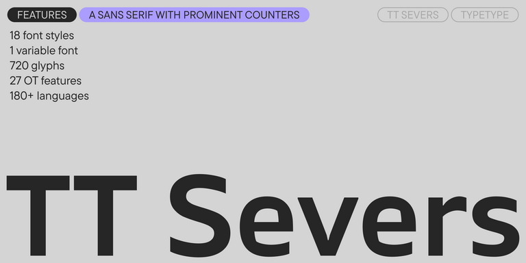
TT Severs is a geometric sans serif with emphasized elements of internal brackets. The main visual feature of TT Severs is the unusual form of internal ovals.
TT Turns is a striking geometric sans serif with expressive elements. This versatile font works exceptionally well for running text, while at large point sizes, it takes on a distinct display character.
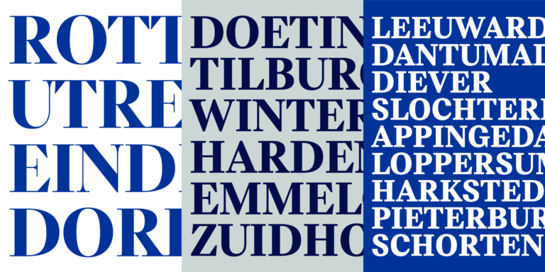
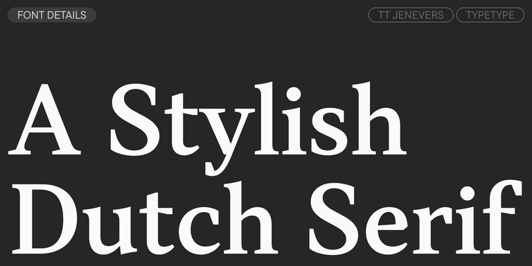
TT Jenevers is a modern serif with a Dutch flavor. The font family features the characteristic details peculiar to Dutch serifs—these are the asymmetrical shape of serifs and an irregular slant of ovals.
TT Regins is a Scottish modern serif. Striking contrast and sharp triangular serifs give this font a stern and commanding character, while refined forms, enlarged lowercase letters, and slightly condensed, static proportions add grace to its design.
TT FRANTZ IS AN EXPERIMENTAL VARIABLE FONT, DISTINGUISHED BY ITS SLIMNESS AND LIGHTNESS. THE VARIATION IN THE FONT AFFECTS THE CHANGE IN THE HEIGHT OF THE MEAN LINE—BY MOVING THE AXIS ADJUSTMENT SLIDER YOU CAN EASILY RAISE OR LOWER THE MEAN LINE OF THE FONT.
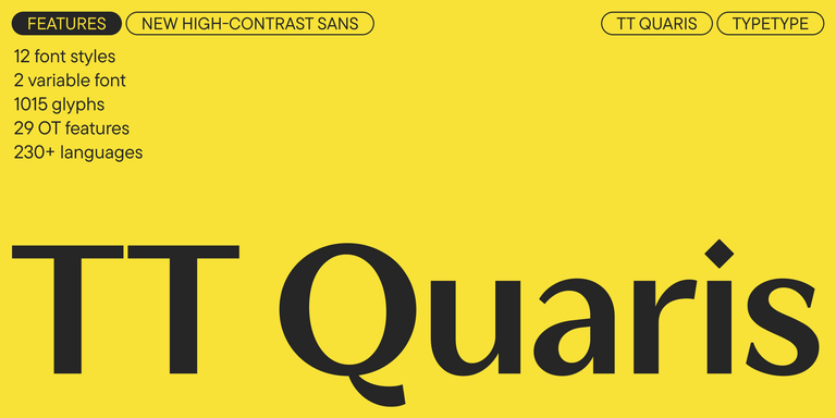
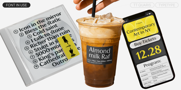
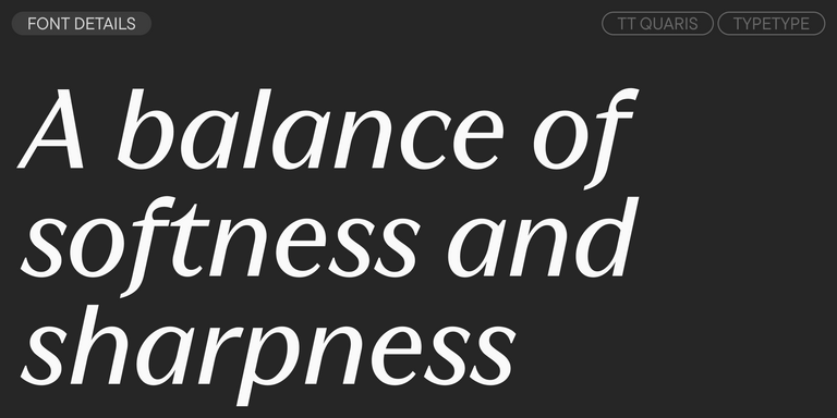
TT Quaris is an exquisite, modern high-contrast sans whose design balances between soft and sharp. The glyph shapes in the font are fluid and tend towards roundness, yet there are also sharp elements.
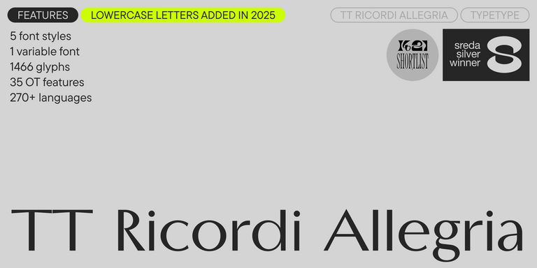
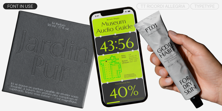
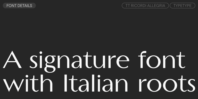
TT Ricordi Allegria is a sleek and intelligent contemporary Florentine grotesque.
What Is The Karakalpak (lat) fonts selection?
It is a TypeType set of typeface families whose character sets include the Latin-script Karakalpak alphabet, so text displays without missing glyphs or substitutions. Karakalpak is a Turkic language spoken mainly in Karakalpakstan, an autonomous republic of Uzbekistan, and it is written in both Latin and Cyrillic scripts.
Which Industries Use Karakalpak Latin Typefaces Most Often?
Demand comes from publishing and media, web and digital products, advertising agencies, education and public signage, as well as from local businesses producing materials in Karakalpak. Any team preparing Latin-script content for this audience benefits from a typeface that renders the alphabet correctly in body text, headings and large-format graphics.
Can Karakalpak Latin Typefaces Be Used for Branding?
Yes. For identity work, choose a family with several weights and consistently drawn diacritics, so that logos, packaging and digital channels share one voice. TypeType can also customize a typeface for a brand, for example by adding a logo glyph, adjusting individual letters or reducing the character set to suit specific applications.
What Should Be Considered When Pairing Karakalpak Latin Typefaces?
First, confirm that both partners support the Karakalpak Latin alphabet; choosing each one from The Karakalpak (lat) fonts selection removes that risk. Then aim for clear contrast, such as a sans serif for text with a serif or display design for headlines. Test diacritics at small sizes and check that accent heights feel balanced.
Can You Buy TypeType Fonts for Commercial Projects?
Yes. Before committing, you can request a free Trial License by clicking the "Trial font" button and completing the form. The trial file is identical to the commercial version in characters and technical set. Once your choice is confirmed, a commercial license can be obtained from TypeType for the intended project.