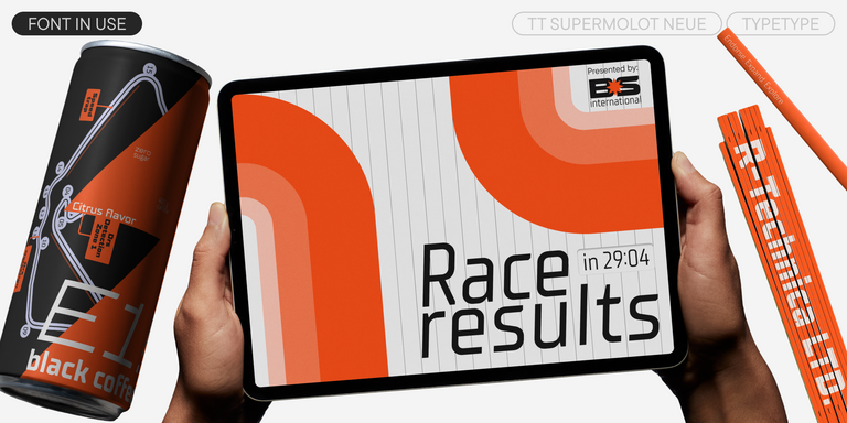
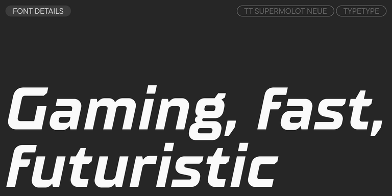
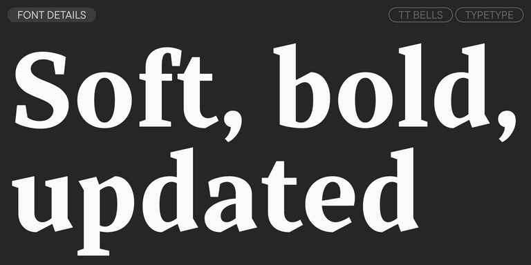
What Are Modern Fonts?
Modern fonts are often associated with something eccentric, futuristic, or unusual. In typography, however, this category appeared much earlier than many people expect. Its classic features grew out of advances in paper quality and printing technology: thin horizontal serifs, strong vertical stress, clear contrast between thick and thin strokes, and a precise, almost architectural rhythm.
Traditionally, these typefaces look laconic, elegant, and neutral rather than loud. Today, the term is broader. It can describe both historical Didone-inspired designs and contemporary families that feel clean, current, and visually refined.
From Classic Forms to Today’s Design Trends
Of course, contemporary typography has moved far beyond the original model. Type designers constantly look for new shapes, proportions, and graphic details, giving familiar structures a new mood without losing clarity.
Some modern looking fonts are geometric and strict, while others are fluid, soft, or expressive. They may be serif or sans serif, minimal or decorative, neutral or full of attitude. This evolution is why the category still feels relevant: it adapts to cultural taste, technology, and brand language. A style that once belonged mostly to print can now become a digital voice for products, services, and entire visual identities.
Use Cases Across Digital and Print Design
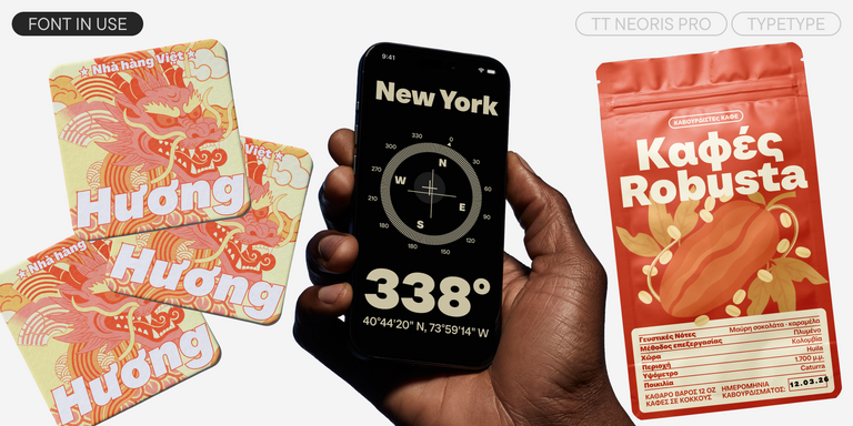
Thanks to this variety, modern design fonts can work across many areas: websites, apps, corporate programs, editorial layouts, posters, packaging, advertising, and presentations. They are especially common in industries where brands need to appear smart, efficient, and forward-looking—IT, design, architecture, consulting, electronics, automotive, and space-related projects.
Neutral families help companies communicate order, confidence, and clarity. More expressive designs can support innovative brands that want to look bold or unconventional.
The key is matching the tone to the task. A clean sans serif may suit a SaaS dashboard or consulting website, while a high-contrast serif can add elegance to a fashion campaign or premium editorial project. In branding, these typefaces often act like chameleons: they adapt to context, color, imagery, and layout, creating different emotions without breaking the system.
Benefits of Modern Typefaces in Digital Design
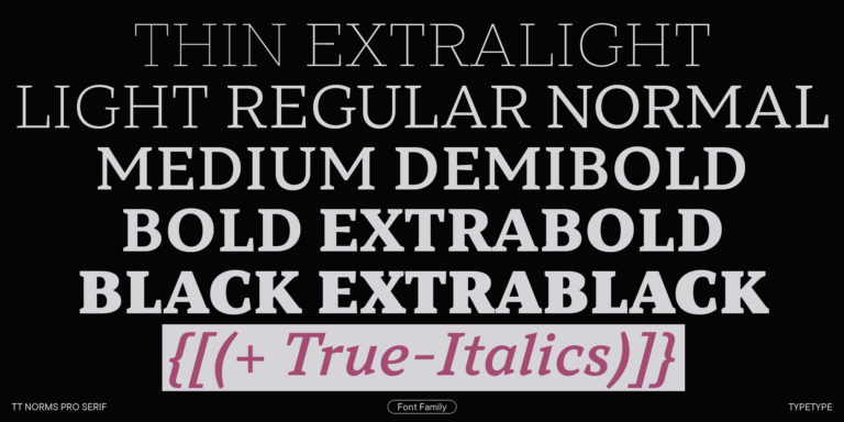
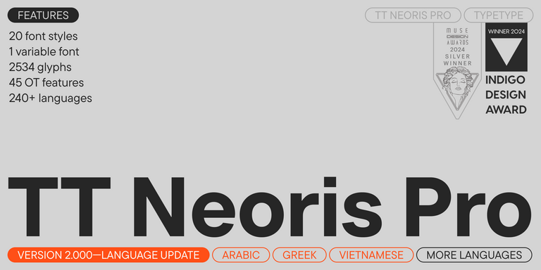
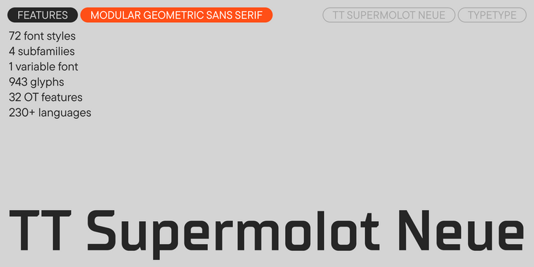
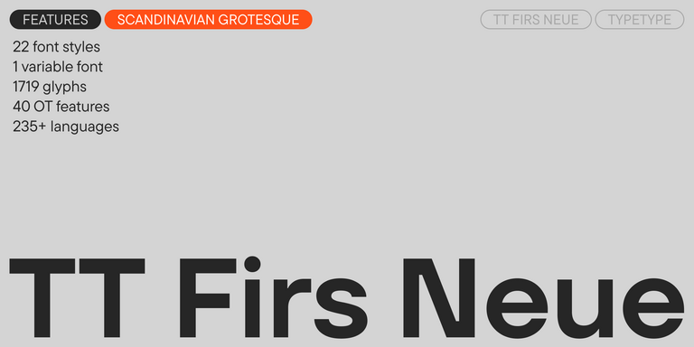
In digital design, the main advantage is usability. Crisp shapes, stable proportions, and clear spacing help text remain readable on websites, interfaces, and mobile screens. Many contemporary families are built with multiple weights, extended character sets, OpenType features, and variable options, making them easier to use inside complex design systems.
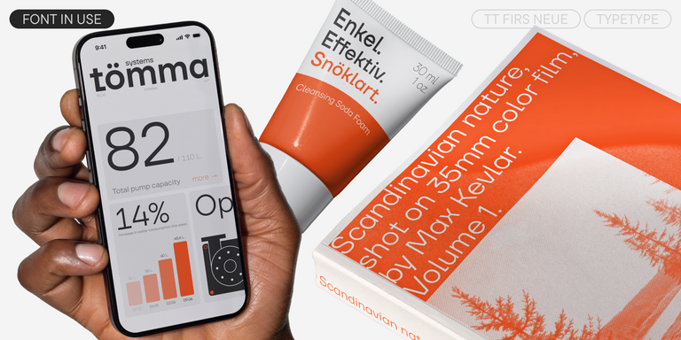
This flexibility matters when typography has to serve many roles at once: headlines, body copy, buttons, forms, navigation, charts, and microcopy. A well-chosen typeface can make an interface feel cleaner and more intentional. It can also reduce visual noise, improve hierarchy, and keep brand communication consistent across digital and print touchpoints.
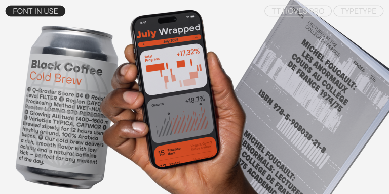
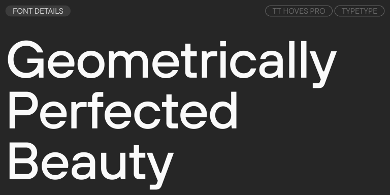
Explore TypeType’s Collection
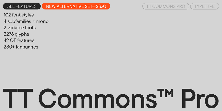
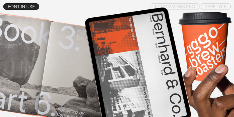
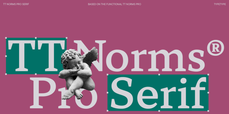
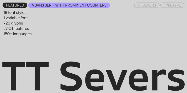
In the TypeType collection, you can find some of the best modern fonts for very different creative and business tasks. TT Norms® Pro and TT Commons™ Pro are among the studio’s most popular families because they are versatile, adaptable, and suitable for a wide range of projects. They work well when a brand needs a reliable typographic foundation with a clean, professional tone.
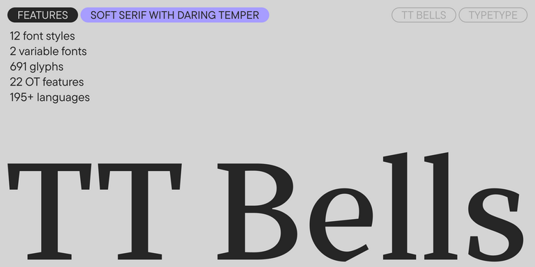
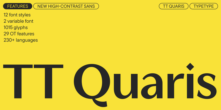
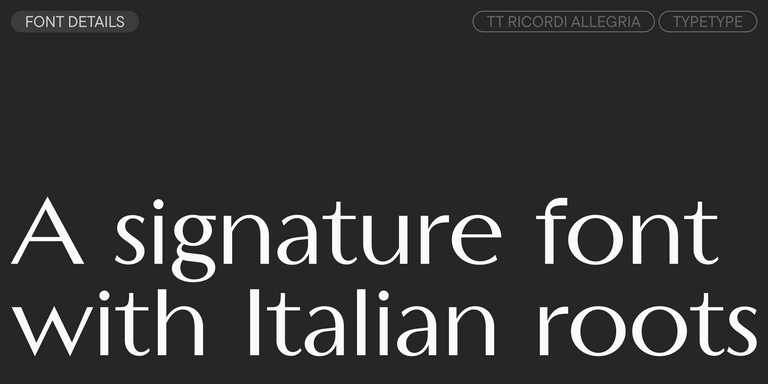
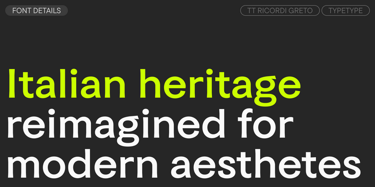
For projects with a more distinctive character, explore TT Ricordi Marmo, TT Fors, TT Lakes Neue, or TT Interphases Pro. Each family has its own voice: elegant, geometric, interface-friendly, expressive, or highly functional. The collection includes designs for branding, web, product interfaces, editorial work, advertising, and corporate communication. Before choosing, test the family in real layouts, compare several weights, and check how the text behaves in both short and long formats. This will help you select not just a beautiful typeface, but a practical tool for your visual system.