The bestseller TT Norms® Pro—a geometric sans serif, trouble-free workhorse
Organic Fonts
An organic font helps create a natural, soft, and expressive visual tone for branding, packaging, websites, and editorial design. This TypeType collection brings together typefaces with human, fluid, and nature-inspired character, making it easier to choose typography for projects that need warmth, authenticity, and a handcrafted feeling.
- All fonts 76
- Sans Serif 49
- Serif 27
- Slab Serif 6
- Display 42
- Script 9
- Variable 47
- Font sale 15
Why Designers Look for Organic Fonts
Not every project benefits from perfect geometry or a deliberately neutral visual voice. Designers often choose organic fonts when they want typography to feel warmer, more approachable, and less mechanical. Soft shapes, subtle irregularities, and human details can make communication feel more personal without sacrificing a professional appearance.
This quality can be especially useful when a brand needs to convey care, openness, craftsmanship, or a connection to the natural world. Depending on the family, the effect may range from quiet and understated to expressive and distinctly handmade.
In branding, packaging, and digital design, these qualities can also help balance more structured elements of a visual identity. A natural-looking typeface can soften a strict layout, bring personality to a minimalist system, or give a brand a more recognizable voice.
Key Features of This Visual Style
There is no single formula that defines this category. Organic style fonts may be serif, sans serif, script, or display designs, and their personalities can differ significantly.
What often connects them is the way their letterforms move away from rigid construction. You may notice flowing curves, softened contours, subtle asymmetry, varied proportions, or a rhythm that feels more natural than mathematically precise. Some designs reveal traces of calligraphy or handwriting, while others achieve the same effect through relaxed shapes and carefully controlled irregularity.
That does not necessarily make them rustic or decorative. A restrained family can look clean and contemporary while still feeling human. At the other end of the spectrum, more expressive designs can become a strong visual accent for headlines, packaging, or identity work.
How to Choose the Right Typeface for Your Project
Start with the role typography needs to play rather than the category itself. An organic typeface used for a logo has different requirements from one intended for product descriptions, an app interface, or a long editorial text.
For body copy and digital products, pay particular attention to legibility at the sizes you expect to use. For branding and packaging, character and distinctiveness may carry more weight. If the family will become part of a broader visual system, check whether it includes enough weights and styles to create a clear hierarchy across headlines, supporting text, and functional information.
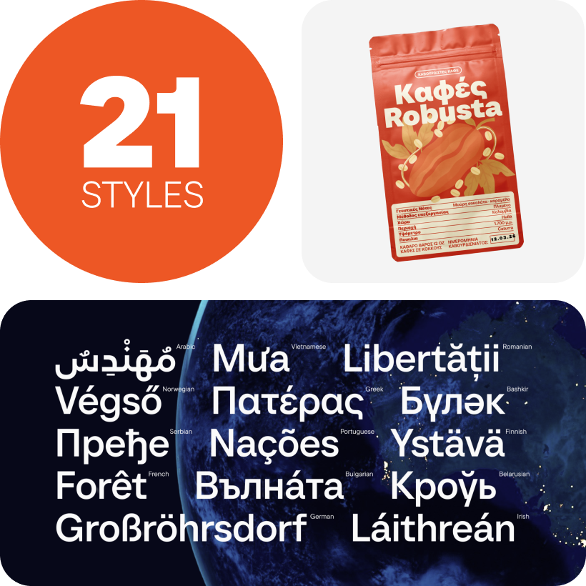
Language support matters for multilingual projects, while available OpenType features can provide additional flexibility. It is also worth checking how the design behaves alongside existing brand elements and whether the licensing terms cover the intended media and usage.
The best choice is not simply the most expressive option—it is the one whose personality and functionality fit the actual context.
Where This Typography Works Best
Organic typography is particularly effective when a project calls for a softer, more human visual tone. It can work naturally for wellness and beauty brands, food and beverage packaging, handmade products, lifestyle projects, hospitality, and businesses associated with sustainability or nature.
Its applications, however, are not limited to those industries. The same qualities can bring warmth to a technology brand, make an editorial layout feel less formal, or add personality to a landing page, presentation, campaign, or social media identity.
Context remains essential. A highly expressive design might be ideal for a short headline or package label but distracting in long paragraphs. A more restrained family can provide the same sense of warmth while remaining practical across websites, interfaces, and complex brand systems.
The goal is to match the emotional tone of the letterforms to the experience the project is meant to create.
Explore TypeType’s Collection
TypeType’s selection brings together organic fonts for design with different personalities and levels of expression. Some options feel subtle and versatile, while others can become a defining element of an identity or creative concept.
When exploring the collection, compare more than appearance alone. Consider how each family works with your content, how its different styles support hierarchy, and whether its visual tone remains appropriate across the places where your project will appear.
For a brand identity, that may mean testing a design in a logo, packaging, and campaign headlines. For a website or design system, it may mean evaluating both large display settings and smaller functional text. Creative and editorial projects may require a different balance between individuality and readability.
Comparing these characteristics in context makes it easier to choose a solution that not only looks right at first glance but continues to work as the project grows.
- The quick brown fox jumps over a lazy dog.
- Pack my box with five dozen liquor jugs.
- Sphinx of black quartz, judge my vow
- 0123456789 !?.,:;—–()[]{}<> “quotes” ‘apostrophe’ @#%&*_+=/\| № $ € £ ₽ +−×÷=≠≤≥ … % © ® ™
- Aa Bb Cc Dd Ee Ff Gg Hh Ii Jj Kk Ll Mm Nn Oo Pp Qq Rr Ss Tt Uu Vv Ww Xx Yy Zz
TT Commons™ Pro is a completely redesigned version of the well-established classic font family TT Commons.
TT Hoves Pro is a versatile sans-serif with a recognizable geometry
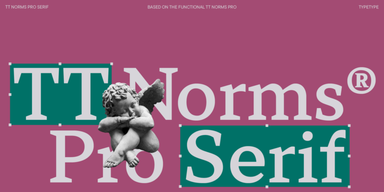
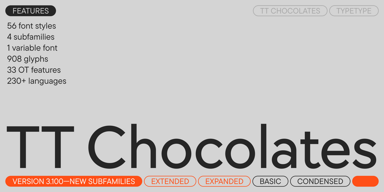
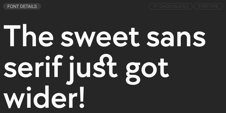
We continue to expand the line of the studio's main bestseller TT Norms® Pro!
TT Livret is an elegant, modern and functional serif
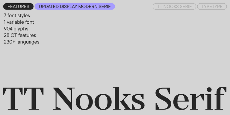
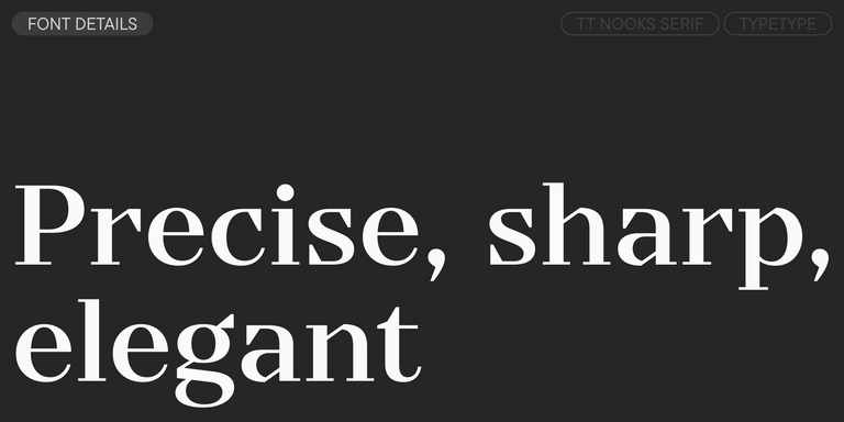
TT Nooks Serif is a display modern serif with a slight touch of egocentricity. It has a sharp and firm, yet elegant and stately character. High contrast and a slight squarishness of the characters give it strictness and angularity, while wide proportions make this font stand out among other contemporary serifs.
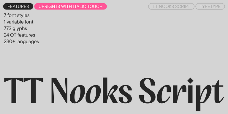
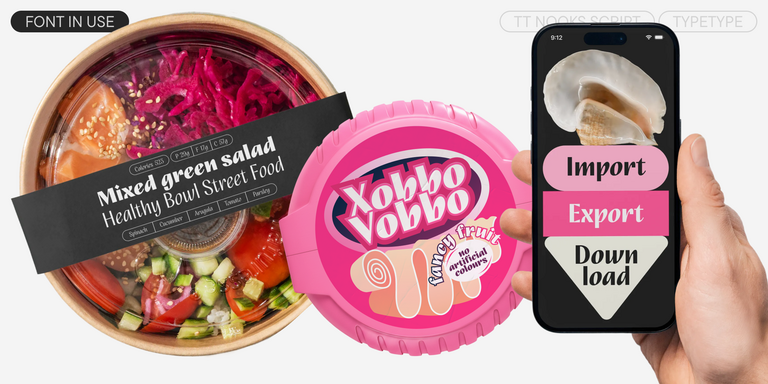
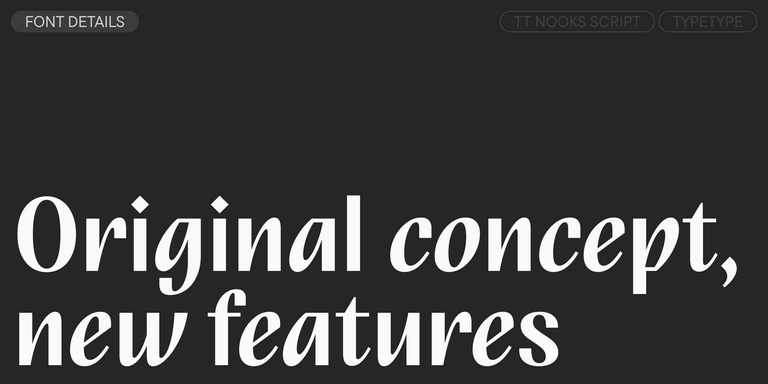
TT Nooks Script features a unique design that has no direct analogs.
TT Qurdisma is a narrow and dense decorative font reminiscent of a whimsical plant. The winding, smooth contours give rise to a botanical ornament.
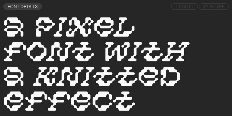
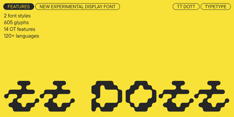
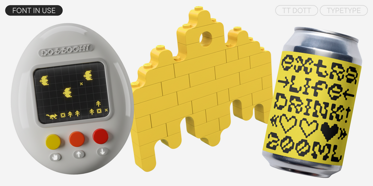
TT Dott is an experimental pixel grotesque where a circle is used as the base for the pixel. It is a fluid and unusual display font, evoking associations with embroidery and techno parties all at once.
TT Neoris is an elegant Neo-Grotesque with unlimited potential and a font that encompasses all modern requirements and user desires.
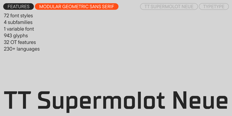
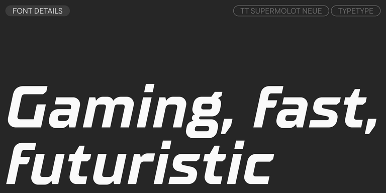
TT Supermolot Neue is a redesigned, extended, and greatly enhanced reincarnation of the popular font family
TT Rationalist is functional and neutral slab serif typeface.
TT Runs is a very stylish and charismatic display sans serif with irregular proportions of some characters.
TT Bluescreens is a upgraded geometric sans serif with narrow proportions
TT Turns is a striking geometric sans serif with expressive elements. This versatile font works exceptionally well for running text, while at large point sizes, it takes on a distinct display character.
TT Regins is a Scottish modern serif. Striking contrast and sharp triangular serifs give this font a stern and commanding character, while refined forms, enlarged lowercase letters, and slightly condensed, static proportions add grace to its design.
TT FRANTZ IS AN EXPERIMENTAL VARIABLE FONT, DISTINGUISHED BY ITS SLIMNESS AND LIGHTNESS. THE VARIATION IN THE FONT AFFECTS THE CHANGE IN THE HEIGHT OF THE MEAN LINE—BY MOVING THE AXIS ADJUSTMENT SLIDER YOU CAN EASILY RAISE OR LOWER THE MEAN LINE OF THE FONT.
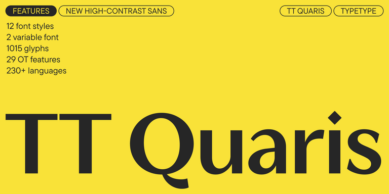
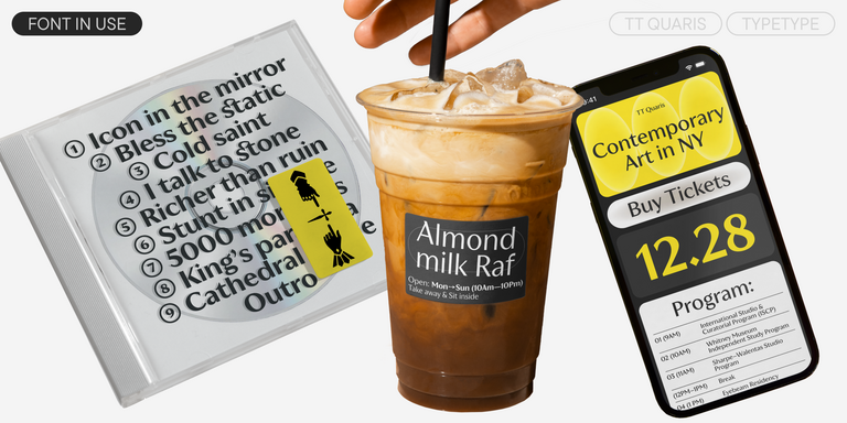
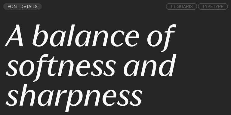
TT Quaris is an exquisite, modern high-contrast sans whose design balances between soft and sharp. The glyph shapes in the font are fluid and tend towards roundness, yet there are also sharp elements.
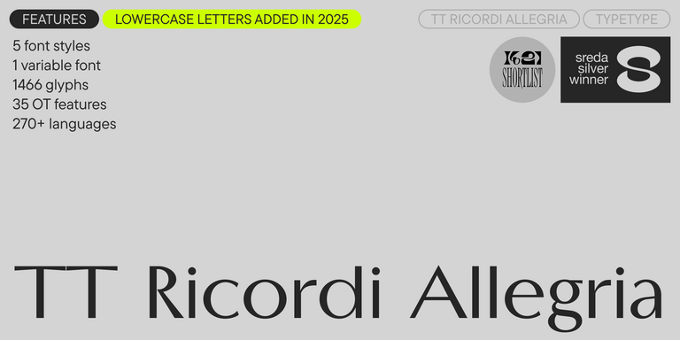
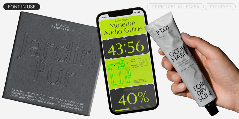
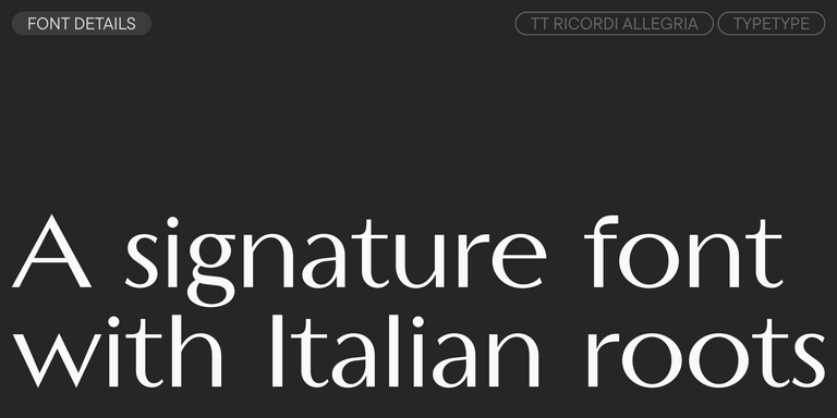
TT Ricordi Allegria is a sleek and intelligent contemporary Florentine grotesque.
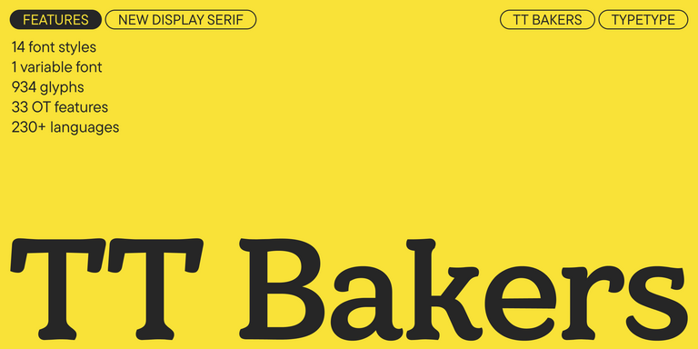
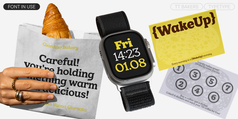
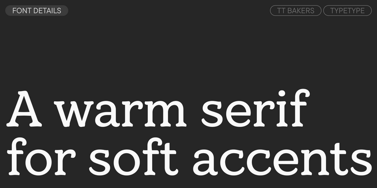
TT Bakers is a fluid serif with a gentle and lively character. This font is like freshly baked goods: it`s warm and soft, especially in its bolder weights.
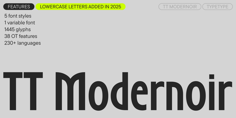
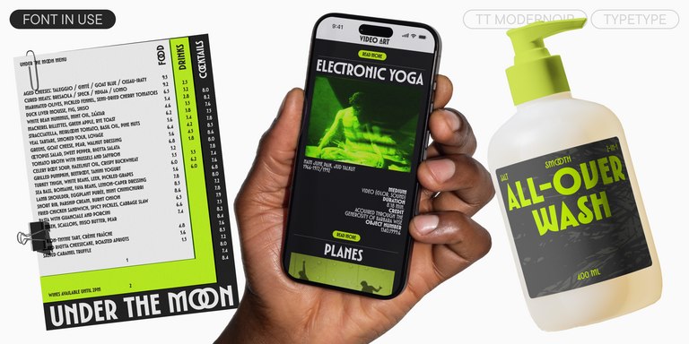
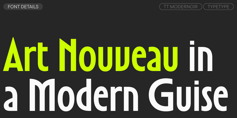
TT Modernoir is a display sans serif with dynamic proportions. Fluid lines and delicate Art Nouveau forms in this typeface blend seamlessly with the rhythmic flow and improvisational freedom of jazz.
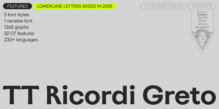
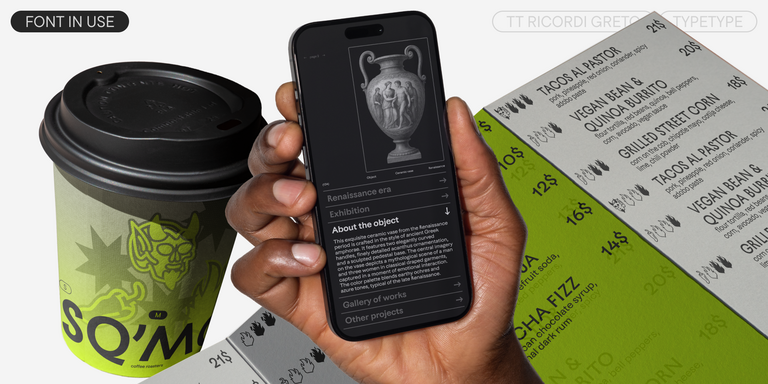
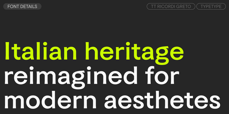
TT Ricordi Greto is an experimental project, inspired by a floor plaque dating from 1423 found in the Basilica di Santa Croce, Florence.
TT Firs Neue is a contemporary reincarnation of the good old TT Firs sans serif.
TT Marks delivers a script with dynamic rhythm, heartfelt character, and nostalgic appeal inspired by the classic art of American sign painting. This craft, where skilled artists hand-painted storefront signage with brushes and careful technique, is experiencing a well-deserved renaissance in today`s design world.
FAQ
What Are the Best Options for a Natural Visual Style?
The best organic fonts depend on where and how they will be used. A branding project, package, website, editorial layout, or social post may require different levels of expression. Compare readability, letterform character, available weights and styles, and how well the typeface matches the brand’s visual tone rather than looking for one universal “best” option.
What Is Closest to a Handcrafted Look?
Organic style fonts with flowing shapes, softer lines, subtle irregularities, and less rigid geometry usually feel closest to handcrafted lettering. Their rhythm can make a design look more personal and expressive. For headlines or packaging, stronger character can work well, while longer text usually benefits from calmer shapes and clearer letterforms that remain comfortable to read.
Are These Typefaces Suitable for Branding?
An organic typeface can work especially well for brands that want to communicate warmth, openness, naturalness, or creativity. The choice should still support the full identity system, not just the logo. Check how the design scales across packaging, websites, advertising, presentations, and smaller text, and whether it works comfortably alongside the brand’s other graphic elements.
Can I Use Organic Fonts in Commercial Projects?
Commercial use depends on the license provided with each typeface, so the terms should always be checked before publication. If you plan to use a font organic in character for a logo, package, website, app, advertising campaign, or another commercial application, make sure the selected license specifically covers that use and the required scope of distribution.
How Do I Choose Between Soft and Expressive Letterforms?
Soft forms usually create a calmer, more approachable impression and can work well throughout a broader identity or in longer passages of text. More distinctive shapes are often better suited to headlines, packaging, campaigns, and other focal points. When working with organic typography, test both directions in real layouts to see how character, readability, and hierarchy interact.
Do These Options Work for Digital Design?
Organic fonts for design can work well on websites and digital products when their visual personality does not interfere with usability. Check legibility at small sizes, contrast, spacing, line rhythm, and overall screen performance. Navigation, forms, product cards, and longer descriptions usually require more restraint than large headlines or promotional sections, where expressive details have more room to work.