ttgertika
Type foundryFonts & StylesVariableTT Espina
Buy font Try out the font

TT Espina

TT EspinaTT EspinaTT Espina
Single style: from $39 . 99 Full family: 7 styles from $129

Any questions about the font or licences? Write us.

Choose the fonts you want

Choose the fonts and licenses you want.

Then, press the "Add to Cart" button

25% OFF when you combine Desktop and Webfont licenses

Package offer:
per style $18.43
from  $129
7 styles
from  $129
from $39.99
from $39.99
from $39.99
from $39.99
from $39.99
from $39.99
from $119
Package offer:
per style $18.17
from  $109
6 styles
from  $109
from $39.99
from $39.99
from $39.99
from $39.99
from $39.99
from $39.99
from $119
1 style
from $119
from $119

Any questions about the font or licences? Write us.

Select font licenses

You must specify a font package or style before selecting a licence

Choose the licenses you want

The license is suitable for anyone who plans to use the font in logo design, images for websites and social media, as well as in print media, souvenirs, and merchandise.

This license is purchased by the number of workstations on which a designer will use the font.

Desktop license is paid for once. Full license text

On request

If you plan to use the font in headings or text blocks on your project site, choose this commercial font license.

Purchase price depend on the number of site visits per month.

Webfont license is paid for once. Full license text

On request

To use the font in applications for iOS, Android, Windows, Linux and other operating systems.

When choosing a license, we do not count the number of application downloads, but focus only on the number of created applications.

App license is paid for once. Full license text

On request

Suitable for placing banners, digital ads and posters on the Internet, as well as for advertising on social media.

The license options differ depending on the number of ad impressions.

Digital Ads license is paid for once. Full license text

On request

This license is for the use of a font in video content: blogging, on a YouTube or TV channel, in online or offline broadcasts.

Font license options depend on the amount of video content that uses the font.

This license is paid for once. Full license text

On request

Video game developers’ license. Allows you to embed a font in the video game code.

This license is paid for once. Full license text

On request

Suitable for those who will be using the font in e-books, magazines, interactive PDFs, or other publications.

This license is paid for once. Full license text

On request

The license is suitable for use on special sites and applications where users can create a product using the selected font without an additional font license.

This license is paid for once. Full license text

On request

This is the case when a font is not limited to one area of application, and you want to discover all the possibilities it offers.

For those who purchase an unlimited licence, we often make font customisation as a gift.

Unlimited license is paid for once. Full license text

On request
No selected items
Total
$0

TT Espina

About font family

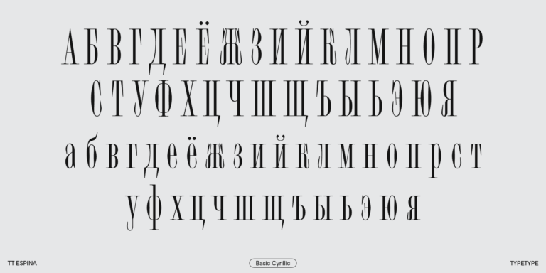
The display TT Espina typeface has been updated and now supports Cyrillic-based alphabets!

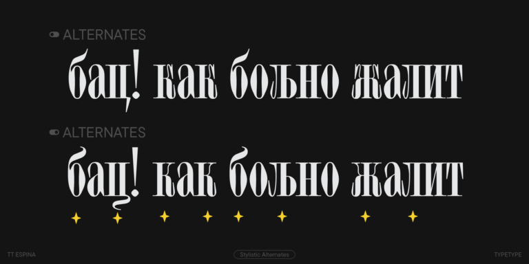
The 2.000 version boasts thoroughly revised kerning, enhanced hinting, more OpenType features, an extended character set, and new stylistic sets.

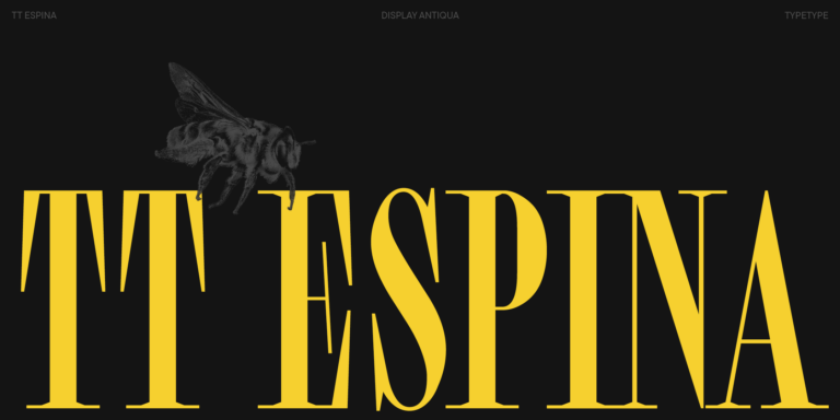
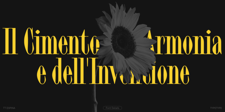
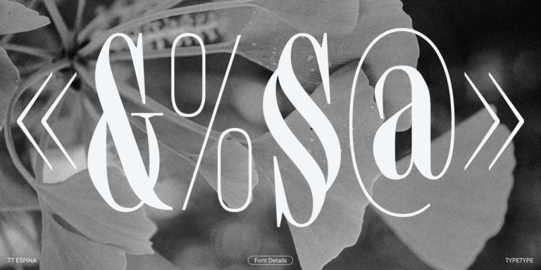
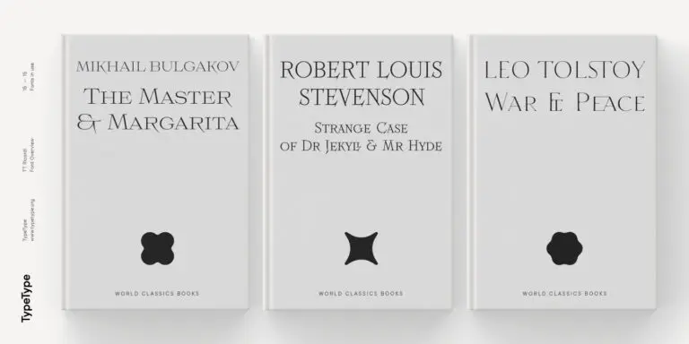
TT Espina is a display Antiqua with expressive serifs. To create it, our designers drew inspiration from the historical form of the letter O that acquired a rhomboid shape during the printing process quality. The final product is a modern typeface with high contrast between horizontal and vertical strokes.

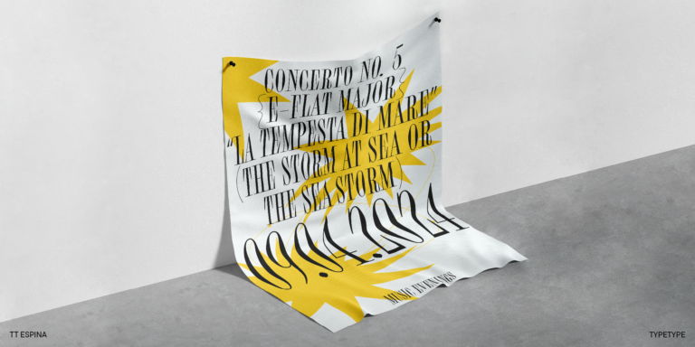
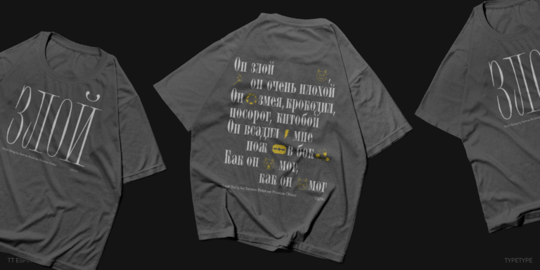
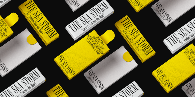
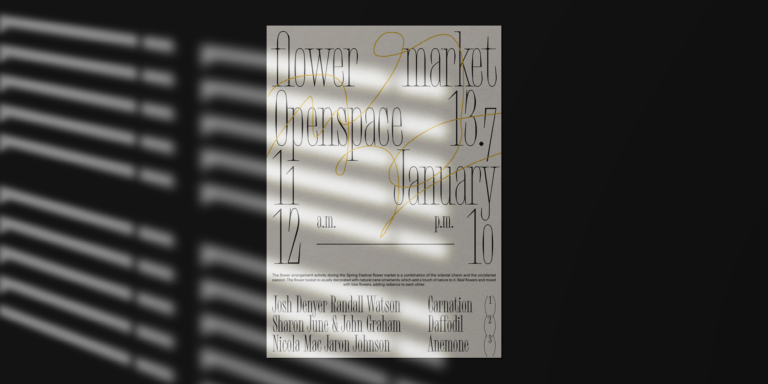
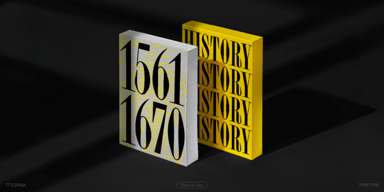
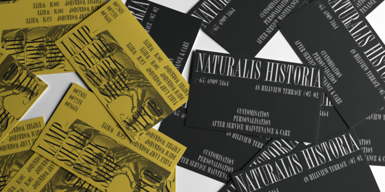
TT Espina is yet another proof that serifs can be stylish and expressive display fonts suitable for contemporary projects. This font is an excellent choice for poster headlines, billboards, gallery and exhibition designs, large-format printed materials, and websites.

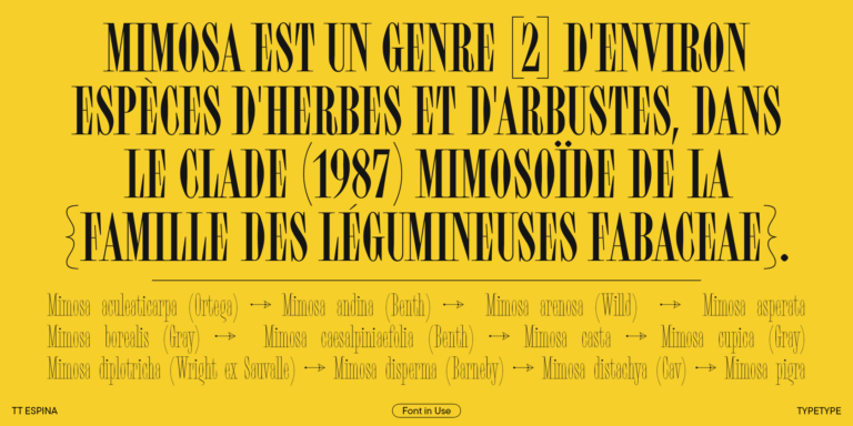
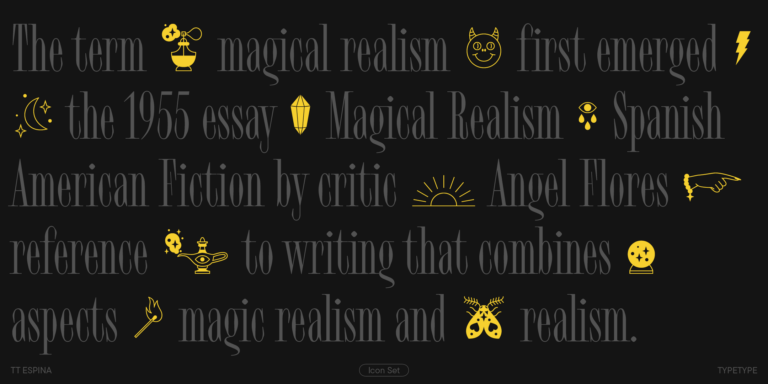
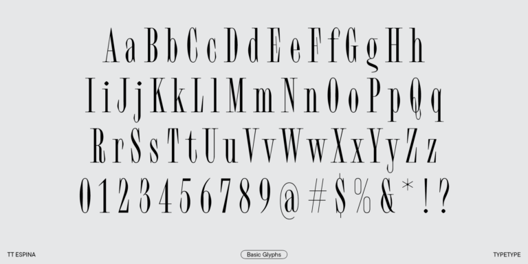
TT Espina stands out among other Antiquas due to its narrow proportions, high contrast, expressive and large serifs, closed aperture, and diamond-shaped bowls. Narrow characters add a unique aesthetic to the font. Each character in TT Espina attracts attention, making the headlines typed in it particularly eye-catching. Designers will appreciate the large set of icons the font includes.

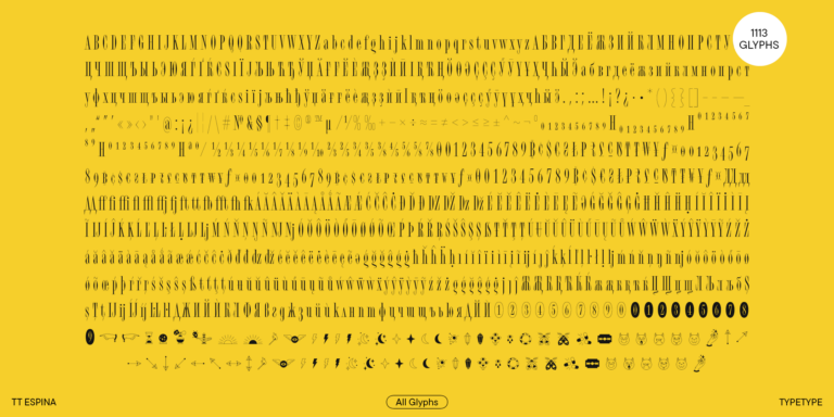
The updated release features improved and extended kerning; refined hinting for each character; additional glyphs for the extended Cyrillic and Latin-based alphabets; a larger base and minuscule sets of currency symbols; fractions and numbers for numerators and denominators; new stylistic sets for Cyrillic-based scripts, the dotted zero symbol, and filled and unfilled negative circled digits.

TT Espina, version 2.000, includes:

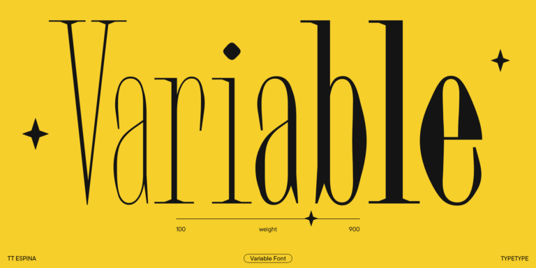
  • 7 font styles: 6 roman and one variable font;
  • 1113 glyphs in each font style;
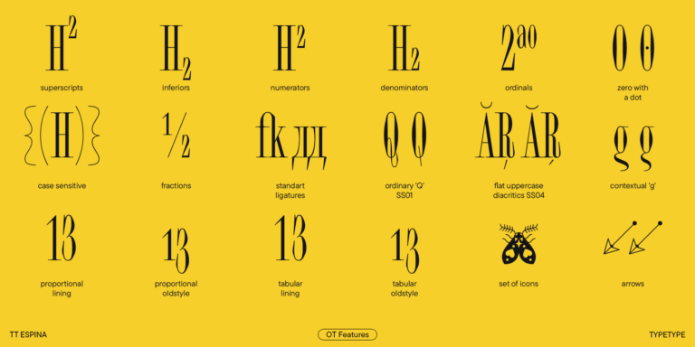
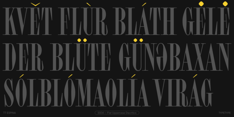
  • 38 OpenType features, counting in the possibility to transform shapes of certain characters and substitute high-diacritic characters with their low-diacritic counterparts, which is convenient for designing posters with dense inter-line spacing;
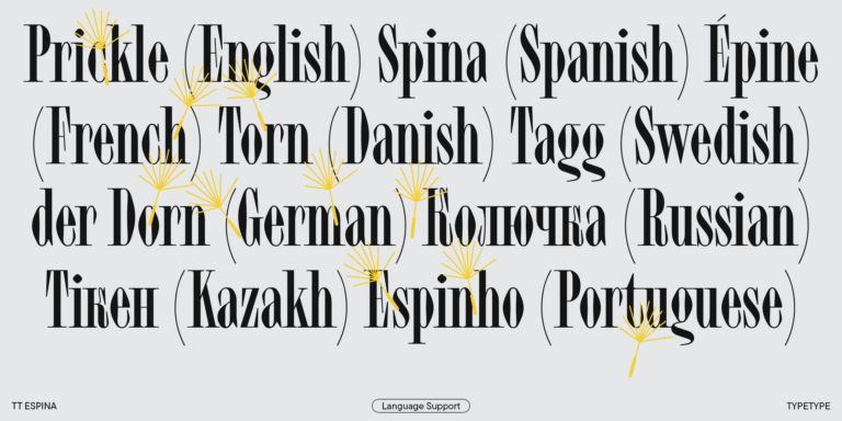
  • 230+ languages support.
240+ Language support

+ extended writing system Show all

Team

Yulia Gonina—art director
Marina Khodak—design lead, supervision
Ksenia Karataeva—idea and senior type designer
Ivan Gladkikh—technical director
Yuri Nakonechny—mastering, supervision
Anastasia Pogorelova—mastering
Elizabeth Ostrovskaya—kerning
Tasya Petelina—hinting
Victor Rubenko—hinting

Release and update date

Release: August 2, 2022

Last update: February 6, 2024

What's changed in the font:
  • The character set has grown from 648 to 1113 glyphs;
  • New OpenType features have been added, so now the font includes 38 of them instead of 21;
  • Cyrillic-based language support has been introduced;
  • The range of supported languages has expanded: now there are 230 of them;
  • Kerning has been fully updated: we have improved and extended it;
  • Hinting has been thoroughly reworked and enhanced;
  • More glyphs have been introduced to the extended Cyrillic and Latin-based scripts;
  • The base and minuscule currency sets have expanded, and fractions have been added along with the figures for numerators and denominators;
  • New stylistic sets have been implemented for the Cyrillic-based scripts, the dotted zero symbol, and filled/unfilled negative circled digits.

Additionally

Specimen

Download font specimen (pdf)

Poster Images

Graphic presentation at Behance

Custom version

Looking for a custom version of this font?

240+ Language support

+ extended writing system
TT Espina
Size
Otf
Turn on all

TT Espina shines the brightest on billboards and shop windows

TT Espina
Size
Otf
Turn on all
Var
Weight

TT Espina—a display Antiqua with expressive serifs

TT Espina
Size
Otf
Turn on all

TT Espina is a typeface that stands out among other Antiquas due to its high contrast, large serifs, closed aperture, and diamond-shaped circles. The font’s narrow letterforms bring a distinctive aesthetic charm to the mockups it’s incorporated into. Each character in TT Espina attracts attention, making the headlines typed in it particularly eye-catching. This typeface gem comes with a set of icons, making it an excellent choice for designers.

TT Espina
Size
Otf
Turn on all

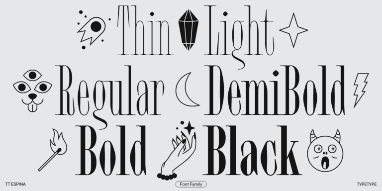
The family consists of 7 font styles: 6 upright and 1 variable font

TT Espina
Size
Otf
Turn on all

The official Queen’s Bagpiper’ plays at 9:00 (PÍOBAÍ)

OpenType features

Ordinary Q

Q

Q

Flat Uppercase Diacritics

Ӑ Ѓ Ё

Ӑ Ѓ Ё

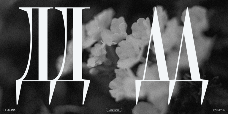
Alternative Cyrillic Tse, Shcha

Ц Щ ц щ

Ц Щ ц щ

Negative Circled Figures

3 4 5

3 4 5

Bulgarian localization

ДЛЯ вгж

ДЛЯ вгж

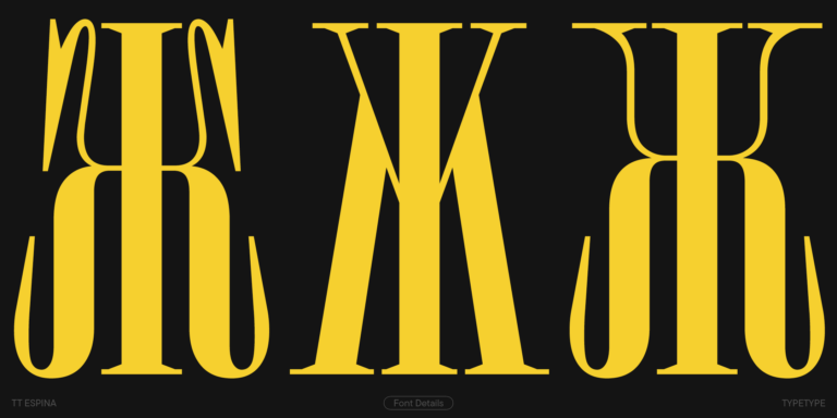
Alternative Cyrillic Zhe, K

Ж Ҡ ж

Ж Ҡ ж

Alternative Cyrillic L

Л Љ л љ

Л Љ л љ

Alternative Cyrillic b

б

б

Show all

Ideal font pairs with TT Espina

What is a font pair, and what does it serve for?

A font pair is a combination of two fonts within one text block. Most often, one of the fonts in a pair is a more expressive headline font, and the other one serves to communicate information. Such fonts complement each other and help designers solve various tasks, like highlighting key elements, adding emotional expressiveness to the project, or separating semantic blocks.

How to choose fonts for a project: Several general recommendations

To begin with, establish the project's tone. Choose the fonts that stylistically match the main idea. After that, you need to determine the functions of each font in the project and their hierarchy: which font will complement the design and which one will serve to attract attention as the main element. You need to assess the difference between the fonts and decide what kind of information each of them should convey. First, we recommend choosing the base font you will use most, and then you can find a suitable pair for it.

Core principles of font pairing and recommendations from designers

The main rule you should follow when matching two fonts is that both similarities and differences must be visible between them. You can highlight the coherence of fonts by the following characteristics: contrast, proportions, width, openness of characters, individual letter shapes, and overall tone. Feel free to experiment with different combinations. We also recommend analyzing the projects you like: this way, you can enhance your visual skills, elevate your knowledge base, and gain confidence in dealing with typography.

Similar fonts

Choose the fonts and licenses you want.