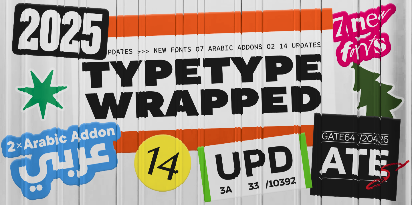
2025 was an incredibly productive year for TypeType: we released 7 new fonts, updated 14 typefaces, and added Arabic language support to two of our bestsellers. In addition, we won awards in type design competitions, explored new platforms, improved our website, wrote about type design in our blog, gave lectures, met with you at webinars, and created joint projects with friends and partners.
Here is a look at all our changes, achievements, and plans for the future!
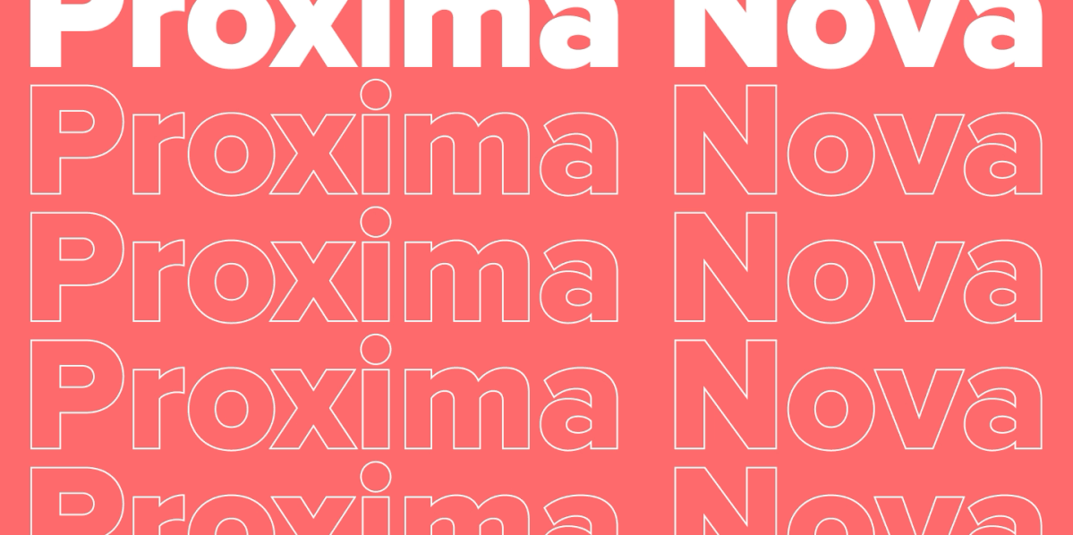
Fonts of the Year

New Fonts
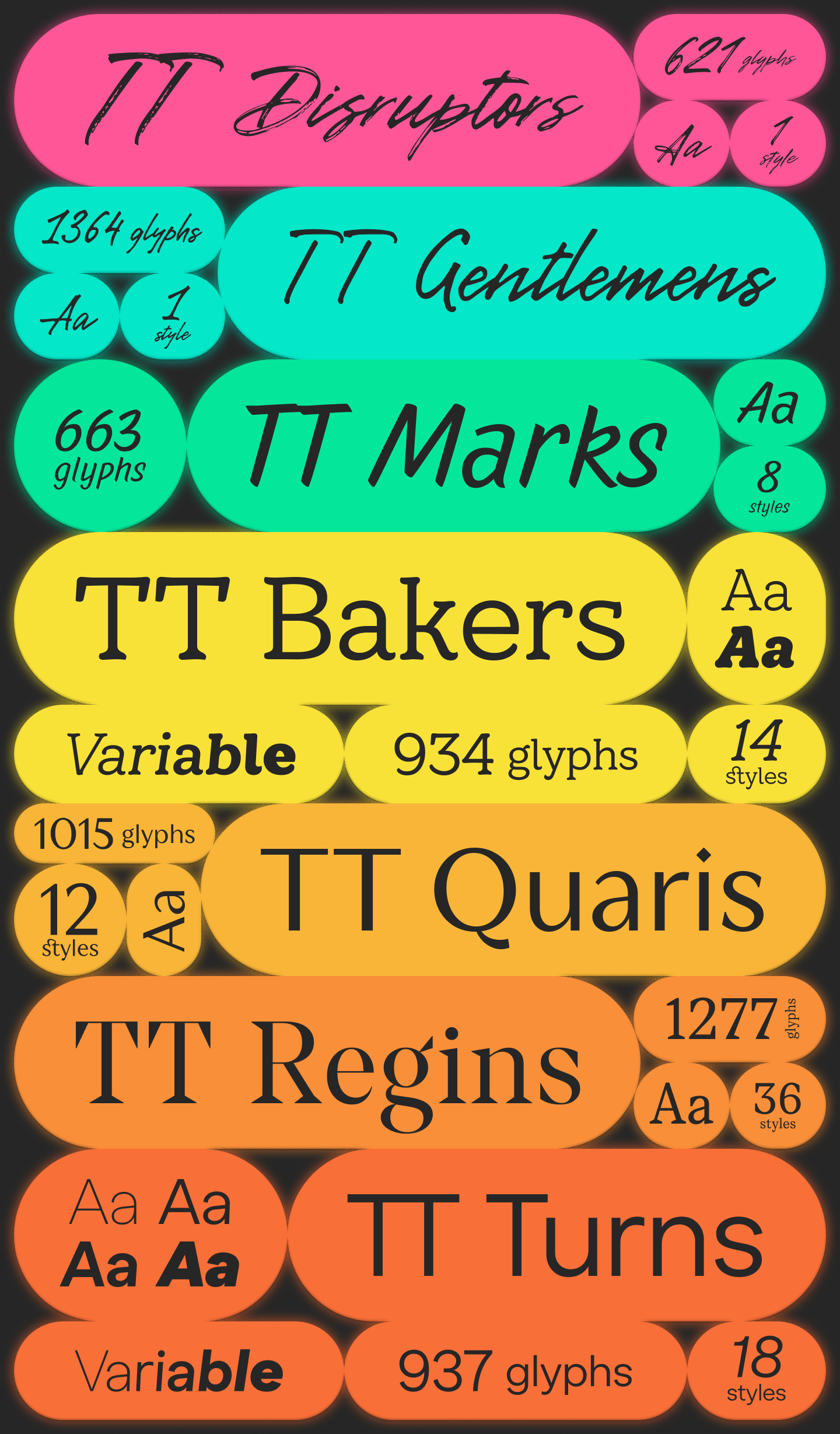
- TT Disruptors and TT Gentlemens: Two handwritten fonts with opposing characters: one rebellious, the other gentlemanly;
- TT Marks: A decorative handwritten font in the style of old American signs;
- TT Bakers: A fluid and soft serif reminiscent of fresh pastries;
- TT Quaris: An exquisite modern high-contrast sans that combines elegance, mystery, and boldness;
- TT Regins: A Scotch Modern serif with a royal character, high contrast, and sharp triangular serifs;
- TT Turns: A vibrant geometric sans serif with expressive elements, suitable for both running text and accents.
Updated Fonts
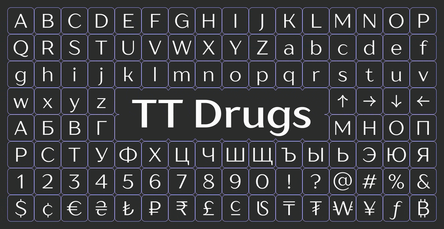
- TT Drugs: An exquisite yet serious high-contrast sans. We added a new subfamily to the typeface and expanded the variable font;
- TT Ramillas: A stylish and modern serif. We increased the character set and added new stylistic sets and languages;
- TT Interphases Pro: A neo-grotesque created specifically for interfaces. We added support for Greek and other languages, updated kerning and hinting, and significantly expanded the character set;
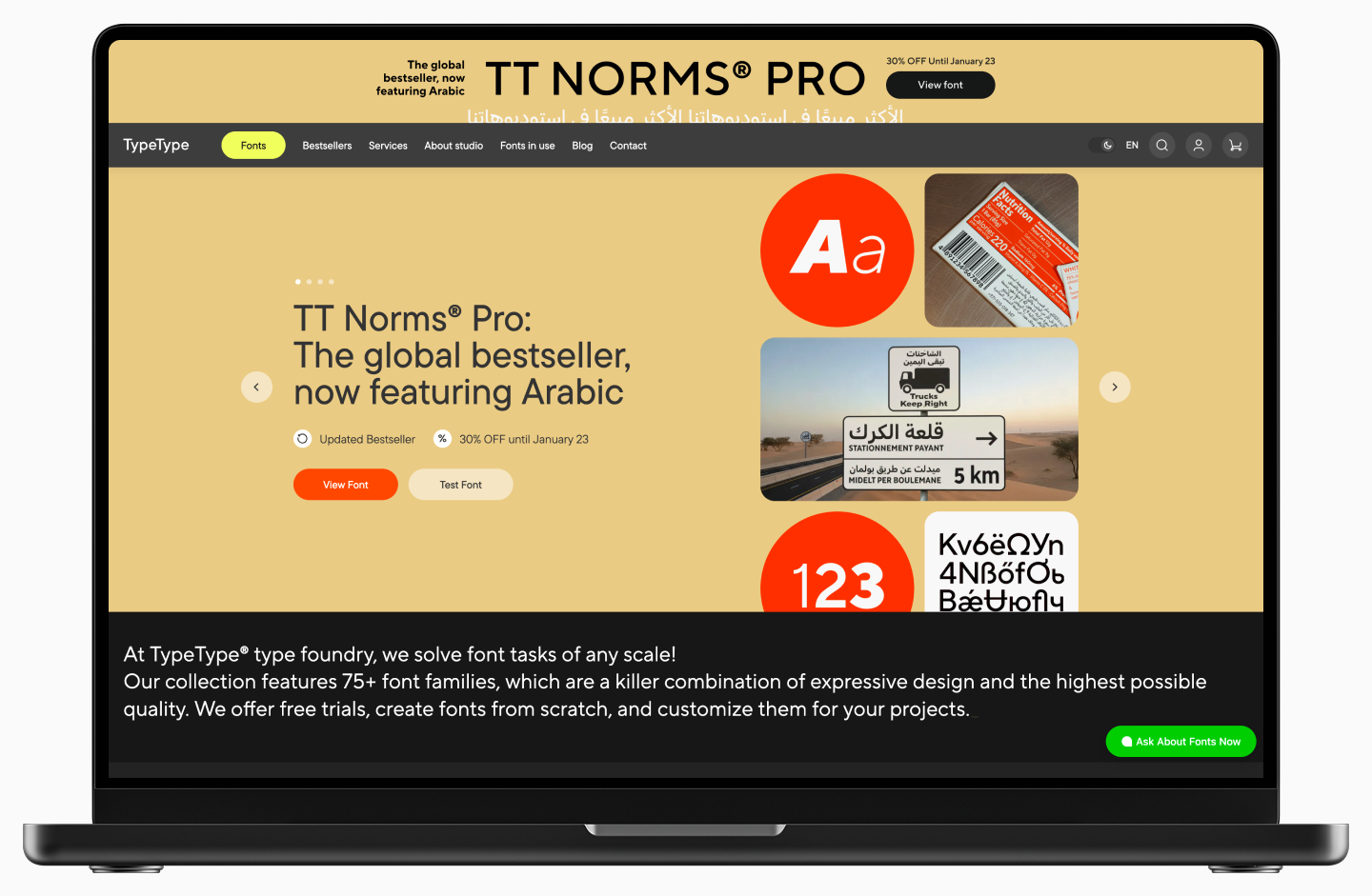
- TT Norms® Pro and TT Commons™ Pro: Two universal geometric sans serifs, the studio’s bestsellers. We increased the character sets and updated the stylistic sets;
- TT Ricordi Greto: A non-contrast Florentine sans serif with dynamic proportions. We added lowercase characters, new features, alternative forms, and languages;
- TT Ricordi Allegria: A modern and elegant high-contrast sans. We added lowercase characters, new styles, stylistic sets, languages, and OpenType features;
- TT Fellows: A universal humanist sans serif with a variable character. We expanded the character set, added stylistic alternatives, and introduced new features and languages;
- TT Fors: A stylish and concise geometric sans serif with precise forms. We added more glyphs, features, stylistic alternates, and languages;
- TT Modernoir: A display experimental sans serif with Art Deco elements. We added new glyphs, features, and stylistic alternates;
- TT Hoves Pro: A Scandinavian sans serif with a neutral yet recognizable character. We added new glyphs and languages;
- TT Moons: A high-contrast serif with narrow proportions. We expanded the character set and added new functions and variable styles;
- TT Jenevers: A display Dutch serif with distinctive details. We added new glyphs, features, languages, and variable styles;
- TT Severs: A geometric sans serif with unusual internal ovals. We added new functions, glyphs, and languages, as well as a variable font.
Fonts with Arabic Support
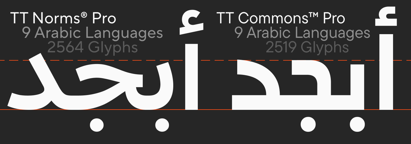
- TT Commons™ Pro: We designed the Arabic version of the font in the Kufi style—it turned out very geometric, strict, and energetic;
- TT Norms® Pro: The Arabic version is drawn in the Naskh style—it looks calm in the light masters and becomes more striking in the bold ones.
Plans for 2026
- Release several new fonts, including experimental projects created within the TT Labs creative laboratory;
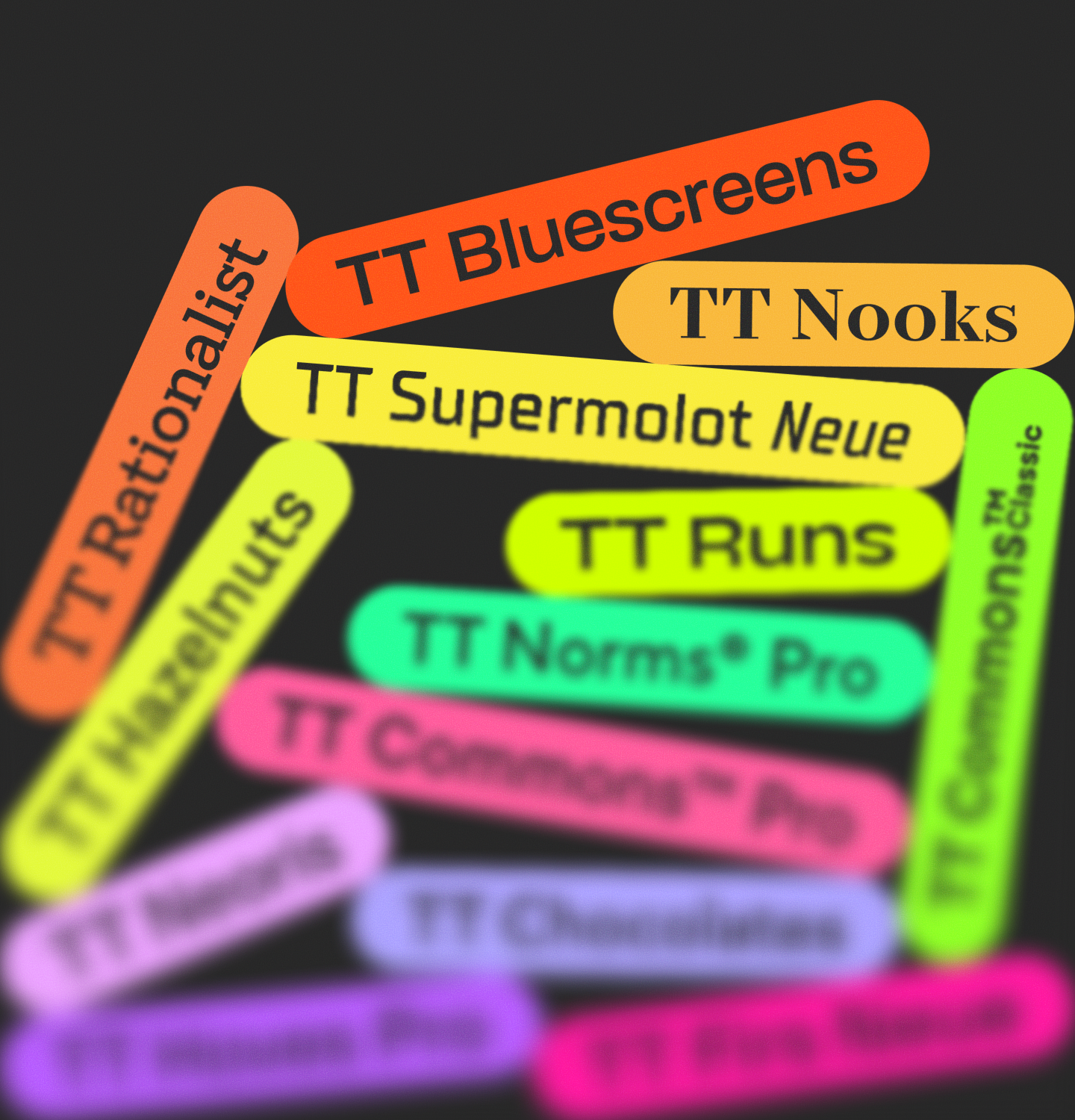
- Update TT Bluescreens, TT Runs, TT Commons™ Classic, TT Rationalist, TT Nooks, TT Hazelnuts, as well as improve our bestsellers TT Supermolot Neue, TT Norms® Pro, TT Neoris, TT Commons™ Pro, TT Chocolates, TT Hoves Pro, TT Firs Neue, and add Arabic language support to some of them.
Awards in Type Competitions
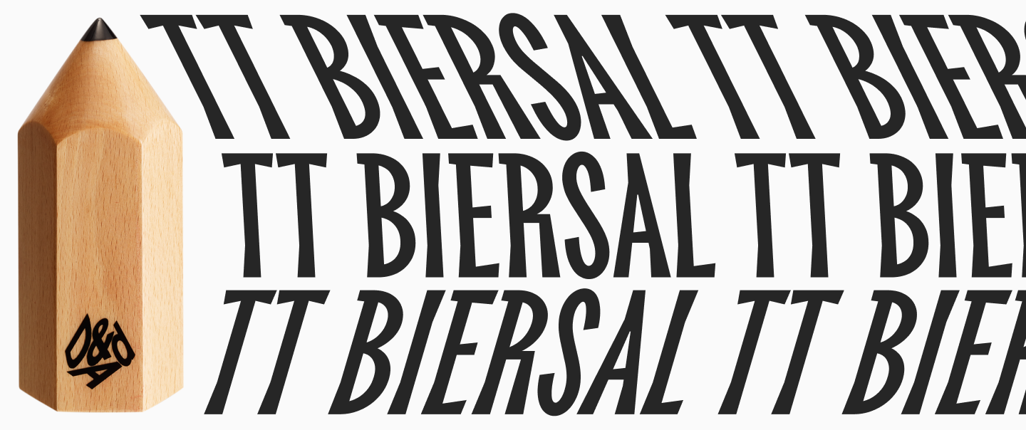
- D&AD Awards: Our decorative TT Biersal, with its mischievous character, won a Wood Pencil;
We have already started submitting entries for new competitions—stay tuned for updates!
How Our Website Changed
- We made payment on the site more convenient by adding the Stripe payment system;
- Launched the Arabic version of the site;
- Made navigation clearer: updated the top menu, font navigation, and font pages;
- Updated the visual components of the site: banners, forms, notifications, cart design, and checkout pages; added the ability to download trial fonts on new pages; and redesigned our emails and newsletters;
- Added new sections: Services, For Agencies and Studios, Font Pairings, Font Styles;
- Launched an online chat where you can ask any questions about TypeType fonts and services.
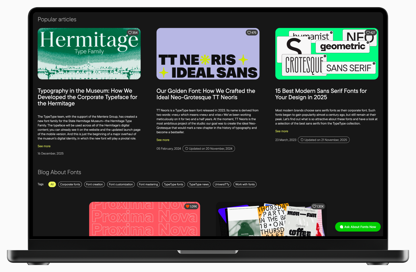
New Articles on the TypeType Blog
- “Retalic or Reversed Italic: Understanding Left-Leaning Type Design” on how retalic appeared, why it is needed, and where it can be found;
- “How to Name a Font? Learning from Real Examples” on how names for typefaces are invented and what they reflect;
- “On the Road: How a TypeType Font Was Tested for the Atom EV Interface” on customizing the font for Atom and testing it in action;
- “Font Universe in a Bottle: How Pinot Agency and TypeType Created ‘Type Wine'” on a joint project that began with conversations over sparkling wine and grew to cosmic scale;
- “UniversiTTy: Lesson 10. Designing Basic Lowercase Characters” a continuation of the “UniversiTTy” article series;
- “The Best and Most Popular Fonts for Memes: How to Choose and Use Them Correctly” on the role fonts play in memes;
- “A Font with a Wide Reach: A Special Project for SHIFTBRAIN’s 20th Anniversary” on developing a unique variable font capable of extreme horizontal expansion;
- “The Perfect Moment Is Now: Launching Our Creative Lab, TT Labs” on “small creative” projects and their realization within a large type studio;
- “Typography in the Museum: How We Developed the Corporate Typeface for the Hermitage” on how to reflect historical context in a modern font without referencing specific eras.
We regularly publish materials about fonts and type design—follow updates in our blog!
Speaking Engagements
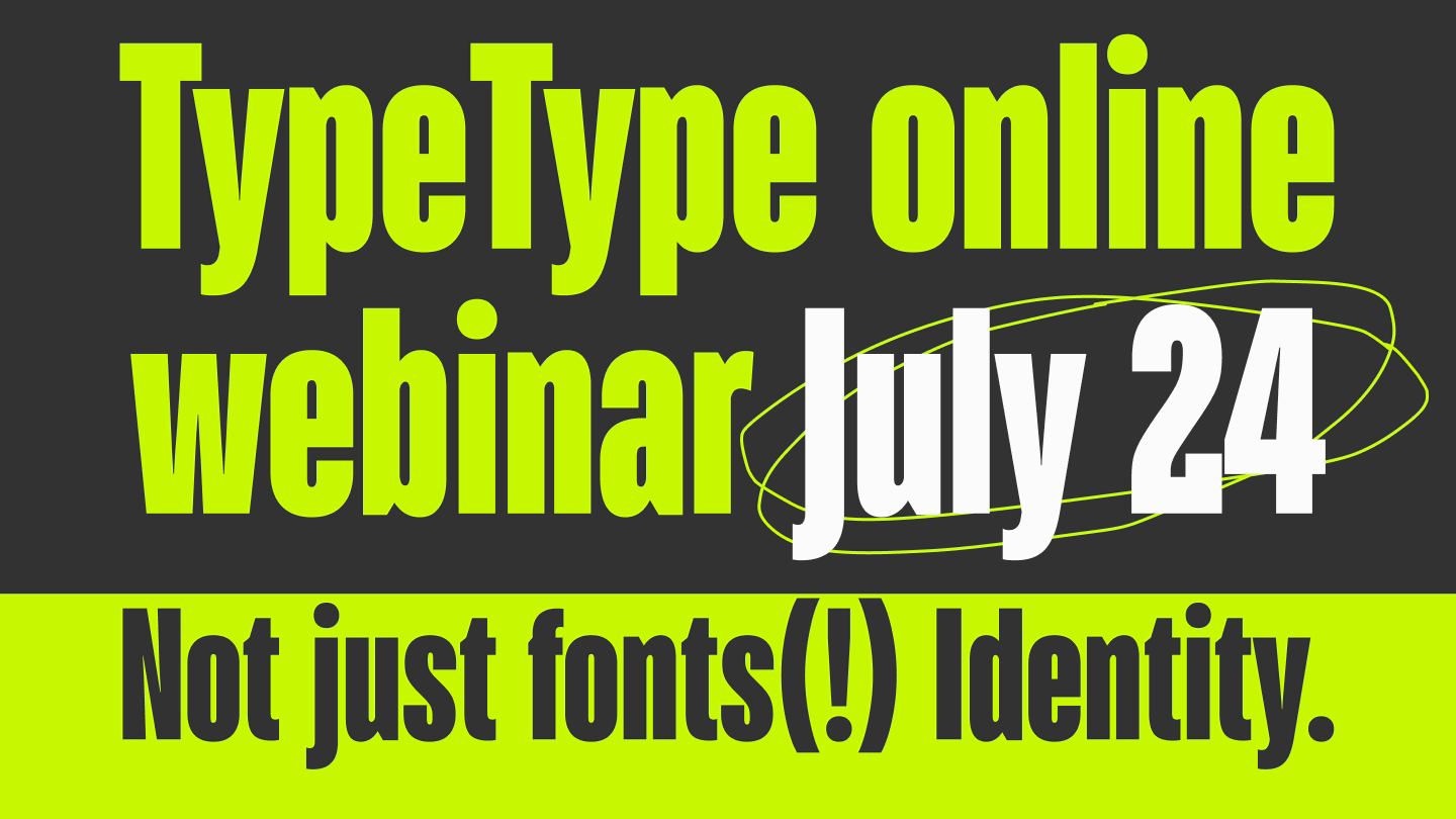
This year we held two international webinars:
- “Meet TypeType” where we told you more about who we are and what we do;
- “Typeface Research” where we showed what this is and how such research helps brands.
Collaborations and Partner Projects
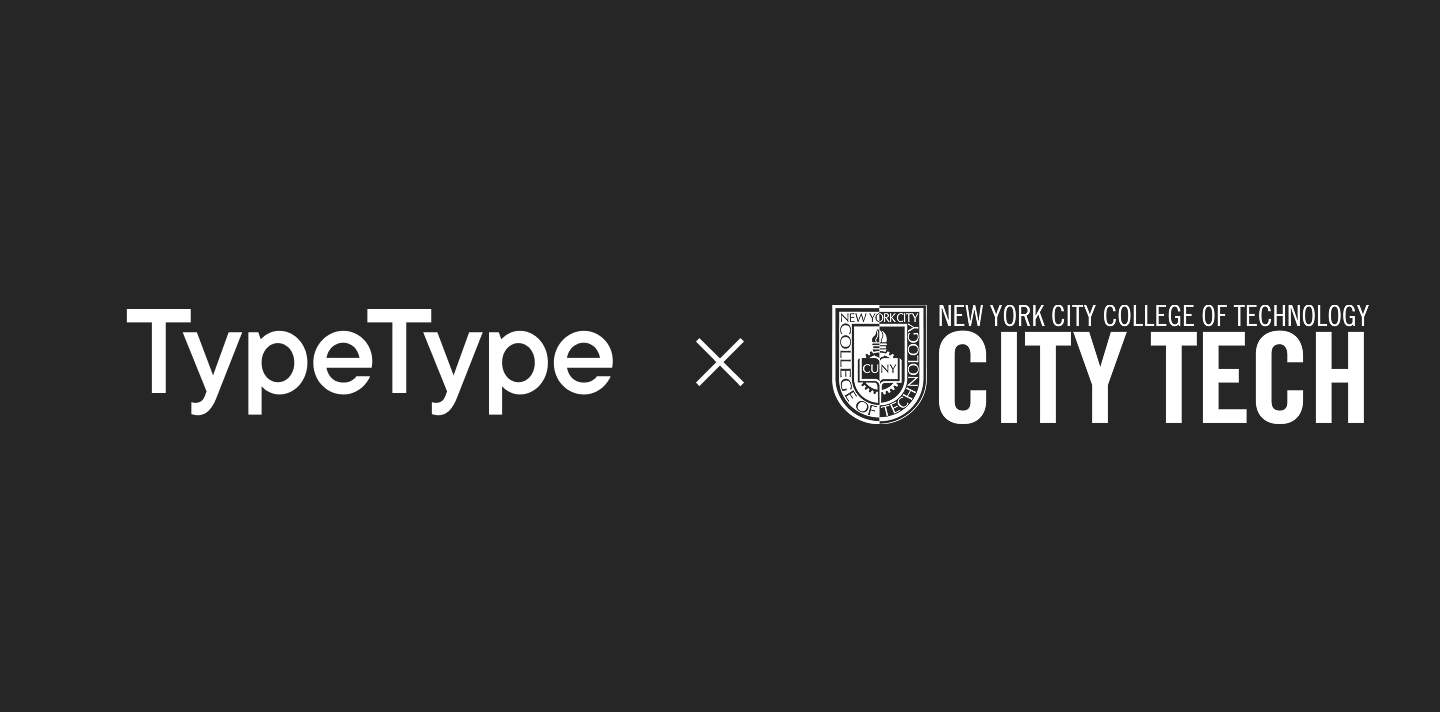
- Held a lecture series for City Tech — New York City College of Technology.
Expanding to New Platforms
Our fonts are now available on HelloFont—a platform for the Chinese and Japanese markets.
Conclusion
Yes, 2025 was intense and complex, but insanely interesting. New fonts and projects are already on the way—stay tuned for news!
And thank you for staying with us <3