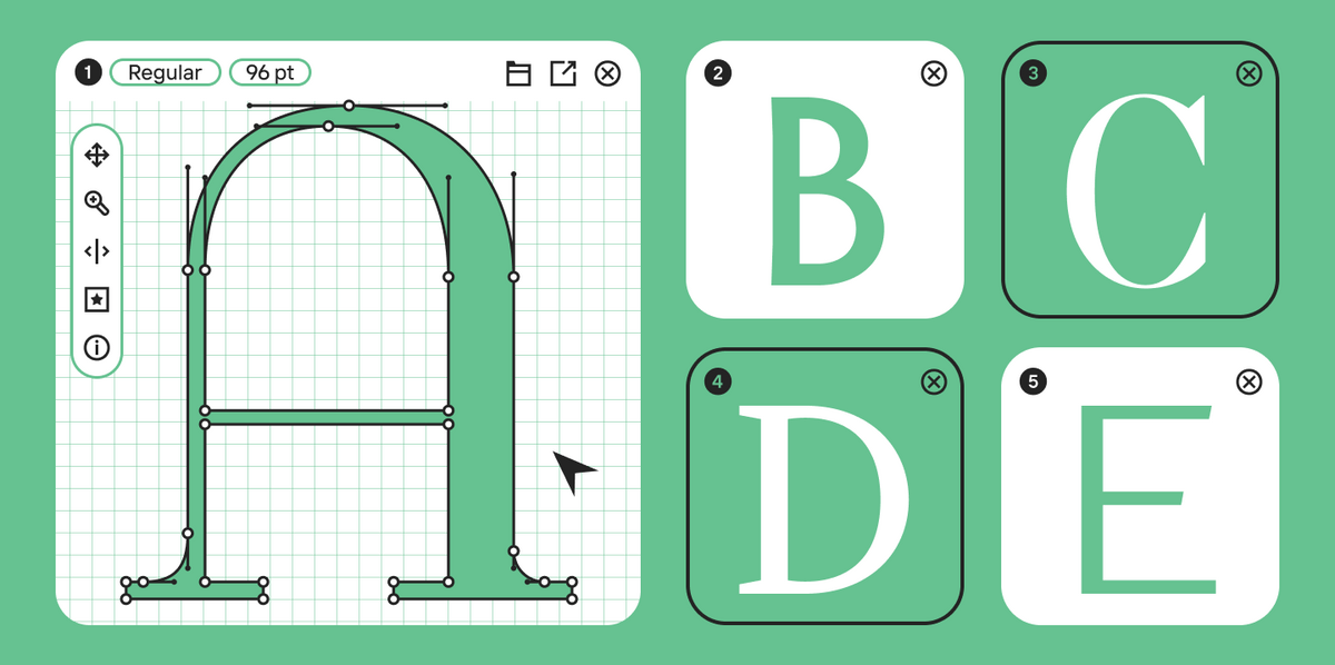
When a designer is looking for a font for a new project, a practical question often arises: should I take a free option or buy a paid one right away? At first glance, everything is simple. A free font can be quickly downloaded, installed on your computer, and used in a layout immediately. A paid one requires a budget, approvals, and at least a basic understanding of the license. But in practice, the choice almost never comes down strictly to price.
The difference between free and paid fonts becomes noticeable during the actual work. One аoption is suitable for a draft, a test, a personal project, or a quick web solution. The other withstands the heavy load of a brand system, a commercial launch, multi-level typography, scaling to new media, and legal scrutiny. Therefore, it is more correct to frame the question not as “what is cheaper,” but as “what perfectly suits this specific task.”
At TypeType, we frequently encounter the exact same situation: a project starts with a search for “something free,” and then it turns out that the client needs a font with Cyrillic support, multiple styles, a clear license, and support for the web, advertising, and applications. At this moment, it becomes clear that free and paid fonts are not head-to-head competitors, but rather different tools for different stages and scenarios.
In this article, we will analyze in detail the difference between paid and free fonts and explore which option is best suited for different situations.
Free and Paid Fonts in Modern Design
Why Fonts Matter in Typography and Branding
A font is one of the most visible tools in a brand’s visual system. It influences the intonation, rhythm, readability, and overall impression of the communication. The exact same text can look friendly, tech-oriented, strict, premium, or utilitarian—depending on which font the designer chooses.
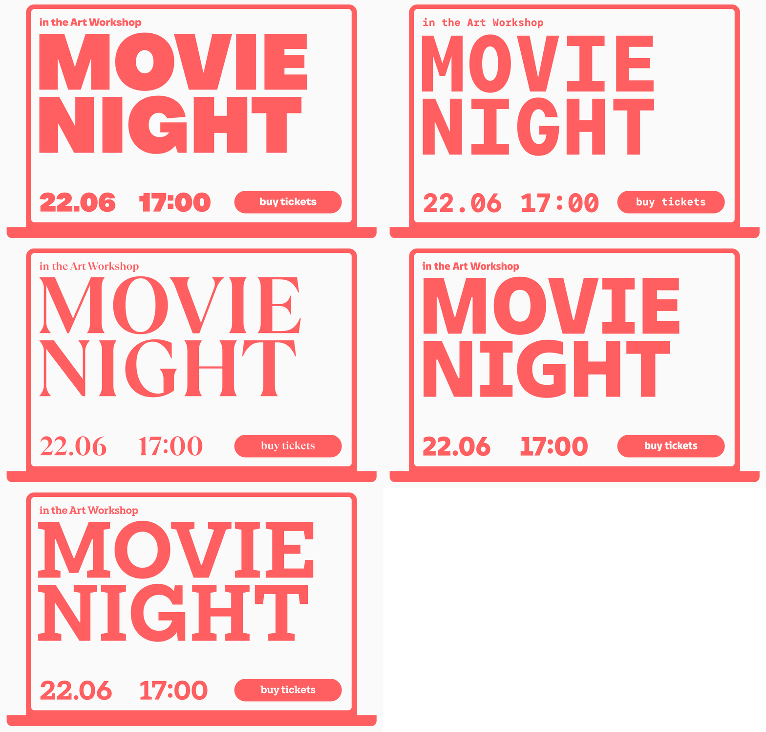
This is especially evident in branding. Colors can be updated relatively quickly, illustrations replaced, and graphics reworked. But a typography system usually becomes a long-term foundation. It works on the website, in the interface, in the app, on packaging, in outdoor advertising, presentations, documents, and social media. And if you make a mistake with it, it will be noticeable everywhere.
Overview of Free and Paid Fonts
At an everyday level, it seems that free fonts are just fonts you can freely download from the internet, and paid fonts are fonts for money. But in a professional environment, the difference goes deeper. A free font is a typeface that you can get for free under the terms of a specific license. A paid font is a typeface for which you must buy a license or set up a subscription access.
In other words, the main difference is not whether you have to pay at the download stage. The main difference lies in usage rights, the depth of design details, the level of control, support, and application scenarios. Sometimes a free font fits perfectly. Sometimes it becomes the source of future problems. Therefore, comparing free versus paid fonts should always be done through the lens of the task at hand.
Free Fonts
What Are Free Fonts and Where to Find Them
Free fonts are typefaces that you can download for free, but you cannot always use them however you want. A good free font always has a source, an author, and clear terms of use. This could be an open-source license, an educational development, or a typeface published by the author for free distribution.
It is best to look for such options in reliable places: on the official websites of font studios, in trusted libraries, and in catalogs where the font has a description, a license, and information about the author. Otherwise, a designer risks getting not a free tool, but a questionable file with an unclear origin.
Types of Fonts: Sans Serif, Serif, Script, Modern
Even within the segment of free solutions, the choice is quite wide. You can find:
- Sans Serif — for interfaces, websites, presentations, and navigation;
- Serif — for layouts, editorial design, and brand communication;
- Script — for accent tasks, packaging, and invitations;
- Display — for headlines, bright designs, and visual experiments.
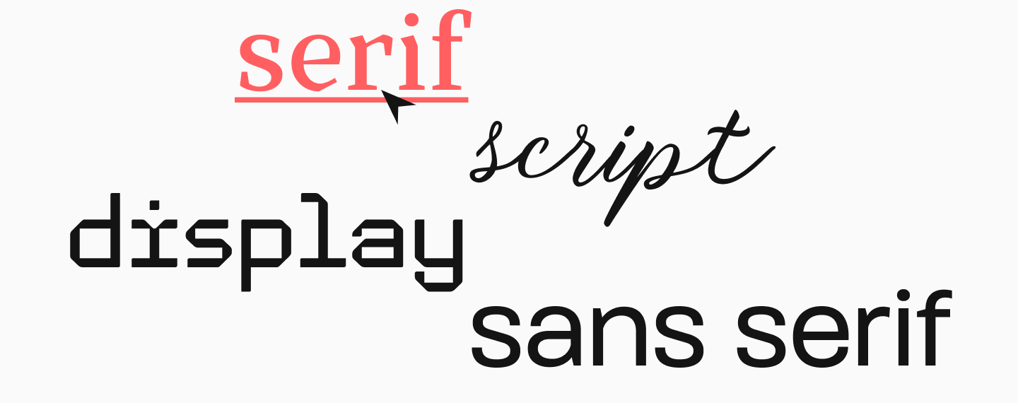
The problem is usually not that there are too few free fonts. The problem is that among them, it is much harder to find truly high-quality, amazing solutions for serious professional work.
Advantages of Free Fonts
Free fonts have their own advantages. They can be quickly integrated into the process, do not require a budget, and let the designer freely explore creative ideas. This is especially useful at the beginning of a project, during the concept, draft, and testing stages.
Free typefaces are convenient when you need to:
- quickly assemble a layout;
- check several visual directions;
- launch a temporary site;
- prepare a personal or educational project;
- create a test version of an identity;
- choose a base typeface for a small business.
Sometimes a good free font truly solves the task completely. But it is important to understand where its convenience ends and its limitations begin.
Disadvantages and Risks of Using Them
Most often, users encounter the following problems when using free fonts:
- the license is not suitable for commercial use;
- the necessary functionality is missing;
- there is no proper Cyrillic support;
- there are too few styles or weights;
- weak detailing of numerals, punctuation, and spacing;
- the font behaves poorly in small sizes or running text;
- the file was downloaded from an unknown site;
- the typeface is too generic and doesn’t allow you to create something unique;
- the font looks uninteresting and outdated.
Paid Fonts
What Makes a Font Premium
A premium font is usually not just a “typeface for money,” but a much more comprehensive and meticulously assembled product. Behind it lies massive work on character drawing, spacing, language support, OpenType features, and adaptation for different environments. In other words, it is a fully functional typography system.
Advantages of Paid Fonts for Professional Work
Paid fonts are especially great where the design needs to be sustainable, not just flashy. If a project is going to live a long time, grow, and be used across a multitude of media, a paid typeface generally becomes the more reliable solution.
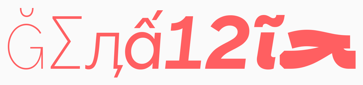
Its advantages can be boiled down to a few key points:
- high quality of drawing and technical execution;
- more styles and options for individual customization;
- broader and higher-quality language support, developed according to all typographic rules;
- clear scenarios for commercial use;
- unique design;
- the absence of legal, technical, and other risks.
For professional design, this matters. The price of a license is almost always lower than the cost of redoing a project where the typography system turned out to be the weak link.
Type Foundries and Quality Standards
When a font is developed by an independent author, they might rely more heavily on their own professional intuition, visual taste, and subjective understanding of what a good result should look like. This approach often yields vibrant, original, and highly expressive typefaces. But the quality criteria in this case are often tied to the individual working method of that specific designer and are not always tested across a wide spectrum of practical scenarios.
Inside a professional type foundry, the approach is usually different. Here, quality is evaluated not only by the impression of the drawing but by a much stricter system of internal criteria. It matters how consistently the character shapes are built, whether the entire typeface works logically as a system, if the proportions between weights are balanced, and how the font behaves in text, on screen, in print, in interfaces, and in large headlines. In other words, the foundry checks not just the idea, but the stability of the font in real-world work.
Furthermore, type foundries usually have higher technical standards. This refers not only to the quality of the drawing but also to how the font itself is assembled as a digital product: whether the spacing and kerning are neatly adjusted, if the OpenType features work correctly, if the numerals, currency signs, special symbols, and service marks are fully developed, how cleanly the files are prepared, and how predictably the font will behave in different software and environments. For professional designers, this is critical, because weak technical execution might only reveal itself after the project has launched.
This is exactly why, for large projects and brands, fonts from a professional foundry often turn out to be a much safer choice than typefaces from individual authors. A business needs more than just an interesting font; it needs a tool with a guaranteed level of quality, stable technical implementation, and predictable behavior across different media. The larger the project, the more important it is that the font is backed not only by a strong idea but by rigorous testing standards.
Free vs Paid Fonts: Key Differences
License and Commercial Use
It is crucial to understand that every font has a license—both paid and free ones. A font can be free, but with limitations on its use. It can be freeware—for example, for personal purposes only. It can be a trial version that you can download to test, but cannot use in a finished project. And a paid font can have several different licenses tailored for different scenarios.
Quality and Attention to Detail
If you compare free and paid fonts on average across the market, paid solutions more frequently win in quality. A free font can be amazing. But in a serious side-by-side comparison, a professional paid typeface will likely win out in both the drawing and the quality of its technical execution.
Uniqueness and Variety
Free fonts are popular, meaning they are frequently found in vastly different projects all over the world. This is convenient if you need neutrality. But if the goal is to stand out, build a recognizable visual language, and avoid looking like dozens of other websites, an equally popular free typeface might be too predictable a choice.
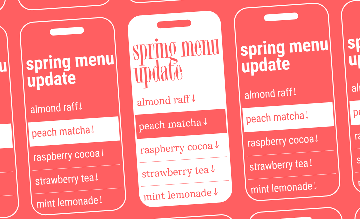
Paid fonts do not guarantee uniqueness automatically, but they have a much higher chance of helping a brand sound distinct. Especially if we are talking not about a random purchase, but a conscious selection tailored to the brand’s character.
Support and Updates
Free fonts are not always developed or updated by anyone over time. They might lack technical support and updates, which is why they often quickly become outdated. In the paid segment, this is usually structured much better: the typeface has a copyright holder, documentation, and a much clearer lifecycle.
For a business, this means one thing: the font doesn’t just solve the task today, it won’t stop working tomorrow.
When to Use Free Fonts
Personal Projects and Experiments
Here, free fonts are appropriate almost all the time. For portfolios, educational work, posters, composition studies, concepts, and tests—they are excellent tools. They let you move quickly and focus on the idea.
It is only important not to train yourself to be careless. Even in personal work, it is helpful to check where the font was downloaded from and under what conditions it is distributed. This is simply good professional hygiene.
Small Business and Startups
For a startup, a free font can be a perfectly reasonable choice. When a business has a limited budget, it is more important to launch than to immediately buy a massive typography system. In this case, a free typeface helps assemble the website, basic templates, presentations, and initial advertising materials.
But you should realize in advance: if the project grows, the typography system will have to be revised. And it is better to plan for this possibility right from the start.
Quick Solutions for Web Design
For the web, free fonts are incredibly convenient. They are easy to test, compare, and quickly connect. For interfaces, landing pages, blogs, internal services, and digital products, this is often a working option.
But as soon as the web project begins to act as a full-fledged brand carrier, the requirements grow. And then the task of “download for free” gradually gives way to the question, “will the font withstand all usage scenarios?”
When to Choose Paid Fonts
Branding and Identity
If a font becomes part of the corporate language, it is better to look towards paid solutions right away. An identity is a system that must be convincing, stable, and alive across different formats.
A paid typeface provides more tools for this work: a broader family, better-crafted details, a clearer license, and a higher probability that the brand will sound more precise and professional.
Large Commercial Projects
The larger the project, the more important predictability becomes. In one of the largest commercial tasks, the font must work across presentations, documents, advertising, interfaces, apps, websites, and other media. Clarity is needed here. And clarity in such projects is usually provided precisely by a paid system.
The Need for Professional Typography
Sometimes a paid font is needed not for status, but for functionality. For example, if a project is multilingual and needs a typography system with correct support for a massive number of languages. Or if the font is part of a complex design and must include extra features (like in our special project for SHIFTBRAIN). In such cases, it matters not only how beautiful the font looks, but how expertly it is built.
Best Free Fonts for Designers
Popular Free Fonts (Serif and Sans Serif)
As a solid working starting point, you can consider options like:
- Inter — for interfaces and digital products;
- Roboto — a universal, neutral sans serif;
- Open Sans — for running text, the web, and simple systems;
- Montserrat — for expressive headlines;
- Manrope — for modern digital design.
You can also find free font options, as well as trial versions of commercial typefaces from TypeType on this page.
Best Free Fonts for Web Design
For the web, typefaces are useful if they:
- work well on screens;
- have multiple weights;
- read well in small text;
- adapt smoothly to different screens and sizes.
How to Choose Quality Free Fonts
Before using a font in a project, check:
- can it be used in commercial projects?
- does it have the languages and symbols you need?
- how many styles are available?
- how do the numerals look?
- are the quotes, dashes, and currency signs accurate?
- is there an official website or author page?
This short checklist instantly filters out the vast majority of questionable options.
How to Find Free Fonts Similar to Paid Fonts
Search Services and Tools
Sometimes a designer doesn’t need a specific font, but rather a similar character. In that case, it makes sense to look for an analog: by proportions, mood, contrast, width, letter drawing, and usage scenario.
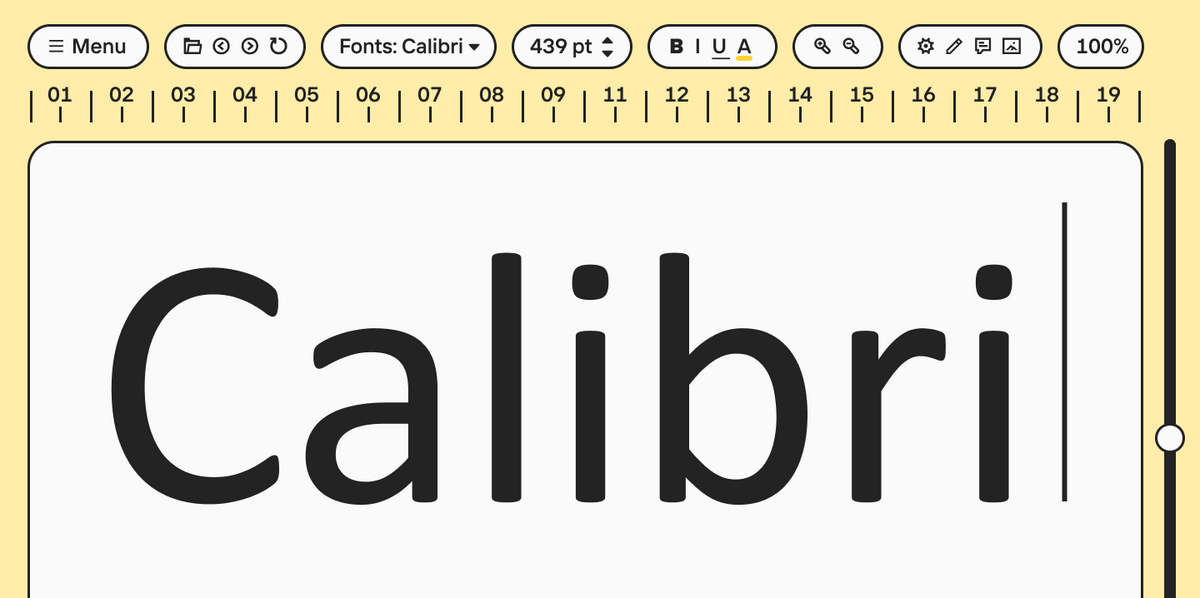
Recognition and comparison services, font catalogs, foundry collections, and category filters help with this. For example, on the TypeType website, you can find analogs of popular fonts like Calibri, Futura, and others.
Tips for Choosing Similar Fonts
When comparing, it is helpful to pay attention to:
- overall geometry;
- x-height;
- letter width;
- stroke contrast;
- the character of the serifs;
- numeral shapes;
- the presence of additional characters.
A good analog is an independent option that solves the task in a similar way, and in some cases, goes even beyond the original by expanding your capabilities.
Font Licensing Explained
What is a Font License
A font license is essentially a set of rules by which the copyright holder allows the font to be used. A font is an object of intellectual property, and its terms of use are determined by the designer or the foundry holding the copyright. In different countries, a font can be considered software, a graphic work, or both simultaneously.
A simple conclusion follows from this: any font, even if you got it for free, is used under a license, not “by default.” And before using it in a project, it is vital to understand exactly what you have the right to do.
Who Needs a License and Why You Can’t Do Without One
Font licenses are needed by everyone who uses them. This applies to free typefaces, fonts for personal tasks, and commercial projects. Using them without a license can lead to legal liability.
In practice, this means the following: the designer, the studio, the marketing team, the business, and the client must all treat the issue of licensing with equal care. Even if a font was already pre-installed on the computer or has been sitting in a project folder for a long time, it doesn’t prove that it can be used for the current task.
Read more about font licensing in this article.
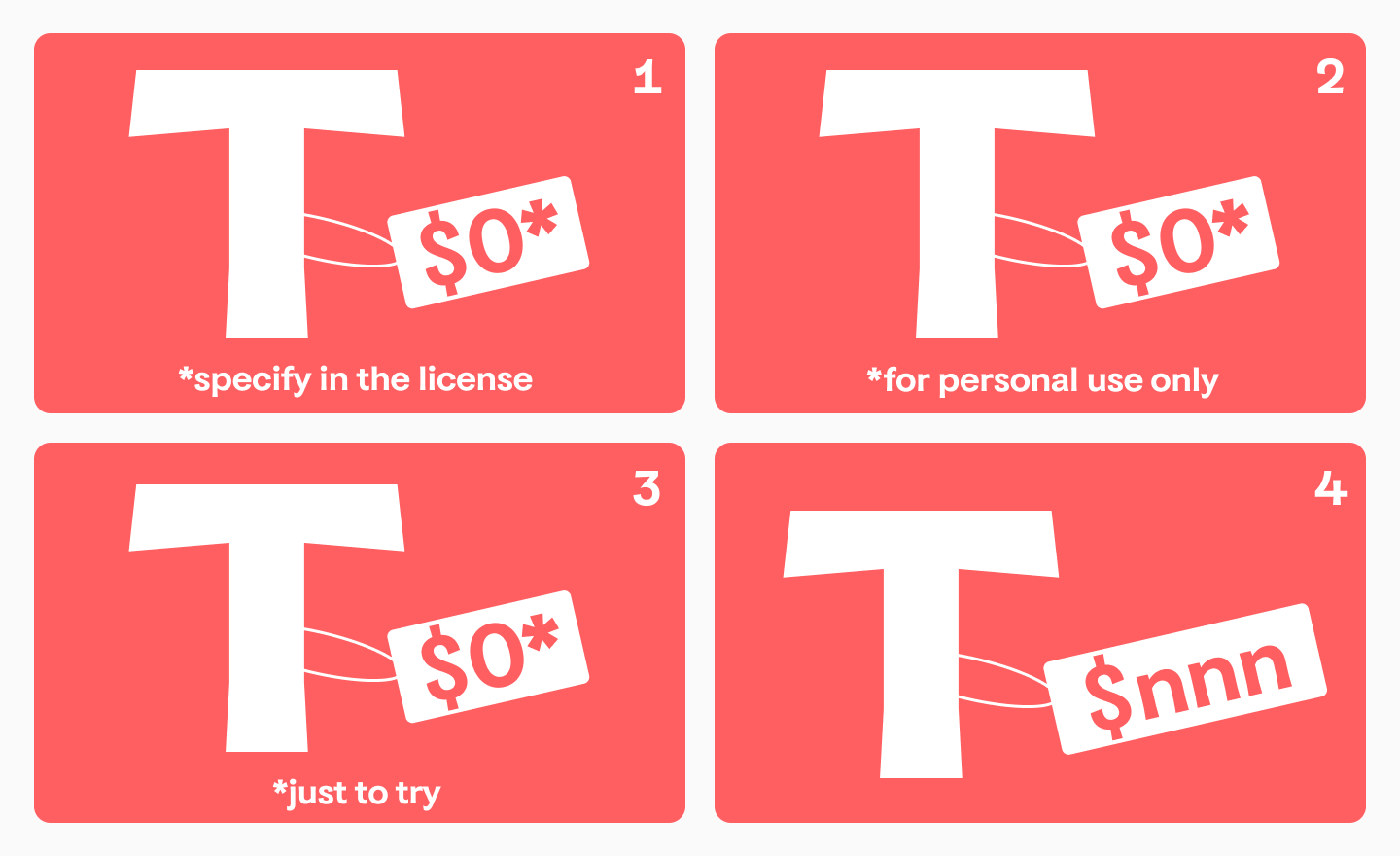
Free, Freeware, Trial, and Paid Fonts
It is important to distinguish between several scenarios that are often mixed up.
First, there are free fonts with an open license: such typefaces can be used for free, including in commercial projects, if permitted by the license terms. But even free licenses can have restrictions, and one of the most common open licenses remains SIL OFL 1.1.
Second, there are freeware fonts—for example, pre-installed system typefaces that the user gets along with a program or device. An example is Microsoft fonts: they are available as part of the product for personal purposes, but commercial use may require a separate purchase.
Third, there are trial (test) versions. You can download them, test them in layouts, compare them with other options, and see if the typeface fits the project. But a trial cannot be considered a free commercial license: it is specifically a test format needed for evaluation, not for use in a finished project. Trial fonts from TypeType are available here.
And finally, there are paid fonts—that is, typefaces for which usage rights are formalized through a specific type of license. Browse the complete collection of paid fonts from TypeType here.
Types of Font Licenses
A license is selected for a specific scenario. Different foundries may have different licensing systems. TypeType offers, among others, a desktop license, web license, and licenses for apps, video games, e-books, publishing tasks, server use, and more. The cost for different types of licenses is calculated differently: for example, desktop is based on the number of devices, web on traffic, and online advertising on the number of impressions. We discussed all types of licenses in detail in this article.
How to Choose the Right License
First, you need to determine exactly where the font will live. On a website? In app code? In banners? In a video? In print? In a logo? In an interface? After that, you can select the license and cross-check with the specific foundry’s terms. It is important to carefully read the End User License Agreement (EULA) and, if something is unclear, contact the copyright holder directly.
How to Check a Font License
If a designer has found a font and wants to know if it can be used for free or commercially, the checking logic is quite simple. You need to look for the license text on the copyright holder’s website, in the font card, or on the marketplace. If it’s not there, it’s better not to guess, but to write to the author or foundry directly.
For a project, it is useful to save this data separately: font name, source, license type, download or purchase date, and permitted usage scenarios.
Transferring a License to a Client and Working with Contractors
Another important nuance that is often overlooked: a font cannot be automatically transferred to third parties just because you bought it. If you want to officially transfer a license to a client or contractor, this capability must be coordinated in advance with the copyright holder and formalized appropriately.
Common Designer Mistakes
In practice, the most frequently encountered mistakes are:
- using a freeware font as a commercial one;
- confusing a trial with a full license;
- not checking if the license is suitable for a website, app, or advertisement;
- sharing font files with a client without permission;
- assuming that since a font was downloaded for free, it can be used without restrictions;
- failing to keep information about the source and terms of use.
Conclusion
Free and paid fonts shouldn’t be divided into “right” and “wrong.” Each option has its own area of strength. Free fonts are great where speed, flexibility, and careful budgeting are needed. Paid ones shine where quality, uniqueness, legal clarity, and readiness for growth are paramount. A good working formula looks like this: first define the task, then check the license, then evaluate the font’s quality, and only after that make a decision.
FAQ
Where can I find free fonts?
It is best to look for them on the official websites of font foundries, and in reliable libraries and catalogs that contain information about the author and the license. For example, Google Fonts.
What are the best free fonts for designs?
Those that support the languages and features you need, have multiple styles, good readability, and clear terms of use. There is no universal list: everything depends on the task.
How to get paid fonts for free?
Legally—only if the copyright holder themselves provides free trial access. You cannot use pirated copies.
How to use downloaded fonts legally?
You need to check the license, understand if it fits your scenario, and use the font only in the permitted formats
What fonts are free for commercial use?
Those for which the copyright holder has explicitly permitted commercial use under an open or other appropriate license.
How to find free fonts similar to paid fonts?
Compare typographic parameters, not names: proportions, contrast, the character of the forms, and overall mood.
What is the difference between free and paid fonts?
The difference lies in licensing, the quality of detail, the number of features, the level of support, and the degree of uniqueness.
Are free fonts safe to use in professional projects?
Yes, if it is a high-quality typeface from a reliable source with a clear license. No, if the file’s origin is questionable and the terms of use are unclear.
When should I choose premium fonts over free fonts?
When the font becomes part of an identity, an interface, a large commercial system, or a project with high typographic demands.
Can free fonts be used for branding and business projects?
You can, but only after checking the license, the quality, and whether the font truly suits the brand in character and goals.