
Font performance optimization is a series of techniques aimed at improving the loading speed and display of fonts on web pages. This boosts overall site performance and enhances user experience. Since fonts are a vital part of web design, proper font optimization plays a key role in ensuring your website is fast and efficient.
Let’s explore why web font optimization is so crucial and what steps you can take to ensure your fonts load faster.

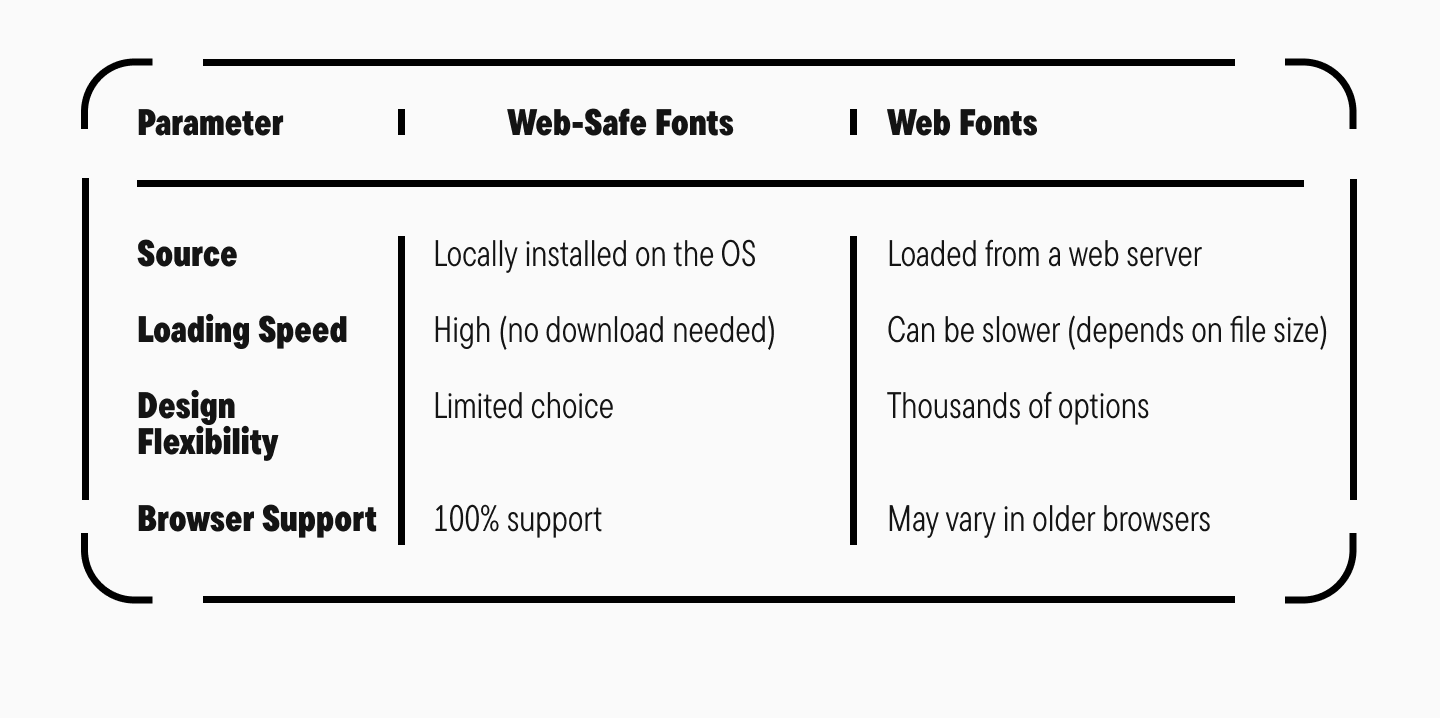
What Are Web-Safe Fonts and Web Fonts?

Web-safe fonts are fonts that come pre-installed on most operating systems and devices. They don’t need to be downloaded from the internet and are guaranteed to display consistently across all browsers and platforms.
Features of Web-Safe Fonts:
- Availability: They are part of the standard font libraries on Windows, macOS, iOS, Android, and Linux. This means there’s virtually zero chance a user’s device won’t have them.
- High Loading Speed: Since these fonts are already on the user’s device, the browser doesn’t need to load them from a server. This significantly improves page load time, especially on mobile devices and with slow internet connections.
- Compatibility: Because they are universally available, their rendering is consistent across different browsers and devices.
- Limited Choice: This is their main drawback. Most web-safe fonts are stylistically neutral and may not meet specific design requirements.

Web fonts are fonts downloaded from the internet to be used on web pages, even if they aren’t installed on the user’s device. They give designers much more creative freedom, removing limitations on font styles.
Features of Web Fonts:
- Huge Selection: Unlike the limited set of web-safe fonts, web fonts allow you to use thousands of unique typefaces with different styles and weights.
- Many web fonts include extended character and language sets, which is crucial for multilingual sites.
- Design Flexibility: Web fonts let you create a unique visual style.
- Require Loading: Because web fonts are downloaded from a server, they can slow down page loading if they aren’t optimized.
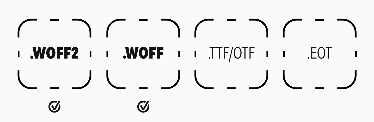
To be used on the web, fonts must be converted into special web font formats:
- WOFF2 (Web Open Font Format 2): The most efficient and compressed format, highly recommended for use.
- WOFF (Web Open Font Format): An older format used as a fallback.
- TTF/OTF (TrueType/OpenType): Original font files, but not optimized for the web.
- EOT (Embedded OpenType): An outdated format used in old versions of Internet Explorer.
Web-Safe Fonts vs. Web Fonts

Why is Font Optimization on a Website Important?
In today’s digital world, page loading speed is critical. It directly impacts user experience, conversion rates, and search engine optimization (SEO). Let’s take a closer look at why a fast-loading website is so important.
1. User Experience (UX)

In the early days of the internet, you could make a cup of tea while a web page loaded. Today, things are different. Internet speeds are higher, and users are more impatient. Online studies show that most people expect a page to load in two seconds or less. If it takes more than three seconds, about 40% of users will leave. Slow loading inevitably leads to a significant loss of potential customers or readers. A fast load time, on the other hand, provides a positive user experience and increases the likelihood that visitors will stay and take action.
2. Bounce Rates and User Retention

Loading speed directly affects bounce rate—the percentage of users who leave after viewing only one page. A high bounce rate can signal issues with your site, including slow loading. Furthermore, a slow site means users spend less time on it and view fewer pages per session, which negatively impacts engagement.
3. Conversion and Revenue

Page speed has a direct impact on conversions—the percentage of visitors who complete a target action, like making a purchase or filling out a form. Research indicates that a one-second delay in page load time can reduce conversions by 7%. This means investing in your site’s speed can lead to a significant increase in profit.
4. Search Engine Optimization (SEO)

Search engines like Google consider page speed when ranking websites. Slow sites rank lower in search results, reducing their visibility and organic traffic. Optimizing your site for speed helps improve your search engine ranking, increasing your chances of attracting more visitors.
5. Mobile Users
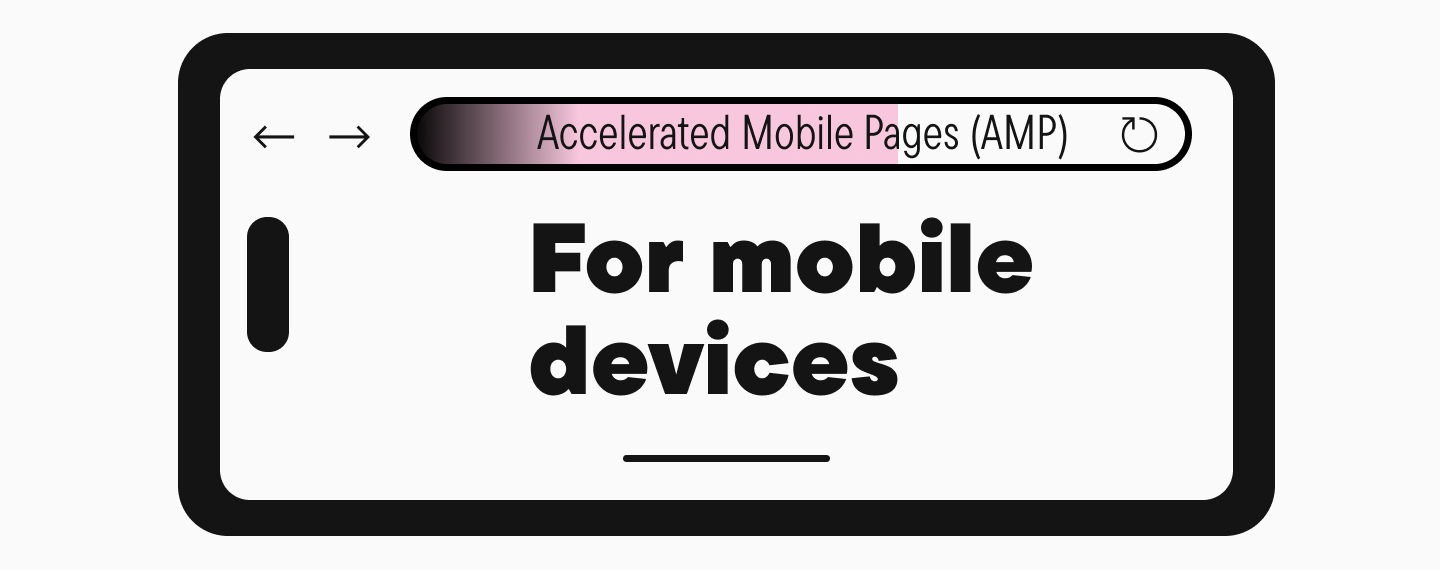
With the rise of mobile devices for internet access, loading speed is even more critical. Mobile networks can be slower and less stable, so optimizing for mobile users is essential. Technologies like Accelerated Mobile Pages (AMP) exist specifically to ensure fast content loading on mobile.
6. Brand Reputation
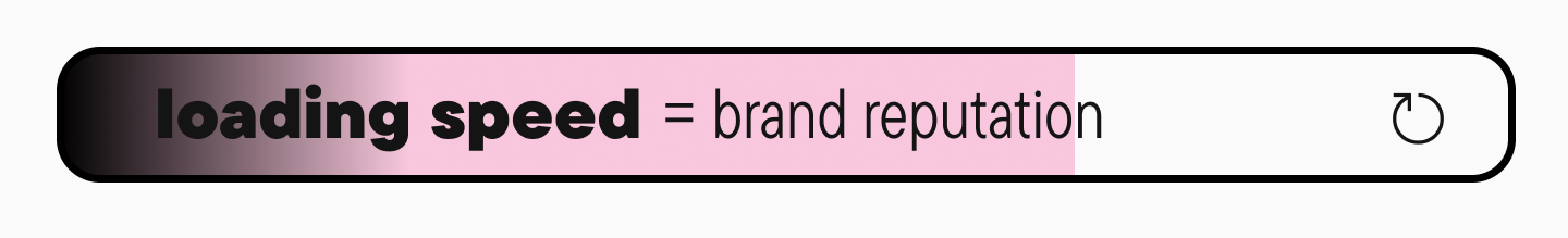
A slow-loading website can harm your brand’s reputation. Users may see it as unreliable or unprofessional.
7. Technical Aspects and Infrastructure

Loading speed depends on many technical factors, including server performance, code optimization, the use of content delivery networks (CDNs), and effective caching. Investing in quality infrastructure and optimizing the technical aspects of your site helps reduce load times and improve overall functionality.
8. Competitive Advantage

In a competitive online landscape, loading speed can be a key advantage. It helps grow your audience and keep them engaged.
9. Resource Savings

Optimizing loading speed not only improves user experience but also reduces the load on your servers, saves bandwidth, and cuts hosting costs. This is especially important for large sites with high traffic, where even a small performance improvement can lead to significant savings.
10. Social Networks and Link Sharing

Users are more likely to share fast-loading pages on social media. This helps increase referral traffic and expand your audience.
Takeaway
A fast website loading speed is fundamental to the success of any online resource. It affects user experience, conversions, SEO, brand reputation, and more. Investing in speed optimization is not just a technical task but a strategic decision that helps achieve business goals and strengthen your market position.
Key Techniques for Web Font Optimization
Choose Optimal Font Formats
Modern font formats like WOFF and WOFF2 offer better compression and browser support. This helps reduce file sizes and makes fonts load faster. For example, the WOFF2 format offers much higher compression than TTF or OTF, which means less data to transfer and a quicker page load.
Preload Your Fonts

Using the preload directive tells the browser to start loading important fonts early, reducing delays in how they display. This is especially useful for critical fonts used in headings or body text, where a delay could negatively impact the user’s perception of your content.
Preloading a Font with the Tag <link>
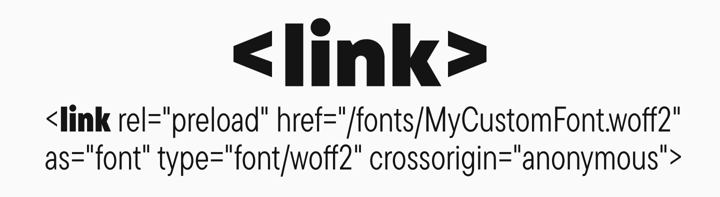
Preloading allows the browser to begin loading a font early in the page rendering process, reducing the time until it appears.
<link rel="preload" href="/fonts/MyCustomFont.woff2" as="font" type="font/woff2" crossorigin="anonymous">Here, the rel="preload" attribute signals the need for preloading, while as="font" specifies the type of resource.
Configure the font-display Property

The font-display property in CSS controls how and when a font will display on a page. For example, setting it to swap allows the browser to immediately display text with a fallback font and then switch to the web font once it has loaded. This prevents the “Flash of Invisible Text” (FOIT).
Problems with unoptimized fonts include:
- FOIT (Flash of Invisible Text): The text remains invisible until the font has fully loaded, leaving blank spaces on the page.
- FOUT (Flash of Unstyled Text): The text first appears in a fallback font and then abruptly switches to the intended web font, causing a jarring visual shift.
- FOFT (Flash of Faux Text): The browser artificially creates a bold or italic style before the actual font file has loaded, which can lead to inconsistencies.
These effects can disorient users and detract from the site’s experience.
Font Rendering: Optimal font-display Settings
The font-display property determines how a font is rendered:
- font-display: auto: The browser uses its default setting.
- font-display: block: The text remains invisible until the font loads, which can cause FOIT.
- font-display: swap: Text is immediately shown with a fallback font and then “swapped” for the web font once it loads. This is the recommended way to prevent FOIT.
- font-display: fallback: A compromise where the text is briefly invisible, but if the font doesn’t load quickly, the fallback is shown.
- font-display: optional: The browser may decide not to load the font at all if the connection is slow, prioritizing performance above all.
Using font-display: swap is considered the best practice for ensuring text appears quickly and preventing FOIT.
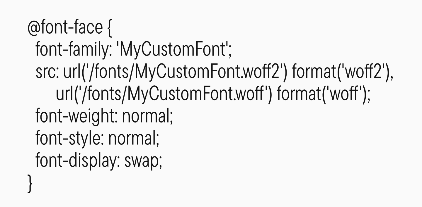
Connecting a Font Using @font-face and font-display
To control how your fonts load and display, it’s recommended to use the @font-face rule and specify the font-display property. This gives you control over the text’s behavior before the font is ready, preventing rendering delays.
Reduce the Number of Fonts and Weights Used
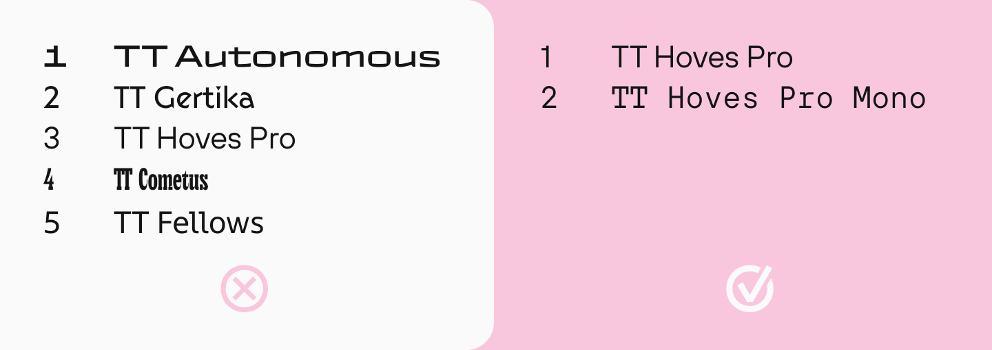
It’s recommended to use no more than two font families with a limited number of weights. This is a key font optimization technique to reduce the amount of data that needs to be loaded and to speed up rendering.
Using a large number of font families increases HTTP requests and the total file size, which slows down page loading.
Using more than two font families on a web page can negatively impact site performance, visual consistency, and the overall user experience. Let’s explore why limiting your font selection is a good idea.
1. Loading Speed and Site Performance
Each additional font family adds another resource the browser must load. This increases load time, which can hurt user experience and increase bounce rates.
2. Visual Consistency and Readability

Using too many different fonts can create visual chaos, making information difficult to process and reducing text readability. The optimal approach is to stick to two fonts—one for headings and one for the body text. This helps structure the content and avoid a cluttered look.
3. Compatibility and Cross-Browser Support

The more fonts you use, the higher the chance of encountering compatibility issues across different browsers and devices.
4. Technical Aspects
Each extra font family increases the size of your CSS and can lead to style conflicts. Limiting the number of fonts simplifies your CSS structure and reduces the likelihood of rendering errors.
In short, limiting the number of fonts on your site helps improve user experience: it speeds up loading, makes information easier to digest, and creates a more aesthetically pleasing website.
Use System Fonts

Using system fonts that are already installed on a user’s device allows you to avoid loading any additional font files. This speeds up text display and improves site performance.
Optimize Font Caching
Properly configuring caching headers allows browsers to store font files locally. This reduces repeat downloads for return visitors and lessens the load on your server. This is especially important for repeat visits, where cached fonts allow text to appear instantly.
The best font caching settings include setting long-term expiration headers, which tells browsers to store the fonts locally. It’s recommended to use the Cache-Control and Expires headers.
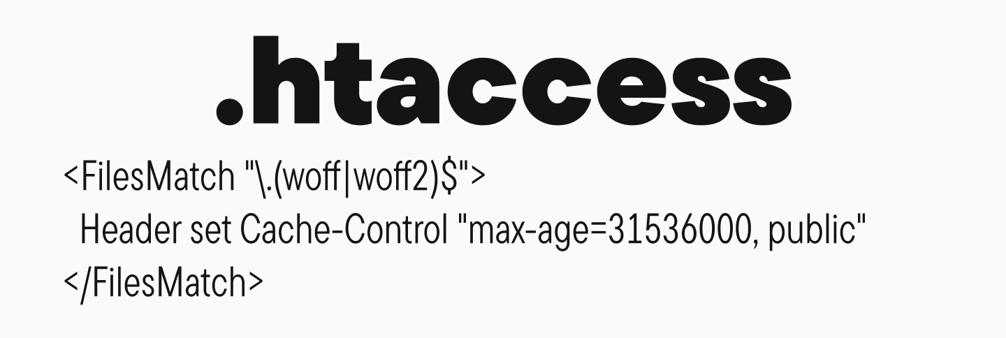
Setting Up Font Caching via .htaccess:
<FilesMatch ".(woff|woff2)$">
  Header set Cache-Control "max-age=31536000, public"
</FilesMatch>
Configuring Font Caching in nginx:
location ~* .(woff|woff2|eot|ttf|otf)$ {
    expires 1y;
    add_header Cache-Control "public, immutable, no-transform";
    add_header Access-Control-Allow-Origin "*";
}
Remove Unused Glyphs (Font Subsetting)

Removing unused characters (glyphs) from font files is a process called “subsetting.” This technique reduces file sizes and speeds up loading. For example, if your site only uses the Latin alphabet, there’s no need to load glyphs for Cyrillic or other scripts. At TypeType, we can create custom font subsets adapted to a client’s specific needs.
Use Variable Fonts
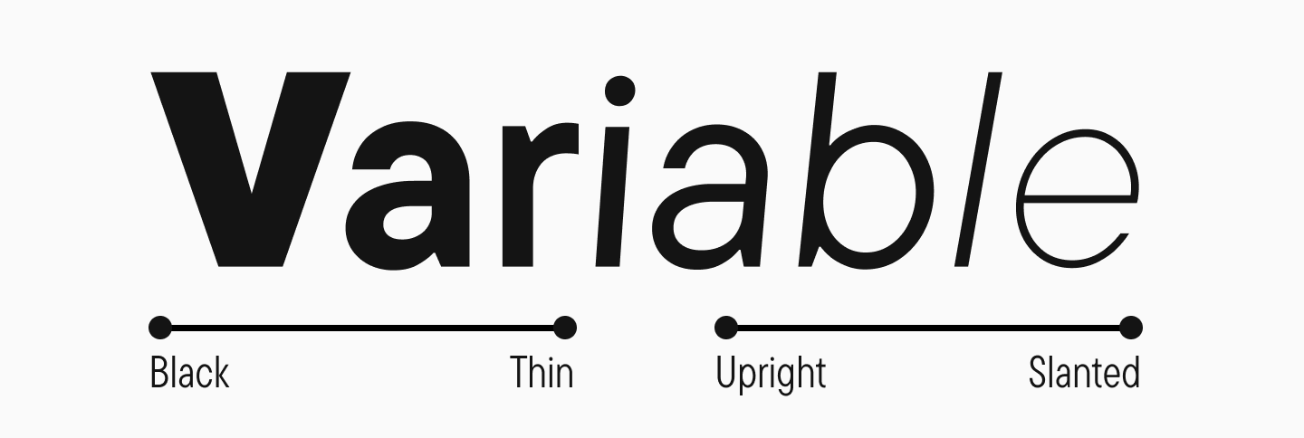
Variable fonts allow you to store multiple weights and styles in a single font file, which reduces the number of files to download. This is especially useful for responsive design, where you might need to dynamically change a font’s weight or width.
Host Fonts Locally

Hosting font files on your own server gives you full control over their loading and caching, and it reduces your dependency on third-party services like Google Fonts. This provides more stable and predictable performance, especially for users with unstable internet connections.
Use Modern Loading Technologies
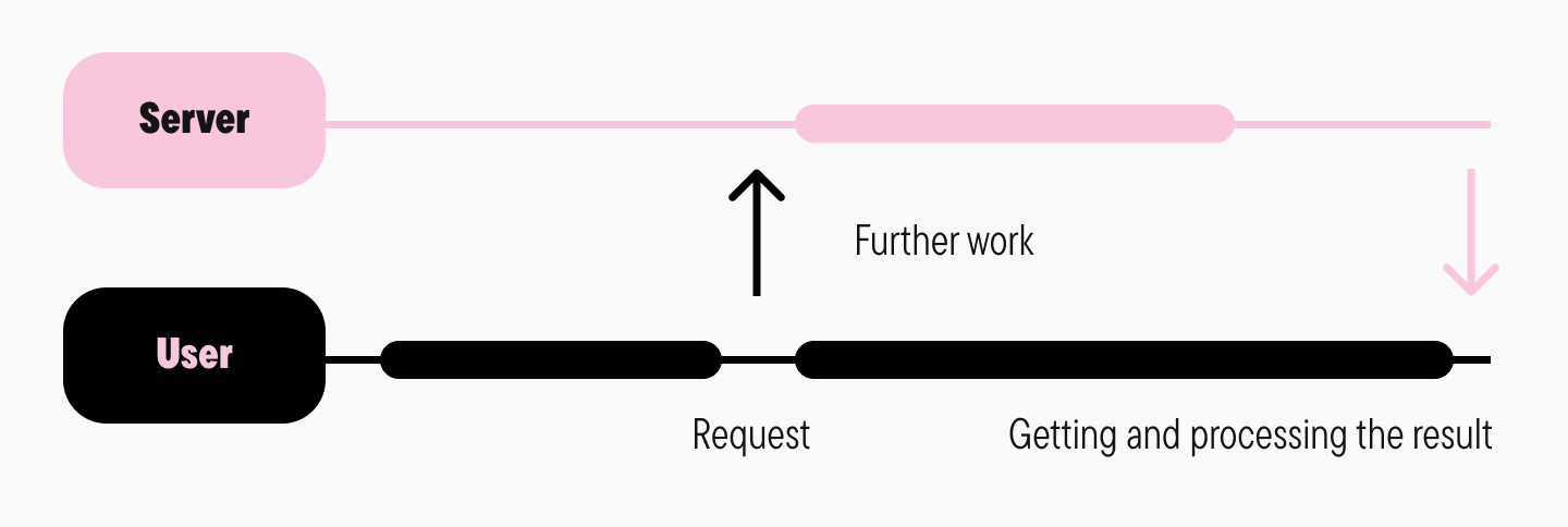
Using modern techniques like asynchronous font loading with JavaScript libraries (e.g., Web Font Loader) allows you to load fonts without blocking the rest of the page from rendering. This improves the perceived loading speed.
Conclusion
As you can see, web font optimization is key to improving user experience. A smart choice of formats (WOFF2, WOFF), preloading, setting font-display: swap, and reducing the number of weights all help minimize text rendering delays. Using system fonts and local hosting reduces dependency on external resources, while caching and font subsetting reduce the amount of data transferred. Variable fonts and asynchronous loading further speed up rendering. Font optimization is more than just a technical tweak; it’s an essential step toward creating an effective and user-friendly web resource.