top_banner_ttsupermolotneue0326
TT Bakers
15 styles
Type foundryFonts & StylesSerifTT Bakers

TT Bakers

TT Bakers is a fluid serif with a gentle and lively character. This font is like freshly baked goods: it’s warm and soft, especially in its bolder weights.
Single style: from $47.99
Full family: from $249 15 styles

Buying Options

Choose the fonts and licenses you want. Then, press the "Add to Cart" button

Any questions about the font or licences? Write us.

Choose the fonts you want

Package offer:
per style $16.60
from  $249
15 styles
from  $249
from $47.99
from $47.99
from $47.99
from $47.99
from $47.99
from $47.99
from $47.99
from $47.99
from $47.99
from $47.99
from $47.99
from $47.99
from $47.99
from $47.99
from $229
Package offer:
per style $16.36
from  $229
14 styles
from  $229
from $47.99
from $47.99
from $47.99
from $47.99
from $47.99
from $47.99
from $47.99
from $47.99
from $47.99
from $47.99
from $47.99
from $47.99
from $47.99
from $47.99
from $229
1 style
from $229
from $229

Any questions about the font or licences? Write us.

Select font licenses

You must specify a font package or style before selecting a licence

Choose the licenses you want

On request
On request
On request
On request
On request
On request
On request
On request
On request
On request
No selected items
Total
$0

Testers

TT Bakers
Size
Features
Turn on all

A Fluid Display Serif with a Soft Character

TT Bakers
Size
Features
Turn on all

TT Bakers is a versatile typeface that works equally well for both text setting and display use. Thanks to its balanced contrast, generous spacing, and thoughtful construction, TT Bakers maintains clear readability even in standard body text. And at large point sizes, its character is revealed: fluid, brush-like strokes lend the typeface an expressive quality.

TT Bakers
Size
Features
Turn on all

An ideal solution for food-related projects, such as packaging for baked goods, menus, window displays, and brand identities

TT Bakers
Size
Features
Turn on all

Asymmetrical serifs create a directional rhythm, adorning the reading experience

TT Bakers
Size
Features
Turn on all
Variable axes
Weight
Slant

Magic Style Fifth (5)

TT Bakers in design

Description

About font family TT Bakers
230+ Language support

Introducing the new display typeface, TT Bakers version 1.000!

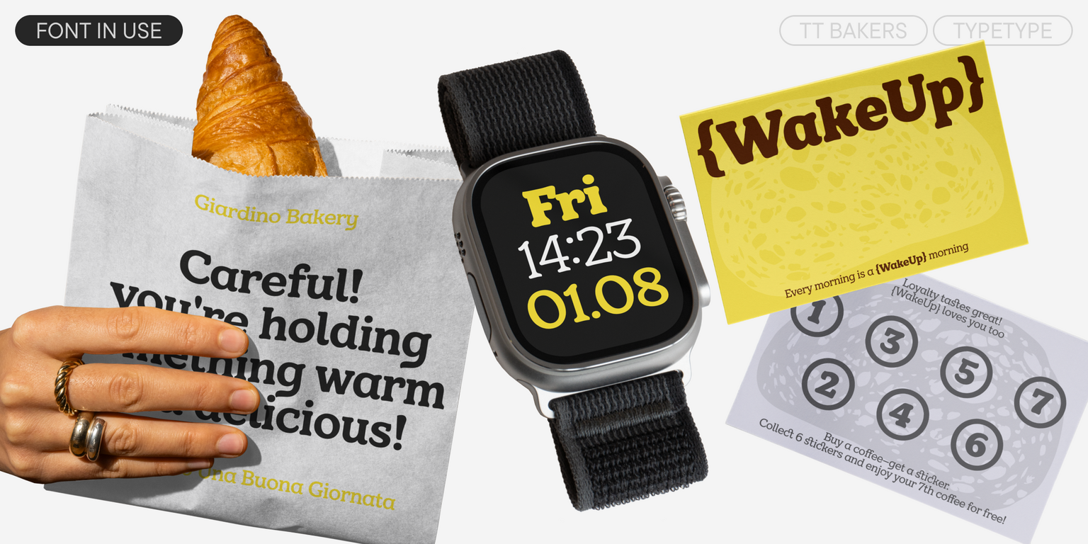
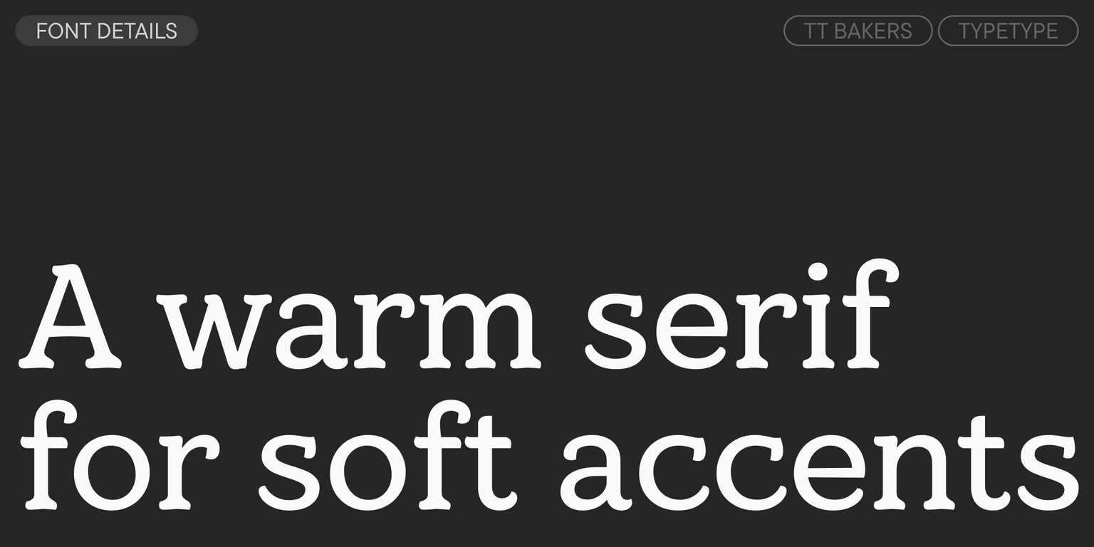
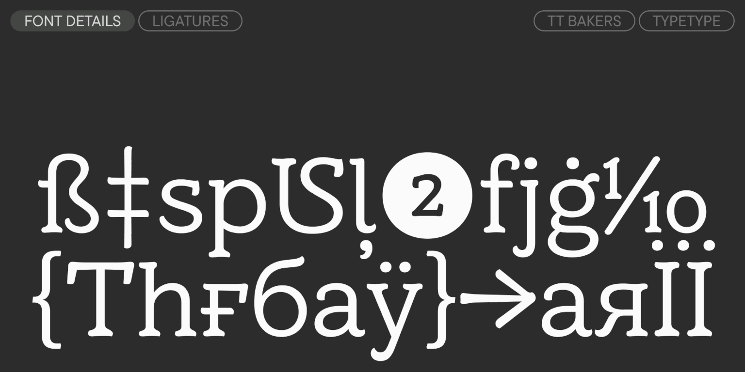
TT Bakers is a fluid serif with a soft and gentle character. Among the visual features of TT Bakers are a balanced contrast, generous spacing, and asymmetrical serifs that create a directional rhythm. Thanks to its thoughtful construction, this typeface maintains excellent readability even in text settings. And at large and medium sizes, its character emerges: fluid strokes, reminiscent of a brush’s movement, are revealed in all their expressiveness.

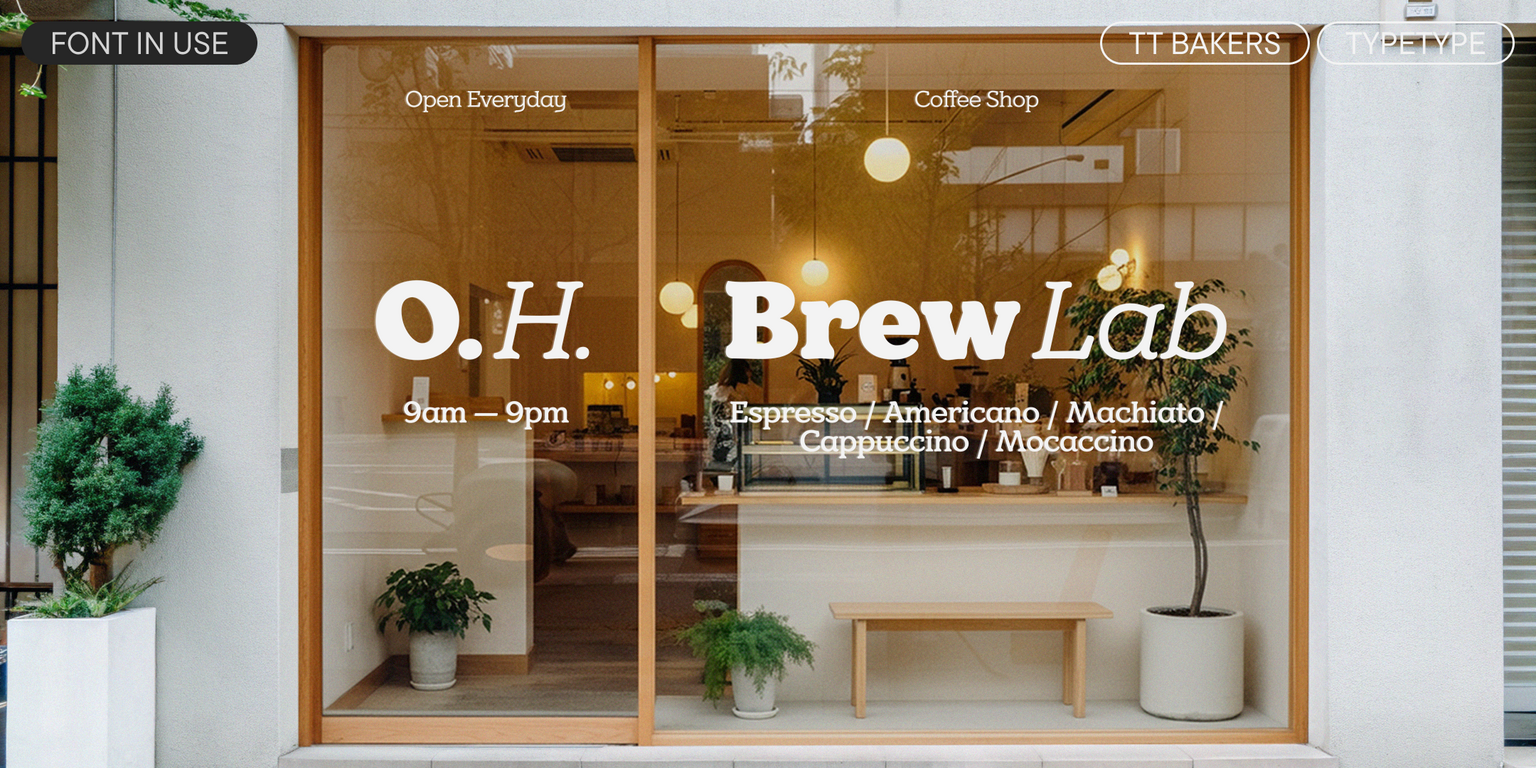
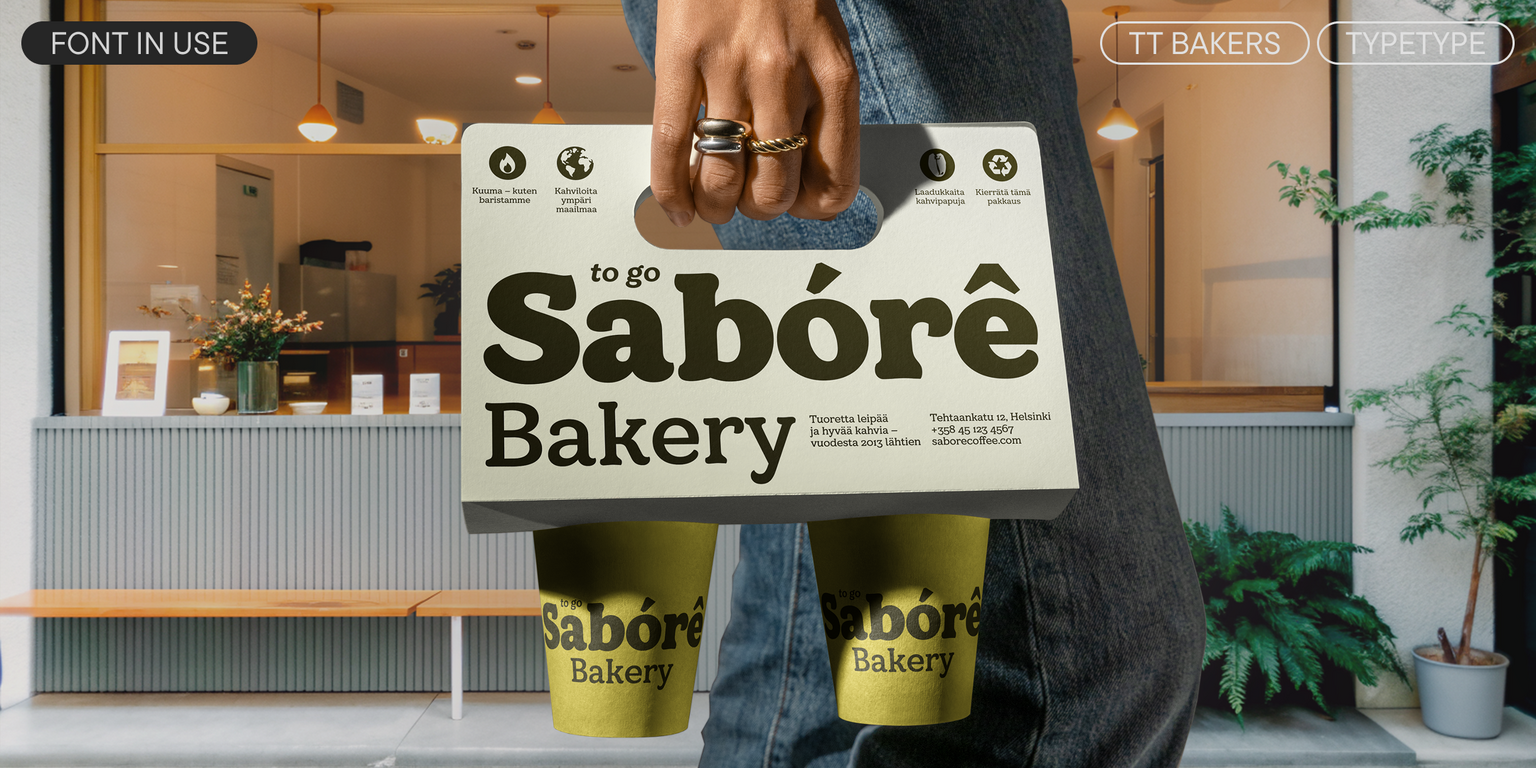
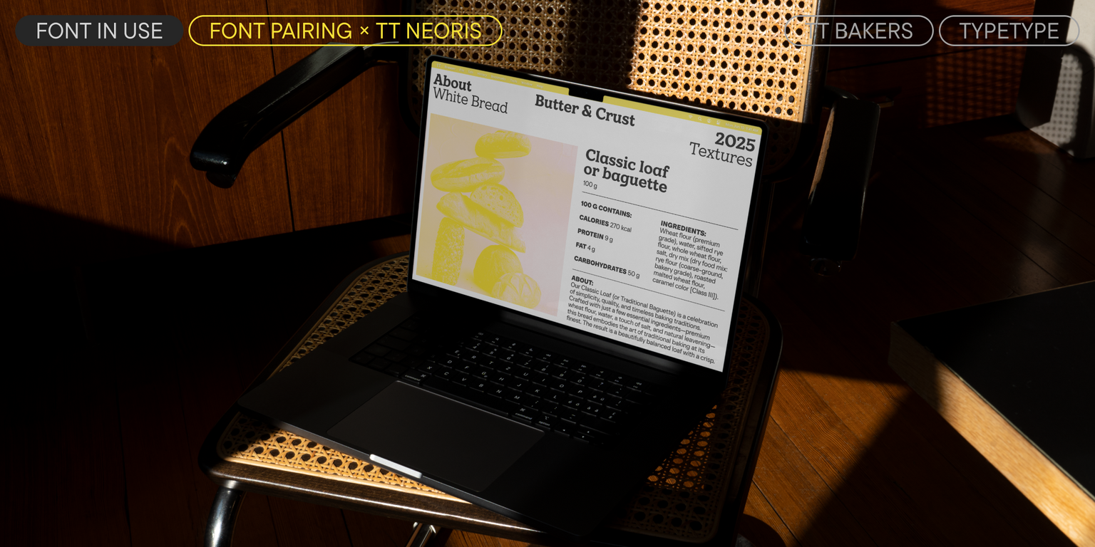
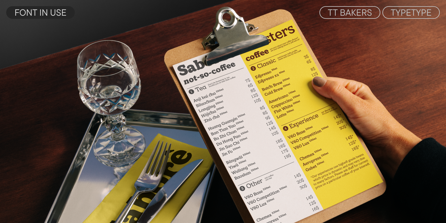
TT Bakers is an ideal solution for food-related projects: from packaging design, menus, and shop windows to creating a complete brand identity. We feel it would look especially harmonious in the identity for bakeries and brands that produce baked goods—and this is what we’ve reflected in the typeface’s name. However, thanks to its versatile character, this typeface is also perfectly suited for projects with other themes.
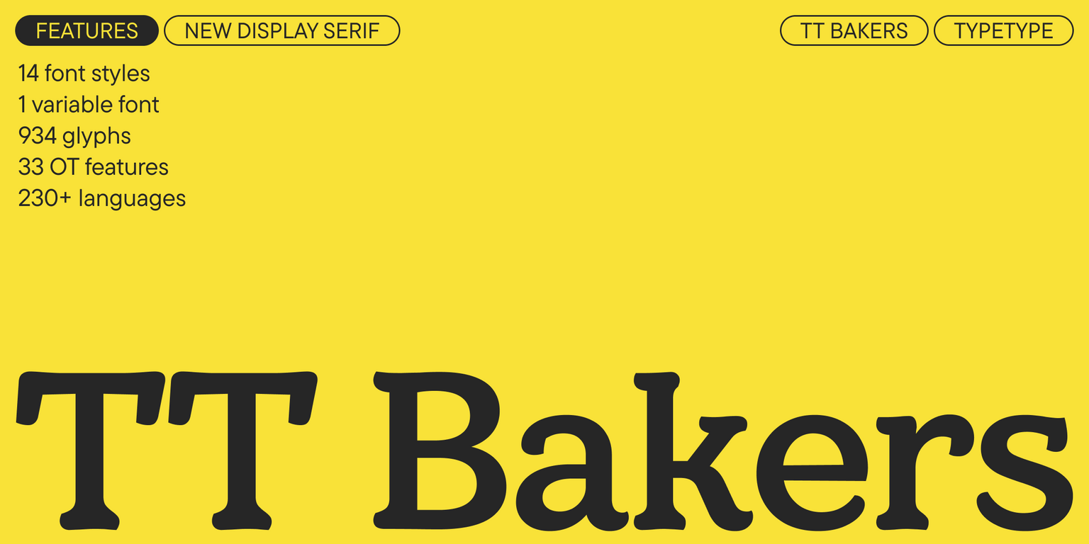
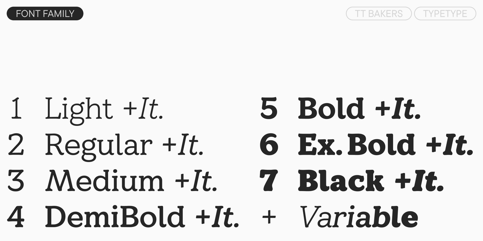
TT Bakers includes:

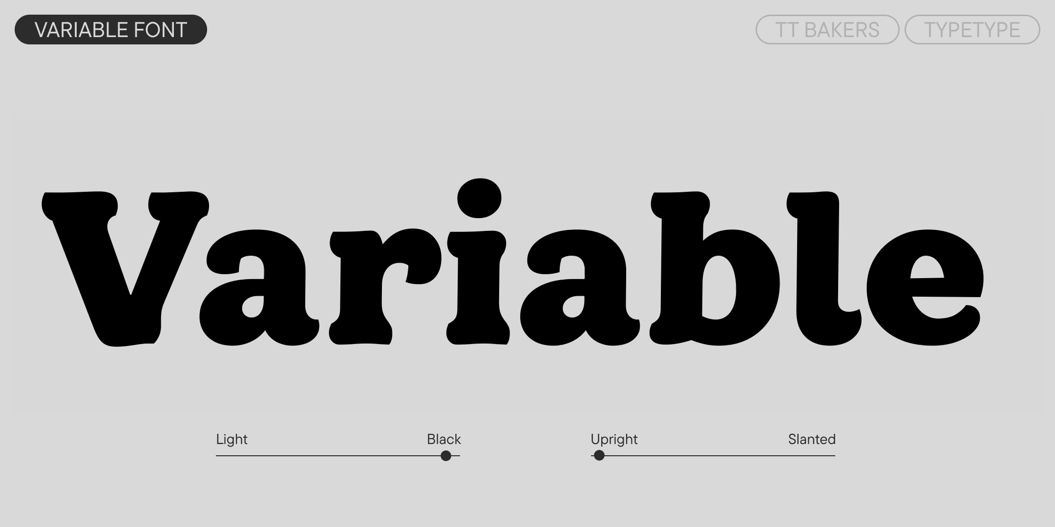
  • 15 styles: 7 uprights, 7 italics, and 1 variable font that changes along the weight and slant axes
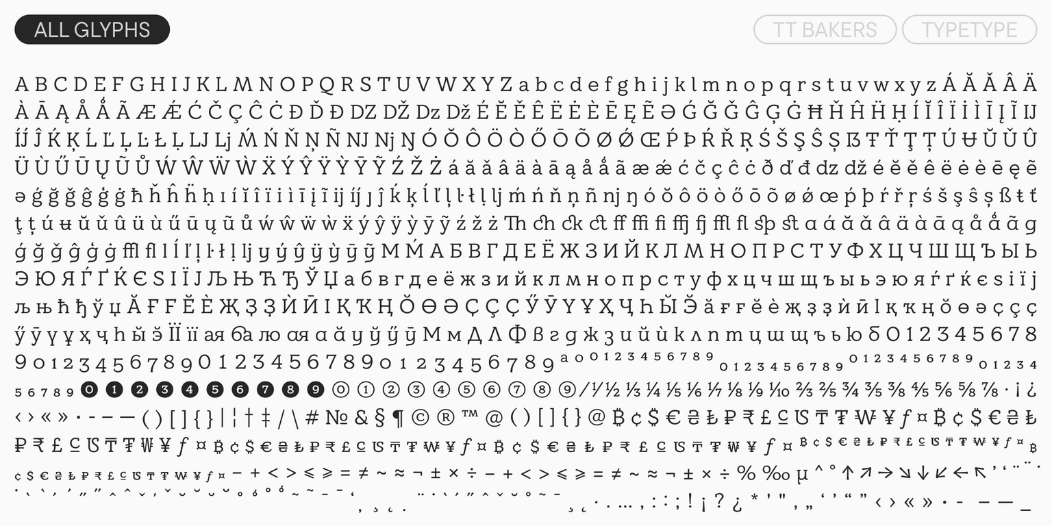
  • 934 glyphs per style
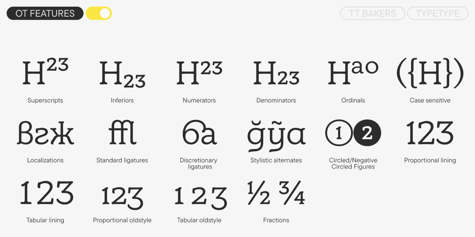
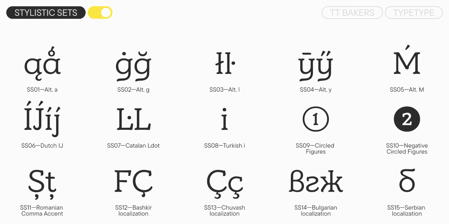
  • 33 OpenType features
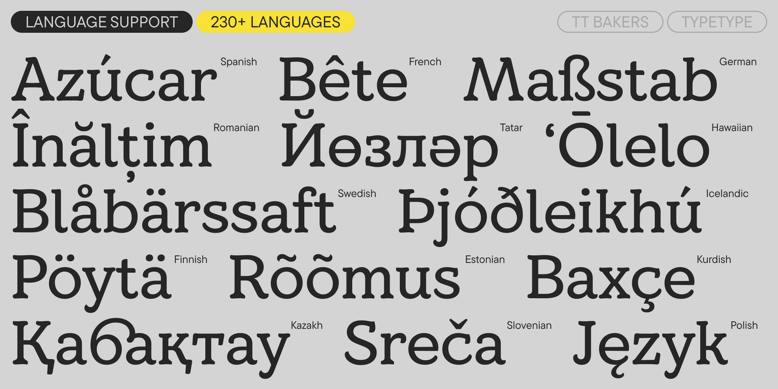
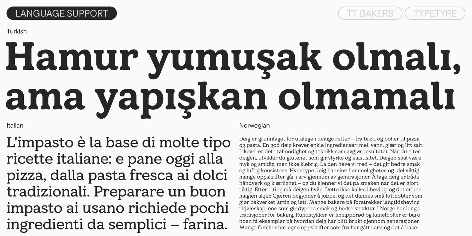
  • Support for over 230 languages

TT Bakers — a warm serif for soft accents!

Release date

23 September, 2025

Additionally

Specimen

Download font specimen (pdf)

Poster Images

Graphic presentation at Behance

Custom version

Looking for a custom version of this font?

+ extended writing system Show all

Character Set

Basic Latin Basic Cyrillic Extended Latin Extended Cyrillic Fractions Proportional Lining Figures and Currencies Other Figures Punctuation and Symbols Math Symbols Arrows
A B C D E F G H I J K L M N O P Q R S T U V W X Y Z a b c d e f g h i j k l m n o p q r s t u v w x y z
А Б В Г Д Е Ё Ж З И Й К Л М Н О П Р С Т У Ф Х Ц Ч Ш Щ Ъ Ы Ь Э Ю Я Ѓ Ґ Ќ Є Ї Љ Њ Ћ Ђ Ў Џ а б в г д е ё ж з и й к л м н о п р с т у ф х ц ч ш щ ъ ы ь э ю я ѓ ґ ќ є ї љ њ ћ ђ ў џ
Á Ă Ǎ Â Ä À Ā Ą Å Ǻ Ã Æ Ǽ Ć Č Ç Ĉ Ċ Ð Ď Đ DZ DŽ Dz Dž É Ĕ Ě Ê Ë Ė È Ē Ę Ə Ǵ Ğ Ǧ Ĝ Ģ Ġ Ħ Ȟ Ĥ Í Ĭ Î Ï İ Ì Ī Į Ĩ IJ Ĵ Ķ Ĺ Ľ Ļ Ŀ Ł LJ Lj Ń Ň Ņ Ŋ Ñ NJ Nj Ó Ŏ Ô Ö Ò Ő Ō Ø Ǿ Õ Œ Þ Ŕ Ř Ŗ Ś Š Ş Ŝ Ș Ŧ Ť Ţ Ț Ú Ʉ Ŭ Ǔ Û Ü Ù Ű Ū Ų Ů Ũ Ŵ Ý Ŷ Ÿ Ȳ Ź Ž Ż á ă ǎ â ä à ā ą å ǻ ã æ ǽ ć č ç ĉ ċ ð ď đ dz dž é ĕ ě ê ë ė è ē ę ə ǵ ğ ǧ ĝ ģ ġ ħ ȟ ĥ ı í ĭ î ï i ì ī į ĩ ij ȷ ĵ ķ ĺ ľ ļ ŀ ł lj ḿ ń ň ņ ŋ ñ nj ó ŏ ô ö ò ő ō ø ǿ õ œ þ ŕ ř ŗ ś š ş ŝ ș ß ŧ ť ţ ț ú ʉ ŭ ǔ û ü ù ű ū ų ů ũ ŵ ý ŷ ÿ ȳ ź ž ż
Ӑ Ғ Ӗ Ѐ Җ Ҙ Ѝ Ӣ Ӏ Қ Ҡ Ң Ө Ә Ҫ Ӳ Ӯ Ү Ұ Ҳ Ҷ Һ ӑ ғ ӗ ѐ җ ҙ ѝ ӣ ӏ қ ҡ ң ө ә ҫ ӳ ӯ ү ұ ҳ ҷ һ
½ ¼ ¾
0 1 2 3 4 5 6 7 8 9 ¢ $ £ ¥ ƒ ¤
¹ ² ³
! ¡ ? ¿ « » . , : ; ... " ' | ¦ - _ \ / ( ) [ ] { } · * § © ® @ & # % µ ° ^ ª º
+ < > = ~ ¬ ± × ÷ %

OpenType features

ss01 | Alternative a

á ă ǎ

á ă ǎ

ss02 | Alternative g

ĝ ģ ġ

ĝ ģ ġ

ss03 | Alternative l

ĺ ľ ļ ŀ ḷ

ĺ ľ ļ ŀ ḷ

ss04 | Alternative y

ý ŷ ÿ

ý ŷ ÿ

frac | Fractions

2/3 1/4

2/3 1/4

case | Case Sensitive Forms

({[H]})

({[H]})

Show all

Ideal font pairs with TT Bakers

What is a font pair, and what does it serve for?

A font pair is a combination of two fonts within one text block. Most often, one of the fonts in a pair is a more expressive headline font, and the other one serves to communicate information. Such fonts complement each other and help designers solve various tasks, like highlighting key elements, adding emotional expressiveness to the project, or separating semantic blocks.

How to choose fonts for a project: Several general recommendations

To begin with, establish the project's tone. Choose the fonts that stylistically match the main idea. After that, you need to determine the functions of each font in the project and their hierarchy: which font will complement the design and which one will serve to attract attention as the main element. You need to assess the difference between the fonts and decide what kind of information each of them should convey. First, we recommend choosing the base font you will use most, and then you can find a suitable pair for it.

Core principles of font pairing and recommendations from designers

The main rule you should follow when matching two fonts is that both similarities and differences must be visible between them. You can highlight the coherence of fonts by the following characteristics: contrast, proportions, width, openness of characters, individual letter shapes, and overall tone. Feel free to experiment with different combinations. We also recommend analyzing the projects you like: this way, you can enhance your visual skills, elevate your knowledge base, and gain confidence in dealing with typography.

Similar fonts

20 font styles
55 font styles
29 font styles
Buy font